A website popup is a small panel that appears over your page to make one offer — a discount, a newsletter, a reminder, a question. Creating one takes about twenty minutes: choose the job, write the offer, design the card, set when it appears and where, publish it, and paste one script tag into your site.
The hard part is not the tool. It is the six decisions underneath, and most first popups get three of them wrong — they fire on page load, they ask for four fields, and the headline describes the mechanism ("Join our newsletter") instead of the reward. This guide walks each decision in the order you actually make it.
Key Takeaways
- One popup, one job. If you want two things, build two campaigns and point them at different pages.
- The headline names the reward, not the mechanism. "Get 10% off" is an offer; "Subscribe" is a chore.
- One input field. Every extra field is a decision the visitor has to make, and decisions cost conversions.
- Never fire on page load. Delay, scroll, exit intent or inactivity — give the visitor something to interrupt.
- Install once, publish forever. A single script tag serves every popup, form, survey and quiz you build afterwards.
What you need before you start
Three things, none of which take long:
- Access to your site's
<head>— or admin access to WordPress, Shopify, Wix or Google Tag Manager, where a plugin or app does it for you. - Somewhere for the leads to go. Submissions are stored in your popup tool's dashboard; if you want an automatic welcome email you will also need an email platform.
- An offer you can actually honour. If you promise a code, the code has to exist and work in your checkout. This is the step teams skip and regret.
You do not need a developer, a design file or a staging site. Everything below happens in a visual editor, and the one line of code is a copy-paste.
Step 1 — Decide the one job the popup has to do
Before you open any editor, finish this sentence: "This popup exists so that a visitor ______." Signs up for the newsletter. Claims a first-order discount. Comes back to an abandoned cart. Tells us why they didn't buy. Sees the shipping deadline.
A popup with two jobs converts on neither. "Join our list and follow us on Instagram and take 10% off" gives the visitor three decisions where they had the patience for one. If two jobs genuinely matter, build two campaigns and use page targeting to keep them apart.
| The job | The popup type | Where it belongs | Typical trigger |
|---|---|---|---|
| Grow the email list | Signup popup with a reward | Blog, homepage, collections | Scroll 50% or 8-second delay |
| Recover a leaving shopper | Discount or free-shipping offer | Product and cart pages | Exit intent (desktop), inactivity (mobile) |
| Announce something | Announcement bar | Site-wide | Immediate — a bar is not an overlay |
| Learn why people leave | One-question survey | Cart, pricing, checkout | Exit intent |
| Segment your list | One-question quiz | Anywhere, returning visitors | Page count after 2 pages |
| Make the offer memorable | Spin wheel or scratch card | Homepage, collections | Delay, then the game does the work |
Step 2 — Write the offer before you design anything
Design is the easy part and it is not what converts. What converts is the trade the visitor is being offered, stated plainly. Write these three lines in a text file first:
- Headline — the reward. What they get. Not what you want.
- One line of body copy — the exchange. What it costs them and what happens next.
- Button — the action, in their words. "Send my code", not "Submit".
| Weak | Stronger | Why |
|---|---|---|
| Join our newsletter | Get 10% off your first order | Names a reward instead of a mechanism |
| Sign up for updates | One good idea every Tuesday. Nothing else. | Says what arrives and how often |
| Don't miss out! | Your cart is saved for 30 minutes | Concrete, and true |
| Submit | Send my code → | Describes what the click does |
| Enter your email address | Where should we send it? | Reads like a person, not a database |
The 25-word test. Read your whole popup out loud. If it takes longer than five seconds, it is too long — the visitor gives you about that before their hand moves to the close button.
Step 3 — Build the popup
Now open the editor. In ChilliPopup you start from a template and change what you need: every element on the canvas is a block you drag, resize and restyle — text, buttons, input fields, images, shapes, icons, a countdown timer, a coupon code, a YouTube embed, a news ticker, or raw HTML if you need it.

A finished signup popup is usually four blocks: headline, one line of copy, one input, one button.
The anatomy that works
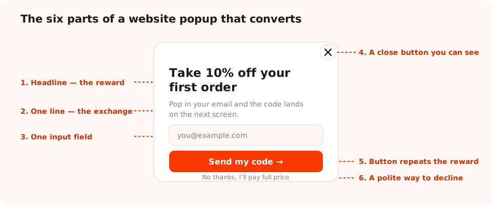
Six parts. Anything you add beyond these has to earn its place against the close button.
- A visible close button. Not a grey 8px cross in the corner. Making the exit hard does not win the signup; it wins the back button.
- One input field. Email, or phone if SMS is genuinely your channel. Not both.
- A button that repeats the reward. The button is the last thing they read.
- An optional decline link. "No thanks, I'll pay full price" gives people a way out that isn't the close button, and it tends to make the offer land harder.
- Contrast between the button and everything else. If three elements are bright, none of them are.
Size and position
A centred overlay is the loudest option and converts best for a real offer. A bottom-right or bottom-left corner card is the quiet one — lower conversion, far lower irritation, and the right choice for anything running site-wide. A bar across the top is quieter still and never blocks content, which is why announcements belong there.
Check the mobile view before you publish. Phones are where popups go wrong: the keyboard covers half the screen the moment someone taps the input, so the button has to still be reachable, and the close control has to be a real tap target.
Don't skip the thank-you state. Deciding what happens after submit is part of building the popup: show a thank-you screen with the code, close the popup, or send them to a URL. A popup that just vanishes leaves the visitor wondering whether it worked.
If you'd rather start from a prompt
You can also describe the popup in a sentence and let the AI generator produce a first draft — copy, layout and colours — which lands in the same editor for you to fix. It is a faster blank page, not a replacement for the six decisions above.
Step 4 — Choose when it appears
This is the decision that separates a popup people tolerate from one they resent. The rule: the visitor must have seen something worth interrupting first.
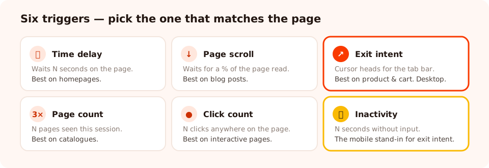
Six triggers. The popup appears as soon as the first enabled one fires, so start with one.
| Trigger | What it waits for | Best on | Watch out for |
|---|---|---|---|
| Time delay | N seconds on the page (or in the session) | Homepages, landing pages | Too short and it reads as a page-load popup |
| Page scroll | A percentage of the page read | Blog posts, long product pages | Short pages hit 50% instantly |
| Exit intent | The cursor leaving toward the browser chrome | Product, cart and pricing pages | Desktop only — there is no cursor on a phone |
| Page count | N pages seen this session | Catalogues, content sites | Resets between sessions |
| Click count | N clicks anywhere on the page | Interactive pages, configurators | Noisy on pages with lots of controls |
| Inactivity | N seconds without input | Mobile, as the exit-intent substitute | Fires on people who are simply reading |
A good default for a first popup: exit intent on desktop, 50% scroll on mobile, built as one campaign with both rules on, or as two campaigns split by device if you want different copy.
Step 5 — Choose where it appears, and how often
Three settings turn a popup from a nuisance into a campaign:
- Page targeting. Restrict the URL with contains, does not contain, is exactly, is not, starts with or ends with. A cart-recovery offer that appears on your About page is just noise.
- Audience. Everyone, new visitors, or returning visitors — and you define what "new" means in days. First-order discounts belong to new visitors.
- Frequency. Once a day, once per session, every N days, every N visits. This is how a dismissal is respected. Without it, someone who closed your popup meets it again on the next page view, which is the fastest way to teach people to close popups reflexively.
The single most-missed switch: turn off "show again after conversion". Otherwise your existing subscribers keep being asked to subscribe, which makes you look like you don't know who they are.
Advanced targeting adds a date window, an operating-system and browser filter, and a weekday-and-hour schedule — useful for a sale that must not open early, or a "we're open now" offer. Every enabled rule is an AND gate: the popup shows only when all of them pass. For the full breakdown, see the targeting rules guide.
Step 6 — Publish and install it on your site
Publishing and installing are two different things, and this trips people up: a popup only ever serves when its status is published, and the pixel only serves popups on sites where the script is present. Drafts never show, whatever else is switched on.
The script is one tag, pasted once, into your site's <head>:
<script id="chillipopup-pixel"
  src="https://player.chillipopup.com/javascript/pixel.js?id=YOUR_WORKSPACE_ID"
  data-api="https://api.chillipopup.com"
  async="true"></script>
It loads asynchronously, so it never blocks your page, and it serves every popup, form, survey, quiz and game in that workspace — you install it once and never touch it again. On the platforms with a dedicated app you don't even paste it:
- WordPress — install the plugin, paste the Workspace ID.
- Shopify — connect the store and enable the app embed.
- Wix — add the free app and it connects your site automatically.
- Google Tag Manager — a Custom HTML tag on All Pages.
- Anything else — the snippet above.
Then load a real page and check. If nothing appears: is the campaign published, is the script in the page source, and have you already met the trigger or frequency rule yourself in this browser?
Build your first popup in twenty minutes
Popups, forms, surveys, quizzes and games from one editor — and one script tag. Free plan, no credit card required. Paid plans from $29/month.
Start free →A worked example: a first popup for an online store
Here is the whole thing, end to end, for a store selling homeware.
- Job: capture the email of a first-time visitor who is about to leave without buying.
- Headline: "Take 10% off your first order"
- Body: "Pop in your email and the code lands on the next screen."
- Field: one email input, required, with typo checking on.
- Button: "Send my code →"
- Decline link: "No thanks, I'll pay full price"
- After submit: thank-you screen showing the code, plus a line telling them it is also in their inbox.
- Trigger: exit intent on desktop; 50% scroll on mobile.
- Pages: URL contains
/productsor/collections. - Audience: new visitors. Frequency: once every 7 days. Show again after conversion: off.
That is a complete campaign, and the version most stores would be better off with than whatever they are currently running. Everything else — a second field, a second offer, a second popup — is an experiment you run after this one has two weeks of data.
Seven mistakes to avoid on your first popup
- Firing on page load. The visitor has seen nothing yet, so there is nothing to interrupt them for — and on mobile arriving from search this is exactly the pattern Google calls an intrusive interstitial.
- Four fields "while we have them". Each one is a decision. Ask for the identifier and collect the rest later with progressive profiling.
- A headline about you. "Sign up for our newsletter" describes your process. Name the reward instead.
- A hidden close button. It converts dismissals into bounces, and it is the single fastest way to make a brand feel cheap.
- No frequency rule. The same popup on every page view is how you train visitors to close popups without reading them.
- Leaving "show again after conversion" on. Your subscribers keep being asked to subscribe.
- Promising a code that doesn't work. Test the code in a real checkout before you publish. A dead discount code costs more trust than the popup ever earned.
What to measure once it's live
Give it two weeks, then read four numbers, all of which sit on the campaign's own analytics page:

Views, clicks, submissions and conversion rate — plus a breakdown of the values people typed into each field.
- Views — is it even being seen? A low number means the rules are wrong, not the copy.
- Conversion rate — submissions divided by views. Compare it against itself over time, not against a number you read in a blog post.
- Clicks — interest without completion usually means the form is too long or the reward wasn't believed.
- The values collected — a field full of
asdfis telling you it should not have been required.
Then change one thing. If you want to know whether the change actually helped, run it as an A/B test rather than swapping the popup and comparing two different weeks.
Create your popup, step by step
The short version, in the order you'll actually do it. If the pixel isn't on your site yet, start with the one-line install guide.
1. Name the one job
Finish the sentence "this popup exists so that a visitor ______". One verb. If you need two, build two campaigns.
2. Pick a template and make the offer concrete
Choose the template that matches the job, then rewrite the headline so it names the reward, and cut the body to one line.
3. Keep it to one input field
Email, or phone if SMS is your channel. Turn on typo checking. Everything else waits for a later campaign.
4. Set the trigger and the pages
Exit intent on desktop, scroll on mobile, and a URL rule so it only fires where the offer makes sense.
5. Set frequency and turn off "show again after conversion"
Switch display frequency on, pick a cooldown, choose the audience, and stop the popup reappearing for people who converted.
6. Publish, then install the script once
Publish the campaign — drafts never serve — paste the tag into your <head>, and load a real page to confirm.
7. Wait two weeks, change one thing
Read views, conversion rate and the collected values. Change the offer or the trigger, not both.
Related reading
Frequently asked questions
How do I create a popup for my website?
Pick the one job the popup has to do, choose a template that matches it, write a headline that names the reward instead of the mechanism, keep it to a single input field, set a trigger and page targeting, publish it and paste one script tag into your site's <head>. In a no-code builder like ChilliPopup the whole thing takes about twenty minutes, and the same script serves every popup you make afterwards.
Do I need to know how to code to make a popup?
No. The only code involved is a single script tag you paste once into your site's <head>, and on WordPress, Shopify, Wix and Google Tag Manager even that is handled by a plugin or app. Everything after that — design, triggers, targeting, publishing — happens in a visual editor.
What should a website popup say?
Name the reward in the headline, explain the exchange in one line of body copy, and put the action in the button. "Get 10% off your first order" beats "Join our newsletter", because one is a reward and the other is a chore. Keep the whole popup under about 25 words and use one input field.
When should a popup appear?
Late enough that the visitor has seen something worth staying for. A five-to-ten second delay or a 40–60% scroll depth works for content pages; exit intent works for product and cart pages on desktop. Never fire on page load — the visitor has not seen your site yet, so there is nothing to interrupt them for.
How many popups should a website have?
One per job, not one per page. Most sites run three to five campaigns in total: a signup offer, a cart-abandonment catch, an announcement bar, and maybe a survey. What matters is that a single visitor only ever meets one of them at a time, which you control with page targeting and display frequency.
Are popups bad for SEO?
Not in themselves. Google's guidance targets intrusive interstitials that cover the main content on mobile immediately after arriving from search. A popup that fires after a delay, a scroll or an exit signal, is easy to dismiss and does not block the page on mobile is outside that pattern. Size it so the close button is reachable and never fire it on page load.