Most popups that fail do not fail because popups do not work. They fail because of a handful of specific, fixable mistakes — a two-second delay, no page exclusions, a close button nobody can find, or a signup form still shown to people who signed up months ago.
Below are the thirteen popup mistakes that come up again and again, each with the symptom you will see in your own numbers and the exact fix. None of them require a redesign. Most of them are one setting.
Key Takeaways
- Timing is the biggest single killer. A popup that fires before the page has been read is an interruption with no context.
- Showing the signup popup to subscribers is the most common mistake on this list — and it is one toggle away from being fixed.
- An unclosable popup is worse than no popup, and on mobile it is an actual search-ranking risk.
- Every extra field is a decision, not a keystroke. Fields cost conversions unevenly.
- Diagnose from the funnel: views, clicks and submissions each point at a completely different mistake.
How to tell which popup mistake you are making
Before the list, a shortcut. Your popup reports four numbers — views, clicks, closes and submissions — and the shape of that funnel narrows the diagnosis to a couple of candidates immediately.
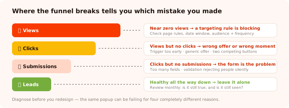
Where the funnel breaks tells you which mistake you are actually making.
| Symptom | Almost always means | Mistakes to check |
|---|---|---|
| Almost no views | A targeting rule is blocking the campaign | #12, #13 |
| Lots of views, very few clicks | The offer or the moment is wrong | #1, #2, #4, #5 |
| Clicks but few submissions | The form is asking too much, or rejecting people | #6, #7 |
| High close rate within a second or two | Reflexive dismissal — it read as an ad | #1, #3, #8 |
| Good rate on desktop, terrible on mobile | The mobile experience was never designed | #3, #9 |
Mistake 1 — Firing the popup two seconds after arrival
The visitor has not read your headline, has not seen a product, has not formed any opinion at all. You are asking a total stranger for their email address before they know what you sell. Reflexive dismissal is the only sane response, and it is what you will get.
The fix: give the page a chance to do its job first. On content pages, a scroll trigger around 50–60% is a genuine engagement signal — someone that far down an article is reading it. On product and category pages, a time delay of 20–30 seconds, or exit intent, works better. On a very long page, page-count or click-count triggers beat both.
The related version of this mistake: switching on every trigger at once. Triggers are an OR — the popup fires on whichever hits first — so enabling all six is functionally identical to "show immediately". Pick two: one for desktop, one for mobile.
Mistake 2 — One generic popup on every page
"10% off your first order" shown identically on the homepage, a blog post about sizing, the returns policy and the contact page. It is not wrong anywhere, so it is not compelling anywhere.
The fix: page targeting. Two or three campaigns, each restricted with a
contains URL rule, beat one campaign everywhere — a shipping offer on product pages, a newsletter
ask on /blog/, a cart-recovery offer on /cart. The
popup targeting rules guide covers
the operators in full.
Mistake 3 — A close button nobody can find
A pale grey X on a pale background, an X that appears fifteen seconds late, or a popup with no visible way out at all. This is the mistake that generates actual complaints — and on mobile, an interstitial that is hard to dismiss is a documented search-ranking risk, not just a UX one.
The fix: a close control with real contrast, visible immediately or after a second or two at most, plus dismissal by clicking the surrounding overlay. If you want a softer alternative, use a visible text decline — "No thanks, I'll pay full price" — which converts the dismissal into a decision rather than an escape. Do not use a delayed close button on a campaign that also blocks scrolling.
Mistake 4 — Asking before you have offered anything
"Join our newsletter" is not an offer. It is a request for a favour. The visitor is being asked to give something concrete (their inbox) for something abstract (updates).
The fix: name what they get and when. A discount code, a size guide, early access to a drop, the one email a week that is actually good. If you genuinely have no incentive to give, at least make the promise specific: "One email a month. New arrivals only. No sales spam."

The fix for most of this list is subtraction: one offer, one field, one obvious way out.
Mistake 5 — Two calls to action fighting each other
"Subscribe" next to "Shop now" next to "Follow us on Instagram." Three buttons is three decisions, and the reliable outcome of three decisions in a popup is none of them.
The fix: one primary action per popup, styled as the only button. Everything else is either a plain text link or deleted. If two goals genuinely matter, that is two campaigns targeted at two different moments — not two buttons.
Mistake 6 — Too many fields, and the wrong ones
Name, email, phone, company, "how did you hear about us?" — collected from someone who arrived four minutes ago. Every field is a decision, not a keystroke, and the cost is wildly uneven: once someone has decided to take a discount, typing an email is nearly free, while a phone number or a qualifier reads as an objection.
The fix: one identifier in the first ask. Everything else moves to a later campaign, after you have delivered something — the approach in our progressive profiling guide. Where you must ask a second question, make it tappable options rather than a text box: you get a normalised value you can actually segment on instead of three spellings of the same answer.
Mistake 7 — Validation that rejects people silently
The opposite failure to too many fields, and much harder to spot: clicks are healthy, submissions are not.
Usually it is an email rule doing more than you realised — business-email validation switched on for a
consumer store rejects every gmail.com address, and nobody tells you.
The fix: match validation to the audience. Format checking plus a common-typo guard for consumer signups; business-email restriction only on genuinely B2B forms where list quality matters more than volume. Then submit your own popup from your phone once a month. It takes twenty seconds and catches this immediately.
Mistake 8 — No thank-you state
The visitor submits and the popup just… closes. Did it work? Is the code coming? Should they check spam? The one moment they were most engaged, wasted.
The fix: a thank-you screen that does three jobs — confirms it worked, delivers the reward immediately (show the code, do not just promise it), and gives one next step: "Shop the new arrivals" or "Check your inbox for the guide." Then let it auto-close after a few seconds so it is not in the way.
Mistake 9 — Designing for desktop and shipping to mobile
A card designed at 600px wide, on a 390px screen, with an on-screen keyboard covering the submit button and an exit-intent trigger that can never fire because there is no cursor.
The fix: treat mobile as its own campaign, not a resize. Fewer words, bigger tap targets, one field, a scroll or inactivity trigger instead of exit intent, and the submit button above the fold of the popup itself. Our mobile popup best practices goes through the layout rules.
Mistake 10 — Showing the signup popup to subscribers
The single most common mistake on this list. Someone joins your list, comes back next week, and is asked to join your list. It reads as "we have no idea who you are", and it is the reason a lot of people say they hate popups.
The fix: turn "show again after conversion" off on every capture campaign. It stops that popup appearing to anyone who already submitted it. Check it before you publish, every time.
Be precise about what it does: the switch is per campaign — it suppresses that popup for someone who submitted that popup. It does not link two different campaigns together. If you run a second, later ask, give it its own audience and frequency rules rather than assuming it knows about the first.
Mistake 11 — Popups over checkout and cart
A discount popup covering a payment form does not earn an email; it loses an order, and it plants the "wait, is there a better code somewhere?" thought at the worst possible moment.
The fix: a does not contain /checkout page rule on every campaign,
as a habit, plus /cart unless the campaign is specifically cart recovery. Add
/account and your login pages while you are there.
Mistake 12 — Frequency set to "every visit"
The same popup, every single visit, forever. This is how a campaign that worked in week one becomes background noise by week three and a complaint by week six.
The fix: once a day is the sensible default for a capture popup. Once every 7 or 14 days for a second ask. Reserve "every session" for genuinely time-limited campaigns, and pair those with a date window that switches the campaign off on the night the sale ends.
Mistake 13 — Publishing and never looking again
The quiet one. A popup runs for eight months. The sale it advertises ended in March. The URL rule stopped matching after a replatform, so it has had eleven views since May. Nobody noticed because nobody looked.
The fix: a calendar reminder, monthly. Open the dashboard, sort by views, and ask two questions of each campaign: is this still true, and is it still being seen? Kill anything that fails either. Our popup analytics guide has the full review routine.

Ten minutes a month in here catches mistakes 12 and 13 before they cost you a quarter.
Fix these in one afternoon
Triggers, page rules, frequency, thank-you screens and mobile layouts — all in one no-code editor. Free plan, no credit card required. Paid plans from $29/month.
Start free →The 60-second pre-publish check
Almost every mistake above is caught by six questions asked before you hit publish. Run them on your next campaign:
- Is "show again after conversion" off? (Mistake 10)
- Is there a does not contain
/checkoutrule? (Mistake 11) - Does the trigger give the page at least 20 seconds or 50% of a scroll? (Mistake 1)
- Is there exactly one button? (Mistake 5)
- Is there exactly one required field? (Mistake 6)
- Have you submitted it yourself, on a phone? (Mistakes 3, 7, 8, 9)
The longer version — twenty-odd checks across design, rules, data and measurement — is in our popup launch checklist.
What to fix first
You will not fix thirteen things this week, and you should not try. In rough order of return per minute spent:
- Turn off "show again after conversion" on every capture campaign. Thirty seconds, and it removes the complaint most people have about popups.
- Add the checkout exclusion. One rule, protects revenue.
- Push the trigger later. Free, and usually the biggest single lift in click rate.
- Delete a field. Usually the phone number.
- Write a real thank-you screen. Ten minutes, and it fixes the wasted moment after the conversion.
Then measure. Change one thing at a time and give it two weeks — otherwise you will never know which fix did the work, which is its own kind of mistake.
Related reading
Frequently asked questions
Why do my popups have a high close rate?
A close rate that spikes within a second or two is reflexive dismissal, and it almost always comes from timing or contrast rather than copy. The popup fired before the visitor read anything, or it looks like an ad. Push the trigger back to a scroll depth of 50 to 60 percent or a 20 to 30 second delay, make the offer concrete in the first line, and make the close control easy to find so dismissal is a choice rather than a fight.
What is the most common popup mistake?
Showing a signup popup to people who already signed up. It is caused by leaving 'show again after conversion' switched on, it makes a brand look like it does not recognise its own customers, and it is fixed with a single toggle on each capture campaign.
How long should I wait before showing a popup?
Long enough for the page to make its case. On articles and blog posts, trigger at 50 to 60 percent scroll depth rather than on a timer. On product and category pages, 20 to 30 seconds or exit intent works better. Anything under about eight seconds arrives before the visitor has formed an opinion and will be dismissed on reflex.
Do popups hurt SEO?
A well-behaved popup does not, but an intrusive mobile interstitial can. The risk is concentrated in popups that cover the main content on mobile immediately on arrival and are hard to dismiss. Delay the trigger, keep the popup smaller than the screen, and give it an obvious close control, and the problem goes away.
How many fields should a popup have?
One required field in the first ask — usually email. Fields do not cost the same: an email is nearly free once someone has decided to take your offer, while a phone number or a qualifying question behaves like an objection. Collect anything else in a later campaign, after you have delivered something.
Should popups appear on the checkout page?
No. A popup over a payment step costs orders far more often than it earns emails, and it introduces doubt about whether a better discount exists elsewhere. Exclude /checkout with a 'does not contain' page rule on every campaign, and exclude /cart too unless the campaign is specifically a cart-recovery offer.
How often should the same popup be shown to one visitor?
Once a day is a sensible default for a capture popup, and once every 7 to 14 days for a follow-up ask. 'Every visit' should be reserved for genuinely time-limited announcements, and those should be paired with a date window so the campaign switches itself off when the offer ends.