Popup copywriting is the craft of making an interruption worth it. You get one glance, one screen and no scroll, so the job is narrow: say what the reader gets, say what it costs them, and make the button describe the reward rather than the paperwork. Everything below is that one idea, applied line by line.
It is also the cheapest thing you will ever change. Rebuilding a popup's design takes an afternoon. Rewriting its headline takes four minutes — and the headline is the part almost every underperforming popup gets wrong.
Key Takeaways
- Lead with the reward, not the ask. "Get 20% off your first order" beats "Join our mailing list" — same deal, opposite order.
- Five words or fewer in the headline. If it cannot be read in a glance, it will not be read at all. Everything you cut moves down a line.
- Specifics beat adjectives. "Great content" is your opinion. "One tactic, 200 words, every Tuesday" is the reader's evidence.
- The button is a promise. Verb plus benefit, in the reader's voice — never "Submit", never "Continue".
- Give a real way out, and only claim urgency that is true. A clean "No thanks" and a deadline you actually enforce both cost you far less than the alternative.
The one job popup copy has
Page copy and popup copy are not the same discipline. Someone reading your product page chose to be there. Someone meeting your popup did not — they were mid-scroll, mid-thought, mid-decision, and a rectangle landed on top of it. That single difference sets the rules.
Popup copywriting, in two sentences
Popup copywriting is writing the handful of words inside a popup — headline, supporting line, button, decline link, small print — so that an interruption is worth the reader's attention. Because it interrupts rather than invites, the copy has to offer the trade before it asks for anything.
Every popup that works answers three questions, in this order, without the reader having to hunt:
- What is this? — answered by the headline, in a glance.
- What do I get? — the reward, named specifically enough to picture.
- What does it cost me? — the ask, plus whatever reassurance makes it feel small.
Most weak popups answer question three first ("Sign up", "Subscribe", "Enter your details") and hope the reader is curious enough to keep reading. They are not. The rest of this guide is really just techniques for keeping that order intact.
The five-word headline test
Cover every other element on the popup. Read the headline alone. Could a stranger say what they get? If not, no amount of body copy will rescue it — the body copy is not going to be read.
Five words is a forcing function, not a law. It exists to stop you writing a sentence where a phrase will do. Watch what happens when the same idea is written both ways:
- ❌ "Sign up for our newsletter" — five words, and every one of them is about your process.
- ✅ "One new recipe every Thursday" — five words, and every one of them is about their Thursday.
The trick for cutting: delete the verb about the reader's action and keep the noun about the reward. "Subscribe to get our packing checklist" becomes "The 12-item packing checklist". The action word does not need to be in the headline — that is what the button is for.
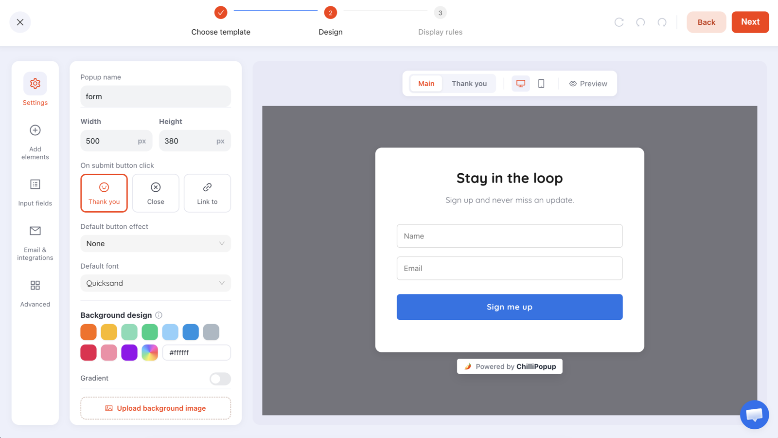
A textbook starting point: "Stay in the loop", "Sign up and never miss an update", "Sign me up". Nothing here is wrong — and nothing here names a reward. That is exactly the popup this guide is for.
Rewrite that one and it becomes: "Two new drops a month" / "We email when something actually launches — nothing in between." / "Tell me about new drops". Same layout, same two fields, completely different offer.
The eyebrow is not a headline. The small line above it — "WAIT!", "ONE LAST THING", "FOR FIRST-TIME ORDERS" — is there to buy you the half-second in which the headline gets read. Keep it to two or three words and never put the offer in it.
Lead with the reward, not the ask
Every popup contains a trade: you want an email address, a phone number or ninety seconds of attention, and in return the reader gets something. The copy either opens with your side of the trade or theirs. Open with theirs.
The value-first formula.
Headline = the reward, made specific.
Supporting line = the ask, plus how fast the reward arrives.
Button = the reward again, as a verb.
Under the button = the objection you know they have.
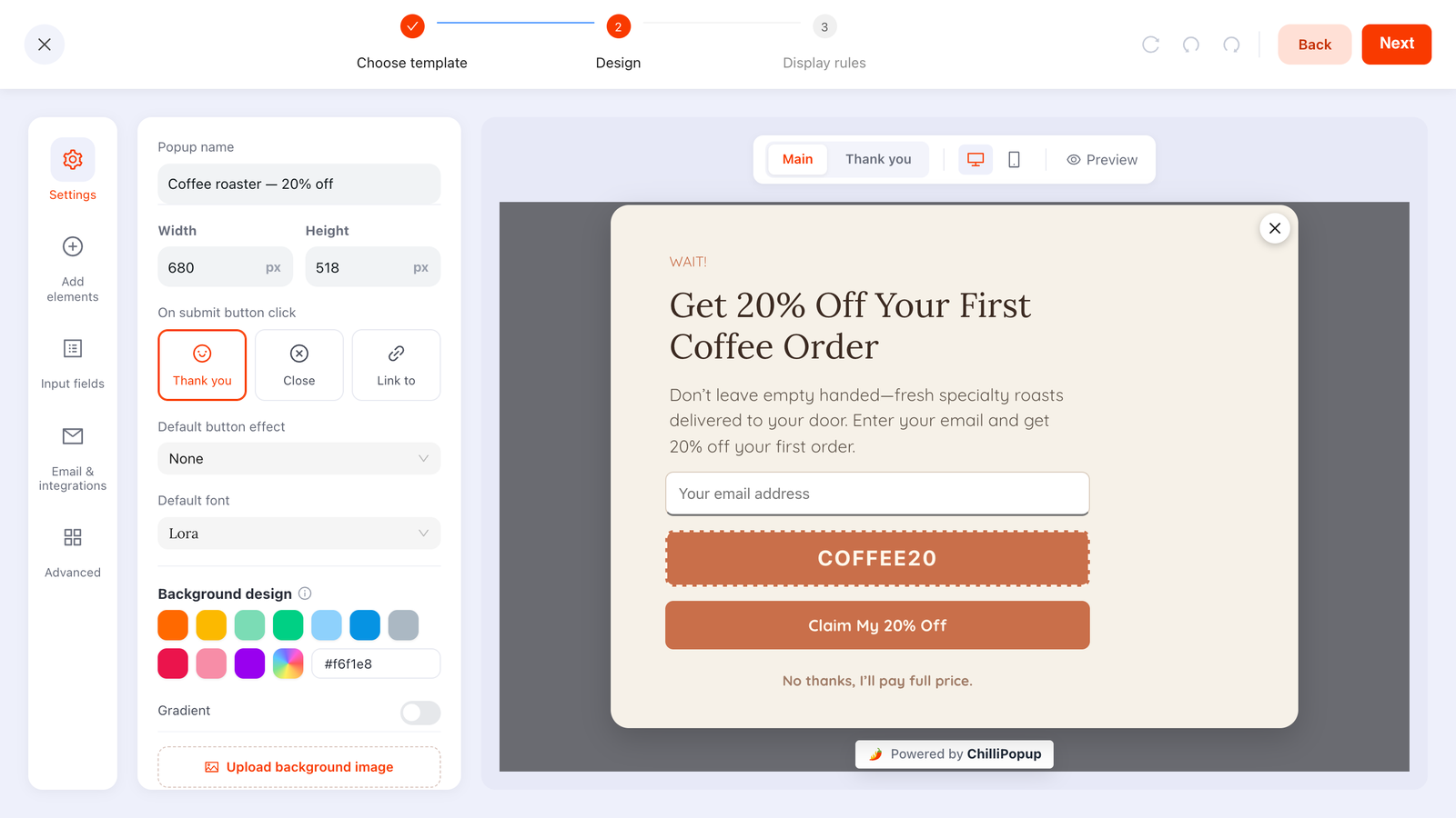
Applied to the coffee popup at the top of this page:
- Headline: Get 20% off your first coffee order
- Supporting line: Enter your email and the code is yours — it appears on the next screen.
- Button: Claim my 20% off
- Under the button: No thanks, I'll pay full price.
Note the phrase "it appears on the next screen". That is not decoration — it is the difference between a promise and a deferred promise. In ChilliPopup the submit action can show a Thank you screen, close the popup, or send the visitor to a page you choose, so put the code on the thank-you screen and the reward lands while the reader is still looking at it.
Be honest about who sends the email. ChilliPopup collects the address; it does not send email. So "check your inbox" is only true if your own email tool is set up to send a welcome message. If it is not — and for a lot of small stores it is not — reveal the code on the thank-you screen and write "Your code is below" instead. Never write a promise your stack cannot keep.
Reward-first also applies when there is no discount. On a blog, the reward is the next article; on a SaaS site, it is the thing the reader learns. If you genuinely cannot name a reward, that is not a copywriting problem — the popup should not exist yet. Our guide to popup design best practices covers the layout side of the same trade.
Two voice rules: be specific, write to one person
Specificity beats adjectives
Adjectives are the writer's opinion. Nouns and numbers are the reader's evidence. "Exclusive", "amazing", "curated", "premium" and "the best" all describe how you feel about your thing, and the reader has no way to check any of them — so they discount all of them.
- ❌ "Get exclusive deals and amazing content" → ✅ "One deal a week, members only, usually 15–20% off"
- ❌ "Join our growing community" → ✅ "Be first to know when your size restocks"
- ❌ "Premium tips from our experts" → ✅ "Two hundred words. One tactic. No pitch."
The right-hand column is not more clever. It is just checkable. Anything checkable outperforms anything flattering, because trust is the scarce resource in a popup, not enthusiasm.
Write to one person, in second person
Say "you" and "your", not "customers", "users" or "our subscribers". A popup lands on one screen in front of one person; copy written for an audience reads like a press release.
- ❌ "Customers can save their cart for later" → ✅ "Your cart is saved for 24 hours"
- ❌ "We help thousands of teams ship faster" → ✅ "Ship your next release without the Friday panic"
And cut "we" from the promise. "We" is fine — necessary, even — in the reassurance line underneath ("We email twice a month"), because that is precisely the sentence where the reader wants to know what you will do. In the headline, "we" is a word spent on the wrong person.
What to put on the button
The button is the last thing read and the first thing clicked. It should restate the reward in the reader's own voice: verb + benefit.
"Submit" is the canonical failure. It describes what the form does to the data — not what the reader gets — and it is a word from the world of tax returns. "Continue" is the same failure with better manners: continue to what? Every popup with a strong headline and a "Submit" button is losing people at the last possible moment for no reason at all.
- Match the button to the headline's noun. Headline promises a code → button says "Send me the code". Headline promises a checklist → "Get the checklist". If the two do not match, the reader re-reads, and re-reading is where popups die.
- Keep it to four words or fewer. On a phone a five-word button wraps to two lines and stops looking like a button.
- Pick a person and stay in it. "Get my code" (first person, the reader speaking) and "Get your code" (second person, you speaking) both work. Mixing them across popups on the same site does not.
- Never label the button with the cost. "Sign up" and "Register" name the chore. "Start my 10% off" names the payoff.
The sentence test. Read it as: "I want to ___". "I want to submit" is nonsense. "I want to send me the code" is nearly right. "I want to get the checklist" is a button.
The decline link: a real no beats a sneaky one
There are three ways to say no to a popup: the X in the corner, clicking outside it, and a decline link you wrote on purpose. Only the third one is copy — and it is the most under-used line on the whole widget.
A written decline link does three jobs at once:
- It gives a clean exit. A 30-pixel X is a small target on a phone and reads as "we would rather you did not".
- It restates the offer on the way past. "No thanks, I'll pay full price" is the last chance the reader has to reconsider, and it works precisely because it is not pushy.
- It keeps your numbers honest. An easy no means the people who said yes meant it.
In ChilliPopup a decline line is its own button. Add a second button under the submit button, set its background to transparent so it reads as plain text, write whatever label you like, and set its click action to Close. That is the "No thanks, I'll pay full price." sitting under the button in the screenshot at the top of this page — and because it is your text, not a system control, you can write it in words a person would actually use.
Do not confirmshame. "No, I hate saving money." "No thanks, I prefer paying more." These win a handful of extra clicks from people who feel got, and cost you the quiet goodwill of everyone else — including the ones who would have bought anyway. Write "No thanks" and move on.
Then respect the no in the display rules, not just the copy. Set the frequency to once every N days rather than every visit, so someone who declined is not met by the same rectangle on their next page view. And turn "show again after conversion" off, so the people who already submitted that campaign never see it again — nothing undermines a well-written popup faster than showing it to a subscriber for the ninth time. The switch is per campaign, so a second popup elsewhere on the site will still show to them.
Microcopy that removes the last objection
Between "I want this" and "I typed my email" sits a short list of unspoken questions. Microcopy is where you answer them — three short lines, under the button, aimed only at the hesitant reader.
| Unspoken question | The line that answers it | Where it goes |
|---|---|---|
| "What happens after I click?" | Your code appears on the next screen. | Under the button, or as the last line of the supporting text |
| "How often will you email me?" | Two emails a month. Unsubscribe in one click. | Under the button, smallest type on the popup |
| "What do you do with my address?" | We never share your address. | Same line as the frequency, separated by a middot |
| "Is this going to be long?" | One question — takes about ten seconds. | Supporting line, for surveys and quizzes |
| "What do I type here?" | you@company.com | Placeholder text — and never as a replacement for a label |
Three product details make that microcopy easier to keep true:
- Email validation. Each email field can check the format and catch likely typos, or accept business addresses only. A typo'd address is a lead you paid for and cannot reach, and no reassurance line saves it.
- The Email Consent field. Where consent has to be explicit, use the ready-made consent checkbox rather than burying permission in a sentence nobody reads. Write its label as a statement, not a legal clause: "Yes, email me new drops."
- Required toggles. Every required field is a wall. Mark the optional ones optional in the placeholder — "First name (optional)" — so the reader can see the exit before they start.
One more piece of microcopy people forget: the thank-you screen. It is the only screen where the reader is definitely paying attention, and most sites waste it on "Thanks!". Use it to deliver the reward and to say what happens next: "Here's your code: COFFEE20. It works on your first order, and we've saved it for the next 48 hours."
Urgency that is true
Urgency works. Fake urgency works once. The difference is not stylistic — it is whether the sentence would survive someone checking it tomorrow.
Write the deadline, not the adjective. "Limited time only" is a phrase that has been applied to offers running for three years; readers have learned to price it at zero. "20% off ends Sunday at midnight" is checkable, which is the only reason it moves anyone.
Then make it structurally true. A ChilliPopup campaign has a date window and a weekday-and-hour schedule, both of which are AND gates on top of your other targeting. Set the window to end when the offer ends and the claim stops being a claim — the popup simply stops appearing. That is what separates a deadline from a decoration.
Scarcity you can state honestly without inventing a single number:
- "First order only."
- "One per customer."
- "Your code expires in 48 hours."
- "Back in stock — we got 40 pairs." (only if you got 40 pairs)
The counter that never moves. A "only 3 left!" line that reads "only 3 left!" every day for a month is the fastest way to teach a returning visitor that your popups can be skipped without reading. You are not trading a small lie for a few conversions — you are trading every future popup on the site.
If you want the feeling of scarcity without a claim you would have to defend, put the offer behind a game. A spin wheel or scratch card makes the prize feel won rather than handed out, the outcome is decided server-side so it cannot be rigged from the browser, and the odds per prize are yours to set. The copy job shifts to instructions — and instructions are the one place where plain is best.
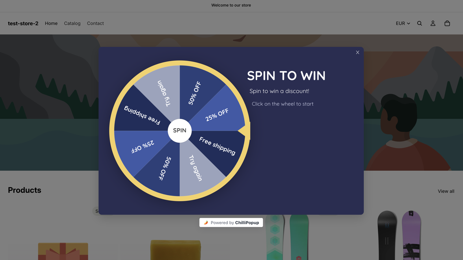
Game copy has a different job: "Click on the wheel to start" is not persuasion, it is an instruction. Persuasion belongs on the claim screen, after they have won.
Weak line → stronger line: 18 rewrites and why
Nothing teaches this faster than seeing the same idea twice. The left column is not made up to look bad — it is the default text people actually ship. The right column changes one thing each time, and the third column names it.
| Weak line | Stronger line | Why it works |
|---|---|---|
| Sign up for our newsletter | One new recipe every Thursday | Names what arrives and when, so the reader can picture the thing they are agreeing to |
| Join our community | Be first to know when your size restocks | Swaps a benefit you feel for one you can use |
| Don't miss out! | Your cart is saved for 24 hours | Replaces manufactured FOMO with a fact that is genuinely useful |
| Welcome to our store! | Take 10% off your first order | The interruption now pays the reader instead of costing them |
| Subscribe to our updates | Two short emails a month. Unsubscribe in one click. | Answers the frequency objection up front instead of hiding it in the footer |
| We value your feedback | One question: what nearly stopped you buying? | States the size of the ask, so it reads as answerable rather than open-ended |
| Limited time offer! | 20% off ends Sunday at midnight | Urgency the reader can check — and that you can enforce with a date window |
| Enter your details below to receive exclusive offers and updates from our team. | Enter your email. The code lands on the next screen. | Half the words, second person, and it says what happens next |
| We send great content! | Every Tuesday: one tactic, 200 words, no pitch. | "Great" is your opinion; "200 words" is a fact the reader can hold you to |
| Our customers love our products | Four sizes came back in stock this week | About their decision, not your self-praise |
| Submit | Send me the code | Verb plus benefit, in the reader's voice — describes the reward, not the form |
| Sign up | Start my 10% off | Names the payoff at the exact moment of the click, instead of the chore |
| Continue | Show my discount | Removes the "continue to what?" pause that costs you the click |
| Download | Get the 12-page checklist | Sets the expectation of size and format, so the click feels safe |
| Subscribe | Send Thursday's recipe | Turns an abstract commitment into one concrete delivery |
| (X in the corner only) | No thanks, I'll pay full price | A real exit in plain words — and it restates the offer one last time |
| No, I hate saving money | No thanks | Confirmshaming reads as contempt; a clean no costs you nothing |
| By submitting you agree to our terms. | Two emails a month · Unsubscribe any time · We never share your address | Answers what people actually want to know instead of what your lawyer wants stated |
Draft fast, edit slowly
Blank-page paralysis is real, and the first draft is the cheapest part of this. ChilliPopup's AI generator turns one sentence — "an exit-intent discount popup for a specialty coffee roaster" — into a finished popup with layout, colours, fonts and copy already in place. Treat the copy it writes as a starting draft, then run the five rules over it: five-word headline, reward first, specifics instead of adjectives, verb-plus-benefit button, a real decline line.
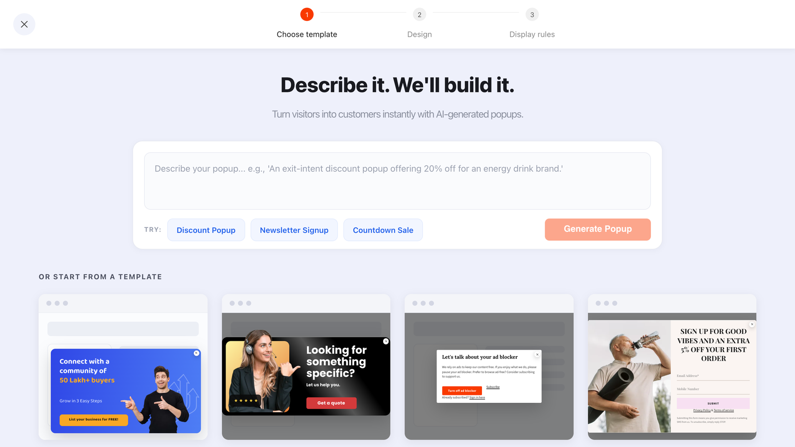
One sentence in, a full draft out. The AI is good at getting something on the page; the five rules are what make it worth reading.
Paste-ready copy for six popup moments
Copy these, change the nouns, ship them. Each block follows the same order — eyebrow, headline, supporting line, button, decline, microcopy — because that is the order the reader's questions arrive in. If you want to see the same moments as finished widgets rather than scripts, the roundup of website popup examples is the visual companion to this list.
1. Exit intent on a product or collection page
EYEBROW    WAIT!
HEADLINE   Get 20% off your first order
SUPPORT    Enter your email and the code is yours — it appears on the next screen.
BUTTON     Send me the code
DECLINE    No thanks, I'll pay full price
MICROCOPY  One email a week · Unsubscribe in one click
THANK YOU  Here's your code: FIRST20. Valid on your first order for 48 hours.
Exit intent is the highest-stakes moment on the site, because it is the last one. If you are setting this up for the first time, our guide to exit intent popups covers the trigger, the desktop-versus-mobile problem and the targeting rules that go with this copy.
2. Newsletter signup on a blog post
EYEBROW    LIKED THIS?
HEADLINE   One tactic every Tuesday
SUPPORT    Two hundred words you can act on before lunch. No pitch, no roundup.
BUTTON     Send me Tuesday's issue
DECLINE    Not right now
MICROCOPY  One email a week · Unsubscribe in one click
3. Back-in-stock / restock alert
EYEBROW    SOLD OUT — FOR NOW
HEADLINE   We'll email you the day it's back
SUPPORT    Leave your email and your size. One message, the morning it lands.
BUTTON     Tell me when it's back
DECLINE    No thanks
MICROCOPY  One message about this product only · Nothing else
The microcopy is doing the heavy lifting here: "this product only, nothing else" is the objection — that a restock alert is a mailing list in disguise — answered before it is raised.
One caveat before you ship this script or the birthday one below, both of which promise a message later: ChilliPopup captures the addresses and lists them in the Collected input data table, but it does not send email, and there is no export or integration that hands them to a tool that does. You will be reading that table and sending from your own inbox or email platform. Write the promise only if you have already decided who keeps it.
4. Spin-to-win game screens
PLAY       Spin for today's discount
           One spin per customer. Click the wheel to start.
           [ SPIN ]

CLAIM      You won 25% off
           Enter your email to unlock it — the code appears on the next screen.
           [ Unlock my 25% off ]

WINNING    25% off is yours — code SPIN25
           Works on your next order. Expires in 48 hours.

LOSING     No prize this time
           Free shipping over $50 is still on, though. Enjoy the browse.
Two rules specific to games. The Play screen is instructions, not persuasion — the wheel is doing the selling. And the Losing screen deserves real copy: it is the one screen most people never write, and it is the one that decides whether the visitor felt played with or played on.
5. One-question feedback survey
HEADLINE   One question before you go
SUPPORT    What nearly stopped you from ordering today?
FIELD      Long text — placeholder: "Shipping cost, sizing, something else..."
BUTTON     Send it
DECLINE    Skip
MICROCOPY  Takes about ten seconds. A real person reads every one.
"A real person reads every one" is worth the line only if it is true. It is the single most effective sentence in feedback copy, and the single most damaging one to fake.
6. Post-purchase, on the order confirmation page
EYEBROW    ORDER CONFIRMED
HEADLINE   Want 10% off the next one?
SUPPORT    Tell us your birthday month and we'll send a code that week.
BUTTON     Save my 10%
DECLINE    Maybe later
MICROCOPY  One email in your birthday month. That's the whole deal.
This is the cheapest ask on your entire site, because the value has already been delivered — they just bought something. If you want to go further with that idea, the progressive profiling guide shows how to sequence a second and third ask instead of stacking fields into one.
How to tell whether the copy is what's broken
A popup can fail at three different points, and each one has a different line to blame. Every ChilliPopup content type reports views, unique views, clicks, submissions, a conversion rate (submissions ÷ views) and field inputs, which is enough to tell them apart.

Views, clicks, submissions and field inputs, plus a date-range picker. The gaps between those four numbers are your diagnosis.
| What the numbers show | Most likely cause | The line to rewrite |
|---|---|---|
| Plenty of views, almost no clicks | The headline never earned the glance | Headline, then the eyebrow. Apply the five-word test. |
| Clicks, but very few field inputs | The reward is not worth the typing | Supporting line — name the reward and how big it is |
| Field inputs, but few submissions | Something at the end scared them off | Button text, required fields, and the missing reassurance under the button |
| Healthy conversion, poor list quality | The offer attracts the wrong reader | Headline — describe who it is for, not just what it is |
| Fine on desktop, weak on mobile | Too many words for a small screen | Cut the supporting line to one sentence; shorten the button to three words |
Then read the qualitative half. The Collected fields breakdown shows the top values per
field, and the Collected input data table shows raw submissions — which is where you
find out that "Company" is full of asdf and that field should never have been required.
An honest limit worth planning around. ChilliPopup does not run A/B or split tests, so copy testing here is sequential: change one line, leave it alone for a comparable stretch of time, then compare the two periods with the analytics date-range picker. That is a real method, but it is vulnerable to seasonality, traffic-source shifts and payday weeks — so change one line at a time, give it long enough to matter, and treat small differences as noise.
If you want the reader's own words rather than a number, run the one-question survey from the section above. Surveys and quizzes additionally record partial responses — what someone typed before leaving without submitting — and a drop-off analysis ranking the field people quit on. That is the closest thing to hearing an objection out loud, and it usually rewrites the copy for you — see surveys for the question widgets.
Rewrite one headline this afternoon
Build popups, forms, surveys, quizzes and games from one editor — and one pixel. Free plan, no credit card required. Paid plans from $29/month.
Start free →Related reading
Frequently asked questions
What is popup copywriting?
Popup copywriting is writing the handful of words inside a popup — the headline, the supporting line, the button, the decline link and the small print underneath — so that an interruption is worth the reader’s attention. It is a tighter discipline than page copy because you get one glance, one screen and no scrolling, so every word has to pay for the space it takes.
How long should a popup headline be?
Aim for five words or fewer. A headline that cannot be read in a glance will not be read at all, and almost anything you cut can live in the supporting line underneath instead. The test: cover everything except the headline and ask whether a stranger could still say what they get.
What should a popup button say?
A verb plus the reward, written the way the reader would say it: “Send me the code”, “Get the checklist”, “Start my 10% off”. Never “Submit” — it describes what the form does rather than what the reader gets, and it is the most common reason a popup with a good headline still loses people at the last click.
Should a popup include a decline link?
Yes, and it should say something a real person would say. A visible line such as “No thanks, I’ll pay full price” gives the reader a clean way out, restates the offer one last time on the way past, and keeps your numbers honest. Avoid confirmshaming lines like “No, I hate saving money” — they win a few clicks and cost you everyone else’s goodwill.
How do I write urgency without lying?
Only promise a deadline you are willing to enforce, then enforce it. Write the real end date instead of “limited time only”, and set the campaign’s date window so the popup stops showing when the offer stops. Manufactured scarcity is the fastest way to teach returning visitors that your popups can be ignored.
Does popup copy matter more than popup design?
They fail in different places, so what matters is knowing which one is broken. If people see the popup and never click, the headline is not earning the interruption. If they click and start typing but never submit, the problem is usually the button, the number of fields, or the missing reassurance underneath — and all three of those are copy. Design mostly decides whether the copy gets read at all.