Good popup design comes down to three things: one job, one accent colour, one obvious way out. Size, hierarchy, imagery, field count, motion and mobile layout are all downstream of those. Get them right and a popup stops reading as an interruption and starts reading as an offer.
What follows is the anatomy, element by element, with the numbers I would start from, a do/don't line for each, and an honest note on what you can actually prove afterwards.
Key Takeaways
- One popup, one job. One headline, one input, one button. A second offer on the same card does not double your chances — it splits the attention you just interrupted someone to get.
- Size it to the ask. 560–680 px wide and 380–520 px tall covers almost every centre modal. If you need 900 px, you are asking for too much.
- Spend the accent colour on the button. Colour is how you point; using it three times points nowhere.
- The close button is a design element. 30–44 px, top right, 3:1 contrast, visible in the first frame. Hiding it costs more than the email you catch.
- Design the phone version first. The keyboard eats half the screen and the thumb only reaches the bottom third.
What good popup design actually means
The three-second test
A well-designed popup passes three questions in about three seconds: Can I tell what this is? (one glance at the headline), Can I do it in one gesture? (one field, one button), and Can I leave in one tap? (an obvious close control). Fail any one and the design is broken, however good it looks in a screenshot.
Almost every popup has the same seven parts, read in roughly the same order. Knowing the order tells you what to make big and what to keep quiet:
- The card — its size, and the dimmed page behind it. This says how big an ask is this? before a word is read.
- The eyebrow — an optional two- or three-word label like
WAIT!orONE-TIME OFFER. - The headline — the offer, in eight words or fewer.
- The subhead — one sentence answering "and then what?"
- The input — ideally exactly one.
- The button — the accent colour lives here and nowhere else.
- The exits — the close control, plus an optional text decline link.
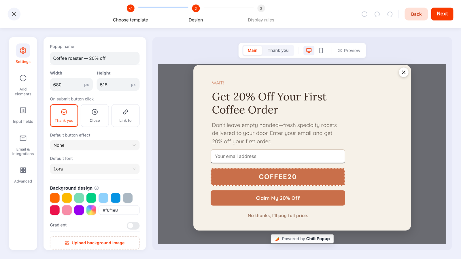
The whole anatomy in one card — and on the left, the width and height as literal pixel values.
One popup, one job
This is the rule that fixes the most popups, and the one most often overruled in a meeting. Someone wants the discount and the newsletter checkbox and the social follow, because the popup is "already there". Each addition looks free. None of them are.
The deletion test: remove everything except the headline and the button. Is the offer still intact? If yes, what you removed was decoration. If no, add back the single smallest element that restores it — and stop there.
When you genuinely have two offers, build two campaigns with different display rules rather than one crowded card. Every enabled rule is an AND gate, so they are easy to keep apart: a discount popup on product pages at exit intent, and a newsletter form on blog articles at 60% scroll.
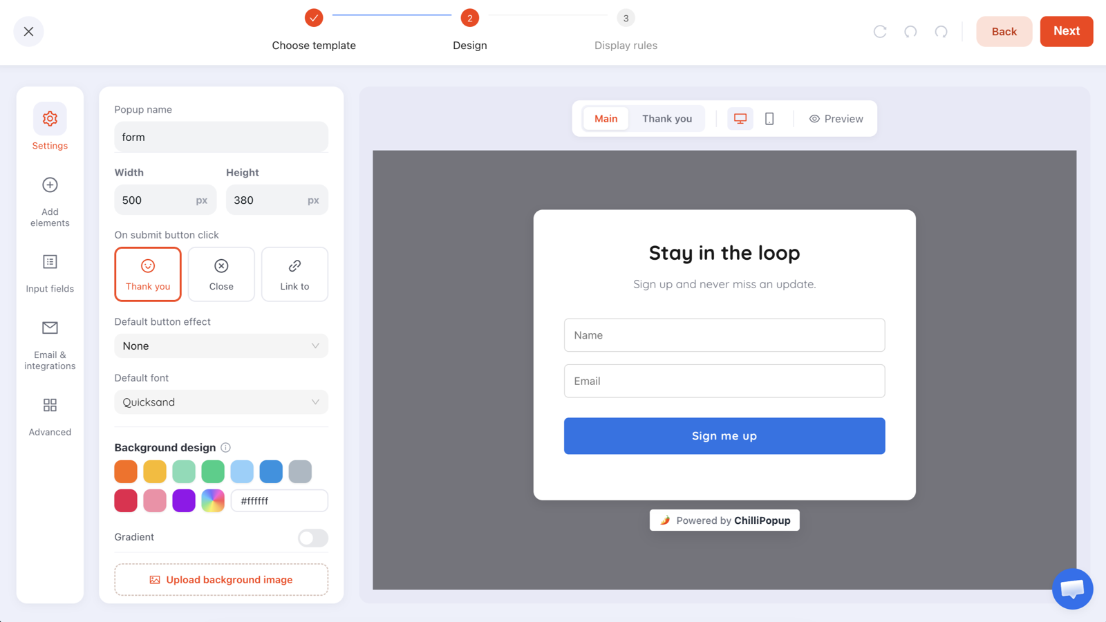
500 × 380 px, white card, one button, one accent colour. A good default to argue every bloated popup back down to.
Size and placement: the numbers to start from
Size is the first message. A card that fills the viewport reads as a demand; a small card in the corner reads as a suggestion. Match the footprint to the size of the favour you are asking.
| Format | Desktop size to start from | Best for | Watch out for |
|---|---|---|---|
| Centre modal | 560–680 × 380–520 px | Exit intent, a discount, the one offer that matters on this page | Going wide just to fill space — the copy gets lost across long lines |
| Corner card | 340–420 px wide | Ambient asks: newsletter, a feedback prompt, a nudge | Cramming a headline, subhead, two fields and an image into 380 px |
| Bar / strip | Full width, 60–90 px tall | Announcements, shipping thresholds, one always-on offer | Covering the site nav, or a close control smaller than the text beside it |
| Near-fullscreen | Viewport, with 40+ px of breathing room | Content that needs the room — a spin wheel, a multi-step quiz | Using it for a newsletter signup: the size promises what the offer cannot pay off |
Inside whatever box you pick, four numbers do most of the work:
- Padding: 32–40 px desktop, 20–24 px mobile. Nothing touches an edge, ever.
- Line length: under ~60 characters per line. That is the real reason not to go wide.
- Corner radius: match your site's buttons. A 24 px pill on a site of 4 px corners looks borrowed.
- Backdrop dim: 40–60% black behind a centre modal. Without it the card has no figure and ground.
The 640 px rule of thumb. If your desktop card stays at or under roughly 640 px wide, the same layout usually survives a phone with almost no rework. Go past that and you have committed to designing twice.
Placement and trigger are one decision, not two. A centre modal is an interrupt, so it needs the strongest moment — usually exit intent on desktop. A corner card is ambient, so it pairs with scroll depth or a time delay. Put an ambient trigger on an interrupting format and you get a takeover four seconds after landing.
The copy hierarchy: eyebrow, headline, subhead, button
Four slots, in this order, with sizes to start from:
- Eyebrow — 2–3 words, 12–13 px, uppercase, letter-spaced. Optional. It sets a frame:
WAIT!,FIRST ORDER,ENDS SUNDAY. - Headline — 8 words or fewer, 28–34 px desktop and 22–26 px mobile, line-height 1.15–1.25. Name the benefit, not the mechanism: Get 20% off your first order, not Join our newsletter.
- Subhead — one sentence, under 20 words, 15–17 px, line-height 1.5. Answer "and then what?" — what arrives, how often, how to stop it.
- Button — 2–4 words, 16–17 px, 48 px tall minimum, in the visitor's voice. Send my 20% code beats Submit every time.
A paste-ready set you can adapt in two minutes:
Eyebrow:   ONE-TIME OFFER
Headline:  Get 20% off your first order
Subhead:   Enter your email and the code appears right here.
           One email a week, unsubscribe in a click.
Button:    Send my 20% code
Decline:   No thanks, I'll pay full price

Thank-you screen
Headline:  Here's your code
Body:      COFFEE20 — copy it and use it at checkout. Expires in 7 days.
Two typographic rules save most popups. One font family — set the editor's default font once and let every block inherit it, rather than mixing three faces in 450 px of space. And no centred paragraph longer than two lines: centring is fine for a headline and punishing for a subhead, because every line starts somewhere different. If the words themselves are the problem, the popup copywriting guide goes deeper than there is room for here.
Colour, contrast and imagery
One accent colour, spent on the button
Pick one accent, put it on the button, and let it appear nowhere else — not the headline, not the border, not an icon. Colour is a pointing device; the moment it appears three times it stops pointing at anything. Everything else stays quiet: near-white or near-black card, ink headline, softer grey subhead. If the popup needs to feel branded, do it with the background — a flat colour or a two-hue gradient — and keep the copy on the calmest part of it.
The contrast numbers you cannot argue with
- 4.5:1 — body text and anything under 24 px (WCAG 2.2 AA, criterion 1.4.3).
- 3:1 — large text: 24 px and up, or 18.66 px and up if bold.
- 3:1 — interface elements and meaningful graphics (1.4.11): input borders, the close icon, the button edge.
White text on a mid-tone accent is the classic near-miss — fine on a big monitor, unreadable on a phone in daylight. Check the button's text-on-fill pair, and fix it by darkening the fill rather than bolding the label.
Imagery has to earn its pixels
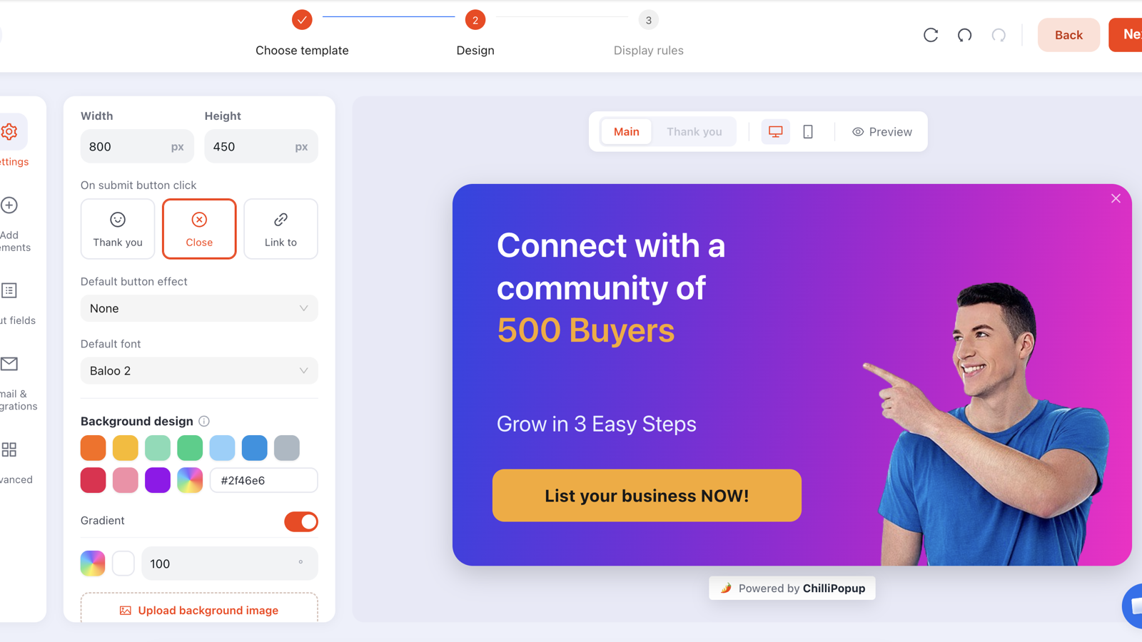
An image is worth including only when it explains the offer or shows the product. The actual bag of coffee earns its half of the card; a stock photo of a laptop is furniture that takes 40% of the space and pulls the eye off the button. Three rules if you do use one: split layouts beat backgrounds when there is text to read; faces steal attention, so have them looking towards the copy; and keep the file well under 200 KB, or the card paints first and the picture arrives a beat later, which looks broken even though nothing is.
The close button is part of the design
Hiding the close button is the worst thing you can do to a popup, and it is done deliberately surprisingly often. The theory is that a harder exit means more signups. What it produces is a reader who now dislikes you, and a page that fails a mobile-usability review.
The spec I would treat as non-negotiable:
- Visible from the first frame. No fade-in delay, no appearing after five seconds.
- Top right, on or just inside the card edge. That is where every hand already goes.
- 30–44 px of hit area. WCAG 2.2 sets 24 × 24 CSS px as the AA floor; Apple's interface guidelines recommend 44 × 44 pt. Design for the higher number and you are safe in both.
- 3:1 contrast minimum against whatever is behind it. A white circle with a dark X is the workhorse precisely because it holds up over a photo, a gradient or a flat colour.
- A second exit for big asks: a plain text decline link under the button — No thanks, I'll pay full price.
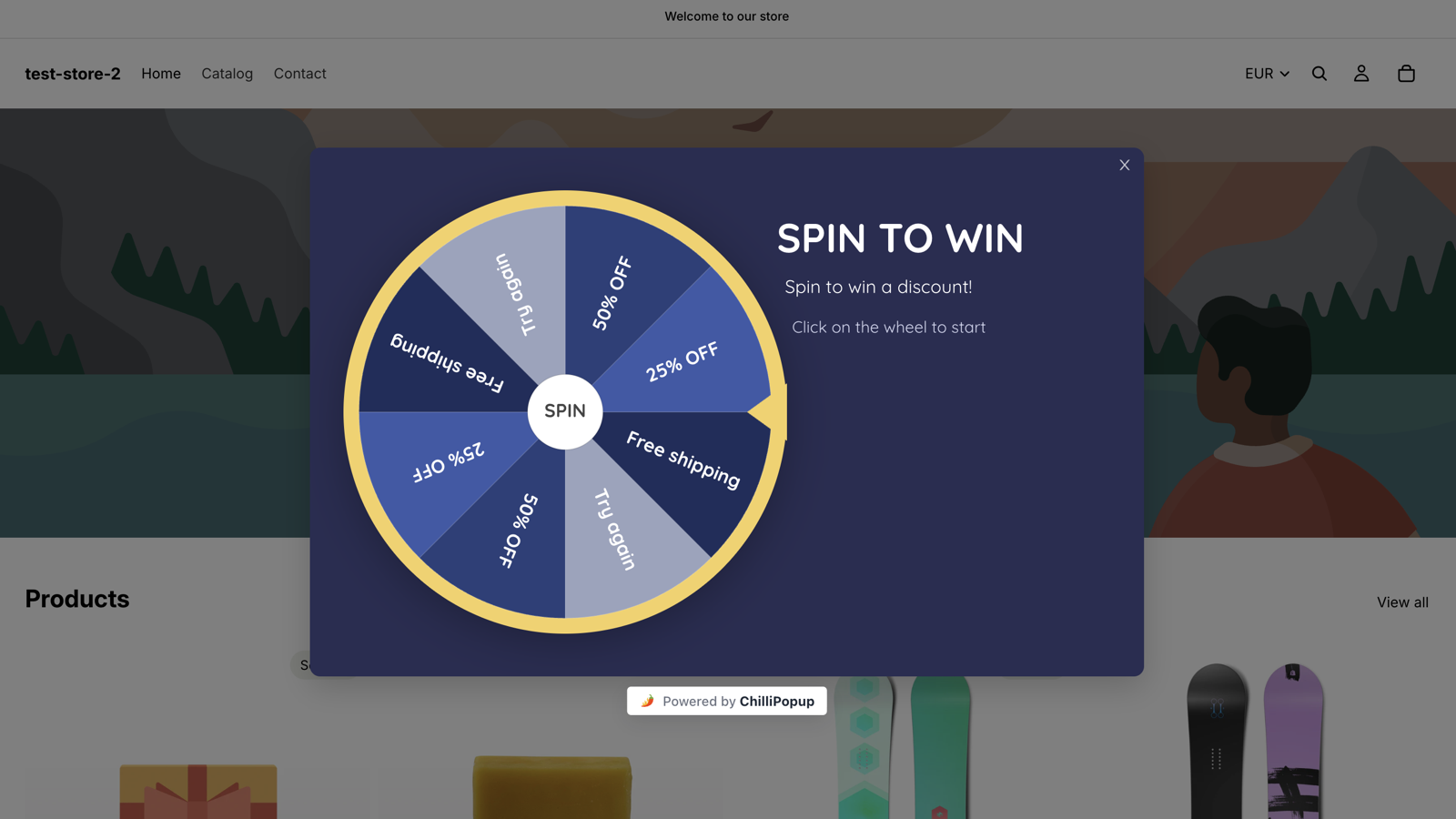
Live on a real store: the page dims so the card has figure and ground. The close control is in the right place — and it is exactly the sort of small, thin X that should be bigger.
Confirmshaming has a ceiling. No thanks, I'll pay full price is playful and reads as confidence. No thanks, I hate saving money insults the person you are asking for an email address. The first is a design flourish; the second is the thing people screenshot.
What happens after the close is a design decision too. Set a display frequency so a dismissal sticks — once a day, or once every N days, suits most offers. And turn Show again after conversion off, so people who already signed up stop being asked. Nothing makes a site feel less considered than being pitched a discount you already redeemed.
Fields: how many, and box versus underline
One field. That is the answer for the overwhelming majority of popups: an email input and a button. Every extra field is a decision, not a keystroke, and decisions are what people leave over. If you need a second, make it optional and put it second — and if you need a third, what you actually need is a second ask on a later visit.
- 48 px tall minimum, matched to the button height so the stack looks deliberate.
- Input text 16 px or larger. Below that, iOS Safari zooms the page on focus — the popup appears to jump and half of it goes off-screen.
- Placeholders are not labels. A field carries a placeholder, not a label, and the placeholder vanishes exactly when it is needed. On a one-field popup that is genuinely fine; at two or more, add a small text block above each field and treat it as the label.
- Required sparingly. Mark a field required only if you would chase the answer.
Each field can use a box or an underline variant, and that is a real design decision rather than a taste one:
| Box variant | Underline variant | |
|---|---|---|
| Reads as | A standard, unmistakable input | Editorial, light, magazine-ish |
| Use it on | Dark, photographic or gradient backgrounds; two or more fields; anything transactional | Flat light backgrounds; a single field; luxury, wellness and editorial designs |
| Main risk | Looks heavy if the border is dark or the radius large | Reads as a divider rather than something you type in |
| Contrast rule | Border at least 3:1 against the card fill | Line at least 3:1 and at least 2 px thick, with real space under the text |
One setting worth using deliberately: email validation. You can check the format and catch common typos, restrict to business addresses, do both, or neither. Typo checking is free design-wise and it is the difference between a list you can send to and one you cannot.
Mobile popup design: thumb reach and the keyboard
Most popups are designed on a 27-inch monitor and then seen on a phone. Reverse it — design the phone version first and the desktop one is nearly free.
- Leave the page showing. 16–20 px of visible page down each side, roughly 90% of the viewport width, tells the visitor they have not been navigated somewhere new.
- Design around the keyboard. When it opens you have about the top half of the screen. Field and button must both be above it. If the visitor has to scroll inside a popup to find the button, it is too tall.
- Full-width button, 48 px+, in the bottom third — where the thumb rests. Never two half-width buttons side by side at that size.
- 44 px close control, top right, clear of the notch and the browser's own address bar. The desktop X shrunk by 40% is not a mobile close button.
- Headline 22–26 px, body 15–16 px. Shrinking the headline to keep it on one line is the wrong trade — let it wrap.
Two behaviours change on touch. Exit intent has no real equivalent — no cursor leaves towards the tab bar — so use scroll depth or a time delay on mobile instead. And because targeting includes a device rule that ANDs with everything else, the honest answer when a layout will not compromise is to stop compromising: build two campaigns, one per device, each designed properly.
Check the preview, then check it for real. The editor has a phone icon next to the desktop one, which catches the obvious breaks — but it cannot show you the keyboard. Publish, open the page on your own phone, and tap the field. That one test finds more mobile popup problems than any amount of previewing.
Timing, motion and layout courtesy
Design does not stop at the card edge. How the popup arrives is part of how it feels.
- Never fire at zero seconds. Nobody has read anything yet, so the dismissal is reflexive. Five to eight seconds, 40–60% scroll, or exit intent. Precisely: a time delay counts from page load, so eight seconds means eight seconds after this page rendered — not eight seconds of engaged reading, and not carried across pages.
- One animation, 150–250 ms. A fade, or a short slide in one direction. Longer feels sluggish; bouncier feels like an advert.
- Nothing loops. A pulsing button is a permanent attention tax on someone trying to read your page.
- Choose calm motion as the default. You cannot express a reduced-motion preference from the editor, so pick the animation that would be acceptable to someone motion-sensitive and use it for everyone. A fade always qualifies.
- Do not stack overlays. If you open campaigns from your own code,
ChilliPopup.open()is a forced open that bypasses the queue — callclose()first or two cards end up on screen together.
On layout stability: a popup is a triggered overlay, so it sits above your page rather than pushing content around. The residual risk is inside the card — an oversized background image that lands after the text and reflows the block. Compress it and the popup arrives in one piece.
Accessibility: never trap the reader
A popup has three obligations: readable, operable without a mouse, easy to leave. The contrast numbers above cover most of the first. The rest is short, and skipping it is how a popup becomes a complaint.
- Never signal an error with colour alone. A red border plus the words "Enter a valid email".
- Keep the close target large — an accessibility feature as much as a courtesy, because motor precision varies enormously.
- No autoplaying sound or video in an overlay nobody asked for.
- No essential text inside an image. It cannot be read out, translated or resized.
- Test with the keyboard yourself. Publish, load the page, press Tab and watch where focus goes, then press Escape. Do not assume — check, on your own site.
One thing you do not have to build: Escape already closes it. Every overlay the pixel shows — popup, form, survey, quiz or game — listens for the Escape key, so a keyboard user is never stuck behind a card they cannot dismiss. Where the JavaScript API earns its keep is the opposite case: opening a campaign from your own button, without ending up with two cards on screen.
// Escape already dismisses any ChilliPopup overlay — no code needed for that.
// This is for opening one yourself, e.g. from a "Get the code" link:
document.querySelector('#get-the-code').addEventListener('click', function () {
  if (!window.ChilliPopup) return;   // window.Pepper is an alias for window.ChilliPopup
  window.ChilliPopup.close();        // clear whatever is on screen first
  window.ChilliPopup.open('YOUR-POPUP-UUID');  // forced open, bypasses the queue
});
open() deliberately ignores the display rules and the queue, which is what makes it useful
for a manual trigger and dangerous without the close() in front of it.
The do and don't table, element by element
Everything above, compressed. Read this next to your live popup.
| Element | Do | Don't | Why |
|---|---|---|---|
| Card size | 560–680 × 380–520 px centre modal | Fill the viewport for a newsletter | Size sets the expected cost |
| Backdrop | Dim the page 40–60% | Leave the page at full brightness | No figure and ground, no readability |
| Eyebrow | 2–3 words, uppercase, 12–13 px | Write a sentence up there | It is a label, not copy |
| Headline | 8 words max, names the benefit, 28–34 px | "Join our newsletter!" | For most readers it is the whole offer |
| Subhead | What arrives, how often, how to stop | Restate the headline in longer words | It answers the unspoken objection |
| Button | 2–4 first-person words, 48 px+, accent colour | "Submit" or "Continue" | Last thing read before the decision |
| Second CTA | Delete it, or make it its own campaign | Discount + follow + survey on one card | Two asks is functionally zero |
| Accent colour | One, on the button only | Colour headline, border and button | Colour is how you point |
| Imagery | Product or offer imagery, under 200 KB | Stock photography as filler | Image pixels are pixels off the offer |
| Fields | One, 48 px tall, 16 px text | Four fields and a phone number | Each field is a decision |
| Field style | Box on busy backgrounds, underline on flat light ones | A 1 px pale underline on a pale card | If it looks untypable, nobody types |
| Close button | 30–44 px, top right, 3:1, immediate | A 10 px grey ×, or a delayed one | Trapping people costs more than it earns |
| Motion | One fade or short slide, 150–250 ms | Bounce, pulse, loop | Motion announces, it does not perform |
| Timing | 5–8 s, 40–60% scroll, or exit intent | Fire at 0 seconds | Nothing has been read to say yes to |
| Mobile | ~90% viewport width, button in the thumb zone | Reuse the desktop layout unchanged | The keyboard takes half the screen |
| Contrast | 4.5:1 body, 3:1 large text and UI | Light grey on white because it looks calm | Unreadable cannot convert |
Worked example: one popup, rebuilt element by element
A made-up but extremely typical starting point, and the rebuild. Nothing about the offer changes — only the design.
Before
- 900 × 620 px centre modal, no backdrop dim, stock photo of a laptop taking the left half
- Headline Join Our Newsletter! at 22 px, the same weight as the subhead below it
- Four required fields: First name, Last name, Email, Company
- Button Submit — mid-grey, 36 px tall, the same grey as the input borders
- Close: an 11 px light-grey × sitting outside the card
- Fires immediately on page load, every page, every visit
After
- 560 × 420 px, page dimmed 50%, 36 px padding, 14 px radius, no image
- Eyebrow
FIRST ORDERat 13 px; headline Get 20% off your first order at 32 px, line-height 1.2 - Subhead at 16 px: Enter your email and the code appears right here. One email a week, unsubscribe in a click.
- One field — Email, box variant, 48 px tall, 16 px text, placeholder you@email.com, typo checking on
- Button Send my 20% code — full width, 52 px tall, the single accent colour, label checked at 4.5:1
- Under it: No thanks, I'll pay full price at 14 px, muted
- Close: the 30 px white circle with a dark X, top right on the card edge
- The code lives on the thank-you screen, so the main screen never carries it
- Rules: exit intent on desktop, 50% scroll on mobile, frequency once every 7 days, Show again after conversion off
Four fields became one; one typeface, one accent colour, two exits. The offer is identical — the design simply stopped charging for it. For more finished shapes to steal from, the website popup examples roundup walks through a pile of them.
How to tell whether it worked
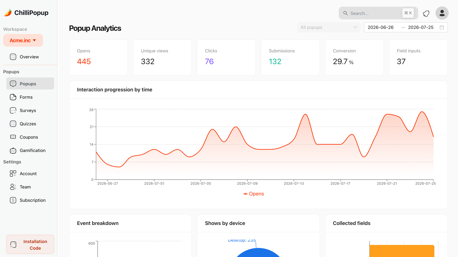
Conversion is submissions divided by views. Compare a design against its own previous number over an equal stretch of days.
Be honest about the method, because it is easy to fool yourself here. ChilliPopup has no split testing, so you cannot run two designs against each other at the same time. What you can do is sequential and disciplined: change one element at a time, run each version for the same number of days (whole weeks, so the weekday mix matches), read conversion rather than submissions so a traffic spike cannot flatter you, and only believe big moves — seasonality and traffic mix shift that number too. Then check quality as well as volume: the collected-fields breakdown shows the top values per field, and junk answers are a friction signal, people complying rather than converting.
One reporting boundary, so you do not go hunting. The funnel, completion rate, average time and drop-off views live on survey and quiz analytics. Popups and forms report views, unique views, clicks, submissions, conversion, field inputs, the interactions chart, device split, collected fields and the raw submissions table — plenty to judge a design change by.
The pre-publish checklist
- One headline, one input, one button — nothing else asks for anything
- The accent colour appears exactly once
- Body text clears 4.5:1; large text and input borders clear 3:1
- The close control is 30 px+ and visible in the first frame
- The button label starts with a verb and is not "Submit"
- Input text is 16 px or larger
- The mobile preview shows field and button together, with no inner scroll
- The trigger is not zero seconds, and a display frequency is set
- "Show again after conversion" is off
- Any background image is under 200 KB
- You have opened the published popup on your own phone and typed in the field
If the pixel is not on your site yet, the one-line install guide takes about two minutes, and the same script then serves every popup, form, survey and quiz you build afterwards.
Design a popup people don't resent
Build popups, forms, surveys, quizzes and prize games in one editor, with pixel-level control over every element on this page. Free plan, no credit card required. Paid plans from $29/month.
Start free →Related reading
Frequently asked questions
What are the most important popup design best practices?
Three rules carry most of the weight: give the popup one job, so there is one headline, one input and one button; spend your single accent colour on that button and keep everything else quiet; and make the close control obvious from the first frame, 30 to 44 pixels, top right, in high contrast. Size, imagery, timing and motion all follow from those three.
What size should a popup be?
For a centre modal on desktop, start at 560 to 680 pixels wide and 380 to 520 pixels tall, and only go bigger when the content earns it — a spin wheel or a multi-step quiz, not a newsletter signup. In the ChilliPopup editor width and height are literal pixel fields. Staying under about 640 pixels wide also means the layout survives a phone.
Where should the close button go on a popup?
Top right, on or just inside the card edge, with a hit area of at least 30 pixels and ideally 44, and at least 3:1 contrast against whatever sits behind it. A white circle with a dark X works on every background. Never hide it and never fade it in after a delay. For a big ask, add a plain text decline link under the button too.
How many fields should a popup have?
One. An email input and a button is the whole shape you need, because every extra field is a decision rather than a keystroke. If you truly need a second, make it optional and put it second. Anything beyond that belongs on a later ask on a later visit, or on the claim screen of a game, after the visitor has already played.
How do I design a popup for mobile?
Design the phone version first. Leave 16 to 20 pixels of page visible each side, keep the field and the button above the on-screen keyboard, make the button full width and at least 48 pixels tall, and set input text to 16 pixels or larger so iOS does not zoom when the field is focused. Exit intent has no equivalent on touch, so use scroll depth or a time delay there.
Are popups bad for accessibility?
A badly designed one is. A popup has to be readable, operable without a mouse and easy to leave. Hold body text to 4.5:1 contrast and large text and interface elements to 3:1, never signal an error with colour alone, and keep the close control large. Every ChilliPopup overlay already closes when the visitor presses Escape, so nobody is trapped by the keyboard — but publish it and test it with the keyboard yourself anyway.