There are twelve main types of website popups, and they sort along two axes: when a popup appears (its trigger — immediate, time delay, scroll, exit intent, click, inactivity, pages viewed) and what it is (its format and goal — from a lightbox modal to a spin wheel). Mixing those axes up is why most "popup types" conversations go in circles: an exit-intent popup and a coupon popup aren't competing categories. One is a timing decision, the other is a content decision — and every campaign you ship combines both.
This guide walks the whole taxonomy: each type, when it earns its place, one line of copy you could steal, and the trigger-plus-blocks recipe that builds it. If you'd rather see finished examples first, start with our teardown of real website popup examples and come back for the map.
Key Takeaways
- Classify on two axes. Trigger = when it fires (7 options). Format = what it is (12 types). Every popup is one of each.
- Placement makes the format. The same popup pinned center is a modal, pinned top is a bar, pinned bottom-right is a slide-in — one builder, nine positions.
- Intrusiveness must match intent. Loud formats (full-screen, modal) need a strong offer or a strong moment; quiet formats (slide-in, bar) can run everywhere.
- Interactive beats static for opt-ins. Coupon, gamified and quiz popups trade something for the email — plain "join our newsletter" modals don't.
- One popup per page, per moment. Variety belongs across your site, not stacked in one session.
The two axes: trigger vs format
Ask five marketers to list popup types and you'll get five overlapping lists — "exit popup", "email popup", "slide-in", "spin to win" — that mix apples and schedules. The clean split:
- The trigger axis answers "when does it appear?" Any format can ride any trigger.
- The format axis answers "what appears?" — its shape on the screen and the job it does.
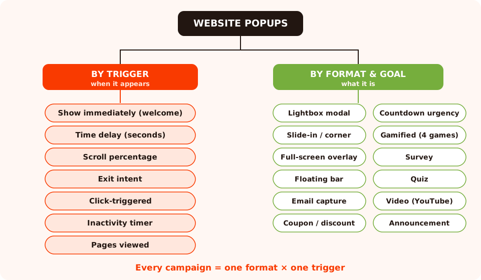
The full popup taxonomy. A campaign is always one pick from each branch — a coupon popup on exit intent, a quiz on scroll, a bar shown immediately.
That's also how ChilliPopup is structured: the format lives in the design editor (blocks, position, size), the trigger lives in the display rules — so any format below can be wired to any trigger without rebuilding anything.
Popup types by trigger: the seven "whens"
Quick tour of the trigger axis — each of these is a display rule you toggle, not a different popup to build. For the full playbook on picking and tuning them, see the dedicated popup triggers guide.
- Welcome / immediate — fires on page load. Right for announcements and bars; wrong for a cold email ask.
- Time delay — fires after N seconds, per page or per session. The default for mid-funnel offers: long enough to show interest, short enough to catch the visit.
- Scroll percentage — fires at, say, 50% scroll depth. The engagement trigger: they're reading, so the ask lands warmer. Also the best mobile stand-in for exit intent.
- Exit intent — fires when the cursor darts toward the tab bar. The zero-cost trigger: the visit was ending anyway. Our exit-intent popups guide covers it end to end.
- Click-triggered — fires when the visitor clicks a set number of times. The only trigger the visitor opts into — perfect for video popups and "get the discount" links.
- Inactivity — fires after N seconds without interaction. A nudge for stalled sessions: "Still there? Here's 10% to decide."
- Pages viewed — fires on the Nth page of a session. The loyalty trigger: someone three pages deep has earned a bigger ask than someone who just landed.
Rule of thumb: the louder the format, the later the trigger. A quiet bar can show immediately; a full-screen overlay had better wait for exit intent or a genuine occasion.
Placement formats: modal, slide-in, full-screen, floating bar
The first four types are defined by where they sit. In ChilliPopup they're all the same popup under the hood — the editor lets you pin a popup to any of nine positions (top, middle and bottom × left, center and right), and the position is what turns one design into a modal, a bar or a slide-in.
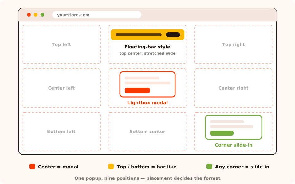
The nine placement positions. Center = lightbox modal, top/bottom center stretched wide = bar-like, any corner = slide-in.
1. Lightbox modal
The classic: a centered card over a dimmed page. It demands a decision — act or dismiss — which makes it the highest-converting and highest-friction static format. Use it when the offer genuinely justifies an interruption: a first-order discount, a lead magnet worth downloading, a cart-saving deal.
Copy example: "Get 10% off your first order — drop your email and the code is yours."
Build it: center position, text + email input + button blocks, exit intent or a 10–20 second delay. Never on page load for search visitors.
2. Slide-in / corner popup
A smaller card that slides into a corner — usually bottom-right — while the page stays fully usable. It converts fewer of the people who see it, but it annoys almost nobody, so you can run it on pages where a modal would be rude: blog articles, docs, long product pages.
Copy example: "Enjoying this guide? Get one like it every Tuesday."
Build it: bottom-right position, compact design, scroll trigger at 40–60% so it appears mid-read rather than on arrival.
3. Full-screen overlay
The takeover: the popup becomes the page. Total attention, total interruption. Reserve it for the few moments that deserve it — a site-wide sale, a launch, a "we're closing for the holidays" notice — and never show it to first-time visitors arriving from search (that's the intrusive interstitial pattern search engines penalize).
Copy example: "Our biggest sale of the year ends Sunday. Everything 30% off — or keep shopping full price." (Always leave a visible decline path.)
Build it: a centered popup sized up large with a full-bleed image or shape background, shown once per visitor with a strict display frequency.
4. Floating bar
A slim strip pinned to the top or bottom edge. It's the only format that can stay on screen for a whole session without wearing out its welcome, which makes it the workhorse for standing messages: free-shipping thresholds, sale reminders, shipping-deadline notices.
Copy example: "Free shipping on orders over $50 — automatically applied at checkout."
Build it: top-center or bottom-center position, a wide short design with one line of text and at most one button, shown immediately on every page.
Goal formats: email capture, coupon, countdown
The next three types are defined by what they're for. Each usually rides one of the placements above — most often the modal.
5. Email capture popup
The most common popup on the internet: one input, one button, one reason to subscribe. The entire game is the reason — "join our newsletter" converts strangers at rounding-error rates; a specific promise ("one teardown a week", "10% off today") does real work. Our guide to building an email list with popups goes deep on the offer side.
Copy example: "The Tuesday teardown: one conversion tactic a week, three minutes to read. Unsubscribe anytime."
Build it: text + email input + button, exit intent on desktop and scroll on mobile, with "stop showing after conversion" switched on so subscribers never see it twice.
6. Coupon / discount popup
An email capture popup with the incentive made explicit: trade your address for a code. It's the
highest-intent static opt-in there is, because the visitor plans to use what you hand over.
ChilliPopup's dedicated coupon code block renders the code on the thank-you screen, so nobody
retypes WELCOME10 by hand. Full recipe in the
coupon popup guide.
Copy example: "Unlock 10% off — enter your email and we'll reveal your code."
Build it: email input on screen one, coupon block on the thank-you screen, exit intent on product and cart pages.
7. Countdown / urgency popup
A popup with a live timer counting toward a real deadline: sale end, shipping cutoff, cart hold. Deadlines convert because they resolve "I'll decide later" — but only when they're true. A timer that resets on refresh trains visitors to ignore every timer you'll ever show. The countdown timer popup guide covers honest-urgency mechanics in detail.
Copy example: "Order in the next 3 h 12 m for delivery before Friday."
Build it: the countdown timer block plus a date-range schedule (start/end date and hour), so the campaign switches itself off when the deadline passes — great for seasonal sales.
8. Gamified popups: spin wheel, scratch card, slot machine, claw machine
Gamified popups replace "here's 10%" with "play for your prize" — and the difference in engagement is not subtle, because a game gives the visitor a tiny stake in the outcome before the email ask arrives. ChilliPopup ships four game types, each with themed designs:
- Spin wheel — the classic spin-to-win; slices carry your prizes. See the spin-to-win playbook.
- Scratch card — swipe to reveal a prize; the slowest, most tactile reveal. See the scratch card guide.
- Slot machine — pull the lever, watch the reels land.
- Claw machine — the arcade grab, for brands that want the playful extreme.
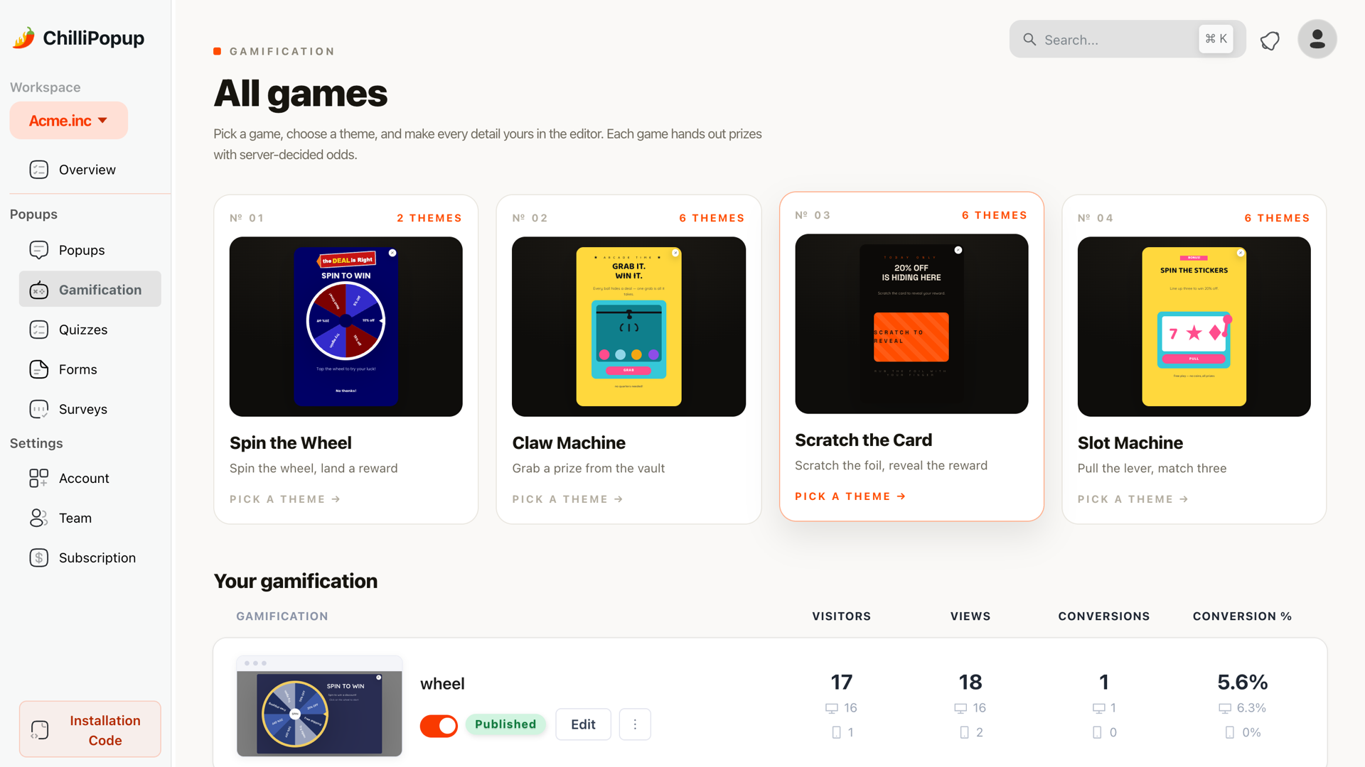
The four gamified popup types. Every game's outcome is decided server-side, so it can't be rigged from the browser.
Copy example: "Feeling lucky? Spin the wheel — every spin wins something, up to 25% off."
Build it: pick a game from the gamification gallery, set the prizes and their odds, and put the email field on the claim screen — the visitor plays first, then submits to reveal what they won. Trigger on exit intent or a short delay.
Interactive formats: survey and quiz popups
9. Survey popup
A popup that asks instead of offers: one to five questions, usually with rating or scoring blocks. Surveys shine where a sales pitch would be tone-deaf — post-purchase ("how was checkout?"), on exit from pricing ("what held you back?"). Because ChilliPopup surveys are multi-step, the results view shows a completion funnel with per-step drop-off, so you see exactly which question loses people.
Copy example: "Quick one before you go — what almost stopped you from ordering today?"
Build it: two or three steps, first question effortless (a rating tap), trigger on exit intent or inactivity. Surveys can also live outside popups entirely — shared by hosted link or embedded inline.
10. Quiz popup
Multiple-choice questions that lead somewhere: a product recommendation, a persona, a score. The visitor gets self-knowledge, you get segmentation data a form field would never capture honestly. Quizzes use tappable choice blocks — single or multiple select — so they work beautifully on mobile.
Copy example: "What's your skin type? Three questions, and we'll build your routine."
Build it: three to five choice questions plus an email step before the result, triggered on the second or third page viewed — quiz-takers are browsers, not bouncers.
Content formats: video and announcement popups
11. Video popup
A popup whose main block is an embedded YouTube video — a demo, a founder welcome, a how-it-works clip. Video earns attention that text can't, but autoplaying it at a visitor uninvited squanders that goodwill. The best video popups are click-triggered: a "▶ Watch the demo" button on the page opens the popup, so everyone who sees the video chose to.
Copy example: "See it in action — the 90-second demo, no signup needed."
Build it: the YouTube embed block (paste the video URL), a click-count trigger, and a headline plus button under the player for the next step.
12. Announcement / news ticker popup
The informational type: no ask, just news — a new collection, a policy change, a holiday closure. ChilliPopup's news ticker block scrolls a message continuously, which suits bar placements; a small corner card works for one-off notices. With no conversion ask, announcements can safely show immediately — the one type where "welcome" timing is exactly right.
Copy example: "New: the spring collection just dropped — free returns through April."
Build it: news ticker or text block in a top-bar placement, shown immediately, with a weekly schedule or date range if the news expires.
All 12 popup types at a glance
The whole taxonomy in one table — each format with the trigger, page and goal it pairs with best. Treat the pairings as defaults to A/B test against, not laws.
| Popup type | Best trigger | Best page | Primary goal |
|---|---|---|---|
| Lightbox modal | Time delay (10–20 s) or exit intent | Home, collections | Offers that justify an interruption |
| Slide-in / corner | Scroll 40–60% | Blog, docs, long product pages | Soft lead capture mid-read |
| Full-screen overlay | Exit intent, or immediate for returning visitors | Home during a sale or launch | Site-wide moments |
| Floating bar | Show immediately | Every page | Standing reminders (shipping, sale) |
| Email capture | Exit intent (desktop), scroll (mobile) | Blog, home | List growth |
| Coupon / discount | Exit intent | Product & cart pages | First-order conversion |
| Countdown urgency | Time delay + date range | Product & cart pages | Resolving "I'll decide later" |
| Gamified (4 games) | Exit intent or short delay | Home, collections | High-engagement email capture |
| Survey | Inactivity or exit intent | Post-purchase, pricing | Feedback & objections |
| Quiz | Pages viewed (2–3) | Collections, catalog | Segmentation & product finding |
| Video | Click-triggered | Landing & feature pages | Demo & education |
| Announcement / ticker | Show immediately | Every page | News with no ask |
Match the popup type to the funnel stage
If the table is the reference card, this is the decision rule: pick the type by where the visitor is in their visit, not by which template looks nicest.
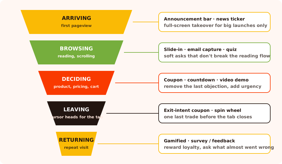
Where each popup type belongs in a single visit — the ask grows as the visitor's investment grows.
A worked example — a small skincare store running four types at once without them colliding:
Site-wide: a floating bar, shown immediately — "Free shipping over $40."
Collection pages: a quiz slide-in at two pages viewed — "Not sure where to
start? Find your routine in 3 questions."
Product pages: a coupon modal on exit intent — "Before you go: 10% off your
first order."
Order confirmation: a two-step survey after a short delay — "How easy was
checkout, 1–5?"
Four campaigns, four page scopes, four triggers — and no visitor ever meets two in the same
moment.
Common mistakes when choosing a popup type
- Picking the format before the goal. "We need a spin wheel" is a decoration decision. Start from the job — list growth, urgency, feedback — and let the job pick the type.
- Using loud formats for quiet asks. A full-screen overlay for a newsletter signup burns attention you'll want later for the sale that deserves it.
- Stacking types in one session. A bar plus a modal plus a slide-in on the same page reads as a carnival. One popup per page, per moment — use display frequency rules to enforce the cooldown.
- Shipping the same type to desktop and mobile. A generous desktop modal becomes a screen-eating wall on a phone, and exit intent doesn't exist for thumbs. Use device targeting to swap in a lighter format — our mobile popup best practices guide covers the swaps.
- Fake urgency. A countdown that resets is worse than no countdown: it converts once and inoculates forever.
- Guessing instead of testing. When two types both fit — coupon modal vs spin wheel, say — don't debate it in a meeting. A/B test them on the same page and let the traffic vote.
Build any of the 12 types in ChilliPopup
Every type in this guide comes out of the same editor — the practical payoff of the two-axis model: learn one builder and one set of display rules, and the twelve types are just combinations.
Start from a template or a prompt
The popup gallery has templates for every type above, and the games each come with themed designs. In a hurry, describe what you want to the AI generator and edit the draft it returns.
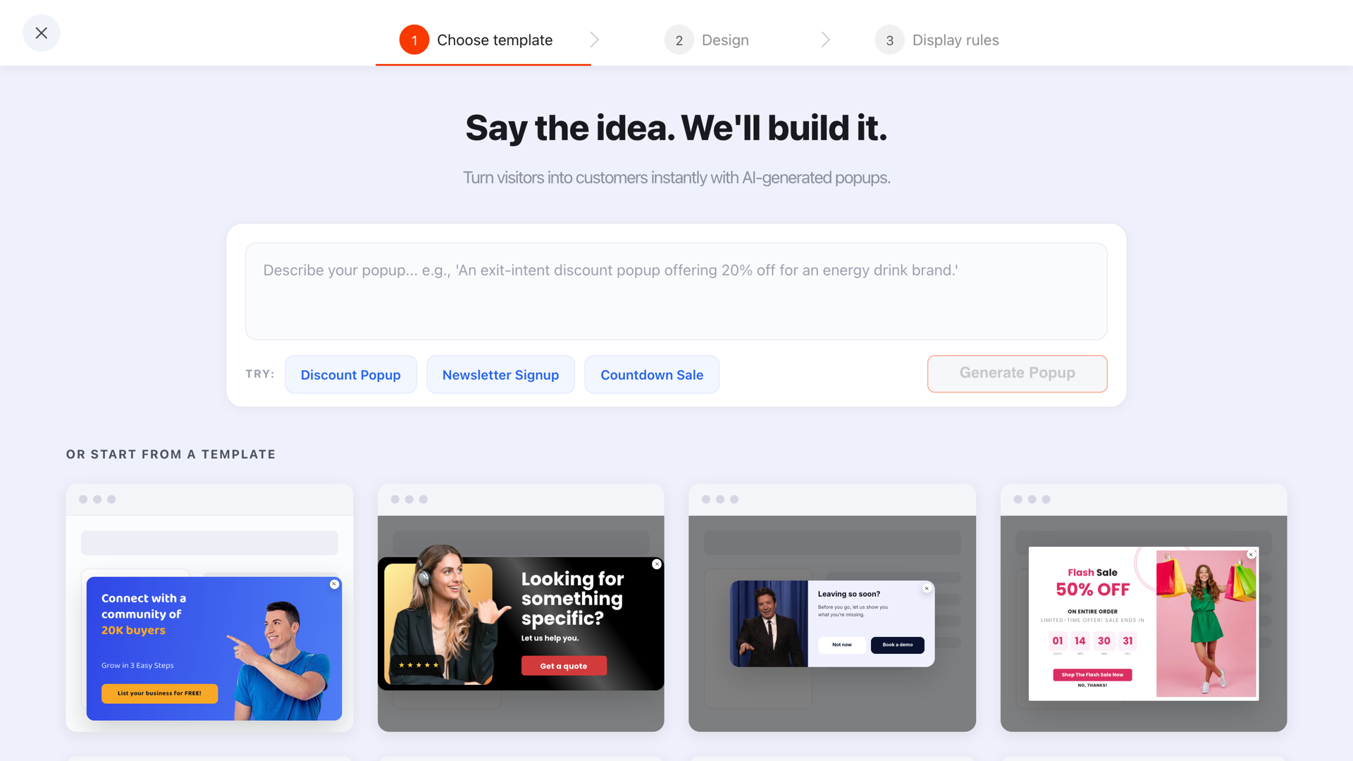
The template gallery — modals, bars, coupon and countdown designs ready to restyle.
Shape the format in the editor
Drag in the blocks the type needs — text, inputs, button, image, countdown timer, coupon code, news ticker, or a YouTube embed — then pick one of the nine positions to make it a modal, a bar or a slide-in.

One editor for all twelve types — blocks define the goal, position defines the placement.
Wire the trigger and targeting
Pick the trigger from the seven above, then narrow with page targeting, device targeting, frequency and — for seasonal types — a date range. Publish, and the same one-line script serves every campaign you'll ever run.
Try every type from one editor
Popups, bars, games, surveys and quizzes — twelve types, nine positions, seven triggers, one pixel. Free plan, no credit card required. Paid plans from $29/month.
Start free →Related reading
Frequently asked questions
What are the main types of website popups?
Most popups fall into twelve types across two axes. By format: lightbox modals, slide-ins, full-screen overlays, floating bars, email capture, coupon, countdown, gamified, survey, quiz, video and announcement popups. By trigger: immediate, time delay, scroll, exit intent, click, inactivity and pages viewed. Every campaign you build combines one format with one trigger.
What is the difference between a modal and a slide-in popup?
A modal (lightbox) appears in the center of the screen over a dimmed page and expects a decision before the visitor continues. A slide-in appears in a corner — usually bottom-right — leaves the page fully usable, and can simply be ignored. Use a modal when the offer justifies an interruption, and a slide-in when you want to make an offer without breaking the visitor's flow.
Which popup type converts best?
There is no single winner — conversion depends on matching type to intent. Coupon and gamified popups usually post the highest email opt-in rates because they trade something concrete for the address; slide-ins convert at lower rates but annoy fewer people. The honest answer is to A/B test: run two types against each other on the same page and let your own traffic decide.
Are popups bad for SEO?
Not if you use them carefully. Search engines penalize intrusive interstitials that cover the main content the moment a visitor arrives from search results — a full-screen overlay on landing is the classic offender. Popups triggered by exit intent, scroll depth or a click, and smaller formats like slide-ins and floating bars, are broadly safe.
What popup type is best for mobile?
Smaller, less intrusive formats: slide-ins, floating-bar style placements at the top or bottom, and tap-friendly quizzes. Exit intent doesn't work reliably on touch screens, so swap it for a scroll-percentage trigger. ChilliPopup lets you target campaigns by device, so you can show a modal on desktop and a lighter format to mobile visitors.
How many popup types should I run at once?
One per page, per moment. Different pages can carry different types — a floating bar site-wide, a coupon on product pages, a survey after checkout — but stacking two overlays in the same session reads as an interrogation and drives dismissals up. Set display frequency rules so campaigns don't collide.