
Ten website popup examples, organised by the job each one does rather than by how it looks: discount capture, newsletter signup, exit-intent save, cart-abandonment offer, announcement bar, product-finder quiz, feedback survey, spin-to-win game, gated-content unlock and post-purchase profiling. Most galleries stop at the screenshot and never explain why any of them fired. Each example below does something the other nine can't, and the thing that makes it work is almost never the design — it's the trigger and the targeting.
Copy the job, adapt the copy, and steal the settings. Every rule mentioned here is one you can set yourself in a builder like ChilliPopup, and where a tactic runs into a real limitation, it's flagged rather than hand-waved past.
Key Takeaways
- Ten jobs, not ten designs. A discount capture and a feedback survey look similar and behave nothing alike — the difference lives in the display rules.
- The trigger is the campaign. The same popup on exit intent, at 50% scroll, or on page two of a session produces three completely different results.
- Turn off "show again after conversion" on anything that captures an email. It is the one switch that stops subscribers being asked to subscribe forever.
- Copy beats layout. "Subscribe to our newsletter" fails at any size. Name the payload, the cadence and the exit.
- Build two, not eight. One email capture plus one that does a different job entirely. Add a third once you can read the numbers.
What every good popup example has in common
Before the list: four things are true of all ten, and if you get them wrong the example won't work no matter how well you copy it.
- It arrives after something, not before. A delay, a scroll, a second page, an exit signal, a completed order. A popup that fires on arrival is asking a stranger for a favour before saying hello.
- It asks for one thing. One field, or one tap. Every extra field is a decision, not a keystroke — see the progressive profiling guide for how to spread the rest across later asks.
- It has a visible way out. A real close button and, ideally, a worded decline link. Hiding the exit doesn't raise conversions; it raises rage-clicks.
- It stops when it's done its job. Frequency capped, and the conversion gate switched off so converters don't see it again.
A note on how the rules combine. In ChilliPopup the first enabled trigger is the one that fires, while every enabled targeting rule is an AND gate — page URL, device, OS, browser, date window and weekday-plus-hour schedule all have to agree before the campaign is allowed to show. That means "cart page OR checkout page" is two campaigns, not one rule.
The ten jobs at a glance
| # | The job | Build it as | Typical trigger | Number that tells you it works |
|---|---|---|---|---|
| 1 | Discount capture | Popup | Time delay, 12s | Submissions |
| 2 | Newsletter signup | Popup or form | Page scroll, 50% | Conversion rate |
| 3 | Exit-intent save | Popup (desktop) | Exit intent | Submissions on exit |
| 4 | Cart-abandonment offer | Popup on the cart URL | Inactivity or exit intent | Clicks back to cart |
| 5 | Announcement bar | Wide, short popup | Time delay, 1s | Clicks |
| 6 | Product-finder quiz | Quiz | Time delay, 8s | Completion rate |
| 7 | Feedback survey | Survey | Time delay on a post-action page | Drop-off analysis |
| 8 | Spin-to-win game | Gamification | Time delay or exit intent | Claim-screen submissions |
| 9 | Gated-content unlock | Popup or form | Page scroll, 60% | Conversion rate per article |
| 10 | Post-purchase profiling | Popup or short survey | Time delay on the order page | Field inputs |
1. The discount capture popup
The job: turn a first-time browser into a subscriber by trading a first-order discount for an email address. This is the workhorse of ecommerce popups and the one most sites get almost right.
When to fire it: around 12 seconds after page load, on product and collection pages, to new visitors. Not on the cart, not on the checkout — someone already buying does not need a reason to pause and go hunting for a better code.
Copy you can paste
- Headline: Take 10% off your first order
- Subline: Your code appears on the next screen. Unsubscribe any time.
- Field: Email — placeholder
you@email.com - Button: Show me my code
- Decline link: No thanks, I'll pay full price — a second button block with its click action set to Close, styled to look like a link
The rules behind it:
- Content type: popup, one Email input, Required on.
- Trigger: Time Delay, 12 seconds — counted from page load.
- Targeting: page URL does not contain
/cart, plus a second rule that it does not contain/checkout. - Audience: new visitors (the default window is 30 days, and you can change it).
- Frequency: once every 3 days. Turn the frequency rule on first — the audience and conversion controls only appear once it is.
- Show again after conversion: off.
The mistake that kills it: promising the code "by email" and then relying on a tool that doesn't send email. ChilliPopup doesn't send any email — set the submit action to Thank you and put the code on the thank-you screen, where the visitor sees it in the same second they typed their address. Your own email tool can follow up afterwards.
2. The newsletter signup popup
The job: build a list where you have no discount to give — a blog, a media site, a B2B product. The trade here is content for attention, so the copy has to do the work the discount would have done.
When to fire it: at 50% page scroll on article pages, or on the second page of a session. Both signals mean "this person is actually reading", which is the only qualification that matters for a newsletter.
Copy you can paste
- Headline: The Friday teardown, in your inbox
- Subline: One email a week: what we shipped, what broke, and what we'd do differently. No pitches.
- Field: Email
- Button: Send it to me
- Microcopy under the button: Unsubscribe in one click.
The rules behind it: a popup, or a standalone form, with a single Email field; trigger Page Scroll at 50%, or Page Count at 2 pages (counted within the current browser session); frequency once every 7 days; conversion gate off. Set the email validation mode to check format and prevent typos, or, on a B2B site, to accept only business emails so you stop collecting throwaway addresses. Keep the division of labour straight: the popup captures and stores the addresses, which you read in the campaign's Collected input data table — the Friday email itself goes out from whatever email tool you already write your newsletter in.
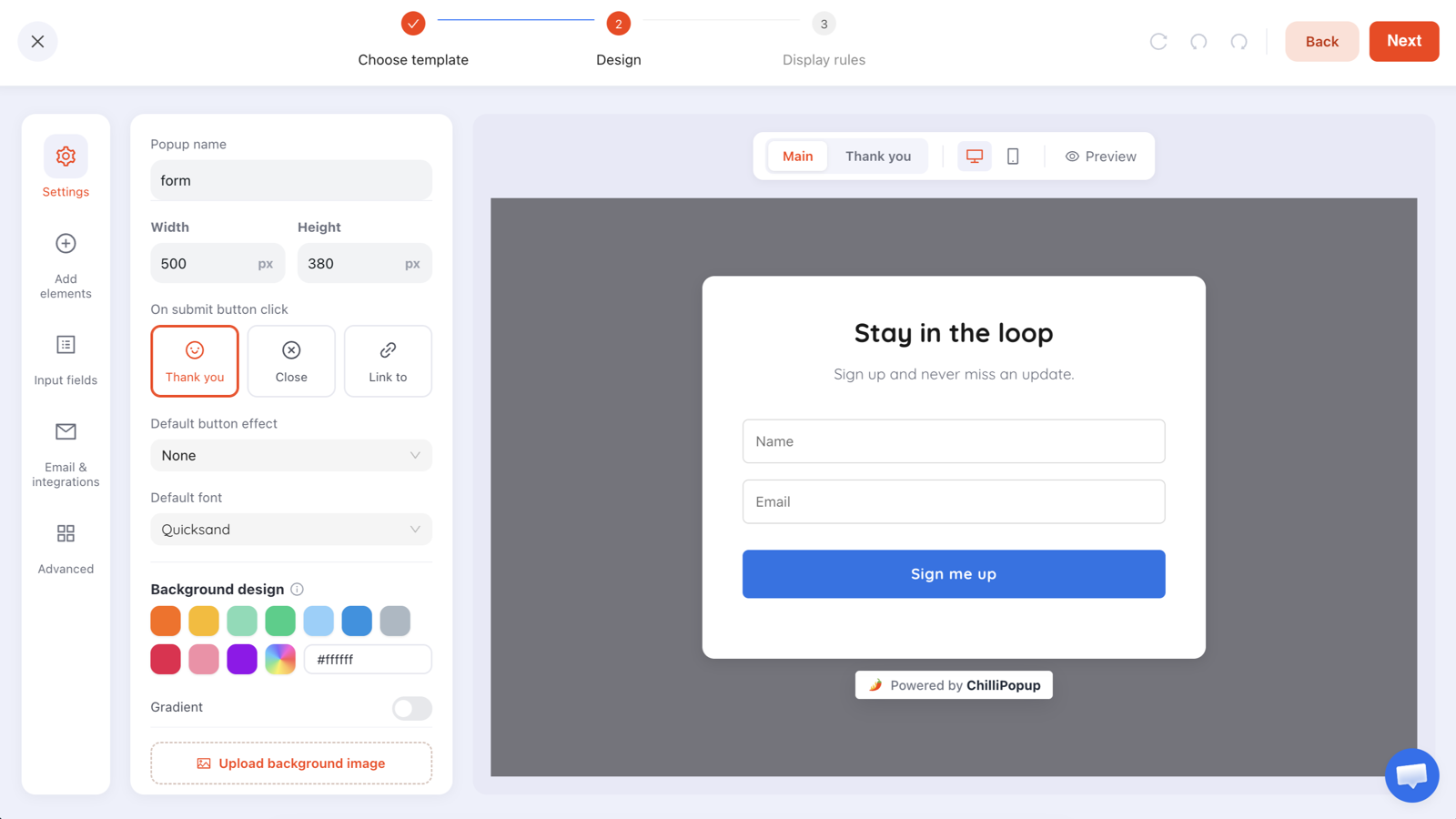
A newsletter capture built in the editor. Two fields is already one more than this job needs — drop the name unless you genuinely personalise subject lines.
The mistake that kills it: the headline "Subscribe to our newsletter". It describes the mechanism, not the payload. Name what arrives, how often, and what doesn't arrive. The word "weekly" converts better than any button colour you will ever test.
3. The exit-intent save
The job: make one last offer to someone who is leaving anyway. Because it fires on the way out, it costs you nothing in interrupted browsing — which is why it's the safest popup on this list to run site-wide.
When to fire it: on the exit signal, desktop only. There is no reliable mouse-out gesture on a phone, so the mobile version of this campaign is a separate one with the device rule set to mobile and either a 60% scroll trigger or an inactivity trigger instead.
Copy you can paste
- Headline: Leaving empty-handed?
- Subline: Take the 10% code with you and use it whenever you're ready. It'll be waiting.
- Field: Email
- Button: Save my 10%
- Decline link: No thanks, just browsing
The rules behind it: popup, trigger Exit Intent, device rule Desktop, frequency once a day, conversion gate off. Build the mobile twin as its own campaign with device Mobile and Page Scroll at 60% — same copy, different trigger. There's a fuller breakdown of the signal and its failure modes in the guide to exit intent popups.
The mistake that kills it: running one exit-intent campaign for everything and wondering why half your traffic never sees it. Check the shows-by-device breakdown in analytics; if mobile is near zero, that's the reason, not your offer.
4. The cart-abandonment offer
The job: catch a session that has items in the cart before it closes. This is the highest-value moment on the whole site, and the popup is doing something an email can't: arriving while the intent is still live.
When to fire it: on the cart or checkout URL, on inactivity (roughly 30 seconds of nothing happening) or on exit intent. Both signal hesitation rather than abandonment, which is the window you actually want.
Copy you can paste
- Headline: Still thinking it over?
- Subline: Free shipping if you finish this order today — no code needed.
- Button: Take me back to my cart
- Secondary line: Free returns for 30 days, in case it isn't right.
The rules behind it: popup with page URL contains /cart,
trigger Inactivity, frequency once a day. Set the submit action to
Link to so the button takes them straight back to the checkout URL. If you want the same
rescue on the checkout step, that's a second campaign with its own URL rule.
An honest limit: targeting is by URL, device, audience and schedule — a popup builder can't read what's in the cart or how much it's worth. So write an offer that's true for any basket (free shipping, free returns, a deadline) rather than one that depends on the total. And keep the sender straight in your head: the popup catches them before they leave, your ecommerce platform sends the follow-up email.
The mistake that kills it: discounting someone who was going to buy anyway. Reach for reassurance first — shipping, returns, sizing help — and keep the money for the exit-intent campaign one step earlier in the funnel.
5. The announcement bar
The job: say one factual thing to everybody without interrupting anybody. Sale dates, a shipping cut-off, a delivery delay, a new feature. It is the only example here that is allowed to appear on every page, all the time.
When to fire it: one second after page load, everywhere, every visit. It's a fixture, not an event.
Copy you can paste
- Bar text: Free shipping on orders over $50 — this week only.
- Button: Shop the sale
- Alternative (operational): Order before 2pm and it ships today.
The rules behind it: there is no separate "bar" content type — you build it as a popup sized wide and short (something like 1000 × 90 px in the editor's Width and Height fields) and placed at the top of the screen. Trigger Time Delay, 1 second; frequency all pages all the time; and — the part everyone forgets — a date window in the targeting rules so it retires itself the morning after the sale ends. For the "ships today" version, use the weekday-and-hour schedule instead so it only appears when it's true.
The mistake that kills it: leaving it up after the deadline. A stale bar teaches regulars to ignore the top of your site, and every campaign you run afterwards pays for it. Set the date window when you build it, not when you remember.
6. The product-finder quiz
The job: convert "I don't know what I need" into a segment and a starting point. A quiz earns an email that a plain form wouldn't, because by the time the email screen appears the visitor has already invested three taps.
When to fire it: 8 seconds into a collection page, or on the second page of a session. Best on catalogues wide enough to be genuinely confusing.
Copy you can paste
- Start screen: Not sure where to start? Three questions, 20 seconds.
- Q1: What are you shopping for? — Women's · Men's · Kids · Home
- Q2: What's the occasion? — Everyday · Work · A gift · Something special
- Q3: Add your email and we'll open the edit on the next screen — Email field
- Button: Show me the edit
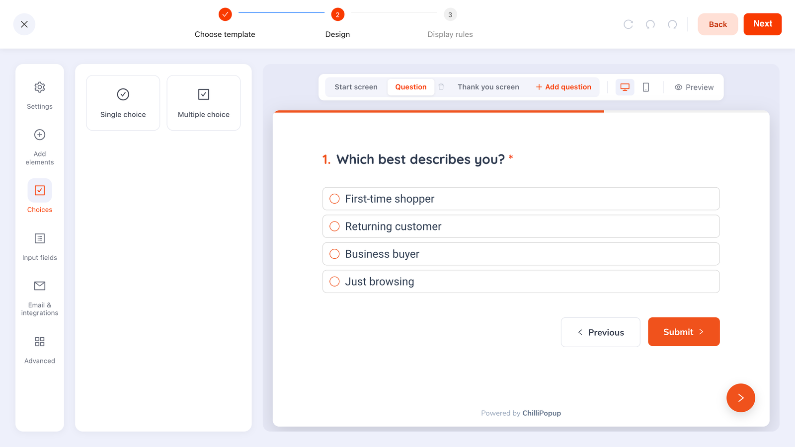
Quiz questions are built in the Choices panel as single- or multiple-choice lists. Tappable options return clean values you can segment on; free-text answers don't.
The rules behind it: a quiz with three question steps, the progress bar on and a fade transition between them. Mark the choice blocks Required so a visitor can't skip past them, and put the email on the last step. Everything they answered arrives as one submission at the end. A quiz always finishes on its own thank-you step, so that's where the payoff goes: write it there and add a button block whose click action is Link to, pointing at one curated collection.
Three constraints to design around. Steps run strictly in order — there's no branching, so you can't jump from "Kids" straight to question five. There is no per-answer result screen either: everyone lands on the same thank-you screen or the same link, so promise "the edit" or "our bestsellers", never "your personal results", and use the answers in the dashboard to decide what to merchandise next. And if a visitor steps back, a chosen option stays selected but a typed email comes back empty and has to be retyped. Keep the email on the screen they're least likely to leave and return to.
The mistake that kills it: eight questions. Three is the format; four is the ceiling. If you're not sure which one to cut, the Drop-off Analysis on the quiz's results page ranks the fields by how often they were the last thing a visitor touched before quitting — that's your cut list, already sorted.
7. The feedback survey
The job: find out why the numbers look the way they do. Analytics tells you people left the pricing page; only a survey tells you it was because the plan comparison was unreadable.
When to fire it: after the visitor has experienced something. On the order-confirmation page, after a help-centre article, or 20 seconds into a page you know is underperforming. Never on the homepage to a first-time visitor — they have nothing to report yet.
Copy you can paste
- Start screen: Got 20 seconds? Two questions, then we'll leave you alone.
- Q1 (NPS, 0–10): How likely are you to recommend us to a friend? — endpoints labelled "Not at all likely" and "Extremely likely"
- Q2 (Long text, optional): What's the main reason for your score?
- Thank-you screen: Noted, genuinely. We read every one of these.
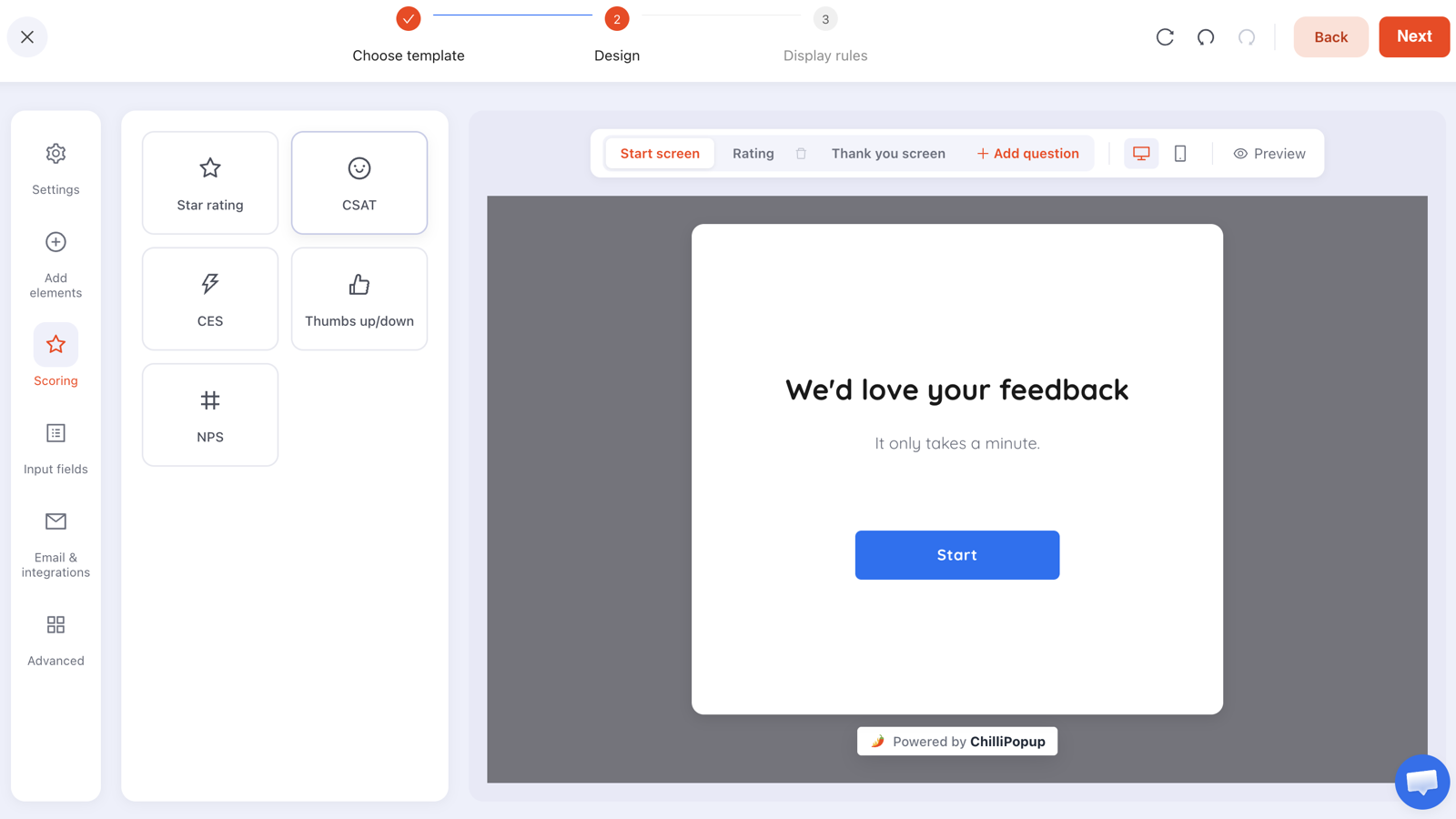
The scoring panel: star rating, CSAT, CES, thumbs up/down and NPS, each with configurable endpoint labels. Pick one — a survey with three different scales is a chore, not a question.
The rules behind it: a survey
with the NPS widget on step one and an optional long-text follow-up on step two; trigger Time Delay
20 seconds; page URL contains /thank-you; frequency once every 90 days so
regulars aren't polled every month. Surveys and quizzes are the two content types that also get the
Results view — a four-stage funnel, completion rate, average open-to-submit time, an NPS card and a
day-by-hour heatmap of when responses actually arrive. There's more on question design in the
website feedback survey guide.
The mistake that kills it: making the follow-up question required. The score is the data you need; the comment is the bonus. Requiring the comment converts a 3-second answer into a writing task and you lose both.
8. The spin-to-win game
The job: make the email trade feel like a reward rather than a toll. Mechanically it's the same exchange as example 1 — an address for a discount — but the order is reversed: the visitor wins first, then hands over the email to claim.
When to fire it: 15 seconds into the homepage or a collection page, to new visitors, or on exit intent. It suits promotional periods far better than everyday trading.
Copy you can paste
- Teaser tab: 🎁 Spin to win
- Play screen: Spin the wheel — up to 25% off. One spin per visitor.
- Claim screen: You won! Add your email to unlock the code — Email field, button "Claim my prize"
- Winning screen: Here's your code. It's live for the next 48 hours.
- Losing screen: So close. Here's 5% anyway, because you played.
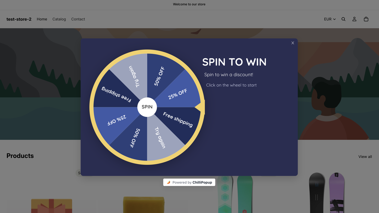
A spin-to-win overlay running live on a store. Prize odds are set per prize and the outcome is decided server-side, so the result can't be rigged from the browser.
The rules behind it: a gamification campaign — spin wheel, scratch card, slot machine or claw machine, they all share the same screen model. The claim screen collects the details, and submitting it is what reveals the prize. Trigger Time Delay 15 seconds, audience new visitors, frequency once every 7 days, conversion gate off. The spin to win popup guide covers prize odds and slice design in more depth.
The mistake that kills it: a losing screen that's a dead end. If a third of players get "Try again" and nothing else, you've built a machine that annoys a third of your visitors on purpose. Give the loser a small consolation and you keep the email either way.
9. The gated-content unlock
The job: trade a genuinely useful artefact — a checklist, a template, a calculator, a swipe file — for an email, on the one page where somebody has already proved they care about the topic.
When to fire it: at 60% scroll on the specific article — deep enough that the reader has hit the part of the piece the checklist summarises. The deeper the scroll, the warmer the ask.
Copy you can paste
- Headline: Want this as a one-page checklist?
- Subline: The 12 steps from this article, condensed to something you can print and tick off.
- Field: Email
- Button: Open the checklist
The rules behind it: a popup triggered at Page Scroll 60% with a
page URL rule that starts with /blog/ — or the same capture built as a form and
ruled to that one article. Because ChilliPopup doesn't send the file, set the submit action to
Link to and point
it at the asset URL, or put the download link on the thank-you screen. Delivery is instant either way,
which is a better experience than "check your inbox" anyway.
The mistake that kills it: gating something the article already gave away. If the checklist is just the h2 headings retyped, the ask reads as a toll booth. The upgrade has to be a different format or a genuine extension — the spreadsheet, the template, the version they can hand to a colleague.
10. The post-purchase profiling ask
The job: collect the one field you couldn't justify asking for earlier, at the single moment when the customer is most inclined to give it — right after the money has changed hands and nothing is at stake.
When to fire it: 5 seconds after the order-confirmation page loads. One question. Never two.
Copy you can paste
- Headline: Order's in. One quick thing?
- Subline: Tell us your birthday month and we'll send something on the day.
- Fields: Birthday · Email
- Button: Add it to my profile
- Decline link: Skip — just show me my order
The rules behind it: a popup or a two-step survey with page URL
contains /order-confirmation, trigger Time Delay 5 seconds, frequency once every
365 days, conversion gate off. ChilliPopup stores the birthday against that submission; the message
you promised on the day comes from your own email tool, not from the popup. This is the third rung of a
progressive profiling ladder
— the guide covers which field belongs on which rung and why the expensive ones have to come last.
Why the email field is on there twice over. Each campaign stores its own submissions — there is no shared contact record stitching this birthday to the address someone gave you three weeks ago, and no dedupe by email. So keep an email field on every campaign after the first. It's the key you match rows on when you read them in the dashboard's Collected input data table. Asking a customer to confirm an address they've typed a hundred times is cheap; guessing which anonymous answer belongs to which contact is not.
The mistake that kills it: asking for something the checkout already captured. If your order flow has the phone number, requesting it again "for delivery updates" tells the customer your systems don't talk to each other — which, at that exact moment, is the last thing you want them thinking about.
Before you copy any of these: the settings that decide the outcome
Nine times out of ten, a popup that "doesn't work" is a rules problem, not a design problem. Here is the short checklist to run before you publish any of the ten.
| Setting | What to set | Why it matters |
|---|---|---|
| Trigger | Exactly one enabled | The first enabled trigger fires. Two enabled triggers is not "either / or", it's a coin toss you didn't intend. |
| Time delay | 10–15s for capture, 1s for a bar | The delay is always counted from page load, so it restarts on every page. Set it for the page, not for the session. |
| Frequency | Turn it on first | The audience and conversion controls only appear once the frequency rule is enabled. This trips up almost everyone. |
| Show again after conversion | Off, for anything that captures an email | It suppresses that campaign for people who submitted that campaign. Per campaign — it doesn't carry across to your other popups. |
| Device | Split exit-intent campaigns | Exit intent has no reliable mobile equivalent. One desktop campaign, one mobile campaign with a scroll trigger. |
| Page URL | One rule per condition | Six operators — contains, does not contain, is exactly, is not, starts with, ends with — and every enabled rule is an AND. |
| Audience | New vs returning, in days | Recognition comes from the visitor's own browser storage, so a second device or a private window looks like a brand-new visitor. |

Every campaign reports views, unique views, clicks, submissions, conversion and field inputs, plus a breakdown of the top values collected per field.
One more piece of honesty about measurement: there is no built-in A/B test, so don't try to read two variants against each other. Change one thing — the headline, the trigger, the delay — publish it, and compare the campaign against its own previous fortnight. Conversion is reported as submissions divided by views, which means a campaign that fires rarely to a warm audience will always flatter a campaign that fires constantly to everyone. Compare like with like, or don't compare at all.
Which two should you build first?
Not all ten. Pick one that captures an email and one that does something else entirely, so the two never compete for the same moment:
- Ecommerce store: the discount capture (example 1) plus the announcement bar (example 5). Add the cart-abandonment offer once the first two are earning.
- Blog or media site: the newsletter signup (example 2) plus the gated-content unlock (example 9) on your three best-performing posts.
- SaaS or B2B: the newsletter signup with business-email validation on, plus the feedback survey (example 7) on the pricing page.
- Running a promotion: the spin-to-win game (example 8) plus the announcement bar — and a date window on both so they retire themselves.
If you're starting from a blank editor, the fastest route is the AI generator: describe the popup in one sentence — "an exit-intent popup offering 10% off a first order, warm cream background, one email field" — and it drafts the layout, colours, fonts, copy and blocks for you to edit. It's on every plan with a fair-use daily limit. And if the pixel isn't on your site yet, the one-line install guide takes a couple of minutes; the same script serves all ten of these, so there's nothing new to embed as you add campaigns.
Build any of these ten in an afternoon
Popups, forms, surveys, quizzes and games from one editor and one script tag. Free plan, no credit card required. Paid plans from $29/month.
Start free →Related reading
Frequently asked questions
What are the most common types of website popups?
The recurring ones are the discount capture popup, the newsletter signup, the exit-intent save, the cart-abandonment offer, the announcement bar, the product-finder quiz, the feedback survey, the spin-to-win game, the gated-content unlock and the post-purchase profiling ask. They are worth thinking of as ten different jobs rather than ten designs, because the trigger and the targeting change far more between them than the layout does.
When should a popup appear on a website?
Late enough that the visitor has seen something worth reacting to. In practice that means a delay of around 10 to 15 seconds from page load, a scroll depth of 40 to 60 percent, or the second page of a session. Exit intent is the exception, because it fires on the way out rather than on arrival. Avoid firing anything the instant a page loads on mobile.
Do website popups hurt SEO?
A popup that fires after a delay, a scroll or an exit signal does not sit between the visitor and the page they arrived on, so it is not the pattern search engines object to. The one to avoid is an interstitial that covers the main content on mobile immediately after someone arrives from a search result. Delay it, target it to returning visitors, or exclude your top landing pages from that campaign.
How many popups should a website run at once?
Start with two: one that captures an email and one that does a completely different job, such as an announcement bar or a feedback survey. The ChilliPopup pixel queues campaigns rather than stacking them, so a visitor never sees two overlays at once, but running five overlapping campaigns still means they fire in an order you cannot predict and you lose the ability to tell which change did what.
What is a good conversion rate for a website popup?
There is no benchmark worth chasing, because a popup that fires on every page to everyone and one that fires only on the cart page at exit are measuring completely different audiences. Compare a campaign against its own history instead. ChilliPopup reports conversion as submissions divided by views, so read it as the share of the people who saw it who then finished it.
Can I build these popup examples without a developer?
Yes. One script tag on your site serves every popup, form, survey, quiz and game, so nothing new gets embedded when you add a campaign. The editor is drag and drop, and the AI generator will draft a whole popup, including layout, colours, fonts and copy, from a single sentence describing what you want.