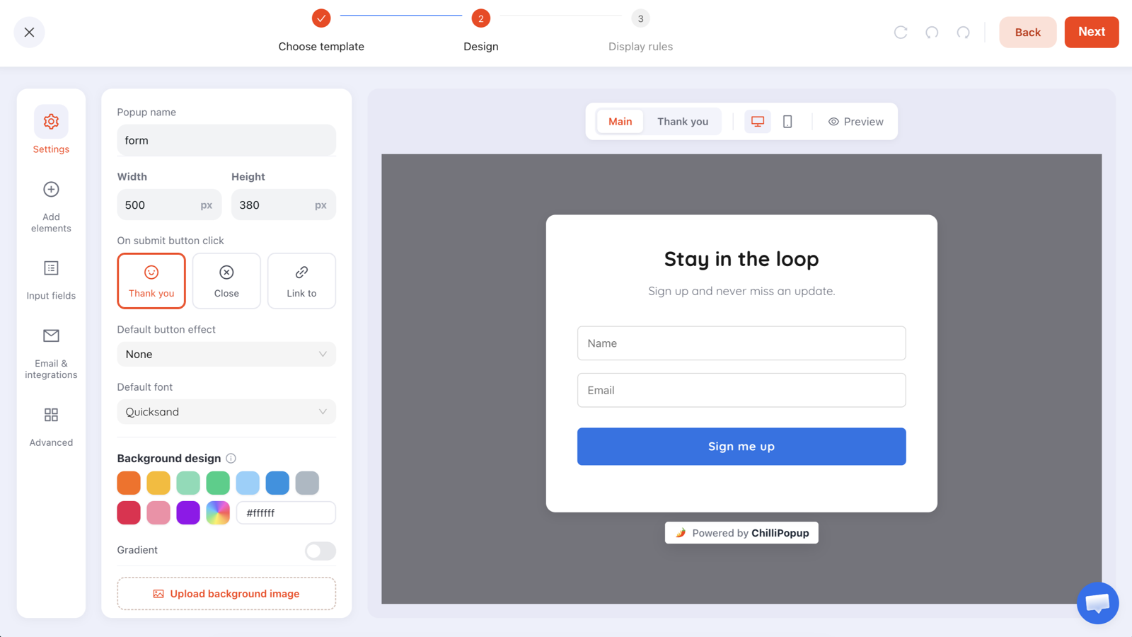
To build an email list with popups: choose one offer worth an email address, ask for that address and nothing else, trigger it to match what the page is for, cap how often it shows, and validate at capture.
The rest of this guide is detail on those five decisions, what to reach for when a plain form stalls, and the two things people get wrong at the end: where the addresses live once collected, and which number proves the list is growing. One thing to settle immediately — ChilliPopup captures, stores and shows you the addresses, but it does not send email. Your own email tool does that, and that fact should change your copy.
Key Takeaways
- The offer does the work, not the popup. Four archetypes reliably earn an address: money off, a useful artifact, early access, or a game.
- One field. Email, required. Every extra field is a decision made while a box covers the page they came for.
- The trigger should match the page. Exit intent on product pages, scroll on articles, a short delay on waitlist pages, nothing during checkout.
- Turn off “show again after conversion” so subscribers stop being asked to subscribe. It is the single most important switch in list building.
- Measure new addresses per 1,000 visitors, not conversion rate. A lower-converting popup that shows far more often can grow the list faster.
What a popup can and cannot do for your list
Settle the division of labour before you build anything — most disappointing popup projects come from expecting the wrong half.
What ChilliPopup does — and what it deliberately does not
It does: show the ask at the right moment, capture the address, check it before the submission is accepted, store every submission, and show you the raw rows in the Collected input data table plus a per-field breakdown of the values collected.
It does not: send email. Not the welcome message, not the discount code, not the newsletter. Sending is your email tool’s job. ChilliPopup is the capture layer.
That is not a footnote, it changes your copy. If the popup says “check your inbox for your code”, something in your stack has to put it there. If you have not wired that up, show the reward on the thank-you screen instead: a promise that lands one second later beats a promise that never arrives.
Two more honest limits, up front. There is no CSV export and no notification email when a submission arrives, and the editor’s Email & integrations tab is a “Coming soon” placeholder, not a live connection to an email platform. Today you read the addresses in the dashboard and move them across yourself — or have a developer catch the browser event shown further down.
Step 1: Choose an offer worth an email address
Nobody subscribes to a form. They subscribe to a thing. The biggest lever on list growth is not the design, the animation or the button colour — it is whether the visitor can picture what arrives. Four archetypes consistently work:
- Money off what they are already looking at. The ecommerce default: instantly valuable, instantly understood. Be specific — “10% off your first order” beats “save on your order” — and put any expiry in the popup, not the fine print.
- A useful artifact. A checklist, template, sizing guide, or the one-page version of the article they are reading. The archetype for blogs, services and B2B, where a discount makes no sense. Small enough to consume in one sitting, specific enough that the title alone is the pitch.
- Early access. Restock alerts, drop notifications, first look at the sale, a waitlist. Costs nothing, needs no discount, and attracts the people most likely to buy — they just told you what they want. Massively underused.
- A game. The prize is the offer and the play is the reason to stay. Reach for it when a plain form has stalled on a page; mechanics in Step 6.
The weakest offer of all is “subscribe to our newsletter”. If a newsletter is what you genuinely have, sell it: what is in it, how often it arrives, one concrete example. “One email each Tuesday: three new arrivals and the story behind one of them” is an offer. “Join our mailing list” is a chore.
Staring at a blank editor? Describing the offer in one sentence to the AI generator drafts the layout, colours, fonts, copy and blocks in one pass, and you edit from there. It is included on every plan with a fair-use daily limit.
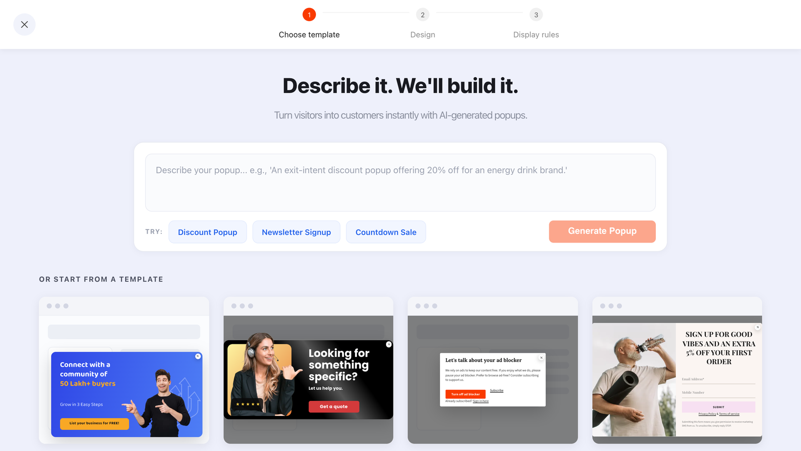
Describe the offer in a sentence and the generator drafts the whole popup — or start from one of the ready-made templates underneath.
Step 2: Ask for one field
One field. The email address, marked Required. Delete the name field the template ships with — the popup in this article’s header has one, and it is the first thing to go.
“Just a first name too, so we can personalise” is weaker than it looks. A name buys you a greeting; the address buys the entire relationship. Unless a real subject line changes because of it, the name is friction with no payoff — ask later, once you have delivered something, which is the idea behind progressive profiling.
Eight input types and twelve ready-made fields are available, so it is easy to add more than you should. Two additions earn their place: Email Consent, the ready-made checkbox to use when you need explicit recorded opt-in (write your own label, make it required, keep it honest), and a phone number — only if SMS is genuinely a channel you run, and even then a separate SMS campaign beats bolting it onto the email ask.
Two presentation details. Each field takes a box or underline variant and
its own placeholder — make the placeholder an example (you@example.com), not a repeat
of the label. And the editor’s On submit button click control offers Thank
you, Close or Link to; for a downloadable artifact, Link to pointing
at the file is the cleanest delivery there is.
Step 3: Match the trigger to what the page is for
A popup that fires at the wrong moment is not a list-building tool, it is an interruption with a form attached. The trigger should reflect what the visitor is doing on that page — and since the first enabled trigger is the one that fires, pick one per campaign and scope it with a URL rule.
| Page | What the visitor is doing | Trigger | Offer that fits | Frequency |
|---|---|---|---|---|
| Product page | Comparing, close to a decision | Exit intent (desktop) | Money off the first order | Once every 7 days |
| Collection / category | Browsing, no single item yet | Page scroll 50% | New-arrival and restock alerts | Once a day |
| Blog post | Reading, not buying | Page scroll 60% | The one-page version of this article | Once every 7 days |
| Home page | Orienting — lowest intent on the site | Page count, after 2 pages | The newsletter, described concretely | Every session |
| Sold-out / waitlist | Wants a thing you do not have | Time delay, 5 seconds | “Email me when it is back” | Every visit |
| Cart or checkout | Mid-transaction | Nothing. Do not interrupt | Ask on the confirmation page instead | — |
Three details that matter in practice. Exit intent reads the cursor leaving toward the browser chrome, so it is a desktop mechanic — on mobile use a scroll percentage or a time delay instead (full breakdown in the exit intent popups guide). A time delay counts seconds from page load, so 5 seconds means five seconds on that page, not five seconds into the visit. And page count counts pages within the current browser session, which makes it the honest proxy for “this person is engaged”.
Beyond triggers, every enabled targeting rule is an AND gate: URL rules with six operators (contains, does not contain, is exactly, is not, starts with, ends with), device, OS, browser, a date window and a weekday-and-hour schedule each narrow a campaign further.
Step 4: Cap the frequency so you never nag
This step separates a list-building popup from the reason people install popup blockers. Switch the display frequency rule on first — the audience and conversion controls only appear once it is — then choose from: once a day, every visit, every session, once every N days, once every N visits, or all pages all the time. Sensible starting points:
- Discount popup: once every 7 days. If the offer did not land the first time, a second showing the same afternoon will not change their mind.
- Newsletter or content popup: once a day at the most aggressive; once every 3 days if visitors read several articles per session.
- Restock or waitlist popup: every visit is fine — it is a service, and they came back for the thing.
Then turn off “show again after conversion”. That one switch stops the campaign showing to anyone who already submitted it, which is the difference between a subscriber feeling recognised and a subscriber being asked to subscribe every single week. If you change nothing else in this article, change this.
Two honest caveats about that memory. It is scoped per campaign — it hides that popup from someone who submitted that popup, and there is no rule saying “hide campaign B from people who submitted campaign A”, so two signup popups will overlap. And recognition lives in the visitor’s own browser storage, so a new device, a cleared browser or a private window all look brand new. There is no dedupe by email address either, so the same person can appear twice in your rows: deduplicate when you import.
The Audience control sits in the same panel — everyone, new visitors or returning visitors, with the window defined in days (30 by default). Aiming a signup popup at new visitors stops it bothering regulars who were never going to take the offer.
Step 5: Validate the address at capture
A mistyped address is worse than no address: it inflates your numbers, it bounces, and it drags down the sending reputation of everything you send afterwards. The only moment it can be fixed is at capture, while the one person who knows the correct spelling is still on screen: the check runs when they press the submit button, and a bad address is refused with the popup still open and the field highlighted, so they can correct it there and then. Set the email field’s validation mode to one of four:
| Validation mode | What it does | Use it when |
|---|---|---|
| Check format & prevent typos | Refuses malformed addresses and likely typos when the visitor hits submit | Your default for every consumer list |
| Accept only business emails | Turns away consumer mailbox domains | B2B lead capture, where a personal address is not the lead you want |
| Both | Format and typo checking, business addresses only | B2B where list quality matters more than raw volume |
| None | Accepts anything | Almost never — only if you are capturing something that is not really an address |
Business-only validation is a trade, not a free upgrade. Plenty of legitimate founders and freelancers sign up with a personal address. Turn it on when a personal address genuinely cannot be worked, and leave it off when volume is the point.
Step 6: Use a game or a quiz where a plain form stalls
Some pages do not respond to a form however good the copy — category pages and content-heavy traffic are the usual suspects, because the visitor is not in decision mode and a box asking for an address reads as an errand. Two alternatives change the shape of the ask rather than its wording.
A game, where the address is on the claim screen
A spin wheel, scratch card, slot machine or claw machine reorders the exchange. The visitor plays first, the claim screen collects the address, and submitting the claim form is what reveals the prize — claiming a win rather than filling in a form, for identical keystrokes. Odds are configurable per prize and the outcome is decided server-side, so it cannot be rigged from the browser. Screens run Play → Post-Play/claim → Winning or Losing, plus an optional teaser.
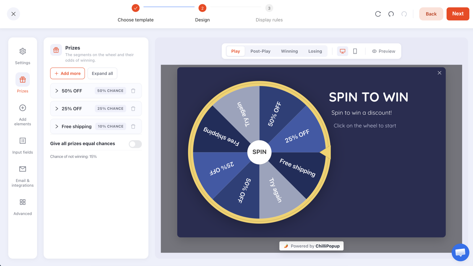
Every prize has its own odds, and the claim screen between Play and Winning is where the email address is collected.
Set the odds so losing is rare and even the smallest win is worth having — a wheel that mostly lands on “try again” trains people to ignore it. Fuller walkthrough in the spin to win popup guide.
A quiz, where the answer earns the ask
A one-question quiz — single or multiple choice, built in the editor’s Choices panel — gets the visitor to do something tiny before the email field appears on the next step, and hands you a clean normalised segment value instead of free text you can never sort on. Everything answered arrives as one submission.
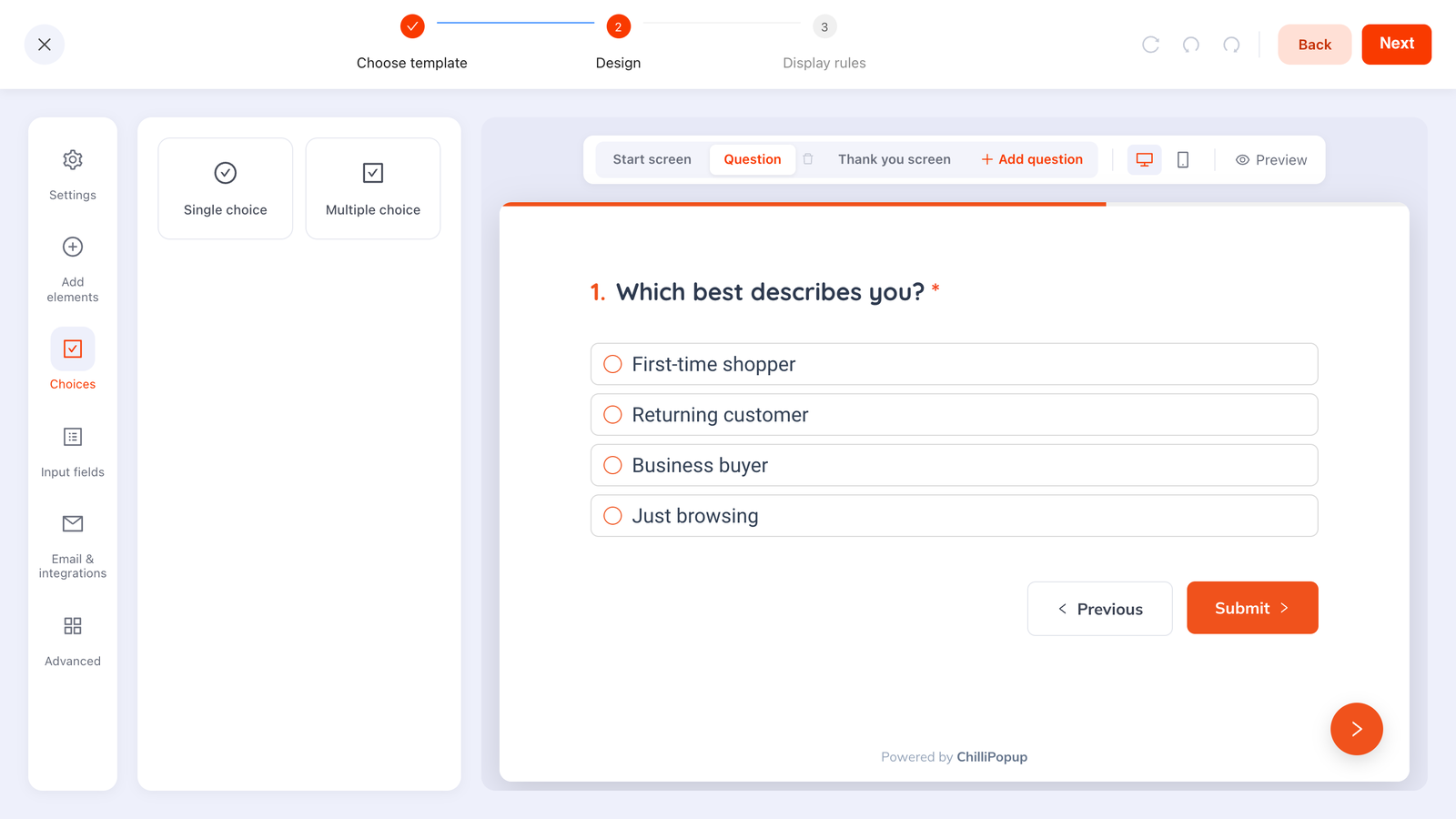
One question, four options, one tap — then the email field on the following step, once the visitor is already engaged.
Two constraints to design around. Steps run strictly in order — no branching, so you cannot jump elsewhere based on an answer. And if a visitor steps backwards, a choice stays selected but a text or email field comes back empty and must be retyped, so put the email on the step they are least likely to revisit.
Three popups you can copy, word for word
Sample copy, written to be pasted and edited. None of it promises anything the popup cannot deliver on its own.
1. Product page, exit intent — the discount
- Headline: 10% off your first order
- Subhead: Drop your email and your code appears right here — no waiting on an inbox.
- Field: one email input, required, placeholder
you@example.com - Button: Show my code
- Decline link: No thanks, I’ll pay full price
- Thank-you screen: Here it is: WELCOME10. Use it at checkout on any order this month. You’re on the list too — one email a week, unsubscribe whenever you like.
Putting the code on the thank-you screen instead of promising it by email is the honest version, and the reward lands before the visitor has time to doubt it. Your email tool can still send a welcome message afterwards.
2. Blog post, 60% scroll — the artifact
- Headline: Want the one-page version?
- Subhead: The 12-point checklist from this article, as a PDF. Plus one short email each Tuesday — nothing else.
- Field: one email input, required
- Button: Get the checklist
- On submit button click: Link to → the URL of the PDF
The download happens on submit, so the promise is kept in the same second it is made. The popup copywriting guide goes deeper on the subhead, which is where most of the persuasion actually lives.
3. Sold-out product, 5-second delay — early access
- Headline: Sold out. Want first dibs?
- Subhead: Leave your email and you’ll hear the moment it’s back — before it goes on the site.
- Field: one email input, required
- Button: Notify me
- Thank-you screen: You’re on the list. We’ll only email you about this one thing.
This one leans hardest on your email tool, because the restock message has to come from somewhere. Decide who sends it, and how they will know, before you publish.
Where the addresses go — and how they reach your email tool
Every submission is stored and shown on that campaign’s analytics page in two places: the Collected input data table, the raw rows exactly as people typed them, and the Collected fields breakdown of the top values per field. That is where your list lives inside ChilliPopup. Getting it into the tool that actually sends email is manual today, by one of two routes:
- Read and copy, on a schedule. Move new addresses from the Collected input data table into your email tool — weekly is fine for a newsletter, daily if you promised anything time-sensitive. Deduplicate on import.
- Catch the submit event. With a developer, the pixel fires a browser event on every submit carrying the submitted values, so you can hand the address straight to whatever already runs on your pages.
window.addEventListener('chillipopup:submit', function (e) {
  // e.detail = { popupUuid: '…', data: { email: 'jo@example.com' } }
  var email = e.detail.data.email;
  if (!email) return;

  // hand `email` to whatever you already run on this page
  console.log('new subscriber', email, 'from popup', e.detail.popupUuid);
});
Forms, surveys and quizzes fire their own equivalents — chillipopup:form_submit,
chillipopup:survey_submit, chillipopup:quiz_submit — each carrying its own
id key (formUuid, surveyUuid, quizUuid), so listen for the
right one. Not installed yet? The
one-line install
guide covers it, and the same script serves every campaign you ever build.
Measure new subscribers per 1,000 visitors
The dashboard reports Conversion as submissions divided by views. Useful for judging a popup against itself, terrible for judging list growth, because it silently ignores everyone the popup never showed to — a strict trigger on one page can post a beautiful conversion rate while adding almost nobody.
Steer by new addresses per 1,000 visitors instead: submissions divided by the visitors your web analytics reports, times 1,000. Here is why the two disagree, using figures invented purely to illustrate the arithmetic — they are not measured.
| Made-up example | Popup A — exit intent, product pages only | Popup B — 50% scroll, every page |
|---|---|---|
| Site visitors in the period | 20,000 | 20,000 |
| Views (times it was shown) | 900 | 4,000 |
| Submissions | 90 | 160 |
| Conversion (submissions ÷ views) | 10% | 4% |
| New addresses per 1,000 visitors | 4.5 | 8.0 |
Popup A wins the metric everyone quotes and loses the one that matters. The fix is rarely to rewrite A — it is to widen its reach, with more pages or an earlier trigger, and watch whether the per-1,000 figure climbs while conversion holds.

Opens, unique views, clicks, submissions, conversion and field inputs — with the event breakdown, shows-by-device and collected-fields charts underneath.
Four numbers worth checking weekly, per campaign:
- Unique views — your reach. If this is small, no rewrite saves the campaign; the display rules are what is wrong.
- Submissions — the only number that becomes list growth. Divide it by your visitor count.
- Conversion — compare a campaign against itself over time, never against another campaign with different rules.
- Field inputs — people who started typing. A gap between field inputs and submissions means they began and gave up, which points at the form, not the offer.
There is no built-in A/B or split testing, so change one thing at a time and compare periods of similar length and traffic. Give each change a couple of weeks, and never change the offer and the trigger in the same week or you will not know which one moved the number.
Start with one campaign, not five. One offer, one page type, one trigger, a frequency cap, validation on. Get that adding addresses every week before you build a second one — five half-tuned popups fighting over the same visitor grow a list more slowly than one good one.
Start collecting addresses this week
Build the popup, the game and the quiz from one editor and one pixel — then read every address in the dashboard. Free plan, no credit card required. Paid plans from $29/month.
Start free →Related reading
Frequently asked questions
How do I build an email list from scratch?
Start with the traffic you already have. Put one popup on the pages where visitors show intent, offer one thing that is genuinely worth an email address, ask for the address and nothing else, and cap how often it shows. A modest amount of traffic with a concrete offer will out-collect a much busier site with a vague newsletter box, because the offer is what people are trading for, not the form.
What should I offer in exchange for an email address?
One of four things: money off the thing they are already looking at, a useful artifact such as a checklist or a sizing guide, early access such as restock and drop alerts, or a game where the prize is revealed on the claim screen. A generic newsletter signup is the weakest offer of all, because nobody can picture what arrives.
How many fields should an email signup popup have?
One. The email address, marked required. Every extra field is another decision the visitor has to make while a box is covering the page they actually came for. If you need a first name or a category, ask for it on a later campaign once you have already delivered something, not in the first ask.
Does ChilliPopup send the emails to my list?
No. ChilliPopup captures the address, stores it, and shows it in the Collected input data table on that campaign analytics page. Sending the welcome email, and every newsletter after it, is done by your own email tool. Plan for that in your copy: if you promise a discount code by email, either your email tool has to send it, or you show the code on the popup thank-you screen instead.
How often should the same person see my signup popup?
Rarely. Once every seven days is a sensible starting point for a discount popup, and once a day is about as aggressive as a newsletter popup should ever get. The setting that matters more than any of them is show again after conversion: turn it off and the campaign stops showing to anyone who already submitted it, so subscribers are never asked to subscribe twice.
How do I measure whether my popup is growing the list?
Count new addresses per 1,000 visitors, not conversion rate. The dashboard divides submissions by views, which only tells you how the popup did among the people who saw it. A popup with a lower conversion rate that shows to far more people can add more subscribers per 1,000 visitors, and that is the number your list actually feels.