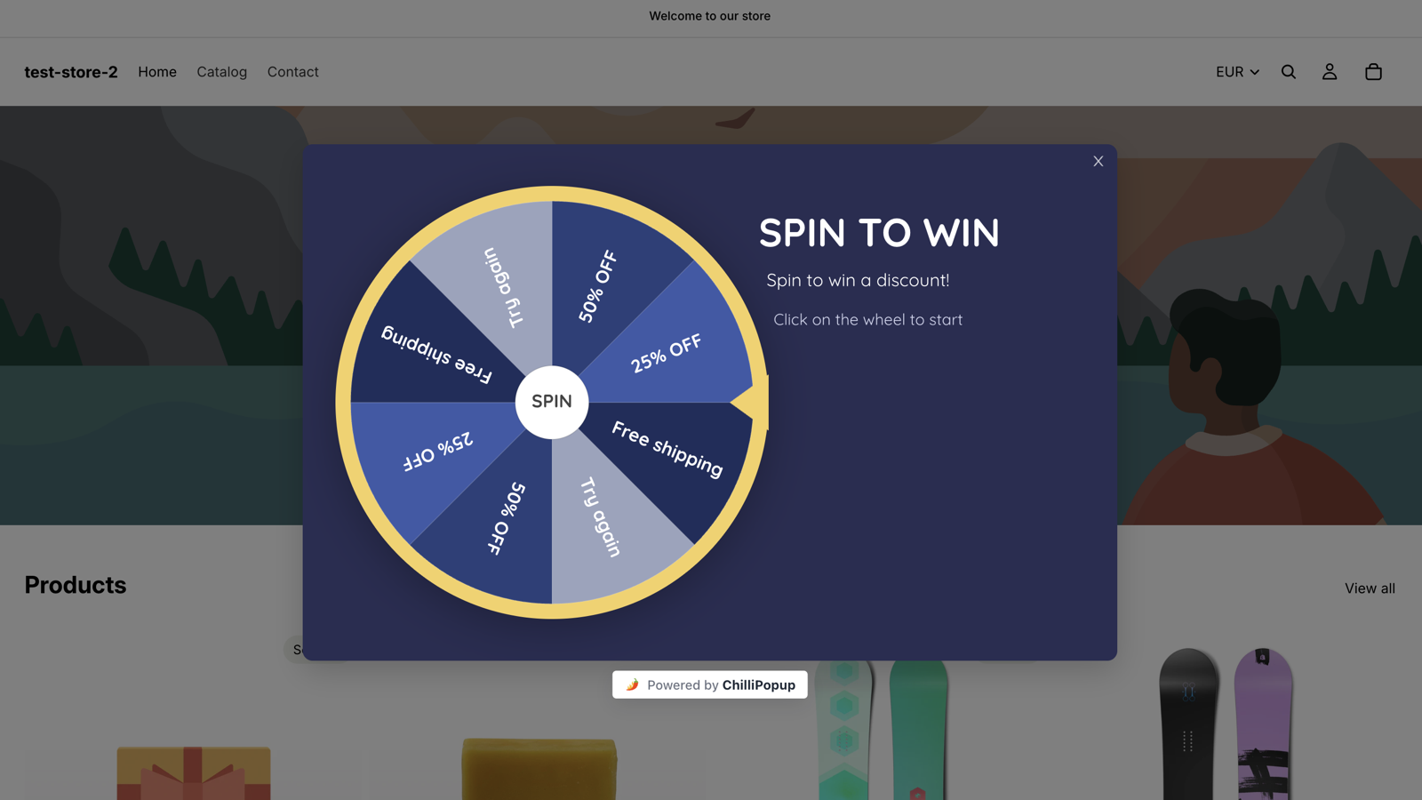
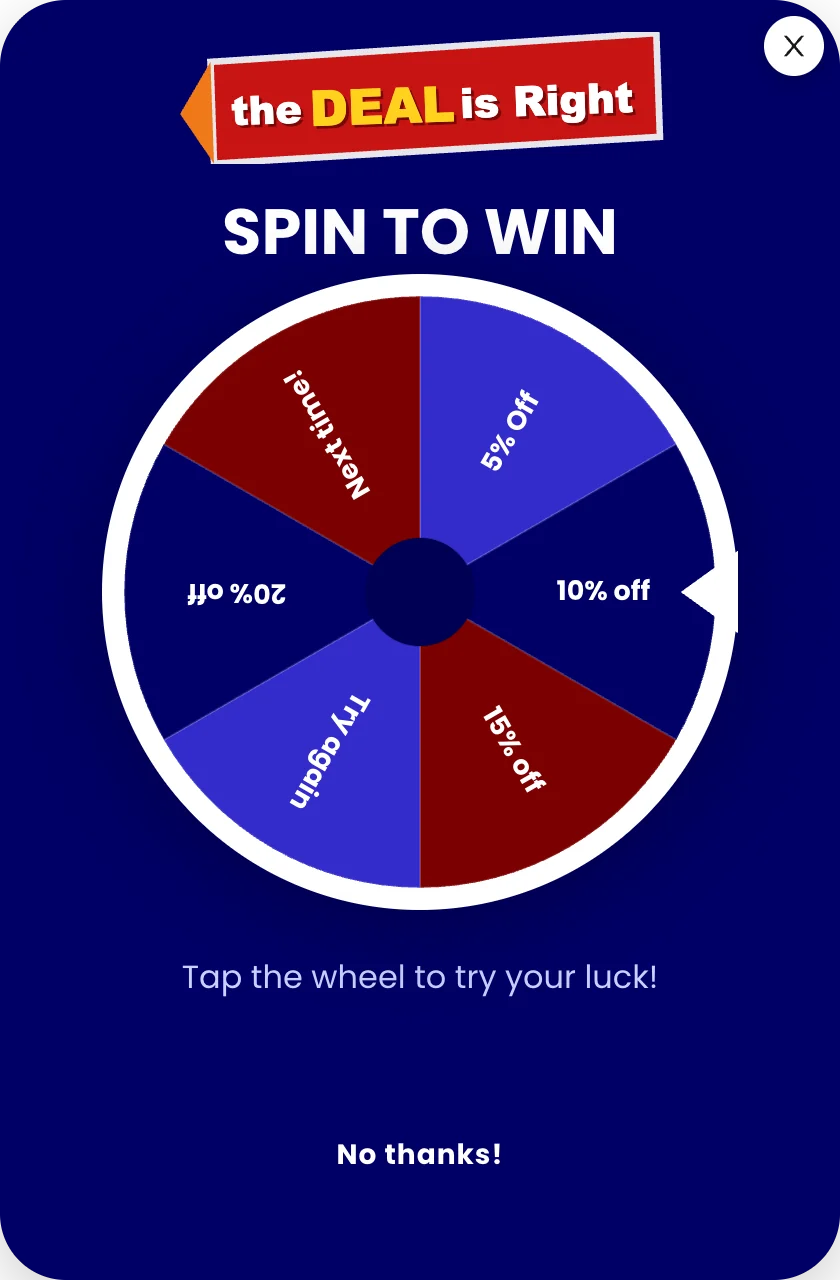
A spin to win popup shows a prize wheel instead of a signup form: the visitor spins, then hands over an email on the claim screen to find out what they won. It can outperform a plain discount box for one reason — the play is the reward, and the email arrives as the cost of collecting a prize rather than the price of entry.
That is also exactly where most wheels go wrong. Teams design the graphic first and the prize table last, ship a slice they cannot afford, and then quietly turn the whole thing off six weeks later because the discount bill got scary. This guide does it in the right order: economics, odds, screens, rules, copy, and the honest list of businesses that should not run one at all.
Key Takeaways
- The play is the reward. A wheel converts because spinning feels like winning something; a discount form feels like paying for something.
- Design the prize table before the wheel. Every slice must be a discount you could afford if every single player redeemed it.
- The email goes on the claim screen — after the spin, before the reveal. Asking first removes the only reason the game works.
- Odds are enforced server-side, so the split you configure is the split that runs and nothing in the browser can change it.
- Turn off "show again after conversion" and set a real cooldown, or the same visitor keeps meeting the wheel they already played.
What is a spin to win popup?
Spin to win, in two sentences
A spin to win popup is a website popup that shows a prize wheel instead of a plain signup form: the visitor clicks the wheel, it spins, and the prize is revealed once they fill in a short claim form. The wheel is not decoration — it is the offer, because the act of playing is what the visitor is being given.
Mechanically, a wheel is a popup with four screens instead of one:
- Play — the wheel itself, plus a headline and one line of instruction. In ChilliPopup the wheel is the button: the play screen says "Click on the wheel to start".
- Post-Play (the claim screen) — the spin has landed but the prize is still hidden. This is where the input fields live.
- Winning — the reveal. The prize, the code, the expiry, and a button back into the shop.
- Losing — shown only if a play can miss, and it replaces the claim screen rather than following it: a losing play jumps straight here, so no email is collected. Write it as carefully as the winning screen.
There is also an optional fifth screen, the Teaser — an extra screen you can switch on before the game, so the visitor meets a headline first and the wheel arrives a beat later. Most wheels do not need it: leave it off and the popup opens straight onto the Play screen.
Why a game beats a plain discount form
Put a wheel and a "Get 10% off" box side by side and they look like the same trade: an email for a discount. They are not, and the difference is entirely psychological.
The offer stops being a transaction
A discount form is a price tag on your inbox address. A wheel is a thing you do. The visitor performs an action, the outcome is uncertain for two seconds, and by the time the claim screen appears they have already invested effort — so filling in an email reads as collecting a prize, not paying for a coupon. That is the whole mechanic. Everything else in this guide exists to protect it.
You can offer a bigger headline number for less money
A flat "20% off" form costs you 20% of every order it converts. A wheel with a 50% slice at long odds shouts a bigger number in the headline while paying out an average that is far smaller. That is a legitimate advantage, and it is also the exact place a wheel becomes dishonest if you set odds you never intend to honour. More on that below.
It survives being seen twice
Nobody re-reads a signup form. People will replay a game, which is why a wheel pairs so well with a seasonal campaign — swap the prize table, keep the mechanic, and the same visitors engage again. If you are planning Black Friday popups, a wheel is one of the few formats that can carry the same traffic twice in one week without feeling stale.
The one-line test. If you removed the prize entirely and just let people spin for fun, would anyone spin? If yes, you have a game. If no, you have a discount form wearing a costume — and it will convert like one.
Design the prize table before you design the wheel
Open a text file, not the editor. Write down every slice, the code behind it, and the chance you want it to land. Then apply the only rule that matters:
Every slice must be something you can afford to honour if every single player lands on it. Odds are a budgeting tool, not a safety net. Codes get screenshotted and shared, and a slice you cannot pay for is a slice you should not draw — however unlikely it is.
Here are five prize tables that work, with example odds that add up to 100. Pick the row that matches your margins, not the one that looks most exciting.
| Prize table design | Example slices | Example odds | What it actually costs you | Best for |
|---|---|---|---|---|
| Everybody wins, tiered | 20% off · 15% off · 10% off · 5% off | 10 / 20 / 30 / 40 | Your floor discount on every claimed order, and a bit more on the lucky ones | Stores that already run a permanent welcome offer — the wheel just dresses it up |
| One headline prize | 50% off · 20% off · Free shipping · 10% off | 3 / 17 / 40 / 40 | A handful of very cheap orders, mostly small ones | Making the play feel genuinely worth it without a large average payout |
| No-discount prizes | Free shipping · Free gift with order · Early access · 10% off | 30 / 20 / 20 / 30 | Fulfilment and stock, not margin percentage | Thin-margin catalogues, and brands that refuse to train customers to wait for a sale |
| Two losing slices | 25% off · 10% off · Try again · Try again | 20 / 55 / 13 / 12 | The least money — and the fewest emails, because a losing play never reaches the claim screen | High-traffic sites that genuinely must ration codes. Needs a real consolation screen |
| Single-prize reveal (use a scratch card) |
One hidden prize, revealed by scratching | 100 | Exactly the prize you chose, every time | Brands that want the game mechanic without the carnival look of a wheel |
Do the worst-case arithmetic once
Made-up numbers, purely to show the shape of the sum: take the one headline prize row and assume 1,000 people spin in a month. The 50% slice lands 3 times in every 100 plays, so roughly 30 people walk away holding a half-price code. Ask yourself whether 30 half-price orders is a marketing cost or a problem. If it is a problem, the fix is not longer odds — it is a smaller headline prize, or a minimum order value attached to the code.
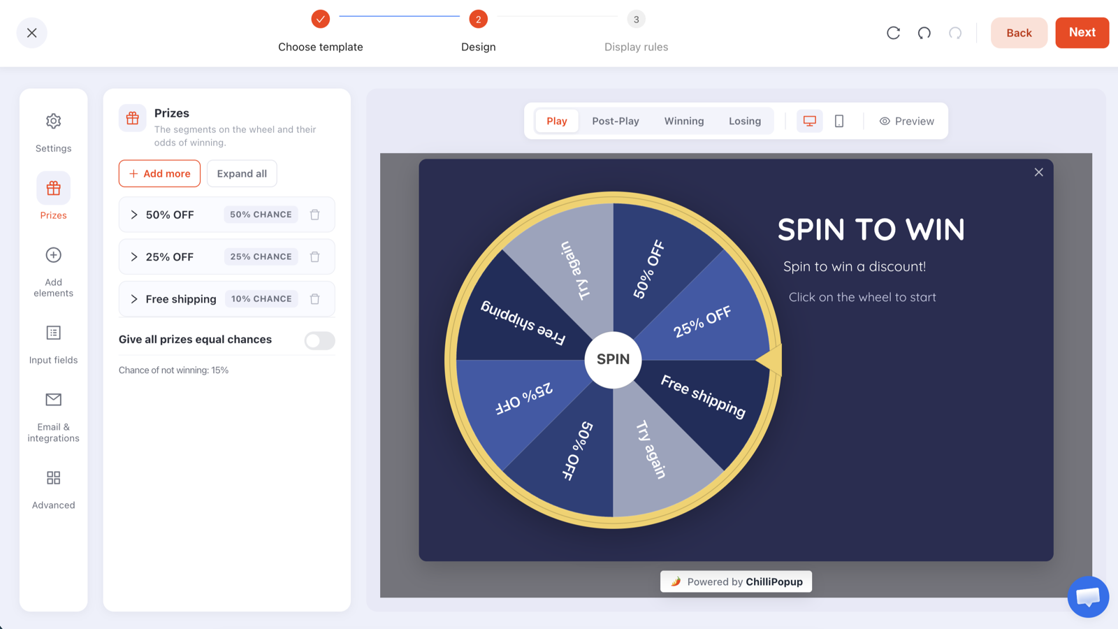
Each prize carries its own chance of winning. Whatever is left over after the slices add up becomes the chance of not winning — the editor keeps a running total so you can see it.
Odds, losing slices, and the fairness question
How the odds work
Every prize has its own chance of winning. If your chances add up to 100, every play lands on a real prize. If they add up to less — say 50 + 25 + 10 — the remaining 15% becomes the chance of not winning, and the editor shows you that number as you type. There is also a Give all prizes equal chances toggle if you want a flat split and no arithmetic.
Two habits worth adopting: make your odds add up to exactly 100 unless you deliberately want a losing outcome, and never set a slice below about 2–3%. Odds so long that almost nobody ever wins are the online equivalent of a fairground prize nobody has seen anyone take home.
Should there be a losing slice? The honest answer
A losing slice is a real trade, not a best practice. It buys cheaper economics and costs you goodwill at the precise moment a visitor was enjoying themselves — and it costs you the lead outright, because a losing play skips the claim screen and drops straight onto the losing screen. That visitor is never asked for an email at all.
Three positions, all defensible:
- No losing slice at all. Every slice is a real prize, with the smallest one set to the welcome discount you were going to give anyway. Simplest to write, kindest to the visitor, and the play screen can honestly promise "every slice is a real prize".
- A losing slice with a real consolation. The wheel can land on Try again, but the losing screen still gives something — a smaller code, free shipping, or early access to the next drop. You get the tension of a gamble and nobody leaves empty-handed.
- A genuine miss. Only defensible when the prizes are large enough that losing is obviously part of the deal, and only if you would be comfortable with a customer screenshotting the losing screen. Most stores should not do this.
Never let a losing screen be blank. The single most common wheel mistake is a losing screen that reads "Better luck next time" with no offer and no next step. The visitor played, lost, and was never even asked for an email — you got nothing and gave nothing, and that dead end is the interaction people remember. Put a consolation code and a button back into the shop on it.
The odds are enforced on the server, not in the browser
This is the part that makes a wheel trustworthy in both directions. In ChilliPopup the winning slice is decided server-side — the browser asks which prize this play landed on and animates the wheel to match. Nothing in the page decides the outcome, so the odds you configured are the odds that actually run, and a visitor poking at the page cannot force a 50% slice.
Be clear about the limit of that guarantee, though. What is protected is the outcome. Whether the same person can play twice is a display-rule question, and display rules live in the visitor's own browser storage — so a private window looks like a brand-new visitor. If a code being used a handful of extra times would hurt, set a usage limit on the code inside your ecommerce platform. That is the real enforcement layer, and it is one line of configuration.
Where the email ask goes — and why it goes there
On the claim screen. After the spin. Before the reveal. That sequence is load-bearing:
- The visitor clicks the wheel and it spins. No form, no friction, no cost.
- The wheel stops. The claim screen appears — the prize is decided but still hidden.
- They enter their email. Submitting is what reveals the prize.
- The winning screen shows what they got, the code, and the expiry.
Move the email ask in front of the wheel and you have rebuilt the plain discount form, with an extra animation. Move it after the reveal and there is no reason left to fill it in. The claim screen is the one place where the visitor has already invested effort and still wants something from you.
One consequence to plan for: that sequence only runs on a win. A losing play goes from the wheel straight to the losing screen, so the claim form never appears and no email is captured. Every losing slice you draw is a slice of your traffic that plays and leaves no address behind — which is the strongest argument for a wheel where every slice is a real prize.
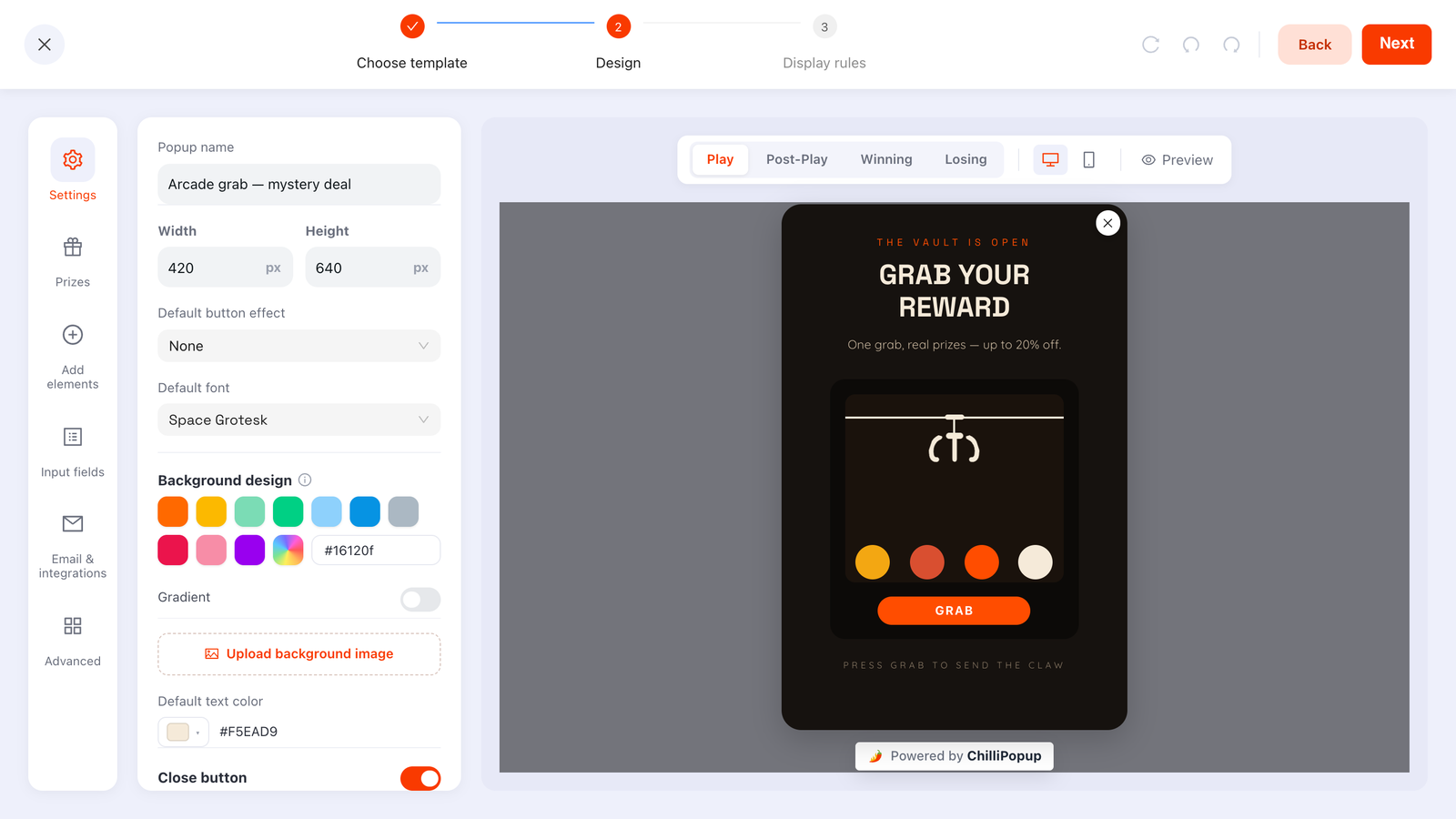
Every game has the same four screens — Play, Post-Play, Winning, Losing — and each one is edited independently. The Input fields panel is where the claim form lives.
Ask for one field, maybe two
Email, and stop. A phone number on a claim screen is where a beautifully performing wheel goes to die — it reads as a second price after the visitor thought they had already paid. If you sell to businesses you can switch email validation to accept only business emails, or to check format and prevent typos so a mistyped address does not silently swallow the prize.
If you genuinely need a second field — a birthday month, a size, a shopping category — the claim screen of a game is one of the few places a visitor will hand it over without complaint, because they are claiming a win rather than filling in a form. That is the same logic behind progressive profiling popups: expensive fields belong after delivered value, never before it. Keep it to two fields total, and mark the second one optional.
The display rules a spin to win popup needs
A wheel is a big, loud interruption. The rules matter more here than on a small newsletter bar. These are the settings to start from — every enabled rule is an AND gate, so add them deliberately.
- Trigger. On desktop, exit intent — the wheel is the last offer before they leave. On mobile, where exit intent is unreliable, use a time delay of about 8 seconds or a page scroll of 40%, so the visitor has seen a product before the game arrives. Every trigger you switch on is armed at the same time and the first one to fire wins the race — which is why an exit-intent-plus-time-delay pair covers touch devices too, as long as the delay is long enough that it does not beat exit intent on desktop.
- Page targeting. Add two URL rules: does not contain
/cartand does not contain/checkout. Interrupting someone mid-payment with a discount wheel is the single most expensive popup mistake there is. - Audience. New visitors if the wheel is your welcome offer, so you are not discounting orders from people who were already going to buy. Everyone for a seasonal campaign.
- Frequency. Once every 7 days. Not every visit, and definitely not all pages all the time.
- Show again after conversion — off. The most important switch on the page. With it off, anyone who submitted the claim form stops seeing that wheel entirely. Note the scope: it is per campaign, so it suppresses this wheel for someone who played this wheel — it does not know about your other popups.
- Date window. Set a start and end date on any seasonal wheel the day you build it. A Black Friday wheel still spinning in January is a very public way to look asleep at the wheel.
- Device and schedule. Wheels are large. Check the mobile preview before publishing, and if the layout only really works on desktop, target desktop rather than shipping something cramped.
Bonus rule: the direct link. Every campaign gives you a copyable on-click link — your own page address with the campaign's id on the end — that opens the wheel the moment someone lands. Put it behind a "Spin the wheel" button in an email or a social post and you get a game-driven campaign without building anything new; the pixel you already installed does the work.
Spin to win copy you can paste
Here is a full worked set for a mid-market apparel store running the one headline prize table (50% at 3, 20% at 17, free shipping at 40, 10% at 40). Copy it, swap the numbers, ship it.
Play screen
- Headline: One spin. Real prizes.
- Subhead: Every slice is a genuine discount — there is nothing to lose.
- Instruction: Click the wheel to spin
- Decline link: No thanks, I will pay full price
Claim screen (Post-Play)
- Headline: Your prize is locked in.
- Subhead: Enter your email and we will show you what you won.
- Field placeholder: you@email.com
- Button: REVEAL MY PRIZE
- Small print: One prize per customer. We will send you the odd good email — unsubscribe any time.
Winning screen
- Headline: Free shipping is yours 🎉
- Code line: Use code SPINSHIP at checkout
- Expiry: Valid for 7 days. One use per customer.
- Button: START SHOPPING
Losing screen (only if you use a losing slice)
- Headline: The wheel said no. We are overruling it.
- Body: Have 10% off anyway, for turning up. Code SPIN10, valid 7 days.
- Button: TAKE THE 10%
Three things that copy is doing deliberately. The play screen makes an honest promise it can keep (every slice is genuine is only allowed if the odds add to 100). The claim screen names the reward for submitting — reveal, not subscribe. And the losing screen refuses to end on a loss. If you want the reasoning behind lines like these, the popup copywriting guide goes deeper on headline structure and button verbs.
Do not write a prize you have not created. Before publishing, create every code in your ecommerce platform, with its expiry and usage limit set, and paste the exact code string into the matching prize. A wheel that hands out a code the checkout rejects converts once and costs you a customer.
Honouring the prize: codes, expiry and what happens next
One code per prize, controlled at the checkout
A slice hands out one fixed code — you write it once, and everyone who lands on that slice sees the same string. That is fine as long as the control lives where it belongs: set a usage limit, a minimum order value and an expiry date on the discount inside your store platform. Those limits are what stop a screenshotted code becoming a public coupon.
Put an expiry on the screen, not just in the fine print
"Valid for 7 days" on the winning screen does two jobs: it creates a real reason to shop now, and it caps your exposure. Seven days is the sweet spot for a discount — long enough to sleep on, short enough to matter.
The follow-up email comes from your email tool
Worth being straight about: ChilliPopup does not send email. The prize and the code appear on the winning screen, which is where most people will use them — but if you want the code to land in their inbox as well, that email is sent by whatever email tool you already use. Claims show up in the dashboard under Collected input data, alongside a Collected fields breakdown of the top values per field, and you move them across from there.
If you would rather not do that by hand, the pixel fires a browser event on every submit, so you can pass the claim straight into whatever tooling you already run on the page:
window.addEventListener('chillipopup:submit', function (e) {
  // e.detail = { popupUuid: '…', data: { email: 'jo@example.com',
  //                                      prize: 'Free shipping', prize_code: 'SPINSHIP' } }
  if (e.detail.popupUuid !== 'YOUR_WHEEL_UUID') return;

  // Hand the claim to your own analytics, helpdesk or logging endpoint
  console.log('Wheel claim:', e.detail.data.email);
});
Forms, surveys and quizzes fire their own equivalents — chillipopup:form_submit,
chillipopup:survey_submit and chillipopup:quiz_submit — each carrying its own id key.
And window.ChilliPopup.open(uuid) lets any button on your site launch the wheel; call
close() first, because open() is a forced open and overlays will otherwise stack.
Same mechanic, four different skins
The wheel is the famous one, but it is one of four games that share the same engine: server-decided odds, configurable prizes, and a claim screen that reveals the prize on submit. Choosing between them is a question of tone, not capability.
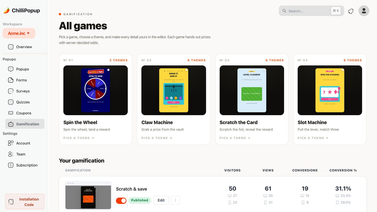
Four games, one mechanic. Each ships with hand-tuned themes — the same engine with a different typographic and colour persona — and every detail stays editable.
- Spin the wheel — the loudest and most recognisable. Shows the whole prize table at once, which is exactly what you want when the prizes are generous and exactly what you do not want when they are modest.
- Scratch the card — quiet, tactile, and the best fit for a single-prize reveal. It hides the prize table entirely, so 10% off feels like a discovery rather than a disappointment. The most brand-safe of the four.
- Slot machine — pure arcade. Strong for a younger audience and for anything with a seasonal or nightlife feel; the worst fit for anything that wants to look considered.
- Claw machine — the most novel, and the one people actually stop to look at. Good when the prizes are physical items or a mystery gift rather than percentages.
If the wheel feels too loud for your catalogue, do not abandon the mechanic — change the skin. A scratch card with an identical prize table often converts as well and looks nothing like a discount carnival. You can see all four side by side on the gamification page.
When a spin to win popup is the wrong choice
A wheel announces one thing before it announces anything else: our prices are negotiable. For plenty of stores that is already true and the wheel just makes it fun. For these, it is a mistake:
- Luxury and premium positioning. If part of what you sell is the price holding, a wheel undoes it in one interaction — and the customers who paid full price last month will notice. Use a waiting-list or early-access popup instead: same email capture, opposite signal.
- B2B and considered purchases. The person spinning is rarely the person with the budget, and a slot machine on a procurement-led site reads as unserious. A one-question quiz or a short survey earns the same email while telling you something useful about the account.
- Regulated or sensitive categories. Chance-based promotions carry real legal obligations in many countries — published rules, eligibility, sometimes registration — and alcohol, finance, health and gambling-adjacent categories have their own restrictions on top. Get sign-off before you publish, not after.
- Margins that cannot take it. If your smallest affordable discount is 5%, a wheel is a very elaborate way to give away 5%. A plain, well-written offer is cheaper to build and easier to defend.
- Mostly returning customers. A wheel shown to people who were already going to buy is a discount on revenue you had. Target new visitors, or skip it.
And if the honest answer is that you just want more subscribers without a discount at all, a wheel is the wrong tool for a different reason — read how to build an email list for the non-discount offers that work.
Build your spin to win popup in ChilliPopup
About forty minutes end to end, no code. If the pixel is not on your site yet, start with the one-line install guide — the same script serves every popup, form, survey, quiz and game, so there is nothing extra to embed for the wheel.
1. Write the prize table on paper first
Every slice, its code, its odds. Check two things before you go near the editor: the odds add up to 100 (unless you want a losing outcome), and you could pay the bill if every player landed on your most expensive slice. Create the codes in your store platform now, with expiry and usage limits set.
2. Pick the game, pick a theme, enter the prizes
Open Gamification → All games, choose Spin the Wheel (or the scratch card if the wheel is too loud for you), and pick a theme. Then open the Prizes panel, add a slice per prize and set each one's chance of winning. Watch the chance-of-not-winning number as you type — it is your arithmetic check.
3. Write the four screens, put the email on the claim screen
Fill in Play, Post-Play, Winning and Losing using the sample copy above. Add the email field from the Input fields panel on the claim screen only, mark it required, and turn on typo checking. Leave the teaser off unless you actually want a lead-in screen before the wheel. Then check the mobile preview — that is where wheels break.
4. Rule it so nobody meets the wheel twice
Exit intent on desktop, 8 seconds or 40% scroll on mobile. Exclude /cart and
/checkout with does not contain rules. Switch the frequency rule on — the audience and
conversion controls only appear once it is — set it to once every 7 days, pick your audience, and
turn off "show again after conversion". Add a date window if it is seasonal. Publish.
5. Read the numbers in two weeks, change one thing
The analytics page gives you views, unique views, clicks, submissions, conversion and field inputs, plus an interactions-over-time chart and a shows-by-device split. Read it next to the redemption you can see in your store — claims and redemptions are different numbers and only one of them costs money. Then change a single thing: one slice, or one line of copy. Not both, or you will never know which moved it.

Opens, unique views, submissions and conversion for the wheel. Conversion is submissions divided by views, so compare a wheel against itself over time rather than against a different campaign.
Try the four games live
Each card is a game's starter theme, exactly as it ships in the editor. Press Try it live and the real game opens over this page: played in your browser, decided on our servers, the same way it runs on your site.
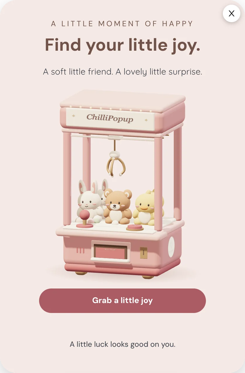
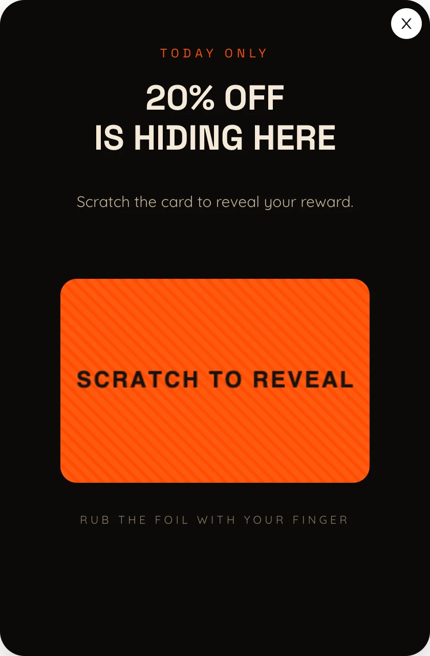
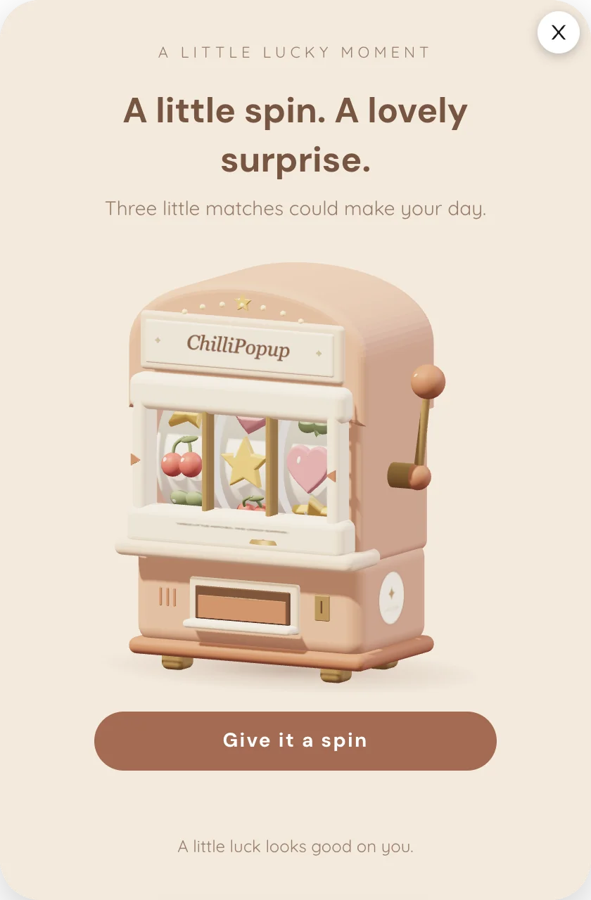
The prizes you can win here are demo codes. On your site you set the prizes, the odds and every screen.
Build a wheel worth spinning
Spin wheels, scratch cards, slot and claw machines — plus popups, forms, surveys and quizzes, all from one editor and one pixel. Free plan, no credit card required. Paid plans from $29/month.
Start free →Related reading
Frequently asked questions
What is a spin to win popup?
A spin to win popup is a website popup that shows a prize wheel instead of a plain signup form. The visitor clicks the wheel, it spins, and the prize is revealed after they fill in a short claim form — usually just an email address. The game is what earns the email: playing feels like something you get, while a discount form feels like something you pay.
Should a spin to win wheel have a losing slice?
Only if you cannot afford to reward every play. A losing slice buys you cheaper economics and costs you both goodwill and the lead, because a losing play skips the claim screen and goes straight to the losing screen — so that visitor is never asked for an email at all. If you do use one, write a real consolation on the losing screen — a smaller code, free shipping, or early access — so nobody walks away with nothing.
Where should the email field go on a spin to win popup?
On the claim screen, after the spin, never before it. In ChilliPopup the screens run Play, then Post-Play or claim, then Winning or Losing. The visitor plays first, the claim form collects the details, and submitting it is what reveals the prize. Asking for an email before the wheel turns removes the only reason the game works.
Can someone rig a spin to win wheel from their browser?
Not the outcome. ChilliPopup decides which prize you land on server-side, so the odds you configured are the odds that run, and nothing in the page can change them. What a determined visitor can still do is come back in a private window and play again, because show-again rules are stored in their own browser. Set usage limits on the codes themselves and you are covered.
How often should the same visitor see the spin to win popup?
Once, then not again for at least a week. Turn off show again after conversion so anyone who already claimed a prize stops seeing the wheel, and set the frequency to once every seven days for everyone else. A wheel that reappears on every page view stops reading as a treat and starts reading as an obstacle.
Do spin to win popups cheapen a brand?
They can, and it depends entirely on the catalogue. A wheel signals that your prices are negotiable, which is fine for a mid-market store running a welcome offer anyway and wrong for luxury, professional services or anything sold on scarcity. If discounting is already part of how you sell, a wheel is a better wrapper for it. If it is not, use a survey or a quiz to earn the email instead.