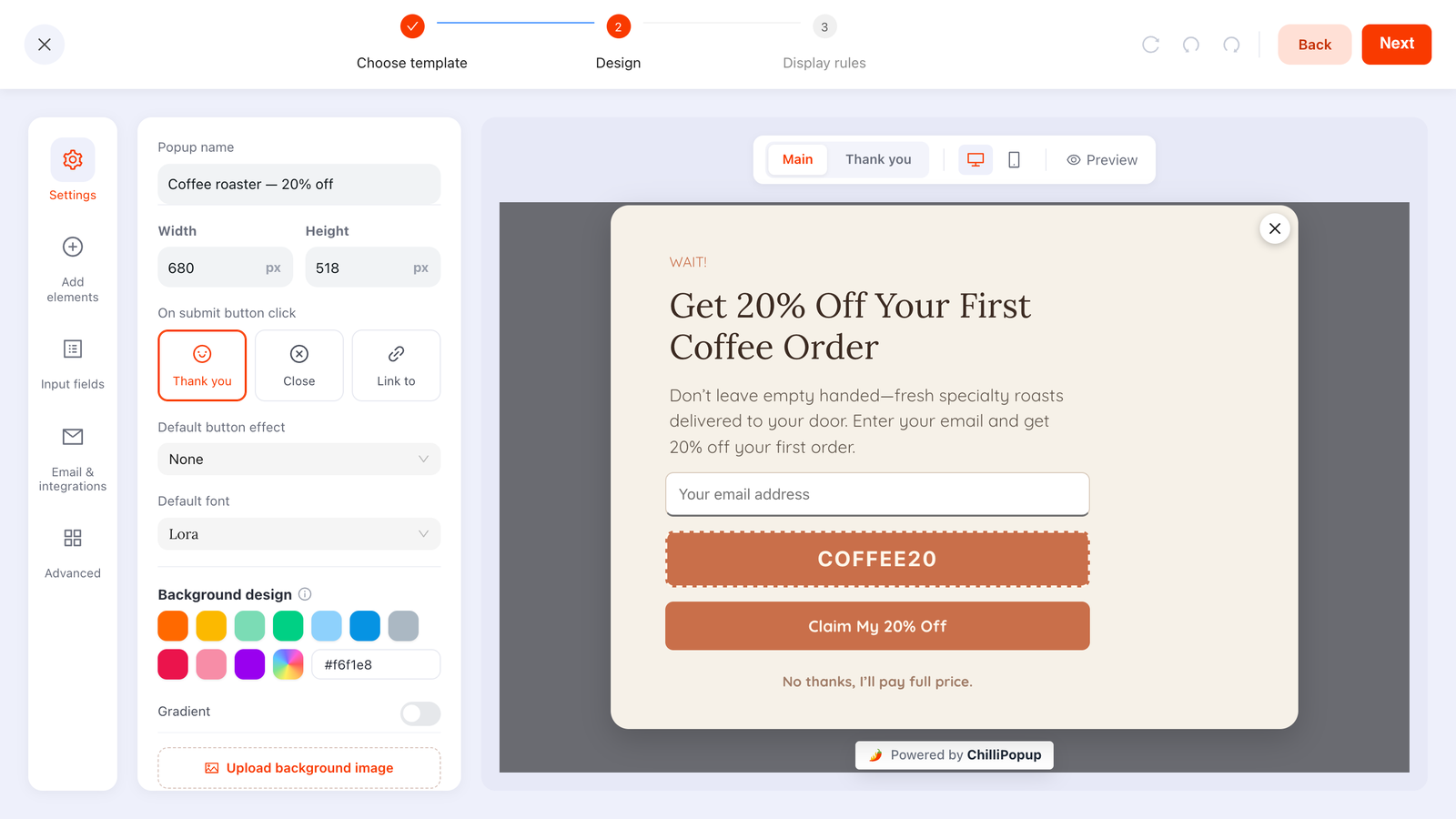
Exit intent popups appear when a visitor is about to leave the page. The trigger watches the mouse pointer, and fires the moment it crosses the top edge of the browser window — the direction you move in when you are reaching for the tab bar, the address bar or the close button. It is a cursor signal, which makes it a desktop signal. On a phone there is no cursor, so it never fires at all.
That explains most of what people get wrong about exit intent: they run it as their only campaign, watch it perform beautifully in the desktop preview, then wonder why most of their traffic never saw anything. This guide covers what the trigger really catches, what to put in one, the rules to pair it with, what to run on mobile instead, and how to tell whether it worked.
Key Takeaways
- Exit intent tracks a cursor leaving through the top of the window. Not the sides, not the bottom, and not a tab switch or a keyboard close.
- It is a desktop-only trigger. Touch devices have no pointer. Use page scroll, a time delay or inactivity on mobile — same offer, different trigger.
- The leaving moment is the cheapest moment to interrupt. Nothing the visitor still wanted to read is being covered up.
- One promise, one field, one button. An exit popup is an impulse decision; a second field is a second decision.
- Frequency and the conversion gate do the real work. Turn off "show again after conversion" or your subscribers will keep meeting the signup popup forever.
What an exit intent popup actually detects
Exit intent, precisely
The player listens for the pointer leaving the document, and checks whether it left through the top of the viewport — vertical position at or above zero. If it did, the popup opens. That is the whole mechanism. It is a heuristic about where a mouse is heading, not a prediction engine, and there is nothing clever underneath it.
What it catches is narrow: a cursor sliding up toward the tab strip, the back button or the window's close control, plus the occasional harmless false positive from someone reaching for their bookmarks bar or a second monitor placed above the first.
What it misses matters more:
- Every touch device. No pointer, no event, no popup. Ever.
- Keyboard closes.
Cmd/Ctrl + WandAlt + Tableave no pointer trail. - The back button, if it is clicked without the cursor first crossing the top edge — and on many layouts it is nowhere near the top edge.
- The visitor who simply stops. Someone who reads two lines, loses interest and sits there is leaving in every sense that matters, and exit intent has no idea.
- Exits through the sides or the bottom of the window — dragging to a second screen on the right, or down to the dock or taskbar.
There is no "wait a few seconds first" setting on the exit trigger. It is armed from page load, so a visitor who lands and immediately moves the mouse up to the tab bar gets the popup within a second. If a minimum dwell time matters to you, do not try to combine two triggers on one campaign — when several triggers are enabled, whichever fires first wins, so adding a 20-second delay just means the popup often opens on the timer instead. Either accept the fast exit, or run a time delay campaign and leave exit intent off.
Why the leaving moment converts
Every popup is an interruption, and the cost of an interruption depends on what it interrupts. A popup three seconds into a page covers the paragraph the visitor came for. A popup that lands as they head for the tab bar covers nothing — the session was over anyway. Three things follow from that:
- The attention cost is close to zero. You are not competing with the content; you are the last thing on screen.
- The visitor has context. They have seen the product, the price, the article. The offer lands on someone who understands it — unlike the popup that fires before they have read a word.
- You already lost them. The alternative outcome for an exit popup is a bounce, so any conversion it produces is genuinely incremental in a way a homepage-on-load popup's is not.
The flip side: you get exactly one shot and no build-up. Nobody reads an exit popup twice. That is why the copy rules below are stricter than for any other trigger, and why the offer has to be legible in about two seconds.
Exit intent vs time delay vs scroll depth vs page count
Exit intent is one of six automatic triggers, and picking the wrong one is the most common reason a well-designed popup underperforms. Here is what each one actually sees.
| Trigger | What it catches | What it misses | Fires on mobile? | Best used on |
|---|---|---|---|---|
| Exit intent | A desktop cursor crossing the top edge of the window | All touch devices, keyboard closes, tab switches, side and bottom exits, silent disengagement | No | Product, cart and pricing pages on desktop |
| Time delay (N seconds) |
Anyone still on the page after N seconds, counted from page load | Engagement. Twenty seconds of reading and twenty seconds of an abandoned tab look identical | Yes | Single-screen landing pages and anywhere there is nothing to scroll |
| Page scroll (N% of the page) |
People who are actually consuming the page, measured against its scrollable height | Pages too short to scroll — no scroll, no event, no popup. Also misses skimmers who jump straight to the footer | Yes | Blog posts, long product pages, the mobile stand-in for exit intent |
| Page count (N pages) |
Session depth — the Nth page viewed in the same browser session, current page included | Single-page visits, and it resets when the session does (new browser, restored tab, some private modes) | Yes | Category browsing, returning-visitor asks, second-rung questions |
Two more exist and are worth knowing: clicks count fires after N clicks anywhere on the page, which is a decent proxy for "this person is engaged but not finding it", and inactivity fires after N seconds with no mouse move, key press, scroll or touch. Inactivity is the closest thing to exit intent that works on a phone, because a finger that stops moving is a real signal.
Do not stack triggers on one campaign hoping for an AND. Enabling exit intent and a 30-second delay does not mean "after 30 seconds, on exit". It means whichever happens first opens the popup. If you want two behaviours, build two campaigns and separate them with device or page targeting.
What to offer on an exit intent popup
The offer has to do two things: answer the reason they were leaving, and be deliverable on the spot. The second half is where most exit popups quietly fail — a promise that arrives in an email tomorrow is not an answer to someone whose cursor is already on the close button.
| Where they are leaving from | Why they are probably leaving | Offer that fits | Sample headline you can paste |
|---|---|---|---|
| Product page | Price hesitation, or not sure it is the right one | First-order discount, or a sizing / fit answer | "Before you go — 15% off this one, code on the next screen." |
| Cart | Shipping cost, or they want to think about it | Free shipping threshold, or save the cart by email | "Your cart is saved. Want free shipping to finish it today?" |
| Blog post | Done reading, nothing else pulled them in | The next post, a checklist, a short list signup | "Liked this one? Get the next one Thursday." |
| Pricing page | Cannot tell which plan they need | A comparison, or one qualifying question | "Not sure which plan? Answer one question and we'll tell you." |
| Category page | Too many options, no filter that helped | A one-question quiz that narrows the range | "Too much choice? Tell us one thing and we'll narrow it down." |
Notice that only two of those five are discounts. A discount is the default exit offer because it is easy, but it is also the one that trains people to trigger the popup on purpose and costs you margin on buyers who were going to convert anyway. If you want a broader look at what other kinds of offers look like in practice, our roundup of website popup examples shows the patterns side by side.
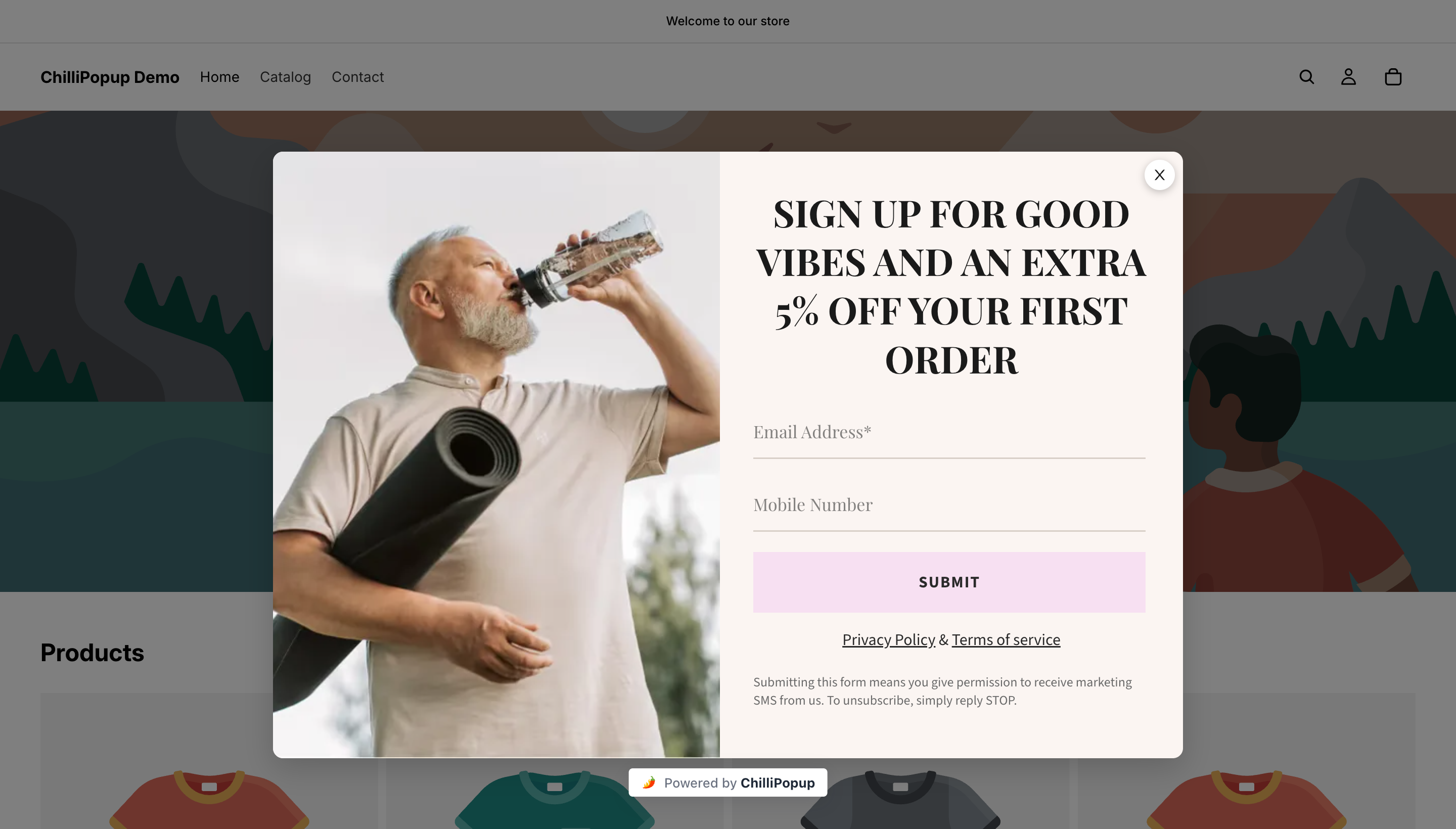
A live overlay on a real storefront. Note the second field: a mobile number is a much bigger ask than an email address, and on an exit popup it is usually the thing to cut.
When a plain discount is not enough
If your exit popup has plateaued, changing the mechanism often does more than changing the number. A prize game turns the same discount into something the visitor plays for: they spin, scratch or drop, the claim screen collects their email, and submitting it is what reveals the prize. The outcome is decided server-side so it cannot be rigged from the browser, and you set the odds per prize. Our spin to win popup guide covers the prize table and the failure modes in detail.
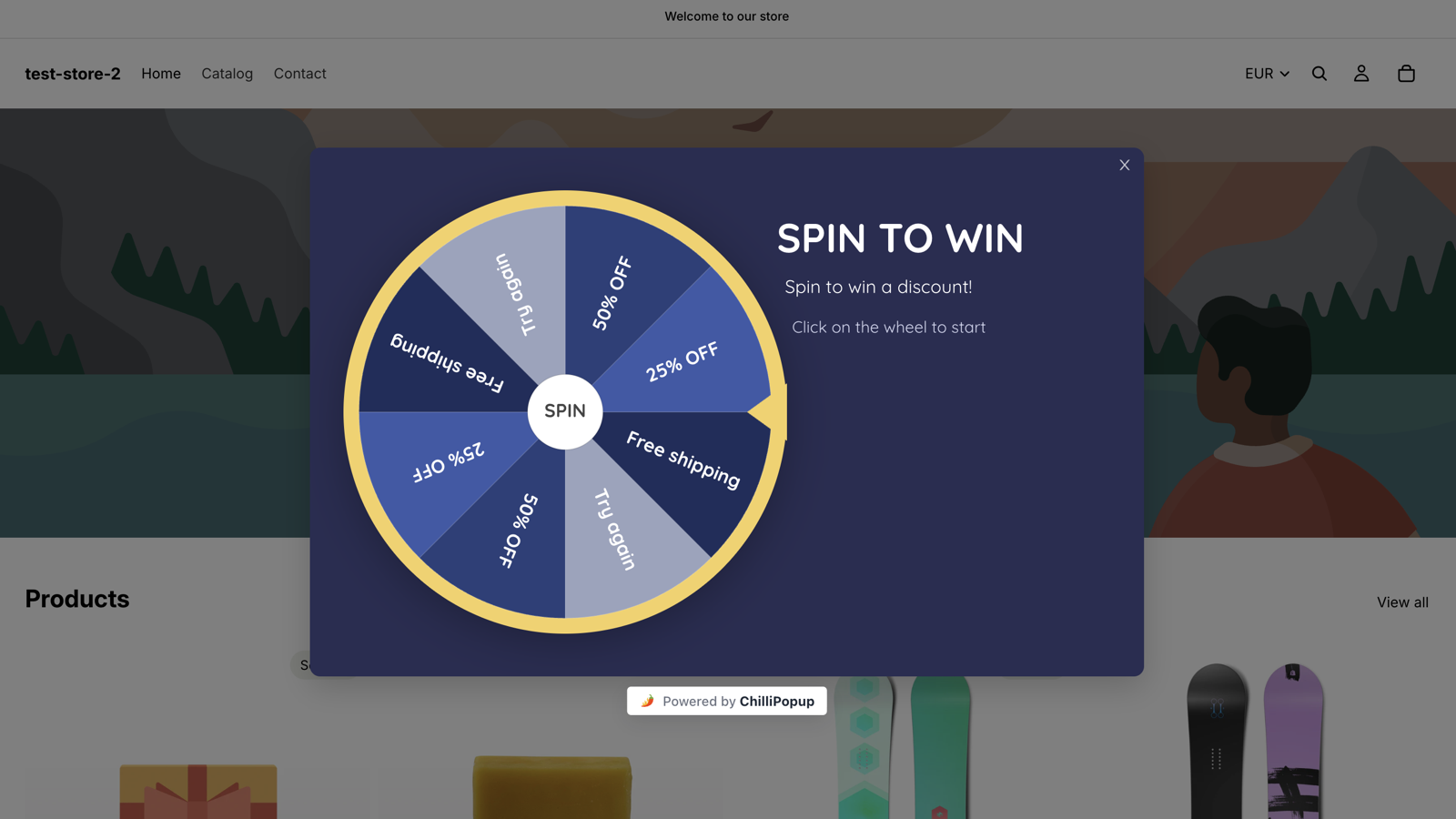
The same discount, delivered as a game. Losing segments are part of the design — they are what make the winning ones feel earned.
How to write an exit intent popup
You have roughly two seconds and one screen. Five rules cover almost everything:
- Put the offer in the headline. Not the brand, not "Don't go!", not a question. The headline is the offer, in plain words, with the number in it.
- One field. Email is nearly free once someone has decided to convert. A phone number, a name and a dropdown are three more decisions on a screen that has no time for any. If you genuinely need more, collect it later — that is exactly what progressive profiling is for.
- Label the button with what they get. "Claim my 20% off" beats "Submit" every time, because the button is the last thing they read before deciding.
- Give them a visible way out. A real close button plus a text decline link. It sounds counterproductive; it is the difference between a dismissal and a bad impression.
- Deliver on the thank-you screen. Show the code right there, not "check your inbox".
A worked example, line by line
Here is a complete exit popup for a coffee store's product pages. Every line is paste-ready:
Eyebrow: WAIT!
Headline: Get 20% off your first coffee order
Body: Don't leave empty handed — fresh roasts, delivered to your door. Enter your email and your code appears on the next screen.
Field: Email · placeholder you@example.com · Required on · underline
variant · validation set to "check format & prevent typos"
Button: Claim my 20% off
Decline link: No thanks, I'll pay full price.
Thank-you screen: Here's your code: COFFEE20. Use it at checkout in the
next 7 days.
Three things to note. The eyebrow does the "you are leaving" work so the headline does not have to waste words on it. The decline link is written in the visitor's voice, which makes dismissing feel like a choice rather than a defeat. And the code is on the thank-you screen because ChilliPopup does not send email — the welcome message comes from your own email tool, later, from the addresses you collect. If you want to go deeper on the wording itself, the popup copywriting guide breaks down headline and button patterns.

The Design step. The Main and Thank you tabs above the preview are two separate screens — and the little monitor and phone icons next to them let you check both layouts before you publish.
Write the mobile layout too, even though exit intent will never fire there. The same content gets reused by your mobile campaign, and a headline that fits in two lines on a desktop card can run to five on a phone. Check the phone preview before publishing.
The display rules to pair with exit intent
The trigger decides when. Everything that decides who, where and how often lives in the display rules, and this is where an exit popup either behaves or becomes the thing people complain about.
- Device: desktop. Set it explicitly. The trigger cannot fire on a phone anyway, but being explicit keeps the campaign honest and makes the analytics readable. (The player treats a viewport of 768px or narrower as mobile.)
- Page targeting. Six URL operators — contains, does not contain,
is exactly, is not, starts with, ends with. Use one rule to include
(
contains /products/) and one to exclude (does not contain /checkout). Every enabled rule is an AND gate. - Audience. Everyone, new visitors or returning visitors, where you define "new" and "returning" in days — 30 by default. A first-order discount belongs to new visitors.
- Frequency. Once a day, every visit, every session, once every N days, once every N visits, or all pages all the time. Once every 7 days is the sane default for an exit offer: a dismissal is remembered for a week rather than repeated on the next page.
- Show again after conversion — turn it OFF. This is the single most important switch on the screen. With it off, anyone who submitted that campaign stops seeing it. Leave it on and your own subscribers meet the signup popup forever.
- Schedule and date window. A weekday-and-hour schedule and a start/end date, for offers that expire.
Two honest limits. The conversion gate is per campaign — it suppresses that popup for someone who submitted that popup. There is no rule that says "hide this from anyone who filled in a different campaign". And new-versus-returning recognition is computed from the visitor's own browser storage, so a second device, a cleared cache or a private window all look like a brand new visitor.
Mobile: what to run instead of exit intent
This is the section most exit intent guides skip. If a large share of your traffic is on phones — and for most stores it is — an exit intent campaign on its own reaches only part of your audience. The fix is not a cleverer trigger. It is a second campaign.
Build a duplicate of your exit popup, set device targeting to mobile, and swap the trigger:
- Page scroll at 50–60%. The best all-round substitute. Someone who has scrolled past halfway has consumed the page, which is the same "I am nearly done here" state exit intent is guessing at. On short pages that do not scroll, no scroll event fires and the popup never opens — use a time delay there instead.
- Time delay of 20–30 seconds. Blunt but reliable. It is counted from page load, always, so treat it as "seconds on this page", not "seconds in the visit".
- Inactivity of 30–45 seconds. The closest mobile analogue to exit intent: no scroll, no tap, no touch means attention has gone somewhere else.
- Page count of 3. Good for stores, where browsing three products is a real intent signal. It counts pages within the browser session, including the current one.
If you want a true mobile exit signal, script it
There is no built-in "mobile exit" trigger. The closest usable proxy is a fast upward scroll — the flick back to the top that usually precedes a tab close — and you can wire that up yourself with the JS API in about twenty lines:
(function () {
  // Read the flag first, so it also guards the next page in the same session.
  var fired = false;
  try { fired = sessionStorage.getItem('exit_shown') === '1'; } catch (e) {}
  if (fired) { return; }

  var last = window.pageYOffset;
  window.addEventListener('scroll', function () {
    var y = window.pageYOffset;
    // jumped up by 400px or more, and we are near the top again
    if (!fired && last - y > 400 && y < 200) {
      if (!window.ChilliPopup) { return; }   // pixel not ready yet
      fired = true;
      try { sessionStorage.setItem('exit_shown', '1'); } catch (e) {}
      window.ChilliPopup.close();            // never stack overlays
      window.ChilliPopup.open('YOUR_POPUP_UUID');
    }
    last = y;
  }, { passive: true });
})();
Guard it yourself. open() is a forced open: it bypasses the campaign's
triggers and its once-per-session guard, and it stacks overlays if one is already showing. Call
window.ChilliPopup.close() first, keep your own "already shown" flag (the
sessionStorage line above), and set that campaign's trigger to the JavaScript option so it
does not also open on its own.
When an exit intent popup is the wrong tool
Four situations where the right move is to not run one:
- Checkout and payment pages. A visitor moving their cursor toward the top on a payment page might be checking the padlock icon, not leaving. Interrupting a purchase in progress is the one place a popup can cost you the sale it was meant to save. Exclude those URLs explicitly.
- Mobile-dominant traffic with no companion campaign. If most of your visitors are on phones and you only build the exit version, you have built a campaign for the minority. Build the mobile one first, then add exit intent for desktop.
- Support and documentation pages. Someone trying to solve a problem does not want 10% off. If you want something from them here, ask a one-question survey about whether the page helped.
- When you have nothing to offer. An exit popup with no offer is a goodbye message with a form attached. Fix the offer before you fix the trigger.
There is a timing case too: a one-weekend sale rarely justifies building an exit popup from scratch, because by the time you have enough data to judge it the campaign is over. Build the exit popup once, keep it running, and change the offer inside it when the season changes.
How to tell whether it worked
Every popup gets its own analytics page: Views, Unique views, Clicks, Submissions, Conversion and Field inputs, an interactions-over-time chart, an event breakdown, a shows-by-device split, a Collected fields breakdown of the top values per field, and a Collected input data table of the raw submissions.

Views, unique views, clicks, submissions and conversion in one row — and a shows-by-device split that will tell you immediately whether your exit campaign is behaving.
Four things to actually look at, in this order:
- Shows by device. Start here. An exit intent campaign should be showing almost entirely on desktop. If you see meaningful mobile shows, something else is triggering it — check whether a second trigger is enabled.
- Views versus site traffic. If views are tiny, the problem is the rules, not the copy. Too narrow a URL rule, too aggressive a frequency cap, or a conversion gate doing its job on a list that already converted.
- Conversion. The dashboard divides submissions by views, so read it as "of everyone who saw this, how many finished". Compare a campaign against itself over time — never your exit popup against your time-delay popup, because they are shown to different people in different states.
- Collected fields and the raw submissions table. Junk addresses and obvious throwaways tell you the offer is attracting people who want the code and nothing else. That is a signal about the offer, not the trigger.
To show the arithmetic — and to be clear, these numbers are invented for the example: a popup with 4,000 views and 300 submissions reports a 7.5% conversion. Add a stricter URL rule so it only shows on product pages and views drop to 1,600 while submissions hold at 260 — conversion jumps to 16.3%, and you kept 87% of the leads. That is a better campaign, and the headline conversion number moved for reasons that have nothing to do with the copy. Always read conversion next to views.
Two things to be realistic about. There is no A/B or split testing, so a change has to be tested sequentially — run version A for two weeks, change exactly one thing, run version B for two weeks, and remember that traffic mix also changed, so it is a comparison and not a controlled test. And the funnel, completion-rate and drop-off views live on survey and quiz analytics, not on popup analytics — for a one-screen exit popup, views and submissions are the funnel.
Build your exit intent popup in ChilliPopup
About thirty minutes, six steps, no code. If the pixel is not on your site yet, start with the one-line install guide — the same script serves every campaign you ever build.
1. Install the pixel and start the popup
Paste the script once, then create a popup from a template. If you would rather start from a sentence, the AI generator will draft the layout, colours, fonts and copy from one line like "exit popup offering 20% off a first coffee order".
2. Write one promise, one field, one button
Use the worked example above as your skeleton. Keep the email field required with typo checking on, set the submit action to show the Thank you screen, and put the code on that screen. Add the decline link as a text block under the button.
3. Turn on exit intent and restrict it to desktop
In Display rules, enable Exit intent and leave every other trigger off. Then set device targeting to desktop so this campaign is only ever counted against traffic it can actually reach.
4. Target the right pages, then set the frequency
Add a URL rule that contains the section the offer fits, and a second that does not
contain /checkout. Switch the display frequency rule on — the
audience and conversion controls only appear once it is — set the cooldown to once every 7 days, pick
your audience, and turn off "show again after conversion".
5. Duplicate it for mobile with a scroll trigger
Copy the campaign, name it clearly (Exit offer — mobile), switch device targeting to
mobile, turn exit intent off and page scroll on at 55%. Keep the offer and the copy
identical so the two are comparable, and check the phone preview.
6. Read the numbers in two weeks, change one thing
Check shows by device, views, submissions and conversion on both campaigns. Then change a single element — the offer, the headline, or the page targeting — and give it another two weeks before you touch it again.
Catch the visitors who were already leaving
Build popups, forms, surveys, quizzes and prize games from one editor — and one pixel. Free plan, no credit card required. Paid plans from $29/month.
Start free →Related reading
Frequently asked questions
What is an exit intent popup?
An exit intent popup is a message that appears when a visitor looks like they are about to leave. The signal is the mouse pointer crossing the top edge of the browser window, on its way to the tab bar, the address bar or the close button. Because it depends on a cursor, it is a desktop signal: touch devices have no pointer to track, so the trigger never fires there.
Do exit intent popups work on mobile?
No. There is no mouse pointer on a phone or tablet, so nothing ever crosses the top of the viewport and the trigger simply never fires. Set the exit intent campaign to desktop only, then build a second campaign for mobile on a scroll depth of roughly 50 to 60 percent, a time delay of 20 to 30 seconds, or an inactivity trigger. Same offer, same copy, a trigger that exists on that device.
What should an exit intent popup offer?
Something that answers the reason they were leaving, and that you can hand over immediately. On a product or cart page that is usually a discount code, free shipping or a sizing answer. On a blog post or a pricing page it is more often a resource, a comparison or a single question. Whatever you choose, reveal it on the popup's thank you screen instead of promising an email that arrives later.
Why is my exit intent popup not showing?
Work down this list. The campaign has to be published, not a draft. The pointer has to leave through the top of the window, not the sides or the bottom. Device targeting has to include desktop. The frequency rule has to allow another show. And if show again after conversion is off, anyone who already submitted that campaign will never see it again. Testing in the same browser you built it in is the usual culprit, so clear the site data or open a fresh private window.
Should the same exit intent popup show on every page?
Rarely. The offer that works on a product page is the wrong one on a blog post, and neither belongs on checkout. Use the URL rules — contains, does not contain, is exactly, is not, starts with, ends with — to give each part of the site its own exit popup, and exclude the pages where an interruption costs you money.
Are exit intent popups bad for user experience?
A badly aimed one is. An exit popup is the gentlest moment to interrupt, because by the time it appears the visit is already ending and nothing the visitor still wanted to read is being covered. What keeps it fair is a visible close button, a frequency cap so a dismissal is remembered, and turning off show again after conversion so the people who already signed up stop seeing it.