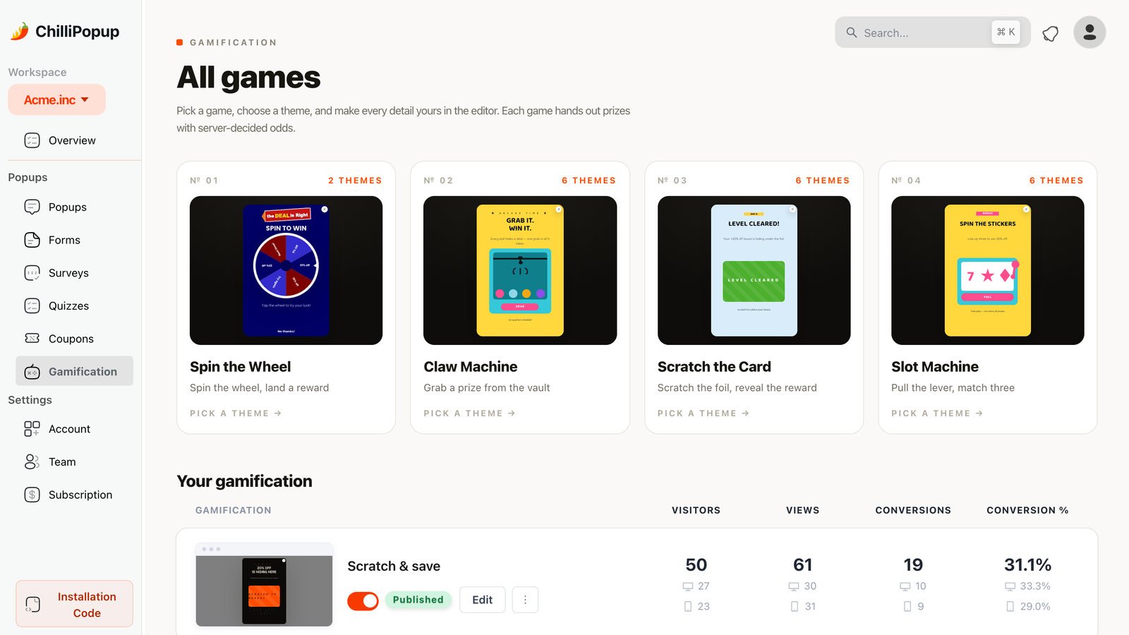
A scratch card popup is a gamified popup that hides your offer under a virtual foil panel: visitors rub it away with a mouse or a thumb, a claim screen collects their email, and only then does the prize appear. Same email ask as any signup popup — completely different willingness to give it.
Of the four game formats ChilliPopup ships — spin wheel, scratch card, slot machine and claw machine — the scratch card is the most tactile. The wheel is a spectacle you watch; the card is a surface you touch. That difference is not cosmetic. It changes the psychology of the ask, the kind of offers that work, and even which devices the game performs best on. If you've already read our spin to win popup guide, think of this as its quieter, closer-to-the-skin sibling.
Key Takeaways
- Scratching is effort, and effort inflates value. A discount someone rubbed a foil off feels earned — earned rewards get used at a rate a pasted coupon code never matches.
- The email arrives before the reveal. The claim screen sits between the scratch and the prize, so curiosity — not the discount — is what carries the visitor through the form.
- The outcome is decided server-side the moment the visitor plays. Nothing in the browser knows what's under the foil, so the game can't be rigged or reverse-engineered.
- A good prize table is a mix: one hero prize at low odds, a bed of common small discounts, and — usually — a small honest chance of losing.
- One play per visitor is a display rule, not a law of physics: frequency plus the conversion gate covers honest visitors; expiry dates and minimum orders cover the rest.
What is a scratch card popup?
Scratch card popup, in two sentences
A scratch card popup (also called a scratch to win popup or digital scratch card) is a website overlay that presents a lottery-style card whose result is hidden under a scratchable foil layer. The visitor scratches, enters their email on a claim screen, and submitting it reveals whether they won — turning a plain signup form into a thirty-second game.
The format borrows everything that made physical scratch cards one of the most compulsive products ever printed: a concealed outcome, a physical action that uncovers it, and a result that arrives in seconds. On a website it does one more job the paper version never could — it captures a contact. Every play is a signup, because the claim form is the toll booth between scratching and knowing.
You'll see the format everywhere for a reason: on a scratch and win website campaign, the popup isn't competing with your content for attention — it is the attention. Visitors who would close a "subscribe to our newsletter" box in 400 milliseconds will stop and scratch, because a game makes an offer where a form makes a demand.
Why scratching converts: the psychology
Effort justification: earned beats given
People value what they worked for more than what they were handed — even when the "work" is symbolic. It's the same effect that makes furniture you assembled yourself feel worth more than it is. A 10% code pasted in a banner is a price adjustment; a 10% code you scratched your way to is a small win. Wins get used. The discount is identical, but the story the customer tells themselves about it is not, and the story is what drives redemption.
The curiosity gap: a question the thumb can answer
The foil panel is a visible unanswered question. Humans are notoriously bad at walking away from those — the itch to close an information gap is the same mechanism that makes people finish terrible articles they've started. A scratch card makes the gap physical: the answer is right there, one gesture away. That is a much stronger pull than "Subscribe for updates", which opens no gap at all.
Commitment: the scratch is a first yes
By the time the claim screen appears, the visitor has already invested: they chose to play, they performed the gesture, they're two-thirds through a story that needs an ending. Abandoning at the email field now means writing off that investment. This is the quiet engine of the whole format — the ask lands after the commitment, not before it. A classic popup asks a stranger; a scratch card asks a player.
The design consequence: everything before the scratch should minimise friction (one glance to understand, one gesture to play), and everything after it can afford a little — because the visitor is now motivated to finish. Put your ask on the far side of the scratch, never in front of it.
How a ChilliPopup scratch card actually works
Every ChilliPopup game — wheel, scratch, slot, claw — is built from the same named screens and the same prize model, so once you've built one you've learned them all. A scratch card runs through three moments:
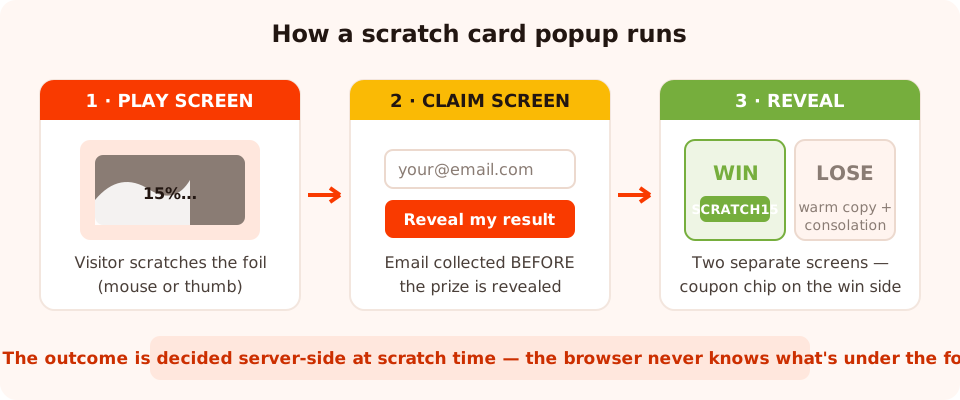
Three screens, one toll booth: the email is collected between the scratch and the reveal — and the server, not the browser, decides the outcome.
- The play screen. The card, a headline, and a scratch instruction. The visitor rubs the foil with a mouse or a finger — scratching works with both — and the moment they play, the outcome is decided server-side. The browser only learns the result; it never holds the odds, and prize codes are never exposed to the page until a prize is actually won. Nobody with DevTools open can peek under the foil, and you can promise "real odds" honestly.
- The claim screen. Before the result is shown, the claim form appears — typically an email input (with email validation you can set to format checks, business-address-only, both, or none) plus a button. This ordering is the entire business model of the format: the contact is collected before the prize is revealed, so curiosity carries the visitor through the form.
- The reveal. Submitting the claim form flips the card to a win or lose screen — two separate screens you design independently. The win screen typically carries a coupon chip with click-to-copy so the code travels to checkout in one tap; the lose screen is where a warm consolation keeps the goodwill you just built.
Because these are ordinary editor screens, you're not restricted to a fixed layout: each screen takes the same blocks as any popup — text, buttons, images, shapes, countdown timers, even a news ticker — so the card can look like your brand rather than like a template. And because it's a standard campaign, it installs the way everything else does: one pixel script, or the WordPress plugin, Shopify app, Wix app or Google Tag Manager — the help center has an install guide for each.
Why server-side outcomes matter more than they sound: a scratch card whose result lives in the page source is a scratch card whose hero prize will be extracted by the first curious developer who visits. With the decision made at scratch time on the server, the odds you configure are the odds that happen — and "one in fifty cards hides the grand prize" is a claim you can actually stand behind.
Designing the prize table: hero, bed, and honest odds
The prize table is where scratch card campaigns are won or lost — more than the design, more than the copy. Each prize gets a chance you configure, and the mix of those chances is the product. A table that converts has three layers:
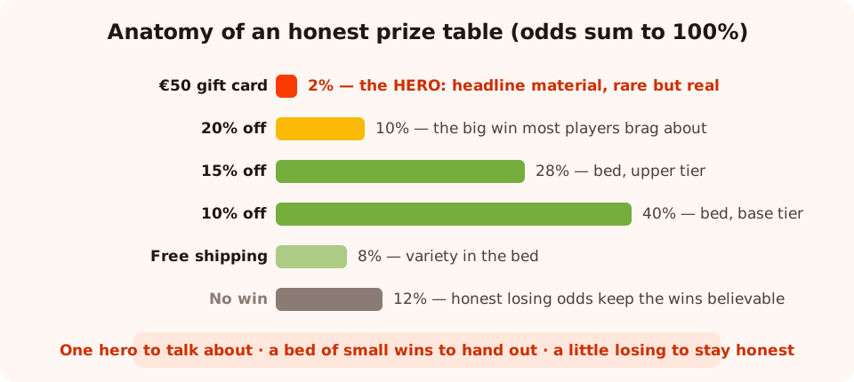
A prize table that feels like a game: a rare hero to talk about, a bed of small wins to hand out, and just enough losing to keep it honest.
The hero prize (1–5%)
One prize big enough to be worth mentioning in the headline — a gift card, a premium product, a large discount. The hero isn't there to be won often; it's there to make the game worth playing. It sets the ceiling of the story ("someone is going to win this") while the bed does the daily work. Keep its odds low and real: 2% means one player in fifty genuinely gets it, which is rare enough to protect your margin and common enough that winners actually exist.
The bed: common small discounts (70–85%)
Most cards should reveal a modest, margin-safe win: 10% off, 15% off, free shipping. This is the discount you were probably willing to give every subscriber anyway — the scratch card just wraps it in a win. Spread the bed across two or three tiers rather than one flat prize, so the reveal still carries a little variance ("15! not just 10").
Losing outcomes: include a few, keep them honest
Should every card win? It depends on what you're displaying. If your prizes are believable (10–20% off), an every-card-wins table is fine — the win is small enough that nobody smells a fix. But the moment a big hero prize is on display, a 100% win rate starts to feel rigged: everyone wins, but nobody ever wins that. A small real losing chance — 10–15% — does two things: it makes the wins feel like wins, and it makes your odds claims true. Just design the lose screen with as much care as the win screen (there's full sample copy below), because roughly one player in eight will see it. And if the every-card-wins question splits your team, you no longer have to settle it by argument: A/B test the same card with two prize mixes — one where every card wins, one with a small losing chance — and let the conversion numbers pick.
Rule of thumb for the mix: 2% hero, 78% split across two or three small discounts, 8% free shipping, 12% "no win this time". The chances you set are exactly what the server enforces — so make sure they sum to 100 and to a game you'd be happy to explain to a customer face to face.
One honesty note on the codes themselves: a prize's discount code is the code you configure — every
winner of "15% off" receives the same SCRATCH15. That's perfect for campaigns; it also
means the code will eventually travel. Give each code an expiry date and a minimum order in your
store, and rotate codes between campaigns. If coupons are the heart of your offer, the
coupon popup guide goes deeper on code
hygiene.
A legal word, generically: prize promotions are regulated in some countries — rules about free entry routes, disclosed odds, age limits and prize descriptions vary by jurisdiction. A discount-only scratch card is usually the safest shape, but check the rules where your customers are before running anything with significant prizes. This isn't legal advice; it's a reminder to get some if the stakes warrant it.
Themes and design: make it look like your brand
You don't start from a blank card. ChilliPopup's games catalog lets you pick the game first — scratch card — and then a themed template for it, and every theme is fully restylable afterwards: colors, copy, prizes, images, all of it. The theme gets you a coherent look in one click; the editor lets you replace every trace of it with your own brand.
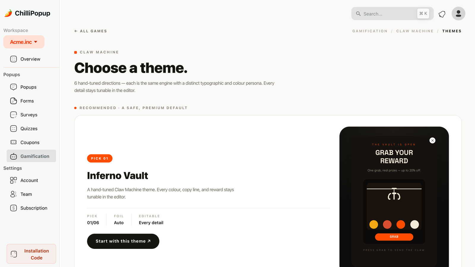
Pick the game, pick a theme, then make it yours — every color, prize and line of copy is editable.
Three design decisions matter more than the rest:
- Make the foil look scratchable. The panel should read as "rub me" at a glance — a metallic-looking field with a visible instruction. If a first-time visitor doesn't understand the game within one second, the format's whole advantage evaporates.
- Put the offer in the headline, the mystery in the card. "Scratch to reveal your discount" tells people what category of thing is under the foil without spoiling which one. Mystery about which prize converts; mystery about whether this is worth my time does not.
- Design the reveal screens like landing pages. The win screen is the highest-attention moment you will ever get from this visitor — coupon chip front and center, a countdown timer if the code expires, and one button to shop. Don't spend that attention on decoration.
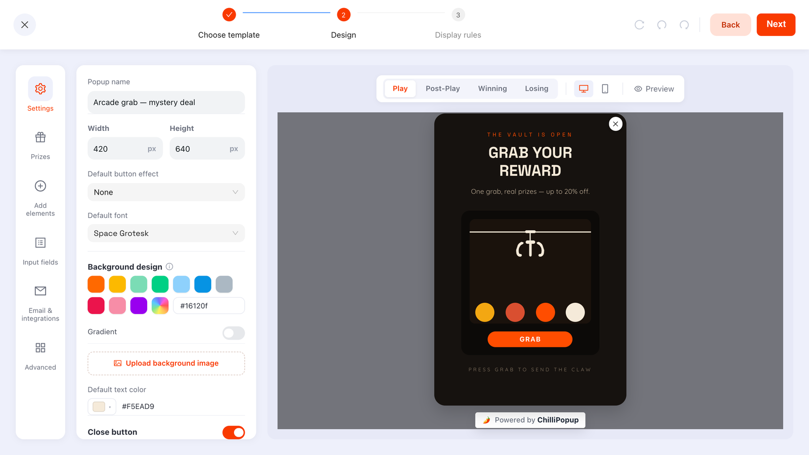
Each screen — play, claim, win, lose — is edited separately with the same blocks as any popup.
Scratch card vs spin wheel vs slot machine vs claw machine
All four games share the mechanics that matter — same prize model, same claim-before-reveal flow, same server-side outcome. The choice between them is about feel and what your offer needs shown up front.
| Game | Feel | Time to play | Prizes visible before playing? | Best use |
|---|---|---|---|---|
| Scratch card | Tactile, personal — you uncover it | ~5–10 seconds of active scratching | No — the outcome stays hidden under the foil | Mobile-heavy traffic, subtle branding, mystery-led offers, seasonal "golden ticket" campaigns |
| Spin wheel | Spectacle — you trigger it and watch | ~3 seconds plus the spin animation | Yes — every segment advertises a prize | When the prize list is the pitch; loud promos where a big colourful wheel fits the brand |
| Slot machine | Anticipation — reels settle one by one | ~3–5 seconds, near-miss drama built in | Partially — symbols hint at prizes | Playful brands that want casino energy without a wheel; repeat seasonal events |
| Claw machine | Skill illusion — you "aim" the grab | ~5–10 seconds of positioning | Partially — prizes sit visibly in the pile | Product-led prizes (win an item, not a percentage); audiences who'll enjoy the arcade nostalgia |
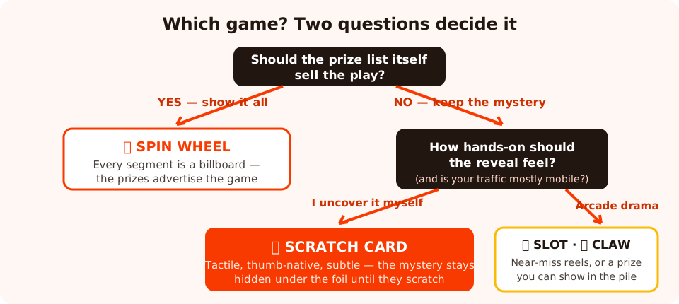
Two questions get you to the right game: should the prize list sell the play, and how hands-on should it feel?
The practical shortcut:
- Pick the scratch card when your traffic is mostly mobile (a thumb-scratch is the most natural touch gesture of the four), when your brand is understated, or when the mystery itself is the hook — advent-style seasonal cards, "golden ticket" promos, VIP reveals.
- Pick the wheel when seeing all the prizes is what earns the play — the wheel is a billboard for your prize table before anyone touches it. The spin to win guide covers that format's odds and copy in the same depth as this one.
- Slot and claw are the specialty picks: the slot for near-miss drama, the claw when the prize is a physical product you can show sitting in the pile.
Because all four share one prize model, switching later is cheap — your table, screens and rules translate. It also means the scratch-vs-wheel question no longer has to be answered on instinct: create an A/B test from the card's menu, rebuild the variant as a wheel around the same prize table, and let the traffic split report which game actually converts better for your audience. Browse all four side by side on the gamification page.
The display-rule recipe: right visitor, right moment, one play
A scratch card is an event, and events stop working when they happen constantly. The rules below are the standard recipe; the logic behind each knob generalises to any campaign (our popup triggers guide covers the full rule system).
Who sees it
- Evergreen welcome card: audience = new visitors (you define how many days "new" means). Your regulars have already played; showing them the same card again cheapens it.
- Seasonal campaign: audience = everyone, bounded by a date window — the rule built for exactly this. A Black Friday scratch card that runs Friday-to-Monday and then vanishes feels like an event; the same card in week three feels like wallpaper. (Pair it with the Black Friday popup strategy if that's the season you're building for.)
When it fires
- Desktop: exit intent. The scratch card is the strongest exit offer there is — the visitor was leaving anyway, so the game costs them nothing and the mystery gives them a reason to stay ten more seconds.
- Mobile: a delay or scroll depth. Exit intent is unreliable on mobile, so use a time delay of 10–20 seconds or a ~50% scroll instead. Don't fire on landing — let the visitor see your site first, or the game reads as a gate rather than a gift.
One play per visitor
- Set frequency to once every N days (not "every visit"), so a dismissal isn't punished with an instant rematch.
- Turn off the "show again after conversion" switch — anyone who played and submitted stops seeing the card. This is the closest thing to "one play per person" the browser can give you.
An honest anti-abuse note: frequency and the conversion gate live in the visitor's browser storage. Someone who opens a private window, clears their data, or switches devices looks like a brand-new visitor and can play again. For a discount scratch card that's usually fine — the determined replayer wins another 10% code with an expiry date and a minimum order, which is a cost, not a catastrophe. What it means in practice: cap the damage at the prize, not at the popup. Never put a prize behind a scratch card that you couldn't afford to hand to the same person twice.
Worked example: a complete scratch card, copy included
Imagine you run an online skincare store and want an evergreen welcome campaign. Here is the whole card — every screen, every line — as a template to adapt. The copy principles behind it are the same ones in our popup copywriting guide: concrete offer, zero cleverness at the moment of action, and a voice that survives losing.
The prize table
| Prize | Chance | Code | Role |
|---|---|---|---|
| €50 gift card | 2% | SCRATCH50 | The hero — headline material |
| 20% off first order | 10% | SCRATCH20 | The "big win" most weeks |
| 15% off first order | 28% | SCRATCH15 | Bed, upper tier |
| 10% off first order | 40% | SCRATCH10 | Bed, base tier |
| Free shipping | 8% | SHIPFREE | Variety in the bed |
| No win this time | 12% | — | Keeps the odds honest |
Play screen
Headline: "Your card's been dealt. Scratch it."
Subline: "Every card hides something — most hide 10–20% off your first order, and one in fifty
hides a €50 gift card."
Instruction under the card: "Rub the silver panel with your finger or mouse to reveal your
result."
Decline link: "No thanks, I'll pay full price."
Notice what the subline does: it states the odds mix in plain language. That's not just compliance hygiene — disclosed odds make the hero prize believable, which is the entire reason to have one.
Claim screen
Headline: "Done scratching? One step to see what's under there."
Field label: "Your email" (email validation on — format check at minimum)
Button: "Reveal my result"
Small print: "We'll send your code by email too, plus our skincare letter — unsubscribe
anytime."
The button says reveal, not subscribe — the visitor is finishing a game, and the copy should agree with them. The small print is where you're straight about the newsletter; burying that costs you spam complaints later. One workflow note: ChilliPopup stores every submission in your dashboard but doesn't send email itself, so copy your submissions into your email tool as part of your campaign routine.
Win screen
Headline: "You scratched your way to 15% off."
Coupon chip: SCRATCH15 — the click-to-copy chip, front and center
Supporting line: "Tap the code to copy it — it's good for 48 hours on anything in the store."
Button: "Use my code →"
Add a countdown timer block set to the code's expiry if you want urgency you can defend — the deadline is real because you configured the code that way.
Lose screen
Headline: "So close — this card was a blank."
Body: "The foil giveth and the foil taketh away. Thanks for playing — your welcome treat is
still on: here's free shipping on your first order, no scratching required."
Coupon chip: SHIPFREE
Button: "Claim free shipping →"
A consolation offer on the lose screen is optional but usually right for ecommerce: the visitor gave you their email in good faith, and "you get nothing" is a poor first message in a relationship. The loss stays real — they didn't win the prize — but the goodbye is warm. If your list-building strategy leans on offers like this, the email list guide shows where a scratch card fits among the other capture formats.
The rules
New visitors (first 30 days) · exit intent on desktop, 15-second delay on mobile · frequency once every 7 days · "show again after conversion" off · all product and collection pages, excluded from checkout.
How to build it in ChilliPopup, step by step
About thirty minutes end to end, no code. If the pixel isn't on your site yet, the help center has one-line install guides for any website, plus the WordPress, Shopify, Wix and Google Tag Manager routes.
1. Pick the scratch card game and a theme
Open the games catalog, choose the scratch card, then pick the themed template closest to your campaign's mood. Everything in the theme — colors, copy, prizes — can be restyled afterwards, so choose on structure, not palette.
2. Set the prize table and the odds
Replace the template prizes with your own mix: one hero at low odds, two or three bed discounts, optionally a small losing chance. Give each prize its chance and the code it should reveal, and make the chances sum to a game you'd defend out loud.
3. Write the four screens
Play screen: headline, odds subline, scratch instruction, decline link. Claim screen: email field (validation on) and a reveal-flavored button. Win screen: coupon chip, expiry line, shop button. Lose screen: warm copy and, if you like, a consolation code.
4. Set the display rules
Exit intent for desktop, a delay or scroll percentage for mobile. Audience: new visitors for an evergreen card, or a date window for a seasonal one. Frequency: once every few days. And turn off "show again after conversion" so one visitor gets one play.
5. Publish and read the numbers
Publish, then leave it alone for a week before judging. The analytics section below tells you which number to look at first — and which screen each number indicts.
Two power-user extras once the basics run: the JS API lets you open the card from any element on your
page — window.ChilliPopup.open('YOUR_CARD_UUID') wired to a "Feeling lucky?" button
turns the popup into an on-demand game — and the chillipopup:submit browser event fires
on every claim submission if you want to trigger something of your own at that moment.
Five mistakes that kill scratch card popups
- Prizes nobody wants. A scratch card multiplies the perceived value of a good offer; it can't create value where there is none. "Win a 5% discount or our monthly newsletter" is a game with no stakes, and playing it costs the visitor more dignity than the prize returns. If your best offer is weak, fix the offer first — the ecommerce lead magnet ideas list is a good place to shop for a better one.
- The rigged-feeling table. A €100 hero prize displayed in the headline, 100% win rate, and every single player "wins" 10% off. Visitors aren't stupid: when everyone wins something and nobody wins the thing, the game reads as a costume on a coupon — and worse, it teaches them your other claims are decorative too. Either give the hero real odds or don't display it.
- Showing it on every page view. A scratch card is special precisely once. Fired on every navigation it becomes the most annoying popup on your site, because games demand more attention than banners — that's the point of them. Frequency rules and the conversion gate exist for exactly this; use both.
- Forgetting mobile — where scratching is best. Most teams design the card on a desktop monitor and treat mobile as the degraded version. It's the opposite: thumb-scratching is the most natural version of the gesture, and mobile is where this format beats every other popup type by the widest margin. Check the card at phone width, make the foil panel thumb-sized, and swap exit intent for a delay or scroll trigger — then watch the desktop-vs-mobile split in your analytics to see where the game actually earns its keep.
- A lose screen written by the legal department. "Unfortunately you have not won. You may close this window." — one in eight players sees this, right after handing you their email. Write it warm, keep the brand's voice, and consider a consolation. The lose screen is a first impression too.
Measuring a scratch card: which numbers matter
The dashboard reports views, clicks, closes, submissions, conversion rate, field inputs and the desktop-vs-mobile split for every campaign. For a scratch card, read them as a funnel with three distinct failure points:
- Views → clicks: is the game inviting? Views with no interaction mean the play screen isn't earning the scratch — the offer isn't stated, the foil doesn't look scratchable, or the card fires at the wrong moment. This is a play-screen and trigger problem.
- Clicks → submissions: is the claim fair? People who scratched but didn't submit balked at the toll booth. Usually the claim screen asks too much (keep it to email), or the button copy reads like a subscription instead of a reveal. Conversion rate — submissions over views — is your single headline number; a game format should beat your plain signup popup on it, or the game isn't paying for its attention.
- Closes and the mobile split: is the moment right? A high close rate concentrated early suggests the trigger fires too soon. And compare desktop against mobile — if mobile underperforms on a scratch card, something specific is broken (foil too small for a thumb, a layout issue at phone width), because this is the format mobile should win.

Views → clicks → submissions: each gap in the funnel points at a specific screen to fix.
Beyond the dashboard, track one number in your store: redemption rate — how many
revealed codes actually get used. This is where the effort-justification effect shows up in money,
and it's also your early-warning system for a leaked code (a spike in redemptions without a matching
spike in submissions means SCRATCH15 has escaped to the wider internet — rotate it).
And when a number tells you something needs fixing, don't fix it by editing the live card and squinting at before-and-after weeks — too much else moves between them (traffic mix, season, a promotion running elsewhere). Run the change as an A/B test instead: every campaign's menu has a Create A/B test action that clones the card into a second, independently editable variant, and once you publish that variant, traffic splits between the two — 50/50 by default, adjustable — so both versions run against the same traffic at the same time. The results view puts the last 30 days of views, conversions and conversion rate side by side, and its confidence check keeps you honest: it won't call a winner until each version has at least 100 views and the test has 20 conversions, and below 95% confidence it will warn you the lead can still flip. The A/B testing guide walks through the whole flow. One discipline carries over from the old way: still change one thing per test — if the variant gets a new headline and a new prize table, a win tells you something worked without telling you what.
Put a scratch card on your site this afternoon
Build popups, forms, surveys, quizzes and games from one editor — and one pixel. Free plan, no credit card required. Paid plans from $29/month.
Start free →Related reading
Frequently asked questions
What is a scratch card popup?
A scratch card popup is a gamified popup that shows visitors a virtual scratch card: they rub away a foil layer with their mouse or finger to reveal whether they have won a prize, usually a discount code. Before the prize is revealed, a claim screen collects their email, so every play doubles as a signup.
Do scratch card popups work on mobile?
Better than almost any other popup format. Scratching with a thumb is a natural touch gesture, so the game feels native on a phone rather than shrunken. The one thing to change is the trigger: exit intent is unreliable on mobile, so use a time delay or a scroll percentage there instead.
Can visitors cheat a digital scratch card?
Not in ChilliPopup. The outcome is decided server-side at the moment the visitor scratches, not in the browser, and prize codes are never sent to the page until a prize is actually won. Nothing in the page source reveals what is under the foil, so inspecting the code cannot rig the result.
Should a scratch card include losing outcomes?
Usually a few, at low odds. An every-card-wins game is fine when the prizes are believable, but if a huge hero prize is on display and everyone wins something, the game starts to feel rigged. A small real chance of losing makes the wins feel earned — keep total losing odds low, around 10 to 15 percent, and write a warm lose screen.
When should I use a scratch card instead of a spin wheel?
Use a scratch card when you want one tactile reveal, a mobile-first feel, or a subtler look than a big colourful wheel. Use a spin wheel when displaying the whole prize list up front is part of the pitch — the wheel's segments advertise every prize before anyone plays, while a scratch card keeps the outcome hidden until the foil comes off. If you truly cannot decide, you no longer have to: create an A/B test, rebuild the second variant as a wheel around the same prizes, and let the traffic split show which one converts better.
How do I stop the same visitor playing again and again?
Use the frequency rules plus the show-again-after-conversion switch: turn the switch off and anyone who played and submitted stops seeing the card. Be honest with yourself about the limits, though — this is enforced through the visitor's browser storage, so someone in private browsing or on a second device looks like a new visitor. Cap what one code can do with an expiry date and a minimum order rather than relying on the popup alone.