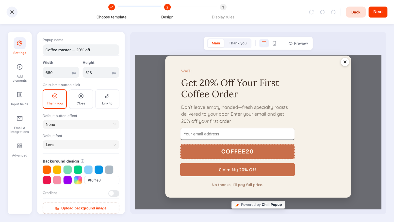
A coupon popup offers a discount code in exchange for an email address — the visitor submits, the code appears on the thank-you screen, and you've turned a stranger into a subscriber and, usually, a first order. It's the highest-converting popup in ecommerce for a simple reason: the incentive is money.
It's also the only popup that can lose you money while its dashboard numbers look great. Every code redeemed by someone who was already going to buy is margin you set on fire; every visitor who learns that leaving the tab summons a discount is a full-price customer you converted into a bargain hunter. The craft of coupon marketing isn't the popup — it's deciding who never sees it.
Key Takeaways
- A coupon popup is a first-order acquisition tool. It earns its margin when it converts strangers; it burns margin when returning buyers see it.
- Match the discount type to the problem. Percentage for varied catalogues, fixed amount with a minimum spend to steer cart size, free shipping when delivery cost is the objection.
- Gate the code behind the email. Screen one collects the address, the thank-you screen reveals the code as a click-to-copy chip — nobody gets the discount for free.
- Everyone who converts sees the same code. ChilliPopup shows the code you configure — it doesn't mint one per visitor — so set expiry and usage limits in your store, and rotate codes per campaign.
- Turn off "show again after conversion" and exclude checkout URLs. Those two rules alone prevent most of the margin leakage this guide is about.
What a coupon popup is — and what it actually buys
Coupon popup, in two sentences
A coupon popup is an overlay that trades a discount code for an email address: the visitor types their email on the first screen, submits, and the code is revealed on the thank-you screen or in the welcome email your email tool sends. It is the standard welcome discount popup pattern — "10% off your first order" — that most online stores use as their primary list-building tool.
Be precise about what you're buying, because it's three different things at once:
- An email address — the durable asset. Long after the code expires, you can still reach this person.
- A first order, pulled forward — the discount converts some fence-sitters who would otherwise have left and never returned.
- A price signal — the part nobody budgets for. Every impression teaches the viewer something about what your prices really are.
The first two are why coupon popups outperform every "join our newsletter" ask ever written. The third is why this guide spends half its length on targeting. A discount popup isn't good or bad — it's an instrument that pays for itself under some conditions and quietly doesn't under others, and the conditions are under your control.
When a discount earns its margin — and when it just subsidises
The acquisition case
Do the arithmetic once and the whole strategy clarifies. Say your average order is $60 and you offer 10% off the first order. A redeemed code costs you $6. For that $6 you got a new customer's first order plus a subscriber you can email for years. Compare that to what you currently pay in advertising to get one new customer to their first purchase — for most stores the coupon is the cheapest acquisition channel they run. That's the honest case for coupon marketing: a discount aimed at someone who hasn't bought yet is an acquisition cost, and usually a good one.
The subsidy case
Now run the same $6 through a different person: a repeat customer who came back to reorder, saw the popup, entered a throwaway email, and applied the code to a purchase they were already making. You acquired nothing. No new subscriber worth having, no incremental order — just $6 gone. Worse, you taught them the price is negotiable, so next time they'll go looking for a code before they check out. Multiply that by every returning visitor who sees the offer and "10% off" becomes a permanent, invisible price cut on your most loyal segment.
The one-question test: for each group of people who can see your coupon popup, ask — would this person have bought at full price without it? If the honest answer is "probably yes", the popup shouldn't show there. That single question generates almost every targeting rule in this guide.
Three signs your coupon popup is subsidising, not acquiring
- Redemptions come from known customers. Check redeemed orders in your store platform against your customer list — if familiar names dominate, the offer is leaking to the wrong audience.
- The popup shows on checkout or cart pages. Anyone there has already decided to buy; a discount at that moment is pure giveaway, and pausing checkout to hunt for the code is how carts get abandoned.
- The same visitors see it visit after visit. If frequency is uncapped and the conversion gate is off, you're not making an offer — you're printing a standing price on the door.
Percentage, fixed amount or free shipping: choosing the discount type
The offer type matters more than the offer size, because each type distorts behaviour differently. The popup announces whichever you choose — the discount itself is created and enforced in your store platform's coupon settings.
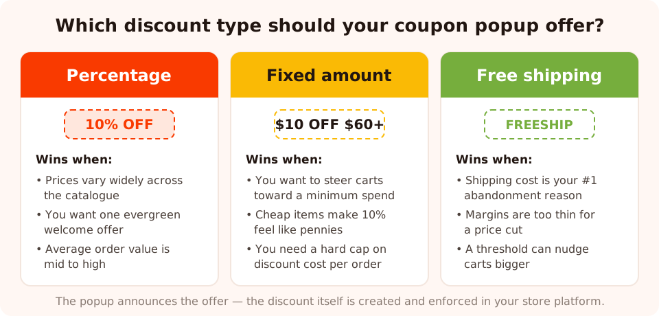
Three offer types, three different jobs. Pick for the problem you have, not the number that sounds generous.
| Discount type | Example | When it wins | Watch out for |
|---|---|---|---|
| Percentage | 10% off your first order | Varied catalogues and mid-to-high order values; the evergreen welcome offer — it scales fairly across every cart | Cost scales with cart size too: 10% off a big cart can exceed your margin. Cap it with a maximum discount in your store settings |
| Fixed amount | $10 off orders over $60 | When you need a hard cap on discount cost per order, and when the minimum spend can pull small carts up to a profitable size | Reads as worthless on cheap carts and suspiciously generous on cheap products; the minimum spend must be stated in the popup copy |
| Free shipping | Free shipping on your first order | When delivery cost is your top abandonment reason, or margins are too thin for a price cut; a threshold version nudges carts bigger | Weak as a headline if your shipping is already cheap — the visitor can't feel a $3 saving the way they feel "10% off" |
| Mystery amount (via a game) | Spin to win 5–15% off | When a flat offer has stopped converting; the same average discount feels earned rather than given | Needs prizes people can actually win at every tier, and honest odds — see the gamified section below |
Two sizing rules that hold across all types. First, start at the smallest number that still reads as real — for percentage offers that's usually 10%. You can raise a discount that isn't converting; you can never quietly lower one your audience has memorised. Second, price the offer against your margin, not your revenue. On a product with 30% margin, a 15% discount hands over half the profit of the order — the popup's conversion rate can't tell you whether that trade was worth it.
And when the table doesn't settle it, stop debating and split-test it. The percentage-versus-free-shipping call is the classic first A/B test: from the ⋮ menu on the campaign's row, Create A/B test gives you a second version that's a full, independently editable copy of the popup. Change nothing but the offer — and the code behind it — publish, and traffic splits between the two versions, 50/50 by default, with each visitor keeping the version they first saw. Real traffic answers in weeks what a meeting can argue about forever; the A/B testing guide walks through the setup and how to read the results.
The mechanics in ChilliPopup: email in, code out
The build is a standard two-screen popup and takes about fifteen minutes. The structure is what makes it work: the code lives on the thank-you screen, so the email is the price of admission.
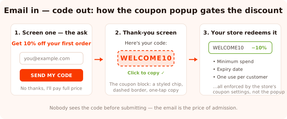
The gate: no email, no code. Everything after the chip — expiry, minimum spend, usage limits — is your store's job.
Screen one: the ask
One email input, one submit button, one line of copy that names the reward — plus a visible decline
link, which keeps the choice honest and the close rate down. Set the input's
email validation to at least format checking so asdf doesn't earn a
discount; if you sell B2B, you can restrict it to business addresses instead. If the headline needs
work, steal from the popup
copywriting guide — the offer line does most of the converting.
The thank-you screen: the coupon block
Drop the coupon block onto the popup's thank-you screen and type your code into it. It renders the code as a styled chip — give it the dashed border, which is the visual shorthand every shopper recognises as "this is a coupon" — and switch on click-to-copy, so one tap puts the code on the clipboard. That tap matters more than it looks: a code the visitor has to retype from memory at checkout is a code that gets mistyped, abandoned, or googled — and the google search leads straight to coupon aggregator sites and other people's offers.
Or deliver the code by email instead
The alternative pattern: the thank-you screen says "Check your inbox — your code is on its way", and the code travels only in the welcome email. ChilliPopup doesn't send email — you copy submissions into your email tool, and its welcome automation carries the code. You trade some instant-gratification conversion for a real filter: only genuine, reachable addresses ever receive the discount, and every redemption starts with an opened email. Choose this when list quality matters more than squeezing out the last conversions; choose the on-screen chip when it doesn't. The middle path — show the code instantly and repeat it in the welcome email — is what most stores should run.
Don't publish the popup before the code exists. Create the coupon in your store platform first — with its expiry, minimum spend and usage limits — then paste the code into the coupon block. A popup that hands out a code the store rejects is worse than no popup: it converts the visitor and then punishes them at checkout. If the pixel isn't on your site yet, the one-line install guide covers every platform.
Code strategy: evergreen vs campaign codes
Here's a product fact to design around: the coupon block shows the code you configure — the same code to every visitor who converts. ChilliPopup does not mint a unique one-time code per visitor. That's true of the popup's thank-you chip and of a game's prize reveal alike, and it has real consequences for how you manage codes.
A shared code will eventually escape the popup. Someone pastes it into a coupon aggregator, a browser extension picks it up, a friend texts it to a friend. That's not a failure — it's the physics of shared codes — but it means the code's lifecycle has to be managed in your store platform, where the enforcement lives:
- Expiry date on every code. A leaked code with an end date is a contained cost; a leaked evergreen code is a permanent price cut you no longer control.
- One use per customer. Nearly every store platform supports it — turn it on so a single shared code can't be redeemed repeatedly by the same account.
- First-order-only restriction where your platform offers it, which re-aims the discount at acquisition even if the popup's targeting misses.
- Rotate per campaign. Retire
SUMMER26when the summer campaign ends and issueAUTUMN26for the next one; update the coupon block to match. Rotation turns "the code leaked" from an emergency into a scheduled non-event.
Evergreen or campaign codes — which should the popup show?
An evergreen generic code (WELCOME10) fits the always-on welcome
popup: it's memorable, it never needs a mid-campaign edit, and since the welcome offer is public
anyway, leakage costs little — provided the store enforces first-order-only and one-use-per-customer.
Campaign codes (FLASH48, VIP-SEPT) fit anything with a
deadline: the date window on the popup and the expiry on the code end together, and each campaign's
redemptions stay separable in your store's reports. Most stores run both — one evergreen welcome
code, plus rotating campaign codes for seasonal pushes — as separate popups with separate rules.
Never put a must-stay-secret code in a popup. If a code's leaking would genuinely hurt — a partner rate, an influencer code with commission attached — don't reveal it to everyone who submits an email. Shared-code popups are for offers you'd be comfortable seeing on a coupon site, expiring on schedule.
Gamified coupons: the same 10%, but earned
A flat "10% off" popup and a spin wheel whose common outcome is 10% off cost you the same margin. They do not convert the same. A prize won feels categorically different from a discount handed over — the visitor invested a spin, the wheel "chose" them, and the code now has a story attached. When a welcome discount popup has gone stale, reskinning the identical economics as a game is the cheapest refresh available.
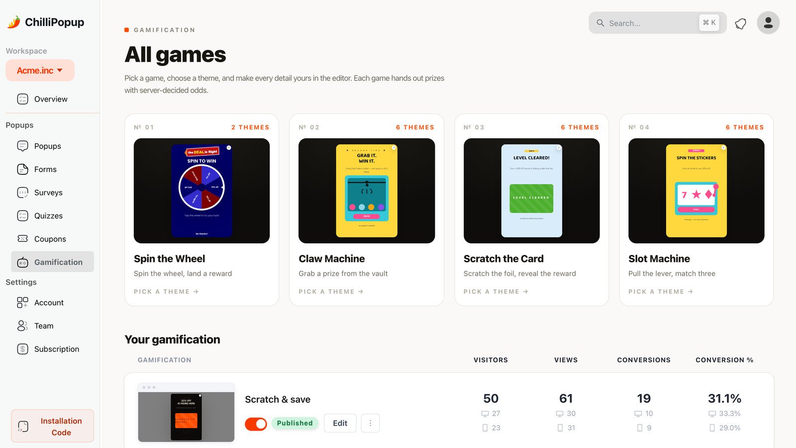
Four ways to wrap the same discount: spin wheel, claw machine, scratch card, slot machine.
ChilliPopup ships four game types — spin wheel, scratch card, slot machine and claw machine — and two mechanics make them safe to run as coupon marketing:
- The outcome is decided server-side. The wheel's winning slice, the card's reveal, the slot result — none of it can be rigged from the visitor's browser, so the odds you configure are the odds that happen.
- The prize is revealed only after the claim form is submitted. The visitor plays, wins, and then enters their email to claim — the same email gate as the classic popup, but now it stands between them and a prize they already feel they own. Few asks convert better.
The code-strategy rules from the previous section apply with one addition: each prize shows the
code you configured for it, so a three-tier wheel needs three store-side codes
(SPIN5, SPIN10, SPIN15), each with its own expiry and
limits. And keep the game honest — real odds, winnable prizes, no fake "you almost won" theatre.
The deep dives cover the details: Spin
to Win popups and scratch card
popups.
The display-rule recipe: who sees the coupon
This is where the margin protection actually happens. Every rule below exists to keep the offer in front of the one audience it pays for — new visitors who haven't bought — and away from everyone else.
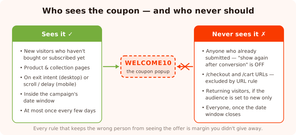
The recipe in one picture: aim the discount at strangers, and make it structurally impossible for buyers to keep seeing it.
The concrete setup, rule by rule:
- Audience: new visitors. Returning visitors either already took the offer or already pay full price — both are people the coupon shouldn't meet. You define how many days "new" means.
- Trigger: exit intent on desktop, delay or scroll on mobile. Exit intent fires the offer at the moment it can't interrupt a purchase — the visitor was leaving anyway. It's unreliable on touch screens, so give mobile a 15–20 second delay or a 40–60% scroll trigger instead. The exit-intent guide covers the trade-offs.
- URL rules: exclude checkout and cart. Add does not contain
/checkoutand/cart. A discount popup on the payment page is the purest form of subsidy — it interrupts a full-price sale to offer a markdown. - Frequency: once every few days. Someone who dismissed the offer shouldn't meet it again on the next page view. Scarcity of exposure is part of what keeps a discount feeling like an event.
- "Show again after conversion": OFF. The single most important switch. Anyone who submits stops seeing the popup — which is exactly what stops your subscribers and buyers being re-marketed a discount they've already used.
- Date window for campaign offers. Schedule the popup's start and end dates to match the code's expiry in your store, so the offer and its enforcement die on the same day without a midnight manual edit.
Know the limits of "new vs returning". Visitor recognition is computed from the visitor's own browser storage — someone on a second device, in a private window, or after clearing data looks new again. The audience rule does most of the work most of the time; the store-side first-order-only restriction on the code is the backstop for the rest. Use both.
Anti-bargain-hunter tactics
Bargain hunters aren't born — they're trained, one unconditional discount at a time. Each tactic here adds a condition that genuine new customers barely notice and pure code-seekers bounce off.
1. Put the minimum spend in the copy
"$10 off when you spend $60" converts differently from "$10 off" — it pre-filters for people actually intending to shop, and it steers the first cart to a profitable size. The enforcement lives in your store's coupon settings; the popup's job is to state the condition honestly, up front, in the headline — not in fine print the visitor discovers at checkout.
2. Give the offer a visible deadline
An offer that expires is an offer that gets used instead of hoarded. Add a countdown timer block to the popup — flip-clock cards ticking down either a fixed duration per visitor (say, 24 hours from when they first saw it) or to a fixed campaign end date. Pair the visual deadline with a real one: the code's expiry in your store platform must match what the clock promises, or the countdown is theatre — the countdown timer guide is blunt about why fake urgency backfires.
3. Keep the discount away from purchase moments
The URL exclusions from the recipe above, stated as a principle: the closer a visitor is to paying full price, the more a discount costs you. Product pages and collection pages are fine territory; cart and checkout are not. If you want a popup near checkout at all, make it reassurance — shipping times, returns policy — never a markdown.
4. Make discounts seasonal, not structural
A store that discounts four weeks a year has sales; a store that discounts every week has prices nobody believes. Use the date window to run coupon popups as bounded campaigns — a launch week, a seasonal sale, a list-building push — with full-price quiet between them. Your regulars learn the rhythm: deals are occasional, real, and worth acting on when they appear.
5. Make the discount feel earned
The gamified route again, from the anti-bargain-hunter angle this time: a prize won on a spin feels like luck, not pricing policy. Visitors don't extrapolate "this store discounts" from a wheel the way they do from a permanent 10%-off banner — the game frames the markdown as an event with a winner, not a standing offer with a loophole.
6. Test how small the offer can go
The strongest anti-bargain-hunter move is discovering the percentage was never doing the work. Run your 10% offer against free shipping as an A/B test, to see whether conversion survives the cheaper offer — same popup, same targeting, only the offer and its code differ between the two versions — and let the results view judge. It shows both versions' views, conversions and conversion rate side by side, and it refuses to call a winner until each version has at least 100 views and the test has 20 conversions; below 95% confidence it warns that the lead can still flip, so give it the traffic it needs. If free shipping holds its own, switch to it: you've found an offer that costs less per order and teaches visitors nothing about your prices being negotiable.
Three worked examples, with copy
1. The evergreen welcome offer — apparel store
Offer: 10% off the first order, code WELCOME10, first-order-only and
one-use-per-customer in the store settings, no expiry (the restrictions do the containing).
Rules: new visitors; exit intent on desktop, 20-second delay on mobile; excludes
/checkout and /cart; conversion gate off.
Headline: "Leaving empty-handed?" — Body: "Get 10% off your first order. Drop your email and
the code's yours." — Button: "SEND MY CODE" — Decline: "No thanks, I'll pay full price." —
Thank-you screen: "You're in. Here's your code:" above the WELCOME10 chip,
with "tap to copy" beneath it.
2. The threshold builder — home goods store
Offer: $15 off orders over $80, campaign code HOME15, expiry in
four weeks. The average order was $62 — the minimum spend exists to pull first carts above it.
Rules: new visitors on collection pages only (URL contains
/collections); 50% scroll trigger; date window matching the code's expiry.
Headline: "$15 off when you spend $80" — Body: "Enough for the throw AND the cushions. Email
below, code on screen." — Button: "CLAIM $15 OFF" — Thank-you screen: the HOME15
chip plus one honest line: "Valid on orders over $80 until September 1."
3. The seasonal spin wheel — beauty store
Offer: a summer spin wheel with three winning tiers — free shipping
(SUNSHIP), 10% off (SUN10) and 15% off (SUN15) — each a
separate store-side code expiring when the campaign ends. Outcomes decided server-side; the prize
reveals only after the claim form (email) is submitted. Rules: everyone except
checkout URLs, once per several days, date window for the six-week campaign, conversion gate off.
Wheel headline: "Spin for your summer treat" — Claim screen: "You won! Enter your email to
reveal your prize." — Prize screen: "15% off — you lucky thing. Your code:" above the
SUN15 chip.
Seven coupon popup mistakes
- Showing the code without collecting the email. A popup that just displays
SAVE10is a price cut, not a coupon popup — you paid the discount and built nothing. The code belongs on the thank-you screen, behind the submit. - Leaving "show again after conversion" on. Your newest subscribers keep meeting the popup they already answered, and your discount becomes wallpaper.
- No expiry or usage limits on the code. Since every visitor sees the same code, an unlimited, undated code is a blank cheque the moment it leaks. Expiry, one-use-per-customer, first-order-only — set them in the store before the popup goes live.
- Springing the minimum spend at checkout. If the deal has conditions, the popup says so. A visitor who discovers the $60 threshold after entering their email feels tricked, and tricked subscribers unsubscribe.
- Running the discount popup on checkout pages. The one place a discount can only lose money — everyone there was about to pay full price.
- A countdown that lies. If the clock hits zero and the code still works, you've taught the exact lesson you were trying to avoid: deadlines here are fake, wait for a better one.
- Leading with a bigger discount when conversion dips. The popup's copy, trigger and targeting are almost always the real problem — A/B test a new headline or trigger against the current popup before the number even enters the conversation. Escalating 10% → 15% → 20% trains your audience to wait you out — it's the one lever that gets harder to un-pull each time.
Measuring it: conversion rate is only half the answer
The dashboard gives you the popup half of the picture: views, clicks, closes, submissions, and a conversion rate computed as submissions divided by views, split by desktop and mobile. A welcome coupon popup on exit intent typically converts several times better than a plain newsletter ask — if yours doesn't, suspect the copy or the trigger before the offer size.

The popup half of the measurement: views, submissions and conversion rate, split by device.
The margin half lives in your store platform, and it answers the question the popup can't: was the discount worth it? Three checks, monthly:
- Redemption rate. Codes issued (popup submissions) versus codes redeemed (store orders using the code). Very low redemption means you're buying emails, not orders — fine if that was the goal, a problem if it wasn't. Redemptions exceeding what the popup plausibly drove means the code has leaked to coupon sites — time to rotate.
- Who redeemed. Spot-check redeemed orders against your customer list. New names = acquisition. Familiar names = subsidy, and a targeting rule needs tightening.
- Do discounted first orders come back? The verdict metric. Take a month's coupon-acquired customers and check, 60–90 days later, how many placed a second order — at full price. If they return like your other customers, the discount bought real customers cheaply. If they overwhelmingly never return, you're renting one-time buyers at a 10% premium, and the offer, the audience, or the welcome flow needs rethinking — not the popup's conversion rate, which was never the problem. And when you're torn between two offers, run them as an A/B test with a separate code per version: the sticky split hands each code a comparable audience, so this same 60–90-day report tells you not just which offer converted more, but which one's customers came back.
The definition of success: a coupon popup works when the people it converts were strangers, the codes it reveals expire on schedule, and the customers it acquires come back at full price. Everything in this guide — the offer type, the email gate, the code rotation, the targeting — exists to make those three sentences true.
Ready to trade codes for customers?
Build popups, forms, surveys, quizzes and games from one editor — and one pixel. Free plan, no credit card required. Paid plans from $29/month.
Start free →Related reading
Frequently asked questions
What is a coupon popup?
A coupon popup is an overlay that offers a discount code in exchange for an email address. The visitor types their email on the first screen, and the code appears on the popup's thank-you screen — usually as a click-to-copy chip — or arrives in the welcome email your email tool sends. It is the standard first-order acquisition tool in ecommerce because it converts a stranger into a subscriber and a first-time buyer in one move.
How much of a discount should a coupon popup offer?
Start at 10% for percentage offers — it is the smallest number that still reads as a real incentive on most catalogues. Use a fixed amount with a minimum spend (like $10 off $60+) when you need a hard cap on discount cost per order, and free shipping when delivery cost is your biggest abandonment reason. Whatever you pick, work out the margin cost on your average order before you publish, not after.
Should the coupon code appear in the popup or arrive by email?
Showing the code on the popup's thank-you screen converts better because the reward is instant — the visitor submits and the code is right there with click-to-copy. Delivering it by email instead filters out fake addresses, because only a real inbox receives the code. A good middle path: show the code instantly to keep conversion high, turn on email format validation on the input, and repeat the code in the welcome email your email tool sends.
Do coupon popups attract bargain hunters?
They can — if you show the discount to everyone, everywhere, forever. The fix is targeting, not abandoning the tactic: show the offer to new visitors only, exclude checkout and cart pages so nobody pauses a full-price purchase to grab a code, turn off 'show again after conversion' so buyers stop seeing it, state a minimum spend in the copy, and put an expiry on the code in your store platform.
Can ChilliPopup generate a unique coupon code for each visitor?
No. The coupon block displays the code you configure for the campaign — every visitor who converts sees the same code. Plan for that: create the code in your store platform with an expiry date and a one-use-per-customer limit, rotate to a fresh code each campaign so leaked codes die on schedule, and never use a coupon popup to reveal a code that must stay secret.
When should a coupon popup appear?
Not on arrival. Use exit intent on desktop, and a time delay or a 40–60% scroll trigger on mobile, where exit intent is unreliable. Target new visitors on product and collection pages, exclude checkout URLs, cap the frequency to once every few days, and turn off 'show again after conversion' so people who already took the offer never see it again.