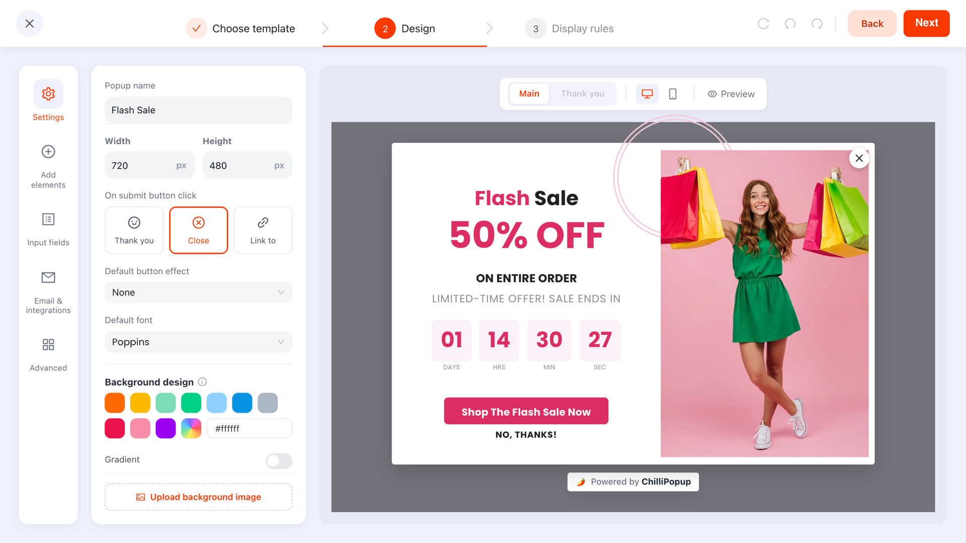
Mobile popups need their own rules: a bottom banner or small overlay instead of a full-screen takeover, a scroll or time trigger instead of exit intent, one field instead of a form, and a close button a thumb can actually hit. Follow those four and you keep the conversions — and your Google rankings.
Break them, and the same campaign that performs politely on desktop becomes the single most hostile thing on your mobile site. This guide walks through everything that changes on a small screen, why it changes, and how to build a mobile campaign that converts without punishing the people — and the search engine — that visit it.
Key Takeaways
- Never mirror desktop. Thumb reach, the on-screen keyboard and 44px tap targets make a shrunken desktop popup a different — and worse — product on a phone.
- Google penalises intrusive mobile interstitials on the page a searcher lands on. Bottom banners, delayed triggers and second-page popups keep you safe.
- Exit intent doesn't work on mobile — there's no cursor to track. Substitute scroll percentage, a time delay, or inactivity.
- Mobile gets its own campaign. Device targeting lets you run a mobile-only version with its own format, trigger and copy — don't force one campaign to serve both.
- One field, big chips, honest close. Every extra input summons a keyboard; every fake close button costs more trust than the signup was worth.
Why desktop popups fail on phones
A popup designed for desktop makes three silent assumptions: the visitor has a cursor, the screen has room to spare, and typing is cheap. On a phone, all three are false — and each failure has its own mechanism.
Thumb reach decides what's tappable
Most people hold a phone in one hand and operate it with a thumb. That thumb sweeps a comfortable arc across the bottom half of the screen; the top corners require re-gripping the device or using the second hand. Desktop popups put their close button in the top-right corner — precisely the hardest pixel on the entire screen for a right-handed thumb to reach. The visitor who wants to dismiss your popup politely can't, so they do the impolite thing instead: they hit back and leave the site.
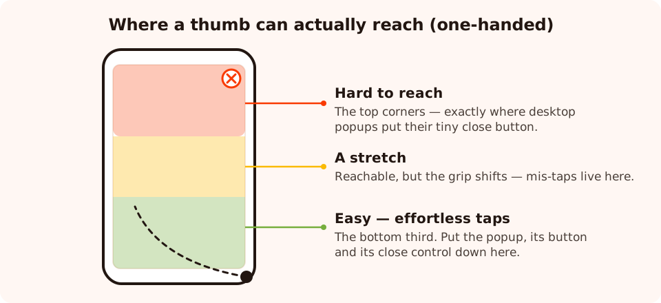
The thumb zone: the bottom third is effortless, the middle is a stretch, and the top corners — where desktop popups put the X — are hostile territory.
The keyboard eats the screen
Tap an email field on a phone and the on-screen keyboard slides up, covering as much as half the viewport. Whatever your popup was saying — the offer, the reassurance line, sometimes the submit button itself — is now hidden or shoved off-screen. A two-field form means this happens twice, with a scroll-and-refocus dance in between. On desktop a second field costs a little friction; on mobile it costs the visitor their view of what they were agreeing to.
Tap targets have a minimum size
A fingertip is not a cursor. Platform guidelines converge on roughly 44×44 pixels as the minimum reliable tap target, and anything smaller produces mis-taps. The classic offender is the 16px close icon that was perfectly clickable with a mouse: on a phone it becomes a test of dexterity, and every miss taps whatever sits behind it — often the popup's own call-to-action. If your mobile analytics show clicks that never turn into submissions, mis-taps on an undersized close button are a prime suspect.
The rule underneath all three: a mobile popup is not a smaller desktop popup. It's a different interaction on different hardware, and it deserves its own design — which is why the rest of this guide treats mobile as its own campaign, not a breakpoint.
Popups on mobile and SEO: Google's interstitial rules
Since January 2017, Google's guidance has been that pages where content is not easily accessible on mobile — because an intrusive interstitial covers it — may rank lower. Nearly a decade later this is still the rule that should shape every mobile popup decision you make, so it's worth being precise about what it does and doesn't say.
What gets penalised
- Full-screen overlays that cover the main content as soon as a visitor arrives from search results.
- Standalone interstitials the visitor has to dismiss before reaching the content they clicked for.
- Deceptive layouts where the above-the-fold area looks like an interstitial and the real content is pushed below it.
What's explicitly fine
- Legally required notices — cookie consent banners and age-verification gates.
- Login dialogs for content that isn't publicly indexable anyway.
- Banners that use a reasonable amount of screen space and are easy to dismiss — the pattern a bottom banner or small bottom-sheet falls into.
Two scope details matter enormously in practice. First, the guidance concerns the transition from search results — the page a searcher lands on. A popup that appears later in the visit, on the second or third page, is outside the pattern being demoted. Second, it's about mobile; desktop popups aren't subject to the same rule, which is one more reason the two devices should never share a campaign.
The practical translation: never show a full-screen popup instantly on the pages that earn your organic traffic. Either shrink the format (a bottom banner), delay the trigger (scroll depth or a time delay — by which point the visitor has demonstrably accessed the content), or exclude your top SEO entry pages from the mobile campaign entirely with a page-URL rule.
Mobile popup formats that pass the test
With the SEO constraint and the thumb zone in mind, the format question mostly answers itself: on mobile, smaller and lower wins.
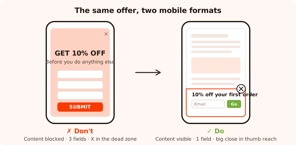
Same offer, two fates: the full-screen takeover blocks the content and hides its X in the dead zone; the bottom banner stays in thumb reach and leaves the page visible.
The bottom banner (your default)
A card docked to the bottom edge, covering roughly a quarter to a third of the screen. It lives entirely inside the easy thumb zone, so both the call-to-action and the close control are effortless to hit. The page content stays visible above it, which keeps you inside Google's "reasonable amount of screen space" exemption. In the ChilliPopup editor this is a positioning choice, not a separate product — build the popup, dock it to the bottom, and keep it short.
The small centered overlay (for engaged visitors)
A compact centered card — headline, one field, one button — with visible page behind it on all sides. Reserve it for moments where the visitor has already invested: 60% scroll depth, several pages into the session. It demands more attention than a banner, so it needs more earned engagement to justify itself.
The full-screen takeover (almost never)
On mobile, a full-screen popup should be the response to something the visitor did deliberately — tapping a "Get my discount" button, clicking a link in your email. As an uninvited interruption it's the exact pattern the interstitial guidance exists to punish, and the exact pattern the thumb-zone map shows people can't comfortably escape.
Whichever format you pick, remember popups here render straight into the page and respond to the viewport — but responsive rendering only rescales your layout, it doesn't rethink it. A six-field desktop design doesn't become a good mobile popup by shrinking; it becomes a small bad one. The rethinking is your job, and it starts with a separate campaign.
Triggers: the mobile exit intent alternative
Exit intent is the workhorse of desktop popups: it fires when the cursor darts toward the top of the viewport — toward the tabs and the address bar — catching people at the moment they decide to leave. Read the full mechanics in our exit intent guide; the one-line summary for this article is simpler: phones have no cursor, so exit intent is unreliable on mobile. There's no pointer to watch, so there's no clean leave signal to catch.
That doesn't mean mobile has no intent signals. It means you substitute the ones a touchscreen actually produces:
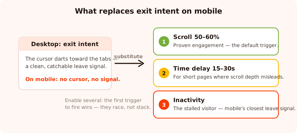
The substitution map: exit intent stays on desktop; on mobile the same job is split across scroll depth, time on page and inactivity.
- Page scroll percentage — the default. Someone 50–60% into your page has proven they're reading, and the trigger self-adjusts to reading speed: fast scrollers hit it in seconds, careful readers in minutes. It also guarantees the content was accessible first, which is exactly what the interstitial guidance wants to see.
- Time delay — for short pages. On a landing page with little to scroll, set a delay of 15–30 seconds. Anyone still there has settled in. ChilliPopup's time delay can count per page or per session — use session scope when visitors bounce between short pages and you want total time, not per-page time.
- Inactivity — the closest thing to mobile exit intent. A visitor who stops scrolling and tapping has stalled: they're deciding whether to continue, or their attention has drifted to another app. An inactivity trigger catches that pause the way exit intent catches the cursor's dash for the tabs. It's the most defensible "before they leave" moment mobile offers.
- Pages viewed — for the engaged minority. Firing on the second or third page of a session selects your most interested visitors and, as a bonus, keeps the popup entirely off the search entry page.
One mechanical detail worth knowing: when several triggers are enabled on a campaign, the first one to fire wins — they race, they don't stack. A common mobile recipe is scroll 50% plus a 45-second time delay: readers get caught by the scroll, skimmers who linger get caught by the clock. For the full decision tree across every trigger, see Popup Triggers: When Should Your Popup Appear?
Device targeting: give mobile its own campaign
Everything above points the same way: the format, trigger and copy that are right for mobile are wrong for desktop, and vice versa. The clean solution is two campaigns, split by device.
In ChilliPopup, every campaign's display rules include desktop and mobile device toggles. Duplicate your campaign, switch one copy to desktop-only and the other to mobile-only, and you can now make opposite decisions without compromise:
| Decision | Desktop campaign | Mobile campaign |
|---|---|---|
| Trigger | Exit intent | Scroll 50% + time delay (first to fire wins) |
| Format | Centered overlay | Bottom banner |
| Copy length | Headline + subline + reassurance | Headline + button, little else |
| Fields | Email (+ one optional) | Email only — or a tap-only choice |
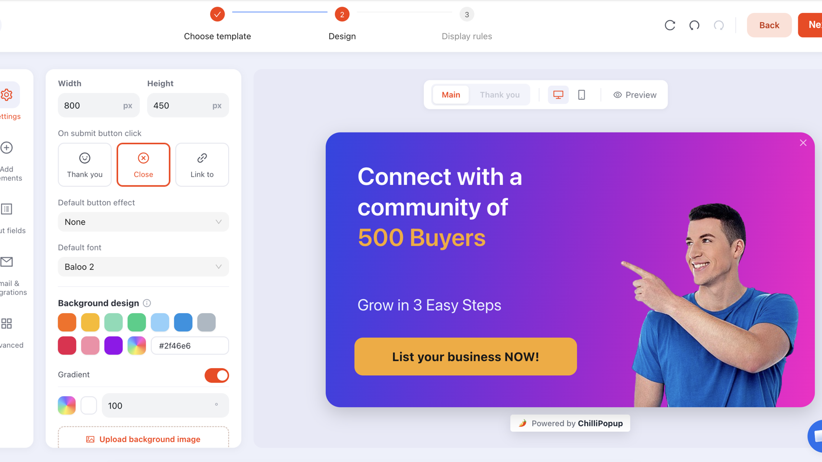
One editor, two campaigns: duplicate the popup, flip the device toggles, and each version gets its own trigger, layout and copy.
Three refinements once the split exists. First, remember that display rules AND together — device targeting combines with page-URL rules, audience (new vs returning visitors) and frequency, so your mobile campaign can be "mobile, returning visitors, not on the blog's top landing pages, once every 7 days". Second, the advanced targeting rules let you pick OS and browser separately for desktop and mobile — useful when a rendering quirk or an offer (say, an app available on one platform) is device-OS-specific. Third, set the frequency deliberately: mobile sessions are shorter and more frequent than desktop ones, so "every visit" that feels merely persistent on desktop feels like harassment on a phone. Once a day or once every N days is the polite mobile default.
The device split also gives you a clean way to settle the format question from earlier — bottom banner or small overlay — with data instead of taste. Choose Create A/B test from the mobile campaign's row menu and you get Variant B: a full, independently editable copy that starts as a draft, so everyone keeps seeing the banner until you publish it. Rebuild B as the small centered overlay, publish, and traffic splits between the two (50/50 by default, adjustable), with each visitor assigned once and kept on the version they first saw. Our guide to how to A/B test your popups walks through the whole flow.
Field discipline: one field, and chips beat typing
On desktop, form length is a friction problem. On mobile it's a hardware problem: every field summons the keyboard, and the keyboard covers the popup. That leads to two rules.
Rule one: one field
Email. That's the mobile ask. Name, phone, company, "how did you hear about us" — all of it moves to
a later interaction or disappears. If you genuinely need more than an email, collect it after the
signup (a thank-you screen can point people onward) rather than in front of it. Turn on email
validation — format checking at minimum, business-email checking on B2B lists — so the fat-fingered
gmial.com typos that phones produce in bulk get caught at the popup instead of bouncing
later.
And if someone on the team insists a name field earns its keep, don't settle it in a meeting — settle it with an A/B test: give Variant B the second field, leave everything else identical, and let the mobile conversion rate arbitrate.
Small styling note with outsized mobile impact: ChilliPopup inputs come in a box or underline style. Whichever you choose, keep the input tall — a generous tap target the visitor can hit on the first try matters more on a 6-inch screen than any aesthetic choice.
Rule two: taps beat typing
Whenever a question has a small set of answers, don't offer a text field — offer tappable choice chips. ChilliPopup's multiple-choice options block (single or multi-select) turns "What are you shopping for?" from a typing exercise into one tap, with no keyboard, no typos, and clean values you can actually segment on. A one-question ask built from chips is the highest-converting piece of interactivity you can put on a phone.
The same logic makes quizzes and scoring scales
(stars, NPS, thumbs) disproportionately effective on mobile — they're built entirely from taps. And
if your offer involves a discount code, use the coupon chip with click-to-copy:
nobody should have to memorise SUMMER15 while switching to their cart on a phone. One
tap copies it.
The mobile field budget: one typed field, or up to five tappable chips, per popup. If your ask doesn't fit in that budget, it's not a mobile popup — it's a landing page.
Close-button honesty
On desktop, a sneaky close button costs you goodwill. On mobile it costs you the session — a visitor who can't dismiss your popup in one tap doesn't hunt for the X, they leave. Honest closing is a conversion tactic, not just a courtesy:
- Make the X at least 44×44px of tappable area, visually distinct, and never hidden against a busy image.
- Keep it out of the dead zone. On a bottom banner this solves itself — the whole popup sits in thumb reach. On a centered overlay, make sure the close control is big enough that reaching it once is enough.
- Let the overlay be an exit. ChilliPopup's close on overlay click option means tapping anywhere outside the popup dismisses it — turning the entire screen minus the card into one giant, thumb-friendly close button. On mobile, turn it on.
- Use the delayed close button sparingly and visibly. A close button that appears after a couple of seconds can stop reflex-dismissals of a genuinely short message, but on mobile the delay reads as a trap much faster than on desktop. If you use it, keep the delay short and never combine it with a full-screen format.
- Auto-close what doesn't need closing. For a pure announcement — free-shipping threshold reached, sale ends tonight — set auto-close after a few seconds and don't make the visitor do the dismissing at all.
- No shame buttons. "No thanks, I hate saving money" was tired on desktop; on a screen where the decline link is also a 12px tap target, it's both insulting and unusable. A plain "No thanks" in a tappable size respects the visitor and your analytics.
Desktop vs mobile: the full comparison
Here's the whole guide as one table — the defaults to reach for on each device before your own data tells you otherwise.
| Dimension | Desktop default | Mobile default | Why it differs |
|---|---|---|---|
| Format | Centered overlay, ~40% of screen | Bottom banner, ~25–33% of screen | Thumb reach + Google's interstitial guidance |
| Primary trigger | Exit intent | Scroll % (with time delay as backup) | No cursor on mobile — exit intent is unreliable |
| Timing floor | Can fire early on non-SEO pages | Never on arrival on search entry pages | The mobile interstitial penalty targets the entry moment |
| Fields | 1–2 | 1, or tap-only chips | The keyboard covers up to half the mobile viewport |
| Copy | Headline + subline + reassurance | Headline + button | A banner has one breath's worth of space |
| Close control | Standard X, decline link | 44px X + close on overlay tap | Tap targets and the top-corner dead zone |
| Frequency | Every session is tolerable | Once a day / every N days | Mobile sessions are shorter and more frequent |
| SEO exposure | None specific | Intrusive-interstitial demotion | The guidance applies to mobile results |
Three worked mobile popup examples
1. Ecommerce: the bottom-banner welcome offer
Setup: mobile-only campaign, bottom banner, trigger at 50% scroll on collection and product pages, new visitors only, once every 7 days, "show again after conversion" off.
Copy: "10% off your first order. Drop your email, the code appears right here." One email field, one button — "Send my code" — and a thank-you screen showing the coupon chip: "You're in! Tap to copy: WELCOME10."
Why it works: the banner never blocks the product photos, the promise "the code appears right here" removes the switch-to-email-app anxiety that kills mobile signups, and click-to-copy means the code survives the trip to checkout.
2. Content site: the scroll-triggered newsletter ask
Setup: mobile-only, small centered overlay, trigger at 60% scroll, page rule excluding the handful of posts that earn most search traffic (URL does not contain those slugs), close on overlay tap enabled.
Copy: "Liked this one? One email a week, our five best reads. No noise." Email field, button — "Count me in" — and a plain "No thanks" underneath.
Why it works: 60% scroll means the ask lands only on demonstrated readers, the entry-page exclusion keeps the intrusive-interstitial question from even arising on the posts that matter for SEO, and the overlay-tap close makes dismissal a zero-effort flick.
3. SaaS: the inactivity nudge on pricing
Setup: mobile-only, bottom banner, inactivity trigger (roughly 20 seconds of no scrolling or tapping), page rule is exactly the pricing page, returning visitors.
Copy: "Weighing it up? Most teams start on the free trial and decide in a week." One button — "Start free trial" — no field at all.
Why it works: stalling on a pricing page is the mobile equivalent of the cursor drifting toward the tabs — a decision moment. A zero-field banner answers the hesitation without demanding anything, and the button deep-links straight into signup. This is the pattern to reach for wherever you're tempted to wish exit intent worked on phones.
Want more end-to-end teardowns like these? Our website popup examples collection covers both devices, and the popup copywriting guide goes deep on the words themselves.
Reading the desktop-vs-mobile analytics split
Every ChilliPopup campaign reports views, clicks, closes, submissions and conversion rate — with a desktop-vs-mobile breakdown per campaign. Once you've split your campaigns by device, that breakdown becomes a diagnostic instrument. Read it in this order:
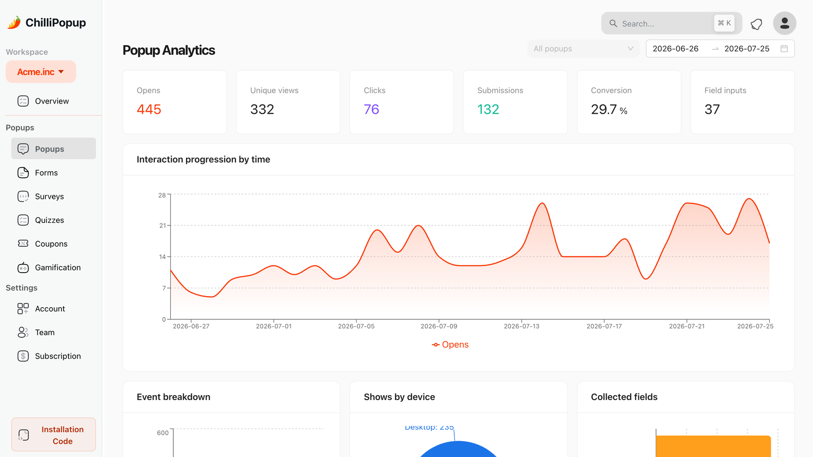
The device breakdown turns one blended conversion rate into two honest ones — and the gap between them is your to-do list.
- Views split vs traffic split. If 60% of your traffic is mobile but only 30% of popup views are, your mobile campaign under-fires — usually a scroll threshold set too deep for short mobile pages, or page rules that exclude more mobile landing pages than you realised.
- Mobile conversion far below desktop. Some gap is normal — mobile visitors are more distracted and typing is dearer. A chasm (say, desktop at 4% and mobile under 1%) points at a mechanical failure: a layout that breaks small, a keyboard covering the submit button, or a close button people can't find so they bounce instead.
- High mobile closes, low mobile clicks. The popup renders fine and people dismiss it deliberately — an offer or timing problem, not a design one. Move the trigger later or change the ask.
- High mobile clicks, low mobile submissions. People tap but don't finish — the classic keyboard-kills-the-form signature, or mis-taps from undersized targets. Cut fields, grow the targets.
- Field inputs vs submissions. The field-input counts show how many people started typing. Starts without finishes on mobile almost always means the form, not the offer, is the problem.
When the split points at a suspect, resist the urge to change the campaign and compare this week to last — before-and-after reads are muddied by weekday mix, traffic sources and promotions. The cleaner instrument is an A/B test: change that one variable in Variant B, leave the rest identical, and read the two conversion rates side by side over the same days. The patience rule survives the upgrade, though — the A/B results view deliberately refuses to call a winner until each version has at least 100 views and the test has at least 20 conversions, and below 95% confidence it will tell you the lead can still flip. For the full metric-by-metric playbook, see Popup Analytics: The Metrics That Tell You What to Fix.
Seven mobile popup mistakes to avoid
- Shipping the desktop popup to mobile untouched. Responsive scaling shrinks the layout; it doesn't fix the trigger, the field count or the thumb-zone problem. Split the campaign.
- A full-screen popup on the search entry page. The one pattern that risks rankings and annoys visitors most. Banner it, delay it, or move it off the entry page.
- Relying on exit intent on mobile. With no cursor to track it fires unreliably or not at all, and your "cart-saver" quietly protects nothing. Substitute inactivity or scroll.
- Two or more typed fields. Each one re-summons the keyboard and re-hides the offer. One field — or chips.
- A decorative close button. Under 44px, top corner, low contrast, or delayed without reason. Every escape you make difficult converts a dismissal into an exit.
- "Every visit" frequency on mobile. Phone sessions are short and repeated; yesterday's popup is today's harassment. Once a day or every N days.
- Judging mobile by the blended number. One averaged conversion rate hides a failing device behind a succeeding one. Always read the desktop-vs-mobile split.
Build a popup your mobile visitors won't hate
Build popups, forms, surveys, quizzes and games from one editor — and one pixel. Free plan, no credit card required. Paid plans from $29/month.
Start free →Related reading
Frequently asked questions
Do popups on mobile hurt SEO?
They can. Since January 2017 Google has been able to demote pages that show an intrusive interstitial when a mobile visitor arrives from search results. The penalty targets full-screen and hard-to-dismiss overlays on the entry page; banners that use a reasonable share of the screen, cookie-consent notices and age-verification gates are exempt. Keep the search entry page clean — delay the popup, trigger it on scroll, or show it later in the visit — and mobile popups carry no meaningful SEO risk.
Does exit intent work on mobile?
No — not reliably. Exit intent works by detecting the cursor leaving the top of the viewport, and phones have no cursor to track. On mobile, substitute the intent signals a touchscreen does give you: scroll percentage for proven engagement, a time delay for settled readers, and inactivity for visitors who have stalled. Run them in a separate mobile-only campaign rather than bolting them onto your desktop popup.
What is the best trigger for mobile popups?
Scroll percentage is the strongest default: someone 50 to 60 percent into a page has proven engagement, and the trigger adapts to any reading speed. Use a time delay when pages are short or scroll depth is misleading, and inactivity to catch visitors who have stopped moving. Whatever you pick, never fire on arrival — an instant popup on the search entry page is exactly the pattern Google's interstitial guidance penalises.
How big should a mobile popup be?
Small enough that the page behind it is still obviously there. A bottom banner or bottom-sheet covering roughly a third of the screen is the safe pattern: it sits in easy thumb reach, leaves the content visible, and stays outside the intrusive-interstitial pattern Google demotes. Save anything close to full-screen for moments the visitor initiated, such as tapping a button that opens the offer.
How many fields should a mobile popup ask for?
One. On a phone, every field summons a keyboard that can cover half the viewport, so a second field roughly doubles the pain rather than just the friction. Ask for the email and nothing else — and wherever a question can be answered by tapping a choice chip instead of typing, use the chips. A tap costs almost nothing; typing on glass always costs something.
Should mobile and desktop have separate popup campaigns?
Yes. The formats, triggers and field budgets differ too much for one campaign to serve both well. Use device targeting to run a desktop-only campaign with exit intent and a mobile-only campaign with a scroll or time trigger, a smaller layout and a shorter ask. Two focused campaigns also give you a clean per-device read in your analytics, instead of one blended number that hides which half is failing.