
A popup asks a stranger to make a decision in about two seconds, using roughly fifteen words, while they were busy doing something else. That is not a design problem — it is a psychology problem. The popups that convert are not louder; they are aimed at how people actually decide when the stakes are small and the attention is thin.
Below are the eight principles that do the work, each with the copy it produces, the moment it belongs in, and the way it fails when it is overused. Then the three versions to refuse, because a popup that converts by cornering someone costs you the customer afterwards.
Key Takeaways
- Give before you ask. Reciprocity is the only principle that changes the offer, not just the wording — and it is the strongest one.
- Losses outrank gains. "Don't lose your 10%" and "get 10% off" are the same deal and different popups.
- Match the principle to the moment. Exit intent wants loss aversion; a first visit wants reciprocity; a cart wants commitment.
- One principle per popup. Stacking four of them reads as a sales pitch and converts like one.
- Refuse the dark patterns. Fake countdowns, shame-decline links and hidden close buttons buy one conversion and cost the relationship.
Why popups are a psychology problem, not a design problem
Three constraints shape everything a popup can do. It is uninvited, so the socially acceptable ask is smaller than on a page someone chose to open. It is timed, so it interrupts a task and competes with whatever the visitor was already doing. And it is short, so there is no room to argue anyone into anything.
Under those constraints, people do not evaluate — they use shortcuts. The principles below are those shortcuts, named. Working with them costs nothing; working against them means paying for traffic that bounces off a perfectly nice-looking box.

Eight principles, eight different sentences. The offer barely changes; the framing does all the work.
1. Reciprocity: give something before you ask
People feel a pull to return a favour, and the pull is strongest when the favour came first and felt unrequested. Most popups invert this: they ask for an email and promise a benefit later. Reverse the order and the same list grows faster.
The copy it produces:
- "Here's our 12-page fit guide — free, no strings. Want it in your inbox too?"
- "Take 10% off your first order. Code lands the second you hit send."
Reciprocity is the reason a genuine lead magnet outperforms "subscribe to our newsletter" so consistently. If you need ideas for what to give, the lead magnet guide has a shelf of them.
Where it fails: when the gift is obviously worthless. A one-page PDF that restates your product page is not a favour, and everyone can tell.
2. Loss aversion: frame the same offer as something to keep
A loss looms larger than an equivalent gain. This is the highest-leverage rewrite in popup copy, because it costs one sentence and changes nothing about the deal.
| Gain framing | Loss framing | Best moment |
|---|---|---|
| Get 10% off your first order | Don't leave your 10% behind | Exit intent |
| Save your cart | Your cart is only held for 24 hours | Cart abandonment |
| Join 4,000 readers | Don't miss this week's issue | Blog scroll |
| Get restock alerts | Be told before it sells out again | Out-of-stock product page |
Loss framing pairs naturally with exit intent, because leaving is already the frame the visitor is in.
3. Social proof: borrow other people's decision
Uncertain people copy other people. A number, a face or a quote turns an unknown brand into one that others have already vetted.
- Scale: "Join 12,400 people who get the Friday edit."
- Recency: "148 people ordered this week."
- Specificity: "'Best fit I've found in years.' — Marta, verified buyer."
If your numbers are small, do not stretch them — swap scale for specificity. One concrete, true quote beats a vague claim of popularity, and it cannot be disproved by a visitor who checks.
Never invent the number. Fabricated counters are the fastest way to make every other claim on your site suspect, and they are exactly the kind of thing screenshots travel with.
4. Anchoring: set the reference point yourself
The first number someone sees becomes the yardstick for every number after it. In a popup that means showing what the offer is worth before showing what it costs — in money or in effort.
- "The full course is $249. The first module is yours free."
- "Usually 3–5 business days. Yours ships tomorrow."
- "Takes 20 seconds — three questions, no typing."
That last one is the underused version: anchoring the effort. Telling someone a survey has three questions before they start is worth more than any amount of encouragement afterwards.
5. Commitment and consistency: get a small yes first
Once someone takes a small action, they behave in ways that stay consistent with it. This is the entire psychological case for the multi-step popup: a first screen that costs one tap earns a second screen that costs a keystroke.
In practice, build it as a two-step quiz or survey: screen one is a choice question ("What are you shopping for?"), screen two asks for the email that delivers the answer. The visitor has already invested a tap, and dropping out now feels like abandoning something they started.
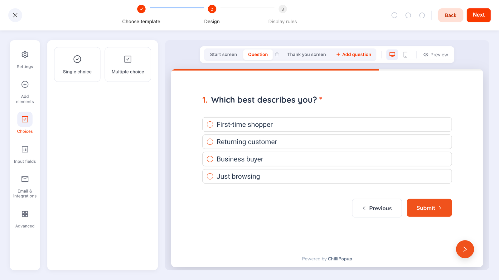
A one-tap first screen is the cheapest "yes" you can buy — and it changes what happens on the second one.
The progressive profiling guide turns this principle into a full field-order strategy.
6. Scarcity and urgency: only when it is true
Limited things feel more valuable, and a deadline converts a "maybe later" into a decision. Both work. Both are also where marketers get themselves into trouble, because the fake version is so easy to build.
Honest versions worth running:
- A real sale end date shown as a countdown in the popup.
- A genuine stock number on a product you actually run out of.
- A capacity limit — seats in a webinar, slots in a workshop.
- A code that genuinely expires, with the expiry stated in the popup and honoured.
A countdown timer works because it makes the deadline concrete. It stops working the moment a returning visitor notices it restarted — and returning visitors are the ones who were going to buy.
7. The endowment effect: let them own it before they pay
People value what they already feel is theirs. This is why "your discount" beats "a discount", why a won prize converts better than an offered one, and why gamified popups outperform their plain equivalents so reliably.
A spin wheel, scratch card, slot machine or claw machine works on exactly this: by the time the claim screen appears, the visitor has won the prize, and the form is the last obstacle between them and something that already feels like theirs. That is a completely different emotional position from being asked for an email in exchange for a coupon.
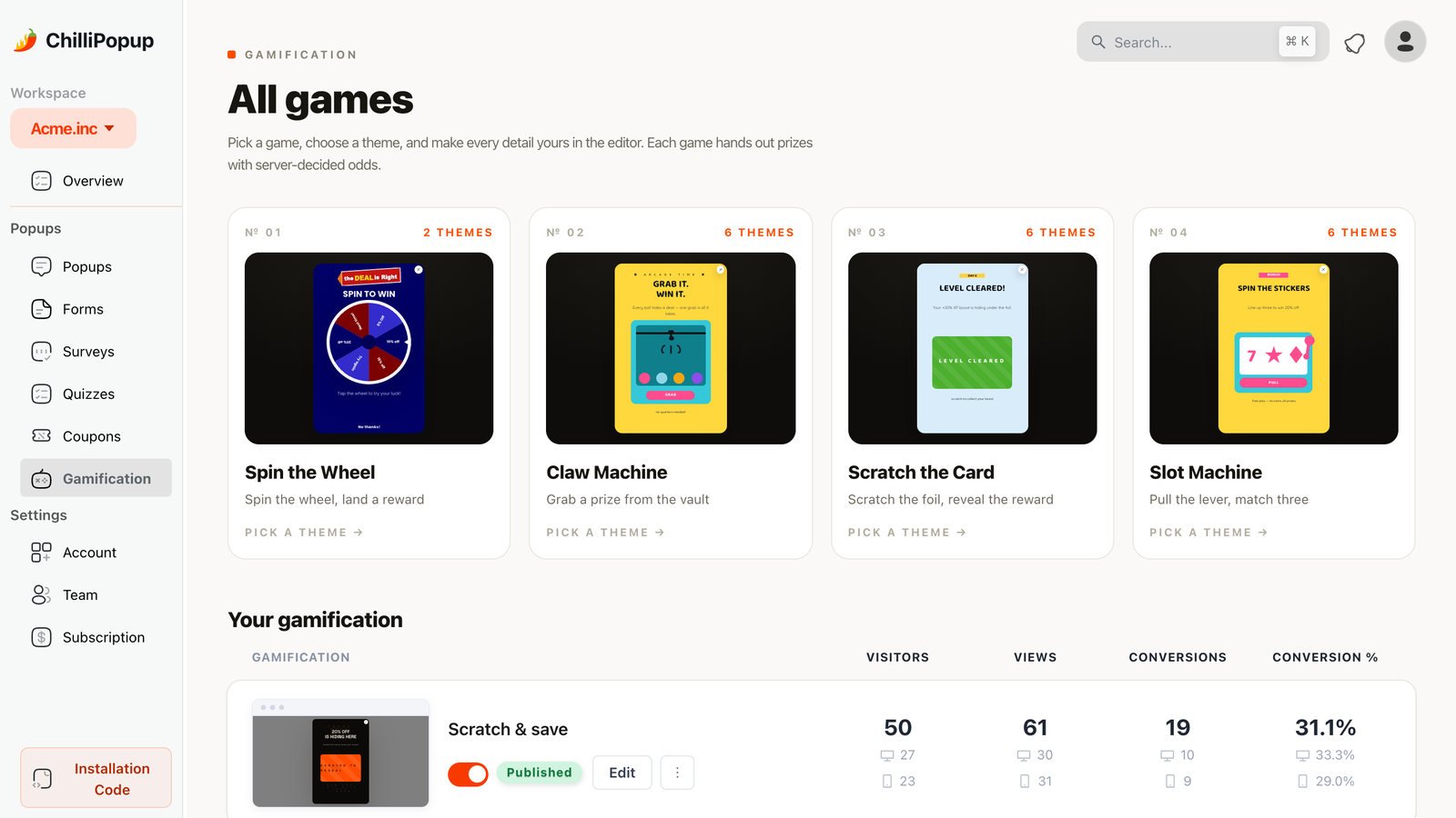
Winning first, claiming second. The endowment effect is why the same coupon converts better after a game.
The same principle applies without a game: "Your 15% is waiting" and "Here's 15% off" are the same discount with different ownership.
8. The peak-end rule: the last screen is the one they remember
People judge an experience by its most intense moment and its ending — not its average. Which makes the thank-you screen, the screen most teams leave on the default text, disproportionately important.
A thank-you screen that earns its place does three things:
- Delivers immediately. Show the code on the screen, not only in an email that may take minutes to arrive.
- Tells them what happens next. "Check your inbox — it's from hello@yourstore.com."
- Gives one next step. A link to the collection the discount applies to.
Get the ending right and the interruption is remembered as a good trade. Leave it as "Thanks for subscribing!" and the memory is of a form.
Which principle for which moment
Principles are not interchangeable. The moment picks the principle, and the wrong one is worse than a plain popup — urgency on a first-time visitor who has not decided they want anything reads as pressure.
| Moment | Principle | Sample line |
|---|---|---|
| First visit, browsing | Reciprocity | "New here? Take the size guide — and 10% while you're at it." |
| Blog article, 50% scroll | Anchoring (effort) | "One email a week. Two minutes to read. Unsubscribe in one click." |
| Exit intent on a product page | Loss aversion | "Leaving without your 10%?" |
| Cart with items, exit intent | Commitment | "You're one step from done — want the code applied?" |
| Sale ending genuinely | Scarcity | "Ends Sunday 23:59. Timer's real." |
| Returning visitor, no purchase | Endowment | "Spin for the prize that's waiting on your account." |
| After any submission | Peak-end | "Done. Here's your code — and here's what to spend it on." |
Put a principle behind every popup
Build popups, forms, surveys, quizzes and prize games from one editor, then test the framing that wins. Free plan, no credit card required. Paid plans from $29/month.
Start free →Three dark patterns to refuse
The line is simple: persuasion helps someone make a decision they would still endorse tomorrow; a dark pattern makes it hard to decide otherwise. Three that show up constantly in popup copy:
- Confirmshaming. A decline link that reads "No thanks, I hate saving money." It converts a few people through embarrassment and annoys the rest. Write a neutral decline — "No thanks" — and let the offer do the work.
- The escape-proof popup. A hidden X, a close button that appears after ten seconds, or a card that reopens the moment it is dismissed. This is the pattern that gets popups banned by marketing teams entirely, and it is the one behaviour that genuinely risks how search engines treat your page — see do popups hurt SEO.
- The resetting countdown. A timer that starts again on reload teaches your best visitors — the returning ones — that your deadlines are decoration. You cannot unteach that.
One more, quieter one: a pre-ticked marketing consent box. It is a compliance problem in several jurisdictions and a trust problem everywhere. Leave it unticked; the people who tick it are the ones worth having on the list. The GDPR popup guide covers the details.
How to test a principle instead of arguing about it
Every principle above is a hypothesis about your audience, and hypotheses are cheap to check. The discipline that makes this work is changing one thing: same offer, same trigger, same design, different framing.
- Test the headline, not the whole popup. "Get 10% off" versus "Don't leave your 10% behind" is a clean read on loss aversion. Rewriting the design at the same time tells you nothing.
- Split the traffic, don't run them in sequence. Week-on-week comparisons are mostly seasonality. An A/B test splits visitors between variants so the comparison is like-for-like.
- Judge on submissions, not clicks. A dramatic headline can lift opens and lose signups. Conversion rate is the number that matters — the popup analytics guide explains how to read it without fooling yourself.
- Give it enough volume. A handful of conversions per variant is noise. Wait for a few hundred views per side before you believe anything.

Two framings, one dashboard: the winner is the one with more submissions per view, not the one that sounded better in the meeting.
A worked rewrite, principle by principle
Before — a real shape of popup you have seen a hundred times:
"Sign up for our newsletter"
"Enter your email to receive updates and offers from our store."
[ Email ] [ Subscribe ]
There is no principle here at all. It describes a mechanism ("sign up") and offers a category ("updates"), which is a request with no gift, no ownership, no proof and no anchor.
After — exit intent, on a product page, one principle plus a peak-end finish:
"Don't leave your 10% behind" ← loss aversion
"It's yours for your first order — 4,100 people used theirs last month." ← endowment + honest social proof
[ Email ] [ Send my code ] ← the button says what happens
Thank-you screen: "Done — here's your code: WELCOME10. It's already waiting in your inbox too." ← peak-end
Same offer. Same field. Same trigger. The difference is that every line is doing a job, and no line is doing two.
Related reading
Frequently asked questions
What is popup psychology?
Popup psychology is the application of behavioural principles — reciprocity, loss aversion, social proof, anchoring, commitment, scarcity, the endowment effect and the peak-end rule — to the moment a popup appears. It is not manipulation: it is matching what you ask for, and how you phrase it, to how people actually make small decisions under time pressure.
Which psychological principle works best in a popup?
Reciprocity, because it is the only one that changes the offer rather than the wording. A popup that gives something first — a guide, a code, a useful answer — converts better than the same popup that only asks. Loss aversion is the strongest wording-level lever, and it is why 'don't lose your 10%' outperforms 'get 10% off' on an exit popup.
Does urgency still work in popups?
Real urgency works; fake urgency works once. A countdown tied to a genuine deadline, a stock number that is true, or a sale that actually ends are all legitimate. A timer that resets when the page reloads teaches returning visitors that your deadlines mean nothing, and that lesson is permanent.
How do I use social proof in a popup without inventing numbers?
Use a number you can stand behind and name its source: total subscribers, orders shipped, reviews collected, years in business. If you do not have an impressive number yet, use specificity instead of scale — a named customer quote or a concrete result beats a vague claim, and it is honest.
What is the difference between persuasion and a dark pattern?
Persuasion helps someone make a decision they would endorse afterwards; a dark pattern makes it hard to decide otherwise. Concretely: a shaming decline link, a hidden or delayed close button, a pre-ticked consent box and a fake countdown are dark patterns. A clear offer, an honest deadline and a well-written headline are persuasion.
How many psychological principles should one popup use?
One, occasionally two. Each principle adds a sentence, and every extra sentence dilutes the single decision you are asking for. A popup that stacks urgency, social proof, scarcity and reciprocity reads as a sales pitch and converts like one — pick the principle that matches the moment and cut the rest.