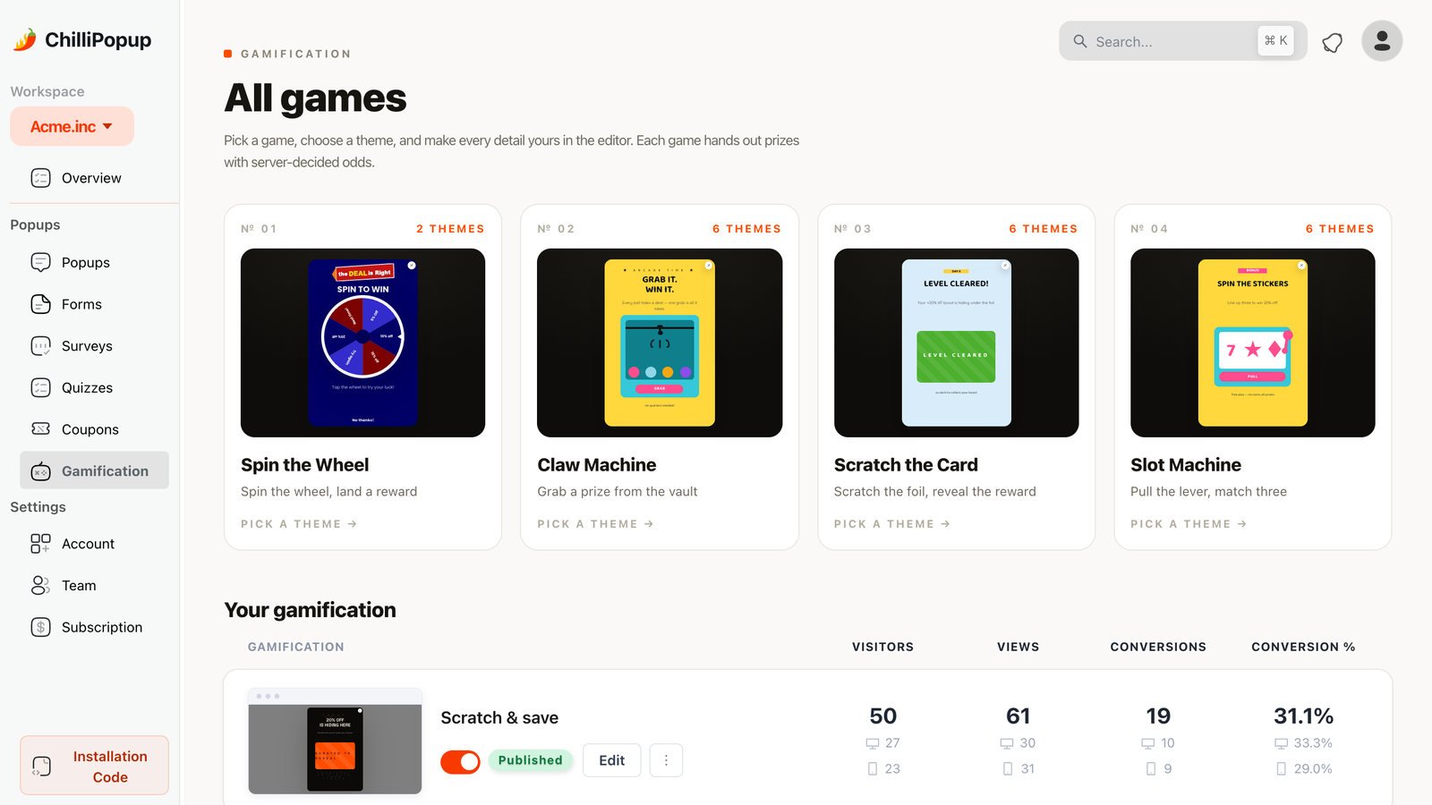
A gamified popup swaps the transaction for a game. Instead of "give us your email and we'll give you 10% off", the visitor spins, scratches, pulls or grabs — and then claims what they won. The email still gets collected. It just arrives at a completely different emotional moment.
That reordering is the entire mechanism. Below are twelve ways to use it, built on four game types, plus the part most people get wrong: the prize table.
Key Takeaways
- The play comes before the ask. Visitors claim a win rather than pay an entry fee — that's the whole advantage.
- Four mechanics, one prize model: spin the wheel, scratch card, slot machine, claw machine. Swapping the mechanic doesn't mean rebuilding the campaign.
- Nothing should be a dead end. Low outcomes still win something small; a real loss feels like a trick.
- The outcome is decided server-side and the prize codes never reach the page, so a game can't be rigged from the browser.
- Honour every prize, instantly. A gamified popup is a promise made in public — the claim screen is where you keep it.
Why gamified popups convert
Three things happen when you wrap an offer in a game, and none of them are about the discount:
- Anticipation buys you attention. A form is read and judged in under a second. A wheel takes two seconds to spin, and for those two seconds the visitor is invested in the outcome.
- The prize feels earned. The same 10% given away in a form is a coupon; won on a wheel it is a result. People are noticeably more willing to hand over an email address to claim something they won.
- Variable outcomes beat a fixed one. Even a modest range — 5%, 10%, free shipping, a sample — makes the play feel like a game rather than a formality.
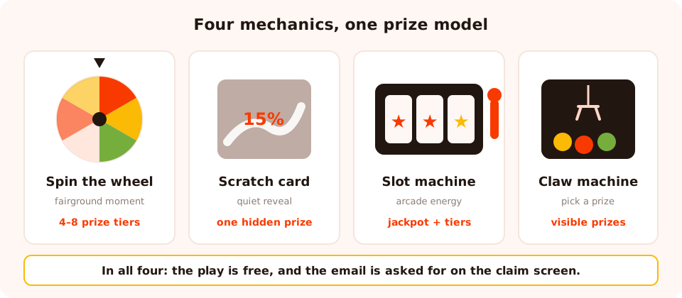
Four mechanics, one shared prize model. Pick the feeling you want, not the novelty.
| Mechanic | Feels like | Best for | Prize shape |
|---|---|---|---|
| Spin the wheel | A fairground moment — public, colourful, familiar | Welcome offers with several prize tiers | 4–8 outcomes of different value |
| Scratch card | A quiet reveal — intimate, tactile, quick | Mystery discounts, post-purchase gifts | One hidden outcome |
| Slot machine | A bold pull — high energy, arcade | Bigger campaigns, sale weekends, younger audiences | A jackpot plus consolation tiers |
| Claw machine | Picking a prize — playful, choice-flavoured | Pick-a-gift offers, product drops | Several visible prizes to grab |
Each game ships with a set of hand-tuned themes — a distinct typographic and colour persona per direction — and every detail stays editable afterwards, so you can start from a look that already works and recolour it to your brand.
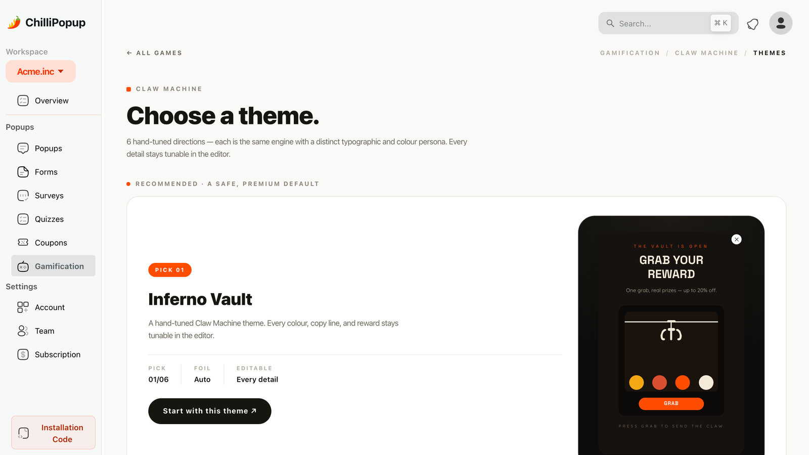
Pick a theme first, then recolour — it's faster than styling a game from a blank canvas.
Four spin-the-wheel ideas
1. The welcome wheel
The workhorse. New visitors only, triggered after a few seconds or a first scroll, with four to six outcomes between 5% and 20%. Copy: "Spin for your welcome gift" — never "subscribe to spin", which puts the ask back in front of the play.
2. The exit-intent wheel
The same wheel, ruled to exit intent instead. It only ever meets people who were leaving, which makes it the safest gamified popup you can run on a product page: everyone it converts was already gone. "Before you go — one spin, one prize."
3. The tiered-prize wheel
Build the wheel so the small prize is common and the big one is rare — 5% at 45%, 10% at 35%, free shipping at 15%, 25% off at 5%. The rare slice is what makes the spin feel like it matters, and the common one is what keeps your margin intact. Set the chances explicitly rather than letting them default to even.
4. The seasonal reskin
One wheel, four campaigns a year. Same mechanic and prize structure, new theme and new prize names for each season — pumpkin, snowflake, heart, sun. It's the cheapest seasonal campaign in existence because the build is already done; see the seasonal popup calendar for the timing.
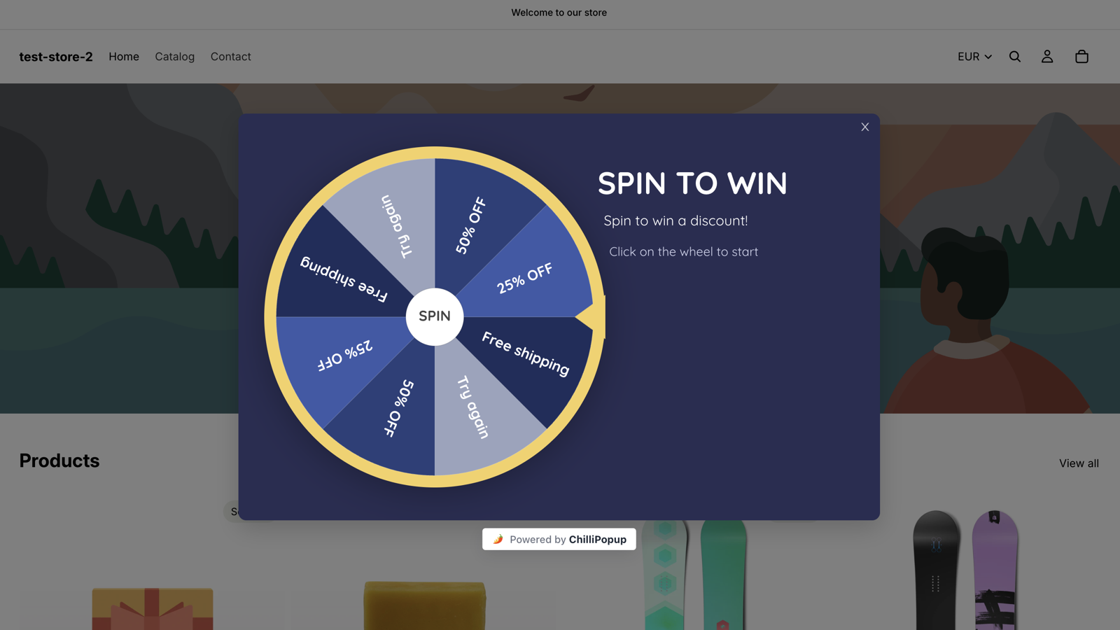
A live welcome wheel. The visitor spins first; the email is asked for on the claim screen.
Three scratch card ideas
5. The mystery discount
One card, one hidden outcome, no wheel of options to read. It suits brands whose design language would look wrong wrapped around a fairground wheel — the reveal is quiet and fast. "Scratch to reveal your discount."
6. The post-purchase birthday gift
The best use of a scratch card, and the one most stores miss. Target the order-confirmation URL and let the customer scratch for a gift on their next order. Because they have just bought something, this is the one moment where asking for birthday month and size on the claim screen is fair — those fields would have wrecked a first-visit popup.
7. The shipping reveal
"Scratch to see if today's your free-shipping day." Cart page, or exit intent from the cart. Free shipping is often cheaper than a percentage discount and converts better on hesitant carts — see the cart abandonment guide for how it fits with the rest of the recovery sequence.
Two slot machine ideas
8. The three-in-a-row bonus
Loud by design. Use it for sale weekends and launches where the whole site is already shouting, with a jackpot outcome and a couple of consolation tiers underneath. The jackpot should be genuinely good — a slot machine that only ever pays out 5% reads as theatre.
9. One play a day
Set the frequency to once a day and tell people: "One pull per day for the whole sale week." It's the only gamified popup that gives visitors a reason to come back tomorrow, which makes it unusually good during a multi-day event. Pair it with an audience rule for returning visitors.
Two claw machine ideas
10. Pick a gift
The claw machine's natural fit: several prizes on display, one grab. The visitor feels like they chose, even though the outcome is decided fairly behind the scenes — which is exactly why it works for "pick your welcome gift" offers where a wheel would feel too random.
11. The product-drop grab
For launches: the prizes are the new arrivals themselves — a sample, a bundle discount, early access to the drop. "Grab one from the new collection." It doubles as a merchandising moment, because the visitor reads the product names while they play.
Two ways to place the game itself
12. The inline game block
A game doesn't have to arrive as an overlay. The same campaign can be rendered in the flow of a page — drop a single div where you want it and it mounts in place, which turns a campaign landing page into something people scroll to and play rather than something that interrupts them.
<div class="chillipopup-inline" data-uuid="YOUR_GAME_UUID"></div>And the combo: one question, then a play
Ask a single segmenting question first — "Shopping for yourself or a gift?" — and let the answer be the ticket to the game. You get a normalised segment value and a played game, and the question feels like part of the fun rather than an extra form field. Build the question as a one-question quiz and the game as its own campaign.
Designing a prize table people trust
This is where gamified popups are won or lost. Three rules:
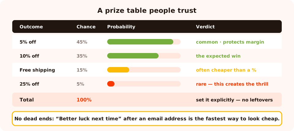
Probabilities that add up to 100, one rare prize worth wanting, and no outcome that pays nothing.
- Make the chances add up to 100. If they don't, the remainder becomes a leftover outcome you didn't design — set them explicitly so the wheel you see is the wheel that spins.
- One rare prize, several common ones. The rare prize is what creates the anticipation; the common ones are what protect your margin. A wheel where everything is worth the same isn't a game.
- No dead ends. Give the weakest outcome something small and real — free shipping, 5%, a sample with the next order. "Better luck next time" after someone hands you an email address is the fastest way to make a brand feel cheap.
Honour every prize, immediately. Show the code on the claim screen, make it work straight away, and put the same code in the email. A prize that fails at checkout costs more trust than the whole campaign earns.
Fairness: why the game can't be rigged
Any prize mechanic invites the same question — can someone force a win by poking at the page? Two things prevent it in ChilliPopup:
- The outcome is decided server-side. The browser asks for a result; it doesn't compute one. There is no client-side random number to intercept.
- Prize codes never reach the page. They're stripped out of the public content response, so the prize list can't be read out of the popup's data before anyone plays.
That matters commercially as much as technically: a discount code that leaks from a wheel is a discount code that ends up on a coupon aggregator by the weekend.
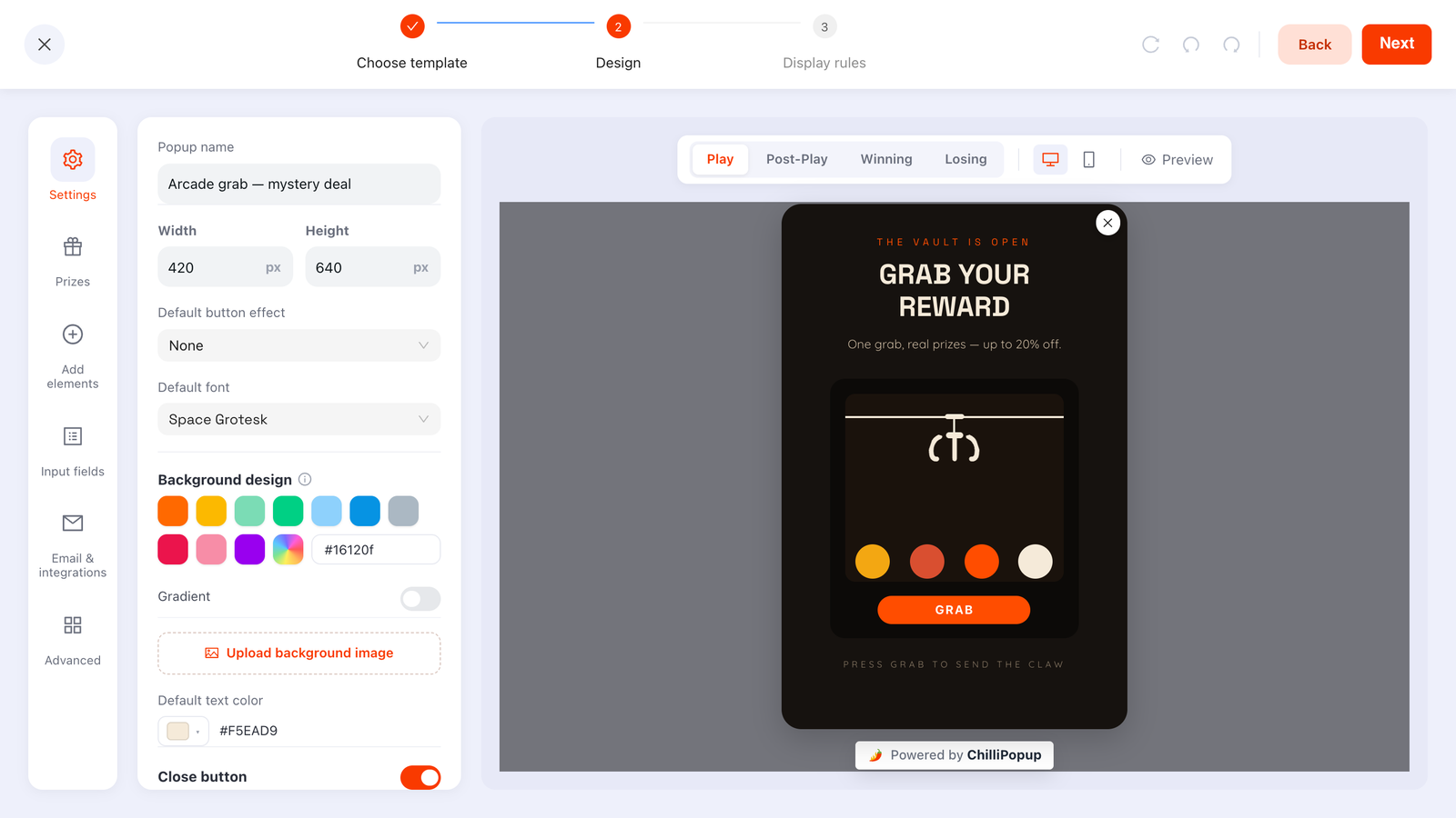
Prizes, chances, colours and copy all live in the same editor as the rest of the campaign.
Six mistakes that kill a gamified popup
- Asking for the email before the play. It converts the game back into a form with decoration. The play is the incentive; keep it free.
- Every outcome is the same discount. Visitors work this out in one visit and tell each other in two.
- A prize you can't fulfil. If the 25% code doesn't stack with the sale, say so on the claim screen — not in the support ticket.
- Running it on every page, every session. A game is a big interruption. Rule it to a moment: new visitors, exit intent, or the confirmation page.
- Leaving "show again after conversion" on. Nothing undermines a prize like being asked to win it again on the next page.
- Using a game where a sentence would do. On a B2B pricing page, a spin wheel is not charming — it's confusing. Match the mechanic to the audience.
Build one in ChilliPopup
About forty minutes for the first, ten for every one after. If the pixel isn't installed, start with the one-line install guide.
1. Pick the mechanic that matches the offer
Multi-tier welcome offer → wheel. Single mystery reward → scratch card. Pick-your-prize → claw machine. Sale-week spectacle → slot machine.
2. Write the prize table on paper first
Outcome, real value, probability. Make the probabilities total 100 and give the weakest outcome something genuine.
3. Keep the play free, put the ask on the claim screen
One email field on the claim form. Submitting is what reveals the code — that ordering is the whole point.
4. Start from a theme, then recolour
Choose one of the ready-made looks for the game, then match your fonts and colours so it reads as your brand rather than a generic arcade cabinet.
5. Rule it to a moment
New visitors for a welcome game, exit intent for recovery, the order-confirmation URL for a post-purchase gift. Switch the frequency rule on, then turn off "show again after conversion".
Give your visitors something to play
All four prize games are included on every plan, alongside popups, forms, surveys and quizzes. Free plan, no credit card required. Paid plans from $29/month.
Start free →Related reading
Frequently asked questions
What is a gamified popup?
A gamified popup replaces "enter your email to get 10% off" with a game the visitor plays to win a prize — a wheel to spin, a card to scratch, a slot to pull, a claw to drop. The email is collected on the claim screen, after the play, so it feels like claiming a win rather than paying an entry fee.
Do gamified popups actually work?
They work when the prize is real and the play is short. The mechanic adds a moment of anticipation that a plain form does not have, which is why gamified popups tend to hold attention longer. They stop working the moment visitors suspect every outcome is the same discount dressed up — so vary the prizes and honour every one.
Which game should I use?
Spin the wheel for a multi-prize welcome offer, scratch card for a single mystery reward or a post-purchase gift, slot machine for a bolder "three in a row" moment, and claw machine for a pick-your-prize feel. All four use the same prize model, so you can swap the mechanic without rebuilding the campaign.
How do I stop people cheating a prize wheel?
The outcome must not be decided in the browser. In ChilliPopup the winning segment is decided server-side and the prize codes are stripped out of the public content response, so a visitor cannot read the prize list or force a win by editing the page.
Should losing outcomes exist?
Yes, but nothing should be a dead end. Give the low-value outcomes a small real prize — free shipping, 5% off, a sample with the next order — so nobody walks away with literally nothing after handing you an email address. A game where every outcome is a prize of some size stays fun; a game where you can genuinely lose feels like a trick.
Where should the email field go in a gamified popup?
On the claim screen, after the play. The visitor plays, sees that they have won, then fills in the claim form — and submitting it is what reveals the code. That ordering is the whole advantage of gamification: the ask arrives after the reward has been earned rather than before.