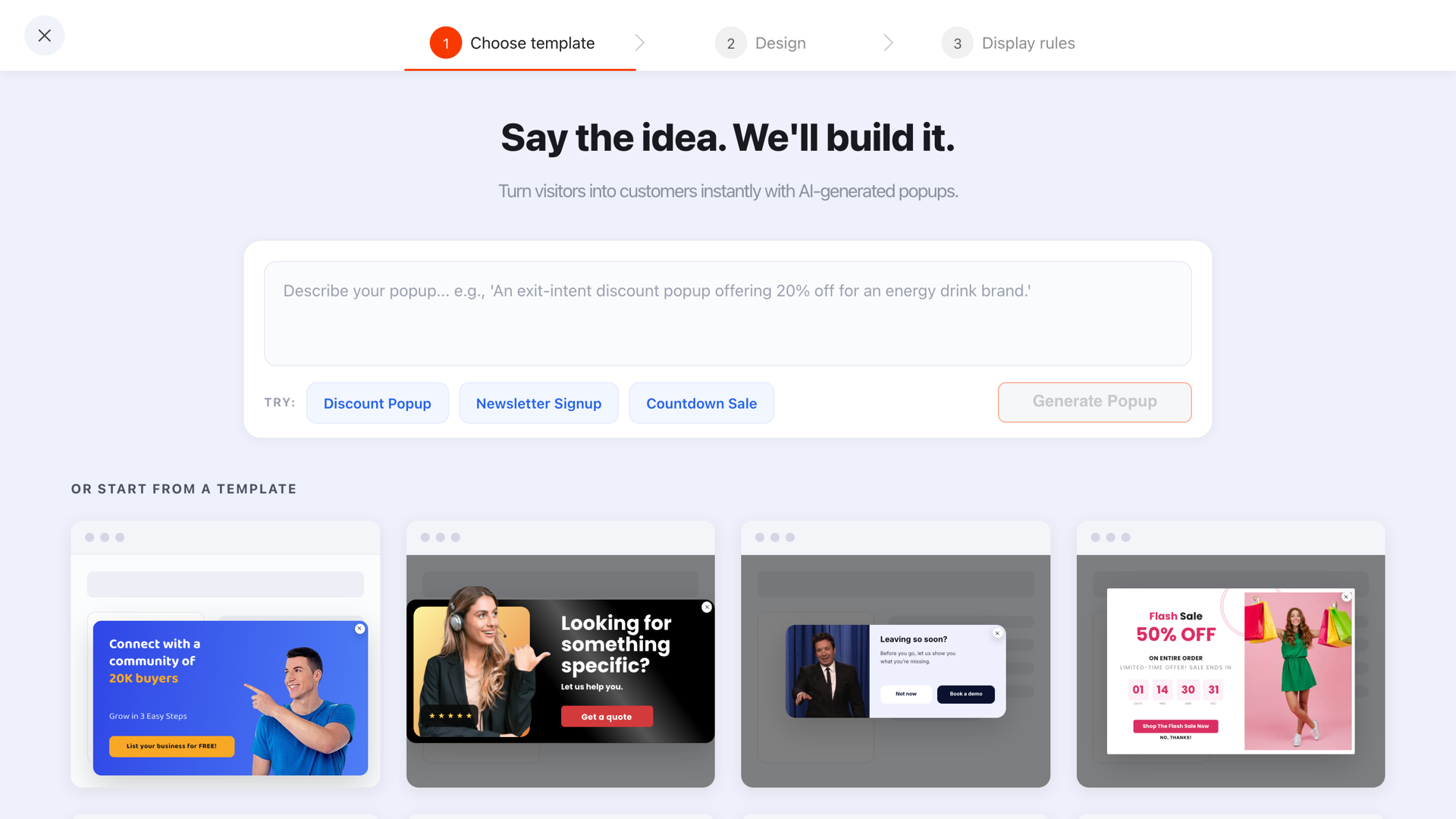
A lead magnet is the reason a stranger trades their email for a place on your list: a discount, a prize, early access, a recommendation. In ecommerce the magnet usually lives in a popup — and the magnet, far more than the design, decides whether that popup converts.
Most stores never make this choice deliberately. They ship the default — "Sign up for 10% off" — because everyone else did, then wonder why the list is full of one-time bargain hunters and the margin report looks bruised. There are at least a dozen offers a popup can deliver, and they differ enormously in what they cost you, who they attract, and when they work. This guide walks through all twelve, with sample copy you can steal, and ends with the mechanics of actually getting the code, file or recommendation into the visitor's hands.
Key Takeaways
- The magnet is the trade. A popup doesn't convert because it's pretty — it converts because what's inside is worth an email to this visitor, right now.
- Do the arithmetic first. A magnet must cost you less per subscriber than a subscriber is worth — a rule most "10% off everything forever" popups quietly break.
- Discounts pull hardest and cost most. Access, alerts, quizzes and birthday clubs pull nearly as hard on the right traffic at a fraction of the margin cost.
- Match magnet to temperature. Cold traffic needs concrete value, warm traffic needs help choosing, hot traffic wants priority — not a bigger price cut.
- Deliver on the thank-you screen. Show the code in a click-to-copy chip or link the file the moment they submit — then let your email tool send it again.
What is a lead magnet? A 60-second definition
Lead magnet, in two sentences
A lead magnet is a specific, immediate incentive you offer a visitor in exchange for their contact details — most often an email address. In an ecommerce popup, it's the answer to the only question the visitor is asking: "What do I get for typing my email into this box?"
The word specific is doing the work in that definition. "Subscribe to our newsletter" is not a lead magnet — it's a request for a favour. "Get 10% off your first order", "Get first pick when the new colourway drops", "Answer four questions and we'll match your skin type" — those are magnets: the visitor can picture exactly what they receive and when.
A good magnet has three properties, and every idea in this list will be judged against them:
- Immediate — the value lands now, or at a clearly named moment ("when it's back in stock"), not "eventually".
- Product-shaped — it's only valuable to someone who might buy from you, which is what keeps freebie seekers off your list.
- Affordable — it costs you less per subscriber than that subscriber is worth. Which brings us to the arithmetic.
The economics: what a magnet is allowed to cost
Before choosing between a 10% code and a spin wheel, put two numbers side by side. Neither needs to be precise — the point is the comparison.
What a subscriber is worth. Open your email tool's reports and divide the revenue it attributes to email over the last year by the size of your list. That's a rough annual value per subscriber. Say — purely as a worked example — email drove €24,000 last year across a list of 8,000: each subscriber is worth about €3 a year to you.
What the magnet costs per subscriber. For a discount, that's the face value of the code × the share of subscribers who redeem it × your average order value's margin sensitivity. In the same made-up store: a 10% code on a €60 average order costs €6 per redemption — but if one in four subscribers redeems, it's €1.50 per subscriber. For non-discount magnets the cost is mostly production time and the occasional fulfilment (a birthday gift, a giveaway prize) spread across everyone who signed up.
The rule: the magnet must cost less per subscriber than a subscriber is worth — ideally less than they're worth in their first few months, because a list you have to hold for a year to break even is a list you'll be tempted to over-email. If your discount fails this test, don't shrink the popup. Shrink the discount, add a minimum order, or switch to a magnet from the left side of the chart below.
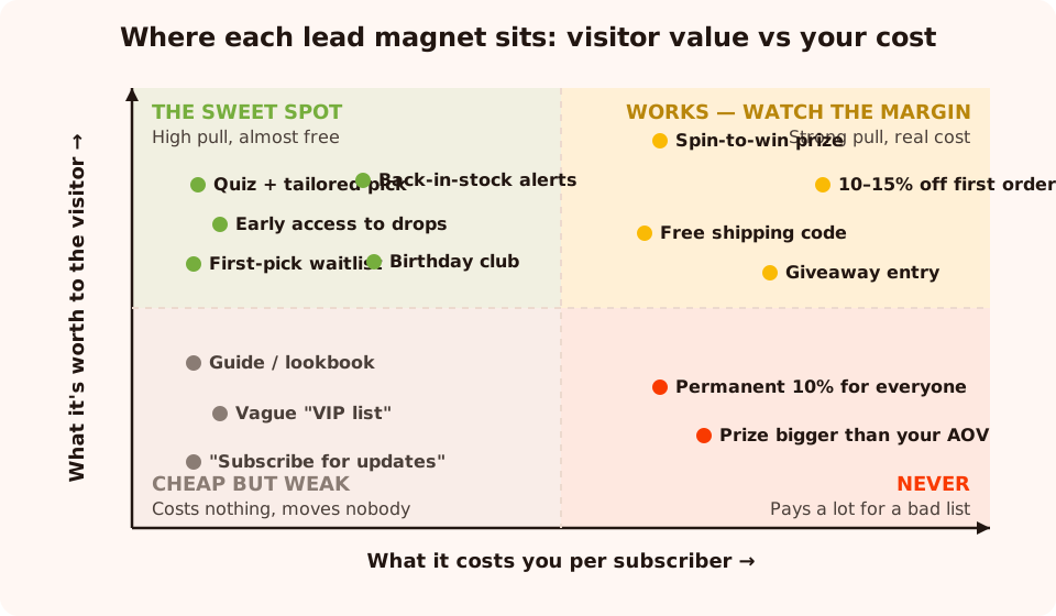
The sweet spot is the top-left: magnets that feel valuable but cost you almost nothing per subscriber.
Notice what sits in the top-left quadrant: quiz results, early access, waitlists, alerts. None of them touch your margin, yet to the right visitor they out-pull a discount — because a discount answers "how much?", while access answers "will I even get one?". Now, the twelve ideas.
Lead magnet ideas 1–4: discounts and prizes
The heavy artillery. These convert cold strangers better than anything else, and every one of them has a real per-order cost — which is exactly why they should be a decision, not a default.
1. A percentage discount on the first order
The classic, and still the strongest single offer for a first-time visitor. The percentage frames the saving relative to whatever they spend, so it scales with the cart — generous on big orders, cheap-feeling on small ones.
"Wait — your first order just got cheaper. Drop your email and take 10% off."
Widget fit: a standard popup with one email input, then the code on the thank-you screen in a click-to-copy coupon chip. The catch: it's your most expensive magnet, and left running permanently it teaches every visitor that full price is for suckers — the failure mode our coupon popup guide is entirely about. Cap it: first order only, and consider a date window or an expiry in the welcome email.
2. A fixed amount off, with a minimum order
"€10 off" reads bigger than "10% off" whenever the typical cart is under €100 — which is most stores. (If your average order sits near the crossover, don't debate it: A/B test the two framings and let your own carts vote.) The minimum order is the margin guard: it turns the discount into a nudge toward a larger basket instead of a straight price cut.
"Here's €10 toward your first order of €60 or more. Where should we send the code?"
Widget fit: same single-field popup and thank-you-screen code as idea 1 — put the minimum in the popup copy so nobody feels tricked at checkout. The catch: a fixed amount is brutal on low-priced catalogues (€10 off a €19 product is a fire sale), and the minimum order must be enforced in your store's coupon settings, not just promised in the popup.
3. A free shipping code
Shipping is the most resented line in any checkout — it feels like paying for nothing. Waiving it converts almost like a discount while usually costing you less, and it doesn't devalue the product itself: the price integrity of your catalogue survives.
"Hate paying for shipping? Same. Your first order ships free — just tell us where to send the code."
Widget fit: single-field popup, code on the thank-you screen. The catch: the real cost swings with what people order — free shipping on one €12 mug can exceed your margin on it. It works best when shipping is a known, visible objection: you sell mid-priced items and charge a flat rate the visitor has already seen.
4. A spin-to-win or scratch-card prize
Instead of stating the discount, make it a game: the visitor spins a wheel or scratches a card, and the prize is what they win. Two things change. Psychologically, a won 15% feels earned in a way a given 15% never does. Economically, you set the prize table — most spins can land on 5% while the popup honestly advertises "up to 30% off".
"Feeling lucky? Spin the wheel — every spin wins something, up to 30% off."
Widget fit: the gamification widgets — spin wheel, scratch card, slot machine or claw machine. The claim screen collects the email before the prize is revealed, the outcome is decided server-side so it can't be rigged from the browser, and the code only appears on a win. The catch: games pull a wider, more entertainment-motivated crowd than a plain discount, so watch redemption rates — and never promise a prize pool you wouldn't be happy paying out at the advertised odds. The full setup lives in our spin-to-win guide.
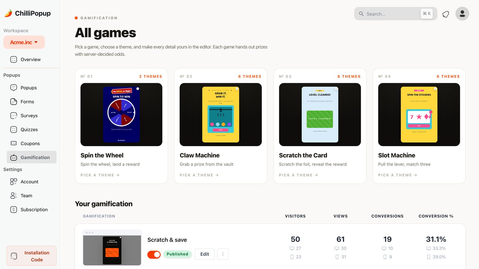
Four ways to turn a discount into a prize: the wheel, the claw, the scratch card and the slots — all decided server-side.
Lead magnet ideas 5–12: access, alerts and identity
Everything in this section costs you little or nothing per subscriber. The trade-off: each one only works on the visitor it was designed for, so targeting does the heavy lifting.
5. Early access to new drops
If your store runs on drops, restocks or seasonal collections, the list is the product: being on it means seeing things before they sell out. No discount required — you're selling priority.
"New drops hit this list 24 hours before the site. Get in before everyone else."
Widget fit: a single-field popup on collection and home pages, aimed at returning visitors. The catch: you must actually honour it — schedule the announcement email a day before the public launch, every time. One drop that goes public first and the magnet is dead. And if you don't genuinely sell out, "early access" is just "email", and visitors can tell.
6. Back-in-stock and restock alerts
A sold-out product page is the highest-intent dead end on your site: the visitor wanted the thing and can't have it. A popup there converts demand you'd otherwise lose into the warmest emails you'll ever collect — people asking to be sold to.
"Gone — but not for good. Leave your email and you'll hear the moment it's back."
Widget fit: a popup or inline form targeted with URL rules at your sold-out product pages (or a URL pattern your store uses for them). To be honest about the mechanics: the popup collects the requests — it doesn't watch your inventory. When you restock, you read the collected emails for that campaign in the dashboard and send the alert from your email tool. That's a manual step, and it's worth it: these are buyers, not browsers. The catch: if restocks are rare or unpredictable, you're collecting promises you can't keep.
7. A size or style quiz with a tailored recommendation
The magnet is the answer: your shade, your size, your routine. The visitor taps through three or four questions, leaves an email, and the result screen recommends something specific. You get a subscriber plus their answers — which shade, which size, which concern — which is worth more than the email alone.
"Not sure which one is yours? Answer 4 quick questions and we'll match you in 30 seconds."
Widget fit: a quiz with single-choice questions and a tailored result on the thank-you screen after the choices; put the email field before the final step. The catch: the recommendation has to be real. A "quiz" whose every path ends at the same bestseller is a discount popup with extra steps, and visitors feel it.
8. A downloadable guide or lookbook
The classic content magnet, imported from B2B: a sizing guide, a care manual, a seasonal lookbook, a "how to build a capsule wardrobe" PDF. It works when the purchase genuinely needs research — think products with fit, compatibility or technique questions.
"The Fall Lookbook: 40 pages of outfits built from this collection. Free — where should we send it?"
Widget fit: a popup whose thank-you screen links straight to the file — hosted on your site or your store's file storage — with your welcome email carrying the same link. The catch: production cost up front, and it skews toward readers over buyers unless the content is purchase-adjacent. A lookbook that links every look to its product pages earns its keep; a generic "10 style tips" PDF rarely does.
9. A birthday club
Trade the email for a promise twelve months long: a gift or code in their birthday month, every year. It quietly collects a second field — the birthday month — which powers the single highest-open email most stores ever send.
"Join the birthday club — a little something from us, every year, no purchase needed."
Widget fit: a popup with an email input plus a select input for the month — two fields, both cheap. The catch: the payoff is deferred, so it converts best as a second ask to people who already like you (post-purchase pages, returning visitors), not as the first thing a stranger sees. And the gift email has to actually go out — set the yearly send up in your email tool the same week you launch the popup.
10. A VIP or members list — with named perks
"Join the VIP list" is either the strongest or the weakest magnet on this page, and the difference is specificity. Vague VIP is a newsletter in a tuxedo. Named-perks VIP — first access, members-only offers, an annual gift — is a bundle of the best magnets in this list under one roof.
"The inner circle gets first access to drops, subscriber-only offers, and a gift on your birthday. In?"
Widget fit: a popup that lists the two or three perks as short lines above one email field. The catch: every named perk is now a commitment. If "members-only offers" never arrive, unsubscribes tell you exactly what your list thinks of the tuxedo.
11. A contest or giveaway entry
Raffle a product bundle; entry costs an email. Nothing on this page collects addresses faster — and nothing collects worse ones if the prize is generic. The fix is to make the prize your own product, ideally your flagship: then even the entrants who don't win have told you they want what you sell.
"Win the whole winter bundle — everything in the photo. One email, one entry, winner drawn Friday."
Widget fit: a popup with an email field, a countdown timer block ticking toward the draw, and a thank-you screen confirming the entry; pick the winner from the campaign's collected emails and announce it from your email tool. The catch: the freebie-seeker rate is the highest of any magnet here, giveaway rules are regulated in many countries (check yours before launch), and the post-draw unsubscribe wave is real. Run giveaways as occasional spikes, not as the standing offer.
12. A "first pick" waitlist
For limited runs, preorders and made-in-small-batches products, the scarcest resource is a place in line — so sell the place in line. Unlike early access (idea 5), which is a standing perk of the list, a waitlist is attached to one specific product or drop, which makes it even more concrete.
"Only 200 will be made. Join the waitlist and you'll get first pick — before it goes public."
Widget fit: a popup on the product's teaser page — URL-targeted, with a countdown timer to the drop if you've set a date. The catch: it only works with genuine scarcity. A "waitlist" for a product that never sells out, or "200 made" that quietly becomes 2,000, spends brand trust you can't buy back.
The comparison: cost, list quality, margin impact
Same twelve ideas, side by side. "List quality" here means the share of signups who ever plausibly buy — the number that decides whether your list is an asset or an expense.
| Lead magnet | Cost per subscriber | List quality | Margin impact | Best first use |
|---|---|---|---|---|
| 1. Percentage discount | High — face value × redemption | Medium — includes bargain hunters | Direct hit on every redeemed order | Cold traffic, healthy margins |
| 2. Fixed amount + minimum | High, but capped per order | Medium | Contained by the minimum order | Carts under €100 |
| 3. Free shipping | Medium — varies with basket | Medium-high | Shipping cost, price integrity intact | Stores with visible shipping fees |
| 4. Spin-to-win prize | Medium — you set the prize table | Medium — adds prize hunters | Weighted average of the wheel | Cold traffic, playful brands |
| 5. Early access | Near zero | High | None | Drop-based stores |
| 6. Back-in-stock alert | Near zero + a manual send | Highest on this list | None | Sold-out product pages |
| 7. Size / style quiz | Build time, then near zero | High — plus their answers | None | Fit- or match-driven catalogues |
| 8. Guide / lookbook | Production time up front | Medium — skews to readers | None | Research-heavy purchases |
| 9. Birthday club | One small gift a year | High | Tiny, deferred | Post-purchase, returning visitors |
| 10. VIP list (named perks) | The cost of the perks you name | High — if perks are real | Depends on the bundle | Brands with repeat buyers |
| 11. Giveaway entry | Prize ÷ entrants — low at volume | Lowest on this list | One prize, plus the churn after | Occasional list-growth spikes |
| 12. First-pick waitlist | Near zero | Very high | None | Limited runs and preorders |
Read the columns together. The giveaway has the lowest cost per subscriber at volume and the lowest list quality — cheap addresses aren't cheap if they never open, never buy, and drag your sender reputation down. Cost per eventual customer is the number the table is really pointing at.
Match the magnet to the traffic temperature
The most common magnet mistake isn't picking a bad offer — it's showing one offer to everyone. A first-time visitor from an ad and a returning customer staring at a sold-out product want completely different things, and your popup tool's targeting is how you give each of them theirs.
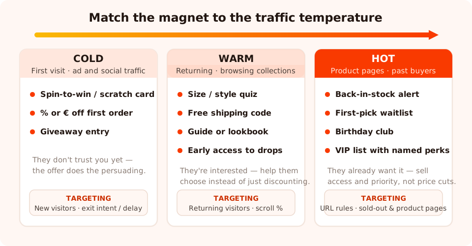
Cold buys with incentives, warm buys with help, hot buys with priority. Targeting rules make the sorting automatic.
- Cold — first visit, ad or social traffic. No trust yet, so the offer does the persuading: a discount, a game, a giveaway. Target new visitors, trigger on exit intent on desktop and a time delay or scroll percentage on mobile, where exit intent is unreliable.
- Warm — returning, browsing collections. They're deciding, so help them decide: the quiz, free shipping, the lookbook, early access. Target returning visitors and trigger on scroll — someone 60% down a collection page is comparing, which is exactly when a "let us match you" quiz feels like service.
- Hot — product pages, sold-out pages, past buyers. They already want it; a discount here just refunds people who would have paid full price. Sell priority instead: back-in-stock alerts and waitlists via URL rules on the exact pages, the birthday club and VIP list for the audience that keeps coming back.
- Everyone, always: set the frequency so a dismissal buys days of silence, and turn off "show again after conversion" so subscribers stop meeting the popup they already answered.
Running two or three magnets this way isn't more intrusive than one — it's less, because each visitor only ever meets the offer built for them. And when two magnets plausibly fit the same temperature — quiz or free shipping for your warm returners, say — don't guess: create an A/B test on that campaign and let the two offers split the segment's traffic until one earns the slot. The broader system for this is covered in how to build an email list with popups.
Delivery mechanics: how the visitor actually gets the thing
A magnet that arrives late, or not at all, is worse than no magnet — it converts a stranger into someone who feels tricked. The mechanics are simple, but they have to be deliberate.
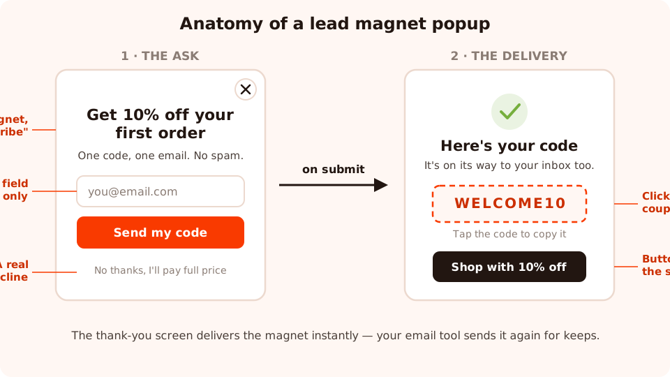
One promise, one field, one decline — and the delivery happens the second they submit, not "check your inbox".
Deliver instantly on the thank-you screen
Every popup, form, quiz and game has a thank-you screen, and that screen is your delivery bay:
- Discount and shipping codes go in a coupon chip — the dashed-border code block the visitor taps to copy. No transcribing, no "did I spell it right", no waiting on an inbox.
- Files — the guide, the lookbook — are a button on the thank-you screen linking to the file wherever you host it (your site, your store's file storage).
- Quiz recommendations appear as the tailored result right after the choices — the magnet is the screen.
- Game prizes are revealed on the win screen, after the claim form collects the email — the reveal order is the whole trick.
Deliver again from your email tool
The thank-you screen closes; the welcome email is the copy that keeps. Your submissions — every address and field, with a collected-fields breakdown — are readable in the ChilliPopup dashboard; you copy them into your email tool, and that tool sends the welcome email carrying the same code or file link. Worth saying plainly: ChilliPopup doesn't send email on your behalf — the popup collects and displays, your email platform delivers. Design the pair together so the popup's promise and the email's payload always match.
Never write "check your inbox for your code" as the only delivery. Some welcome emails land in spam, some visitors typo their address, and every minute between promise and delivery costs conversions at checkout. The thank-you screen delivers instantly; the email is the backup and the receipt — in that order.
Six mistakes that turn a magnet into a margin leak
- The magnet–product mismatch. A free tote, a generic gadget, an unrelated PDF — anything valuable to people who'd never buy from you fills your list with exactly those people. The magnet should be worthless to anyone outside your market.
- The permanent 10%. A launch-week code becomes furniture, and within months you've trained every visitor to wait for the popup before buying — a standing 10% price cut you never decided to take. Give discounts an expiry, a first-order cap, or a date window, and rotate them off.
- The freebie-seeker giveaway. Raffling something everybody wants collects everybody — including the segment that unsubscribes the day the winner is drawn. Make the prize your own product and accept the smaller, warmer entry pool.
- Promising instant, delivering "eventually". If the popup says "get 10% off now", the code must be on the thank-you screen now. Any gap between the promise's tense and the delivery's tense reads as a bait-and-switch.
- Showing the magnet to people who already took it. A subscriber who meets the signup popup again learns you don't know who they are. Turn off "show again after conversion" on every magnet campaign — it's one switch.
- Ignoring the words. The same offer converts differently depending on how it's framed — "10% off" and "your first order just got cheaper" are different popups, and exactly the kind of pair an A/B test settles with numbers instead of opinions. Once the magnet is chosen, the copy is the next-biggest lever; our popup copywriting guide covers the headline-ask-decline formula in depth.
How to measure which magnet wins
You can't crown a winner from taste — and you no longer have to crown one from memory either. The old method was sequential: run one magnet for two weeks, swap in the challenger for the next two, and hope the periods compare. The cleaner way is a proper split test. Hit Create A/B test on the campaign and Variant B appears — a full copy of the popup that you edit into the challenger: same design, same trigger, different magnet. Publish it and ChilliPopup splits traffic between the two versions (50/50 by default, adjustable), keeps each visitor on the version they first saw, and lines up views, conversions and conversion rate side by side. Both offers now face identical pages, identical season, identical everything; the setup walkthrough is in how to A/B test your popups.
Patience still matters — it just changed shape. Instead of waiting out calendar weeks you're waiting out sample size: the results view refuses to call a winner until each version has at least 100 views and the test has 20 conversions, and below 95% confidence it will tell you the lead can still flip. On a quiet store that takes a few weeks. Let it.

Each campaign reports its own views, clicks, closes, submissions and conversion rate — plus the desktop-vs-mobile split and the values collected per field.
Read three layers, in order:
- The popup layer. Views, submissions and conversion rate per campaign — the raw pull of the offer. Check the desktop-vs-mobile split too: games and quizzes often behave very differently by device, and a magnet that loses overall can be winning on one of them.
- The close layer. Closes tell you about the offer's reception, not just its conversions. Two magnets with equal conversion rates but very different close speeds are not equal — the fast-close one is burning goodwill with everyone who didn't sign up.
- The list layer. The decisive one, and it lives in your email tool: welcome-email opens, code redemptions, first purchases, unsubscribes per cohort. A spin wheel that out-converts a waitlist popup three-to-one but produces cohorts that never buy didn't win — it just collected faster.
Tag each cohort on import — magnet:wheel, magnet:waitlist — so ninety days
later you can answer the only question that matters: cost per customer, not cost per
email. That's the number the comparison table above was always about.
Pick a magnet. Ship the popup today.
Build popups, forms, surveys, quizzes and games from one editor — and one pixel. Free plan, no credit card required. Paid plans from $29/month.
Start free →Related reading
Frequently asked questions
What is a lead magnet in ecommerce?
A lead magnet is the specific thing a store offers a visitor in exchange for their email address — a discount code, a free-shipping code, a prize, early access to new products, or a personalised recommendation. In ecommerce it usually lives inside a popup, because that is where the offer meets the visitor at the right moment. Nobody subscribes to 'stay updated'; they subscribe to get the magnet.
What should I offer in a popup to get email signups?
Match the offer to the visitor. Cold traffic responds to concrete, immediate value: a first-order discount, a spin-to-win prize, or a giveaway entry. Warm visitors respond to help and access: a size or style quiz, free shipping, early access to drops. Hot visitors — on product pages or returning after a purchase — respond to priority: back-in-stock alerts, a waitlist, a birthday club or a VIP list with named perks.
Do I have to offer a discount to grow my email list?
No. Discounts convert strangers fastest, but early access, back-in-stock alerts, waitlists, quizzes with a tailored recommendation and birthday clubs all grow lists without touching your margin on every order. If your brand is premium or your margins are thin, lead with access and personalisation, and save the discount for a game where you control the prize table.
What is the best lead magnet for a small store with low traffic?
Pick one magnet that costs you almost nothing per subscriber and that you can honour without extra work: a back-in-stock alert on sold-out product pages, or a simple first-order discount if your margin allows it. Avoid giveaways — they need volume to justify the prize — and avoid content magnets like guides, which take days to produce and tend to convert readers rather than buyers.
How do I deliver a lead magnet from a popup?
Deliver it twice. First, instantly, on the popup's thank-you screen: show the coupon code in a click-to-copy chip, link to the file you host, or show the quiz recommendation. Second, from your email tool: copy the collected addresses over and let your welcome email carry the same code or file. The popup collects and displays; your email tool does the sending.
Why does my lead magnet attract subscribers who never buy?
Because the magnet is disconnected from the product. A generic giveaway or an unrelated freebie attracts people who want the free thing, not your catalogue. Fix it by making the magnet product-shaped: discount your own products, restrict prizes to store credit, quiz people about their needs, or offer early access — offers that are only valuable to someone who might actually buy.