
Popup analytics comes down to five numbers per campaign — views, clicks, closes, submissions, and a conversion rate of submissions ÷ views — and one skill: reading which of those numbers is broken, because each broken number points at a different fix.
That second part is the one nobody does. Most teams ship a popup, glance at the submission count once, and never open the analytics again. The campaign then runs for months in whatever state it launched in — too narrow to be seen, or seen constantly and dismissed constantly — while the team debates redesigns based on opinions. This guide is the reading manual: what each metric actually tells you, the diagnostic ladder that maps every symptom to its likely cause, and the cadence that turns a set of dashboards into decisions.
Key Takeaways
- Five numbers, one formula. Views, clicks, closes, submissions — and conversion rate = submissions ÷ views. Views is the denominator on purpose: it charges the popup for every impression it spends.
- Each symptom names its own fix. Low views is a rules problem. High views with high closes is an offer problem. High clicks with low submissions is a form-friction problem. Don't redesign; diagnose.
- Read the device split before anything else. A popup that converts on desktop and dies on mobile isn't a bad popup — it's two campaigns pretending to be one.
- There is no "good" popup conversion rate. Trigger, offer and traffic move the number more than your design does. Benchmark a campaign against its own history — or its own A/B variant — never against internet averages.
- One change, on the right instrument. Judge nothing on day one. Rules problems iterate in place — change one rule, re-read two weeks later. Offer, copy and design questions go to a linked A/B test: same audience, same fortnight, one difference.
What popup analytics actually measures
Popup analytics, in two sentences
Popup analytics is the per-campaign record of what visitors did with a popup: saw it, clicked it, closed it, typed into it, submitted it — and on which device. Its job is not to produce a grade; it's to tell you which part of the campaign to fix — the display rules, the offer, or the form itself.
Under the hood, everything is events. Each time a campaign renders or a visitor interacts with it, an event is recorded against that campaign — an open (a view), a click, a close, a field input, a submit — along with the device it happened on. The dashboard then rolls those events into the five headline numbers, charts them over time, and splits them by desktop versus mobile; a campaign running an A/B test adds a results view that puts each version's last-30-days views, conversions and conversion rate side by side. In ChilliPopup this works identically whether the campaign is a popup, a form, a survey, a quiz or a game — each campaign gets its own analytics page, its own charts and its own collected data.
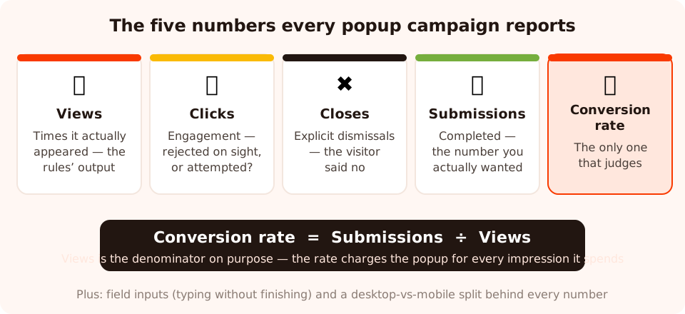
The five core numbers per campaign. Four are counts; the fifth is the only one that's a judgement.
Before reading any of them, understand what shapes them: the display rules. A popup's views are the direct product of its trigger (exit intent, time delay, scroll percentage, pages viewed, clicks, inactivity), its URL and device targeting, its audience setting (everyone, new or returning visitors), and its frequency cap — and every enabled rule is an AND gate that narrows the funnel further. Half of all popup "performance" problems are really rules problems wearing a disguise.
The five core metrics, one by one
Views — how often the campaign earned an audience
A view is recorded each time the popup actually appears in front of a visitor — not each page load. Views measure the output of your display rules, nothing else. A beautiful popup with 40 views a month isn't underperforming; it's unseen. And a popup with views on every page load of every visit isn't popular; it's uncapped. Views are the first number to check because every other number is downstream of it: no reach, no data, no conclusions.
Clicks — did anyone engage at all?
Clicks record interactions with the popup — a button pressed, an element engaged. They sit between seeing and finishing, which makes them the hinge of every diagnosis: clicks tell you whether visitors rejected the popup or attempted it. A popup nobody clicks was rejected on sight. A popup lots of people click but few submit was attempted and abandoned. Those are different failures with different fixes, and clicks are how you tell them apart.
Closes — the metric everyone ignores
A close is an explicit dismissal: the visitor pressed the X or the decline link. It's the most honest number on the page, because it's the only one where the visitor actively told you something — "I saw it, I understood it, no." A high close count next to a healthy view count is direct feedback on the offer or the moment. Most dashboards get read with the closes column skipped entirely, which is like running a survey and ignoring every negative answer.
Submissions — the number you actually wanted
A submission is a completed campaign: the form sent, the survey finished, the prize claimed. It's the numerator of everything. Alongside the count, the dashboard keeps the submissions themselves in a collected-input-data table — every row a real response — plus field inputs, which record typing activity even when the visitor never finished. Field inputs without submissions are the fingerprint of a form that people started and gave up on.
Conversion rate — submissions ÷ views
The one computed metric: of everyone who saw the popup, the share who finished it. The denominator matters. Dividing by views rather than clicks means the rate charges the campaign for every impression it spent — a popup that interrupts 100 people to convert one gets a score that says so. That makes conversion rate the fairest single summary of a campaign, and also the easiest to misread, because both halves of the fraction move: loosen your targeting and the rate falls while submissions rise; tighten it and the rate climbs while submissions collapse. Never read the rate without its two parents next to it.
An honest footnote on precision: on some visitors' browsers, ad blockers suppress a small share of the analytics beacons that record these events, so every count can slightly undercount reality. The popup still renders and submissions still arrive — it's the measurement that loses a few events, not the campaign. Treat your numbers as a floor, not a census, and lean on trends: the undercount is roughly steady, so week-over-week movement stays trustworthy.
The diagnostic ladder: from symptom to cause
Here is the discipline that separates measuring from staring: every bad number has a most-likely cause, and the causes live in different parts of the campaign. Work the ladder top to bottom — each rung assumes the one above it is healthy.
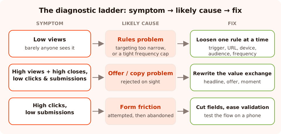
Three rungs, three different parts of the campaign to fix. Never skip a rung.
Rung 1 — Low views: a rules problem
If the popup is barely seen, nothing about its design matters yet. The cause is in the display rules, and it comes in two flavours. Too narrow: an exit-intent trigger on a mostly-mobile audience (exit intent is only reliable on desktop), a scroll trigger set at 80% on pages nobody finishes, a URL rule with a typo, an audience filter pointed at returning visitors on a site with little returning traffic, or a stack of AND-ed conditions — device plus schedule plus date window — that almost no session satisfies. Too broad a cap: a frequency rule like "once every 30 days" quietly caps views at one per visitor per month, which on a small audience looks identical to a broken trigger. The fix is never a redesign; it's loosening exactly one rule and re-reading in two weeks. Our popup triggers guide covers which trigger fits which page.
Rung 2 — High views, high closes, low submissions: an offer problem
Reach is fine; visitors see the popup, understand it in half a second, and dismiss it. Nobody is even clicking. This is a rejection of the value exchange — the offer isn't worth an email, the headline doesn't say what you get, or the moment is wrong (a discount popup two seconds after landing reads very differently from the same popup at exit). The fix lives in the copy and the offer, not the form: what you promise, how fast the headline promises it, and what the visitor gives up in return. This is exactly the territory of our popup copywriting guide.
Rung 3 — High clicks, low submissions: a form-friction problem
The most encouraging failure on the ladder, because the hard part is done: the offer landed, people tried. They clicked, they started typing — the field inputs prove it — and then they bailed. Something between intent and completion is stopping them: too many fields, a validation rule rejecting addresses without explaining why, inputs too small to hit on a phone, a button below the keyboard fold. Cut a field, simplify the ask, test the whole flow on your own phone. Design-level fixes for this rung are in popup design best practices.
The order is the method. Fixing copy on a popup nobody sees is wasted work; cutting form fields when nobody clicks fixes a problem you don't have. Diagnose views first, then closes and clicks, then submissions — and only fix the rung that's actually broken.
The fix-decision table
| Symptom | Likely cause | Fix |
|---|---|---|
| Low views | Display rules too narrow (trigger, URL, device, audience, schedule all AND together) — or a frequency cap doing its job invisibly | Loosen one rule at a time; check the trigger suits the page and the device mix |
| High views, high closes, low clicks | Offer or copy rejected on sight; wrong moment | Rewrite the headline and the value exchange; move the trigger later in the visit |
| High clicks / field inputs, low submissions | Form friction — too many fields, harsh validation, mobile keyboard problems | Cut fields, soften validation messages, test the flow on a real phone |
| Converts on desktop, dies on mobile | One design serving two contexts; exit intent doesn't fire reliably on touch | Build a device-targeted mobile campaign with its own trigger and fewer fields |
| Stepped content: many interactions, many abandons | One specific question is killing the flow | Open the drop-off analysis, rewrite or remove the top-ranked question |
| Submissions full of junk values | Fields easy to fake; email validation off; free text where options would do | Turn on email validation, replace free-text fields with choices |
| Everything slightly lower than expected | Ad blockers suppressing a small share of analytics beacons | Treat counts as a floor; compare trends, not absolutes |
Read the desktop-vs-mobile split before anything else
Every metric above ships with a device breakdown, and it's the first split to open — because an averaged number can hide two opposite stories. A campaign showing a mediocre overall conversion rate is often a perfectly good desktop campaign averaged against a dead mobile one. Roughly half your traffic lives on each side for most sites, so the blend tells you almost nothing until you separate it.
The mobile side fails for predictable, physical reasons: the popup covers the whole viewport instead of sitting politely in a corner, the keyboard eats half the screen the moment a field is focused, the close button is a fingertip-sized target, and — the big one — exit intent doesn't exist on touch. There's no cursor to watch leave the window, so an exit-intent campaign on mobile either never fires or fires on an unreliable proxy. A popup triggered and designed for desktop is simply a different product when it reaches a phone.
The fix is structural, not cosmetic. When the split shows desktop converting and mobile flatlining, don't shrink the desktop popup — build a separate mobile campaign. Use the device toggle in the display rules to point the existing campaign at desktop only, then create a mobile twin: triggered by scroll percentage or a time delay instead of exit intent, one field instead of three, bigger inputs, a thumb-sized close button. Two campaigns also means two clean sets of numbers, so the next read tells you how each context performs instead of blending them back together. The full playbook is in our mobile popups guide.
Also stop comparing across the split. A mobile scroll-trigger campaign and a desktop exit-intent campaign see different visitors at different moments in the visit. Their conversion rates aren't better and worse versions of the same number — they're different numbers. Each campaign benchmarks against its own history, on its own device.
The deeper funnel: analytics for surveys and quizzes
A one-field popup is binary — submitted or not — so five numbers cover it. Stepped content is not binary: a survey or quiz can be started, half-finished and abandoned at any screen, which is why stepped campaigns report a deeper funnel with four stages:
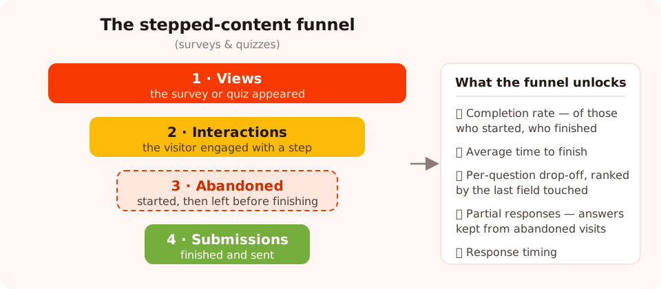
The stepped-content funnel: two extra stages between seeing and finishing, and that middle gap is where the diagnosis lives.
- Views — the survey or quiz appeared.
- Interactions — the visitor engaged: answered something, touched a field. The gap between views and interactions is your rung-2 offer problem, same as any popup.
- Abandoned — engaged, then left without finishing. This stage doesn't exist for simple popups, and it's the one that tells you the content of the flow is losing people, not the pitch.
- Submissions — finished and sent.
Around that funnel sit four more readings. Completion rate summarises the middle of the funnel: of the people who started, how many finished. Average time to finish calibrates your ask — if your "quick question" takes minutes, the promise and the product disagree. Response timing shows when submissions actually arrive, which tells you which days and hours your audience is really answering. And the sharpest tool of the set: per-question drop-off, which ranks questions by the last field visitors touched before leaving. That ranking is a to-do list. The question at the top is where people quit — too personal, too vague, too much typing — and rewriting or removing that one question is usually worth more than any redesign of the rest.
Two bonuses worth knowing. Partial responses keep the answers visitors entered before leaving without submitting — so an abandoned survey still teaches you what the first two answers were, and reading a batch of partials often shows the exact screen where tone or effort changed. And quizzes additionally report option counts per choice question — how many visitors picked each answer — which turns a quiz into segmentation data even before anyone reads individual submissions.
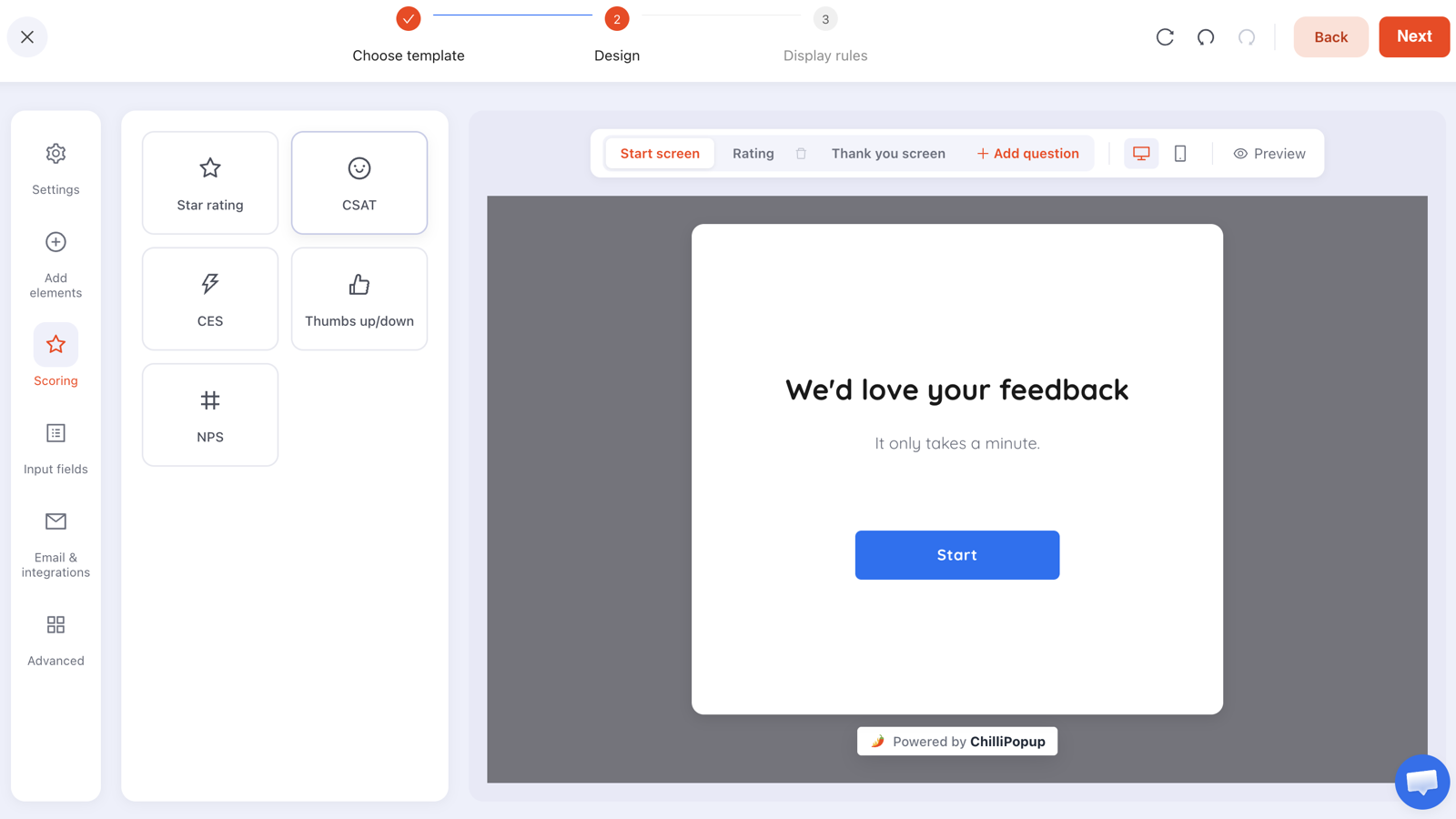
Every screen you add in the builder becomes a rung in the funnel — and a row in the drop-off ranking.
The collected-fields breakdown: reading the answers themselves
Counts tell you how many; the collected data tells you what. Beyond the raw submissions table, the dashboard aggregates a collected-fields breakdown — the top values entered per field. Two minutes in that view catches problems no funnel metric can see:
- Junk data. If a required phone field's top values look like
0000000000and123456789, visitors are paying a compliance tax, not giving you data. The field is costing conversions and returning garbage — drop it or make it optional. For email fields, turn on the input block's email validation (format checking, business-address-only, or both): validation failures at typing time mean fewer junk rows in this table later. - Dead questions. A field where 95% of answers are the same value didn't need asking — you could have assumed it. Every dead question is free friction you can remove, and on stepped content, one fewer screen in the funnel.
- Unnormalised chaos. A free-text "role" field returning
mktg,Marketingandmarketing opscan never be segmented. The breakdown makes this visible instantly; the fix is replacing the text input with a choice question whose options come back clean. - Surprises worth keeping. Sometimes the breakdown is the insight — an answer option you added as an afterthought turning up as the second most common value is your audience telling you something your roadmap didn't know.
Rule of thumb: read the numbers to find where the campaign leaks, then read the collected fields to find why. A funnel locates the problem; the answers usually explain it.
What is a good popup conversion rate? An honest answer
You came here for a number, so here's the truth: there isn't one, and any article confidently quoting "the average popup converts at X%" is either guessing or averaging things that should never be averaged. Three forces move popup conversion rate more than your design ever will:
- The trigger. An exit-intent popup fires at leaving visitors; a 3-second time delay fires at everyone, including people who haven't read a word yet. Same popup, wildly different denominators, incomparable rates. Comparing an exit-intent campaign's rate to a delay campaign's rate is comparing two different questions.
- The offer. "10% off your first order" and "subscribe to our newsletter" are not the same product, and no benchmark that averages them describes either.
- The traffic. A popup on a high-intent pricing page and the same popup on a cold blog post reach different people with different reasons to care. Your traffic mix is baked into your rate, and it's different from everyone else's.
Which is why "am I above the industry average?" is the wrong question. Two benchmarks mean something, and neither lives on the internet. The first is the campaign's own history: let it run untouched for two weeks to establish a baseline, change one thing, run two more weeks, and ask whether its rate moved against its own past. That's the right instrument when the change is about reach — display rules, triggers, targeting. The second, for offer, copy and design questions, is a linked A/B test: spin up a variant of the same campaign, split its traffic — 50/50 by default — and run both versions at the same time in front of the same audience. That holds trigger, traffic and season constant by construction, which even a careful before-and-after can't fully promise: no two fortnights carry identical traffic.
ChilliPopup's built-in A/B testing applies the same honesty to the verdict. The results view refuses to name a winner until each version has at least 100 views and the test has at least 20 conversions, and below 95% confidence it says outright that the lead could still flip. A dashboard that tells you to keep waiting is worth more than any article that hands you an "average".
Also mind the denominator when volumes are small. A campaign with 80 views and 6 submissions isn't "converting at 7.5%" in any stable sense — three more or fewer submissions swings the rate by half. Give small campaigns more time before reading anything into their rates.
A measurement cadence that actually works
The failure mode of popup analytics isn't misreading — it's not reading. Here's a cadence lightweight enough to survive contact with a real workload:
- Launch, then leave it alone for two weeks. A fortnight covers weekday and weekend traffic twice and accumulates enough events to dampen noise. Day-one numbers are a coin flip wearing a dashboard.
- Read in a fixed order. Views first (is it being seen?), then the device split (is one platform carrying it?), then closes and clicks (rejected or attempted?), then submissions and conversion rate. On stepped content, add the funnel, completion rate and the drop-off ranking.
- Skim the collected fields. Two minutes for junk values, dead questions and surprises.
- Change exactly one thing. One rule, one headline, one field — never several. Change three things and a moved number can't tell you which change moved it; you've spent two weeks of data learning nothing.
- Route the change to the right instrument. A rules fix — reach, trigger, targeting — is an edit in place: run another two weeks and compare against the previous cycle. An offer, copy or form change deserves better than overwriting the version that earned your baseline: pick Create A/B test from the campaign's row menu, make the one change on the linked Variant B, and let the traffic split run both versions head to head — the lab the calendar could only approximate. The variant enters the rotation once it's published and enabled (until then everyone keeps seeing the original), and ending the test keeps both versions, so you never destroy the control. The A/B testing guide walks through the setup.
Four cycles in, you'll have made four evidence-backed improvements to the same campaign — some proven against its own history, some settled by an A/B verdict — which beats the industry-standard alternative of one opinionated redesign per year. And because every campaign in ChilliPopup reports the same way, the same twenty-minute ritual covers your popups, forms, surveys, quizzes and games in a single sitting. If a campaign isn't live yet, start with the install guides in the help center — the numbers only start when the pixel does.
A worked diagnosis, start to finish
Everything in this section is made up. The numbers below are illustrative, invented for the walkthrough — they are not benchmarks, targets, or averages, and your campaigns will look nothing like them. The point is the method, not the values.
Imagine a fictional store running a discount popup for two weeks. The dashboard shows: 12,400 views · 610 clicks · 9,100 closes · 260 submissions · conversion rate 2.1%. Is that good? Wrong question. Walk the ladder instead.
Step 1 — views. 12,400 views in two weeks means the rules are delivering an audience. Rung 1 is healthy; whatever is wrong, it isn't the trigger or the targeting. Move down.
Step 2 — the device split. Opening the breakdown, the fictional numbers split into desktop: 5,900 views and 233 submissions (about 3.9%), mobile: 6,500 views and 27 submissions (about 0.4%). The "2.1% campaign" doesn't exist — it's a working desktop campaign averaged with a dead mobile one. That's the headline finding, and it took one click.
Step 3 — closes and clicks, per side. On desktop, closes are proportionate and clicks convert to submissions cleanly — attempted and completed. On mobile, closes are massive and nearly instant, and the few clicks that do happen rarely become submissions: the field-input counts show visitors starting to type and quitting. Mobile is failing on two rungs at once — rejected on sight by most, and form-hostile for the few who try. That's consistent with a desktop-sized popup landing on phones: it covers the screen (instant close) and fights the keyboard (abandoned typing).
Step 4 — one change. The diagnosis names the fix: leave desktop untouched, and split off a mobile campaign — device-targeted, scroll-triggered, one email field, big close button. Two weeks later, the fictional team reads desktop against desktop's past (unchanged, as expected) and the new mobile campaign against nothing but its own first fortnight. Next cycle, the highest close rate gets the attention.
Notice what never happened: nobody asked whether 2.1% was "good", nobody compared the campaign to an internet average, and nobody redesigned anything on day one. The dashboard located the leak, the split explained it, and one structural change addressed it.
Popup analytics mistakes to stop making
- Judging a popup on day one. The first day's traffic is one slice of one weekday, plus launch-hour bugs. Every number needs a fortnight before it means anything.
- Comparing unlinked campaigns against each other. The exit-intent popup isn't "beating" the welcome popup — two separate campaigns differ in audience by construction, because different triggers and rules select different visitors at different moments, so their rates answer different questions. An unlinked campaign benchmarks against its own history, full stop. When you genuinely need a head-to-head, run it as a linked A/B test on one campaign: the split assigns every visitor at random to one version — and keeps them there — so both versions face the same audience at the same moment.
- Chasing views instead of submissions. Views are a cost, not an achievement — every one spends a visitor's attention. Loosening rules to inflate views while submissions stay flat just lowers your conversion rate and raises your annoyance footprint.
- Ignoring closes. Closes are the only metric where visitors explicitly voted. A campaign with a towering close count is generating brand damage on a schedule, and the submission count alone will never tell you.
- Changing three things at once. New headline, new trigger, new field count — and the rate moved. Which change did it? You'll never know, and the next decision is a guess again. An A/B test doesn't repeal this rule: a variant that differs from its original in three ways tells you which version won, never why.
- Reading the blended number when the split disagrees. Any time desktop and mobile diverge, the average is fiction. Diagnose per device, fix per device.
- Never opening the drop-off view on stepped content. Surveys and quizzes name the exact question that loses people, ranked. Skipping that view and guessing is choosing to work blind.
Measure every campaign from one dashboard
Build popups, forms, surveys, quizzes and games from one editor — and one pixel. Free plan, no credit card required. Paid plans from $29/month.
Start free →Related reading
Frequently asked questions
What is popup analytics?
Popup analytics is the per-campaign measurement of how a popup performs on your site: how many times it was seen (views), how often visitors interacted with it (clicks and field inputs), how often it was dismissed (closes), how many people finished it (submissions), and the conversion rate — submissions divided by views. Read together, those numbers tell you not just whether a popup works, but which part of it to fix.
How is popup conversion rate calculated?
Popup conversion rate is submissions divided by views: of everyone who saw the popup, the share who completed it. It deliberately uses views as the denominator, not clicks, so it charges the popup for every impression it spent — a popup that annoys 100 people to convert one gets the score it deserves. ChilliPopup computes it this way automatically for every campaign.
What is a good popup conversion rate?
There is no universal number, and any article that gives you one is guessing. Conversion rate depends on the trigger (an exit-intent popup and a 3-second delay popup see completely different audiences), the offer (a 10% discount versus a bare newsletter ask), and the traffic reaching the page. Only two comparisons hold: a campaign against its own history — establish a two-week baseline, change one thing, and watch whether its own rate moves — and a linked A/B test between two versions of the same campaign, which splits the same traffic between them at the same time.
Why does my popup have views but no submissions?
Look at where the funnel breaks. If views are high, closes are high and clicks are low, visitors are rejecting the offer or the copy before touching the popup — rewrite the headline and the value exchange. If clicks or field inputs are high but submissions stay low, people are trying and giving up — that is form friction, so cut fields, fix validation errors and make the inputs easier to complete, especially on mobile.
Why does my popup convert on desktop but not on mobile?
Because it is one design serving two very different contexts. Mobile visitors get a smaller screen, a keyboard that covers half of it, and no reliable exit intent. Check the device breakdown in your analytics: if desktop carries all the submissions, build a separate mobile campaign — device-targeted, triggered by scroll or time delay instead of exit intent, with fewer fields and larger inputs — rather than shrinking the desktop popup.
Do ad blockers affect popup analytics?
They can. On some visitors' browsers, ad blockers suppress a small share of the analytics beacons that record events, so counts can slightly undercount actual activity. The popup itself still renders and submissions are still collected; the undercount affects the measurement, not the campaign. Treat your numbers as a floor rather than an exact census, and compare trends over time — the undercount is roughly consistent, so relative movement stays trustworthy.