
A newsletter signup popup is a small overlay that asks a website visitor for their email address in exchange for something specific — a discount, a guide, early access, or a genuinely good weekly email. It works when the offer is concrete and the form is one field; it fails when it says “Subscribe to our newsletter” and asks for four.
Below are twelve newsletter popup examples you can copy, the placement and trigger each one needs, and the handful of rules that separate the versions that build a list from the versions that just annoy people.
Key Takeaways
- Sell the email, not the signup. “Join our newsletter” describes an action; “Get the drop list before it goes public” describes a benefit.
- One field. Email only. Every extra input is a decision, and decisions are where signups die.
- The button repeats the reward — “Send me the code”, not “Submit”.
- Match interruption to intent. Exit intent and scroll depth for readers, delay for landing pages, an inline form where a popup would be rude.
- Say what happens next. Frequency, content and an unsubscribe promise remove the last objection in one line.
What a newsletter signup popup actually has to do
The visitor is mid-task. They came to read a post or look at a product, and something appeared over it. In the two seconds before their hand moves to the close button, your popup has to answer three questions: what do I get, what does it cost me, and what happens after I type this.
Most newsletter popups only answer the second one. That's why the six-part anatomy below matters more than the design does — a plain popup that answers all three beats a beautiful one that answers one.
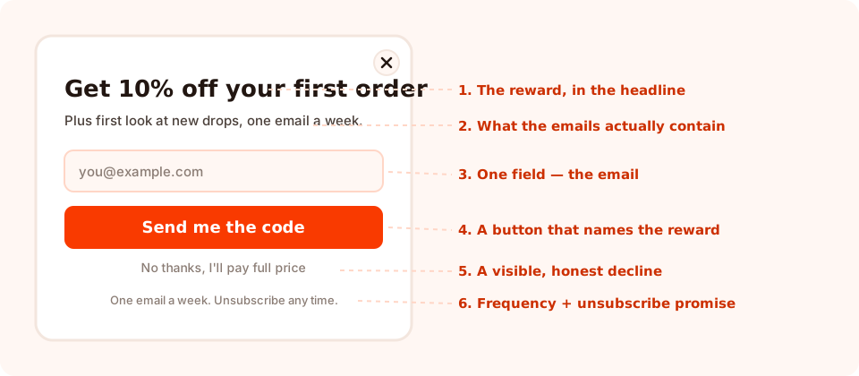
Six parts. Remove any one of them and you can usually name which metric drops.
The two-second test. Screenshot your popup, show it to someone for two seconds, then ask what they'd get by signing up. If they can't answer, no amount of trigger tuning will save it.
12 newsletter signup popup examples you can copy
Each of these is a complete popup: headline, sub-line and button. Swap in your own nouns — the structure is what's doing the work.
1. The first-order discount (ecommerce default)
“10% off, before you go.”
“Drop your email and the code lands on screen — plus one email a week when something new
arrives.”
Button: Send me the code
The workhorse. Note the second sentence: it tells people they're joining a list, which is what keeps unsubscribe rates sane later.
2. The free-shipping alternative
“Free shipping on your first order.”
“We'll email the code now. Minimum order £25.”
Button: Unlock free shipping
Better than a discount if your margins are thin or your brand doesn't discount. Shipping cost is the single most-cited reason people abandon a cart, so removing it reads as a bigger win than 10% often does.
3. The early-access list
“See the new drop 24 hours early.”
“Subscribers get the link before it's public. Sizes go fast.”
Button: Get early access
No margin cost at all, and it self-selects for your best customers. Works for anything with limited stock, seats, or a release cadence.
4. The restock alert
“Sold out? We'll tell you the second it's back.”
Button: Notify me
Page-target this to out-of-stock product URLs and it stops being a popup and starts being a service. Highest conversion rate of anything on this list, because the visitor's intent is already perfect.
5. The content upgrade (blogs)
“Want the checklist version of this post?”
“A one-page PDF of every step here. Free, no signup wall.”
Button: Send me the checklist
Trigger it at 60% scroll on that one article. A relevant offer on a page someone is already deep into converts far better than a site-wide newsletter ask — see the blog popup strategy guide for how to scale this across a whole content library.
6. The weekly digest with a real promise
“One email. Friday. Five minutes.”
“The three things worth knowing this week, and nothing else.”
Button: Join
the Friday list
When you have no discount to give, sell the format. Named day, named length, named number of items — specificity is the offer.
7. The insider price list (B2B and wholesale)
“Get the trade price list.”
“Business email only — we'll send the current sheet and update you when it changes.”
Button: Email me the price list
Turn on business-email validation for this one so free-provider addresses are rejected at submit and your list stays a trade list.
8. The size or fit guide
“Not sure of your size?”
“Our real-measurements guide, emailed in 10 seconds.”
Button: Send the size guide
Solves a live objection on the product page and collects the email as a side effect. That's the ideal shape for any newsletter ask.
9. The exit-intent save
“Leaving without the code?”
“It's 10% and it takes one field.”
Button: Yes, send it · decline: No thanks, I'll pay full price
The decline link is not decoration. An honest, slightly costly “no” option makes the “yes” feel like a choice, and it's the single cheapest edit on this page. The full mechanics live in the exit intent popups guide.
10. The welcome-back list (returning visitors)
“Second visit — want the good stuff by email?”
“New arrivals and subscriber-only sales. One email a week.”
Button: Keep me posted
Target returning visitors only. Someone who came back has already told you they're interested; asking them is a different conversation from asking a first-time stranger.
11. The gamified signup
“Spin for your discount.”
“Everybody wins something. Enter your email to claim it.”
Button: Spin the wheel
The email is collected on the claim screen, after the visitor has already played and won — which is a much warmer moment than asking cold. Spin wheels, scratch cards, slot machines and claw machines all work this way, and the outcome is decided server-side so it can't be rigged from the browser.
12. The quiet inline form
“Liked this? Get the next one.”
Button: Subscribe
Not a popup at all — an inline form at the end of an article or in the footer. Lower volume, zero interruption, and it's the safety net for everyone who dismissed the popup.
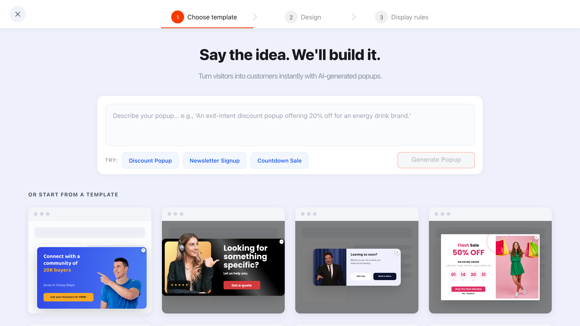
Most of the twelve start as a template you edit — or as a sentence typed into the generator.
Where to put it: four placements, four jobs
The same offer performs completely differently depending on how much it interrupts. Pick the placement from the page's job, not from what looks best in a screenshot.
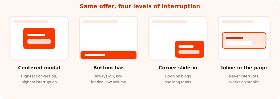
A popup can be anchored to any of nine positions — centre, the four corners, or any edge.
| Placement | Best page | Trigger to pair with | Trade-off |
|---|---|---|---|
| Centered modal | Home, collection, product | Exit intent (desktop), 50% scroll (mobile) | Best conversion rate, most intrusive — needs a frequency cap |
| Bottom or top bar | Every page, always on | Short time delay | Low volume, but it never blocks anything |
| Corner slide-in | Blog posts, long reads | 60–70% scroll | Reads as polite; easy to ignore entirely |
| Inline form | End of article, footer, sidebar | None — it's always there | Lowest volume, highest intent, zero complaints |
Run at least two: one interrupting placement for volume and one inline form for the people who dismissed it. They collect different visitors, and neither cannibalises the other as long as you cap the popup's frequency.
How to write the offer (the part everyone skips)
Nobody wants a newsletter. They want the thing inside the newsletter. Every weak popup on the internet makes the same swap — it describes the container instead of the contents.
| Weak (describes the action) | Strong (describes the payoff) | Why it works |
|---|---|---|
| Subscribe to our newsletter | Get 10% off your first order | Names a reward with a number |
| Stay in the loop | See new arrivals 24 hours early | Specific benefit, specific timing |
| Join our mailing list | One email, Friday, five minutes | Sets the cost before they ask |
| Sign up for updates | We'll email you when it's back in stock | Answers a question they already have |
| Don't miss out! | Subscriber-only sales, about once a month | Replaces vague urgency with a real promise |
Then write the button last, and make it finish the sentence “I want to…”. Send me the code, Get the size guide, Join the Friday list. If your button says Submit, you have thrown away the last piece of persuasive real estate on the popup.
Don't promise what you can't send. If there's no welcome email set up in your email tool yet, deliver the code on the popup's own thank-you screen instead — a coupon block can display the code and copy it to the clipboard on click. Promising an email that never arrives is worse than not promising one.
How many fields? One.
Email, and nothing else. First name earns a slot only if you genuinely personalise subject lines — and even then, make it optional. Phone number belongs on a different campaign entirely.
The reason isn't typing speed. It's that each field is a separate decision, and some decisions are much more expensive than others: once someone has decided to take your discount, an email address is nearly free, while “company name” or “how did you hear about us?” reads as an objection. If you need more than an identifier, collect it later — that's what progressive profiling is for.
Two field settings worth turning on for a newsletter popup:
- Email format validation with a typo guard — catches
gmial.combefore it becomes a permanently bouncing subscriber. - An explicit consent checkbox where you need one. In the EU/UK, marketing email generally needs opt-in consent that isn't bundled into another action — the GDPR popup guide covers the wording.
Timing: when the popup should appear
A newsletter popup fires on the first enabled trigger, so pick one deliberately rather than switching several on at once.
- Exit intent — the cursor heads for the tab bar. The classic last-chance moment, and desktop-only in practice.
- Page scroll percentage — the mobile equivalent. 50–60% on a product page, 60–70% on an article.
- Time delay — simple and blunt. Anything under about five seconds arrives before the visitor has seen enough to want it.
- Page count — wait until someone has viewed two or three pages this session. Fewer views, better visitors.
- Inactivity — they stopped scrolling. Useful on long reads.
- Click count — after N clicks, which tends to mean genuine browsing.
Then cap it. A frequency rule — once a day, once every N days, once every N visits — is what stops the same person meeting the same popup six times, and turning off show again after conversion is what stops subscribers being asked to subscribe. More detail in the popup frequency guide and the popup triggers guide.
A worked example: a small apparel store
Three campaigns, about an hour of work, no overlap.
Campaign 1 — the acquisition popup. Centered modal on collection and product pages. Exit intent on desktop, 50% scroll on mobile. Headline “10% off your first order”, sub-line “Plus first look at new drops — one email a week”, one email field, button Send me the code, decline link No thanks, I'll pay full price. Frequency: once every seven days. Show again after conversion: off. The thank-you screen shows the code with copy-on-click.
Campaign 2 — the content upgrade. Corner slide-in on blog URLs only, 60% scroll, offering the style guide PDF relevant to that section. Different offer, so it can run alongside campaign 1 without competing.
Campaign 3 — the inline safety net. An inline form embedded at the end of every article and in the footer. No trigger, no interruption, catches the people who closed campaign 1 reflexively.
Why three and not one: the modal wins on volume, the slide-in wins on relevance, and the inline form wins on the people who dislike popups. They cost nothing to run in parallel as long as each has its own frequency cap.
What to measure

Opens, unique views, clicks, submissions, conversion rate and field inputs — per campaign, over any date range.
Four numbers tell you which part to fix:
- Unique views — how many people the popup actually reached. A low conversion rate on 40 views is not a signal; it's noise.
- Conversion rate (submissions ÷ views) — your headline number. Compare a campaign against itself over time, never against someone else's benchmark.
- Clicks and field inputs — the gap between them and submissions is where people started typing and then quit. If field inputs are high and submissions are low, look at validation errors and the button, not the offer.
- Shows by device — if mobile views are large and mobile submissions aren't, your popup is probably too tall or your trigger is exit intent.
Change one thing at a time. The A/B testing guide walks through running two versions against each other properly instead of eyeballing last week versus this week.
Seven mistakes that flatten a newsletter popup
- “Subscribe to our newsletter” as the headline. It's the container, not the contents. Name what's inside.
- Firing it in the first two seconds. The visitor hasn't seen anything worth subscribing to yet, so the answer is automatic.
- Four fields. Name, email, phone, and a dropdown nobody reads. Cut to one.
- A hidden or insulting decline. A close button that's invisible on mobile creates rage-clicks; a snarky “No, I hate saving money” creates screenshots. A plain, honest decline outperforms both.
- No frequency cap. The same modal on every page view is the single fastest way to make people hate an otherwise good offer.
- Still showing it to subscribers. Turn off show again after conversion. It takes one switch and it's the difference between a brand that recognises you and one that doesn't.
- A promised email that never arrives. If the welcome email isn't built yet, deliver the reward on the thank-you screen instead.
Build your newsletter signup popup in ChilliPopup
About twenty minutes, no code. If the pixel isn't on your site yet, start with the one-line install guide — the same script serves every campaign you build afterwards.
1. Start from a template or a sentence
Pick a newsletter template from the gallery, or describe the popup you want in one line and let the generator draft it — then edit. Either way you end up on the same canvas.
2. Write the offer, then cut the fields to one
Headline names the reward, sub-line names what the emails contain and how often. Delete every input except email, and turn on format validation so typos are caught at submit.
3. Rewrite the button and add an honest decline
Button repeats the reward. Add a small text link that closes the popup — a button with the close action — reading something like No thanks, I'll pay full price.
4. Set the trigger, the placement and the cap
Exit intent for desktop, page scroll around 50% for mobile. Anchor the popup where the placement table above says it belongs. Switch the display frequency rule on, choose a cooldown, and turn off “show again after conversion”.
5. Deliver the reward on the thank-you screen
Put the discount code on the thank-you step with copy-on-click, so the promise is kept before any email is involved. Publish, then leave it alone for two weeks before judging it.
Build your newsletter popup in twenty minutes
Popups, forms, surveys, quizzes and games from one editor and one script. Free plan, no credit card required. Paid plans from $29/month.
Start free →Related reading
Frequently asked questions
What is a newsletter signup popup?
A newsletter signup popup is an overlay on your website that asks a visitor for their email address in exchange for something specific, such as a first-order discount, a guide, early access or a weekly email. It typically has a headline naming the reward, one email field, a button that repeats the reward and a visible way to decline.
What is a good conversion rate for a newsletter popup?
Treat your own popup as the benchmark. Published averages mix wildly different traffic, offers and triggers, so they tell you very little about your site. Record the conversion rate your popup gets in its first two weeks, then change one element at a time and compare against that baseline.
How many fields should a newsletter signup popup have?
One: the email address. Each additional field is a separate decision, and fields such as phone number or company name read as objections rather than steps. If you need more information, collect it on a later campaign once you have already delivered something.
When should a newsletter popup appear?
After the visitor has seen enough to want it. Exit intent works well on desktop, page scroll of around 50 to 60 percent works on mobile and on articles, and page count works when you only want people who are genuinely browsing. Avoid time delays shorter than about five seconds.
Do newsletter popups hurt SEO?
Not in themselves. Google's intrusive interstitial guidance targets popups that block the main content on mobile immediately after arriving from search. A popup triggered on exit intent or after meaningful scrolling, or one that occupies a reasonable share of the screen, is not what that guidance is aimed at.
Should I still use an inline form if I have a popup?
Yes. An inline form at the end of an article or in the footer catches everyone who dismissed the popup reflexively, costs nothing to run alongside it, and produces higher-intent subscribers. Run both and cap the popup's frequency so they do not compete.