
Blog popups convert differently to product-page popups because blog readers arrive to read, not to buy. The fix is timing and relevance: fire at 50–60% scroll instead of on arrival, and match the offer to the topic of the post rather than showing one sitewide discount to everyone.
Most blogs do the opposite. They install one popup, point it at the whole site, trigger it three seconds after page load, and offer 10% off to someone who came from search to learn how to descale a kettle. It converts badly, and it teaches regular readers to hit the X before they have read a word. This guide is the version that works — offer, timing, frequency, and where the honest limits are.
Key Takeaways
- Blog traffic is research traffic. The reader has intent about a topic, not about your product — so the offer has to be an extension of the article.
- Scroll depth beats a timer. Fire at 50–60% of the page, when someone has committed to the piece but has not finished it.
- Exit intent is a desktop cursor signal. There is no equivalent gesture on a phone, so split the campaign by device rather than hoping.
- One page-URL rule per content bucket does most of the work. Three targeted asks beat one sitewide ask.
- Frequency plus "show again after conversion" off is how you stay welcome with the readers who come back every week.
Why blog traffic converts differently to product traffic
A product page and an article attract two different states of mind, and almost every blog popup mistake comes from treating them as one audience.
The one-line difference
A product-page visitor has already decided what they want and is deciding whether to buy it from you. A blog visitor is still deciding what they want. The first can be closed. The second can only be helped, then kept in touch with — which is why the blog's job is the list, not the sale.
Four practical consequences follow:
- The traffic is colder and wider. Search and social send people who have never heard of you. A discount is meaningless to someone who does not yet want anything.
- The page has a job the popup can interrupt. On a product page, the popup competes with a gallery and a price. On an article, it competes with the sentence the reader is in the middle of, so a badly timed interruption costs far more.
- Sessions are long and shallow. Someone can spend six minutes on one page and never see a second one, so page-count triggers that work on a store fire rarely on a blog.
- The same people come back. A blog's popup meets its own regulars, over and over, which makes frequency capping far more important here than anywhere else on your site.
So the target changes. On a product page you want a conversion now. On a blog you want an email address and permission to send the next thing — the groundwork for how to build an email list made of people who actually wanted to hear from you.
Match the offer to the post, not to the site
The single highest-leverage change on most blogs is replacing one sitewide newsletter popup with two or three topic-matched ones. The reason is simple: an offer that continues the article the reader is already halfway through does not read as an interruption, it reads as the next step.
The mechanism is page-URL targeting. Every ChilliPopup campaign can be restricted by URL using six operators — contains, does not contain, is exactly, is not, starts with and ends with — and every enabled rule is an AND gate. If your posts live under readable paths, one contains rule per bucket is all the segmentation you need:
contains /blog/recipes/→ the printable recipe card offercontains /blog/guides/→ the checklist version of the guidedoes not contain /blog/→ your ordinary product-page campaign, kept off the blog entirely
That last rule matters as much as the first two. Excluding the blog from your store popup is often the fastest quality win available, because it stops a discount code from landing on an article where it makes no sense.
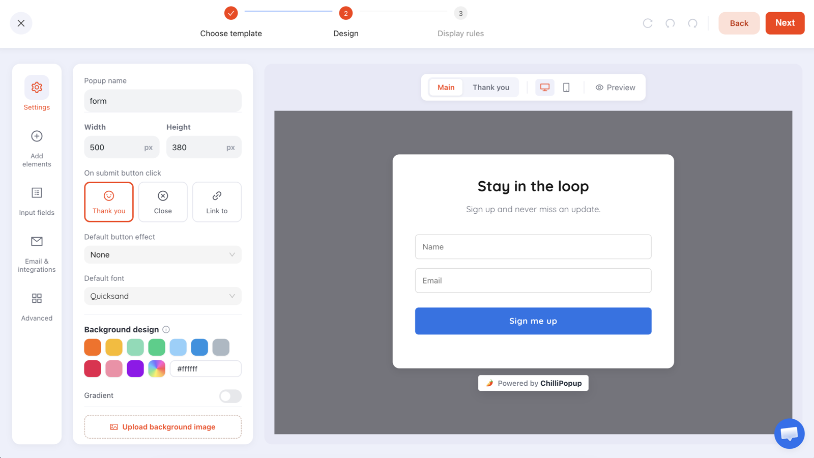
The default newsletter ask ships with a name and an email field. On a blog, delete the name field unless you genuinely personalise your emails — every extra input is another decision mid-article.
Post type → offer → trigger
Use this as a starting map, then cut it down to the two or three rows that describe most of your traffic. Three well-matched campaigns beat nine half-maintained ones.
| Post type | What the reader came for | The offer that matches | Trigger + rules |
|---|---|---|---|
| How-to / tutorial | To finish a task today | The printable checklist or template version of this post | Page scroll 55%; URL contains your tutorial path |
| Listicle / roundup | To compare options | A one-question quiz: "which of these fits you?" | Page scroll 60%; frequency once every 7 days |
| Recipe / project | To make the thing this week | Weekly recipe email, plus the shopping list | Page scroll 50%; URL contains /recipes/ |
| News / opinion | To stay current | The weekly digest — no lead magnet needed | Page count 2 (same session), so only engaged readers see it |
| Beginner "what is X" | To understand a concept | A short email course that starts where the post ends | Page scroll 60%; audience new visitors |
| Buying guide / review | To decide what to buy | A discount code, or a spin wheel — this is the one blog page where an offer belongs | Exit intent on desktop; page scroll 60% on mobile |
| Long-form / case study | Proof before a decision | A walkthrough booking, or a one-question quiz on team size | Page scroll 70%; audience returning visitors |
The test for any blog offer: could a reader plausibly want it because of the specific post they are on? If the answer is "not really, but everyone likes a discount", you are running a store popup on an article, and the numbers will show it.
Scroll depth is the right trigger for a long read
ChilliPopup gives you six triggers: exit intent, a time delay in seconds from page load, page scroll by percentage, page count within the browser session, click count, and inactivity. If you enable more than one, the campaign appears as soon as the first of them fires. On a blog, page scroll is almost always the right one.
Scroll depth is the only trigger that tracks how much of the article a person has actually consumed. A timer cannot tell a skimmer from a careful reader. Scroll percentage adapts to both automatically.
Where to set it
- 50–60% is the default. Past halfway, the reader has committed. There is still enough article left that the ask does not feel like a farewell.
- 65–70% on very long guides. On a piece that takes twelve minutes, the halfway mark is still early. Push the ask closer to the payoff.
- Do not go below 40%. Below that you are interrupting people who have not yet decided whether your article is any good — the highest-friction moment on the page.
- Watch short posts. On a 400-word post, 50% of the page may already be visible without scrolling, so the scroll trigger fires instantly and behaves like an on-arrival popup. For those, use a time delay of 20–30 seconds instead. Note that a delay is always counted from page load.
Check your own page height, not the theory. Sidebars, comment sections, related-post grids and footers all count toward 100% of the page. If your article ends at 65% of the document, a trigger set to 60% fires almost at the end. Scroll your longest post and your shortest post yourself, note where the text actually finishes, and set the percentage from that.
The inactivity trigger is the quiet alternative worth testing on reference content — people who open a recipe, walk to the kitchen and leave the tab idle. It fires on a pause rather than on progress, which makes it a gentler interruption than a timer.
Why exit intent underperforms on mobile blog traffic
Exit intent is one of the best triggers ever invented for a store, and it is genuinely useful on blog traffic — on desktop. It works by watching the cursor: when the pointer travels up and out of the viewport toward the tab bar or the address bar, the visitor is leaving, so the popup fires at the one moment where an interruption costs you nothing.
Touch devices have no cursor. There is no gesture that reliably means "about to leave" — a swipe up could be scrolling, the back gesture belongs to the OS, and switching apps never touches your page at all. So on a phone there is simply no equivalent signal to detect, and a large share of blog traffic is on a phone.
The fix is device targeting, not a workaround. Build the campaign once, then duplicate it: on the desktop copy set the device rule to desktop and enable exit intent; on the mobile copy set the device rule to mobile and use page scroll at 55–60%. Two campaigns, one offer, and each device gets the trigger that actually exists on it.
Keep exit intent for the pages where a departing reader is worth interrupting — buying guides, reviews, comparison posts — and leave your ordinary articles on scroll. If you want the full mechanics of the trigger itself, including the copy that works at the point of leaving, read the deeper guide to exit intent popups.
Inline ask or overlay? The blog version of that decision
Be precise about what is actually available, because this is where advice online gets vague. A popup in ChilliPopup is always a triggered overlay. A form, survey or quiz is not: each one has a Share your form / survey / quiz panel offering four embed modes — inline, popup, lightbox and sidebar. Inline renders the campaign in flow, right where you drop the element into the page, with no backdrop and nothing covering the text.
On a blog that distinction is most of the game. An inline form sits in the article like a paragraph, so it can never interrupt anyone — but it only reaches readers who get as far as the spot you put it in. The snippet is the workspace pixel you already installed plus one empty div, copied from the campaign's Share panel:
<!-- the pixel loads once, anywhere on the page -->
<div class="chillipopup-inline" data-uuid="YOUR_FORM_UUID"></div>
An inline embed ignores display rules. It renders wherever you put the div, for everyone, every time — no trigger, no frequency cap, no audience filter, because nothing has to decide whether to show it. Triggers and frequency belong to the overlay. Treat them as two separate campaigns rather than expecting one to do both jobs.
There is a third shape worth knowing: the reader-initiated overlay, where your own link or button opens a campaign on tap. Two supported ways to do it —
- The on-click direct link. The popup wizard hands you a copyable link that opens the campaign on arrival; forms, surveys and quizzes get a hosted Direct Link page in the same Share panel. Paste it as a normal anchor — no code, no build step — and the same link works in your newsletter.
- The JavaScript trigger. If you want the ask to open without leaving the page, call the player's API from your own button.
<!-- drop this anywhere in the body of your post -->
<button type="button" id="cp-checklist">Get the 1-page checklist →</button>

<script>
  document.getElementById('cp-checklist').addEventListener('click', function () {
    window.ChilliPopup.close();                     // open() is a forced open —
    window.ChilliPopup.open('YOUR_CAMPAIGN_UUID');  // close first or overlays stack
  });
</script>
A blog has room for all three. The trade is easy to reason about:
| Inline embed | Reader-initiated overlay (link or button) | Scroll-triggered overlay | |
|---|---|---|---|
| Content types | Forms, surveys and quizzes | Any campaign | Any campaign |
| Reach | Medium — everyone who scrolls to the spot you placed it | Low — only people who notice it and choose to act | High — everyone who reads past your scroll threshold |
| Annoyance cost | Zero. It is part of the page | Zero. Nothing appears uninvited | Real, and entirely controlled by your timing and frequency rules |
| Display rules | None — it always renders | None — you choose where the link goes | All of them: triggers, targeting, frequency, audience |
| Best placed | End of the post, plus once mid-article on long guides | Mid-article, where the topic is fresh | Once per reader per week, mid-scroll |
| Effort | One div, pasted once into your post template | One anchor, or five lines of JavaScript | No code — display rules only |
A good default if you can edit your post template: an inline form at the end of every article, a scroll-triggered overlay for the readers who never get that far, and the JavaScript button only where a specific post deserves a specific ask. The campaigns can share a design; only the delivery differs. For the visual side of all three — sizing, contrast, and a close button people can actually find — see popup design best practices.
Frequency caps that respect returning readers
A blog's audience is its regulars, which makes frequency the rule you get punished for skipping: the person who reads you every Tuesday is exactly the person your popup will meet fifty times a year.
Three controls do the work, and they compound:
- Display frequency — once a day, every visit, every session, once every N days, once every N visits, or all pages all the time. For a blog, once every 7 days is a sensible default; go to 14 if your readers visit several times a week. "Every visit" and "all pages all the time" are for a checkout reminder, not an article.
- Show again after conversion — turn it off. Anyone who submitted that campaign stops seeing it, which is the difference between a blog that recognises its subscribers and one that keeps asking them to subscribe. The scope is per campaign, so it has to be switched off on each one you build.
- Audience — everyone, new visitors, or returning visitors, where you define "new" and "returning" in days (30 by default). Point your subscribe ask at new visitors and your deeper ask at returning ones.
The honest limit on recognition. New-versus-returning and the frequency counter are both computed from the visitor's own browser storage. Someone reading on their phone after subscribing on their laptop, or reading in a private window, looks like a brand-new visitor and will see the ask again. There is no cross-device identity behind it. Design for a bit of leakage rather than assuming the cap is airtight — and never build a campaign whose logic depends on knowing that a specific person submitted a different campaign, because that rule does not exist.
One more caveat worth designing around: the page-count trigger counts pages within the current browser session. On a blog where most sessions are one page long, "page count 2" is a genuinely strict filter for engaged readers — which is useful, as long as you expect the reach to be small.
Ask one question to learn what the reader came for
Your analytics tell you which post someone read. They do not tell you why. A single-question quiz closes that gap for the cost of one tap, and it is the most underused campaign type on any blog.
Build it in the editor's Choices panel: one question, single choice, three or four options, plus an email field so the answer arrives attached to something you can act on. Options should be jobs, not demographics — what the reader is trying to do, expressed in their words.
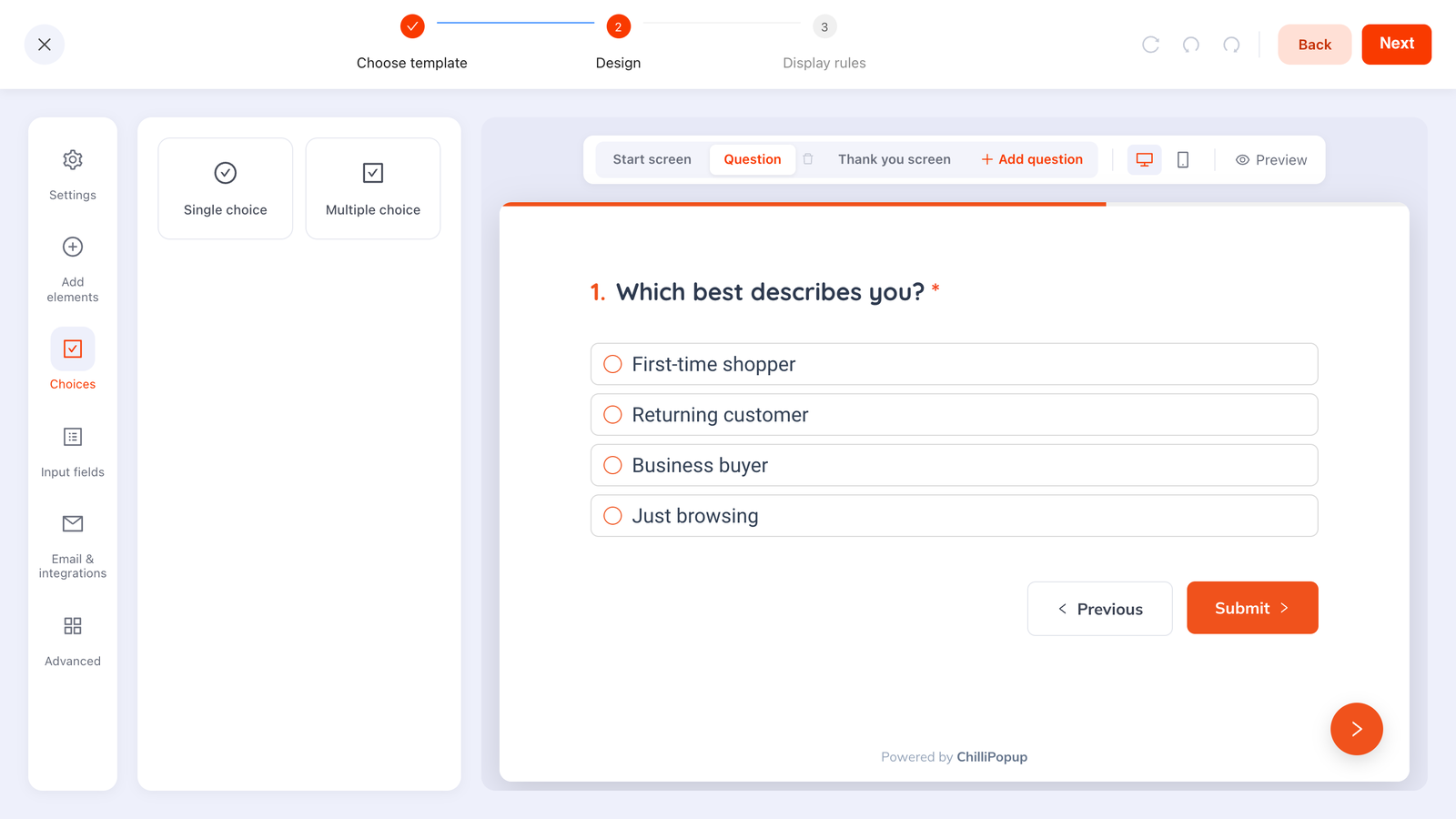
One question, single choice, four options. Swap these for what your readers are trying to do — "just researching", "about to buy", "already a customer", "here for the free tools".
Sample question sets you can lift directly:
- On a how-to blog: "So we send the right follow-up — what are you working on?" → Doing it myself · Hiring someone · Just researching · Teaching someone else
- On a store's blog: "Quick one — what brought you here today?" → A specific product · Ideas and inspiration · A problem I'm fixing · Just browsing
- On a software blog: "What best describes you?" → Founder · Marketing · Product · Engineering
Two rules keep this useful. First, the answer has to change something — the segment you add them to, the follow-up you send, the next post you write. A question whose answer changes nothing is friction with a chart attached. Second, keep it to one question on a blog. You are interrupting a read; you get one.
What the quiz cannot do. Steps run strictly in order — there is no branching, so you cannot ask a different second question depending on the first answer. And each campaign stores its own submissions; answers are not stitched into a shared contact record across campaigns. That is exactly why the email field belongs on the quiz too: the email address is the key you use to match a quiz answer back to a subscriber when you read the Collected input data table.
A worked example: three posts, three asks
Here is a complete set for a home-cooking blog, with copy you can paste and change three words in. Note that each ask is an extension of the post it appears on, and none of them mentions a discount.
Post 1 — a recipe page
Rule: URL contains /recipes/ · Trigger: page scroll
50% · Frequency: once every 7 days · Show again after conversion: off.
Headline: "Cooking this week?"
Body: "We send one tested recipe every Thursday, with the shopping list already written. No ads,
no 900-word preamble."
Field: Email, placeholder you@example.com, required, underline variant, validation
set to check format and prevent typos.
Button: "Send me Thursday's recipe"
Decline link: "No thanks, I'm just cooking tonight"
Post 2 — a long technique guide
Rule: URL contains /guides/ · Trigger: page scroll
65% · Audience: everyone.
Headline: "Want this as a one-page cheat sheet?"
Body: "The timings and temperatures from this guide, on a single printable page you can stick
inside a cupboard door."
Button: "Send the cheat sheet"
Decline link: "I'll keep scrolling"
Post 3 — the equipment buying guide
Rule: URL contains /best- · Trigger: exit intent on
the desktop copy, page scroll 60% on the mobile copy · Device: set on each copy.
Headline: "Before you buy the wrong one"
Body: "Tell us what you cook most and we'll send the two-line version of this guide — the pick,
and the reason."
Question: "What do you cook most?" → Everyday dinners · Baking · Big-batch cooking ·
Entertaining
Button: "Get my pick"
Be clear about who delivers the thing you promised. ChilliPopup captures the address and shows the submissions in your dashboard — it does not send email. The cheat sheet, the recipe and the welcome message all go out from whatever email tool you already use. Two safe patterns: put the link or the download on the campaign's own thank-you screen so it is delivered instantly, and keep the emailed copy as the follow-up. Do not promise anything on the popup that nothing on your side will actually send.
What the set has in common: one field or one tap, an offer that only makes sense on that post, a visible way to decline, and a frequency cap so a regular reader meets it at most once a week. If you want to go deeper on the wording itself — headlines, button labels, decline links — see the guide to popup copywriting.
Once the set is live, the next question is what to ask second. That is a progressive profiling problem: keep the first ask to one field, and collect the rest on a later visit, once you have actually sent something worth reading.
What to measure on a blog popup
Every campaign has its own analytics page showing views, unique views, clicks, submissions, conversion (submissions ÷ views), field inputs, an interactions-over-time chart, an event breakdown, shows by device, a Collected fields breakdown of the top values per field, and a Collected input data table of the raw submissions.

Read unique views and conversion together. A blog popup with a great conversion rate and almost no views usually means the scroll threshold is set past where your article ends.
Four things to look at, in this order:
- Unique views per bucket. This is a reach check on your rules. If the guides campaign is barely shown, the URL rule or the scroll percentage is wrong — no rewrite of the headline will fix it.
- Conversion, compared against itself. Compare the same campaign across two date ranges, not the recipe campaign against the buying-guide campaign. Different posts attract different intent, so cross-campaign comparisons mostly measure the topic.
- Shows by device. This is where an exit-intent campaign confesses. If desktop shows dwarf mobile shows on a blog whose readers are mostly on phones, your mobile copy either does not exist or is not firing.
- Collected fields. On a one-question quiz, this is the actual deliverable — the distribution of why people came. If one option takes almost everything, you have learned something about your audience and can stop asking.
A made-up illustration of the arithmetic, not a benchmark from anywhere: if a guide gets 1,000 reads a month, your ask fires at 65% scroll and 400 readers get that far, only those 400 are in the denominator of the conversion number. Moving the trigger to 50% can lower the conversion percentage while producing more subscribers. Judge the change on submissions, not on the percentage.
Two honest limits on measurement. There is no built-in A/B or split testing, so change one thing at a time and compare date ranges — and give each version long enough that you are not reading a good week. And the four-stage funnel, completion rate and drop-off analysis exist only on surveys and quizzes, not on popups and forms. If you want per-question drop-off from your blog ask, build it as a quiz.
Seven blog popup mistakes that cost you readers
- Firing on arrival on mobile. An overlay that covers the article the instant someone lands from search is the exact pattern Google's intrusive interstitial guidance warns about, and it is the fastest way to teach a reader to bounce. Fire mid-scroll.
- One sitewide popup on every page. The store offer on an article is the single most common blog popup mistake. Add a does not contain /blog/ rule and give the blog its own asks.
- Leaving "show again after conversion" on. Your most loyal readers — the ones who subscribed months ago — get asked to subscribe every week.
- No frequency cap. "Every visit" on a blog means your regulars see the same ask fifty times a year. Once every 7 days, minimum.
- A trigger set from theory instead of from your own page. Comment sections and footers count toward 100%. Scroll your own longest post and set the number from where the text actually ends.
- Asking for more than one thing. Name, email, company and "how did you hear about us" mid-article is a form, not an ask. One field, or one tap.
- Nobody reading the submissions. ChilliPopup does not send email and does not notify you when a submission arrives — the entries wait in the dashboard's Collected input data table until you look. Put a recurring reminder in your calendar to check it and move the addresses into whatever tool actually sends your newsletter.
Build your blog popup set in ChilliPopup
About an hour, no code. If the pixel is not on your site yet, start with the one-line install guide — the same script serves every campaign, so there is nothing extra to add later. If you would rather not start from a blank canvas, describe the ask in one sentence and let the AI generator draft the layout, copy and colours for you, then edit it.
1. Group your posts into three URL buckets
Open your analytics, take the posts that account for most of your blog traffic, and sort them into at most three buckets that share a URL pattern and a reader intent. Three is not a limit of the tool — it is the number of campaigns a person can actually maintain.
2. Build one offer per bucket, targeted by URL
One campaign per bucket, one email field, and an offer that only makes sense to someone reading that kind of post. In display rules, add a page-URL rule with the contains operator so it can never appear anywhere else. While you are there, add a does not contain /blog/ rule to your existing store popup.
3. Trigger on scroll, and split desktop from mobile
Set page scroll to 55%. Then duplicate the campaign: on the desktop copy set the device rule to desktop and enable exit intent as well; leave the mobile copy on scroll only. Same offer, two triggers, each one appropriate to the device it runs on.
4. Cap the frequency and turn off "show again after conversion"
Switch the display frequency rule on — the audience and conversion controls only appear once it is — then set once every 7 days and turn off show again after conversion. Do this on every campaign; the setting is per campaign, not global.
5. Add the one-question quiz, then read the numbers in two weeks
Build a quiz with a single choice question and an email field, target returning visitors, and trigger it on page count 2. After two weeks, compare unique views and conversion per bucket, change one thing, and leave it alone for another two weeks.
Give your blog its own popups
Build popups, forms, surveys, quizzes and games from one editor — and one pixel. Free plan, no credit card required. Paid plans from $29/month.
Start free →Related reading
Frequently asked questions
Where in a blog post should a popup appear?
Around the middle of the article, not on arrival. A page scroll trigger set between 50% and 60% waits until the reader has committed to the piece but still has enough left to read that the interruption does not feel like a goodbye. On very long guides, push it to 65% or 70% so the ask lands nearer the payoff.
What is the best trigger for blog popups?
Page scroll, because scroll depth is the only signal that tracks how much of the article a person has actually read. A time delay counts seconds from page load, which treats a skimmer and a careful reader identically. Use a time delay only as a backup on short posts where 50% of the page is visible without scrolling.
Do exit-intent popups work on blog traffic?
On desktop, yes. Exit intent is a cursor signal: it fires when the pointer travels up out of the viewport toward the tab bar or the address bar. Touch devices have no cursor, so there is no equivalent movement to detect, and a large share of blog traffic is mobile. Split the campaign by device and give mobile readers a scroll trigger instead.
Do popups hurt blog SEO?
The pattern that causes trouble is a mobile overlay covering the article the instant a visitor arrives from search, which is exactly what Google's intrusive interstitial guidance warns about. A popup that waits until the reader is halfway down the page, is easy to dismiss and does not block the text underneath is a different thing. Fire late, keep it small, and keep the close button obvious.
How often should a returning reader see the same blog popup?
Once every 7 days is a sensible default for a blog, and once every 14 days if your readers visit several times a week. Set it with the display frequency rule, and turn off show again after conversion so anyone who already subscribed through that campaign never sees it again. That switch is per campaign, so it has to be turned off on each one.
Should I use an inline form or a popup on a blog?
Use both, for different jobs. A form, survey or quiz can be embedded inline: its Share panel gives you a snippet that renders the campaign in flow, right where you drop the element into your post, so it sits in the article without interrupting anyone. The trade is that an inline embed ignores display rules and only reaches readers who scroll to it. A popup is always a triggered overlay, which reaches everyone who passes your scroll threshold and is the one that needs a frequency cap. An inline form at the end of the post plus a scroll-triggered overlay mid-article is a good default.