Your popup conversion rate is submissions divided by views — of everyone who saw the popup, how many finished it. To improve it, don't redesign: find out which stage is leaking first. Almost every underperforming popup is losing people at exactly one of four points, and each point has a different fix.
This guide is the diagnostic. Read your numbers, identify the leak, apply the matching fix, then change one thing at a time.
Key Takeaways
- Conversion rate is a total, not a diagnosis. Split it into shown → seen → engaged → submitted before touching anything.
- The offer is the biggest lever — bigger than copy, far bigger than design. Fix it first.
- Wrong moment beats wrong words. A great offer at second two loses to an average offer at the exit.
- Every extra field is a decision. Cutting from three inputs to one is usually the fastest single win available.
- Judge against your own baseline. Published “average popup conversion rates” mix incomparable traffic and tell you nothing about your site.
What counts as a good popup conversion rate?
The honest answer: better than yours was last month. Any published average blends discount popups on high-intent product pages with newsletter asks on cold traffic, exit-intent campaigns with two-second time delays, and desktop with mobile. Those numbers can't tell you whether your popup is good.
So build your own benchmark. Record the conversion rate of each campaign over its first two full weeks and write it down. That's the number every future change is judged against. Three rules make the comparison fair:
- Compare a campaign against itself, never against a different campaign. An exit-intent discount and a footer newsletter form are not competing in the same event.
- Wait for volume. A jump from 4% to 9% on 40 views is noise. Give it a few hundred views before you believe it.
- Split desktop and mobile. They behave differently enough that a blended rate can hide a mobile campaign that's badly broken.
Split the funnel before you change anything
A popup has four stages, and “conversion rate” only reports the loss across all of them. The fix depends entirely on where the drop happens.
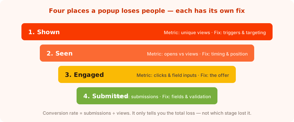
Same conversion rate, four completely different problems. Find the stage first.

Opens, unique views, clicks, submissions, conversion and field inputs — the six numbers this whole guide runs on.
| Symptom in the dashboard | What it means | What to change |
|---|---|---|
| Very few unique views | The popup barely shows — triggers or targeting are too narrow | Loosen the page rules, lower the scroll threshold, check the device toggles |
| Lots of views, almost no clicks | People see it and dismiss instantly — wrong moment or worthless offer | Change the trigger first, then the offer |
| Clicks and field inputs high, submissions low | They started and gave up — the form is the problem | Cut fields, check validation, check mobile height |
| Good desktop rate, poor mobile rate | The mobile experience is different, not the audience | Swap exit intent for scroll, shrink the popup, enlarge the close button |
| Everything looks fine but the list isn't growing | You're converting the same people repeatedly, or capturing junk | Turn off “show again after conversion”; tighten email validation |
Lever 1: the offer (the biggest one by far)
No trigger tuning rescues an offer nobody wants. Before anything else, ask the blunt question: would I give a stranger my email address for this?
Strong offers have three properties:
- Concrete. “10% off your first order” beats “exclusive deals” because it has a number.
- Immediate. Something that happens now — a code on the thank-you screen, a download, a restock alert — beats a vague future benefit.
- Relevant to the page. A size guide on a product page outperforms a generic newsletter ask on the same page, every time.
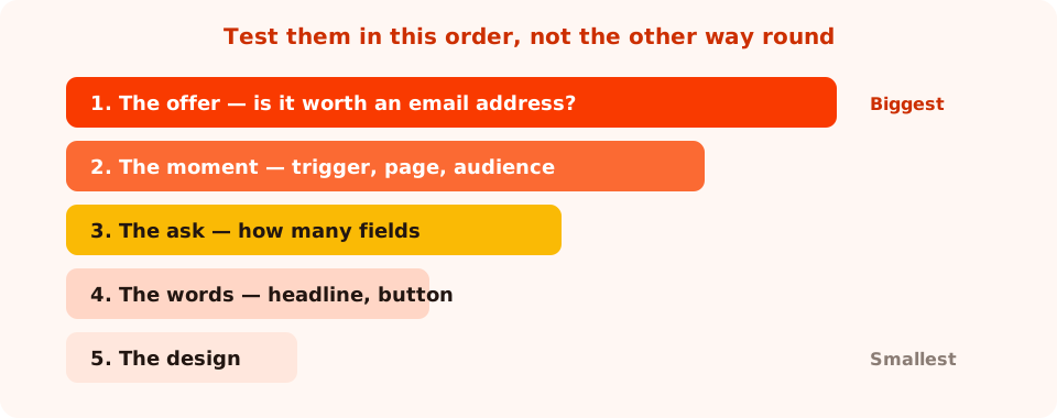
Design is a real lever — it's just the smallest one. Most teams start there.
If you genuinely can't discount, the alternatives are usually stronger than a discount anyway: early access, a restock alert, a guide that solves a live objection, or a game where the reward is revealed after the visitor plays. There are twelve worked offers in the newsletter popup examples and a longer list in lead magnet ideas.
Lever 2: the moment
The same popup converts two, three, sometimes four times better purely by moving when it fires. A popup appears on the first enabled trigger, so pick one on purpose:
- Exit intent — the cursor leaves toward the browser chrome. Desktop only in practice; the highest-converting moment for a discount because it costs the visitor nothing.
- Page scroll percentage — the mobile answer to exit intent. Try 50–60% on product pages, 60–70% on articles.
- Time delay — blunt but predictable. Under five seconds is almost always too early.
- Page count — only show it to people who've viewed two or three pages this session. Fewer views, much warmer visitors.
- Inactivity — they stopped scrolling. Good on long articles.
- Click count — after a few clicks, which usually means real browsing.
The moment isn't only when — it's who and where. Restricting a campaign to the pages where its offer makes sense, and to new or returning visitors, raises conversion rate by removing the views that were never going to convert. That's a genuine improvement, not a vanity one: the same submissions from fewer, better-targeted views.
The cheapest win in this whole guide. Turn off “show again after conversion”. Every subscriber who keeps seeing the signup popup is a wasted view dragging your rate down — and a small insult to a customer you already have.
Lever 3: the number of fields
If field inputs are high and submissions are low, the form is where people quit. Going from three inputs to one is often the single fastest improvement available, because fields aren't keystrokes — they're decisions, and they cost wildly different amounts.
Once someone has decided to take your discount, typing an email is nearly free. A phone number, a company name or a dropdown reads as an objection. Count cost per field, not number of fields.
Then check the things that silently block a submit:
- Validation that's too strict. Business-email-only validation rejects every Gmail address at submit. Correct for a trade list; fatal for a consumer newsletter.
- Required fields nobody wants to fill. Make everything except the identifier optional, or move it to a later campaign.
- A popup taller than a phone screen. The button ends up below the fold with the keyboard open, and nobody scrolls inside a popup.
If you truly need more data, collect it in stages rather than all at once — the progressive profiling guide covers how to do that without losing the first conversion.
Lever 4: the words
Copy is a real lever, just a smaller one than the three above. Three edits that reliably move the number:
- Headline names the reward, not the action. “Get 10% off your first order”, not “Subscribe to our newsletter”.
- The button repeats the reward. Send me the code beats Submit — and it's the last thing they read before deciding.
- Add a visible, honest decline. No thanks, I'll pay full price makes the yes a choice rather than a trap, and it reduces the reflexive close.
Sixty ready-made button lines live in the popup CTA copy examples, and the sentence-level craft is in the popup copywriting guide.
Lever 5: the design
Design matters mostly by not getting in the way. The checks that actually change conversion:
- One button, one job. Two equally weighted buttons halve the decision.
- Contrast on the call to action. If the button is the same colour as the background panel, it stops reading as a button.
- A close button people can find. Hiding it doesn't raise conversion — it raises rage-clicks and, on mobile, complaints.
- Fit the phone. Shorter, fewer blocks, larger tap targets. Check the popup with the mobile keyboard open, not just in the desktop preview.
- Load the image you actually need. A giant hero photo inside a popup delays the moment it becomes readable.
There's a full checklist in popup design best practices and a mobile-specific one in mobile popup best practices.
A worked diagnosis
A store has one exit-intent popup: “Join our newsletter”, three fields (name, email, phone), a Submit button, running on every page with no frequency cap. Conversion rate: low, and the list is barely growing.
The dashboard shows a large number of views, moderate field inputs, few submissions. The order of operations:
- Fix the offer. “Join our newsletter” becomes “10% off your first order — code on screen in one click”. Biggest lever, so it goes first.
- Fix the form. Delete name and phone. One email field, format validation on.
- Fix the button. Submit becomes Send me the code, plus a plain decline link underneath.
- Fix the reach. Restrict it to collection and product pages, add a frequency cap of once every seven days, and turn off show-again-after-conversion. Views go down; rate goes up; submissions go up too, because the views that remain are the right ones.
- Then test the design. Only now, and only one element at a time.
Don't do all five at once unless the popup is so broken that you're rebuilding it. If you change everything and the rate doubles, you've learned nothing you can reuse on the next campaign.
How to test a change properly
Comparing this week to last week is not a test — traffic mix, campaigns and seasonality all moved. Run the two versions at the same time, splitting traffic between them, so the only difference is the thing you changed. The A/B testing walkthrough shows how to set that up and read the result.
Three rules that keep tests honest:
- One variable. Change the headline or the trigger, not both.
- Let it run. A few hundred views per variant before you call anything.
- Test big things first. Offer, then moment, then fields. Button colour is a tie-breaker, not a strategy.
Six mistakes that keep conversion rates low
- Chasing a benchmark from a blog post. Different traffic, different offer, different trigger — the number doesn't transfer.
- Optimising design before offer. The smallest lever, pulled first, is why so many redesigns change nothing.
- Showing it to everyone. Untargeted views dilute the rate and irritate people who were never going to convert.
- Leaving the popup up for subscribers. One switch, permanently wasted views.
- Judging a week-old campaign. Small samples swing hugely; wait for volume.
- Optimising the rate instead of the outcome. A popup that only fires on one page converts brilliantly and grows nothing. Watch submissions alongside the rate.
Run the diagnosis in ChilliPopup
Twenty minutes with your own numbers in front of you. If the pixel isn't installed yet, the install guide takes one line of code.
1. Write down today's baseline
Open the analytics view, set a date range with real volume in it, and note unique views, clicks, field inputs, submissions and conversion rate for each campaign. That's the number every change is judged against.
2. Find the leaking stage
Use the symptom table above. Few views is a targeting problem, few clicks is a moment-or-offer problem, few submissions after field inputs is a form problem.
3. Pull the biggest lever that applies
Offer, then moment, then fields, then words, then design. Change exactly one thing and note what you changed and when.
4. Stop wasting views
Page-target the campaign to the pages where its offer makes sense, switch the display frequency rule on, set a cooldown, and turn off “show again after conversion”.
5. Re-read in two weeks, then repeat
Compare against the baseline you wrote down, keep the winner, and go back to step two for the next leak. One fix per fortnight beats five fixes in one afternoon.
Stop guessing which popup change worked
Build popups, forms, surveys, quizzes and games, then read views, clicks and submissions per campaign. Free plan, no credit card required. Paid plans from $29/month.
Start free →Related reading
Frequently asked questions
What is a popup conversion rate?
Popup conversion rate is the number of submissions divided by the number of views: of everyone who saw the popup, the share who completed it. It is a total across four stages — being shown, being seen, being engaged with and being submitted — so on its own it tells you that something is losing people, not where.
What is a good popup conversion rate?
The only benchmark worth using is your own. Published averages blend high-intent product-page discounts with cold newsletter asks, desktop with mobile, and exit intent with two-second delays. Record your campaign's rate over its first two weeks and judge every later change against that.
Why is my popup conversion rate so low?
Usually one of four reasons: the offer is not worth an email address, the popup fires before the visitor has seen anything worth subscribing to, the form asks for too many fields, or it is being shown to people it was never relevant to. Check which stage of the funnel drops first before changing the design.
Does reducing form fields increase popup conversions?
Almost always, because each field is a separate decision rather than a few extra keystrokes. Fields such as phone number or company name behave like objections. Going from three inputs to one email field is often the fastest single improvement available.
Should I change several things at once to fix a popup?
Only if the popup is broken enough that you are rebuilding it. Otherwise change one variable at a time and let each version collect a few hundred views, or you will not know which change produced the result and cannot reuse the lesson on the next campaign.
Does a higher conversion rate always mean more leads?
No. Narrowing a popup to one high-intent page raises the rate while shrinking total submissions. Watch conversion rate and submission count together, and treat the rate as a quality measure rather than a goal in itself.