The button is the last thing a visitor reads before deciding. A popup CTA that says Submit describes paperwork; one that says Send me the code describes what they walk away with. Same popup, same offer, different final sentence — and the button is the cheapest element on the whole thing to rewrite.
Below: the formula, sixty ready-to-use button lines sorted by popup type, the decline link that makes the yes work harder, and the mistakes that quietly cost you signups.
Key Takeaways
- Verb + reward. Every good popup button finishes the sentence “I want to…”.
- Write in the visitor's voice — “Send my code”, not “Sign up”.
- One loud yes, one quiet no. Two equally weighted buttons split the decision and lose both.
- Match the button to the offer, not to your industry. A game button and a restock-alert button are different jobs.
- The button is the first thing to test — three words, one minute, measurable.
The popup CTA formula
Almost every button that outperforms Submit is built the same way: a verb, plus the thing the visitor gets, written from their side of the screen.
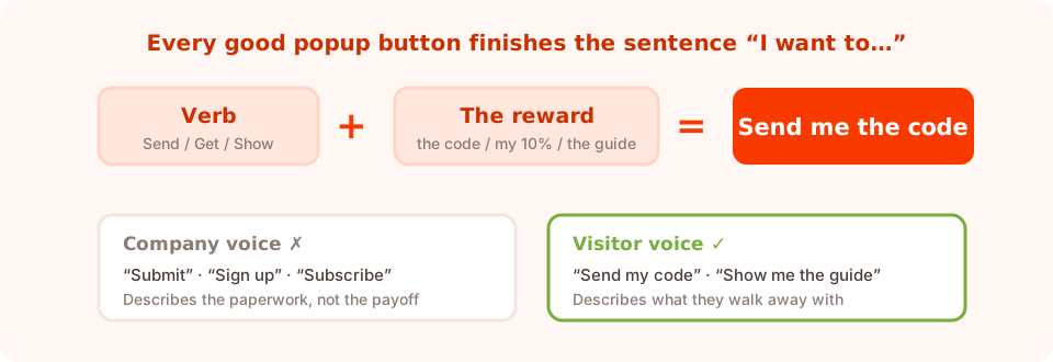
Verb + reward, in the first person. That's the whole formula.
Three tests a button has to pass:
- Does it finish “I want to…”? I want to… send me the code works. I want to… submit doesn't.
- Could it sit on a competitor's popup unchanged? If yes, it's too generic. Sign up fits anywhere; Get my size guide doesn't.
- Does it repeat the reward from the headline? The headline promises, the button confirms. Repetition here is a feature.
Length: two to five words. One word is usually generic (Submit, Go), and anything past five stops reading like a button. If you need more, put it in a line of microcopy underneath.
60 popup CTA examples by campaign type
Take these as starting points and swap in your nouns — your product, your discount, your unit of value.
Discount and coupon popups
- Send me the code
- Email me my 10%
- Unlock my discount
- Yes, I'll take 15% off
- Claim my code
- Show me the code
- Save me 20% today
- Apply my discount
Newsletter and email list popups
- Join the Friday list
- Send me the good stuff
- Keep me posted
- Sign me up for one email a week
- I'm in
- Start my subscription
- Get the weekly edit
- Add me to the list
Lead magnet and download popups
- Send me the checklist
- Email me the guide
- Download the template
- Get my free copy
- Show me the playbook
- Send the size guide
- Grab the swipe file
- Yes, send the PDF
Exit-intent popups
- Wait — show me the offer
- OK, one last look
- Save my basket
- Send it before I go
- Yes, hold my cart
- Give me one reason to stay
Cart abandonment popups
- Finish my order
- Take me back to checkout
- Save my cart for later
- Email me my basket
- Complete my purchase
- Reserve my size
Gamified popups
- Spin to win
- Scratch to reveal
- Play for my prize
- Try my luck
- Claim my prize
- Reveal what I won
Survey and feedback popups
- Share my answer
- Send my feedback
- Take the 30-second survey
- Tell them what I think
- Next question
- Finish and see the results
Quiz popups
- Find my match
- Show my result
- Start the quiz
- See what suits me
- Get my recommendation
- Take the 60-second quiz
Demo, booking and B2B popups
- Book my walkthrough
- Show me a demo
- Talk to a human
- Get the pricing sheet
- Start my free trial
- Send me the case study
Alerts and notifications
- Notify me when it's back
- Tell me when it drops
- Alert me on launch day
- Save my spot

Each button carries its own label, colour and action — submit, close, open a link, or step through a survey.
The decline link: your second-most-important button
A popup with only one exit — a small × in the corner — forces a binary that many people resolve by leaving. A plain text decline underneath the main button gives them a graceful no, and it makes the yes read as a choice rather than a trap.
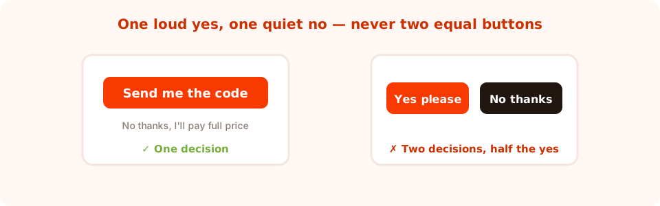
One loud yes, one quiet no. Two equal buttons is the most common CTA mistake there is.
Decline lines that work:
- No thanks, I'll pay full price
- I'd rather not save today
- Maybe later
- Not right now
- I'm just browsing
- Close this
There's a line between a decline that gently reminds someone what they're passing up and one that insults them. “No thanks, I hate saving money” is the second kind — it reads as contempt, it gets screenshotted, and it makes the brand smaller. Keep the friction in the offer, not in the tone.
In practice a decline link is just a button with the close action, styled as plain text. Every popup also keeps its own close control, so the visitor always has a way out.
Matching the CTA to the button's actual job
Not every button submits something. A popup button can submit the form, close the popup, open a link, open a link and close, or move forward and back through a multi-step survey or quiz — and the copy should tell the visitor which of those is about to happen.
| What the button does | Good copy | Copy that misleads |
|---|---|---|
| Submits the form | Send me the code · Join the list | Continue (to where?) |
| Closes the popup | No thanks · Maybe later | Cancel (sounds like undoing an order) |
| Opens a link | Shop the sale · Read the guide | Learn more (says nothing) |
| Advances a survey step | Next question · Almost done | Submit (they aren't finished) |
| Finishes a quiz | Show my result | Send (send what, where?) |
| Plays a game | Spin to win · Scratch to reveal | Start (start what?) |
On games, the button and the mechanic must agree. If the wheel spins when the visitor clicks the wheel, don't put a Submit button next to it — label the action they're actually about to take, and collect the email on the claim screen after they've won.
Microcopy: the line under the button
The button says what happens; one small line underneath removes the last objection. Keep it to a single sentence:
- One email a week. Unsubscribe any time.
- Code appears instantly — no waiting for email.
- We never share your address.
- Takes about 30 seconds.
- No card needed.
Where consent is required — marketing email in the EU and UK, for instance — this is a checkbox, not microcopy, and it can't be pre-ticked or bundled into the submit. The GDPR popup guide has the wording.
Nine CTA mistakes worth fixing today
- “Submit”. The default label, the worst word. It describes your database's experience, not the visitor's.
- Two equally weighted buttons. The no should be quieter than the yes, always.
- A button that doesn't match the headline. If the headline promises a size guide, the button says Send the size guide — not Subscribe.
- Company voice. Sign up for our newsletter is what you want; Send me the weekly edit is what they want.
- Manufactured urgency on a permanent offer. Claim before midnight! on a code that never expires teaches people to ignore your urgency.
- A hidden close. Invisible × buttons don't raise conversion; they raise frustration and, on mobile, complaints.
- Insulting the decline. Shaming copy gets shared for the wrong reasons.
- Low contrast. A button the same colour as its panel stops reading as a button at all.
- Never testing it. Three words is the cheapest test you'll ever run.
How to test a button properly
Because a CTA change is so small, it's the ideal thing to test cleanly. Run both versions at the same time so traffic mix and seasonality are identical, keep everything else fixed, and let each variant collect a few hundred views before calling it. The A/B testing guide walks through the setup.
Read two numbers, not one: clicks tell you whether the button earned the tap, and submissions tell you whether the popup delivered afterwards. A button that lifts clicks but not submissions is over-promising — which is worth knowing before you write the next one.
Rewrite your buttons in ChilliPopup
Ten minutes across every live campaign. If the pixel isn't installed yet, the install guide is one line of code.
1. List every live button
Open each published popup, form, survey and quiz and write down its current button label. Any that say Submit, Sign up or Continue go straight on the fix list.
2. Apply verb + reward
Rewrite each one so it finishes “I want to…” and repeats the headline's promise. Two to five words.
3. Add a quiet decline
Add a second button under the main one, set its action to close, style it as plain text, and give it an honest label rather than a snarky one.
4. Check the action matches the words
Submit, close, link, link-and-close, next or back — make sure each button's on-click action is the thing its label just promised.
5. Test the highest-traffic one
Run the old and new labels side by side on your busiest campaign, wait for a few hundred views per variant, then roll the winning pattern out to the rest.
Rewrite your buttons in ten minutes
Edit any popup, form, survey or quiz in the browser and watch clicks and submissions per campaign. Free plan, no credit card required. Paid plans from $29/month.
Start free →Related reading
Frequently asked questions
What should a popup CTA button say?
It should say a verb plus the reward, written in the visitor's voice — 'Send me the code', 'Get my size guide', 'Join the Friday list'. A good test is whether the label finishes the sentence 'I want to…'. Two to five words is the right length.
Why is 'Submit' a bad call to action?
Submit describes what happens to your database, not what happens for the visitor. It is also completely generic, so it works equally well on any popup anywhere, which means it adds no persuasion at the exact moment the decision is made.
Should a popup have a 'no thanks' button?
Yes, as a quiet text link under the main button rather than a second equally weighted button. It gives people a graceful way out, makes the yes read as a choice, and reduces reflexive dismissals. Keep the wording honest rather than shaming.
How long should popup button text be?
Two to five words. One word is usually generic, and anything longer stops looking like a button. If you need to say more, put a single line of microcopy underneath — for example 'One email a week, unsubscribe any time'.
Should the CTA button be a different colour from the popup?
It needs enough contrast to read as a clickable object against whatever sits directly behind it. Colour choice matters far less than contrast and than having only one primary button on the popup.
Is it worth A/B testing button copy?
Yes, because it is the cheapest test available — three words and one minute of work. Run both versions at the same time so the traffic is identical, wait for a few hundred views per variant, and read clicks and submissions together rather than clicks alone.