
A cart abandonment popup fires at the exact moment a shopper with items in their cart moves to leave — exit intent on the cart page — and makes one last offer: a free-shipping reminder, a save-your-cart email form, or a discount with a deadline.
That one second is the cheapest recovery channel you have. The shopper is still on your site, the cart is still full, and the alternative — a recovery email — only works for the minority of leavers whose address you already hold. This guide covers the whole build: why carts get abandoned, how the popup catches the moment, which offer to show and in what order, worked copy for two very different stores, the exact display rules, and the honest limits — because some abandonment is caused by your checkout, and no popup fixes that.
Key Takeaways
- The moment beats the message. A mediocre offer at the instant of leaving outperforms a great offer shown to everyone on arrival — trigger on exit intent, on the cart page only.
- Offers are a ladder, not a menu. Free-shipping reminder first (costs nothing), save-your-cart email second (costs a follow-up), discount last (costs margin and trains bargain hunters).
- The popup can't see the cart. ChilliPopup targets by URL, not cart contents — write copy that states your threshold instead of computing the gap.
- Mobile needs different triggers. Exit intent reads the cursor leaving the top of the viewport, which doesn't exist on a phone — use inactivity or a time delay there.
- A popup recovers hesitation, not friction. Surprise costs, forced accounts and broken payment steps abandon carts too — and those need a checkout fix, not a message.
What is a cart abandonment popup?
Cart abandonment popup, in two sentences
A cart abandonment popup is a message that appears when a shopper who has added items to their cart starts to leave the site — detected by exit intent, and shown only on cart or checkout pages via URL targeting. Its job is binary: either the shopper turns back and finishes the order now, or they leave you an email address so they can be brought back later.
Notice what that definition does not say: it doesn't promise to read the cart, calculate the total or list the products. It's a moment-and-message machine. You choose the moment with display rules, and you choose the message from a short ladder of offers. Everything else in this guide is those two decisions done well.
It also sits inside a bigger system. The popup is the on-site layer of cart recovery: it works in the seconds before the tab closes. The email layer — whatever recovery sequence your email tool sends — works in the hours and days after. The two are not competitors. The popup's save-your-cart form is very often what captures the address that makes the email layer possible at all.
Why shoppers abandon full carts
Before writing a single line of popup copy, sort the reasons people leave into two buckets — because the popup can only fix one of them.
Bucket one: hesitation (a popup can help)
- Price wobble. The total is visible, the desire is real, and the shopper is talking themselves out of it. A small nudge — free shipping they forgot about, a modest discount with a deadline — settles the argument.
- "I'll come back later." Often sincere, usually fatal. Tabs close, carts expire, competitors interrupt. A save-your-cart email form converts a vague intention into a concrete return path.
- Comparison shopping. The cart is a shortlist, not a decision. You won't stop the comparison — but you can make sure your tab is the one they can find again.
- Shipping-threshold blindness. The shopper never noticed that orders over your threshold ship free. A one-line reminder is the cheapest recovery message in ecommerce.
Bucket two: friction (a popup cannot help)
- Surprise costs at checkout. Shipping, duties or fees that appear late feel like a broken promise. A popup after that moment reads as insult, not incentive.
- Forced account creation. The single most avoidable checkout killer. No discount compensates for a registration wall.
- Missing payment methods, broken forms, slow pages. The shopper wanted to pay and couldn't. That's a bug report, not a marketing problem.
The working rule: a cart abandonment popup recovers hesitation. It does nothing for friction. Build the popup for bucket one, and fix bucket two in the checkout itself — the last section of this guide is an audit for that.
Catching the moment of leaving
The defining feature of an abandoned cart popup is timing. The same offer shown on page load is background noise; shown at the instant of departure, it's a genuine last word. Two display rules combine to catch that instant.
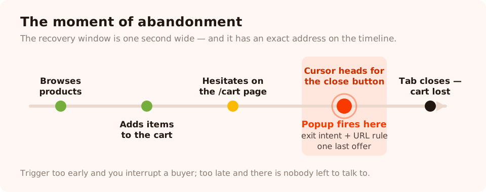
The recovery window is one second wide — after the hesitation, before the tab closes. That's the only moment this popup should exist in.
Rule one: exit intent
Exit intent watches the cursor. When it leaves the top of the viewport — heading for the tab bar, the URL field or the close button — the trigger fires. It's the closest thing the browser gives you to reading "I'm leaving" in real time, and it's the natural trigger for cart recovery because it costs the undecided shopper nothing: people who scroll, click and check out never see the popup at all. (For the full mechanics, edge cases and copy patterns, see the complete exit intent guide.)
Rule two: cart-page URL targeting
Exit intent alone fires sitewide — on the blog, the homepage, the returns policy. A cart abandonment
popup must fire only where a cart exists to abandon. That's a page URL rule: show the popup when the
URL contains /cart, or starts with your checkout path.
ChilliPopup's URL rules cover contains, does not contain, is exactly,
is not, starts with and ends with, so any cart or checkout URL structure
can be matched. Combined with exit intent, the popup now reads: "someone on the cart page is
leaving" — which is the definition of cart abandonment, expressed as two rules.
The honest constraint — and how to write around it. URL targeting knows the shopper is on the cart page. It does not know what's in the cart, how much it totals, or whether it's empty. ChilliPopup cannot read cart contents or values. So never write copy that pretends to — no "You're €12 away from free shipping!". Write the threshold instead: "Orders over €60 ship free." Same nudge, no false precision, and it can never be wrong. The rare shopper who parked on an empty cart page sees a generic reminder and closes it — a non-event.
The mobile half of the recipe
There is no cursor on a phone, so exit intent is unreliable on mobile — and mobile is where most cart abandonment happens. Don't stretch one campaign across both worlds. Use the device toggles to split it: the desktop campaign triggers on exit intent; the mobile campaign keeps the same URL rule but triggers on inactivity (the thumb has stopped — hesitation made visible) or a time delay of 25–30 seconds on the cart page. Keep the mobile version small and instantly dismissible — the full sizing and layout rules are in the mobile popup best practices guide.
What to offer: the recovery ladder
The trigger decides whether the popup is seen; the offer decides whether it works. Order matters, because the three standard offers have wildly different costs. Climb the ladder — don't start at the top.
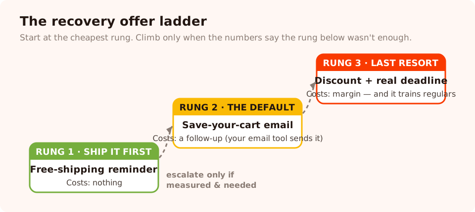
Three offers, three price tags. Start at the bottom rung and escalate only when the cheaper offer has been measured and found wanting.
Rung 1 — the free-shipping reminder (costs you nothing)
If you have a free-shipping threshold, some meaningful share of your abandoners simply forgot it or never saw it. A one-line reminder — threshold stated, not gap computed — recovers those shoppers at zero cost. No email field, no code, one button back to checkout. This should be the first cart recovery popup any store ships, because when it works, every recovered order is full margin.
Rung 2 — save your cart (costs you a follow-up)
For the sincere "I'll come back later" crowd, the right offer isn't money — it's a bookmark. One email field, one button: "Email me my cart." On most platforms the cart itself already persists in the shopper's browser; what the email really does is create the return path — a reason and a link to come back. Be precise about the mechanics: ChilliPopup captures the address and stores the submission; the reminder itself is whatever your email tool sends. Copy the addresses into that tool and let its sequence do the patient work. This rung also has a compounding property the others lack: every submission grows your list, so even "failed" recoveries leave you better off.
Rung 3 — the discount (costs you margin, forever)
A discount is the strongest single recovery offer and the most expensive habit in ecommerce. Shown to everyone, it trains repeat visitors to fill a cart, hover toward the close button and wait for the popup — you end up discounting orders that would have completed anyway. If you climb to this rung: keep it small (5–10%), attach a real deadline with a countdown timer that means what it says, and present the code in a coupon block — a click-to-copy chip — so redemption is effortless and, crucially, trackable. The full playbook for discounting without training bargain hunters is in the coupon popup guide.
A variant worth knowing: wrap the discount in a game. A spin wheel or scratch card turns "here's 10%" into "you won 10%" — the perceived value rises while the real cost stays the same, and outcomes are decided server-side so the prize table can't be rigged from the browser. It suits first-time visitors better than checkout-adjacent moments; see the gamification widgets for what's available.
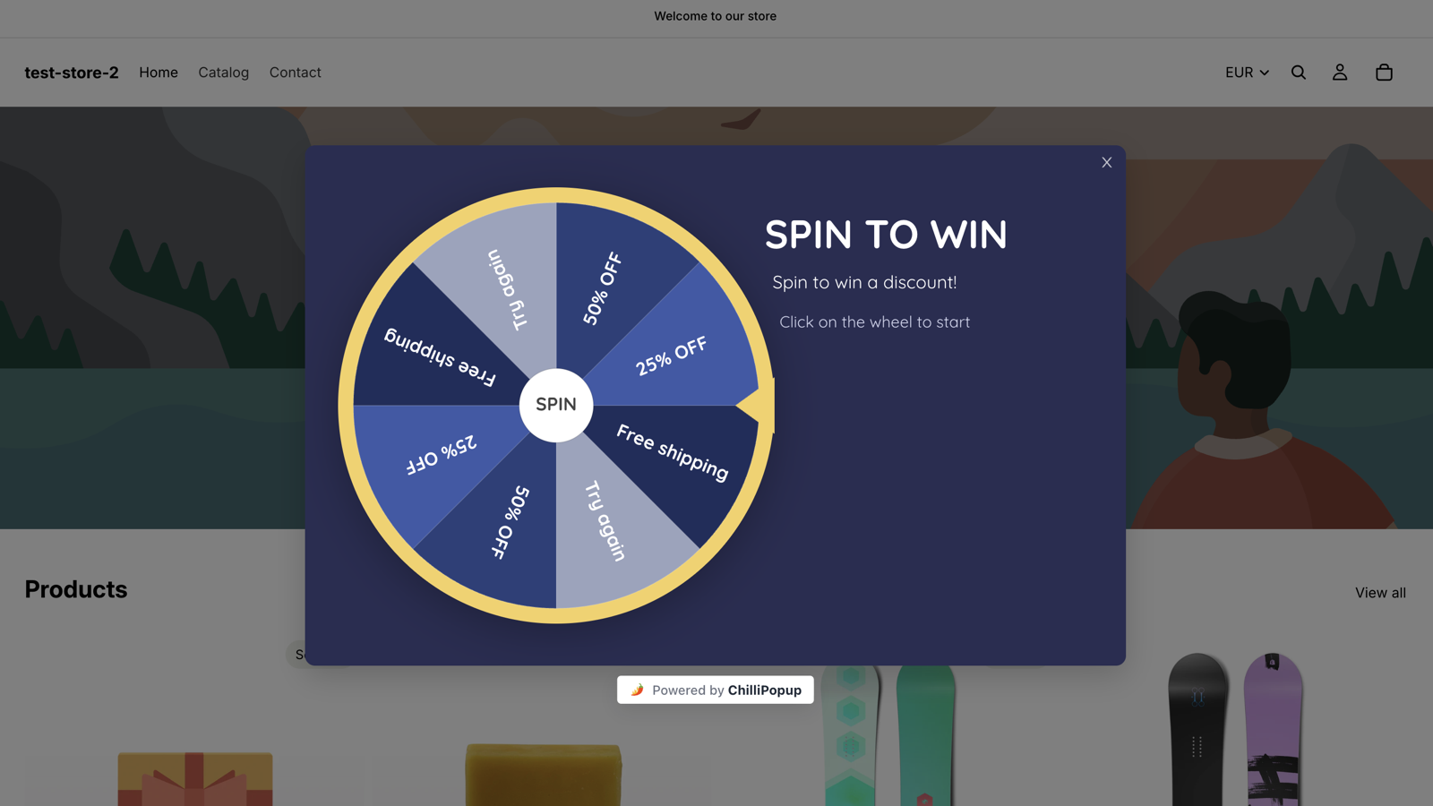
The same 10% costs less resentment when it's won. Game outcomes are decided on the server, so the odds you configure are the odds that happen.
| Offer | What it costs you | Which leaver it recovers | When to use it | Main risk |
|---|---|---|---|---|
| Free-shipping reminder | Nothing | Threshold-blind and shipping-hesitant shoppers | Always, if you have a threshold — ship it first | Irrelevant to shoppers far below the threshold |
| Save-your-cart email | A follow-up email (sent by your email tool) | Sincere "later" shoppers and comparison shoppers | As the default rung for most stores | Weak copy makes it read as a newsletter grab |
| Discount + deadline | Margin on every redeemed order | Price-wobblers on the fence | Sparingly — high-value moments, returning visitors | Training repeat visitors to abandon on purpose |
| Gamified discount | Margin, plus a little build time | First-time visitors who'd ignore a flat coupon | Top of funnel more than cart pages | Tonally wrong for high-ticket, trust-led purchases |
And when two rungs both look defensible for your store — the free-shipping reminder or the discount, say — don't settle it in a meeting. Every campaign's ⋮ menu has Create A/B test: it clones the popup into a second, fully editable version you rebuild around the other offer, and once that variant is published, traffic splits between the two (50/50 by default) and the A/B results put each side's views, conversions and conversion rate next to each other. One caveat the ladder already taught you: the test scores conversions, not margin — a discount that wins the split can still lose money on every redemption, so read a discount victory with its price tag attached.
Worked example: a fashion store
A mid-priced apparel store, €60 free-shipping threshold, mostly mobile traffic, healthy repeat-visit rate. Impulse-friendly products, thin margins — so the ladder is climbed slowly.
Campaign 1 — the reminder (desktop, cart page, exit intent).
Headline: "Before you go — shipping's on us over €60." Body: "Orders over €60 ship free, and returns are free for 30 days." Button: "Back to my cart" (a close action — the shopper is already there; the popup just interrupted the exit). Decline link: "No thanks." No email field. Nothing to redeem. One sentence of remembered value, then out of the way.
Campaign 2 — save the cart (mobile, cart page, 30s inactivity).
Headline: "Not deciding today? Fair." Body: "Drop your email and we'll send your cart link — pick it up whenever you're ready." One email input with format validation on, button: "Email me my cart". The thank-you screen closes the loop: "Done — your cart's in your inbox as soon as we hit send." The reminder email itself comes from the store's email tool; the popup's job was the address and the moment.
Campaign 3 — the nudge (returning visitors only, exit intent, once a day).
Audience set to returning visitors — someone back on the cart page on a second visit has proven the
hesitation is price, not timing. Headline: "Still thinking it over?" Body: "Here's 10%
to settle it — today only." A coupon block with the code COMEBACK10, dashed border,
click-to-copy, and a countdown timer counting down a fixed few hours per visitor. Frequency once a
day, so a dismissal isn't punished with a rerun on the next page view.
Why the split works: new visitors never see a discount, so full-price buyers stay full-price. The discount only reaches shoppers who already demonstrated — by leaving and returning — that the cheaper rungs weren't enough.
Worked example: an electronics store
Now invert everything: high-ticket audio equipment, considered purchases, weeks-long research cycles, desktop-heavy traffic. Nobody impulse-buys a €900 amplifier because a popup blinked at them — and a 10% coupon on €900 is real money thrown at people who were mostly going to buy anyway.
Campaign 1 — reassurance at the exit (cart page, exit intent, desktop).
The hesitation on high-ticket carts is risk, not price. So the popup answers risk: headline "Take your time — your order's protected." Body: "2-year warranty, 30-day returns, and real humans on support if anything's unclear." Button: "Finish checking out"; decline link: "Just looking." No discount anywhere near this popup — a surprise markdown on a premium product reads as weakness, not generosity. If part of the team insists a 10% code would beat the reassurance here, that's a test, not an argument — create an A/B test on the campaign, rebuild the variant around the discount, and let the side-by-side conversion rates settle it. Assignment is sticky per browser, so no returning shopper flip-flops between the premium story and a markdown.
Campaign 2 — save the shortlist (cart page, second exit or mobile inactivity).
Research-cycle shoppers are comparison shopping across tabs, and the store's cart is really a shortlist. Meet that honestly: "Comparing options? Smart." Body: "Leave your email and we'll send your cart link — so this setup is one click away when you've decided." Email field, button "Send me my shortlist". What arrives later — the link, a spec recap, whatever your email tool sends — is the store's call; the popup made the return path exist.
Campaign 3 — the question nobody asked (checkout path, exit intent).
On the checkout URL itself (starts with /checkout), an exit is a louder alarm —
the shopper got past the cart and still bailed. Instead of an offer, ask: "Did something
stop you?" with tappable options — Shipping cost · Payment options · Just not ready · Something
else — built from multiple-choice options, plus an optional text field. The submissions won't
recover that visitor, but a week of answers will tell you exactly which friction (bucket two!) your
checkout is inflicting — data no discount would ever surface.
The display rules recipe
Here is the full rule set for the core desktop campaign, ready to copy into any ChilliPopup popup. Every enabled rule is an AND gate — all of them must pass before the popup fires.
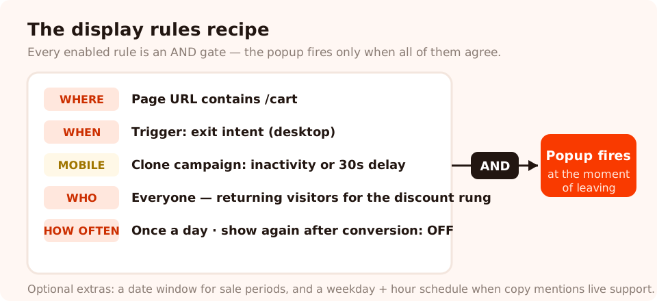
The whole recipe on one card. Every rule is an AND — the popup fires only when all of them agree.
- Page targeting: URL contains
/cart. Add a second rule with starts with for your checkout path if you want coverage there too — but consider giving checkout its own campaign with gentler copy, as in the electronics example. - Trigger: exit intent. Nothing else on desktop — a time delay on a cart page interrupts people who were about to pay.
- Devices: desktop only. Clone the campaign for mobile with the same URL rule and an inactivity or 25–30 second time-delay trigger instead.
- Audience: everyone for the reminder and save-cart rungs; returning visitors for the discount rung (you define how many days separate "new" from "returning").
- Frequency: once a day. Someone who dismissed the popup has answered; asking again two page views later converts a no into an unsubscribe-from-your-whole-store.
- Show again after conversion: off. A shopper who submitted the email form should never see the same form again. This switch is per campaign — flip it on every rung that collects anything.
- Optional refinements: a date window for sale periods, and a weekday-and-hour schedule if your copy mentions live support ("real humans on support" should only show when the humans are awake).
If the pixel isn't on your store yet, that's a one-line script — the install guide covers any website, and there are dedicated apps and plugins for the major ecommerce platforms in the help center. One pixel serves every campaign above.
Measuring recovery
A cart abandonment popup earns its place with numbers, and the numbers come in two layers: what the popup reports, and what your store's order data confirms.

Each campaign reports views, clicks, closes, submissions and conversion rate — plus the desktop-vs-mobile split that tells you whether your triggers fit each device.
The popup's own numbers
- Views — how often the moment was caught. Near-zero views means the rules are wrong (a URL rule that doesn't match your real cart path is the classic culprit — check it against an actual cart URL, not the one you assume).
- Conversion rate — submissions ÷ views, computed for you per campaign. This is the health metric for the save-cart and discount rungs.
- Closes vs clicks — the offer verdict. Lots of views, lots of closes, few clicks: the moment is right and the message is wrong. Rewrite the offer, not the rules — and run the rewrite as the B side of an A/B test instead of swapping it in blind, so you learn whether the new offer beats the old one, not whether this week beat last week.
- Desktop vs mobile breakdown — if mobile views are huge and mobile submissions are near zero, your mobile trigger or layout is failing, and the analytics guide walks through the diagnosis in detail.
- Field inputs — for the checkout-question campaign, the per-field breakdown of what people actually answered is the whole payoff.
The store's numbers: closing the loop
A submission is not a sale. To attribute recovered orders, give each popup rung its own
coupon code — COMEBACK10 lives only in the returning-visitor popup, nowhere else — and
count redemptions in your store's order admin. Redemptions of that code are, by construction, orders
the popup touched. For the no-code rungs (the free-shipping reminder), compare your cart-page exit
behavior and completed-order rate in your site analytics before and after launch, over identical-length
periods. It's cruder, but it's honest.
Reserve that before-and-after method for the one question it fits — whether the popup moves orders at all, since there's no way to split traffic against no popup. Every other choice — reminder vs save-cart form, this headline vs that one — deserves an A/B test instead of eyeballed periods: both versions run on the same traffic at the same time, and the results view pairs their views, conversions and conversion rates. The patience rule still applies — the built-in confidence check won't call a winner until each version has at least 100 views and the test has 20 conversions, and below 95% confidence it will tell you the lead can still flip. On a quiet cart page that takes weeks. Let it.
If you pipe your own analytics, the pixel also announces every submission as a browser event you can forward wherever you count things:
window.addEventListener('chillipopup:submit', function (e) {
  // e.detail = { popupUuid: '…', data: { email: '…' } }
  if (e.detail.popupUuid !== 'YOUR_CART_POPUP_UUID') return;
  // forward to your analytics: a 'cart_popup_recovery' event
});
Seven mistakes that sink cart recovery popups
- Leading with the discount. The most expensive rung becomes the default, margin leaks on orders that would have completed anyway, and your regulars learn that abandoning pays.
- Firing sitewide. An exit popup on your blog is a newsletter popup; on your cart page it's cart recovery. Without the URL rule, you have the former pretending to be the latter.
- Copy that pretends to see the cart. "Your items are selling out!" when the tool cannot know the items reads as exactly what it is. State thresholds, policies and deadlines — things that are true for every cart.
- Reusing desktop rules on mobile. Exit intent barely fires on phones, so the campaign silently covers only your minority device — while looking "live" in the dashboard.
- Fake urgency. A countdown that resets on reload teaches shoppers your deadlines are theater — and theater, once spotted, poisons every future claim. Honest urgency mechanics are the subject of the countdown timer guide.
- No frequency cap. The popup re-fires on every cart visit, and the shopper's third encounter converts mild hesitation into active irritation. Once a day, minimum.
- Interrupting people who are converting. Any trigger that can fire while a shopper moves toward the pay button — click counts, aggressive scroll triggers, short delays on the checkout page — risks abandonments the popup then gets credited with "recovering". Exit intent only, on desktop, and gentle timing on mobile.
When a popup can't help: real checkout friction
End where honest guides must: some carts are abandoned at you, not near you. If the checkout itself pushes people out, a popup at the exit is a bucket under a leak — run this audit before crediting or blaming the popup.
- Complete your own checkout on a phone, this week. Count the fields, the seconds, and every moment you'd bail if you didn't work there.
- Show total cost early. Shipping and fees revealed on the last step are the canonical abandonment trigger — and by then, the shopper is past your popup's moment.
- Offer guest checkout. A registration wall in front of payment loses buyers no message can win back.
- Check your payment methods against your audience. A missing wallet or local payment option is invisible in dashboards and fatal at the pay step.
- Listen at the exit. The checkout-question popup from the electronics example — "Did something stop you?" — is the cheapest checkout research you will ever run, and its answers tell you which of the fixes above to make first.
The order of operations, then: fix the friction your checkout creates, run the recovery ladder for the hesitation that remains, and let each layer do the only job it can actually do.
Catch the next leaver before the tab closes
Build popups, forms, surveys, quizzes and games from one editor — and one pixel. Free plan, no credit card required. Paid plans from $29/month.
Start free →Related reading
Frequently asked questions
What is a cart abandonment popup?
A cart abandonment popup is a message that appears at the moment a shopper with items in their cart starts to leave the site — typically triggered by exit intent on the cart or checkout page. It makes one last, targeted offer: a free-shipping reminder, a way to save the cart by email, or a discount, so the shopper either finishes the order or leaves you a way to bring them back.
Do cart abandonment popups actually work?
They recover a real share of leavers — but only the ones whose objection the popup can answer: price hesitation, a forgotten free-shipping threshold, or a shopper who genuinely means to come back later. They cannot fix surprise costs revealed at checkout, forced account creation or a broken payment step. Run the popup and fix the funnel; the popup is the layer for the leavers your funnel fixes will never reach.
Should I offer a discount in my cart abandonment popup?
Not first. Start with offers that cost nothing: a free-shipping reminder or a save-your-cart email form. A discount is the strongest recovery offer, but it costs margin on every order and teaches repeat visitors to abandon on purpose. If you use one, keep it small, put a real deadline on it, and reserve it for the last rung — never the default.
How do I show a popup only on the cart page?
Use a page URL rule. In ChilliPopup, set the display rules so the popup shows only when the URL contains /cart (or matches your cart path with starts with or is exactly), then add an exit intent trigger for desktop. On mobile, where exit intent is unreliable, trigger on inactivity or a time delay instead and keep the same URL rule.
Can a popup see what is in the visitor's cart?
No. ChilliPopup targets by URL — it knows the shopper is on the cart page, not which products or what total are in the cart. Write copy that works without item names: state your free-shipping threshold instead of computing the gap, and say 'your cart' instead of naming products. The store's own cart keeps the items; the popup's job is the moment, not the inventory.
What is the difference between a cart abandonment popup and a cart recovery email?
The popup is the on-site layer: it fires in the seconds before the shopper leaves, while they are still one click from checkout. The recovery email is the follow-up layer: it reaches shoppers hours later, but only if you have their address. They work as a system — the popup's save-your-cart form is usually what captures the email that makes the recovery sequence (whatever your email tool sends) possible at all.