The best ecommerce popup ideas are not clever — they are well placed. A shopper reading a blog post, a shopper comparing two dresses and a shopper hovering over checkout want three completely different things, and the popup that helps one of them annoys the other two.
So this list is sorted the way a shopper actually moves: browsing, deciding, cart, post-purchase. Fifteen campaigns, each with the page it belongs on, the trigger that fires it, and the honest limits of what it can know.
Key Takeaways
- Stage, not page count. One campaign per shopping stage beats five campaigns fighting over the homepage.
- Rescue removes friction, it doesn't raise the discount — free shipping and returns beat an escalating code.
- Popups can't see the basket. Targeting reads the URL and behaviour, so cart messages must be true for every cart.
- Post-purchase is the most underused page in retail. Reviews, referrals and restock alerts cost nothing to offer.
- Mobile needs its own trigger. Exit intent is a desktop signal; use scroll or a delay on phones.
The four stages of a store popup plan
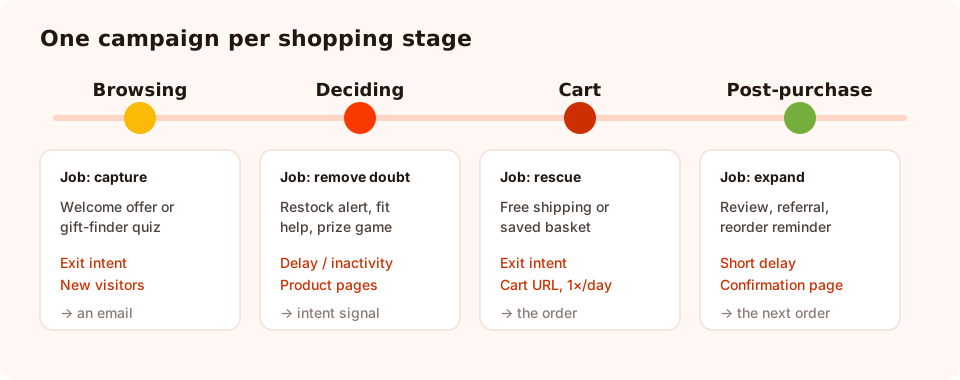
Four stages, four jobs. A shopper should meet at most one of them in a session.
Each stage has a different job. Browsing captures a contact before the visit ends. Deciding removes a doubt about a specific product. Cart rescues an order that is already half-made. Post-purchase turns one order into a relationship. Judge every idea below by whether it does the job of its stage — not by how creative it looks.
Browsing: 4 popup ideas that capture a contact
1. The welcome offer, on collection pages only
The workhorse. "New here? Take 10% off your first order." One email field, code on the thank-you screen. Put it on collection and category pages rather than the homepage, target new visitors, and trigger on exit intent — a shopper who is browsing a category has already told you what they like.
2. The gift-finder quiz
For catalogues where choice is the obstacle. Three tappable questions — who is it for, what is the budget, what is the occasion — then a recommendation and an email field to send it to. A quiz converts better than a static discount on gift traffic because it solves the shopper's actual problem before it asks for anything.
3. The free-shipping threshold
"Free shipping on orders over £50 — want the code for your first one?" Cheaper than a percentage discount on most catalogues, and it attracts shoppers who intend to buy rather than shoppers who collect codes. Say the threshold in the popup; a vague "free shipping available" reads as a trick.
4. The one-question category segmenter
"So we only send you the good stuff — what are you shopping for?" with four chips. It costs one tap, returns a clean value you can actually segment on, and makes every later email more relevant. Pair it with an email field so the answer has an owner.
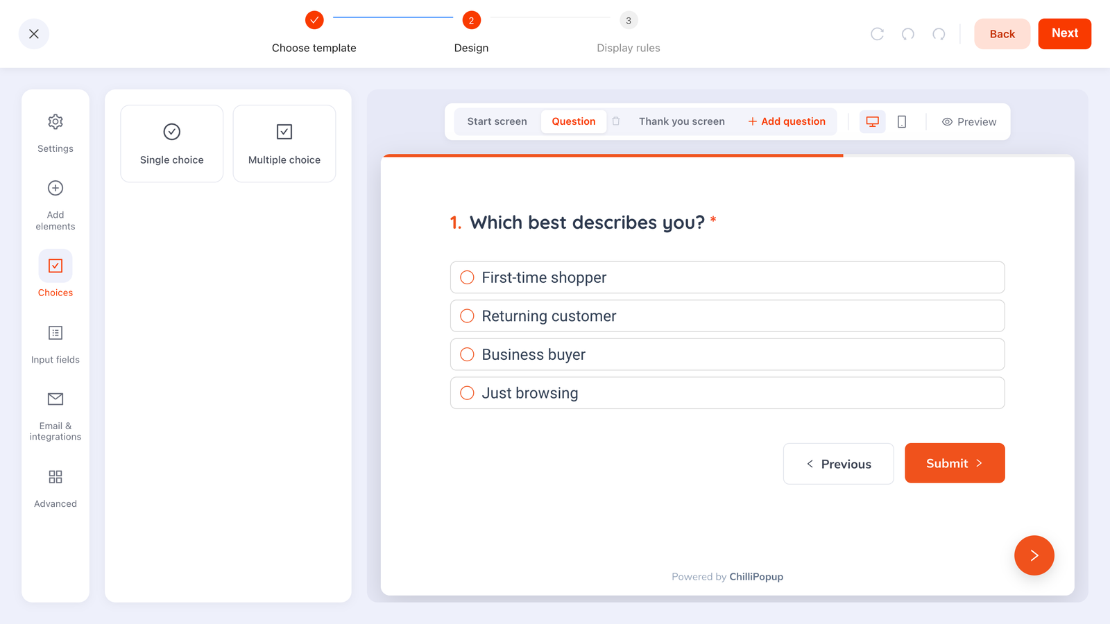
Chips instead of text inputs: one gesture, and a value you can route on afterwards.
Deciding: 5 popup ideas that remove a doubt
5. The back-in-stock alert
The highest-quality list in retail, and it costs you nothing: the shopper is asking to be contacted about a product they already want. Page-target sold-out product URLs if your platform uses a distinguishable pattern, trigger after a few seconds, and keep it to "Tell me when it's back" plus one field.
6. The size and fit helper
Fit anxiety is a silent conversion killer in apparel. A short popup — "Between sizes? Here's how this one runs" — with two lines of guidance and an optional email for the full size guide. Trigger on inactivity: someone who has stopped scrolling on a product page is thinking, not reading.
7. Social proof at the point of doubt
A review quote, a rating, a genuine "most reordered this month" note. Use numbers you actually have — invented proof is both a legal risk and, in practice, easy to spot. The social proof popup guide covers which proof type fits which page.
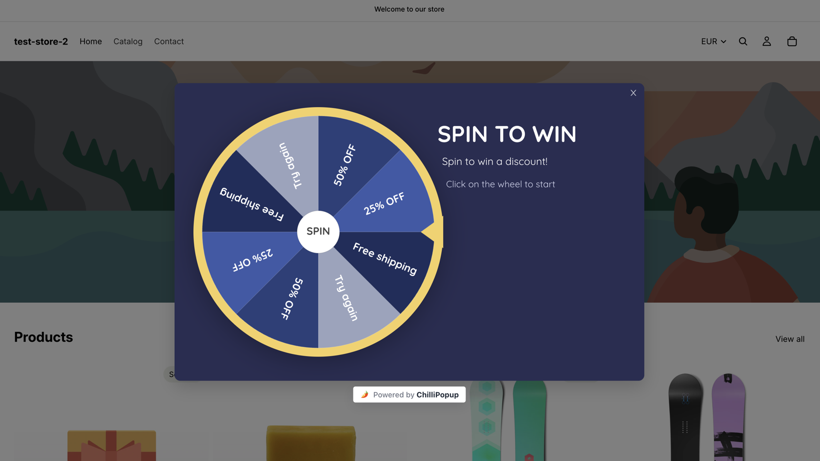
8. A prize game for traffic that ignores static offers
Spin the wheel, a scratch card, a slot machine or a claw machine. The shopper plays, then fills in the claim screen to reveal what they won, which converts far better than the same discount offered flatly. The winning slice is decided server-side, so the odds cannot be manipulated from the browser and the prize codes are not sitting in the page source.
9. The comparison rescue
For shoppers bouncing between two products: "Can't choose? Here's the two-line difference." Short, useful, no email required. Not every popup has to capture something — one that prevents an exit has already paid for itself.
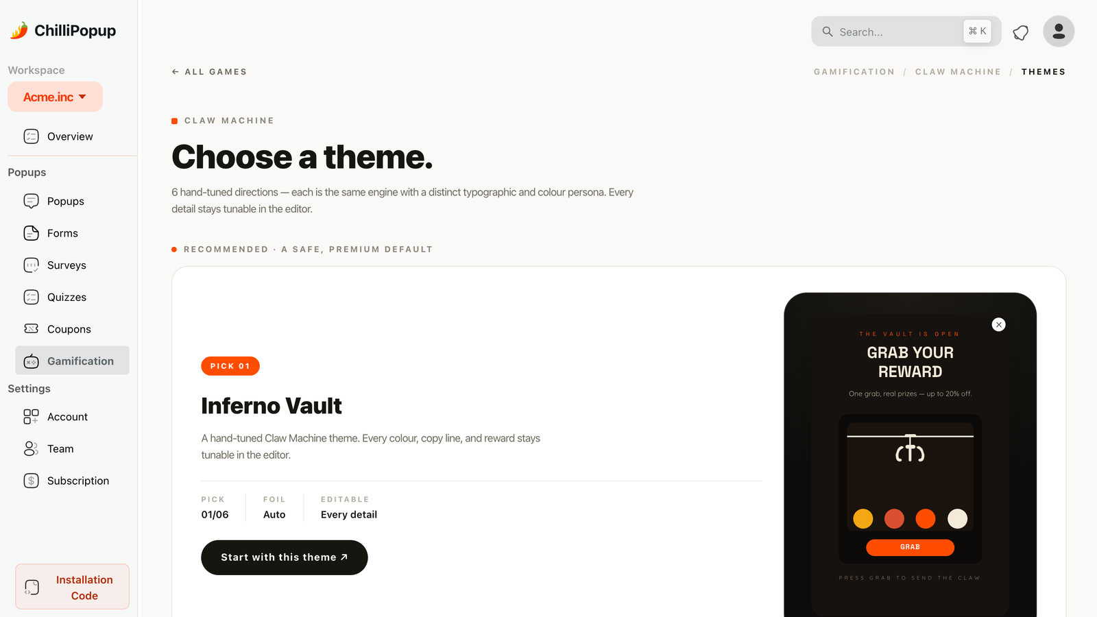
A played offer earns attention a flat discount no longer gets on high-traffic stores.
Cart: 3 popup ideas that rescue the order
10. The exit-intent rescue
Page-target the cart URL, trigger on exit intent, throttle to once a day. Offer one thing: free shipping, a clear returns promise, or a small time-boxed code. Escalating the discount each time trains shoppers to abandon deliberately — the full argument is in the cart abandonment guide.
11. The reassurance popup
Sometimes what is missing is not money. "Free 30-day returns, and a human answers support." No field, no discount — just the three facts that most often stop a checkout. Cheap to build, and it protects your margin instead of spending it.
12. The saved-basket capture
"Want us to email your basket so you can finish later?" One field. It converts the shoppers who genuinely were not ready, and it gives you an address you can follow up with. Note the honest constraint: a popup cannot read the basket, so the email you send has to be built by your store platform — the popup's job is to collect permission to send it.
What a popup can and cannot know. Targeting works on the page URL, on new-versus-returning visitors, on device, on time and on behaviour signals. It does not read cart contents, basket value or customer records. Write cart copy that is true for every basket, and keep the value-specific logic in your store platform.
Post-purchase: 3 popup ideas nobody runs
13. The review request
On the order-confirmation page, after a few seconds: "Loved it? Two taps to rate it." A star rating collected right there gets a response rate an email cannot match — the customer is still in the moment.
14. The referral prompt
"Give a friend 10% — get 10% when they order." The best time to ask is immediately after a purchase, which is exactly the page most stores leave empty.
15. The next-order nudge
For consumables: "Running low in about six weeks? We'll remind you." One field, and a reminder that arrives when the product actually runs out. This is the highest-margin popup on this list because there is no discount in it at all.
Why post-purchase wins. The shopper has already trusted you with money. The ask is small, the context is warm, and nothing you offer competes with a checkout in progress.
The 15 ideas, at a glance
| # | Idea | Page | Trigger | What you capture |
|---|---|---|---|---|
| 1 | Welcome offer | Collection | Exit intent, new visitors | |
| 2 | Gift-finder quiz | Collection, gift guide | Delay 10s | Email + answers |
| 3 | Free-shipping threshold | Collection, product | Scroll 50% | |
| 4 | Category segmenter | Any | Second page view | Email + category |
| 5 | Back-in-stock alert | Sold-out product | Delay 5s | |
| 6 | Size & fit helper | Product | Inactivity 30s | Nothing, or email |
| 7 | Social proof | Product | Scroll 60% | Nothing |
| 8 | Prize game | Collection, home | Delay or exit intent | |
| 9 | Comparison rescue | Product | Exit intent | Nothing |
| 10 | Cart rescue | Cart | Exit intent, once a day | |
| 11 | Reassurance | Cart, checkout | Inactivity 45s | Nothing |
| 12 | Saved basket | Cart | Exit intent | |
| 13 | Review request | Order confirmation | Delay 5s | Rating |
| 14 | Referral prompt | Order confirmation | Delay 8s | |
| 15 | Next-order nudge | Order confirmation | Delay 10s |
The display-rules recipe for a store
You do not need all fifteen. Pick three, rule them properly, and add a fourth only when the first three are earning. Here is the rule sheet that keeps them from colliding.
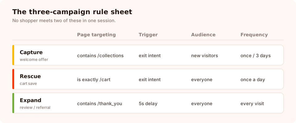
Three campaigns, three rule sets, zero overlap. Copy this before inventing your own.
- Page targeting — restrict each campaign by URL with contains, does not contain, is exactly, is not, starts with or ends with. This is what makes "cart only" real.
- Triggers — exit intent, a delay in seconds, scroll percentage, page count, click count or inactivity. The campaign shows as soon as the first enabled trigger fires, so enable one per campaign and know which one you are relying on.
- Audience and frequency — everyone, new or returning visitors, throttled to once a day, every session, once every N days or once every N visits. Turn the frequency rule on first: the audience and conversion controls only appear once it is enabled.
- Show again after conversion — off, on every capture campaign, always.
- Devices, schedule and date window — desktop/mobile toggles, a weekday-and-hour schedule and a start/end date in a chosen GMT offset. The date window is how a sale campaign retires itself while you are asleep.
What changes on mobile
More than half of most stores' traffic, and the place popups most often go wrong.
- Swap the trigger. Exit intent needs a cursor leaving the top of the viewport. On phones, use scroll depth, a delay, or inactivity.
- One field, big button. A keyboard covers half the screen; every extra field means another scroll.
- Check the close control. It must be reachable and obvious. A close button hidden behind a sticky header is how a popup becomes a bounce.
- Never cover add-to-cart. Test the actual page, not the editor preview.
- Consider a separate campaign. Device toggles let you run a shorter, differently-triggered version on phones instead of compromising one design for both.
Layer the season on top
Everything above is the standing plan. Seasonal campaigns sit on top of it for a couple of weeks and then retire — set the date window when you build them so they cannot outlive their own offer. Our seasonal popup calendar maps the retail year, and the peak-season playbook lives in the Black Friday strategy guide.
Pause, don't stack. During a seasonal push, pause the standing welcome offer instead of running both. Two discounts in one session teaches shoppers to wait for the third.
Six mistakes stores keep making
- The homepage popup on load. Highest reach, lowest intent, worst experience.
- The same discount everywhere. A code on the cart and a code on the collection page compete with each other and train shoppers to hold out.
- No date window on a sale campaign. Nothing looks worse in March than a live Christmas offer.
- Pretending to know the basket. "You have 2 items worth £48" is not something a popup can say truthfully. Say the threshold instead.
- Leaving "show again after conversion" on. Your best customers get sold the newcomer discount forever.
- No post-purchase campaign. The warmest page in the store, running nothing.
What to measure on a store

Read reach first, then rate, then what the campaign actually collected.
Each campaign reports its own views, clicks, submissions and conversion rate, plus the values collected per field. Three habits make those numbers useful:
- Compare a campaign to itself. A cart-exit popup and a collection-page popup are shown to different populations; the rate difference tells you nothing.
- Run one A/B test at a time. Two variants, a split you choose, separate numbers — and only one change between them. Offer first, timing second, wording third.
- Watch what happens after the capture. A high-converting popup that fills your list with people who never order is a cost, not a win.
Set up your store's plan
An hour, five steps. If the pixel is not on your storefront yet, use the Shopify guide or the one-line install for any platform — one script covers every campaign afterwards.
1. Map your pages to the four stages
Write down your real URL patterns for collection, product, cart and order confirmation. That map is your page targeting, already done.
2. Build the capture campaign
Welcome offer or gift-finder quiz on collection pages, exit intent, new visitors, code on the thank-you screen.
3. Build the cart rescue
Cart URL only, exit intent, once a day, one offer that removes friction rather than raising the discount.
4. Build the post-purchase ask
Order-confirmation URL, a few seconds of delay, and one of: review, referral, restock or reorder reminder.
5. Rule out the collisions, then leave it alone
Different pages, one trigger each, a frequency on all three, conversion gate off. Check the numbers in two weeks and change one thing — not five.
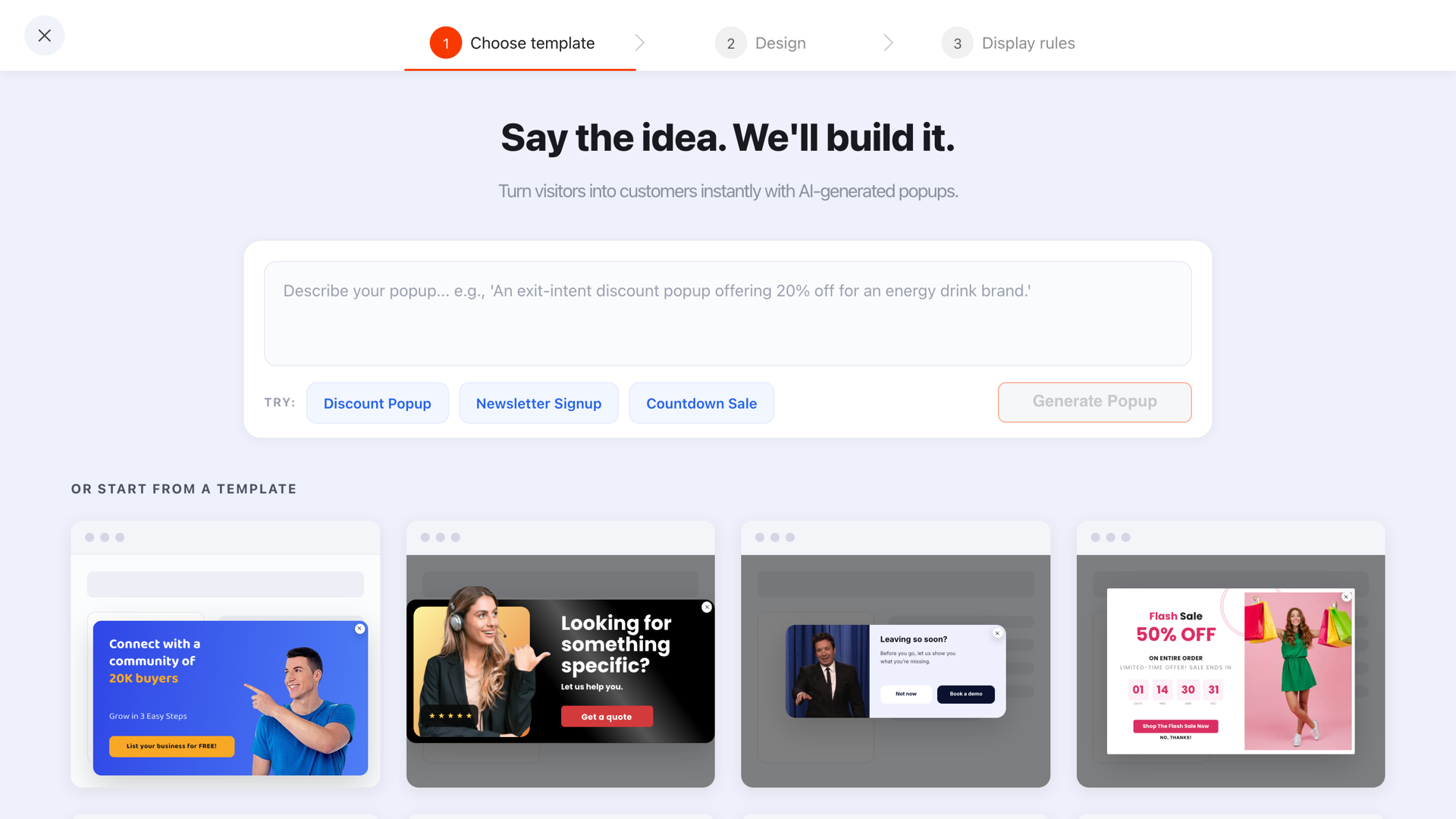
Start from a template, then delete everything the stage does not need.
Run all fifteen from one editor
Popups, forms, surveys, quizzes and prize games, one script on your storefront. Free plan, no credit card required. Paid plans from $29/month.
Start free →Related reading
Frequently asked questions
What are the best popup ideas for an ecommerce store?
The three that earn their place on almost every store are a welcome offer on collection pages for new visitors, an exit-intent rescue on the cart, and a post-purchase ask on the order-confirmation page. Everything else — quizzes, prize games, restock alerts, referral prompts — is worth adding once those three are running and measured.
How many popups should an online store run at once?
Three to five campaigns, each ruled to its own page and trigger, is plenty for most stores. The limit is not how many you build but how many a single shopper can meet in one session — which should be one. Page targeting and a per-campaign frequency are what keep that promise.
Do popups hurt ecommerce conversion rates?
A badly ruled popup does: one that covers a product image on arrival, or repeats on every page view, costs you sales. A campaign that waits for exit intent or a scroll signal, offers something concrete and stops appearing after someone converts adds revenue without competing with the buy button.
Can a popup read what is in the shopper's cart?
No. Targeting is based on the page URL, the visitor's history and behaviour signals, not on cart contents or basket value. So a cart popup should carry a message that is true for every basket — free shipping over a stated threshold, for example — rather than pretending to know what is inside it.
What should a cart abandonment popup offer?
One removal of friction, not a bigger discount. Free shipping, a clear returns promise, a saved basket or a small time-boxed code all work. Escalating the discount every time trains shoppers to abandon the cart on purpose, which is an expensive habit to teach.
Which popups work best on mobile for ecommerce?
Scroll and delay triggers rather than exit intent, which depends on a mouse leaving the viewport. Keep the popup to one field and one button, place it where a thumb can reach the close control, and check it does not cover the add-to-cart button. Device toggles let you run a different campaign on phones entirely.