A product recommendation quiz asks a shopper three to five multiple-choice questions and turns the answers into "here's the one for you". Done well it does three jobs in the time a product page does one: it narrows a catalogue that was overwhelming someone, it collects the segment data your emails have been guessing at, and it feels like service rather than marketing.
Done badly it is a ten-question form with a coupon at the end. The difference is almost entirely in the question design — so that is where most of this guide sits.
Key Takeaways
- Decide the outcomes first. The quiz sorts people into product groups, so the groups have to exist before the questions do.
- Three to five questions. Every question must change the recommendation, or it is decoration.
- Tappable options only. No free-text fields in the middle of a quiz — they break the rhythm and return values you cannot segment on.
- Ask for the email last, and show the result anyway. Gating the answer costs you the shoppers who resent it.
- The option breakdown is the real prize. Learning what your traffic actually wants often outlives the campaign.
Why product quizzes convert
Three mechanisms, and it is worth knowing which one you are relying on:
- They remove choice paralysis. Forty products in a collection is a decision most visitors postpone. Four questions turn it into three.
- They earn commitment one tap at a time. Someone who has answered three questions has invested effort, and finishing feels better than abandoning — which is why the email ask on the last screen converts far better than the same ask on the first.
- They collect declared data. Not inferred from behaviour, not guessed from a purchase — actually stated. Skin type, room size, skill level, use case: the fields your welcome email has been writing around.
That third one is the quiet reason to build a quiz even if the recommendations themselves are simple. Segment data you asked for is worth more than segment data you modelled.

Start screen, one question per step, email on the last one, result on the thank-you screen. Everything else is decoration.
Step one: define the outcomes, then the questions
Almost every failed product quiz was written question-first. Someone lists interesting things to ask, then discovers at the end that the answers do not map to anything the store actually sells.
Work backwards instead:
- List the outcomes. Three to six product groups a shopper could legitimately end up in. Not forty products — groups. "Dry skin routine", "oily skin routine", "sensitive starter set".
- Name the attributes that separate them. What genuinely distinguishes group A from group B? Skin type, budget, experience level, room size, frequency of use.
- Write one question per attribute. That is your quiz. If you have seven attributes, you have too many outcomes — merge some.
The test for every question: if two different answers lead to the same recommendation, cut the question. It costs a screen and buys nothing.
Step two: write questions people enjoy answering
A quiz question is not a form field. It should be readable in one glance, answerable without thinking hard, and phrased in the shopper's language rather than your catalogue's.
| Weak question | Better question | Why |
|---|---|---|
| "Select your skin classification" | "How does your skin feel by mid-afternoon?" | Asks about an experience, not a label they may not know |
| "What is your budget?" | "How much do you want to spend to start?" | "To start" removes the commitment anxiety |
| "Which grind size do you require?" | "How do you make coffee at home?" | Shoppers know their machine, not the grind spec |
| "Enter your room dimensions" | "How big is the room? Small / medium / big enough to echo" | Turns a measurement into a one-tap choice |
| "What are your goals?" | "What's the one thing you want to fix first?" | Forces a single, usable answer |
Four rules for the options themselves:
- Three to five options. Two feels like a coin flip; six needs scrolling on a phone.
- Mutually exclusive. If a shopper could honestly pick two, either allow multiple selection or rewrite the options.
- Include the honest escape. "Not sure yet" is a real answer and stops people guessing — a guessed answer poisons both the recommendation and your data.
- Write them at the same length. One long option among four short ones gets picked disproportionately, and now your data is about layout instead of preference.
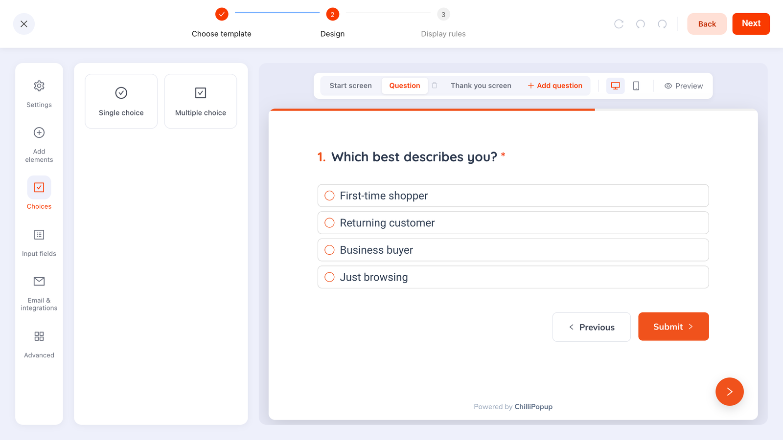
Each question is a choice block: single-select for a clean segment, multi-select where a shopper genuinely wants two.
Single-select gives you one clean value per shopper, which is what you want for routing. Multi-select is right for "what are you shopping for?" style questions where several answers are true — just accept that it is harder to segment on later.
Step three: deliver the recommendation
Here is the honest part. Quiz steps run in order, and there is no built-in branching — no "if they answered dry, jump to screen 5". That constraint turns out to be liberating once you know it, because there are three good ways to deliver a per-shopper result and none of them need branching.
Option A — one thank-you screen, one destination
The simplest version, and the right one for most stores. The final screen says "Based on your answers, start here" with a button to the collection that fits the dominant answer pattern. It works because the quiz has already narrowed the shopper's mindset — they arrive at that collection knowing why.
Option B — deliver it by email
The answers are stored with the submission, so you can send the tailored recommendation from your email tool. Slower, but it gives you room for three products, a photo and a reason — and it makes the first email you ever send that subscriber genuinely useful, which does more for long-term list health than any welcome discount.
Option C — redirect to the matching collection
The pixel fires a browser event when a quiz is submitted, carrying the answers. A few lines of JavaScript on your site can turn that into a per-answer destination:
window.addEventListener('chillipopup:quiz_submit', function (e) {
  // e.detail = { quizUuid: '…', data: { 'skin-type': 'Dry', 'budget': 'Under $50' } }
  if (e.detail.quizUuid !== 'YOUR_QUIZ_UUID') return;

  var routes = {
    'Dry': '/collections/hydrating',
    'Oily': '/collections/balancing',
    'Sensitive': '/collections/gentle'
  };
  var pick = routes[e.detail.data['skin-type']];
  if (pick) window.location.href = pick;
});
Forms and surveys fire their own equivalents (chillipopup:form_submit,
chillipopup:survey_submit), each carrying its own id key — so match on the right one if you
run several.
Redirect with care. If you send the shopper away instantly they never see the thank-you screen, which is where a discount code would have been shown. Either delay the redirect or move the code into the destination page's messaging.
Where to ask for the email
On the last screen, next to the result — and show the result either way. Three reasons:
- Effort earns the ask. Someone four taps in has invested something. Someone on screen one has not.
- Gating breeds fake addresses. Hold a result hostage and you get
a@a.com, which is worse than no address at all — see how to stop spam signups. - The answers are worth more than the address. If they abandon on the email screen, what they already answered is captured as a partial response — so the segment insight survives even when the signup does not.
Frame the ask as delivery rather than a toll: "Where should we send your results and the matching products?" — with the result visible behind it.
Four quizzes you can copy
Skincare store — 4 questions
- How does your skin feel by mid-afternoon? Tight / Shiny / Both / Comfortable
- What's the one thing you'd fix first? Dryness / Breakouts / Dullness / Fine lines
- How many steps will you actually do? One / Three / As many as it takes
- Where should we send your routine? [email]
Coffee store — 3 questions
- How do you make it at home? Espresso machine / Filter / French press / Pods
- How do you take it? Black / With milk / Both, depends
- Strength? Gentle / Balanced / Hits like a truck
Apparel store — 4 questions
- Who are you shopping for? Me / A gift
- What's the occasion? Everyday / Work / Something special
- Which fit do you live in? Relaxed / Regular / Tailored
- Budget to start? Under $50 / $50–120 / No limit
Software or service — 3 questions
- What best describes you? Solo / Small team / Agency / Enterprise
- What are you trying to fix first? [three real use cases]
- Where should we send the plan comparison? [email]
Notice the pattern: question one establishes context, the middle questions do the sorting, and the last screen collects the address. Nothing asks for information the store cannot act on.
Build your product quiz today
Choice questions, one per screen, with per-question drop-off and an option breakdown you can act on. Free plan, no credit card required. Paid plans from $29/month.
Start free →Where to place the quiz
A quiz is an offer to help someone decide, so it belongs where deciding is hard.
| Placement | Trigger | Works because |
|---|---|---|
| Wide collection page | Time delay, or page scroll | The shopper is visibly facing too many options |
| Buying-guide article | Page scroll ~50% | They are already researching how to choose |
| Homepage, first visit | A button that opens the quiz on click | Gives a new visitor a path instead of a catalogue |
| Email campaign | A direct link straight to the quiz | Re-engages subscribers you know nothing about yet |
| Product page | — | Don't. They already narrowed it; a quiz restarts the process |
Whatever you pick, cap the frequency so a browsing session is never interrupted twice, and turn off "show again after conversion" so someone who finished the quiz is not asked to retake it.
Reading the results
The quiz analytics answer three different questions, and the third one is usually the most valuable thing the campaign produces.
- Completion rate. The share who finish once they start. Below about half, the quiz is too long or one question is doing damage.
- Drop-off by question. The dashboard ranks where people quit, based on the last field they touched. That is your rewrite list, in order.
- The option breakdown. How many shoppers picked each option, per question. This is merchandising research: if 70% of your traffic answers "gift", your homepage is speaking to the wrong shopper, and no amount of quiz tuning fixes that.

Completion tells you about the quiz. The option counts tell you about your customers — and that insight outlives the campaign.
The popup analytics guide covers how to read these without over-interpreting a small sample.
Seven mistakes that sink a product quiz
- Too many questions. Past five, completion falls off a cliff and the extra data is rarely worth what it cost.
- Questions that don't change anything. "What's your name?" mid-quiz is a form field wearing a costume.
- Gating the result. The shopper did the work; show them the answer.
- Recommending everything. "Here are 12 products for you" is the catalogue again. One clear pick, maybe two alternates.
- Free-text in the middle. It breaks the tapping rhythm and returns values you cannot segment on.
- No promise on the start screen. Say what they get and how long it takes: "3 questions, 20 seconds, your routine at the end."
- Never reading the option counts. The quiz is a survey of your own demand. Ignoring it is the most expensive mistake on this list.
Build it in five steps
About an hour. If the pixel is not on your site yet, start with the install guide — one script serves quizzes, popups, forms and surveys alike.
1. Write the outcomes on paper
Three to six product groups. If you cannot name them, the quiz has nothing to sort people into.
2. Draft the questions and cut one
One question per attribute that changes the outcome. Then delete the weakest — quizzes are almost always one question too long.
3. Build the steps
Start screen with the promise and the time cost, one choice question per step, thank-you screen with the recommendation and a button to the collection.
4. Add the email field to the last step
Frame it as delivery, keep the result visible, and switch on email-format validation so typos do not silently cost you the subscriber.
5. Publish, then read the drop-off in two weeks
Trigger it from the collection page or a homepage button, cap the frequency, and fix the single question with the worst drop-off before touching anything else.
Related reading
Frequently asked questions
How many questions should a product recommendation quiz have?
Three to five. Each question has to earn its place by changing the recommendation — if two options lead to the same products, the question is decoration. Under three questions the result feels arbitrary; over six, completion drops sharply because the shopper realises they are filling in a form rather than getting help.
Should a product quiz ask for an email before showing the result?
Ask for it on the last screen, and do not hold the result hostage. By then the shopper has invested several taps, which is the moment they are most willing to give an address — and showing the recommendation regardless keeps the quiz feeling like help. Gating the answer converts a few more addresses and loses the shoppers who resent it.
How do I show a different result for different answers?
Quiz steps run in order and there is no built-in branching, so the recommendation is delivered in one of three ways: a thank-you screen that links to the collection most answers point to, an email you send based on the stored answers, or a small script that listens for the quiz submission event and redirects the shopper to the matching collection URL. The third option gives a per-answer result without any branching in the quiz itself.
Where should a product quiz appear on a site?
Wherever the choice is hardest: the collection page for a wide category, a buying guide article, or a homepage button for a catalogue that intimidates first-time visitors. Avoid firing it on a product page — someone reading a specific product has already narrowed the choice, and a quiz there asks them to start over.
What is the difference between a product quiz and a survey?
A survey asks how you feel — ratings, scores, opinions — and the value is in the aggregate. A quiz asks what you want, using multiple-choice options, and the value is in what happens next for that one person. In practice they are built the same way, one question per screen, but a quiz screen is a set of tappable choices while a survey screen is often a rating widget.
How do I know whether the quiz is working?
Read three numbers: completion rate, the option breakdown per question, and the drop-off point. Completion tells you whether the quiz is the right length, the option counts tell you which segments your traffic actually contains — usually the most valuable thing the quiz produces — and drop-off names the exact question to rewrite or delete.