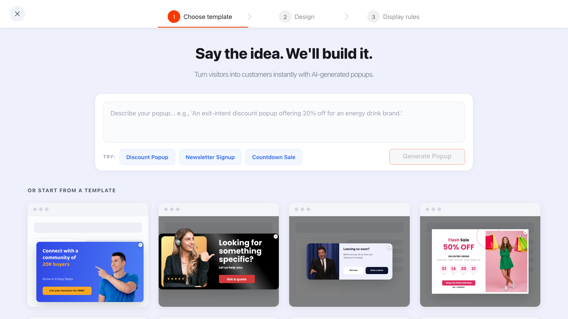
A popup template is a finished layout you fill in: the sizing, the hierarchy, the button placement and the mobile behaviour are already decided, so you can have something live in four minutes. That speed is the whole point — and it is also the trap. A template makes a popup look finished long before it says anything.
The fix is not to avoid templates. It is to treat them as structure rather than as design: choose the one whose shape fits the job, then change the six elements that carry the meaning.
Key Takeaways
- Choose by structure, not by colour. Field count, text volume and image use are hard to change later; a palette takes thirty seconds.
- Six elements do the work: headline, sub-line, button label, image, fields, colours. Change all six, every time.
- Templates carry a design, never a strategy. The trigger, pages, audience and frequency are yours to set.
- Every content type has its own gallery — popups, forms, surveys, quizzes and prize games — and the step structure is worth more than the styling.
- Publish, then look at it on a phone. Half of all template mistakes are only visible at 375 pixels wide.
What a template actually gives you
It is easy to assume you are buying a look. You are not — you are buying a set of decisions somebody already made correctly:
- Hierarchy. One headline that dominates, one sub-line that supports it, one button that is obviously the next action.
- Proportion. A card size that fits a laptop and a phone without either cramping the copy or swallowing the screen.
- Field economy. The number of inputs the format can carry before it stops converting — usually one.
- Contrast. A button that reads as clickable, and text that survives being placed over a photograph.
- A visible way out. A close control that a visitor can find without hunting.
None of that is what you notice in a gallery, and all of it is what makes the popup work. Which leads directly to the selection rule.
Choose by the job, not by the picture
Write one sentence before you open the gallery: "This popup exists to ___." Then pick the template whose layout already serves that sentence. Browsing first and deciding afterwards is how sites end up running a beautiful discount popup with no discount behind it.
| The job | The shape you want | What to avoid |
|---|---|---|
| Capture an email for a discount | Split card: image one side, one field and a bold code the other | Anything with two or three inputs |
| Grow a newsletter | Small, text-led, one field, no photograph competing with the promise | Full-screen takeovers — the offer does not justify the interruption |
| Announce something | An edge-anchored bar or a corner card with no fields at all | Centre-screen overlays; you are not asking for anything |
| Recover an exit | A high-contrast card with one clear offer and a visible decline link | Long copy — nobody reads a paragraph on the way out |
| Segment a visitor | A multi-step quiz or survey layout, one question per screen | A single card crammed with a question and four options |
| Make it playful | A prize-game layout — wheel, scratch card, slot machine or claw machine | A game with a prize table nobody would want to win |
The layout test. If a template needs more words than you have, or fewer fields than you need, it is the wrong template — no amount of restyling will fix that. Structure first, style second.
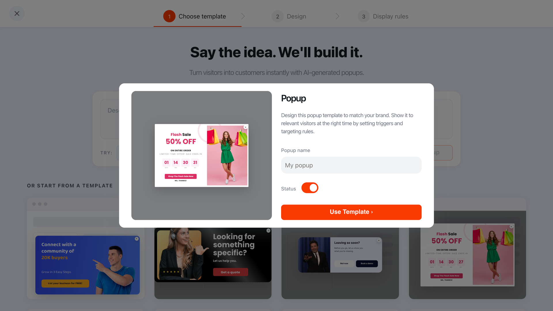
Picking a template is step one of three: choose template, design, display rules. The last step is the one nobody can do for you.
The six things to change every time
Once a template is open in the editor, these are the six edits that turn somebody else's popup into yours. Do all six even when you are in a hurry — the first two on their own account for most of the difference in performance.
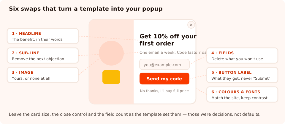
Six edits, roughly ten minutes. Anything you leave at its template default is a sentence written for someone else's business.
1. The headline
Name the benefit in the visitor's words. "Get 10% off your first order" beats "Join our community" every time, because one of them is a thing a person wants and the other is a thing a brand wants. Keep it under about eight words so it survives at phone width.
2. The sub-line
One sentence that removes the next objection: how often you email, how long the code lasts, what happens after they click. If the headline is the promise, the sub-line is the small print people actually read.
3. The button label
Never leave it as "Submit". Write what the visitor gets — "Send my code", "Show me the picks", "Start the quiz". First person is not a gimmick; it reads as the visitor's own decision. There is a whole list of these in the CTA button copy examples.
4. The image
Stock photography is the fastest way to make a popup look like an advert. Use your own product, your own packaging, or delete the image entirely — a clean text popup outperforms one carrying a photo that means nothing.
5. The fields
Templates ship with a sensible field set, but "sensible" was decided without knowing your business. Delete anything you will not act on. If you cannot name the email, segment or recommendation that changes because of a field, it is friction with no payoff.
6. The colours and fonts
Match your site, then check contrast. The button must be the highest-contrast element in the popup, and the close control must stay visible against whatever background you chose. If your brand uses an uploaded font, set it here so the popup renders in the same family your site does.
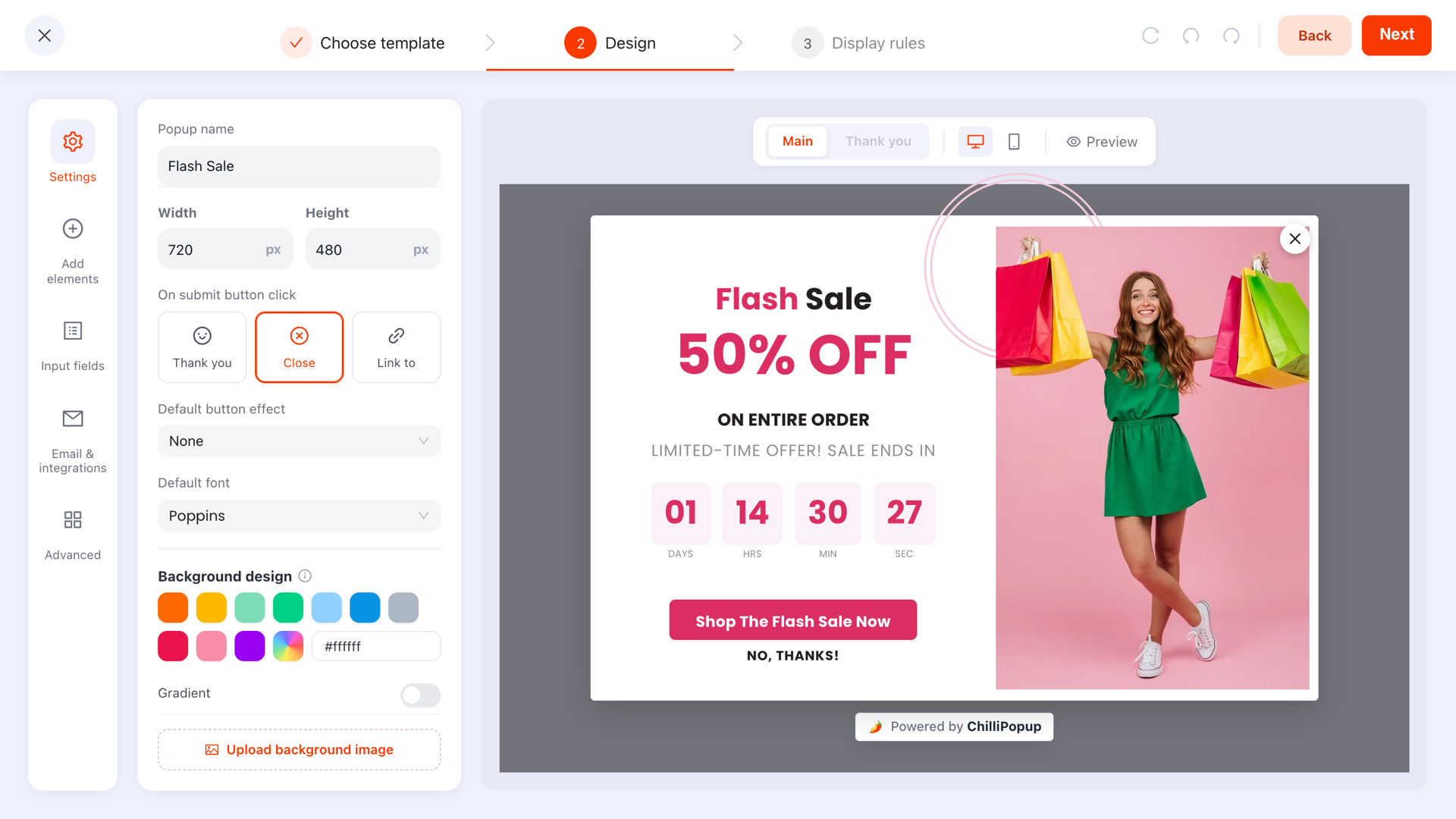
Everything on the canvas is editable, block by block — the template only decides where things start.
What to leave alone
Restraint is the second half of using templates well. Four things are usually right as they come:
- The card size. It was chosen so the popup fits a small laptop screen. Making it bigger to "fill the space" is how a popup becomes an interruption people resent.
- The close control. Hiding or shrinking it lifts short-term conversions and costs you the visit. It is also the first thing that makes a popup feel dishonest.
- The single-field discipline. If the template asks for one thing, the temptation to add a phone number is the temptation to halve your conversion rate.
- The visual hierarchy. One dominant element. Two headlines competing for attention is the most common self-inflicted template wound.
The stock-headline test. Search your published popups for any phrase you did not write. If a visitor could read your popup and not know which site they are on, the template is still wearing its own clothes.
Template, AI draft, or blank canvas?
Three ways to start, and they are genuinely different tools rather than three speeds of the same one.
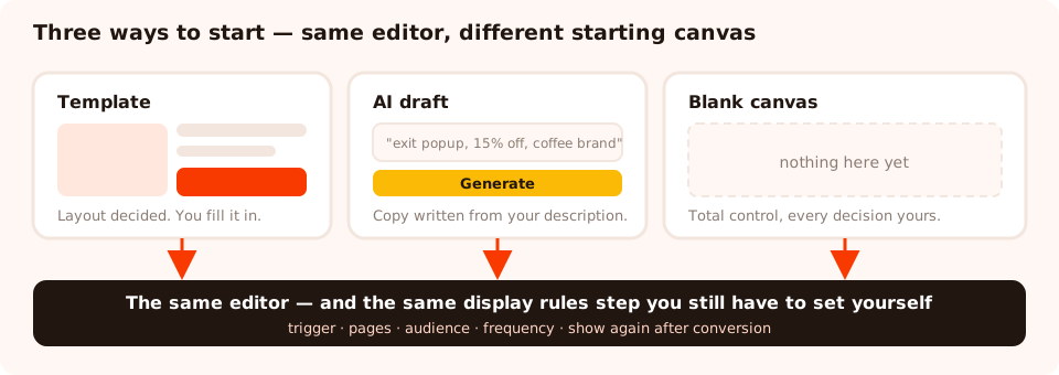
All three land you in the same editor. The difference is what is already on the canvas when you arrive.
| Start from | Best when | What you still have to do |
|---|---|---|
| A template | The job is standard: discount, signup, announcement, exit offer | The six swaps, plus all of the display rules |
| An AI draft | You already know what it should say and want the first version written for you | Fact-check the copy, adjust the brand details, set the rules |
| A blank canvas | The layout is genuinely unusual — built around one product shot, or an odd shape | Everything, including the decisions a template would have made for you |
A useful hybrid: generate a draft from a one-line description, then treat the result exactly like a template and run the six swaps over it. The AI popup generator guide covers how to write the description so the draft comes back close to usable.
Templates for forms, surveys, quizzes and games
Popups are not the only gallery. Each content type has its own, and for the multi-step types the structure is the valuable part — a survey template arrives with its start screen, question steps and thank-you step already sequenced, which is the piece that takes longest to build from nothing.
- Forms — contact, quote request and signup layouts with the field sets already sized.
- Surveys — rating scales (star, thumbs, satisfaction, effort, recommendation) already placed on their own steps.
- Quizzes — multi-step multiple-choice flows with question and result screens.
- Prize games — spin wheel, scratch card, slot machine and claw machine, each with a themed prize table you rewrite.
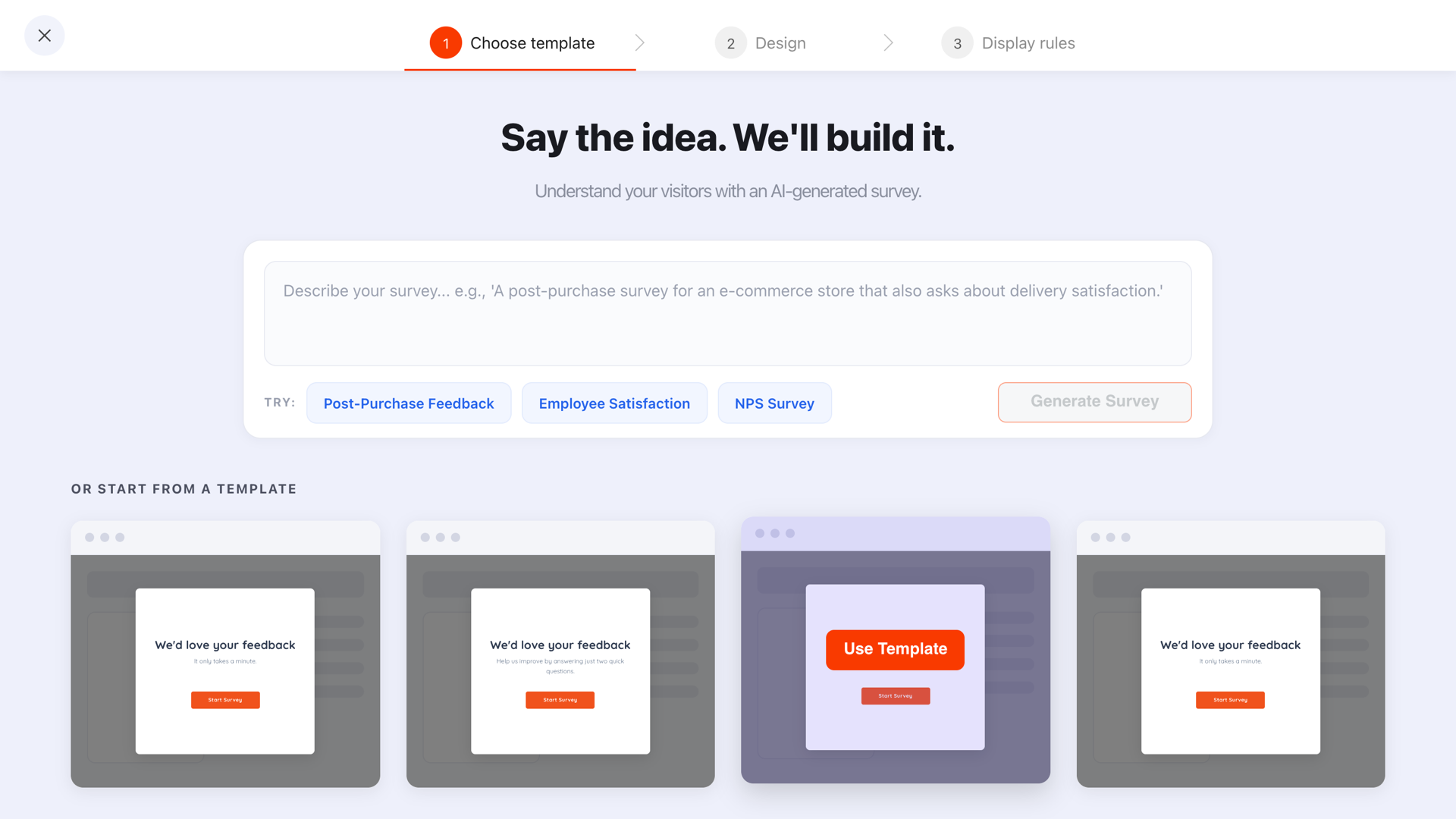
For multi-step content, the sequence is the template. Rewriting the questions is the easy part.
Start from a template, ship it today
Popups, forms, surveys, quizzes and prize games — every content type with its own gallery, one editor and one script tag. Free plan, no credit card required. Paid plans from $29/month.
Start free →The part no template can do for you
A template decides what the popup looks like. It cannot decide when it appears, to whom, and how often — and those choices matter at least as much as the design. After the design step you set:
- The trigger — a time delay, exit intent, scroll depth, page count, click count or inactivity. The first enabled trigger to fire is the one that shows it.
- Page targeting — which URLs it may appear on, using contains, starts with, ends with or exact matching.
- The audience — everyone, new visitors, or returning ones.
- The frequency — how long before the same person meets it again.
- Show again after conversion — turn it off, always, unless you enjoy showing a signup popup to people who already signed up.
Two popups built from the same template can perform completely differently on the same site because of those five settings alone. The triggers guide and the frequency guide cover how to choose them.
Five template mistakes
- Publishing with the stock headline. The most common, and the most expensive.
- Choosing on looks and fighting the layout afterwards. Ten minutes of restyling never rescues a structure built for another job.
- Adding fields the template deliberately left out. The field count was a decision, not an oversight.
- Never opening the mobile preview. Clipped headlines and unreachable buttons are invisible on a desktop.
- Running six templates at once. Two popups competing on the same page make both of them annoying. Pick one job per page.
Related reading
Frequently asked questions
Are popup templates worth using, or should I start from scratch?
Use a template for anything standard — a discount capture, a newsletter signup, an announcement, an exit offer. The layout decisions in those have been made thousands of times and there is no prize for redoing them. Start from a blank canvas only when the popup has an unusual structure, such as a bespoke layout built around one product photograph.
How do I choose the right popup template?
Choose by structure, not by looks. Write down what the popup has to do, then pick the template whose layout already fits that job — the right number of fields, the right amount of text, an image only if you have a good one. Colours and fonts are a thirty-second change; a layout designed for a different job stays wrong for as long as it is live.
What should I change in a popup template?
Six things, every time: the headline, the sub-line, the button label, the image, the field set and the colours. The headline and the button label carry almost all of the persuasion — if you only have five minutes, spend them there and leave the rest of the template alone.
Do templates include the display rules?
No, and that is deliberate. A template is a design. When and where it appears — the trigger, the pages, the audience, the frequency, whether it returns after someone converts — is a separate step you set yourself, because the same design can be an exit offer on one site and a scroll-triggered signup on another.
Can I use templates for forms, surveys and quizzes too?
Yes. Each content type has its own gallery, so a survey template arrives with its start, question and thank-you steps already structured, and a quiz template arrives with its question steps. That structure is usually more valuable than the styling, because it is the part that takes longest to get right.
Is it better to use a template or generate a popup with AI?
They solve different problems. A template gives you a proven layout you then fill in. AI generation gives you a first draft built around your own description, which is faster when you already know exactly what the popup should say. Either way, the output is a starting point you edit — nothing published straight from a gallery or a prompt is finished.