
A high-converting popup has nine visible parts and one invisible one. Each part has a single job, and when a popup underperforms it is almost never "the design" — it is one specific part that has stopped doing its job while the other eight carry on regardless.
Learning the anatomy is what turns "this popup isn't working" into "the offer is fine, the button is wrong". That's a fifteen-second fix instead of a redesign.
Key Takeaways
- The trigger is part of the popup, even though nobody sees it. Wrong moment, wrong result, whatever the copy says.
- The offer outranks the design. A great-looking popup for a bad offer converts worse than an ugly one for a good offer.
- The headline names the reward, not the mechanism. "Get 10% off" beats "Join our newsletter" every time.
- Every field is a decision, not a keystroke — and one identifier is almost always enough.
- The thank-you screen is where the promise gets kept. Deliver there, not three emails later.
The nine parts, mapped
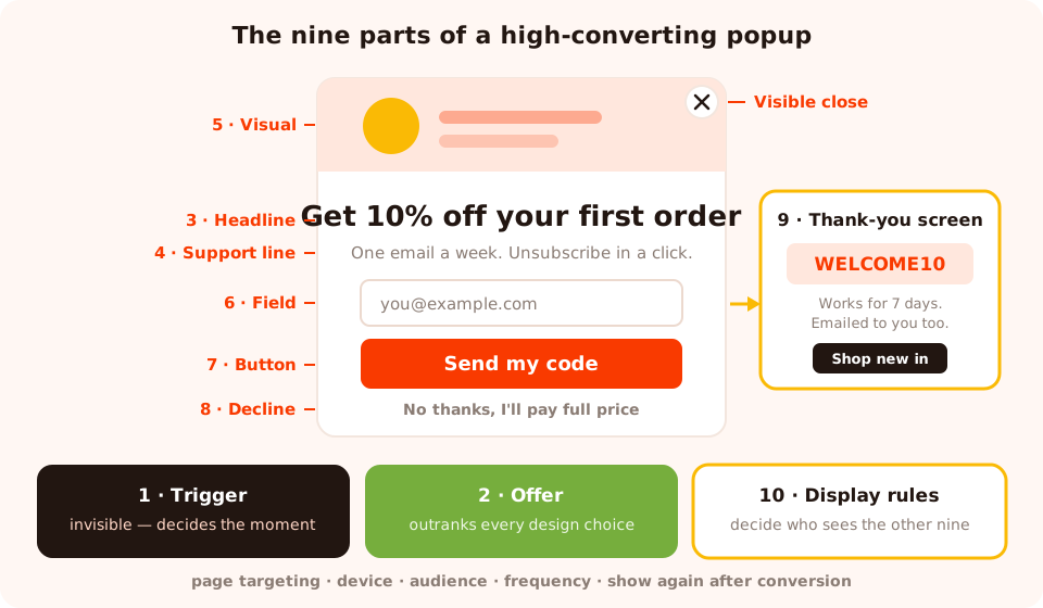
Nine parts. Eight of them are visible; the trigger and the display rules decide whether anyone ever sees them.
| Part | Its one job | How it fails | The fix |
|---|---|---|---|
| 1. Trigger | Pick a moment the visitor isn't busy | Fires on arrival, mid-scroll, or during checkout | Move to exit intent, deep scroll or page count |
| 2. Offer | Be worth an email address | "Newsletter", "updates", "stay in touch" | Swap for something specific and immediate |
| 3. Headline | Name the reward in one glance | Describes the mechanism, not the benefit | Six to ten words, reward first |
| 4. Support line | Remove the one objection | Repeats the headline in longer words | Answer "what's the catch?" instead |
| 5. Visual | Show the product or the reward | Decorative stock photo eating half the card | Delete it, or replace with the actual thing |
| 6. Fields | Collect the minimum you'll act on | Four fields "while we've got them" | One identifier; move the rest to a later ask |
| 7. Button | Restate the reward as an action | "Submit", "Subscribe", "Send" | "Send my code", "Get the guide" |
| 8. Decline | Give a dignified way out | Hidden or missing close control | Visible ✕ plus a "no thanks" link |
| 9. Thank-you screen | Keep the promise immediately | "Thanks for subscribing!" and nothing else | Show the code, the link, the next step |
Part 1 — The trigger: the part nobody designs
The trigger is invisible, unbranded and by far the most consequential component. It decides whether your popup meets a visitor who is deciding, reading, checking out — or leaving.
The available signals are the same in most tools: exit intent, a time delay in seconds, page scroll percentage, page count, click count, and inactivity. The content appears as soon as the first enabled trigger fires, so enabling three of them is a way of saying "whichever happens first" — which is rarely what you meant.
Diagnostic: if your popup has a high view count and a very low conversion rate, look at the trigger before you touch a single word. High reach plus low conversion is the signature of a popup that is arriving at the wrong moment, not one that is written badly.
The full breakdown of which trigger suits which page is in the popup triggers guide.
Part 2 — The offer: the part that outranks the design
Every popup is a trade: the visitor's attention and contact details in exchange for something. If the something is weak, the popup is a tax on the visit no matter how it looks.
Offers, roughly in descending order of how well they convert cold traffic:
- An immediate discount on something they're already looking at.
- A prize with a game attached — a spin, a scratch, a grab. The play is the incentive.
- A genuinely useful asset: the size guide, the checklist, the template, the comparison sheet.
- Access: early drops, restock alerts, the waitlist.
- The newsletter itself — which converts only when it has a name, a promise and a frequency.
The offer also has to be different from what the page already gives away. On a page that already sells the free trial, a popup offering the free trial is just a second chance to say no. There's a longer list in lead magnet ideas for ecommerce.
Parts 3 & 4 — Headline and support line
A popup gets read in about a second, in this order: big text, image, button, everything else. So the big text has to carry the reward on its own.
| Weak headline | Why it fails | Rewritten |
|---|---|---|
| Join our newsletter | Names the mechanism, not the reward | Get 10% off your first order |
| Don't miss out! | Urgency about nothing in particular | Restock alerts before they sell out |
| Sign up for updates | No promise, no frequency, no benefit | One useful email a week. That's it. |
| Wait! Before you go… | Interruption with no payload | Before you go — take the size guide |
| Welcome to our store | Talks about you, not them | New here? Here's 10% to try us |
The support line then does one job: kill the objection the headline creates. If the headline is "Get 10% off", the objection is "and then you'll email me forever" — so the support line is "One email a week, unsubscribe in a click." Not a longer version of the headline.
Two-line test. Cover everything except the headline and the button. If a stranger can't tell what they get and what happens when they click, the popup is failing before any of the other parts get a turn.
Parts 5 & 6 — The visual and the fields
The visual earns its space or goes
Three images are worth including: the product itself, the reward itself (the coupon, the guide cover, the prize), or a brand element that stops the popup reading as a third-party ad. Everything else is decoration that pushes your button below the fold on a phone.
A layout trick that consistently works: a full-bleed image on one side, the copy and field stacked on the other. It gives the image a job — carrying the brand — without letting it crowd the ask.
Every field is a decision, not a keystroke
A field costs the visitor a decision ("why do they want this?"), the typing, and on mobile a keyboard that covers half the screen. And the costs are wildly uneven: once someone has decided to take a discount, typing an email is nearly free, while a phone number or a "company size" reads as an objection.
The predefined fields you can drop onto a popup cover full name, email, phone, message, gender, country, state, city, address, ZIP, birthday and an email-consent checkbox — plus custom fields as text, number, long text, dropdown, date or checkbox. That is a lot of rope. Use one identifier and, where you truly need a second answer, use a choice question instead of a text box so the values come back normalised.
If your CRM genuinely needs six fields, don't put six fields on a stranger's first popup — build a progressive profiling ladder instead.
Free tune-up: set the email field's validation to check format & prevent typos.
It catches gmial.com and .con with a "did you mean…?" prompt, so the address you
collect is one you can actually mail. On B2B forms, switch it to business-emails-only instead.
Parts 7 & 8 — The button and the way out
The button is the last thing read and the first thing clicked. Write it as the outcome, in the visitor's voice: Send my code, Get the guide, Show me the sizes, Save my spot. Never Submit. Never Subscribe — that is a description of what happens to them, not what they receive.
Then give them the exit. A visible close control plus a text decline underneath ("No thanks, I'll pay full price") does three things: it makes the popup feel safe, it makes the offer feel like a real choice, and it gives your dismissal rate a clean signal. The people who click it were never converting.
Part 9 — The thank-you screen, where the promise gets kept
This is the most under-used component in popup design. Most popups treat the thank-you screen as a receipt — "Thanks for subscribing!" — when it is the single best moment you will ever have with that visitor. They just said yes. They are still on the page. Their attention is entirely yours.
Put three things on it:
- The thing you promised — the code, in copyable text, or the download link. Do not make someone go to their inbox to receive a benefit you could give them right now.
- What happens next, precisely — "The code lands in your inbox in a minute and works for 7 days" beats "check your email".
- One next action — shop the collection, read the guide, book the call.
In ChilliPopup the thank-you screen is a separate, fully editable screen inside the same campaign (you can also set the submit button to simply close, or to send the visitor to a URL). That means the code and the next step get designed once, alongside the popup, instead of being outsourced to an email that may take minutes to arrive.
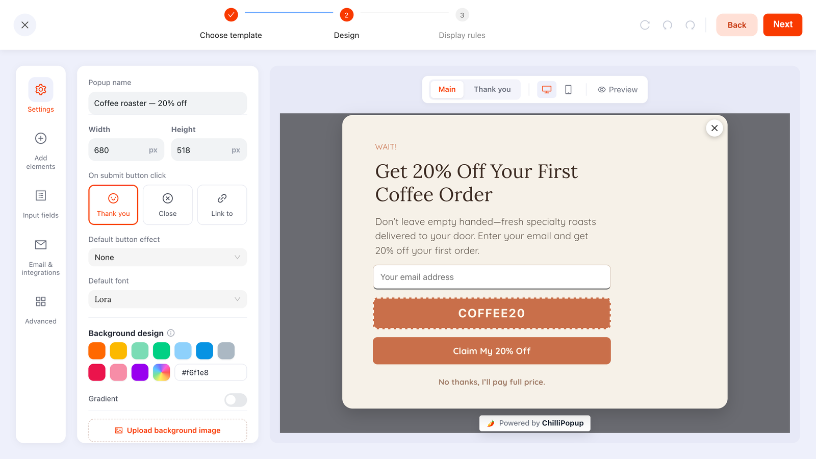
Main screen and thank-you screen live in the same campaign — switch between them while you design.
A full rewrite, part by part
Here is a real-shaped bad popup and the same popup rebuilt. Nothing about the brand, product or traffic changes — only the nine parts.
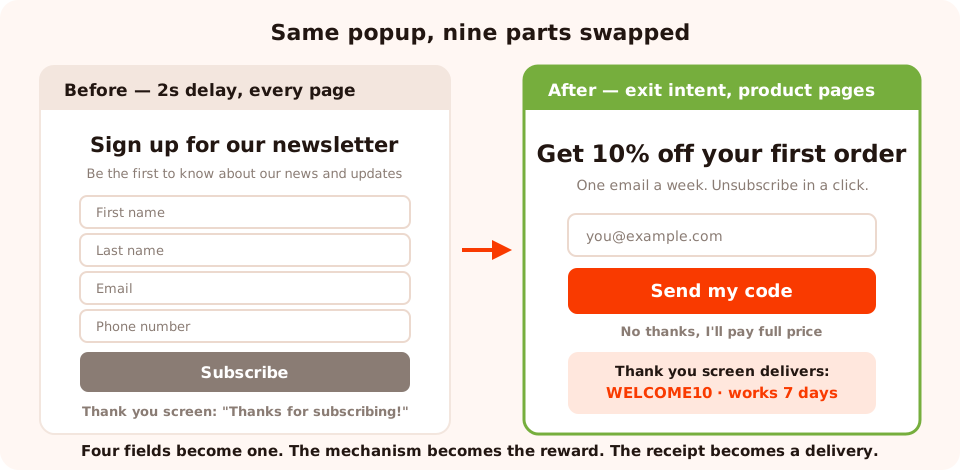
Four fields become one, the mechanism becomes the reward, and the thank-you screen starts delivering.
Before
Trigger: 2-second delay, every page
Headline: Sign up for our newsletter
Support: Be the first to know about our news and updates
Fields: First name, last name, email, phone
Button: Subscribe
Decline: a small grey ✕
Thank you: "Thanks for subscribing!"
After
Trigger: exit intent on desktop, 50% scroll on mobile, product and collection pages only
Headline: Get 10% off your first order
Support: One email a week. Unsubscribe in a click.
Fields: Email (format validation on)
Button: Send my code
Decline: visible ✕ plus "No thanks, I'll pay full price"
Thank you: "Your code is WELCOME10 — it works on everything, for 7 days.
We've emailed it to you too." + a Shop new in button
Every single change is a component swap. None of them required a designer, a developer, or a new tool — and the "after" version can be assembled in the editor in about ten minutes, or described in one sentence to the AI generator and then edited.
The mobile anatomy is a different animal
On a phone, three of the nine parts change behaviour:
- The trigger. There is no cursor, so exit intent has no reliable equivalent. Substitute scroll depth or inactivity.
- The visual. A side-by-side image/copy layout stacks vertically and pushes the button under the fold. Either drop the image on mobile or design a mobile-first variant.
- The decline. A tiny ✕ in a corner is a miss target with a thumb, and a popup that's hard to close is exactly the pattern that gets pages flagged as intrusive.
Full detail in mobile popup best practices.
How to tell which part is broken
The dashboard gives you views, clicks, submissions and conversion rate per campaign. Read them as a funnel and each drop-off points at a different part.

Views, clicks, submissions, conversion rate — plus the values collected per field.
- Lots of views, almost no clicks → the trigger or the offer. People are seeing it and it isn't interesting enough to engage with at that moment.
- Clicks but few submissions → the fields. They started and stopped. Delete one.
- Good conversion, bad list quality → the offer is attracting the wrong people, or you have validation switched off and are collecting junk addresses.
- Good numbers that decay over weeks → frequency. Regular visitors have seen it too often; add a cooldown and turn off "show again after conversion".
When you want to compare two versions of a part rather than guess, run them as an A/B test — change one part at a time, or you'll learn nothing about which one moved the number.
Six mistakes that break the anatomy
- Redesigning when the trigger is the problem. New colours will not fix a popup that fires two seconds after arrival.
- Adding a field "while we have them". Every added field is paid for in conversions you never see.
- A button that describes the form, not the reward. "Submit" is the most expensive word in popup design.
- An image with no job. If you can't say what the picture proves, it's costing you layout.
- A thank-you screen that thanks. Deliver something instead.
- Changing five parts at once. You'll get a different number and no idea why.
Build one, part by part
Forty minutes for a full rebuild. If the pixel isn't on your site yet, start with the one-line install guide.
1. Fix the moment before the words
Open display rules and check the trigger against the page. Exit intent for leavers, deep scroll for readers, page count for browsers. Nothing under five seconds from arrival.
2. Write the offer in one line
What they get, in their words. If it needs a paragraph to sound worth an email address, change the offer rather than the paragraph.
3. Headline = reward, support = objection
Six to ten words on top; one sentence underneath that answers "what's the catch?".
4. Delete every field but one
Keep the identifier, set email validation to format-and-typos, and move anything else to a later ask.
5. Rewrite the button as the outcome
"Send my code". "Get the guide". "Save my spot". Then add a visible decline link beneath it.
6. Make the thank-you screen deliver
Put the code or link on the screen itself, say what happens next and when, and give one next action.
Assemble all nine parts in one editor
Popups, forms, surveys, quizzes and prize games — designed, ruled and measured in one place. Free plan, no credit card required. Paid plans from $29/month.
Start free →Related reading
Frequently asked questions
What makes a popup convert?
One offer the visitor actually wants, shown at a moment they are not busy doing something else, asked for in as few fields as possible. Everything else — design, animation, imagery — modulates that. If the offer is wrong or the timing is wrong, no amount of design work will rescue the popup.
What are the parts of a popup?
Nine: the trigger moment, the offer, the headline, the support line, the visual, the input fields, the button, the decline option, and the thank-you screen. A tenth, invisible part — the display rules — decides who ever sees the other nine.
How long should popup copy be?
A headline of six to ten words, a support line of one sentence, and a button of two to four words. A popup is read in about a second, so anything that needs a second sentence to make sense is either the wrong offer or belongs on the page instead.
Should a popup have an image?
Only if the image does a job: showing the product, showing the reward, or making the popup feel like part of your brand rather than an ad. A decorative stock photo costs layout space and load time and returns nothing. When in doubt, delete the image and make the headline bigger.
Do popups need a "no thanks" link?
Yes. A visible decline link raises trust and costs almost nothing — the people who click it were not going to convert. What it removes is the trapped feeling that makes visitors dismiss every popup on your site reflexively, including the good ones.
What should the thank-you screen say?
It should deliver, not celebrate. Show the code, state exactly what happens next and when, and give the visitor one action to take. In ChilliPopup the thank-you screen is a separate editable screen inside the same campaign, so it can carry the discount code, the download link or the next step.