Website form best practices come down to four decisions: ask only for fields you will act on, pick field types that make honest answers easy, order the form easy-to-hard in a single column, and validate on submit with messages that say exactly what to fix.
Everything upstream of the form — the traffic, the offer, the design, the copy — exists to deliver a person to a set of inputs and a button. That's where the conversion actually happens, and it's where most of it is lost. The good news: forms fail for boringly predictable reasons, which means they can be fixed with boringly repeatable rules. This guide is those rules, plus two complete worked forms you can copy today.
Key Takeaways
- One form, one job, one primary button. A form that tries to capture leads and route support and segment signups does none of them well.
- Every field has a price. Run the "so what" test — name the action that changes because of the answer, or delete the field. Optional is not a compromise; it's a smaller delete.
- Pick field types that normalise answers. A dropdown or a one-question choice ask beats free text whenever you plan to segment on the answer.
- Validate on submit, and say what's wrong. Specific messages next to the failing field beat red borders and "invalid input" every time.
- Past three or four questions, split into steps. A multi-step survey shows you drop-off per question and keeps partial responses; a long form only shows you the survivors.
The one-job rule: every form has one conversion job
The one-job rule, in one sentence
A form exists to complete exactly one conversion — subscribe, contact, register, claim — and every field, label and button on it either serves that job or fights it.
Most bloated forms are not the work of one bad designer. They're the work of four reasonable colleagues: sales wants a phone number, marketing wants an attribution question, support wants a topic dropdown, and legal wants a checkbox. Each addition is defensible; the sum is a form with three jobs and no conversions. The fix is to name the job out loud before you open the editor. "This form's job is to turn a reader into a newsletter subscriber." Once the job has a name, every field can be interrogated against it — and most of them lose.
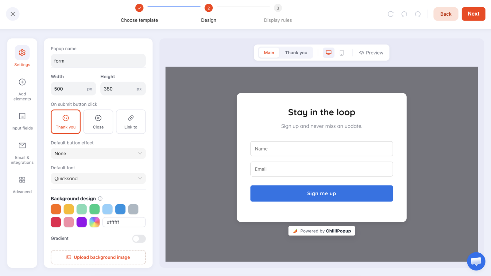
The one-job rule has a visible corollary: one primary button. A form with Submit and Learn more and Talk to sales side by side is asking the visitor to make your prioritisation decision for you. Keep a single submit action styled as the obvious next step. A quiet decline or close affordance is fine — it's not competing for the same click. In the ChilliPopup form editor this is the default shape: a form has one primary submit button, and submitting is what carries the visitor to the thank-you screen.
A useful smell test: read the form top to bottom and ask, "if this form converted at 100%, what list or inbox fills up?" If you can't answer in one sentence — or the honest answer is "two different lists" — the form has more than one job, and each job deserves its own, shorter form.
Field economics: every field has a price
A form field is not a container — it's a transaction. The visitor pays with a decision ("why do they want this?"), with typing, and on mobile with a keyboard that eats half the viewport. You pay too: every field you add costs you a slice of the people who would have submitted the shorter version. The craft is knowing that the price is wildly uneven per field.
An email field on a newsletter form is nearly free — someone who has decided to subscribe was always going to hand you a way to reach them. A first name costs a little more. A dropdown costs a decision but no typing. A phone number is expensive: it reads as "we will call you," which for many visitors is a reason to leave. And an open qualifier like budget or company size is the most expensive of all — it feels like being scored before being served.
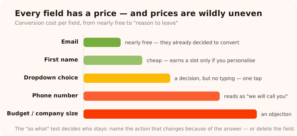
Fields don't cost equally. Count the price per field, not the number of fields.
The "so what" test
Before any field earns a slot, someone must name the exact thing that changes because of the answer: the reply that gets routed differently, the segment that gets a different email, the recommendation that shifts. "Nice to have in the CRM" is not an answer — it's how junk columns are born. Fields that fail the test don't get demoted to optional; they get deleted. And be honest about required versus optional: mark a field required only when you literally cannot do the job without it. In ChilliPopup every input has a per-field required toggle, so this is a one-click decision per field — which means there's no excuse for a form where everything is mandatory by default.
The "so what" test settles most fields. For the one it can't — the name field half the team swears by, say — stop debating and split traffic instead: create an A/B test on the form, delete the disputed field from Variant B, and run both versions side by side. Same page, same weeks, same traffic — and if the shorter form converts meaningfully better while nobody downstream misses the answer, the field never earned its price.
Required fields don't produce data — they produce compliance. Force a phone number
and you'll collect 0000000000. Force a company on consumers and you'll collect
asdf. A demanded answer is often worse than no answer, because now you'll act on it.
Choosing the right field type for each question
Once a field has survived the "so what" test, the next decision is its type — and the right type is the one that makes the honest answer the easiest answer.
Email — and how strictly to check it
The email input is the workhorse, and the real decision is validation strictness. A
format check catches typos — the missing @, the gmial.com
slip — and costs you nothing, so it should almost always be on. B2B teams have a second lever:
business-email-only validation, which rejects free personal domains so your sales
list isn't half throwaway addresses. In ChilliPopup each email field carries its own validation level
— format check, business-email-only, both, or none — so a newsletter form can stay permissive while
the demo-request form stays strict. Choose per form, not globally: strictness that protects one list
quietly taxes another.
Phone — only when calling is the product
Add a phone field only when a call or SMS is genuinely the next step — a callback form, an SMS-list signup. If the honest next step is an email, the phone field is pure friction plus a privacy flinch. And when phone is the point, say what happens: "We'll call you within one business day" converts better than a bare label, because it answers the objection the field creates.
Dropdown / select — for normalised answers
Any question you plan to segment, route or count on should be a dropdown with options
you define, never free text. Ask "What's this about?" as an open field and you'll get
billing, Billing question, invoice thing?? — three strings you
can never group. Ask it as a select with four options and every answer lands in a bucket you chose.
Keep the list short (three to six options), put the most common answer first, and resist the
Other option unless you'll actually read it.
Choice chips and one-question asks — when tapping beats typing
For a single segmenting question, a set of three to five tappable options often beats even a dropdown: the choices are visible without opening anything, they work in one gesture on a phone, and they return clean values. In ChilliPopup that's the choice-options block — single or multiple select — and when the whole ask is one question, a one-question quiz is frequently the better campaign than a form with a text field. Free text is for answers you can't predict — the message body of a contact form. Everything predictable should be a tap.
Every field names a column
One unglamorous practice that pays off for months: name your fields deliberately. In ChilliPopup each
input has a fieldKey, and that key becomes the column name in your collected data. Call
it email, not field_1; call the dropdown topic, not
select2. Future-you, copying submissions into an email tool, will be grateful.
Labels and placeholders: say what you mean
The cheapest conversion lift on most forms is honesty in the small text. Two rules cover almost all of it.
First: placeholders are not labels. A placeholder vanishes the instant someone types,
so a form that uses placeholder-only labels forces people to empty a field just to re-read the
question — and on a six-field form, to remember five questions while answering the sixth. Keep a
visible label for the question ("Work email") and use the placeholder for a format example
(name@company.com). If your design genuinely demands a minimal look with in-field labels,
keep the form to one or two fields where memory isn't a factor.
Second: labels are promises. "Email" next to a field that feeds a daily sales sequence is a small lie, and small lies get repaid in unsubscribes and spam reports. Label the exchange, not just the datum: "Email — we send one issue a week, no spam." The same goes for the button, which is the most-read label on the form — more on that next.
Mark the exceptions, not the rule. If most fields are required, mark the optional ones with "(optional)" instead of scattering asterisks. An asterisk explains nothing; the word "optional" is an invitation to skip — which is exactly what you want low-commitment visitors to do instead of leaving.
Box or underline: choosing an input style
Input fields have a visual anatomy, and the two dominant styles solve different problems. A box input draws a full border around the field: the tappable area is unmistakable, fields stack into a clear column, and the form reads as a form. An underline input draws only a bottom rule: it's lighter, it disappears into editorial layouts and photographic designs, and it makes a short form feel like an invitation rather than paperwork.
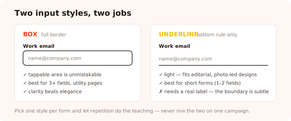
Box for clarity and density; underline for elegance and short forms. Both need a real label.
When to use which:
- Box — contact forms, anything with three or more fields, functional or utility-heavy pages, older or broader audiences. Clarity beats elegance whenever there's work to do.
- Underline — newsletter signups, brand-led landing sections, forms sitting on a photo or a strong background. The subtler boundary means the label and placeholder have to carry more of the "this is a field" signal, so never combine underline inputs with placeholder-only labels on a long form.
In ChilliPopup this is a per-field variant — each input can be switched between box and underline in the editor — so the style is a design decision, not a rebuild. That also makes it one of the cleanest A/B tests a form can run: flip Variant B's inputs to the other style, split traffic 50/50, and let your audience — not your taste — pick the winner. Just don't mix the two on one form: pick one style per campaign and let repetition do the teaching. For the wider visual system around the fields — spacing, contrast, hierarchy — see the popup design best practices guide; everything there about legibility applies doubly to inputs.
Layout and flow: single column, easy to hard, button copy that pays off
One column, always
A form is a conversation, and conversations are linear. A single column gives the eye one path: read, answer, drop, submit. Side-by-side fields create a Z-shaped scan where people miss fields, tab into the wrong one, and — on mobile — get a cramped two-column grid that collapses awkwardly anyway. The classic exception (city / postcode) belongs to checkout pages, not to the short marketing forms this guide is about. Stack everything.
Order fields easy → hard
Momentum is real. Open with the field that costs the least — usually email or name — and put the most expensive ask last. Someone who has filled three easy fields treats the fourth, harder one as a finishing step; the same hard field placed first is a reason not to start. This is also the argument for putting the message box last on a contact form: by the time they reach it, they're invested.
Button copy: say the outcome, not the mechanism
Submit describes what the database does. Button copy should describe what the visitor gets: "Send my message", "Get the weekly issue", "Email me the checklist". First person outperforms because the button completes the sentence the visitor is thinking ("I want to…"). This is a big enough topic that it has its own guide — the popup copywriting guide covers headline-to-button flow in depth — but the one-line version is: the button is the last thing read before the decision, so spend your best words there. And because two people will always disagree about which words those are, button copy is the classic first A/B test: write both labels, give each half your traffic, and let the form's own visitors settle it — the A/B testing guide walks through the setup, and it works the same for forms as for popups.
Mobile is the layout referee. Fields need to be tall enough to tap (a finger, not a cursor), the keyboard will cover half the screen, and every extra field means another scroll-and-refocus cycle. If a form feels fine on desktop and long on mobile, it's long.
Validation and error UX: check on submit, say what's wrong
Validation exists to protect the visitor's effort, not to police them. Done badly it's the single fastest way to lose someone who had already decided to convert — they typed everything, hit the button, and got scolded by a vague red banner. Four practices cover it:
- Validate on submit, not on every keystroke. Live validation that flags a half-typed email as invalid punishes people for the act of typing. Let them finish; check the finished value. (The gentle middle ground — checking a field when the visitor leaves it — is fine; shouting mid-word is not.)
- Say precisely what's wrong, next to the field. "That email is missing an @" beats "Invalid input"; "Please use your work email — free addresses aren't accepted here" beats a silent red border. A message the visitor can act on in two seconds keeps the submission; a riddle loses it.
- Never clear what they typed. An error should cost one correction, not a full re-entry. Forms that wipe fields on failure convert exactly once per visitor — the visitors who got everything right the first time.
- Validate as little as you can get away with. Every rule you add is a new way to reject a real human. Names don't have a valid format. Phone numbers arrive with spaces, dashes and country codes — accept them all. The only fields that earn strict rules are the ones where a wrong value breaks the job, which for most marketing forms means exactly one field: email.
This is also where field strictness from earlier comes home: a ChilliPopup email field set to format check rejects the un-sendable typo at submit time; set to business-email-only it enforces list quality for B2B asks. Both are submit-time checks with a clear reason — which is exactly the kind of validation that helps instead of blocks.
And close the loop on success as deliberately as on failure: a form that just blinks leaves the visitor wondering whether anything happened. A thank-you screen that confirms the outcome — "Message sent — we reply within one business day" — is part of the form, not an afterthought. In ChilliPopup every form ends on one; write it like you mean it.
When one step is too many: splitting into a survey
Some jobs genuinely need more than three or four answers — qualification flows, feedback, preference-gathering. The best practice there isn't a longer form; it's a different shape: one question per screen. In ChilliPopup terms, that means reaching for a survey instead of a form: an ordered flow of start screen → question steps → thank-you, with Next and Back between steps.
Splitting changes three things, and two of them are about data you can't get any other way:
- Each screen is one small decision. Six questions asked one at a time feel lighter than six fields glaring simultaneously — the visitor never faces the whole bill at once.
- You see drop-off per question. A long single-step form tells you only that 4% of viewers finished. A survey's per-question drop-off analytics tell you which question lost the other 96% — which turns "our form converts badly" into "question 3 is the problem," a thing you can actually fix.
- Partial responses survive. When someone answers two steps and leaves, what they entered is still recorded as a partial response. On a single-step form, an abandoner leaves nothing.
Two design notes for stepped asks. Put the field you need most — usually email — on an early step, so even partial journeys leave you something actionable. And know the constraint: steps run in strict order, with no branching, so design a stepped ask as one straight conversation rather than a decision tree. If different audiences need different questions, build separate campaigns targeted at different pages.
Rule of thumb: up to three or four questions, one well-ordered single-step form. More than that — or any mix of one easy ask with several hard ones — split into steps and let the drop-off report tell you which question to cut.
Trust and privacy microcopy: earn the answer
Every form asks a silent question back at the visitor: "what will they do with this?" Trust microcopy answers it before it's asked, in one line, near the fields:
- Say what you'll send, and how often. "One email a week. Unsubscribe any time." Specificity is the trust signal — "no spam, we promise" is what spammers also say.
- Link your privacy policy near the submit button. Almost nobody clicks it; almost everybody notices whether it's there.
- Get consent for what you'll actually do. If the contact-form email will also join a marketing list, that needs its own unticked checkbox — consent for a reply is not consent for a newsletter. Under GDPR-style rules, pre-ticked boxes and bundled consent are exactly the patterns that cause trouble. (Good practice, not legal advice — check your own obligations.)
- Don't collect what you'd hate to explain. The best privacy microcopy is a short form: data you never asked for is data you never have to justify, secure or delete.
The do/don't table, element by element
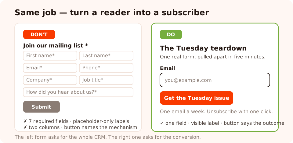
Same job, two forms. The left one asks for the whole CRM; the right one asks for the conversion.
| Element | Do | Don't |
|---|---|---|
| Fields | Only fields that pass the "so what" test; mark true exceptions "(optional)" | Ship the CRM schema; make everything required "just in case" |
| Field types | Dropdown or choice options for anything you'll segment on; free text only for the unpredictable | Open text for "topic" or "role", then wonder why you can't group the answers |
| Email validation | Format check on; business-email-only where B2B list quality matters | Reject personal emails on a consumer newsletter, or accept a@a on a sales form |
| Labels | Visible label for the question, placeholder for a format example | Placeholder-only labels that vanish as soon as someone types |
| Layout | Single column, easy fields first, hardest ask last | Two-column grids; the scariest field at the top |
| Button | One primary submit that names the outcome: "Get the weekly issue" | "Submit" — or three competing buttons |
| Validation | Check on submit; specific message next to the failing field; keep what they typed | Flag half-typed values; say "invalid input"; wipe the form on error |
| Length | More than 3–4 questions → a stepped survey with drop-off analytics | A ten-field single screen, measured only by who survived it |
| Trust | One specific promise line + a privacy-policy link + unbundled consent | Pre-ticked boxes; "no spam, we promise"; silence |
Two worked forms you can copy
Worked example 1: a contact form that gets replies
The job: turn a visitor with a question into a conversation your team can answer well on the first reply. Four fields, one screen, box inputs:
- Headline: "Talk to a human"
- Subline: "Tell us what's going on — a real person replies within one business day."
- Name (text, required) — label "Your name", so the reply can open properly.
- Email (email, required, format check) — label "Email", placeholder name@company.com.
- Topic (dropdown, required) — label "What's this about?", options Question before buying · Help with my account · Billing · Something else. This is the routing field — it's what makes the first reply the right reply.
- Message (text, required, last) — label "Your message", placeholder "The more detail, the better the answer."
- Button: "Send my message" · Trust line: "We only use your email to reply. Privacy policy."
- Thank-you screen: "Sent! You'll hear from us within one business day — check your inbox for a confirmation."
Notice what's absent: no phone number (email is the reply channel), no company field, no "how did you hear about us". Every present field changes the reply; every absent one only changed the conversion rate — downward.
Worked example 2: a newsletter form that fills a list
The job: one new subscriber. One field, underline input, and the whole form is really three lines of copy:
- Headline: "The Tuesday teardown"
- Subline: "One real popup or form, pulled apart in five minutes. Every Tuesday, free."
- Email (email, required, format check) — label "Email", placeholder you@example.com. No name field: personalised subject lines don't earn the extra field on a cold ask.
- Button: "Get the Tuesday issue" · Trust line: "One email a week. Unsubscribe with one click."
- Thank-you screen: "You're in — the next issue lands Tuesday."
Because a ChilliPopup form shares the popup system's triggers and targeting, the same design can run as a scroll-triggered ask on blog posts and stay off your checkout — the email-list guide covers that placement playbook in full. And if you'd rather not start from a blank canvas, describe either of these forms in a sentence and let the AI generator draft it:
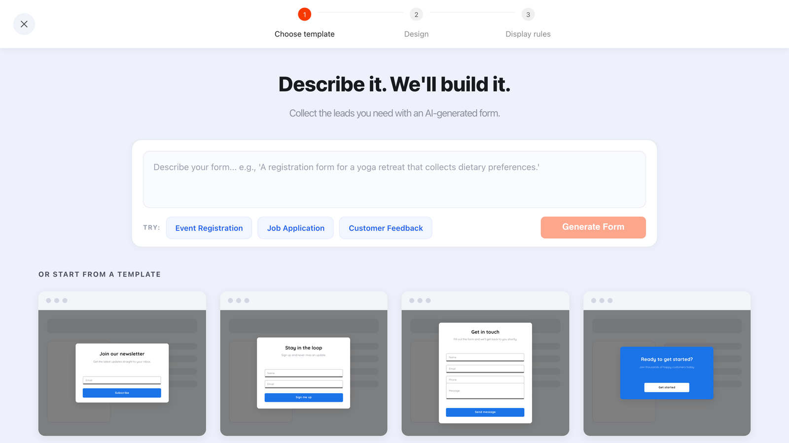
Describe the form's one job in a prompt; edit the draft instead of the blank page.
Eight form mistakes that quietly kill conversion
- Shipping the CRM schema. The form is designed around what sales wants to see instead of what this visitor will give right now — the root cause behind most of the others.
- Two jobs on one form. Lead capture and support routing and event registration, sharing one button. Each job converts worse than it would alone.
- Placeholder-only labels. The questions disappear as the answers arrive.
- The hard ask first. Phone number at the top is a bouncer at the door; the same field last is a finishing step.
- Vague error messages. "Invalid input" converts a decided visitor into a confused one — at the exact moment they tried to give you the conversion.
- Wrong strictness on email. Business-only validation on a consumer list rejects real subscribers; no format check on a sales form fills it with un-sendable addresses.
- No thank-you state. The visitor submits and nothing confirms it — so they submit again, or leave unsure it worked.
- Measuring only submissions. Without views you can't compute conversion; without field-input and drop-off data you can't see where the form leaks — so every redesign is a guess.
How to measure a form (and what to change first)
A form you don't measure is a form you can only argue about. Three numbers, in order:
- Views → submissions conversion. The headline number: of everyone who saw the form, how many finished it? ChilliPopup computes it per campaign as submissions ÷ views. Judge a form against itself, never against a number from someone else's traffic — and the cleanest form of "against itself" is an A/B test, where both versions face the same days and the same traffic mix at once, instead of a before-and-after that quietly assumes last month's visitors matched this month's.
- Field inputs. People typing into fields but not submitting means the offer worked and the form leaked — look at the last fields and the button. Views with barely any field inputs means the problem is upstream: the headline and offer aren't earning the first keystroke, which is a copy problem, not a form problem.
- Drop-off and partials on stepped asks. For surveys, the per-question drop-off ranking is your prioritised fix list, and partial responses show what people gave before leaving. Cut or rewrite the single worst question; re-measure; repeat.
The dashboard also breaks submissions down by device and shows the top values collected per field — which is where dropdown design pays off again, because normalised answers make that breakdown readable. Then act on what you find with a test, not a blind edit: keep the discipline of changing one thing, but change it in Variant B of an A/B test so the original keeps running alongside it. Visitors are assigned to a version once and stay on it, and the results view compares views, conversions and conversion rate side by side. The patience rule survives as sample size: no winner gets called until each version has at least 100 views and the test has 20 conversions, and below 95% confidence the dashboard says the lead can still flip — the two-week wait was never about the calendar; it was about volume.
Build a form that does its one job
Build popups, forms, surveys, quizzes and games from one editor — and one pixel. Free plan, no credit card required. Paid plans from $29/month.
Start free →Related reading
Frequently asked questions
How many fields should a website form have?
As few as the form's one job needs — for a newsletter form that is usually one field (email), and for a contact form three (name, email, message). Every extra field must name the exact reply, segment or decision that changes because of the answer; if nobody on your team can name it, delete the field rather than marking it optional.
Should a form validate while typing or on submit?
Validate on submit, then show a specific message next to the field that failed. Live validation that flags a half-typed email as wrong punishes people for typing. Checking the finished value and saying exactly what to fix — 'That email is missing an @' rather than 'Invalid input' — corrects errors without the noise.
What is the difference between box and underline input styles?
A box input draws a full border around the field; an underline input draws only a bottom rule. Boxes make the tappable area obvious and suit dense, functional forms. Underlines look lighter and suit editorial or minimal designs, but they need clear labels because the field boundary is subtler. In ChilliPopup, each input field can switch between the two variants with one toggle.
When should I split a form into multiple steps?
Split when the form asks more than three or four questions, or when it mixes one easy ask with several hard ones. Multi-step content shows one question per screen, so a ChilliPopup survey reports drop-off per question and records partial responses when someone leaves mid-way — a long single-step form gives you none of that; you only ever see finished submissions.
What is a good form conversion rate?
Conversion rate is submissions divided by views, and the only honest benchmark is your own form. Rates swing enormously with traffic source, offer, placement and device, so a universal 'good' number misleads more than it helps. Instead of comparing time periods, run an A/B test: change one thing in Variant B, split traffic 50/50, and don't trust the difference until each version has at least 100 views and the test has 20 conversions.
Do placeholders replace labels?
No. A placeholder disappears the moment someone types, so a form that uses placeholders as its only labels forces people to empty a field just to re-read the question. Keep a visible label for the question and use the placeholder for a format example, like name@company.com — the question stays on screen while the answer is typed.