A popup teaser is the small, permanent nudge that sits on your page and says "there is something here" without covering anything up. Tap it and the real popup opens. Ignore it and nothing happens — which is exactly the point.
Teasers solve the oldest problem in popups: the offer is often good, but the timing is someone else's guess. A teaser hands the timing back to the visitor. This guide covers the three teaser patterns worth building, when each one beats a straight interruption, the copy that earns the click, and how to put one on your site.
Key Takeaways
- A teaser is an invitation, not an interruption. It converts fewer people, at a much higher rate, and irritates none.
- Three patterns cover almost everything: the pre-play teaser screen, the persistent teaser tab, and the thin teaser bar.
- Teaser and popup are partners, not rivals. Run the triggered popup once, then leave the teaser behind for everyone who said no.
- Name the reward in about four words. A corner tab is read sideways, never studied.
- Watch the corner you park it in — live chat already lives in most bottom-right corners.
What is a popup teaser?
Popup teaser, in two sentences
A popup teaser is a small, persistent element — a corner tab, a floating button, a thin bar or a pre-play screen — that advertises an offer and opens the full popup when the visitor clicks it. The popup never appears uninvited, so the only people who see it are the people who asked for it.
Think of it as splitting a popup into two jobs. The attention job — "we have an offer" — is done by something tiny that costs the visitor nothing. The conversion job — the headline, the field, the button — is done by the full popup, and only for people who have already raised their hand.
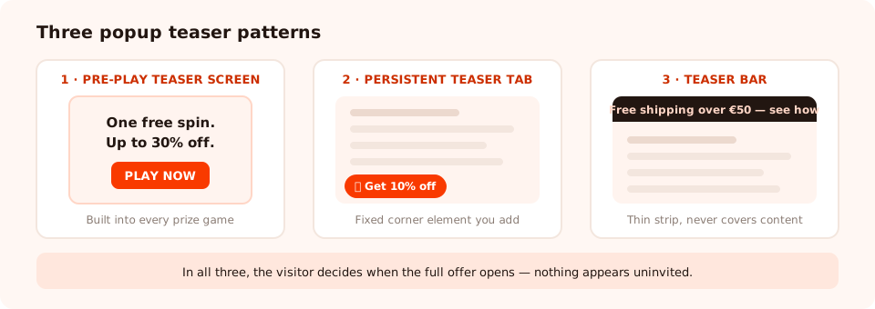
Three patterns, one idea: something small and permanent that opens something bigger on demand.
The three teaser patterns
1. The pre-play teaser screen
This one lives inside the campaign. Every ChilliPopup prize game — the spin wheel, the scratch card, the slot machine and the claw machine — can show an optional teaser screen before the game surface appears: a headline, an image, and one button that starts the play.
It exists because a game surface is a lot to land on cold. A wheel with eight slices demands that the visitor work out the rules before they know whether they care. A teaser screen says "One free spin. Up to 30% off." first, and only then shows the machinery.
2. The persistent teaser tab
A small tab or button fixed to the corner of the page. It stays put while the visitor browses and opens the offer on click. This is the classic "popup teaser" people mean when they use the phrase, and it is the one you build yourself out of a small element plus one line of JavaScript (below).
3. The teaser bar
A thin strip along the top or bottom of the page carrying one line and a call to action. It is the least intrusive of the three and the one that survives mobile best, because it never fights the content for space. If the strip is the whole offer rather than a doorway to one, you want an announcement bar instead.
| Pattern | Where it lives | Best for | Main risk |
|---|---|---|---|
| Pre-play teaser screen | Inside a prize game, before the play surface | Games, where the mechanic needs a sentence of setup | An extra tap between arrival and the fun bit |
| Persistent teaser tab | Fixed to a page corner, always visible | Always-on offers, feedback, help, discount codes | Colliding with live chat in the same corner |
| Teaser bar | A thin strip at the top or bottom of the page | Site-wide messages and mobile-heavy traffic | Banner blindness if it never changes |
When a teaser beats an interruption
Be honest about the trade: a teaser will usually produce fewer signups than a well-timed overlay, because it depends entirely on the visitor taking the initiative. What it produces instead is a higher-quality conversion and a zero-cost impression. Reach for one when:
- The visitor is mid-task. Checkout, account pages, a long article, a booking flow — anywhere an overlay costs you more than it earns.
- The offer is always on. A permanent 10% newsletter code does not need to ambush anyone; it just needs to be findable.
- They already said no. Someone who dismissed your popup should not meet it again — but a small tab in the corner keeps the door open without arguing.
- The ask is optional by nature. Feedback, support, a wishlist, a "notify me" — things people do when the mood strikes.
- Your traffic is mobile-heavy. A full-screen overlay on a phone is the harshest interruption on the web; a bar or a tab is not.
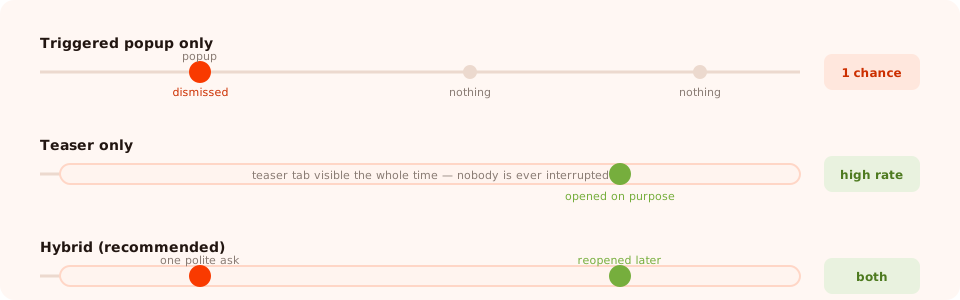
The hybrid is the one most sites should run: interrupt once, politely, then leave a teaser behind for the people who said no.
The pattern that beats both. Run your triggered popup with the frequency capped and "show again after conversion" turned off, and keep a teaser on the page permanently. Newcomers get one well-timed ask; everyone else gets a door they can open whenever they like. Two campaigns, one pixel, no nagging.
How to build a persistent teaser
ChilliPopup does not minimise a dismissed popup into a tab for you. You build the teaser as a small element of your own and let it call the player's open API — which is the same mechanism the dashboard's own share-and-embed panel gives you for opening a form, survey or quiz from a link.
Step one: stop the campaign opening by itself
Build the popup you actually want people to see, then go to its display rules and turn the automatic trigger off. From that moment the campaign only ever appears when something asks for it.
Step two: add the teaser and wire it up
One anchor, one call. Style it however you like — this is your page, so the teaser can look exactly like your brand rather than like a widget.
<!-- the pixel, already on every page -->
<script id="chillipopup-pixel" src="https://player.chillipopup.com/javascript/pixel.js?id=YOUR_WORKSPACE_ID"
        data-api="https://api.chillipopup.com" async="true"></script>

<!-- the teaser -->
<a href="#" class="cp-teaser"
   onclick="ChilliPopup.open('YOUR_CAMPAIGN_UUID'); return false;">🌶️ Get 10% off</a>

<style>
  .cp-teaser {
    position: fixed; left: 20px; bottom: 20px; z-index: 9998;
    background: #f93a00; color: #fff; font: 600 15px/1 system-ui, sans-serif;
    padding: 14px 20px; border-radius: 999px; text-decoration: none;
    box-shadow: 0 10px 24px -10px rgba(0,0,0,.45);
  }
</style>
ChilliPopup.open() takes the campaign's id and opens it immediately, bypassing its triggers.
Two details worth knowing:
- It is a forced open. If something else is already on screen, call
ChilliPopup.close()first or the two will stack. - You can override the presentation. Pass
{ mode: 'lightbox' }to force a centered, dimmed overlay, or{ mode: 'sidebar' }to slide it in as a panel docked to the edge — handy when the teaser sits in a corner and you want the panel to appear beside it.
<a href="#" onclick="ChilliPopup.open('YOUR_CAMPAIGN_UUID', { mode: 'sidebar' }); return false;">
  Give feedback
</a>
Mind the corner. Live chat widgets almost always sit bottom-right. Park your teaser bottom-left, or move the chat bubble — two round buttons overlapping in the same corner is the single most common teaser bug, and on a small screen it makes both of them unusable.
The no-code alternative
If you would rather not touch the page at all, every campaign also gives you a direct link that launches it on arrival. Put that link in your navigation, your footer, an email or a social bio and it behaves like a teaser you did not have to build — the visitor arrives and the campaign opens for them.

The teaser is tiny; the popup behind it is a normal campaign, designed in the usual editor with the usual blocks.
Teaser copy that earns the click
You have roughly four words and a verb. A teaser is read in peripheral vision while someone is doing something else, so it has to name the reward, not the mechanic.
| Job | Weak teaser | Better teaser | Why |
|---|---|---|---|
| Newsletter discount | "Subscribe to our newsletter" | "🌶️ Get 10% off" | Names the reward instead of the obligation |
| Prize game | "Play our game" | "Spin to win — 1 free spin" | Free and finite; both matter |
| Feedback survey | "Feedback" | "2 questions, 20 seconds" | Prices the ask before they commit |
| Back in stock | "Notify me" | "Email me when it's back" | Says what actually happens next |
| Quiz | "Take the quiz" | "Find your size in 30s" | Outcome plus time cost |
Three rules that hold everywhere:
- Reward first, mechanic second. Nobody wants a popup; plenty of people want 10% off.
- Give it a shape. A number — "10%", "2 questions", "30 seconds", "1 free spin" — makes a vague offer concrete.
- One idea only. A teaser that lists two offers gets read as an ad and ignored as one.
A worked example: the polite hybrid
An online homeware shop wants the discount code in front of new visitors without hounding anyone.
Campaign 1 — the triggered popup.
Exit intent on desktop, 50% scroll on mobile, new visitors only, frequency capped at once every seven days, "show again after conversion" off. Copy: "First order? Have 10% on us." One email field.
Campaign 2 — the same offer, teaser-launched.
A duplicate of the popup with its automatic trigger switched off, opened by a bottom-left tab reading "🌶️ Get 10% off". It is always available, on every page, including checkout — because it never opens by itself, it cannot get in the way.
What the visitor experiences.
- Interested on the first visit → they take the popup, and the conversion gate means they never see it again.
- Busy on the first visit → they dismiss it once, and it stays dismissed. The tab in the corner is the only reminder.
- Ready three visits later, at checkout → they tap the tab, the popup opens, and they get the code without ever having been interrupted.
Build the nudge and the offer in one place
Popups, forms, surveys, quizzes and prize games from one editor and one pixel — opened on a trigger, on a click, or from a link. Free plan, no credit card required. Paid plans from $29/month.
Start free →What to measure
A teaser has its own funnel, and it is shorter than a popup's: it either gets clicked or it does not. Three numbers tell you everything.
- Campaign views. With the automatic trigger off, every view is a deliberate open. That number is your teaser click count.
- Conversion rate on the opened campaign. Expect it to be well above your triggered popup's rate. If it is not, the teaser is over-promising and the popup is under-delivering.
- Views over time. Teaser clicks decay when a tab becomes furniture. If the line flattens, change the copy or the colour, not the position.
Judge a teaser on rate and on what it does to your dismissal count, never on raw volume. Its job is to earn the conversions your triggered popup was never going to get.
Six mistakes to avoid
- Stacking it on live chat. Check the bottom-right corner before you put anything in it.
- Leaving the automatic trigger on. Then the popup opens by itself and has a tab. That is not a teaser, that is two interruptions.
- Making the teaser as big as the popup. If it needs a close button of its own, it has stopped being a teaser.
- Describing the mechanic. "Open our signup form" has never persuaded anybody.
- Forgetting the keyboard. A bottom teaser on mobile can sit under the on-screen keyboard or over the sticky add-to-cart bar. Test it on a real phone.
- Ignoring keyboard and screen-reader users. A teaser is a control: it needs to be a real link or button, reachable by tab, with text that makes sense out of context. Our popup accessibility guide covers the rest.
Related reading
Frequently asked questions
What is a popup teaser?
A popup teaser is a small, always-visible element — a corner tab, a floating button or a thin bar — that advertises an offer and opens the full popup when clicked. It replaces the interruption with an invitation: the popup only appears for visitors who chose it, so it never blocks anyone who is busy.
Do popup teasers convert better than normal popups?
They convert a smaller number of people at a much higher rate, and they annoy nobody. A teaser will almost always show a lower absolute signup count than a well-timed overlay, because it relies entirely on the visitor taking the initiative. The right comparison is not teaser versus popup but teaser plus popup: a triggered popup for the first ask, and a teaser that stays behind for everyone who dismissed it.
Where should a popup teaser sit on the page?
Bottom-left or bottom-right for a corner tab on desktop, and a thin bar at the top or bottom on mobile. Keep the bottom-right corner clear if you already run live chat there — two floating buttons stacked on top of each other is the most common teaser mistake there is.
Can a popup reopen itself as a teaser after it is closed?
ChilliPopup does not minimise a dismissed popup into a tab automatically. You build the persistent teaser as a small element of your own on the page, and it calls the open API to launch the campaign whenever it is clicked. That is a few lines of markup, and it gives you full control over what the teaser looks like and where it sits.
What is a teaser screen on a prize game?
It is a different kind of teaser, built into the campaign itself. Every ChilliPopup prize game — spin wheel, scratch card, slot machine and claw machine — can show an optional pre-play teaser screen before the game surface: a headline, an image and one button that starts the play. It sells the game before the visitor is asked to play it.
What should a popup teaser say?
Name the reward, not the mechanic. "Get 10% off" beats "Sign up to our newsletter", and "2 questions, 20 seconds" beats "Feedback". Keep it to about four words plus a verb, because a corner tab is read in peripheral vision, not studied.