
An accessible popup can be closed with a keyboard, read at 200% zoom, understood without colour, and navigated without a mouse. That's most of it. The rest is not putting your whole offer inside an image and not making the close button a 12-pixel grey cross.
Popups are the hardest component on a website to get right, because they do the three things assistive technology finds most disruptive at once: they appear without being asked for, they cover the content someone came for, and they demand an interaction before that content returns. Which is exactly why the rules below are worth ten minutes before you publish.
Key Takeaways
- Escape must work. Mouse-only dismissal is the most common popup accessibility failure there is.
- 4.5:1 contrast for normal text, 3:1 for large text — and photographic backgrounds are where popups fail it.
- Never put the offer inside an image. Headline and price stay as real text; images get alt text.
- Big close target. Roughly 44×44px, visible from the first second, never hidden behind a delay on mobile.
- Test with the mouse unplugged and the browser at 200%. Both take one minute and catch most of it.
What makes a popup inaccessible
Almost every failure falls into one of five buckets. Work through them in order — they're roughly ranked by how many people each one locks out.
| Failure | Who it affects | The fix |
|---|---|---|
| Can't be closed without a mouse | Keyboard users, screen-reader users, anyone with a motor impairment | Escape key dismissal, plus a real focusable close button |
| Text too low-contrast to read | Low-vision users — and everyone outdoors | 4.5:1 for body text, 3:1 for large text |
| Offer baked into an image | Screen-reader users, anyone on a slow connection | Real text for the headline and offer; alt text on the image |
| Fields with no label | Screen-reader users, and anyone who forgets what the box was for | A visible label, not just a placeholder |
| Auto-close on a short timer | Anyone who reads slowly, uses magnification, or was interrupted | No auto-close, or a generous one |

Every part of an accessible popup, labelled. None of it costs you conversions.
Keyboard: the one that matters most
If a visitor can't dismiss your popup without a mouse, they can't use your site while it's open. That is the whole failure — not a degraded experience, a blocked one.
Three exits should exist, and you should never remove all of them:
- The Escape key. ChilliPopup overlays close on Escape as standard, for popups, forms, surveys, quizzes and games alike.
- A visible close control. The close button carries an accessible "Close" label, so a screen reader announces it as a button rather than reading out a shape.
- A click on the dimmed background, when you've left that option enabled.
The close mode is a design choice: a corner X, a text "Skip" link, or no visible control at all with the form action doing the dismissing. That last option is the one to think carefully about — if you remove the visible control, Escape becomes the only exit some visitors have, and they have no way to know it exists. Use a text decline link instead: "No thanks, I'll pay full price" is both more accessible and, in most tests, better copy.
Delayed close buttons are an accessibility trap. Hiding the X for the first few seconds is a conversion tactic that hits exactly the people who need longest to orient themselves. If you use a reveal delay at all, keep it short, and never combine it with a disabled background click.
Contrast, in numbers you can check
The reference most regulations point at is WCAG 2.2 level AA. Two numbers cover almost every popup:
- 4.5:1 — normal body text against its background.
- 3:1 — large text, meaning roughly 24px and up, or 19px bold. Also the minimum for the visual boundary of a form field or a button.
Popups fail this more often than page content for one specific reason: photographic backgrounds. White text over a photo passes on the dark half of the image and fails on the light half — and the photo crops differently on a phone, so the half you tested isn't the half your visitor sees. If you want a photo behind text, put a solid or gradient panel between them and set the text colour against that panel.
The same trap catches placeholder text. Pale grey placeholder inside a pale field is the most common contrast failure in any form. Darken it, and give the field a real label above it rather than relying on the placeholder to explain itself — placeholders disappear the moment someone starts typing.
Text, images and labels
Keep the offer as text
A popup whose headline, price and terms live inside a single exported image is unreadable to a screen reader, unselectable, blurry at zoom, and invisible if the image fails to load. Build the layout from real text blocks, and use images for the picture.
Write alt text that says the thing
Every image block takes alt text. Describe what the image contributes: "A navy wool blanket folded on a bed" rather than "image1". Decorative shapes and background art don't need description — alt text for pure decoration is noise, not access.
Label every field
Use the visible label option on inputs rather than relying on the placeholder. Two extra words above the box cost nothing, and they help everyone: the visitor who tabbed into a field and forgot what it wanted, the person on a small screen, and the screen-reader user who otherwise hears "edit text, blank".
Don't rely on colour alone
A red border to mark an invalid email is invisible to a lot of people. Pair it with words. When a submission fails validation, ChilliPopup moves the cursor to the first field that needs fixing, which is the behaviour you want — but the message next to it still has to say what's wrong in text.
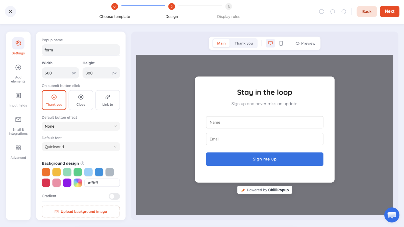
Labels above the fields, generous targets, one obvious action. Accessible design and good conversion design are the same design.
Motion, timers and countdowns
Entry animations are fine when they're short and subtle. What causes problems is persistent motion — a pulsing button, a spinning icon, confetti that never stops — which can be genuinely disabling for people with vestibular disorders and is distracting for everyone else. If you use an attention effect, use it once.
Countdown timers deserve their own thought. A timer that creates pressure to decide within seconds is hostile to anyone using magnification or a screen reader, both of which are slower ways to read the same popup. Give the countdown a horizon of hours or days rather than a 60-second fuse, and never let a timer cause the popup to close itself mid-read.
The same goes for auto-close. If you enable it, be generous: enough time for someone to read the whole offer twice at 200% zoom, not enough time to become the site's default behaviour.
Mobile accessibility
- Tap targets around 44×44px. That applies to the close control most of all — a tiny X in a corner is the single most-cursed element on the mobile web.
- Leave the page visible. A full-screen overlay on a phone removes the context someone needs to decide whether they want the offer at all.
- Don't disable zoom. Whatever the popup does, the page behind it must still be pinch-zoomable.
- Watch the keyboard. When a field is focused on a phone, the on-screen keyboard covers half the viewport. Make sure the submit button is still reachable without closing the keyboard.
The 12-point pre-launch checklist
| # | Check | Pass condition |
|---|---|---|
| 1 | Escape key | Closes the popup |
| 2 | Close control | Visible, at least ~44px, reachable by keyboard |
| 3 | Body text contrast | 4.5:1 or better |
| 4 | Headline contrast | 3:1 or better at large sizes |
| 5 | Placeholder text | Readable, and not the only label |
| 6 | Field labels | Visible above each input |
| 7 | Image alt text | Present and descriptive on meaningful images |
| 8 | Offer in real text | Headline and price are not part of an image |
| 9 | Error messages | Written in words, not only a red border |
| 10 | Motion | No looping animation; short entry only |
| 11 | Zoom | Nothing cut off or unreachable at 200% |
| 12 | Mobile | Close reachable by thumb, page still zoomable |
Test it in ten minutes
No special software, three passes:
- Unplug the mouse. Load the page, trigger the popup, then use only Tab, Enter and Escape. Can you reach the field, submit it, and get rid of the popup? If not, stop and fix that first.
- Zoom to 200%. Browser zoom, not a smaller window. Check nothing is clipped, the close control is still on screen, and the text still reflows into something readable.
- Take it outside. Open the popup on a phone in daylight. It's an unscientific but remarkably effective contrast test — the pale-grey-on-white subtitle you were fond of will disappear entirely.
If you want a fourth: turn on your operating system's screen reader for two minutes and listen to the popup. You don't need to be fluent. If the popup announces itself as a blank region and the only thing it reads is "button", you have found your work list.
No builder can make an inaccessible design accessible. A tool can give you Escape dismissal, a labelled close button, alt-text fields and focus on the first invalid input — and ChilliPopup does — but the contrast, the text size, the tap targets and whether the offer is real text are all decisions you make in the editor. Run the checklist.
Popups and accessibility rules
Popups aren't prohibited by any accessibility regulation. What regulations do is point at a technical standard — usually the WCAG guidelines — and require that your site meets it. A popup is part of your site, so it inherits the same obligations as everything else: perceivable text, operable controls, understandable labels.
In practice, the popups that attract complaints are the ones that fail the basics in the checklist above: no keyboard exit, unreadable text, or a close button nobody can find. Fix those and you have addressed the overwhelming majority of the risk. Requirements differ by market and by sector, so check what applies to yours — this guide is a design brief, not legal advice.
Six accessibility mistakes that also cost conversions
- A hidden close button. It doesn't win subscribers; it wins exits, and it locks out keyboard users.
- Text on a busy photo. Unreadable for some, ugly for everyone, illegible on mobile crops.
- Placeholder-only fields. The label vanishes the moment someone types.
- An offer in an image. Invisible to screen readers, blurry at zoom, gone if the image fails.
- A 30-second countdown. Pressure that punishes slow readers and produces regret purchases.
- Never testing without a mouse. One minute of Tab and Escape would have caught the whole list.
Build a popup people can actually close
Full control of the close button, contrast, text size and alt text — on popups, forms, surveys, quizzes and games. Free plan, no credit card required. Paid plans from $29/month.
Start free →Related reading
Frequently asked questions
What makes a popup accessible?
Five things: it can be dismissed with the keyboard as well as the mouse, the close control is visible and large enough to hit, the text has enough contrast against its background to be read, every image carries alt text and every field carries a label, and nothing important is communicated by colour or motion alone.
Can you close a popup with the keyboard?
You should always be able to. ChilliPopup overlays close on the Escape key as well as the close button and — when it is enabled — a click on the dimmed background. If you design a popup with no visible close control at all, keyboard dismissal becomes the only exit some visitors have, so never remove all three.
What contrast ratio does popup text need?
The widely used reference is WCAG 2.2 level AA: at least 4.5:1 for normal text and 3:1 for large text of roughly 24px and above, or 19px bold. Popups fail this more often than page content because designers put pale text on a photographic background — and the photo changes brightness as it crops on mobile.
Do popups need alt text?
Yes for any image that carries meaning — a product shot, a prize, a screenshot of the thing you are offering. Decorative shapes and background art do not need described alt text. If your popup's entire offer lives inside an image, someone using a screen reader gets a blank offer, so keep the headline and the price as real text.
Are popups against accessibility law?
No — popups are not banned anywhere. Inaccessible ones are the problem. Most accessibility regulations reference the WCAG guidelines rather than naming components, so a popup that meets the same contrast, keyboard and labelling rules as the rest of your site is treated like the rest of your site. Check the requirements that apply in your market.
How do I test a popup for accessibility?
Three passes, ten minutes. Unplug the mouse and try to reach and dismiss it with Tab and Escape. Zoom the browser to 200% and check nothing is cut off or unreachable. Then look at it on a phone in bright light, which is a surprisingly good proxy for a contrast test.