
There is a category of message that every site needs to deliver and no site should interrupt for. Free shipping over £50. The sale ends Sunday. Orders placed after Thursday ship next week. None of those is a trade, so none of them earns a centred card and a dimmed page.
That is what an announcement bar is for: one line, at an edge, with a link and a way to dismiss it. It is the quietest format you own, and the most underused.
Key Takeaways
- Bars carry facts; popups carry trades. If you are asking for something, a bar is the wrong format.
- A bar is a wide, short popup docked to an edge with the backdrop turned off — no separate tool required.
- Watch the mobile scaling trap: a very wide card shrinks to fit a phone, so build a narrower mobile version.
- Always set a date window on a sale bar. Nothing dates a site faster than a finished offer.
- One bar at a time. Two stacked strips read as a broken site, not as urgency.
What is an announcement bar?
Announcement bar, in two sentences
An announcement bar is a thin strip anchored to the top or bottom of the viewport carrying a single short message, usually with one link and a close control. It is the only popup format that can run on arrival without being intrusive, because it never covers the content the visitor came for.
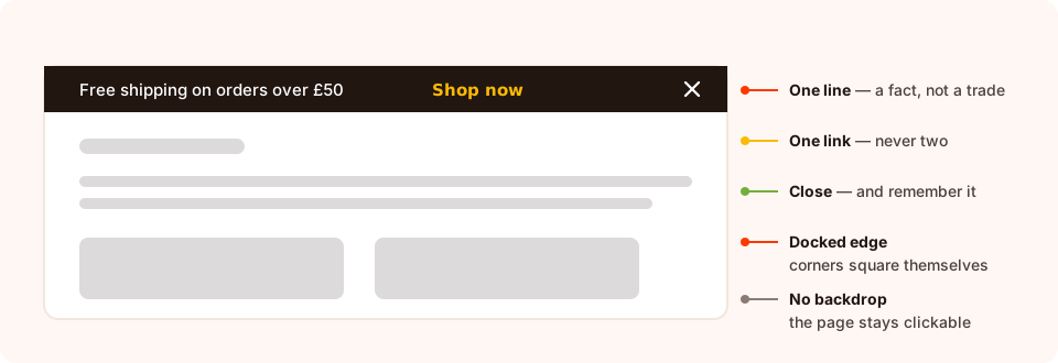
Four parts. If you need a fifth, you are building a popup and should say so.
Names for this thing are inconsistent — notification bar, sticky bar, top bar, banner. The behaviour is what matters: full-width, short, non-blocking, and dismissible.
Bar or popup? A one-question test
Ask what you want the visitor to do. If the answer is "know this", use a bar. If it is "give me something", use a popup. That single question resolves almost every case.
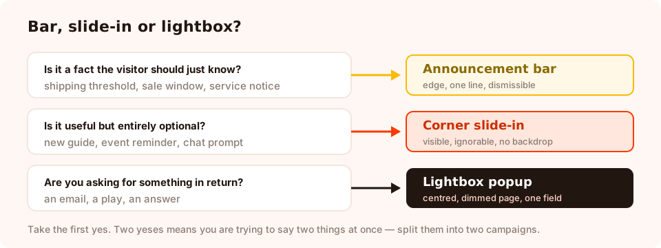
Three formats, one question each. Start at the top and take the first yes.
| The message | Format | Why |
|---|---|---|
| "Free shipping over £50" | Bar | A fact that changes basket behaviour, needed on every page |
| "Sale ends Sunday" | Bar with a timer | Time pressure works better ambient than in your face |
| "Orders ship next week" | Bar | Service information — hiding it creates support tickets |
| "Get 10% off your first order" | Lightbox popup | A trade: it needs a field, a button and a moment |
| "Spin to win a prize" | Lightbox popup | A game needs the middle of the screen |
| "New guide: popup copywriting" | Corner slide-in | Useful but optional; must not block anything |
| "Are you over 18?" | Gated lightbox | Blocking the page is the entire point |
Nine things worth putting in a bar
- The free-shipping threshold. The highest-value line in ecommerce retail copy. State the number; a vague "free shipping available" reads as a trick.
- A sale window. "20% off everything until Sunday 23:59." Add a countdown if the deadline is real, and schedule the bar to end with it.
- A shipping cut-off. Before Christmas or any gifting peak, the last-order date is the most useful sentence on the site.
- A service notice. Delivery delays, a payment provider outage, a store closure. Bad news delivered early costs you far less than bad news discovered at checkout.
- A launch or restock announcement. One line, one link to the collection.
- An event or webinar date. Ambient reminder, with registration one click away.
- A new guide or resource. Content promotion belongs at the edge, not in the middle.
- A region or currency hint. "Shopping from the US? Prices shown in GBP." Useful, and never worth a modal.
- A one-click survey invitation. A link that opens a short survey, so the ask itself is optional rather than imposed.
What does not belong in a bar: an email capture with a field, a discount code you want people to remember, anything with two calls to action, and anything you would be sad if nobody read. A bar is glanced at, not studied.
How to build a bar from a popup
You do not need a separate product for this. An announcement bar is a popup with four settings changed.
1. Shape: wide and short
Set a wide width and a small height, and put one text block plus one button or link inside. Resist a second line — if the message needs two lines on desktop it will need four on a phone.
2. Position: docked to an edge
Choose top or bottom from the nine anchor positions. Docking to an edge squares the corners on that edge automatically, so the bar reads as part of the page frame rather than as a card that drifted upwards. The entry motion follows the anchor too: an edge-docked popup slides in from its own edge.
3. Backdrop: none
Drop the overlay opacity to zero. A bar with a dimmed page behind it is a lightbox that lost its nerve — and it blocks the clicks a bar is specifically designed not to block.
4. Close: visible, and remembered
Use the X or a skip link, then set a frequency so a dismissed bar does not reappear on the next page view. Once a day, or once every few days, is right for most announcements.
One honest limitation. A bar built this way floats above the page rather than pushing the layout down. That is normally what you want, but it means you have to check it does not land on top of your navigation or a sticky header — on both breakpoints, on a real device.
The mobile trap nobody warns you about
This is the one that catches people. A popup card is laid out at the width you set, and on a narrower screen it is scaled down proportionally to fit. That is perfect for a 400px card on a phone. It is terrible for a 1200px bar: on a 375px screen it renders at roughly a third of the size, and your one-line message becomes six-point type.
The fix is not a compromise width. It is two campaigns:
- Desktop bar — wide, one line, full sentence. Device toggles: desktop only.
- Mobile bar — a much narrower card with a shortened message ("Free shipping over £50" rather than "Enjoy complimentary shipping on all orders over £50"). Device toggles: mobile only.
It takes five extra minutes with the duplicate action and it is the difference between a bar people read and a bar people squint at.
Copy formula for a bar
One sentence, one link, no adjectives you would not say out loud. The pattern:
Threshold   Free shipping on orders over £50 → Shop now
Sale        20% off everything until Sunday 23:59 → See the sale
Cut-off     Order by Thu 18 Dec for delivery before Christmas → Shop gifts
Service     Deliveries are running 2 days late this week → Read more
Launch      The new season is live → Browse it
Restock     Back in stock: the ribbed knit → Get yours
Event       Live workshop, Tuesday 3pm → Save my seat
Resource    New guide: writing popups that convert → Read it
Survey      Two quick questions about your last order → Answer them
Mobile versions cut everything before the noun: "Free shipping over £50", "20% off until Sunday", "Order by Thu 18 Dec". If the message will not survive that cut, it is not a bar message.
The display rules a bar needs
- Trigger. A short delay of one or two seconds, or immediately. This is the one format where firing on arrival is fine — it is not covering anything.
- Page targeting. Put the bar where the message is true. A shipping threshold belongs site-wide; a restock notice belongs on the relevant collection. Use contains, does not contain, is exactly, is not, starts with or ends with.
- Frequency. Every visit for an ongoing fact; once a day for anything promotional, so a dismissal is respected.
- Date window. Non-negotiable on anything time-bound: a start and end date with hours in a chosen GMT offset, so the sale bar disappears when the sale does — while you are asleep.
- Devices. Desktop and mobile toggles, used to split the two versions above.
- Show again after conversion. Only relevant if the bar links to something you count as a conversion; leave it on for pure announcements.
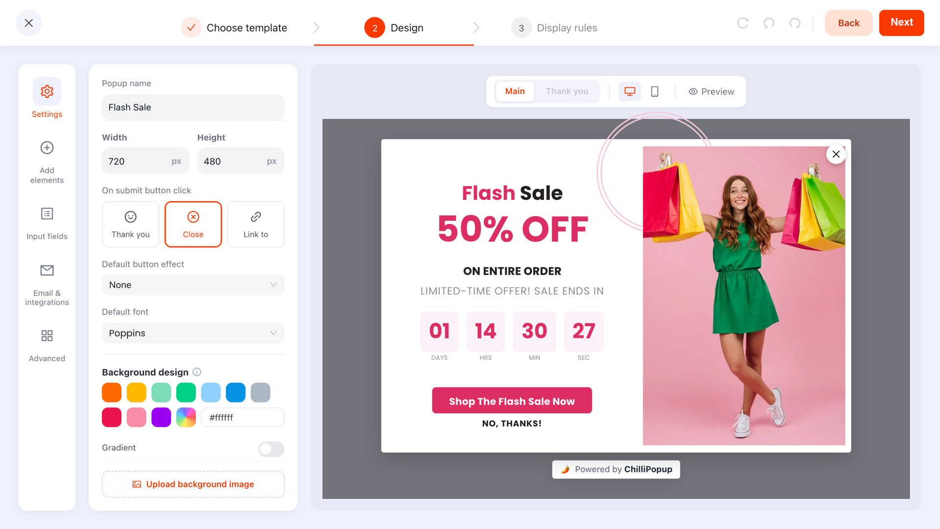
Same designer, different four settings: shape, anchor, backdrop, close.
Timers in a bar
A countdown is the one embellishment a bar can carry well, because the number does the work and needs no explanation. Two rules keep it honest: the deadline must be real, and the bar's date window must match it. A timer that resets on refresh, or a sale that never ends, teaches your visitors to ignore every future one — the argument in full is in the countdown timer guide.
Six mistakes with announcement bars
- Two bars at once. Top and bottom, both dismissible, both ignored. Choose one message.
- Covering the navigation. Check it against your sticky header on both breakpoints.
- One bar for both breakpoints. The scaling trap above. Build two.
- No end date. A live Black Friday bar in February tells visitors nobody is looking after the site.
- Putting a form in it. There is no room, and a field at the edge of the screen converts badly. If you want an email, use a popup.
- Ignoring the dismissal. If someone closed it, do not show it again on the next page view. Set the frequency.
What to measure
A bar reports views and clicks like any other campaign, and those two numbers answer the only two questions that matter: is anyone seeing it, and is anyone acting on it. A bar with high views and almost no clicks is not necessarily failing — an ambient shipping threshold does its job by being read — but a promotional bar with no clicks is either the wrong message or the wrong page.
For a promotional bar, the cheapest experiment is a two-variant A/B test of the sentence itself: threshold first ("Free shipping over £50") versus benefit first ("Get free shipping on this order"). Each variant reports separately, so a week of traffic gives you an answer.
Build your bar
Twenty minutes. If the pixel is not on your site yet, the one-line install guide comes first — after that, bars, lightboxes and slide-ins all come from the same script.
1. Make it wide and short
One text block, one link or button, a single line of copy. Nothing else fits, and nothing else should.
2. Dock it and kill the backdrop
Position top or bottom, overlay opacity at zero, entry motion sliding in from the same edge.
3. Pick the close mode
A visible X or a skip link, plus a frequency so a dismissal lasts more than one page view.
4. Duplicate it for phones
Narrower card, shorter sentence, device toggles set so each version only runs where it fits.
5. Schedule its retirement
Set the date window to the hour the offer ends, then check the live page on a real phone before you walk away.
Build a bar in ten minutes
One wide, short popup, docked to an edge, scheduled to retire itself. Free plan, no credit card required. Paid plans from $29/month.
Start free →Related reading
Frequently asked questions
What is an announcement bar?
An announcement bar is a thin, full-width strip at the top or bottom of a web page that carries a single short message — a shipping threshold, a sale window, a service notice — usually with one link and a close control. It is the least interruptive way to say something site-wide, because it never covers the content the visitor came for.
When should I use an announcement bar instead of a popup?
Use a bar when the message is a fact rather than a decision: free shipping over a threshold, a sale that ends Sunday, a delivery delay, a new guide. Use a lightbox popup when you are asking for something — an email, a play, an answer — because a bar has neither the room nor the attention to carry a real trade.
Do announcement bars hurt SEO?
No. A thin strip at an edge does not cover the main content, which is what search engines treat as an intrusive interstitial. It is the safest format to run on arrival, including on mobile — which is exactly why time-sensitive site-wide messages belong in one.
Should an announcement bar be at the top or the bottom?
Top for anything the visitor should know before they act — shipping thresholds, sale windows, service notices. Bottom for anything optional or ongoing, and on mobile generally, where the top of the screen is crowded with browser chrome and your own navigation.
Can an announcement bar push the page content down?
Not when it is built as an overlay: it floats above the page rather than reflowing the layout. That is usually what you want, but it means you must keep the bar short and check that it does not sit on top of your navigation or a sticky header on either desktop or mobile.
Should an announcement bar have a close button?
Yes, in almost every case, and it should stay closed for a while afterwards — set a frequency so a dismissed bar does not reappear on the next page view. The rare exception is a legally required notice, where the message has to stay until it is acknowledged.