Popup personalization means showing different visitors different popup messages, chosen by rules: the page they're on, the device in their hand, whether they've been here before, and what they're doing right now. No CRM, no data platform, no merge tags required.
Most websites run one popup and show it to everyone. The person reading their third article this week, the first-timer skimming the homepage on a phone, and the shopper about to abandon a cart all get the same 10% newsletter offer — which fits one of them, at best. The fix isn't more data. It's splitting that single popup into a few targeted popups, each with rules that describe one audience and copy written for that audience's moment.
Key Takeaways
- Personalization is rules, not merge tags. URL, device, visit history and in-page behavior already segment every visitor — without storing anything about them.
- The URL is your strongest signal. Someone on the cart page has told you exactly what they're doing; page targeting turns that into the right message.
- Behavior is an intent ladder. Time on page, scroll depth, pages viewed and exit intent rank how engaged a visitor is — match the size of the ask to the rung.
- Suppression is personalization too. Turning off "show again after conversion" is the cheapest personal touch there is: subscribers stop being asked to subscribe.
- Segment first, then A/B test. Targeting decides who sees a popup; a split test decides which message wins inside that segment.
What popup personalization actually means
Rule-based personalization, in two sentences
Popup personalization is matching the message to the visitor using observable context — the URL, the device, new-versus-returning status, and live behavior like scroll or exit — instead of stored customer data. Each segment becomes its own popup campaign with its own display rules and its own copy.
Every personalization decision answers one of three questions, and every display rule feeds one of them:
- Where are they? The URL declares intent. A blog article, a pricing page and a cart page are three different conversations.
- Who are they, behaviorally? A first-time visitor and someone on their fifth visit this month deserve different asks — even though you don't know either one's name.
- What are they doing right now? Scrolling deep, going idle, heading for the close button — the trigger you choose is itself a statement about the moment.
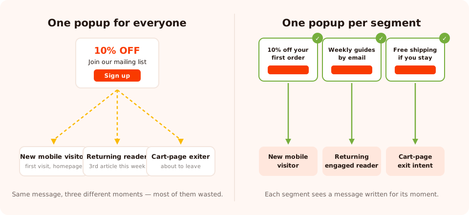
The same three visitors. On the left, one message hopes to fit everyone; on the right, each segment gets its own.
Mechanically, there's nothing exotic here: you duplicate a campaign in the popup builder, change its rules, and rewrite its copy. The craft is in choosing segments that are genuinely different — and resisting the urge to build ten of them on day one.
What popup personalization is NOT (and why that's fine)
Let's be honest about the word, because "personalization" gets used to sell a lot of machinery. ChilliPopup does not do the following, and this guide won't pretend otherwise:
- No name-merge. There are no merge tags, so a popup can't open with "Hi Sarah".
- No geo-targeting. You can't show a different popup per country or city.
- No CRM sync. Popups don't read your customer records, purchase history or email-list membership. Submissions are collected in the dashboard; you act on them from your own email tool.
Here's the part that should be liberating: you don't need a data platform to personalize. "Hi Sarah, 10% off" and "10% off" are the same offer — a first name doesn't change whether the message is relevant. What changes relevance is context: the right page, the right visit, the right moment, the right ask. All of that is observable on every single visit, by rules, with zero stored profile. Rule-based personalization is also the calm option for privacy: you're reacting to what's happening in the browser right now, not to a dossier.
The working definition for the rest of this guide: a popup is personalized when a visitor could reasonably think "this was meant for someone in exactly my situation" — not when it knows their name.
The personalization levers you already have
Every lever below ships with every ChilliPopup popup, form, survey, quiz and game. Together they cover the three questions — where, who, and what now:
| Lever | What it tells you | Example segment |
|---|---|---|
| Page targeting (URL rules) | Declared intent — what they came for | Cart page ⇒ save-the-order message, not a newsletter ask |
| Device (desktop / mobile) | Screen, thumb, attention span | Mobile ⇒ shorter copy, one field, bigger button |
| New vs returning visitors | Stage of the relationship | Returning ⇒ skip the welcome offer, ask for the subscribe |
| Pages viewed | Depth of this session — casual vs engaged | 3+ pages ⇒ they're invested enough for a bigger ask |
| Behavior triggers (time, scroll, inactivity, click, exit intent) | Live intent, right now | Exit intent ⇒ the last-chance offer, and only then |
| Date range (start/end date + hour) | Seasonal context | Sale popup that starts and stops itself on schedule |
| Weekly schedule (day of week + hours) | Time-of-week context | "Chat with us" popup only during support hours |
| OS & browser | Platform edge cases | A notice about a browser-specific issue, shown only there |
| Frequency + stop after conversion | Memory and politeness | Subscribers never see the signup popup again |

Each segment is a normal campaign in the editor — the personalization lives in its display rules and its copy.
One important mechanic: every enabled rule is an AND gate. "Mobile + new visitors +
URL contains /collections" means all three must be true. That's what makes segments precise —
and also what makes it easy to accidentally build a segment nobody matches, which is why you'll check
the views number later.
Page targeting: the URL is a declared interest
If you only use one lever, use this one. Nobody lands on /pricing by accident. Nobody reads
a 2,000-word guide on shipping policies for fun. The URL is the visitor telling you, in plain text, what
they're trying to do — and URL rules (contains, is exactly, starts with,
does not contain and friends) let a popup answer it.
Some pairings that consistently make sense:
- Product and collection pages — first-purchase incentives. This is shopping mode; a discount speaks the visitor's current language.
- Blog and guide pages — content offers. These visitors are researching, not buying, so a newsletter or related-guide ask converts where a coupon feels off-key.
- Cart and checkout pages — nothing but order-savers. This is also where you exclude every other popup: a newsletter ask over a checkout is how you lose an order to save an email address.
- Help and FAQ pages — support-flavored messages, or nothing at all. A visitor with a problem is the wrong audience for an upsell.
Exclusion is half the power. A rule like "URL does not contain /checkout" on every
promotional popup is invisible personalization — the message that politely fails to appear at the wrong
moment. And if your site serves several regions under different paths (/fr/, /de/,
a country subdomain), URL rules are also the honest substitute for the geo-targeting ChilliPopup doesn't
have: one campaign per region path, each in the right language.
Behavioral popups: read the intent ladder
Targeting rules describe who a visitor is; triggers describe what they're doing right now. Stack the trigger types in order of how much intent each one proves and you get a ladder:
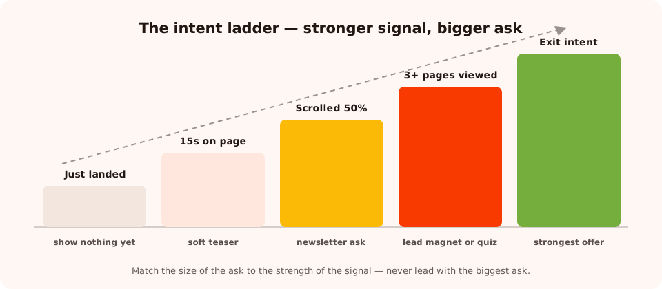
Five behavioral signals, ranked. The stronger the signal, the bigger the ask it can carry.
- Just landed. Zero signal. A popup on arrival is a cold call — it can work for a site-wide announcement, but it personalizes nothing because you know nothing yet.
- Time on page. A delay of 15–30 seconds filters out the bounce traffic. Whoever's left chose to stay — a soft teaser is now fair. The delay can count per page or across the whole session; use the session version so multi-page browsers aren't re-timed from zero on every page.
- Scroll percentage. Reaching 50% of an article is active engagement, not idling. It's the natural rung for the newsletter ask — and the standard stand-in for exit intent on mobile, where there's no cursor to read.
- Pages viewed. The most underrated rule in the set. One page might be an accident; three pages is a session with a purpose. This is how you separate the casual skimmer from the engaged reader and save your bigger asks — a lead magnet, a quiz — for the latter.
- Inactivity. The visitor stalled. A nudge popup ("Still deciding? Here's what other customers ask") meets a hesitation the visitor actually has.
- Exit intent. The strongest and most perishable signal: the cursor is leaving. This is where your strongest offer belongs — and only here, because an offer that good shown earlier would just train everyone to wait for it. Our exit-intent guide covers the mechanics in depth.
The ladder rule: never carry a big ask on a small signal. A discount popup two seconds after arrival wastes your best offer on your least-qualified audience — the same popup on cart-page exit intent spends it exactly where it earns something back.
Context targeting: device, visit history, dates and schedules
Device: a different message, not a smaller one
Device targeting isn't only about layout. A mobile visitor mid-commute and a desktop visitor with two monitors have different attention budgets, so run separate campaigns: the mobile one with a shorter headline, a single email field and a thumb-sized button; the desktop one free to say more. Mobile also changes the trigger — exit intent needs a cursor, so the mobile twin fires on scroll instead. The full checklist lives in our mobile popup best practices guide.
New vs returning: the relationship stage
The audience setting splits visitors into new and returning, with the boundary defined in days — and the frequency rules (once a day, every N days, every N visits) control the cooldown between shows. The welcome offer belongs to new visitors; a returning visitor who's seen it and declined deserves a different angle, not a rerun. One caveat worth designing around: recognition relies on the visitor's own browser storage, so a second device or a private window looks new. Treat the split as a strong heuristic, not an identity.
Stop after conversion: the politeness switch
Turn off "show again after conversion" and a campaign stops appearing to anyone who already submitted it. This single switch does more perceived personalization than anything else on this page — because nothing says "we have no idea who you are" like asking a subscriber to subscribe, daily, forever.
Dates and weekly schedules: personalizing to the moment in time
A date range (start and end, down to the hour) makes seasonal campaigns self-managing: the sale popup appears when the sale starts and — the part everyone forgets — disappears when it ends, so nobody clicks into an expired offer on Monday morning. The weekly schedule targets days and hours instead: a "talk to a human" popup shown only while someone can actually answer, or a weekend-only flash offer. Time is context, and context is personalization.
OS and browser: the niche lever
You'll use this rarely, and that's fine. It earns its keep on edge cases: announcing something that only affects one browser's users to exactly those users, or tailoring an install hint to the platform that needs it. If a message is only true for one platform, showing it anywhere else is noise.
Worked example: three segments for one store
Meet a small homeware store that has been running one generic popup — "Join our newsletter, get 10% off", shown to everyone on every page after five seconds. Here's the same store rebuilt as three mutually exclusive segments. Note how the rules keep the segments from overlapping: every visitor matches at most one popup.
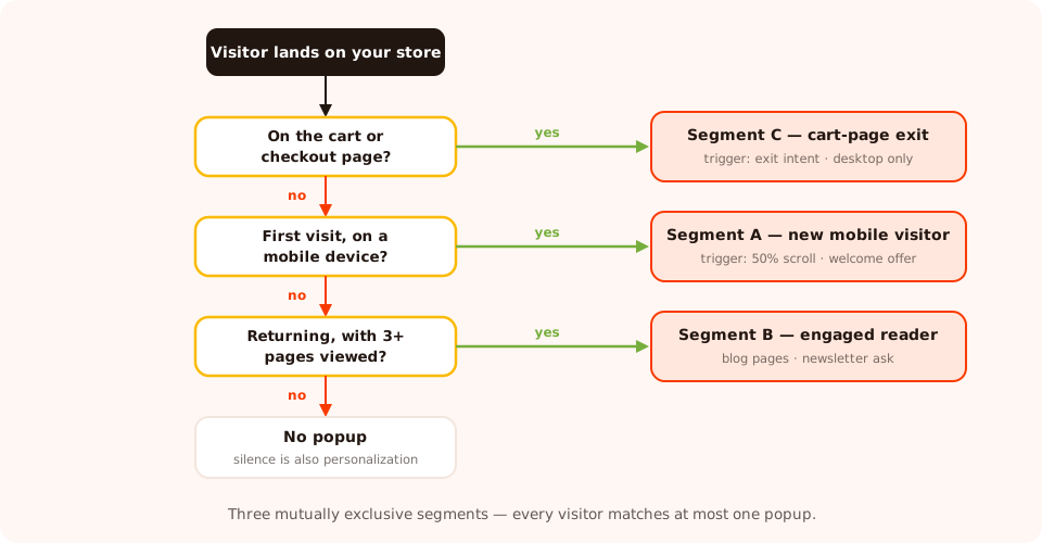
The store's display rules as a decision tree. The order matters: the cart check comes first because it excludes the others.
Segment A — the new mobile visitor
Rules: audience new visitors · device mobile · trigger 50% scroll ·
page targeting URL does not contain /cart or /checkout ·
"show again after conversion" off.
Sample copy: "New here? Take 10% off your first order. Drop your email and your code appears right on the next screen." One email field, one full-width Get my code button, and a visible "No thanks" link. Nothing else — on a phone, every extra line costs more than it earns.
Segment B — the returning engaged reader
Rules: audience returning visitors · trigger pages viewed ≥ 3 ·
page targeting URL contains /blog · frequency once every 7 days ·
"show again after conversion" off.
Sample copy: "Third guide this week — make it official. One email every Sunday with our best home styling ideas. No discount spam, unsubscribe whenever." The copy openly reflects the behavior that triggered it, which is exactly what makes it land: this reader knows they keep coming back. Note what it doesn't do — it doesn't re-offer the welcome discount this person already ignored.
Segment C — the cart-page exit
Rules: page targeting URL contains /cart · trigger exit
intent · device desktop (exit intent needs a cursor) · frequency once per session.
Sample copy: "Before you go — shipping's on us today. Use code SHIPFREE at checkout, valid for the next 24 hours." Button: Finish my order. Decline link: "I'll pay shipping later". The strongest offer in the store, spent only at the moment of highest risk — and never shown to the readers and browsers in segments A and B, whose orders were never in danger.
What changed, structurally: one campaign became three, each with copy that names its own moment. And because each segment is its own campaign, per-segment analytics come free — you'll see exactly which of the three earns its screen space.
Let visitors segment themselves with a quiz
Display rules infer who a visitor is. There's a second, complementary move: ask them. A one-question quiz — "What are you shopping for?" with three or four tappable options — takes one gesture to answer and gives you something no behavioral rule can: the visitor's own words about what they want. Surveys do the same job when you want a scored or multi-step version.
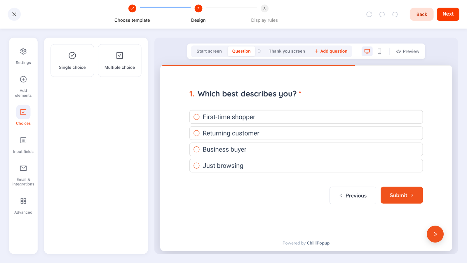
Self-segmentation in practice: one question, a handful of options, and the visitor tells you which segment they're in.
The answers land in the dashboard alongside the email address, so your segments follow the contact into your email tool — the category question a visitor answered in a quiz decides which products your next campaign shows them, even though the popup itself never knew their name. Spread across visits, this becomes a deliberate strategy: ask one small question per visit until the profile fills in. That's progressive profiling, and it has its own dedicated guide.
Validate each segment's message with an A/B test
Segmentation and testing answer different questions. Targeting decides who sees a popup; an A/B test decides which message wins for that audience. Doing the first without the second means every segment's copy is a guess — a well-aimed guess, but a guess.
ChilliPopup's built-in A/B testing splits a campaign's traffic between variant A and variant B, so each segment can run its own experiment: does the new-visitor popup convert better with "10% off" or "free shipping" framing? Does the engaged-reader ask do better as "weekly guides" or "styling ideas"? Two disciplines keep the results readable:
- Test within a segment, never across segments. Comparing the cart popup's conversion rate against the blog popup's tells you the audiences differ — which you already knew. A variant test inside one segment is the only fair fight.
- Change one thing per test. Headline or offer or button — not all three. A segment splits your traffic; a test splits it again, so small segments need patience before the numbers mean anything.
Measuring per-segment conversion
Here's the quiet payoff of rules-based segmentation: because every segment is a separate campaign, the analytics dashboard reports views, clicks, submissions and conversion rate per segment with no extra setup. The generic popup you replaced had one blended number; the three-segment store sees three honest ones.

One campaign per segment means per-segment conversion comes built in — no tagging, no spreadsheets.
Read the numbers in this order:
- Views first. A segment with almost no views has rules that are too narrow — or an AND-gate combination nobody satisfies. Fix reach before judging copy.
- Conversion rate second, each segment against its own history and against the old generic popup's baseline on the same pages. That comparison — segment versus the one-size popup it replaced — is the whole scoreboard for personalization.
- Expect the rates to diverge. A cart-exit popup and a blog newsletter popup should perform very differently; that spread is evidence the segments are real. If two segments convert identically with identical copy, merge them.
For the full tour of what the dashboard reports and how to act on it, see the popup analytics guide.
Common popup personalization mistakes
- Ten segments on day one. Every segment divides your traffic, and small samples lie. Start with two or three segments whose behavior is obviously different; earn the next split with data.
- Different rules, same copy. If your "segments" all say "Join our newsletter, 10% off", you've built targeting, not personalization. The copy has to name the moment the rules detect.
- Overlapping segments. Two popups whose rules both match the same visitor on the same page will compete. Make segments mutually exclusive — by page, audience or device — so every visitor resolves to at most one popup.
- Personalizing the trigger but not the ask. An exit-intent popup that shows the same newsletter offer as the arrival popup wastes the strongest signal you have. Each rung of the ladder deserves its own message.
- Leaving "show again after conversion" on. The fastest way to look impersonal is to keep asking people for the thing they already gave you.
- Faking knowledge you don't have. Copy that pretends to know the visitor ("We picked these just for you!") reads as creepy-or-fake the moment it misses. Rule-based copy should claim exactly what the rules know — "third guide this week" works because it's verifiably true.
- Set and forget. Segments drift: pages get renamed, seasons end, offers expire. Put a monthly reminder on the campaign list — stale personalization is worse than none, because it's specific enough to be visibly wrong.
Show the right popup to the right visitor
Build a campaign per segment — popups, quizzes, surveys and games with the same targeting rules, plus built-in A/B testing and per-campaign analytics. Free plan, no credit card required. Paid plans from $29/month.
Start free →Related reading
Frequently asked questions
What is popup personalization?
Popup personalization means showing different visitors different popup messages based on what you can observe about them — the page they are on, the device they are using, whether they are new or returning, and how they behave during the visit. With a rule-based tool like ChilliPopup, each segment is a separate campaign with its own display rules and its own copy.
Can I personalize popups without a CRM or customer data platform?
Yes. Most of the personalization that moves conversion rates comes from context you already have on every visit: the URL, the device, new versus returning status, pages viewed, and in-page behavior like scroll depth or exit intent. Display rules turn those signals into segments — no customer data, integrations or merge tags required.
Does ChilliPopup insert the visitor's name into a popup?
No. ChilliPopup has no merge tags and no CRM sync, so a popup cannot say 'Hi Sarah'. Personalization in ChilliPopup is rule-based: you match the message to the visitor's context and behavior rather than to their identity. In practice, a relevant offer on the right page at the right moment does far more work than a first name in a headline.
Does ChilliPopup support geo-targeting?
No — there is no country or city targeting. If your site serves different regions, handle it with page targeting instead: most multi-region sites already have separate URL paths or domains per market, so a URL rule per region gets you the same practical result.
How many popup segments should I start with?
Start with two or three, not ten. Pick the segments with the clearest behavioral difference — for example new versus returning visitors, or browsing pages versus the cart page — write genuinely different copy for each, and only split further once every existing segment collects enough views for its conversion rate to be readable.
How do I know if a personalized popup is actually working?
Each segment is its own campaign, so the analytics dashboard reports views, clicks, submissions and conversion rate per segment out of the box. Compare each segmented popup against the generic popup it replaced, and use the built-in A/B testing to validate the copy within each segment.
What is the difference between popup targeting and popup triggers?
Targeting decides who is eligible to see a popup — the page, the device, new or returning visitors, date ranges and weekly schedule. Triggers decide when it appears for an eligible visitor — immediately, after a time delay, at a scroll percentage, after a number of pages viewed, on inactivity or on exit intent. Personalized popups use both: targeting builds the segment, the trigger picks the moment.