Interactive content is anything on your site that responds to the visitor instead of just being read — a quiz, a poll, a prize game, a rating, a calculator-style question set. It earns attention because it gives something back, and it earns data because answering feels like playing rather than filling in a form.
Below are fourteen interactive content ideas you can actually build on a normal website this week, grouped by what you want out of them: attention, segmentation, feedback or leads. Each one comes with the format to use, the moment to show it, and the honest caveat.
Key Takeaways
- Interactive content trades a result for an answer. If the visitor gets nothing back, it is just a form with better styling.
- Choice questions beat text boxes — one tap, and you get a clean value you can actually segment on.
- Games are for the moment after a win, which is the cheapest time to ask for an expensive field.
- Every interactive piece needs a home — a trigger, a page and an audience — or it is a great idea nobody sees.
- Measure completion, not just starts. An interactive piece people abandon halfway is a worse form, not a better one.
What counts as interactive content
Interactive content, in two sentences
Interactive content is any on-site element where the visitor's input changes what they see next. The exchange is the point: they give you an answer, and they immediately get a result, a recommendation, a discount or the satisfaction of having been asked.
On a website you have four practical formats, and almost every idea below is one of them:
| Format | What the visitor does | What you get | Best for |
|---|---|---|---|
| Quiz | Taps through choice questions | Clean, normalised segment values | Recommendations, segmentation, playful lead capture |
| Survey | Rates and answers, one question per screen | Scores plus written reasons | Satisfaction, research, post-purchase feedback |
| Prize game | Spins, scratches, plays | Attention, then a claim with contact details | Discount delivery, seasonal campaigns, list growth |
| Popup or inline form | Answers one focused question | A single high-value answer | Micro-polls, one-tap preferences, quick opt-ins |
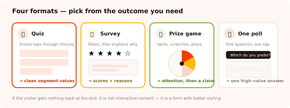
Pick the format from the outcome you want, not from what looks the most fun to build.
Ideas that buy attention
1. Spin-to-win on the welcome moment
A wheel with real, differentiated prizes — 5% off, free shipping, a free sample, one genuinely good slice. The visitor plays, wins, and the claim screen collects the email before revealing the code. The outcome is decided server-side, so it cannot be rigged from the browser. Caveat: check redemption, not just signups — a wheel can win on emails and lose on orders. Full mechanics in our spin-to-win guide.
2. Scratch card on the order-confirmation page
The customer has just bought something and is in the best mood they will be in all month. A scratch card that reveals a next-order discount converts that mood into a second purchase intention — and it is a fair place to ask for a birthday or size, because they are claiming a prize rather than filling in a profile.
3. A weekly poll on your blog
One question, three options, inline on your most-read articles. It costs the reader a single tap, it gives you a genuinely interesting content idea every week, and the results themselves make a good follow-up post.
4. A seasonal prize game with a hard end date
A slot machine or claw machine for a holiday campaign, with a date window that switches the campaign off the night the offer expires. Novelty is the entire draw here, so run it for days, not months. See gamified popup ideas for more.
Ideas that segment your audience
5. The one-question segmenter
"So we only send you the good stuff — what are you shopping for?" Three to five tappable options. It is the cheapest interactive content in existence and probably the highest return: one tap gives you a clean value to route every future email on.
6. A product-recommendation quiz
Three to five questions that narrow a catalogue to two or three products. It works because the questions are the value — people finish because they want the answer, not because you asked nicely. Best on category pages and in navigation, not as an interruption. Our recommendation quiz guide covers question design.
7. A "which plan is right for you?" quiz
The software equivalent. Two or three questions about team size and use case, ending on a recommended plan and a next step. It removes the most common reason people leave a pricing page: not knowing which row is theirs.
8. Preference centre as a quiz
Instead of a settings page nobody visits, ask new subscribers one question about what they want to hear about. Frame it as service — "Tell us what to send" — and it reads as a favour to them rather than data collection.
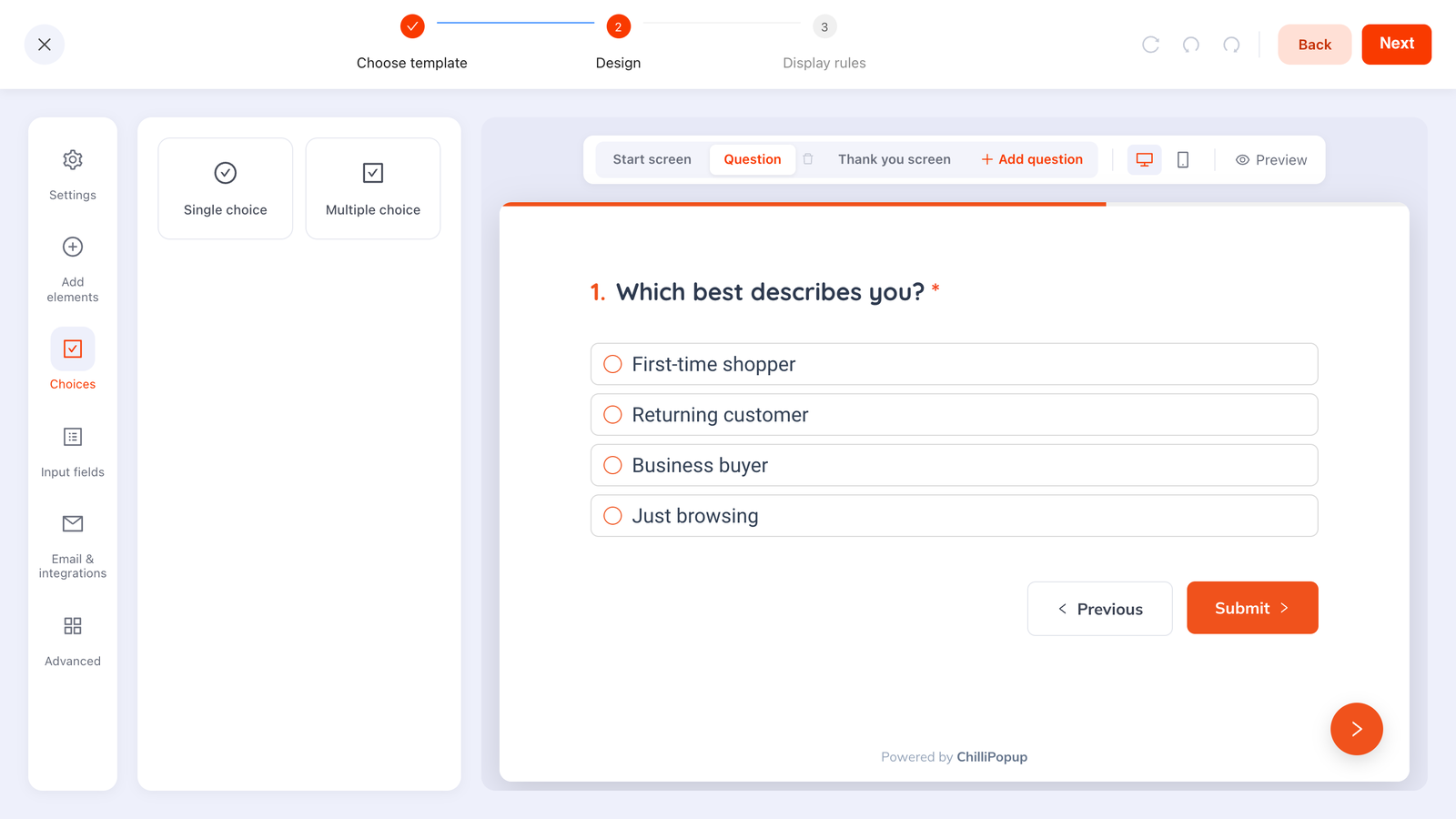
Tappable options return normalised values. A text box returns three spellings of the same answer, which you can never segment on.
Ideas that collect feedback
9. A one-tap satisfaction rating after support
A single satisfaction scale, shown once, on the page people land on after a support interaction. One gesture, and a second screen that asks "what would have made it a 5?" only for the people who rated low.
10. An NPS survey to returning customers
The classic 0–10 question, plus one open follow-up. Target returning visitors so you are asking people who have actually experienced the product, and set the frequency to once every few months so it never becomes wallpaper. See our NPS survey guide.
11. An exit survey on a page that loses people
On exit intent, on one problematic page: "Didn't find what you were looking for?" with four options and an "other" text box. Three weeks of this on a category page usually explains a conversion problem better than a month of speculation.
12. A "how difficult was that?" check after signup
A customer-effort question right after someone completes onboarding. Effort scores predict churn far better than satisfaction scores, and the free-text answers name the exact step that hurt.
Ideas that generate leads
13. A gated result
The visitor answers three questions and the result — the recommendation, the score, the plan — is delivered after an email screen. This is the highest-converting lead capture on the list, for one reason: by the time the ask appears, they want the thing. Caveat: the result has to be genuinely worth it. Gating a generic answer trains people not to trust your forms.
14. An interactive lead magnet
Instead of "download our guide", ask three questions and email a personalised version of it. Same asset, same effort from you, dramatically better response — because the visitor has invested three taps and the promise is now about them. Pair it with our lead magnet ideas.
Build your first interactive campaign
Quizzes, surveys, polls and prize games — one editor, one pixel, no code. Free plan, no credit card required. Paid plans from $29/month.
Start free →How to give an interactive piece a home
The most common way interactive content fails is not the idea — it is that nobody sees it. Every piece needs three decisions before it goes live:
- Where — page targeting. A recommendation quiz belongs on category pages; an exit survey belongs on the one page you are worried about; an NPS survey belongs anywhere your customers land.
- When — the trigger. Exit intent for last-chance formats, scroll depth for anything on an article, a time delay on product pages, and page count for anything that should reward genuine interest.
- Who and how often — audience and frequency. Returning visitors for feedback, new visitors for welcome games, and "show again after conversion" switched off so people who answered are left alone.
There is also a non-interrupting route worth remembering: turn the automatic triggers off entirely and open the campaign from a link or a button instead. That turns a quiz into a permanent piece of your navigation — "Find your fit →" — rather than something that ambushes people. The targeting rules guide covers all of it.
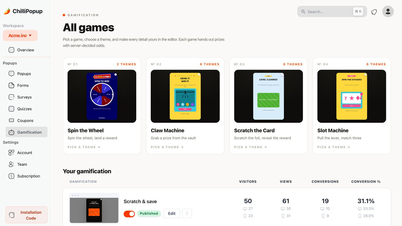
Prize games move the ask to the moment right after a win, which is the cheapest time to request an expensive field.
What to measure
Interactive content has one metric that matters more than the rest: completion rate. Starts are easy; finishing is the whole point. Watch four numbers:
- Completion rate — of those who started, how many reached the end.
- Drop-off by question — a ranking of the questions people quit on. This is your rewrite list, and it is the single most useful thing stepped content gives you.
- Average time to finish — much longer than expected means a confusing question, not an unpopular one.
- The answers themselves — the distribution of choices, and the partial responses people left behind before closing. A question where 92% pick the same option did not need asking.
Five ways interactive content goes wrong
- No result. Questions with nothing at the end is a form wearing a costume, and people can tell within two screens.
- Too many questions. Three to five. If the fifth question does not change the result, it is costing you completions for nothing.
- Free text where chips would do. You end up with unnormalised answers you cannot segment, and a slower experience on mobile.
- Interrupting with something that should be invited. A recommendation quiz works as a button in your navigation and irritates as a popup two seconds after arrival.
- Building it once and never reading the answers. The data is the return. If nobody opens the results in month two, do not build a third one.
Start with one this week
If you build exactly one thing from this list, build the one-question segmenter. It takes fifteen minutes, it costs the visitor a single tap, and the answer changes every email you send them afterwards. Once that is running and you have seen the answers come in, pick a second format from the outcome you need next — a quiz if you need routing, a survey if you need reasons, a game if you need attention.
And if you are not sure the format is the problem, read how to increase response rates first. Often the idea is fine and the moment is wrong.
Related reading
Frequently asked questions
What is interactive content?
Interactive content is anything on your site where the visitor's input changes what they see next — a quiz, a poll, a rating, a prize game, a question set that produces a recommendation. The exchange is the defining feature: they give you an answer and immediately get a result, a discount or a recommendation back.
What is the easiest interactive content to start with?
A one-question segmenter: a single question with three to five tappable options, such as 'What are you shopping for?'. It takes about fifteen minutes to build, costs the visitor one tap, and the answer can route every email you send them afterwards. Start there before building anything longer.
How many questions should an interactive quiz have?
Three to five. Each question should visibly narrow the result — if the fifth question does not change what the visitor is shown at the end, it is costing you completions for nothing. If drop-off is concentrated on one screen, that question is the problem; if it is spread evenly, the quiz is too long.
Does interactive content actually generate leads?
It does when there is a result worth having at the end. A gated result — answer three questions, then give an email to receive the recommendation — converts well because by the time the ask appears the visitor wants the thing. It converts badly when the result is generic, which trains people not to trust your forms.
Should interactive content be a popup or embedded in the page?
It depends on whether the visitor should be invited or interrupted. Recommendation quizzes and preference questions work best as something people choose to open — a button in your navigation, or a direct link — while feedback surveys and prize games work as triggered overlays at a specific moment. You can turn off automatic triggers entirely and open a campaign from a link when you want the invited version.
How do I measure whether interactive content is working?
Completion rate first: of the people who started, how many reached the end. Then the per-question drop-off ranking, which names the question losing people, average time to finish, and the distribution of the answers themselves. A question where almost everyone picks the same option did not need to be asked.