The tool is rarely the reason an on-site survey fails. The question is. "How was your experience?" collects opinions nobody can act on; "What almost stopped you from buying today?" collects a list of things to fix, in the customer's own words, ranked by how often they come up.
Below are fifty questions worth asking, grouped by what you are trying to learn, plus the wording rules that separate a question that changes a roadmap from one that produces a nice chart. Steal freely — that is what the list is for.
Key Takeaways
- Two questions, not ten. One to count, one to understand. Anything more is paid for in abandonment.
- Ask about obstacles, not opinions. "What almost stopped you?" beats "How satisfied are you?" every time.
- Match the question to the moment. Exit, post-purchase and returning-visitor questions are three different surveys.
- Rating first, open second. The number gives you a trend; the free text gives you the reason.
- Tag the answers monthly — an untagged pile of responses is a survey you did not really run.
The five rules that decide whether an answer is usable
- Ask about a specific moment, not life in general. "How was checkout?" beats "How do you feel about our store?" People remember events; they invent opinions.
- One thing per question. "How fast and easy was the process?" is two questions and a single answer that means neither.
- No adjectives in your own favour. "How helpful was our new guide?" has already told them the answer.
- No assumptions. "Why did you choose the premium plan?" is unanswerable by the person who did not.
- Make it answerable in ten seconds. If the honest answer requires a paragraph, the question belongs in an interview, not an overlay.

Five rating shapes, five different questions. Picking the scale is part of writing the question, not an afterthought.
Which rating shape to use for which job is its own topic — the website feedback survey guide compares stars, CSAT, CES, thumbs and NPS properly, and the NPS guide covers that one in depth. This page is about the words.
Understanding new visitors (8 questions)
Best asked after a short delay or a scroll, on a first visit. The goal is to learn what people came for and whether your page says it.
- What brought you to the site today?
- What are you hoping to find?
- Is this your first time here? (Yes / No / I don't remember)
- In one word, what do you think we sell?
- What almost made you close this page?
- How did you first hear about us? (only if your analytics genuinely cannot answer it)
- What would make this page more useful?
- Is there anything you expected to see and didn't?
Number four is the sleeper. "In one word, what do you think we sell?" is the fastest positioning test that exists, and the answers are usually more humbling than any brand workshop.
Diagnosing exits and abandonment (9 questions)
Trigger on exit intent, or on the cart page for a store. Keep it to one question — someone who is leaving will answer one, not three.
- What almost stopped you from buying today?
- What's making you hesitate?
- Did you find what you were looking for? (Yes / No / Sort of)
- What information were you missing?
- If you're not ready to buy, what's the reason? (Price / Shipping / Need to think / Comparing options / Just browsing)
- Was anything unclear about pricing?
- What would have made you order today?
- Did anything on the page confuse you?
- Are you leaving because of something we can fix?
Pair one of these with an exit intent trigger and you have the highest-value single question on your site — the reasons people leave are the only research that comes with a fix attached.
Product and category pages (7 questions)
- Is there anything you'd like to know about this product that isn't here?
- What's stopping you from adding this to your cart?
- Were the photos enough to judge it? (Yes / No — I wanted to see …)
- Did you find the size or fit information you needed?
- How does this compare with what you're using now?
- Too many options, too few, or about right?
- What would you compare this against before deciding?
Question one is the most productive question on a product page in any store, and the answers write your FAQ section for you.
Post-purchase (8 questions)
Ask on the order-confirmation page, while it is fresh and the sale is safely banked.
- How easy was it to order? (rating)
- Was anything harder than it needed to be?
- What nearly stopped you from completing the order?
- How long have you been thinking about this purchase? (Today / A few days / Weeks / Months)
- What made you choose us?
- What else were you considering?
- How did you hear about us? (post-purchase, this is finally worth asking)
- Anything we should have asked you?
Not on the confirmation page: a satisfaction question about the product. They have not received it yet. That question belongs in an email, days later.
Pricing and plans (6 questions)
- Is the pricing clear? (Yes / No — what's confusing?)
- Which plan looks right for you, and what's making you unsure?
- What would you need to see to pick a plan today?
- Does anything look like it's missing from these plans?
- How does this compare with what you expected to pay? (Cheaper / About right / More)
- Are you comparing us with anything else? (open)
Pricing surveys have one hard rule: never ask "what would you pay?". People are bad at answering it and the number misleads you for months. Ask what is unclear, and what is missing.
Content and blog pages (6 questions)
- Did this answer your question? (Yes / Partly / No)
- What were you hoping this article would cover?
- What should we write about next?
- Was anything here wrong or out of date?
- How would you describe your role? (so you know who your readers are)
- Would you want this as an email series? (Yes / No)
On a content site the first question is a quality signal you can track per article, and the second one finds the gaps in your coverage faster than any keyword tool. The blog popup strategy guide covers where to put these without wrecking the read.
Relationship and loyalty (6 questions)
Target returning visitors or existing customers.
- How likely are you to recommend us? (rating)
- What's the main reason for your score?
- What's the one thing we should improve first?
- What made you come back?
- What would make you order from us more often?
- If we disappeared tomorrow, what would you miss?
The last one sounds soft and is not. It surfaces the single feature or quality people actually value, which is frequently not the one your homepage leads with.
Cancellation and unsubscribe (5 questions)
- What made you decide to cancel? (choice list of real reasons)
- What would have kept you?
- Was there a specific moment when it stopped working for you?
- Would you consider coming back? (Yes / Maybe / No)
- Anything you'd want us to fix before you did?
Never gate the cancellation behind the survey. Let them leave, then ask. A survey that stands between someone and the exit is a dark pattern, and the answers it collects are worthless anyway.
Ask two questions, get answers you can act on
Build surveys with one question per screen, ratings, choices and per-question drop-off reporting. Free plan, no credit card required. Paid plans from $29/month.
Start free →Rewrites: the same question, fixed
| Bad question | What's wrong | Rewrite |
|---|---|---|
| "How was your experience?" | No moment, no obstacle, no action | "How easy was it to find what you came for?" |
| "Do you like our new design?" | Leading, and taste is not the question | "Was anything harder to find than before?" |
| "How helpful and clear was this guide?" | Two questions, one answer | "Did this answer your question?" |
| "Why did you choose the annual plan?" | Assumes something that may be false | "What made you pick the plan you picked?" |
| "What can we do better?" | Too broad; answers are unusable | "What's the one thing we should fix first?" |
| "Would you buy this at $49?" | Hypothetical; people mispredict | "What's making you hesitate on price?" |
How to put a question on the page without hurting the visit
A survey is an interruption, so it has to be worth the interruption. Four settings do most of the work:
- One question per screen. Surveys are built step by step, which keeps each screen a single decision — and means the drop-off report can tell you exactly which question people quit on.
- Trigger after the experience. Exit intent for abandonment, order-confirmation URL for post-purchase, scroll depth for content.
- Cap the frequency and turn off "show again after conversion", so nobody is asked twice and answering means never seeing it again.
- Say how long it takes. "Two questions, 15 seconds" on the start screen lifts completion more than any incentive.
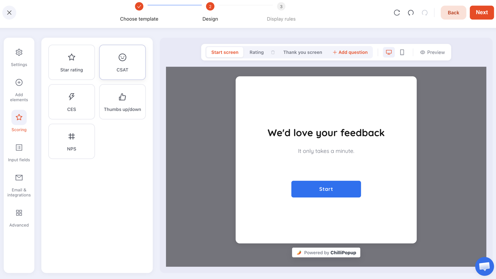
One question per screen is not a style choice — it is what makes per-question drop-off readable afterwards.
One useful detail: if someone answers question one and closes without submitting, what they entered is still recorded as a partial response. Short surveys with an optional second question therefore lose far less than they look like they do.
Reading the answers without fooling yourself
- Tag into four themes, monthly. Price, findability, trust, delivery — whatever recurs. Untagged free text is a pile, not research.
- Count, then read. The counts tell you what is common; the individual quotes tell you what it feels like. You need both, in that order.
- Watch who is answering. On-site surveys are answered by people who stayed. The most frustrated visitors left before the question appeared, so treat your scores as a floor, not an average.
- Act on one thing. Pick the single most common obstacle each month and fix it. That is the entire point — a survey that produces no change should be switched off.

Completion, drop-off and the answer breakdown — three views that tell you about the survey, the questions and the customers respectively.
Related reading
Frequently asked questions
How many questions should a website survey have?
Two or three, and one of them should be optional. An on-site survey interrupts someone mid-task, so every extra question is paid for in abandonment. The standard shape that works is one rating question, one open follow-up asking why, and nothing else — the rating gives you a number to track and the follow-up gives you the reason behind it.
What is the best question to ask website visitors?
"What almost stopped you from buying today?" if you sell something, and "What were you looking for that you couldn't find?" if you do not. Both work because they ask about a specific obstacle rather than a general opinion, and obstacles are actionable in a way that satisfaction scores are not.
Should website survey questions be open or multiple choice?
Multiple choice for anything you want to count, open text for anything you want to understand. The practical pattern is a choice question first — high response rate, clean segments — followed by one optional open question for the people willing to explain. Open questions alone get answered by a small and unrepresentative minority.
When should a survey appear on a website?
After the experience you are asking about, not before it. Exit intent for abandonment questions, an order-confirmation page for post-purchase questions, a scroll or time delay on content pages, and a returning-visitor rule for anything about the relationship rather than the visit.
How do I write a survey question that does not bias the answer?
Remove the adjective, remove the assumption and remove the pairing. "How great was our fast checkout?" contains three problems: it praises itself, it assumes the checkout was fast, and it asks about two things at once. "How was checkout?" collects an honest answer you can act on.
What should I do with the answers?
Read them weekly, tag them into three or four recurring themes, and pick the single most common obstacle each month. A survey that produces a dashboard nobody acts on is worse than no survey, because it cost your visitors attention and bought nothing.