Survey response rate is the share of people who finish a survey out of everyone who was shown it. On a website you raise it the same three ways every time: ask fewer questions, ask at a moment the visitor already has an opinion, and ask on the page instead of sending them somewhere else.
This guide covers where surveys lose people, how long a website survey should be, how to write the first question, the incentive question, and how to read the drop-off data so you know which question to delete.
Key Takeaways
- One question beats ten. A single on-page question outperforms a “quick 5-minute survey” by a distance.
- Timing is the biggest lever — ask right after the experience you're asking about, not a week later.
- Never open with the email field. Identify people at the end, if at all.
- Taps beat typing. Rating scales and tappable options finish; open text boxes get abandoned.
- Drop-off tells you which question to cut — it's usually the one you were most attached to.
What counts as a good survey response rate?
There's no universal number, because the denominator changes everything. An emailed survey to a list of subscribers, an intercept on a checkout page, and a one-question rating on a confirmation screen are three different events, and comparing them tells you nothing.
Use your own baseline instead. Publish a survey, let it run until it has real volume, and record two numbers: completion rate (of the people who started, how many finished) and conversion rate (of everyone who saw it, how many submitted). Every change afterwards is judged against those.
And remember what the number is for. A survey exists to produce a decision. Twelve honest answers that change your product page are worth more than four hundred rushed ones collected for a discount.
Where surveys lose people
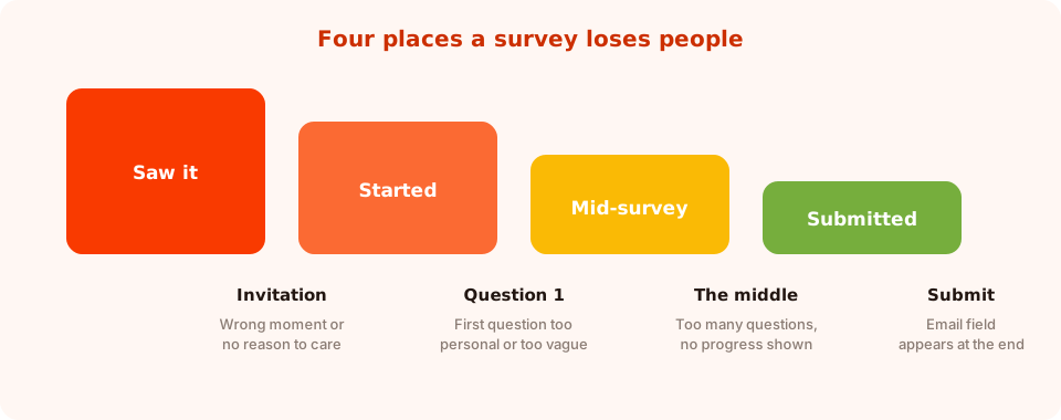
Each drop has a different cause — and only one of them is about survey length.
| Where they leave | Usual cause | Fix |
|---|---|---|
| At the invitation | Wrong moment, or no reason to care | Move the trigger; say how long it takes and what it changes |
| On question one | Too personal, too vague, or a text box | Open with one tappable rating or choice |
| In the middle | Too many questions, no sense of progress | Cut to three; show where they are |
| At submit | An email field appeared at the end | Make it optional, and say why you're asking |
Lever 1: length
Every extra question is another opportunity to close the tab. On a website — where nobody arrived intending to take a survey — the honest limits are lower than most teams want them to be.
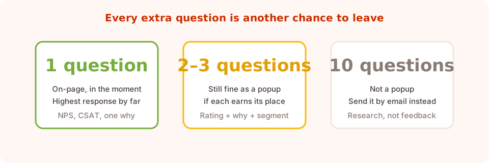
If your survey has ten questions, it isn't a website survey. Email it to people who opted in.
Run each question through one filter: what decision changes because of this answer?
- Can't name the decision → delete the question.
- Can name it, but you could get the answer from analytics → delete it and look at the data.
- Can name it and only a human can tell you → keep it.
Most website surveys survive that filter with one or two questions. That's not a compromise — that's the survey that will actually get answered.
Lever 2: the moment
Ask while the experience is still fresh. The strongest moments, roughly in order:
- Right after an order — page-target the confirmation URL, add a short delay. They're pleased and they have nothing else to do.
- On exit from a page that failed them — exit intent on a product page: “Didn't find what you needed?”
- After real engagement — 60–70% scroll on an article, or after two or three page views in a session.
- On a return visit — the returning-visitor audience, for anything about the relationship rather than today's task.
Weak moments are just as predictable: three seconds after landing, in the middle of checkout, or while someone is clearly mid-task. A survey that interrupts a purchase costs you the purchase and the answer.
Match the question to the page. Asking “how likely are you to recommend us?” on a first visit is meaningless — they don't know you yet. Loyalty questions belong on returning-visitor or post-purchase moments; usability questions belong where the friction is.
Lever 3: the first question
The first question decides whether there's a second. It should be answerable in one tap, obviously low-stakes, and clearly about them rather than about you.
| Weak opener | Strong opener | Why |
|---|---|---|
| What's your email address? | How easy was that to find? (1–5) | One tap, no commitment |
| Tell us about your experience | Did you find what you came for? Yes / Nearly / No | Answerable without composing a sentence |
| How can we improve? | What almost stopped you ordering? | Specific, and it has a real answer |
| Would you recommend us? (on visit one) | What brought you here today? | Asks something they actually know |
Then use the right widget. A survey question can carry a rating scale — stars, smileys, thumbs, a numeric NPS scale, a CSAT or CES scale — or a set of tappable choices. All of those complete in one gesture and return normalised values you can actually count, which a free-text box does not. Keep at most one open comment box, make it optional, and put it last.
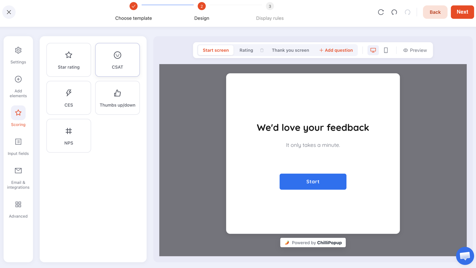
Start screen, question, thank you. Each step is its own screen, so the visitor only ever sees one ask at a time.
Lever 4: telling people what they're in for
Uncertainty is a cost. Two lines remove most of it:
- Length. “Two questions, about 20 seconds.” Then keep the promise exactly — a survey that says two and delivers five destroys trust for every future survey.
- Purpose. “It decides which sizes we stock next season.” People answer more readily when the answer visibly goes somewhere.
On a multi-step survey, a start screen carrying both lines is worth its place. On a one-question survey, skip the start screen entirely — the question is the invitation, and adding a screen in front of it just adds a step.
Lever 5: incentives — and when to skip them
Incentives raise response rate and lower answer quality. That trade-off is fine for some surveys and fatal for others.
| Survey type | Incentive? | Why |
|---|---|---|
| One-question feedback (CSAT, NPS) | No | It's already nearly free to answer; a reward attracts people who don't care |
| Post-purchase “why did you buy?” | No | Goodwill is at its highest point; you don't need to pay for it |
| Longer research survey (3+ questions) | Yes, modest | You're asking for real time; a small discount is fair |
| Anything asking for personal details | Yes — and make it a reward, not a bribe | A game's claim screen is the warmest place to ask |
If you do incentivise, put the reward after the answers, on the thank-you screen — a discount code shown on completion, or a scratch card or spin wheel where playing is the reward for finishing. A prize draw promised in a future email is much weaker than something that happens on screen immediately.
Lever 6: mobile
Most of your traffic is on a phone, and most survey abandonment happens there. Three checks:
- One question per screen. Stacking three questions into a scrollable box is the single most common mobile survey mistake.
- Tap targets big enough to hit. A five-point scale squeezed onto a narrow screen is a five-point guess.
- Watch the keyboard. Any text field brings up a keyboard that covers half the screen and pushes the button out of view. One more reason to prefer taps.
There's a fuller checklist in mobile popup best practices.
Read the drop-off, then delete a question
This is the part most teams skip. A survey tells you where it's losing people, and the fix is usually to remove something rather than to rewrite it.
What to look at:
- The funnel — views, interactions, abandons and submissions, so you can see whether people refuse the invitation or quit partway.
- Drop-off by question — which question people were last on when they left. That is your delete list, in order.
- Completion rate and average time — if the average time is much longer than your promise, your promise is wrong.
- Partial responses — what people typed or selected before leaving without submitting. Stepped content records these, so a half-finished survey still teaches you something.
Then act: delete the highest drop-off question, or move it later. Re-publish, wait, re-read. One deletion per cycle so you know what caused the change. The wider metric set is covered in the popup analytics guide.
Watch for the survey that only your fans answer. High completion with uniformly positive answers usually means the unhappy people left before question one. If you want to hear from them, put a survey where the friction is — exit intent on a product page, or the search-results page when nothing was found.
A worked example: raising a survey from 3 questions to 1
A store runs a post-purchase survey: rating, an open comment, “how did you hear about us?”, and an email field. Completion is poor, and the comments are one-word.
- Delete “how did you hear about us?” Nobody had named a decision it changed, and the answers were unusable anyway.
- Make the email field optional and move it to the thank-you screen, with a reason: “Want a reply? Leave your email.”
- Swap the open comment for four tappable options, keeping one optional “anything else?” box at the very end.
- Lead with the rating. One tap, no commitment, and it sets the tone.
- Promise the length on the start screen: “Two taps, about 15 seconds.”
What changes: fewer people bail at the invitation because the ask is small and stated; fewer bail on question one because it's a tap; and the answers become countable instead of a pile of free text.
Seven mistakes that sink response rates
- Asking for the email first. It converts a free question into a commitment.
- Ten questions on a website. That's a research study; send it by email to people who opted in.
- Open text boxes everywhere. Typing is the most expensive thing you can ask for on a phone.
- Interrupting a purchase. You lose the order and the answer.
- Asking loyalty questions of first-time visitors. They have no basis to answer.
- Breaking the length promise. Say two, deliver two.
- Never deleting a question. Drop-off data is only useful if you act on it.
Build a high-response survey in ChilliPopup
Fifteen minutes. If the pixel isn't installed yet, the install guide takes one line of code.
1. Cut the question list to one or two
Run every question through “what decision changes?”. Delete the ones that fail; you can always add one back later.
2. Make question one a tap
A rating scale — stars, smileys, thumbs, NPS, CSAT or CES — or three to five tappable options. No text field on the first screen.
3. Pick the moment, not just the trigger
Page-target the confirmation URL for post-purchase, exit intent for “didn't find it”, or the returning-visitor audience for relationship questions. Set a frequency cap and turn off “show again after conversion”.
4. Put the reward and the email on the thank-you screen
Any incentive goes after the answers, and the email field is optional with a stated reason for asking.
5. Read the drop-off in two weeks and delete one question
Check the funnel, completion rate, average time and the per-question drop-off. Remove the worst offender, re-publish, and leave it another two weeks.
Ask one question and get an answer
Build surveys, quizzes, popups, forms and games from one editor, with per-question drop-off reporting. Free plan, no credit card required. Paid plans from $29/month.
Start free →Related reading
Frequently asked questions
What is a good survey response rate?
There is no universal figure, because an emailed survey, a checkout intercept and a one-question rating on a confirmation page are different events with different denominators. Record your own completion rate and conversion rate over a period with real volume, and judge every later change against that baseline.
How many questions should a website survey have?
One or two. Nobody arrived at your site intending to take a survey, so every extra question is another chance to leave. Keep a question only if you can name the decision that changes because of the answer and only a person can give it to you.
Should I ask for an email address in a survey?
Not at the start, because it turns a free question into a commitment. If you need it, put it on the thank-you screen, make it optional and say why you are asking — for example that you will reply to their comment.
Do incentives increase survey response rates?
They increase responses and reduce answer quality, so use them selectively. A one-question rating needs no incentive. A longer survey asking for real time can justify a modest reward, delivered on the thank-you screen rather than promised in a future email.
When is the best time to show a survey?
Right after the experience you are asking about. The order-confirmation page is the strongest moment; exit intent on a page that failed the visitor is the best way to hear from unhappy people; and 60 to 70 percent scroll works on articles.
How do I find out which question is losing people?
Read the per-question drop-off, which ranks the questions people were last on when they left, alongside the funnel of views, interactions, abandons and submissions. Partial responses also record what people entered before leaving without submitting.