The best Halloween popup ideas dress a proven offer in a seasonal costume: a coupon becomes a treat, a spin wheel becomes a Wheel of Doom, an exit popup becomes a ghost joke. Below are thirteen of them — trigger, sample copy and build recipe included.
Halloween is the one campaign where playfulness is expected: visitors who would sigh at a generic newsletter popup will happily click "Trick" just to see what happens. The trick is shipping campaigns that launch themselves, die on schedule, and never leave a cobweb behind in November.
Key Takeaways
- Theme the wrapper, not the offer. A Halloween popup is your normal discount, capture or game in costume — a pumpkin doesn't change the economics.
- Games earn the season. Spin wheels, scratch cards, slots and claw machines fit Halloween's trick-or-treat logic better than any other holiday.
- Date ranges run the month for you. Set start and end dates on every campaign so the tease, capture, urgency and clearance phases switch over automatically.
- A/B test spooky vs plain. Split traffic between a themed variant and your standard design — let conversion rate decide if the costume converts.
- Keep it readable. Horror fonts and blood-red-on-black kill more conversions than any ghost — spooky theme, plain typography.
What makes a Halloween popup actually convert
Before the ideas, the anatomy. Every popup below — however spooky — obeys the same rules as a January one: one message, one field where possible, one visible way out, and readable typography. The seasonal layer is a costume: one pumpkin or ghost visual, a dark-or-orange palette, and copy that plays along without hiding the offer.
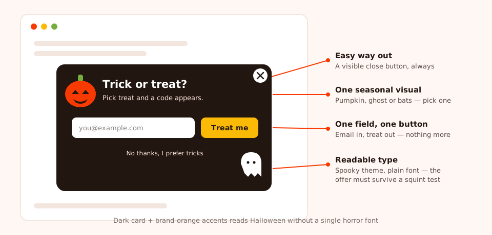
The Halloween popup wireframe: everything a normal popup needs, plus exactly one seasonal visual.
Two ground rules for the month: one overlay campaign per page at a time — use page targeting and display frequency so ideas don't stack — and a date range on every campaign the day you build it. Both come back after the ideas.
Trick-or-treat and game ideas (1–4)
Halloween's core ritual — knock, ask, receive a prize — is literally the mechanic of a gamified popup. These four formats convert the same curiosity that makes kids ring doorbells.
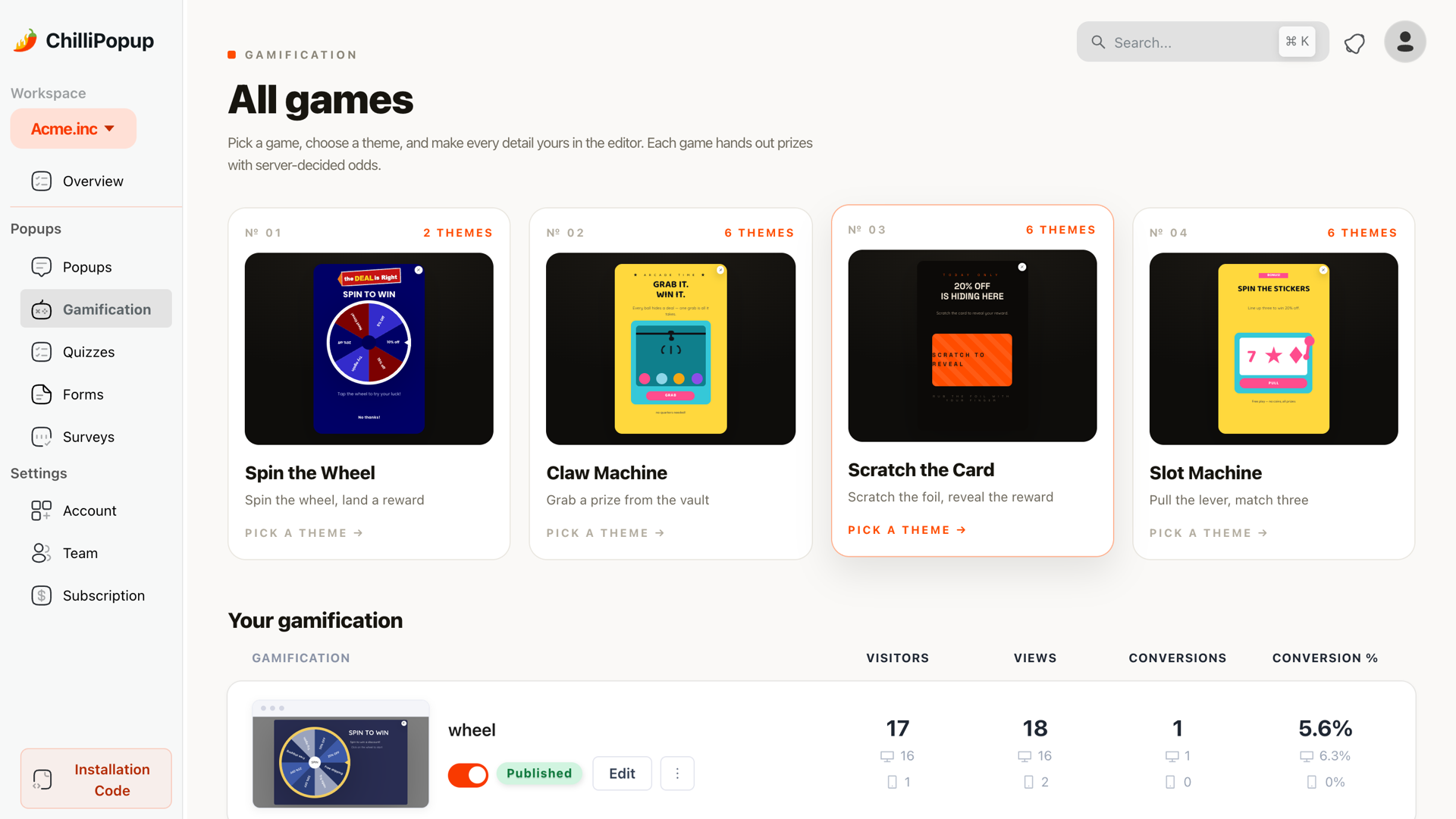
The four games in the gamification catalog — each gets a Halloween costume below.
1. The trick-or-treat coupon reveal
A two-beat popup: the visitor enters an email and "picks treat", and the thank-you screen reveals a coupon code they can copy in one tap. The reveal is what makes it feel like candy, not a form.
Headline: "Trick or treat? 🎃"
Subline: "Pick treat and a code for 15% off appears. Pick trick and… honestly, still the code."
Button: "Treat me"
Build it with: a popup with one email input, a button, and a coupon code block on the thank-you screen. Trigger: a short time delay on collection pages, with "show again after conversion" turned off.
2. Spin the Wheel of Doom
A spin wheel re-labelled for the season: Treat! 15% off, Monster deal: free shipping, Trick! Spin again next visit, Cursed… with 10% off — even the losing slices stay in character. The visitor drops an email to spin; the prize is decided server-side, so the outcome can't be rigged from the browser.
Headline: "Dare to spin the Wheel of Doom?"
Subline: "Every spin wins something. Some fates are just sweeter than others."
Button: "Tempt fate"
Build it with: the spin wheel game — pick a themed design from the gallery and recolor it orange-and-black. Trigger: exit intent on desktop, scroll on mobile.
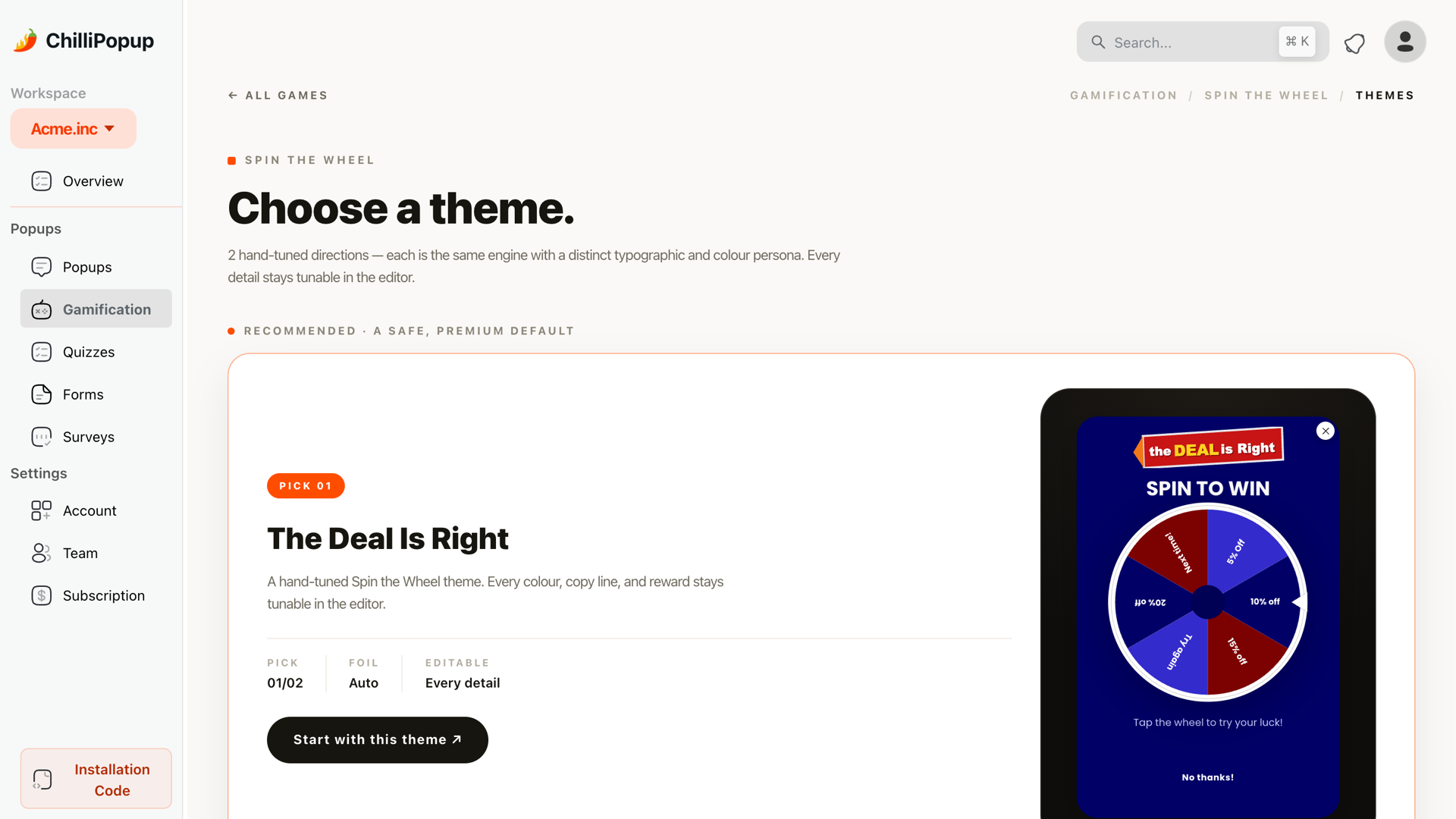
Every game ships with themed designs — pick one and swap the palette and prize labels for Halloween.
3. Scratch the pumpkin
The scratch card is the most tactile format on a phone: a thumb rubs the card and the discount emerges underneath. Skin the art as a pumpkin and the gesture becomes carving.
Headline: "Carve your pumpkin, claim your prize"
Subline: "Scratch to see what's glowing inside. Every pumpkin hides something."
Button: "Start scratching"
Build it with: the scratch card game with pumpkin cover art, on a time delay on product pages — the natural partner for the mobile-only variant (idea 12).
4. The monster jackpot slot machine
Three reels, monster symbols, one pull. The slot machine's near-miss drama suits returning visitors — at a frequency of once every few days it becomes a reason to come back all month.
Headline: "The Monster Jackpot 👻"
Subline: "Line up three pumpkins and the big treat is yours. Everyone wins something."
Button: "Pull the lever"
Build it with: the slot machine game, prizes tiered from a small discount to one headline "jackpot" reward. Audience: returning visitors, frequency once every few days.
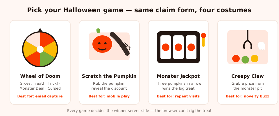
Four games, one claim form. The claw machine — "grab a prize from the monster pit" — is the wildcard if the other three feel overused in your niche.
Urgency and rescue ideas (5–7)
5. The countdown-to-Halloween flash sale
A popup with a live timer ticking toward the end of your sale. Deadlines you can watch expire outperform deadlines you're told about — the whole case for the countdown timer popup — and Halloween is a deadline everybody already believes in.
Headline: "The Spooky Sale vanishes at midnight 🕸️"
Subline: "25% off everything until the clock runs out. Then it's gone — like a ghost."
Button: "Shop before it's too late"
Build it with: a popup with a countdown timer block set to your sale's end, running only during the final week.
6. The "don't ghost your cart" exit saver
An exit-intent popup that fires when the cursor bolts for the tab bar on your cart or checkout pages. Halloween gifts you the perfect pun, and humor lowers the guard of someone mid-abandonment.
Headline: "Don't ghost your cart 👻"
Subline: "It gets lonely in there. Here's 10% off to come back for it."
Button: "Rescue my cart"
Build it with: exit-intent trigger + page targeting with URL contains "cart", frequency once per session — an exit popup that re-fires on every mouse twitch is a haunting, not a save.
7. The Halloween announcement ticker
Not every page can afford an overlay. A slim popup built around a scrolling news ticker block carries the promotion where a full interruption would hurt — the quiet workhorse of the month: always visible, never in the way.
Ticker text: "🎃 SPOOKY SEASON: 20% off sitewide with code TREAT20 · Free shipping on Halloween week orders · New arrivals just landed 🎃"
Build it with: a compact popup containing a news ticker block, shown immediately on all pages except checkout. It asks for nothing, so it can run the whole month.
Quiz and capture ideas (8–10)
8. The costume-finder quiz
"What should I be this year?" is October's biggest dilemma — answer it on your own site. A three-question quiz built from multiple-choice blocks ("Scary or funny?", "Solo or group?", "Effort level: full transformation / a hat is fine") collects an email with the results and tells you which products to pitch. Every answer lands in your dashboard as a clean, segmentable value you can route on in your email tool.
Headline: "Find your costume in 3 questions"
Subline: "Answer three quick ones and we'll match you with your Halloween alter ego."
Button: "Start the quiz"
Build it with: a quiz of three choice questions plus an email field, triggered after two pages viewed. Works beyond costume shops — "find your fall flavor", "find your horror-movie-night snack".
9. The spooky trivia quiz
Pure engagement, light capture: five multiple-choice horror-trivia questions ("Which classic monster can't cross running water?") with a score at the end and an optional email field to get the answers plus a treat code. The Results view shows the completion funnel and which question people quit on — so you can swap out the one that's too hard.
Headline: "How well do you know your monsters?"
Subline: "Five questions. Most people get three. Prove you're the final girl."
Button: "Test my survival odds"
Build it with: a quiz of five choice questions, triggered at 50% scroll on blog and content pages, where visitors are happy to be entertained.
10. The VIP early-access capture
Your early-October opener. Before the sale exists, sell the secret: an email-only popup promising first access to the Halloween collection or sale. It builds the list you'll mail when the real campaign starts — submissions collect in your dashboard, and your own email tool sends the invite.
Headline: "Something wicked this way comes…"
Subline: "Our Halloween drop lands soon. Join the coven and shop it before anyone else."
Button: "Summon my invite"
Build it with: a single-field popup, time-delay trigger, audience set to new visitors, date range covering only early October. By the time the sale opens, this campaign has expired and the capture ideas take its place.
Variant ideas most stores forget (11–13)
11. The post-Halloween clearance popup
The morning after Halloween, your seasonal stock becomes clearance stock. Build the clearance popup in October with a start date of the morning after Halloween — it publishes itself while you sleep off the candy.
Headline: "The party's over. The prices dropped."
Subline: "Up to 50% off everything Halloween — costumes, decor, the lot. When it's gone, it's gone until next year."
Button: "Shop the clearance"
Build it with: a plain-styled popup (the spooky theme retires with the season) whose date range starts right after Halloween night and ends mid-November — the idea that makes date-range rules non-negotiable.
12. The mobile-only variant
Thumbs, not cursors: exit intent barely exists on phones, and a scratch card plays beautifully. Duplicate your main campaign, set device targeting to mobile only (and mobile off on the original), swap the trigger for scroll percentage, shorten the copy to one line, and enlarge the tap targets. Same offer, different body.
Headline: "🎃 15% off — no tricks"
Subline: "Drop your email, grab the treat."
Button: "Get my code"
Build it with: device targeting plus a scroll-percentage trigger around 50%. The full checklist lives in our mobile popup best practices guide.
13. The B2B/SaaS-friendly subtle version
Selling software to procurement teams? You still get to play — quietly. A small popup, one pumpkin emoji of theming, and your normal offer wearing a seasonal one-liner, scheduled for working days.
Headline: "No tricks. Just 20% off annual plans."
Subline: "Our only Halloween scare is what you're currently paying for tooling. Offer ends with the season. 🎃"
Button: "Claim the treat"
Build it with: a standard popup with restrained styling, a weekly schedule rule, and a date range that ends with the month. The wink does the work.
Set it and forget it: date-range display rules
Here's the mechanism that turns thirteen ideas into one self-running month. In ChilliPopup, every popup, form, survey and quiz can carry a date range — a start and end date, down to the hour. The campaign starts serving when the window opens and stops when it closes, no human in the loop. Build everything in one afternoon, stagger the windows, done.
| Campaign | Window opens | Window closes | Why this window |
|---|---|---|---|
| VIP early-access capture (idea 10) | Start of October | Mid-October | List-building before the sale exists |
| Games + coupon reveal + quizzes (ideas 1–4, 8–9) | Mid-October | Halloween night | Peak browsing weeks — play beats urgency here |
| Announcement ticker (idea 7) | Start of October | Halloween night | Zero friction — safe all season |
| Countdown sale + exit saver (ideas 5–6) | Final week of October | Halloween night | Urgency needs an imminent deadline |
| Post-Halloween clearance (idea 11) | Morning after Halloween | Mid-November | Launches while competitors are still serving pumpkins |
The end date matters more than the start date. A late launch costs a few days of a campaign; a missing end date costs credibility — a "spooky sale" popup in mid-November tells every visitor nobody is minding the store. Never publish a seasonal campaign without its expiry.
Your October popup calendar
Sequence the ideas and the month runs itself:
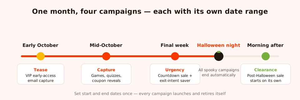
The whole month, staggered with date ranges: tease → capture → urgency → clearance.
- Early October — tease. The VIP early-access capture (idea 10) plus the announcement ticker (idea 7). Light theming, list-building mode.
- Mid-October — capture. The trick-or-treat reveal, your chosen game, and a quiz (ideas 1–4, 8–9). Peak browsing season — playful formats convert curiosity into emails.
- Final week — urgency. The countdown flash sale and the exit saver (ideas 5–6) take over; pause the games so the deadline owns the stage.
- Morning after Halloween — clearance. Every spooky campaign has expired via its end date; the clearance popup (idea 11) starts on its own.
A/B test it: one spooky variant, one plain
Does the costume convert, or does it just feel festive to you? Don't guess — A/B test it. ChilliPopup's built-in A/B testing splits traffic between two variants of the same campaign: run your standard evergreen design as variant A and the themed version as variant B.
- Keep the offer identical — same discount, same field, same trigger. You're testing the theme, and only the theme.
- Judge on conversion rate, not clicks. Spooky designs attract curiosity clicks; the number that pays invoices is submissions over views, reported per variant in the analytics dashboard.
- Decide mid-month. Run the test through the mid-October capture window, then push all traffic to the winner for the final week.
- Write the result down. Whatever wins is your default for Black Friday — the same test, with much more money on the table.
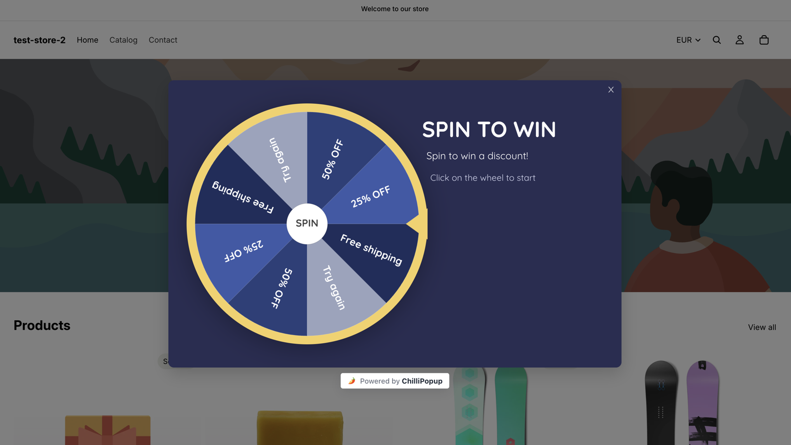
A spin wheel live on a storefront — run themed vs plain and let the audience pick.
6 Halloween popup mistakes that haunt stores every year
- The year-round spooky popup. A Halloween campaign with no end date, still greeting December gift-shoppers with a witch. Date ranges exist precisely so this can never happen — set the expiry the day you build.
- Unreadable "horror" fonts. Dripping-blood lettering demos great and reads terribly at mobile sizes. Keep your normal typography and let color, imagery and copy carry the theme — the squint test in our popup design guide applies double in October.
- Burying the offer under the bit. If a visitor can't tell within two seconds what they get, the joke went too far. "Trick or treat?" works because the treat — 15% off — is right there in the subline.
- Stacking three campaigns on one page. A ticker, a wheel and an exit popup fighting for one visitor reads as chaos. Separate them with page targeting, triggers and frequency rules so each page has one star.
- Launching the countdown too early. A timer that ticks for three weeks is furniture. Urgency formats belong to the final week only.
- The same popup on desktop and mobile. Exit intent doesn't translate to thumbs, and long copy doesn't fit small screens. Build the mobile-only variant (idea 12).
Build your Halloween campaign this afternoon
Popups, quizzes, spin wheels and scratch cards from one editor — with date ranges that launch and retire every campaign automatically. Free plan, no credit card required. Paid plans from $29/month.
Start free →Related reading
Frequently asked questions
When should I start showing Halloween popups?
Start a soft tease in early October — an early-access email capture with light seasonal styling — then run your main capture campaigns from mid-October and switch to urgency formats like countdowns and exit savers in the final week. Set every campaign's start and end date up front so the whole sequence launches itself while you do something else.
How do I make my Halloween popup stop showing after Halloween?
Use a date-range display rule. In ChilliPopup, every popup, form, survey and quiz can carry a start and end date, down to the hour. Give each Halloween campaign an end that falls right after Halloween night and it retires itself — no reminder, no morning-after pumpkin popup embarrassing your store in November.
Do Halloween popups work for B2B or SaaS websites?
Yes, in a quieter register. Skip the dripping-blood theatrics and run a lightly themed version of your normal popup — a small card with one pumpkin accent, a seasonal headline, and your standard offer. Use a weekly schedule to show it on working days if your audience browses from the office, and let the copy wink at the season rather than scream it.
Which game works best for a Halloween popup?
The spin wheel is the safest pick — 'Wheel of Doom' slices with treat-and-trick prize labels are instantly legible and the format is familiar. A scratch card is the most tactile on mobile, a slot machine suits repeat visitors, and the claw machine is the novelty option. All four collect the email on the claim screen and decide the prize server-side, so pick whichever costume fits your brand.
Should I A/B test a spooky design against a plain one?
Yes — it is the single most useful Halloween test. Build your normal offer as variant A and the themed version as variant B, split traffic between them, and let conversion rate decide whether the costume earns its keep. Some audiences reward the theming; others convert better on the plain version. Test it instead of assuming.
What should a Halloween popup actually offer?
The same things that work all year, in costume: a first-order discount revealed as a 'treat', early access for email subscribers, free shipping for the final pre-Halloween days, or a prize from a game. The season changes the wrapper, not the economics — an offer that would flop in plain dress will flop in a witch hat too.