A video popup is a popup with a video inside it — a product demo, a founder welcome, an explainer, a webinar replay — usually with one call-to-action button underneath. Built well, it converts visitors that text never reaches. Built badly, it's an unskippable ad on your own website.
This guide is the honest version: when video actually beats text, how the YouTube-embed approach works (and why not hosting video yourself is a feature), the anatomy of a video popup that converts, which trigger fits which page, and the specific reasons most video popups quietly fail.
Key Takeaways
- Video earns its interruption or it doesn't run. Demos, founder welcomes and product-in-action clips justify a popup; decoration doesn't.
- Click-to-open beats auto-play. A "Watch demo" button the visitor presses converts the willing; an auto-opening video at 0 seconds trains everyone to hit close.
- The video warms them up — the CTA converts them. Never ship a video popup without a button under the player. The video alone converts nobody.
- Keep it under 90 seconds. The popup video's job is to earn the next click, not to say everything.
- Videos cost mobile visitors data. When the clip is heavy, use device targeting to run the video popup on desktop and a lighter text popup on mobile.
What is a video popup?
Video popup, in two sentences
A video popup (sometimes called a video lightbox popup) is an overlay that opens on top of your page and plays a video inside it, dimming everything else so the clip gets full attention. The good ones pair the video with exactly one call to action — a button, and sometimes an email field — because the video's job is persuasion and the button's job is conversion.
The "lightbox" framing matters more than it sounds. A video embedded inline in your page competes with everything around it — navigation, other sections, the scrollbar. A video in a popup suspends the page: for the length of the clip, your message is the only thing happening. That is a powerful thing to do to a visitor, which is exactly why it has to be done at the right moment, on the right page, with their consent wherever possible.
Mechanically, a video popup in ChilliPopup is a normal popup that contains a video block — the same drag-and-drop editor, the same triggers, the same targeting rules as any other popup. Which means everything you already know about popup strategy still applies; the video just raises the stakes on getting the moment right.
When video beats text — and when it doesn't
Video is expensive attention. It asks for sound, seconds and focus, so it has to deliver something a headline can't. Five jobs where it consistently does:
- The product demo. "See it in action" is the highest-intent phrase on a SaaS site. A 60-second screen recording answers "what does it actually look like?" faster than any feature grid — and the people who click to watch it are your best leads of the week.
- The founder welcome. A human face saying "here's why we built this" does something no About page does: it makes a small brand feel accountable. Thirty seconds is plenty.
- The explainer. When the product is genuinely novel — a new category, an unusual mechanism — text forces the visitor to do the imagining. An animation or walkthrough does the imagining for them.
- The webinar replay. You already paid to produce an hour of persuasion. An exit-intent popup offering the replay in exchange for an email recycles that asset on every visit.
- Product-in-action for ecommerce. Fabric moving, a tent going up, the gadget doing the thing — motion sells physical products that stills flatten. A short clip on the product page converts the hesitant.
And the honest counter-list: video does not beat text for discount offers ("10% off" needs four words, not forty seconds), for blog readers mid-article (they chose text; respect it), or anywhere near checkout (never put a video between a customer and the pay button). If your message survives being written as one headline, write the headline — a well-copied text popup is cheaper to make and easier to test.
How video popups work in ChilliPopup: YouTube embeds
Let's be precise about the mechanics, because it shapes your workflow. ChilliPopup's video support is a YouTube embed block: you drop a video block into the popup editor, paste the YouTube URL of your clip, and the popup renders YouTube's player inside the overlay. That's the whole setup — there is no self-hosted video upload, and honestly, you don't want one:
- YouTube does the heavy lifting. Streaming, adaptive quality on slow connections, bandwidth costs, the player itself with its controls — all handled by the biggest video infrastructure on earth, not by your website.
- Your page stays fast. The ChilliPopup script loads asynchronously and doesn't slow the host page; the video itself streams from YouTube only when the popup actually shows. No multi-megabyte file rides along with your page load.
- No pipeline to manage. No transcoding, no formats, no storage limits. Upload to YouTube once, paste the link, done. Updating the video later means swapping one URL.
- You keep YouTube's side benefits. The same clip works on your channel, in your emails and in the popup — one asset, three surfaces.

A video popup is a normal popup with a video block in it — same editor, same blocks, same display rules.
Don't want the clip on your public channel? Upload it to YouTube as unlisted. Unlisted videos embed normally — visitors see it in your popup, but it doesn't appear on your channel page or in search. That's how most teams run demo and welcome videos that were made only for the website.
Anatomy of a video popup that converts
Here is the shape that works, and the reasoning behind each part:
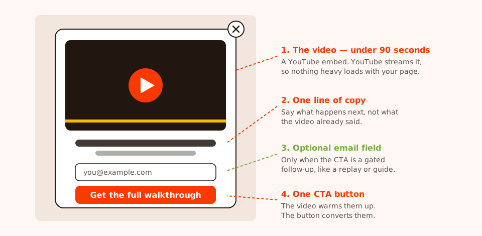
The converting shape: video on top, one line of copy, one button — and nothing else competing for the click.
- The video, under 90 seconds. A popup is a moment, not a screening room. If the material needs ten minutes, the popup's video should be the 60-second trailer and the full version goes behind the CTA.
- One line of copy. Say what happens next — "Get the full walkthrough", "Book a 15-minute call" — not a paragraph repeating what the video said.
- One CTA button. This is the part most video popups forget, and it's fatal. A video with no button is a dead end: the visitor watches, nods, closes, leaves. The video creates belief; the button has to be standing right there to catch it.
- An email field, only when the CTA is gated. Replay access, a PDF companion, a course — if the button delivers something sent by email, put one input under the video. If the CTA is "start your trial" or "see pricing", skip the field; don't tax the click.
- A visible close button. Non-negotiable, and doubly so with video. A trapped visitor doesn't convert — they leave with the sound still playing.
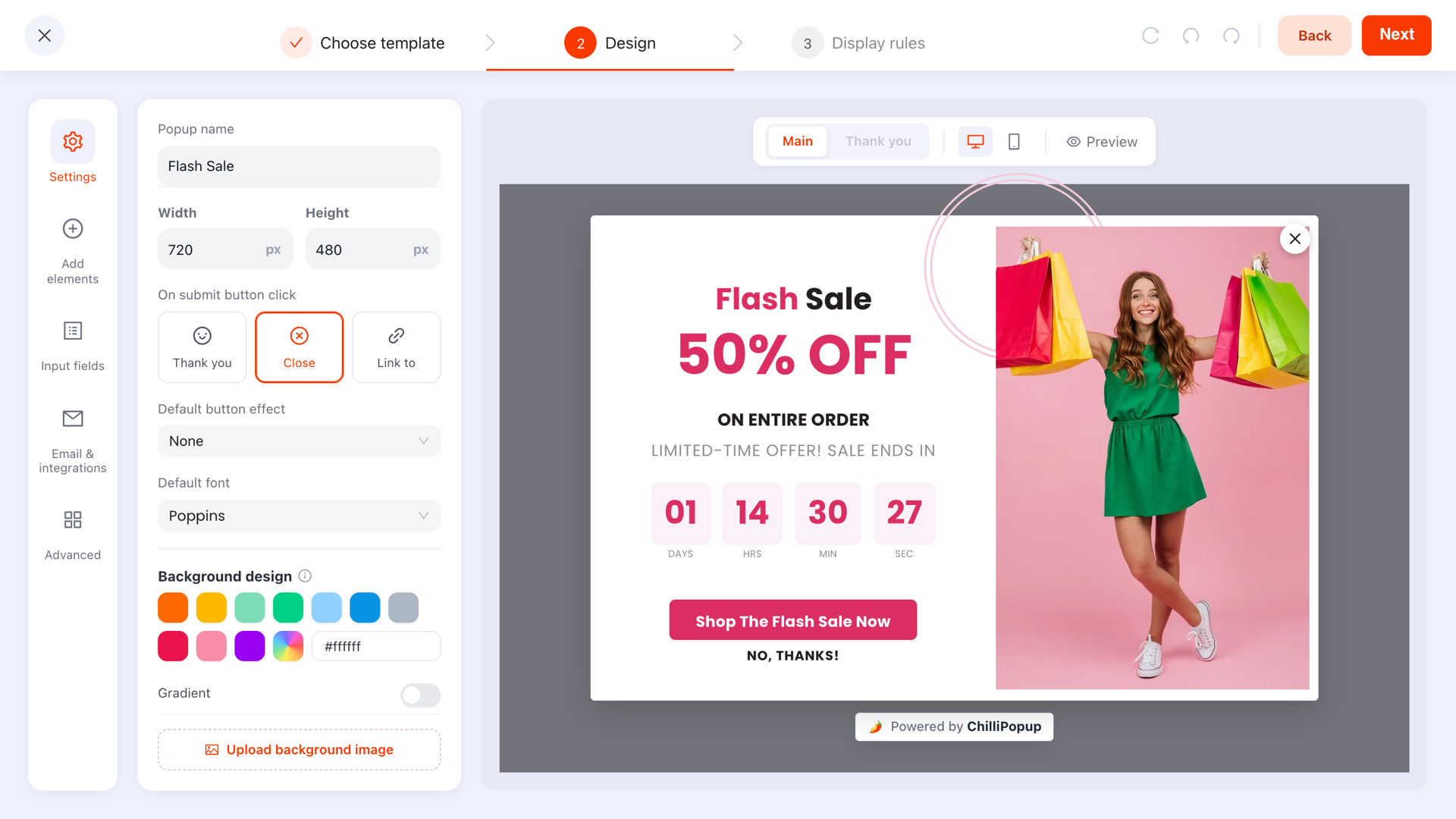
Stacking the blocks in the designer: video, one line of text, button. Resist adding a fourth thing.
Picking the trigger: click-to-open beats auto-play
Trigger choice matters more for video popups than for any other kind, because the cost of a mistimed interruption is higher — a mistimed text popup is a glance, a mistimed video is an ad. The core principle:
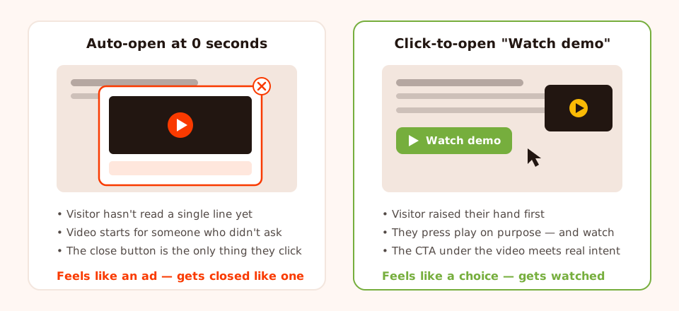
The visitor who clicked "Watch demo" is worth ten who had the video forced on them.
The click-triggered pattern is simple to wire: put a "Watch demo" button anywhere on your page and have it open the popup through the pixel's JavaScript API. The popup never interrupts anyone — it only ever opens for a visitor who asked:
<button onclick="window.ChilliPopup.open('YOUR_POPUP_UUID')">
  ▶ Watch the 60-second demo
</button>
When you do want the popup to open on its own, match the trigger to the page's intent:
| Trigger | Best for | Why it works | Watch out for |
|---|---|---|---|
| Click-to-open | Product demos, "see it in action" on feature pages | Zero interruption — 100% of openers chose to watch | Needs a visible button in your page layout |
| Time delay (~20s) | Pricing pages, founder welcome for new visitors | The visitor has context and is visibly weighing the decision | Too short a delay reads as an ambush — never under 10 seconds |
| Exit intent | Webinar replay offers, "before you go, watch this" | They were leaving anyway — the interruption costs nothing | Desktop-only signal; pair with a scroll trigger for mobile |
| Scroll percentage | Long landing pages — video at 60% scroll depth | Scroll depth proves engagement before you ask for attention | Sends the popup mid-read; keep the clip short |
| Show immediately | Almost nothing | — | A video at 0 seconds is the definition of popup spam |
Exit intent deserves a special mention for webinar replays: the visitor is leaving, so you've got nothing to lose, and "watch the replay" is a stronger parting offer than most discount codes for content-led businesses. The mechanics of the leave signal are covered in our exit-intent popups guide.
Which pages deserve a video popup?
Not every page earns one. The test is simple: does this page carry a question that motion answers better than words? Pricing pages and product pages usually do. Blog posts and checkout never do.
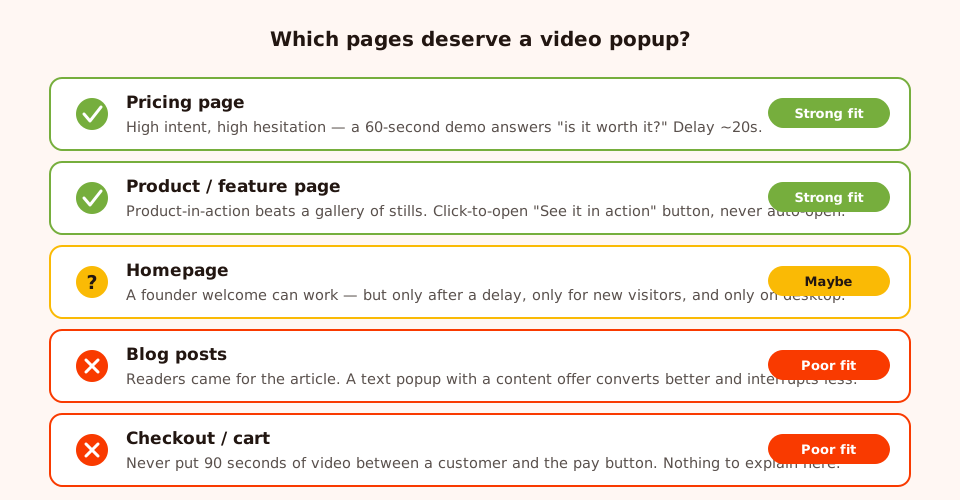
Run the video where hesitation lives — not where attention is already spoken for.
Use page targeting to enforce this: rule the video popup onto the URLs that earn it
(/pricing, /product/) and keep it off everything else. One well-placed
video popup on the pricing page will outperform the same popup sprayed across the site — and it
keeps the rest of your popup inventory free for offers that fit those pages better.
Why your video popup isn't converting
If you already run a video popup and the numbers are flat, the cause is almost always one of these four — in this order of likelihood:
1. It opens too early
An auto-opening video in the first seconds of a visit is indistinguishable from a pre-roll ad, and visitors have a decade of trained reflexes for those: find the X. Nobody evaluates your demo at second three of their first visit. Move to click-to-open, or push the delay to 20 seconds and target the pages where hesitation actually happens.
2. The video has no CTA under it
The most common failure, and the most invisible: the popup "works", people watch, and nothing happens — because nothing was asked. A video popup without a button is a cinema with no exit signs. Every video block needs a button block under it, and the button needs a next step, not applause.
3. The video is too long
Completion collapses with length inside a popup. Your beautiful four-minute brand film belongs on your About page; the popup gets the 45-second cut. If you only have the long version, front-load it — the first 15 seconds must contain the reason to keep watching.
4. It's running on mobile connections that pay for it
Video costs mobile visitors data and battery, the popup competes with a small screen, and a mid-size clip on a metered connection is a genuinely hostile experience. When the video is heavy, use device targeting to run the video popup on desktop only and give mobile visitors a text version of the same offer — same headline, same CTA, no player. Our mobile popup best practices guide covers the rest of the small-screen rules.
A fifth, quieter killer: sound. Nobody forgives unexpected audio — in an office, on a train, next to a sleeping baby. Design the popup assuming the visitor decides when sound starts: let them press play, and make the first frame of the video (YouTube's thumbnail) sell the click on its own.
Worked example: a demo popup for a pricing page
Here's a complete build you can copy — a SaaS pricing page, where the visitor's unspoken question is "is this actually worth $49 a month?", and a 60-second demo answers it better than the feature comparison table below it.
The video
A 60-second screen recording: 0–10s states the problem in the customer's words, 10–45s shows the product solving it (real screen, real data, no title cards), 45–60s shows the outcome and says the CTA out loud. Uploaded to YouTube as unlisted; the URL goes into the popup's video block.
The copy around it
Headline above the video: "See how teams cut reporting from 3 hours to 20 minutes."
Line under the video: "That was the whole setup — no sales call required."
Button: "Start my free trial". Decline link: "I'll keep comparing plans" —
polite, specific, and it closes the popup without shame.
The rules
Page targeting: URL contains /pricing. Trigger: time delay, 20 seconds — long
enough to have read the plans, short enough to catch the hesitation. Device: desktop; mobile
visitors get a sibling text popup with the same headline and button. Frequency: once every few
days, and stop showing after conversion so trial users never see it again.
The test
Run it as an A/B test against a text-only variant with the same headline and button. If video is doing its job, the video variant should win on conversion rate — if it doesn't, you just saved yourself from re-shooting a video that was never the bottleneck.
The ecommerce translation of the same pattern: product page for a tent, click-triggered "▶ Watch the 40-second pitch test" button under the photo gallery, video of the tent going up in the rain, button under it — "Add to cart". Same anatomy, different vertical.
Pairing video with email capture
A video popup and an email field are natural partners when the video creates a reason to stay in touch. The pattern: video on top, one input and one button under it, and an exchange the visitor actually values. Three that work:
- The replay gate. Exit-intent popup: "Leaving? Take the 45-minute workshop with you." The popup's video is a 60-second highlight reel; the email field is how they get the full replay link. The teaser proves the replay is worth an address.
- The series hook. Founder welcome video ends with "I write one teardown a week — want the next one?" Email field, subscribe button, done. The face makes the newsletter ask feel personal instead of transactional.
- The companion asset. Demo video plus "Get the setup checklist we used in this video". The video demonstrates; the download justifies the field.
Two honest notes on mechanics. First, submissions land in your ChilliPopup dashboard — ChilliPopup doesn't send emails, so the replay link or checklist goes out from your own email tool. Second, keep it to one field: the visitor already spent attention on the video, so the form has to be nearly free. If you're tempted to add more fields, read our guide on building an email list with popups first — the short-form rules apply double here.
Common video popup mistakes
- Auto-opening at 0 seconds. The single fastest way to turn a demo into an ad. Earn the moment: click, delay, scroll or exit — never "immediately".
- No CTA under the player. A video that ends into silence converts nobody. Button under every video, no exceptions.
- Two CTAs under the player. "Start trial" and "Book a call" splits a warm visitor into a confused one. Pick the one action this page exists for.
- Using the popup for a four-minute film. Long-form belongs behind the CTA, not inside the interruption.
- Ignoring the thumbnail. Until play is pressed, your "video" is a still image. Make the first frame a promise — a face, a result, a bold claim — not a grey blur.
- Serving heavy video to mobile visitors. Device-target the video popup to desktop when the clip is long; mobile gets the text sibling.
- Hiding the close button. With video, a trapped visitor isn't just annoyed — they're annoyed with sound on. Keep the X obvious.
- Never testing against text. The video variant has to beat the text variant in an A/B split to deserve its production cost. Sometimes the headline wins. Let it.
Measuring: views, clicks, submissions
A video popup produces the same three numbers as any other campaign in the analytics dashboard, and the discipline is reading them in order:
- Views — how many people the popup was shown to. This validates your trigger and targeting. A click-to-open demo popup with low views isn't failing — check how visible your "Watch demo" button is on the page first.
- Clicks — how many pressed the CTA button under the video. This is the video's real score: it measures whether watching created enough belief to act. Views high, clicks low? The video isn't persuading, or the CTA under it is weak.
- Submissions and conversion rate — for popups with an email field, how many completed it, and the rate the dashboard computes per campaign. This is the number the campaign exists for.

Judge the popup by what happens after the video: clicks and submissions, per campaign.
One measurement honesty note: ChilliPopup measures the popup — views, clicks, submissions. What happens inside the player (watch time, where people stop watching) is YouTube's territory; check the video's own YouTube analytics when you want to know whether people bail at second 12. The combination tells you what to fix: popup numbers weak → fix trigger, copy or CTA; watch time weak → fix the video. For the wider framework on reading these numbers, see the popup analytics guide.
Put your best 60 seconds in front of visitors
Add a video block, paste a YouTube URL, pick the trigger — and A/B test it against text. No hosting, no code, no slowdown.
Build a video popup free →Related reading
Frequently asked questions
What is a video popup?
A video popup is a popup window with a video inside it — a product demo, a founder welcome, an explainer or a webinar replay — usually with a call-to-action button underneath. In ChilliPopup you build one by adding a video block to any popup and pasting a YouTube URL; the video plays inside the popup through YouTube's own player.
Can I upload my own video file to ChilliPopup?
No — ChilliPopup's video block works with YouTube embeds: you paste a YouTube URL and the popup renders YouTube's player. In practice that is an advantage: YouTube handles the streaming, bandwidth and player controls, so your popup stays light and you never manage video hosting. If you don't want the video on your public channel, upload it to YouTube as unlisted and embed that link — unlisted videos embed normally.
Should a video popup open automatically?
Usually not. A video popup converts best when the visitor chooses it — a click-triggered 'Watch demo' button beats auto-opening the popup the moment someone lands. If you do auto-open, use a time delay or exit intent so the interruption arrives after the visitor has some context, and let them press play themselves.
How long should the video in a popup be?
Under 90 seconds for demos, welcomes and explainers. The popup video's job is not to say everything — it is to build enough belief to earn a click on the button below it. If the material genuinely needs ten minutes, use the popup to tease it and put the full video behind the CTA instead.
Do video popups work on mobile?
They can, but treat mobile as a separate decision. A video costs the visitor data and screen space, and a popup already competes with a small viewport. When the video is heavy or long, use ChilliPopup's device targeting to run the video popup on desktop only and show mobile visitors a lighter text popup with the same offer.
How do I measure whether a video popup is working?
Read three numbers in the analytics dashboard: views (how many people saw the popup), clicks (how many pressed your CTA button) and submissions (how many completed the form, if there is one), plus the conversion rate the dashboard computes per campaign. Judge the popup by clicks and submissions — the actions after the video — not by how good the video is. To settle a debate, A/B test the video popup against a text-only variant.