
A SaaS signup popup has a harder job than an ecommerce one. There's no discount to offer, the decision takes weeks rather than minutes, and most of your traffic arrives on a blog post with no intention of evaluating software at all. The popups that work don't shout “Start your free trial” at everyone — they match the ask to what the visitor came for.
This guide covers the four page types on a SaaS site, the ask each one supports, how to keep list quality high with one field, and how to move readers toward a trial without pretending they're ready for one.
Key Takeaways
- Page intent decides the ask. Blog readers want a resource; pricing visitors want a demo; comparison readers want a trial.
- Don't ask for a trial on a blog post. The jump is too far, and it costs you the email you could have had.
- One field, and validate it. Business-email validation raises quality and lowers volume — choose on purpose.
- Qualify with a tap, not a text box. Role and team size as tappable options give you clean, segmentable values.
- Leads land in your dashboard, not in your CRM — plan the handoff before you launch.
Why SaaS popups fail more often than ecommerce ones
Three structural differences, all of which punish a lazy popup:
- No instant reward. An apparel store hands over 10% off; you're offering software that takes an afternoon to evaluate. The reward has to be information or time saved, not money.
- A long, multi-visit decision. Nobody buys B2B software on the first visit, so a popup that only converts trial-ready buyers ignores 95% of the traffic.
- Wrong-audience traffic. Content marketing brings in students, competitors and people researching a topic. A popup that treats them all as buyers converts badly and pollutes your list.
The fix isn't a better headline. It's asking each visitor for the next step they're actually willing to take.
The four page types — and the ask each one supports
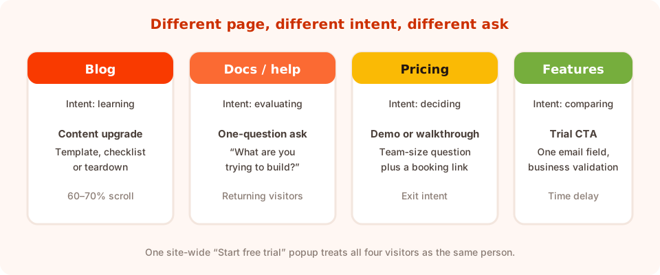
Four pages, four intents. One site-wide trial popup treats them all as the same person.
Blog and resources — the content upgrade
Someone reading “how to run a retrospective” is not evaluating your software. Offer the thing that matches what they're doing right now: the template, the checklist, the spreadsheet version of the post.
“Want the template version of this?” — one email field, trigger at 60–70% scroll, button Send me the template. You get a subscriber who has a real reason to open your next email, and the trial ask comes later.
Docs and help centre — the qualifying question
People in your documentation are either customers or serious evaluators. Neither wants a trial pitch, but both will answer one question.
“What are you trying to set up?” with three or four tappable options. That answer routes them — and tells you which use case your docs are actually serving. Target returning visitors so you're asking people who came back.
Pricing — the demo or walkthrough
The highest-intent page on the site, and the one where hesitation is most visible. An exit-intent popup here is the closest thing SaaS has to a cart-abandonment popup.
“Not sure which plan fits? Fifteen minutes with someone who'll tell you honestly.” — a one-question ask for team size, then a booking link. The qualifier arrives bundled with an offer rather than extracted for free.
Feature and comparison pages — the trial CTA
Someone reading a feature page in depth is genuinely evaluating. This is where Start my free trial belongs — one email field, business validation on if list quality matters, and a reassurance line under the button (no card needed).
The general rule: ask for the next step, not the final one. A blog reader who gives you an email is a win; a blog reader who ignores a trial popup is nothing at all.
Keeping list quality high with one field
B2B lists rot faster than consumer ones, and a popup is where most of the rot enters. You still only ask for one field — you just decide how strictly it's checked.
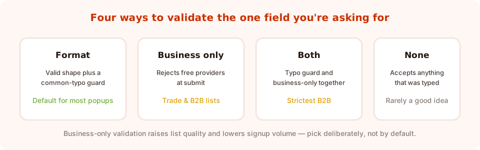
Business-only validation rejects free providers at submit. Powerful, and easy to apply where it doesn't belong.
| Campaign | Validation | Why |
|---|---|---|
| Blog content upgrade | Format + typo guard | You want the audience, including freelancers and job-seekers |
| Trial CTA on feature pages | Format + typo guard | Don't block a genuine buyer who uses a personal address |
| Demo request on pricing | Business only | Sales time is expensive; a work address is a fair filter |
| Trade or partner list | Business + format | The list is only useful if it's genuinely a business list |
Business-only validation is a real filter, not a nudge. A free-provider address is rejected at submit. That's correct for a demo request and wrong for a blog subscriber — plenty of real buyers, founders and consultants use a personal address. Apply it per campaign, deliberately.
The other half of quality is spam. Bot signups and junk entries are a bigger problem for B2B lists than most teams realise; there's a dedicated walkthrough in how to stop spam signups in popups.
Qualifying without killing the conversion
Sales wants company size, role, budget and timeline. Every one of those on the first popup is an objection. The workable compromise is one qualifier, asked as a tap.
- Role — Founder / Marketing / Product / Engineering. Changes which emails and which case studies they get.
- Team size — Just me / 2–10 / 11–50 / 50+. The single most useful B2B field, and painless as a set of bands.
- Use case — three or four options that map to your onboarding paths.
Tappable options also return clean values. A text box gives you Mktg,
marketing ops and Marketing — three strings you can't segment on. Choices
give you one.
Everything else goes on a later ask, once you've delivered something. The staged approach is covered in the progressive profiling guide, and the form-level version in B2B lead capture forms.
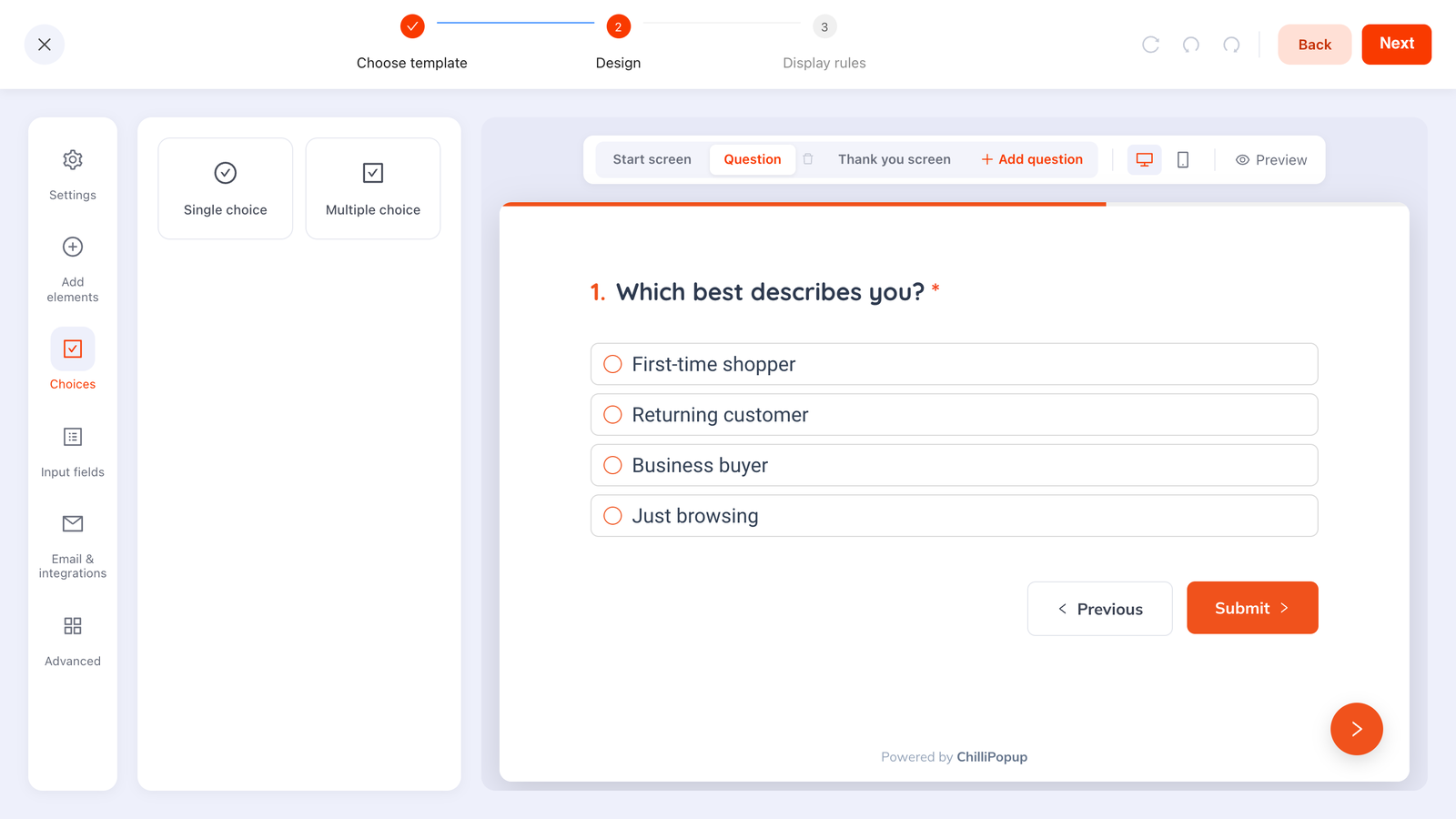
One question, four options, one tap — and a value you can actually route on.
Where the leads go — plan this before you launch
Be clear-eyed about the handoff. Each campaign stores its own submissions, and you read them in the dashboard's collected-input table. There is no built-in CRM sync or ESP integration — the Email & integrations panel is marked coming soon — so decide now how a submission becomes a lead in your stack.
Three workable patterns:
- Manual, for low volume. Read the collected fields in the dashboard once a week. Fine for a demo-request popup that produces a handful of leads.
- Browser event, for automation. The pixel fires an event on every submit, carrying the submitted data, so you can forward it wherever you like from your own site code.
- Link out instead of collecting. If your trial signup already lives in the product, make the popup's button open that page rather than duplicating the form — then the popup's job is persuasion and routing, not storage.
window.addEventListener('chillipopup:submit', function (e) {
  // e.detail = { popupUuid: '…', data: { email: 'jo@company.com' } }
  fetch('/api/leads', {
    method: 'POST',
    headers: { 'Content-Type': 'application/json' },
    body: JSON.stringify({ source: 'pricing-exit', ...e.detail.data }),
  });
});
Forms, surveys and quizzes fire their own equivalents — chillipopup:form_submit,
chillipopup:survey_submit and chillipopup:quiz_submit — each carrying its
answers under its own id key, so match on the right one.
A worked example: a project-management tool
Four campaigns, each ruled to its own page type.
1. Blog — content upgrade. Corner slide-in at 65% scroll on /blog/
URLs. “Get the retrospective template from this post.” One email field, format
validation, button Send me the template. Frequency once every 14 days, conversion gate off.
2. Docs — the routing question. Returning visitors on /docs/, time
delay 20 seconds. “What are you setting up?” with four options. No email field —
this one exists to teach you which use cases are live.
3. Pricing — the demo save. Exit intent on /pricing.
“Not sure which plan? Fifteen minutes, no pitch.” Team-size question, business-email
validation, button Book my walkthrough, thank-you screen carrying the booking link.
4. Feature pages — the trial CTA. Time delay of 30 seconds on feature URLs. “Try it on your own data — free for 14 days, no card.” One email field, button Start my free trial.
What makes this work: four small campaigns, each with a page rule, each asking for the next realistic step. The blog popup never mentions a trial; the pricing popup never offers a template.
What to measure
SaaS popups have longer feedback loops than ecommerce ones, so read them patiently:
- Unique views per campaign. Page-targeted campaigns are narrow by design; check they're firing before judging them.
- Conversion rate against itself. A demo request on pricing will never match a blog content upgrade — different asks, different visitors.
- Collected fields. The breakdown of top values per field tells you which roles, team sizes and use cases your traffic actually contains. That's a positioning input, not just a metric.
- Quality downstream. Track what happens to popup-sourced signups after they arrive. A campaign with a high conversion rate and no activated accounts is attracting the wrong people.
The wider metric set is in the popup analytics guide.
Seven SaaS popup mistakes
- One site-wide “Start free trial” popup. It ignores intent, converts badly, and annoys existing customers.
- Trial pitches on blog posts. Too big a jump. Offer the resource, earn the email.
- Six fields because sales asked. One field, one optional qualifier. The rest comes later.
- Business-email validation everywhere. It silently blocks founders and consultants on personal addresses.
- Showing signup popups to logged-in customers. Exclude your app URLs with a page-targeting rule and turn off show-again-after-conversion.
- Free-text qualifiers. Unnormalised values you'll never segment on.
- No plan for the leads. Decide how a submission reaches your stack before you publish, not after the first demo request goes unanswered.
Build your SaaS popups in ChilliPopup
Start with two campaigns, not four. If the script isn't on your site yet, the install guide takes one line, and there's a Google Tag Manager walkthrough if that's how your site is instrumented.
1. Map your pages to intents
List your URL patterns — blog, docs, pricing, features, app — and write the next realistic step next to each. That list is your campaign plan.
2. Build the blog content upgrade first
It's the highest-volume, lowest-risk campaign. Page-target /blog/, trigger around 65%
scroll, one email field, format validation.
3. Add the pricing exit-intent demo offer
Exit intent, page-targeted to the pricing URL, one team-size question as tappable options, business-email validation, and the booking link on the thank-you screen.
4. Exclude your app and your customers
Add a page rule so nothing fires on your logged-in application URLs, and turn off “show again after conversion” on every campaign.
5. Wire the handoff before you publish
Decide whether leads are read manually, forwarded by the submit event, or whether the popup just links to your existing signup page. Test one real submission end to end.
Match the ask to the page
Page-target popups, forms, surveys and quizzes from one editor and one script. Free plan, no credit card required. Paid plans from $29/month.
Start free →Related reading
Frequently asked questions
Do popups work for SaaS websites?
Yes, but only when the ask matches the page. A blog reader will take a template in exchange for an email; the same person will ignore a free-trial pitch. Run several small page-targeted campaigns rather than one site-wide trial popup.
What should a SaaS popup offer instead of a discount?
Information or saved time: the template version of a post, a checklist, a teardown, a fifteen-minute walkthrough, or early access. On feature and comparison pages, where the visitor is genuinely evaluating, the free trial itself is the right offer.
Should a SaaS signup popup require a business email?
Only where sales time is at stake, such as a demo request. Business-email validation rejects free providers at submit, which correctly filters a demo queue but wrongly blocks founders and consultants who use a personal address for a blog subscription.
How do I qualify leads without hurting conversion?
Ask exactly one qualifier, as tappable options rather than a text field — role, team size band or use case. Choices complete in one gesture and return normalised values you can segment on, while free text produces variants you can never group.
Where do popup submissions go?
Each campaign stores its own submissions, which you read in the dashboard's collected-input table. There is no built-in CRM or email-tool sync yet, so either read them manually, forward them from your own site code using the submit event the pixel fires, or have the popup link to your existing signup page instead of collecting.
How do I stop popups showing to existing customers?
Add a page-targeting rule that excludes your logged-in application URLs, and turn off 'show again after conversion' so anyone who already submitted stops seeing that campaign.