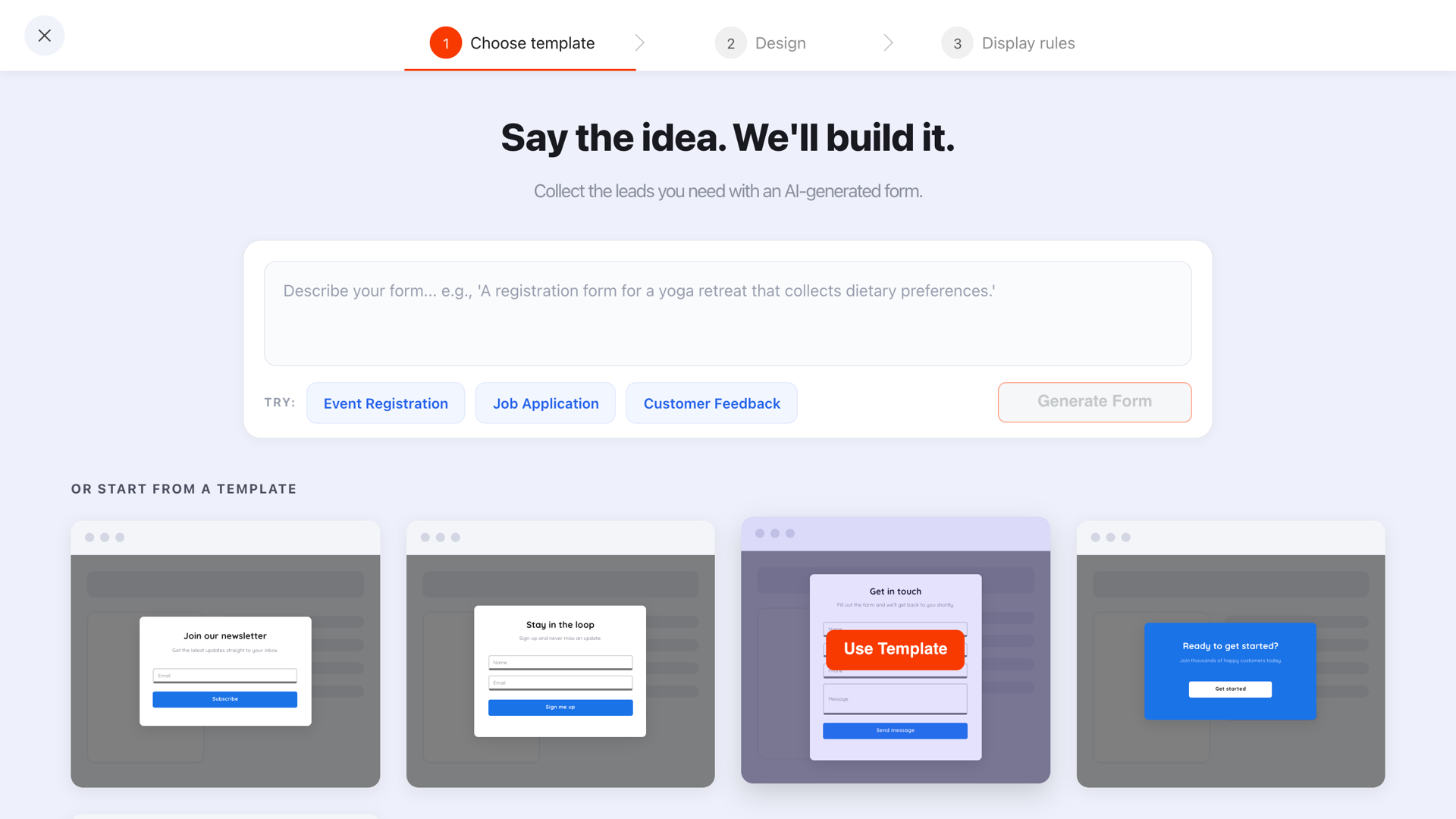
A B2B lead capture form has one job: turn an anonymous visitor into a contact your team can act on. Everything beyond that — the company size, the job title, the "anything else we should know" box — is negotiation between departments, paid for in conversions nobody attributes to it.
The fix isn't "make the form shorter" as a slogan. It's a specific test you can apply field by field, plus a way to collect the rest without putting it in front of a stranger.
Key Takeaways
- Three fields for content, five at most for a demo. Beyond that you're trading conversions for fields nobody uses.
- The so-what test: name the email, route or sales action that changes because of the answer. No name, no field.
- The work email is the qualifier. The domain tells you the company — you rarely need to also ask for it.
- Two paths, not one form. The ready-to-talk form stays; a lower-commitment offer catches everyone else.
- Ask later, not longer. Role and timeline are cheap to collect on the confirmation page and expensive to collect up front.
Why the seven-field form exists (and what it costs)
Nobody designs a seven-field form. It accretes. Sales asks for the phone number after a bad quarter, ops adds "company size" because the CRM has an empty column, and marketing adds a source field because attribution is hard. Each addition is individually reasonable and collectively fatal.
The cost is invisible in exactly the way that keeps it in place: you can see the leads you got, and you can
never see the ones who opened the form, counted the fields and closed the tab. Meanwhile the phone number
column fills with 0000000000, because required fields don't produce data — they produce
compliance.
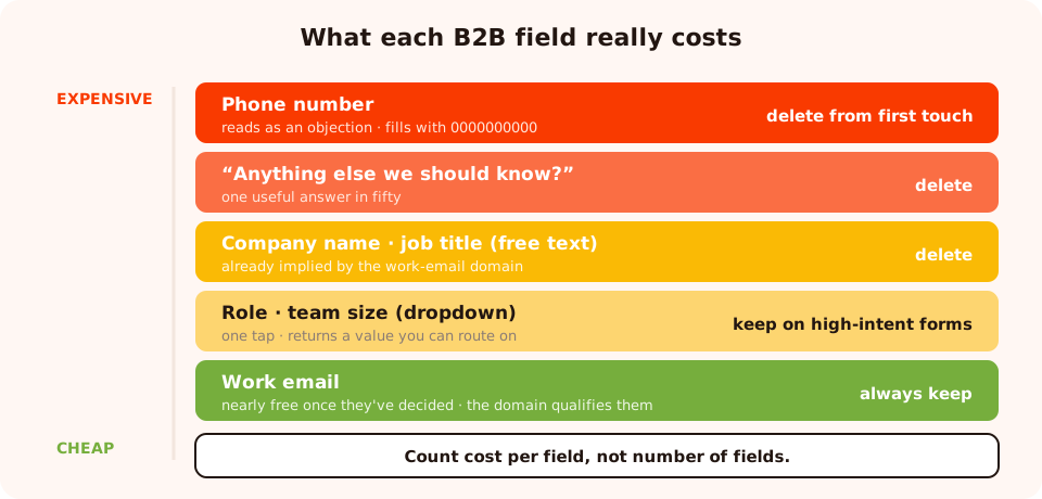
Count cost per field, not number of fields. The difference between rungs is enormous.
The so-what test
Before a field goes on a form, finish this sentence: "When someone answers this, ______ changes." The blank has to be an email that gets sent, a routing decision, a segment, or a specific sales action.
- "Role" → changes which case study the follow-up email leads with. Passes.
- "Team size" → decides whether this goes to self-serve nurture or to a human. Passes, on a high-intent form.
- "Company name" → already implied by the work email domain. Fails.
- "How did you hear about us?" → nobody has ever changed a decision because of this. Fails.
- "Anything else we should know?" → an open box that produces one useful answer in fifty. Fails.
Fields that fail don't get demoted to "optional". They get deleted. An optional field still adds visual length, still slows the scan, and still makes the form feel like paperwork.
Which fields survive, by form type
| Form | Fields | Email validation | Why |
|---|---|---|---|
| Newsletter / blog subscribe | Format & typos | Top of funnel. A personal address from an interested engineer is still a lead. | |
| Gated guide or report | Work email (+ role, optional) | Format & typos | The asset does the qualifying. Don't tax it twice. |
| Webinar registration | Name, work email | Format & typos | The name is used in the reminder emails, so it earns its slot. |
| Pricing / quote request | Work email, team size | Business emails only | High intent. Team size changes the answer you give. |
| Demo request | Name, work email, role, team size | Format & typos + business | Four fields is the honest ceiling. The phone number can wait for the call. |
Notice what's missing everywhere: company name, job title as free text, industry, country, and the source dropdown. Every one of them is either implied by the email domain, discoverable in thirty seconds by whoever picks up the lead, or genuinely unused.
Business-email validation: a qualifier that costs nothing
The single most efficient B2B form setting is one you don't have to add a field for. Set the email field's validation to accept only business emails and free mailbox providers are rejected with a clear message — "Please use your work email address" — so the visitor corrects it themselves.
Three reasons it beats an extra qualifying field:
- It qualifies without asking. The domain tells you the company; you skip the "company name" field entirely.
- It filters throwaways. The easiest way to grab a gated asset without hearing from you is a personal address, and this closes that route.
- It costs one dropdown, not one more thing for the visitor to type.
Use it on the right forms only. On demo, quote and pricing forms, a work address is the qualification. On a blog subscribe or a top-of-funnel guide, it rejects genuinely interested people who happen to be reading on a personal account — and you'll never know how many. There's a combined mode too, which adds the typo correction on top; that's the right setting for a demo form.
Two paths beat one form
The biggest structural mistake in B2B lead capture is treating "the demo page" as a single conversion path. Most of the traffic on that page isn't ready to talk to a person — and a longer form doesn't make them readier, it just makes them leave.
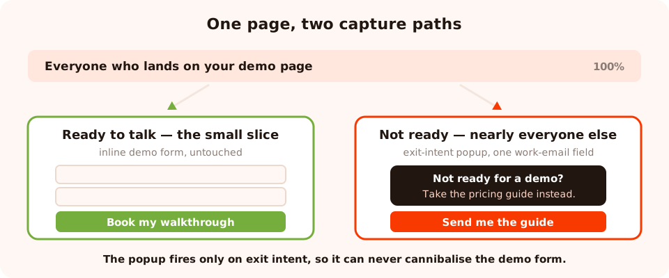
Keep the high-commitment form intact. Add a second, smaller path for the much larger group who aren't ready.
So run both:
- The inline form stays exactly as it is — it's the primary action of the page, and the people who fill it in are your best leads.
- An exit-intent popup offers the smaller thing to everyone about to leave: "Not ready for a demo? Take the pricing and implementation guide instead. No call required." One work-email field, one button.
This converts the objection that made them leave rather than fighting it. And because the popup only fires on a disengagement signal, it can't cannibalise the demo form — everyone it converts had already declined. The full reasoning is in the landing page popups guide.
A third path: the form the visitor opens
On long pricing pages, a plain link in the copy — "Get the price list as a PDF" — that opens the form on click converts unusually well, because the visitor chose it. Zero interruption, high intent.
<a href="#" onclick="ChilliPopup.open('YOUR_FORM_UUID'); return false;">
  Get the price list as a PDF
</a>

<!-- or render it in the flow of the page instead -->
<div class="chillipopup-inline" data-uuid="YOUR_FORM_UUID"></div>
Two worked forms
A gated report
Headline: The 2-page pricing and implementation guide
Support: What it costs, how long it takes, what you need in place. No call required.
Fields: Work email (format & typos)
Button: Send me the guide
Thank-you screen: the download link itself, plus "we've emailed it too"
One field. The asset qualifies; the form doesn't need to. Note the thank-you screen delivers the file rather than sending the visitor to their inbox — that's the difference between a download and a chore.
A demo request
Headline: See it on your data, in 20 minutes
Support: A working walkthrough, not a slide deck.
Fields: Name · Work email (business + typo validation) · Role
(dropdown) · Team size (dropdown)
Button: Book my walkthrough
Thank-you screen: the booking link, and what to have ready
Four fields, two of which are one tap. Note that role and team size are dropdowns, not text
boxes — a choice returns a normalised value you can actually route on, instead of
Mktg, marketing ops and Marketing in the same column.
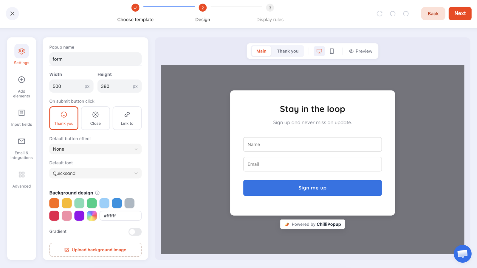
Dropdowns for anything you'll segment on; free text only where a human genuinely has to write something.
Get the rest of the fields — later
The fields you deleted don't have to disappear from your CRM forever. They just move to a moment where the person has already got something from you.
- On the confirmation screen. They've just converted. One question — "What are you hoping to fix first?" — has a response rate you'll never get on the form itself.
- On a return visit. A one-question quiz targeted at returning visitors collects the segmenter with a single tap.
- Inside a stepped ask. Build the capture as a two-screen survey: screen one is the required work email, screen two is one optional qualifier. If they bail on screen two you still keep what they entered as a partial response.
Keep an email field on every later ask so you can match the answers back — each campaign stores its own submissions, and the email is the key. The full sequencing method is in the progressive profiling guide.
What to measure on a B2B form
B2B volumes are small enough that chasing the conversion-rate number alone will mislead you. Three reads:
- Views vs submissions per form, compared against itself over time. Never against another form — a demo request and a newsletter signup are not comparable.
- Drop-off by question on stepped content. The dashboard ranks the questions people quit on, based on the last field they touched. That's your delete list, in priority order.
- What the values look like. The collected-fields breakdown shows the top values per field. A dropdown where 90% pick the same option didn't need asking — you could have assumed it.
When you want a real answer about a field rather than a guess, remove it in a variant and run an A/B test. One field at a time, or you'll learn nothing about which one mattered.
Seven mistakes on B2B lead capture forms
- Adding a field because a column is empty. The CRM schema is not a design brief.
- Free text where a dropdown belongs. Unnormalised values you can never segment on.
- Business-email validation on top-of-funnel content. It rejects real readers.
- A phone number on a first-touch form. The most expensive field in B2B, and the least honestly answered.
- One path only. Everyone who isn't ready leaves with nothing, and you learn nothing.
- A thank-you screen that only thanks. Deliver the asset there; the inbox can be the backup.
- Changing four fields at once and then wondering which change moved the number.
Build it in ChilliPopup
Forty-five minutes for a full rebuild. One pixel serves the inline form and the popup, so there's nothing extra to install — see the install guide.
1. Run the so-what test on the form you have
One line per field naming what changes. Delete everything that fails.
2. Convert survivors to choices where you can
Role and team size become dropdowns. You get clean values and the visitor gets one tap.
3. Set the email validation to match the form
Format-and-typos for content, business-emails-only for demo and quote forms, both together for the highest-intent ones.
4. Add the second path
An exit-intent popup on the demo and pricing pages offering the guide instead. One work-email field, restricted to those URLs, desktop exit intent with a mobile scroll twin.
5. Move the expensive fields to a later ask
Confirmation screen or a returning-visitor quiz. Keep an email field on it so you can match rows back.
6. Read drop-off in two weeks and delete one more field
There is almost always one more that can go.
Build the short form that qualifies anyway
Inline forms, exit-intent popups, one-question quizzes and validation — from one editor and one pixel. Free plan, no credit card required. Paid plans from $29/month.
Start free →Related reading
Frequently asked questions
How many fields should a B2B lead capture form have?
Three or fewer for content downloads, and no more than five for a demo request. Every field costs conversions, and the costs are wildly uneven — a work email is nearly free once someone has decided to convert, while a phone number or a budget question behaves like an objection.
Which fields actually qualify a B2B lead?
Only the ones that change what happens next: the work email domain (which tells you the company), the role or use case (which routes the follow-up), and — on high-intent forms only — team size or timeline. Company name, job title as free text, and "how did you hear about us" almost never change a decision and almost always cost conversions.
Should B2B forms require a work email?
On demo, quote and pricing forms, yes — a work address is the qualification, and the business-email validation mode rejects the common free mailbox providers with a clear "please use your work email address" message. On top-of-funnel content, leave it off: a genuinely interested engineer reading your guide on a personal address is still a lead.
Is a popup or an inline form better for B2B?
Both, for different jobs. The inline form on the page is the primary conversion path and should stay untouched. A popup is the second chance — an exit-intent offer of the lower-commitment asset for people who were about to leave the demo page without filling anything in.
How do I get the fields sales wants without a long form?
Ask later. Collect the work email now, then ask the qualifying question on a return visit or on the confirmation page, as a one-question quiz with tappable options. You end up with the same profile, collected at the speed a stranger is willing to give it.
What is a good conversion rate for a B2B form?
There is no universal number worth chasing — a demo form and an ungated newsletter form differ by an order of magnitude, and traffic source moves it further. Compare each form against itself over time, and treat a single-field change as the unit of experiment.