
A restaurant website gets a very particular kind of visitor: on a phone, in a hurry, usually within a few hours of wanting to eat. They want to know whether you are open, what you serve, and whether they can get a table. Everything else on the site is decoration until those three are answered.
Popups are the cheapest way to answer them without touching the site's design — and the only practical way to keep the visitors who cannot come tonight. Here are ten campaigns worth running, the copy for each, and the mobile rules that matter more here than almost anywhere else.
Key Takeaways
- Never fire on arrival. Someone checking your hours must see them before anything covers the page.
- Say the action, not the welcome. "Book a table for tonight" beats "Welcome to our restaurant".
- Design for the thumb. Restaurant traffic is overwhelmingly mobile — a bottom bar beats a centre card.
- A birthday club is the best list you can build — one genuinely welcome email a year, with a reason to visit.
- Measure the proxy honestly. Clicks and submissions are what you can see; the table is what you are counting.
Why restaurant websites are a special case
Three things make restaurant traffic different from ecommerce traffic, and each one changes what a popup should do.
- The visit is short and task-shaped. Hours, menu, address, book. Most sessions are under a minute, which means a popup that fires at three seconds interrupts the only thing the visitor came to do.
- It is a mobile-first audience. Often standing on a street, deciding between you and somewhere two doors down. A full-screen overlay on that screen is the difference between a booking and a back button.
- The conversion happens offline. No checkout event, no order confirmation page. Your measurement is a proxy, and you should decide which proxy before you launch.

Four moments that map to four different visitors — the browser, the almost-booker, the local and the office manager planning lunch for twelve.
Ten restaurant popup campaigns worth running
1. The booking nudge on the menu page
Someone reading your menu is closer to eating with you than anyone else on the site. After a short delay, a small bottom bar: "Like what you see? Book a table →" with a button straight to your booking system.
2. Exit intent on the booking page
People bounce off booking pages for one reason: their time is not available. Catch them on the way out: "No table at 8? Tell us when you want to come and we'll call you." Name, phone, date, party size. That is a booking your booking system was about to lose.
3. The specials list
The evergreen list builder for a restaurant, and the offer people say yes to: "This week's specials, every Thursday morning. One email, no spam." It works because it is specific, it is short, and it lands on the day people decide about the weekend.
4. The birthday club
The single best list a restaurant can own. "Join the birthday club — a glass of something on us in your birthday month." Email plus birthday month — a choice list of twelve, not a date picker, which is one tap instead of three and stores a clean value you can segment on.
5. The quiet-night offer
Schedule it so it only appears on the days you need to fill. Advanced targeting supports a weekday-and-hour schedule, so a Tuesday-and-Wednesday offer really does stay invisible on a Friday night when you are already full.
6. The catering and private-hire enquiry
Your highest-value visitor is the person organising lunch for twelve, and they are usually on a different page from the diner. A page-targeted popup on your events or catering page with a short form — name, email, date, headcount — beats a "contact us" mailto link by a wide margin. See the contact form examples for the field order.
7. The opening-hours announcement
Bank holidays, kitchen closures, a change of hours. A slim top bar answers the question before anyone has to phone you: "Closed Monday 14th — back Tuesday from 6pm." Use a date window so it disappears on its own.
8. The event or supper-club promotion
Wine dinners, live music, tasting nights. A popup with a photo, a date and a countdown to the ticket deadline, targeted at your events page and the homepage, with the frequency capped so a regular does not meet it every visit.
9. The post-visit feedback survey
Two questions: "How was it?" as a star rating, then "What would you change?" as one optional open answer. The survey questions library has more you can steal. Each campaign also gives you a copyable direct link that opens it on arrival — put that link behind a QR code on the table card, and the survey opens the moment someone scans it.
10. The hiring notice
Unglamorous and genuinely useful: "We're hiring a chef de partie." Your website already reaches exactly the local, hospitality-adjacent people you want, and it costs nothing to ask them.
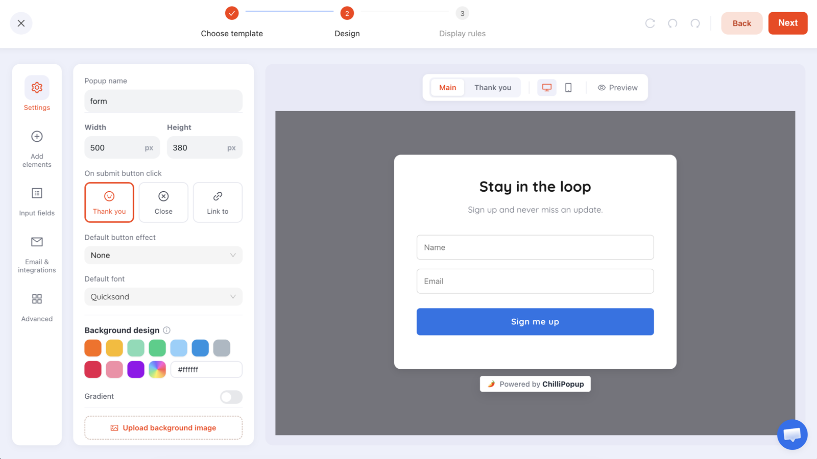
A four-field enquiry form beats a "contact us" email address — especially for the bookings worth the most.
Copy that works on a restaurant site
| Campaign | Headline | Button |
|---|---|---|
| Booking nudge | "Table for tonight?" | Check availability |
| Booking-page exit | "Nothing at the time you wanted?" | Tell us when |
| Specials list | "This week's specials, every Thursday" | Send them to me |
| Birthday club | "A drink on us in your birthday month" | Join the club |
| Quiet night | "Tuesday: two courses for £20" | Book Tuesday |
| Catering | "Feeding a group? We do that." | Get a quote |
Three rules behind all of them:
- Be concrete about time. "Tonight", "Thursday", "your birthday month" — vague offers get postponed, and postponed means forgotten.
- Name the food or the occasion. "Two courses for £20" beats "special offer" because one is a plan and the other is a category.
- Make the button the action. "Check availability" tells them what happens next; "Submit" tells them nothing.
More patterns in the popup copywriting guide.
The mobile rules that matter most here
Restaurant traffic skews mobile harder than almost any other category, so these settings are not optional polish:
- Bottom bar, not centre card. It leaves the menu and the hours visible behind it.
- One field. An email, or a phone number. Anything more on a phone, standing outside, is not going to be typed.
- Page scroll instead of exit intent. Exit intent has no reliable equivalent on a touchscreen — fire at around half the page instead.
- A close button you can actually hit. Small targets on a phone make a helpful popup feel like a trap.
- A real delay. Long enough that the visitor has seen your hours and address first.
The mobile popup guide goes through thumb reach and keyboard behaviour in detail.
The one unforgivable restaurant popup: a full-screen overlay that appears instantly and covers your opening hours. Half the people who land on your site are asking one question — "are you open?" — and that popup answers it with "apparently not".
Fill the quiet nights
Booking nudges, enquiry forms, birthday clubs and feedback surveys — built once, scheduled for the nights you need them. Free plan, no credit card required. Paid plans from $29/month.
Start free →A four-campaign setup for a single-site restaurant
This is a complete programme. It takes an afternoon and then mostly runs itself.
- Specials list — bottom bar, menu and homepage, 15-second delay, frequency once every few days, audience everyone, hidden after signup.
- Booking-page exit — desktop exit intent and mobile scroll, targeted at the booking URL only, capturing name, phone, date and party size.
- Quiet-night offer — scheduled to Monday through Wednesday, targeted at the homepage, with a real end date so it expires by itself.
- Catering enquiry — targeted at the events or catering page, no delay needed, four fields, a button that says "Get a quote".
Notice that no two of them can meet the same visitor on the same page. That is deliberate — the frequency guide explains why separating campaigns by page is the easiest way to stay at one interruption per visit.
Measuring when the conversion happens at a table
You will never see the full loop, so pick your proxies deliberately and stop pretending they are revenue:
- Clicks through to the booking system. The campaign records clicks, so this is directly countable.
- Form submissions. Enquiries, waitlist requests, catering leads — real, attributable demand.
- List growth per week. The compounding asset. A restaurant with 2,000 local subscribers has a lever no advertising platform can take away.
- The offline check. Ask the team to note how many people mention the offer. It is crude, and it is the only number that touches the actual table.
When two of those move together, believe it. When only one does, wait. The popup analytics guide covers reading the campaign side properly.

Clicks and submissions are what a website can see. The table is what you are counting — keep both numbers in the same conversation.
Six mistakes restaurant sites make
- Covering the opening hours. The most common question on your site, blocked by your own marketing.
- Asking for a booking you cannot honour. If nobody checks the inbox on a Saturday, do not capture Saturday requests by email.
- Generic "10% off" popups. Restaurants sell occasions, not discounts. A specific dish, night or event outperforms a percentage.
- Running the same popup all year. Regulars are your best customers and they see everything. Rotate seasonally — the seasonal calendar is a good starting grid.
- Collecting emails with nowhere to send from. Set up the sending tool before the signup popup, not three months later.
- Ignoring the phone number. For a local restaurant, a phone field often outperforms an email one — just be clear about what you will use it for.
Related reading
Frequently asked questions
Do restaurant websites need popups?
They benefit more than most sites, because a restaurant's visitors are overwhelmingly mobile, in a hurry, and looking for one of three things: hours, menu or a table. A single well-timed popup that answers the question they came for — or captures an email from the ones who cannot come tonight — usually outperforms a redesign of the page they landed on.
What should a restaurant popup say?
Say the next action, not the brand. "Book a table for tonight", "See this week's specials", "Get the set menu as a PDF" all beat "Welcome to our restaurant". Restaurant visitors arrive with a task; the popup that helps them finish it converts, and the one that introduces you gets closed.
When should a restaurant popup appear?
After a few seconds on the menu or homepage, or on exit intent from the booking page. Never on arrival — someone checking whether you are open tonight needs to see your hours before anything covers them, especially on a phone.
How can a restaurant grow an email list from its website?
Offer something with a specific reason to open: the weekly specials, first look at event nights, or a birthday-month treat. A birthday club is particularly effective for restaurants because it gives you a genuinely useful reason to contact someone once a year with an offer they are happy to receive.
Can a popup take a table booking?
It can capture the request — name, date, party size, phone — and it can link straight to whatever booking system you already use. Which you choose depends on your setup: a link keeps everything in one system, while a capture form is better when bookings are handled by a person who checks a phone or an inbox.
How do I measure a popup when the sale happens in the restaurant?
Measure the step you can see and be honest that it is a proxy. Track clicks through to the booking system, form submissions for enquiries, and list growth over time — then check the offline side manually by asking staff to note how many people mention the offer. Two imperfect measurements pointing the same way are enough to make a decision.