"Contact form" is a category, not a design. A support request, a quote enquiry, a table booking and a job application arrive from different people, in different moods, with different tolerance for questions — and the form that serves all four serves none of them well.
Below are eight layouts for eight real jobs, each with the fields, the wording and the confirmation copy. Then the rules underneath them: field order, validation, and what to promise when someone hits send.
Key Takeaways
- One form per job. Support, sales, quotes and careers deserve their own fields and their own promise.
- Three fields carry a general enquiry. Name, email, message. Add a field only when it changes what happens next.
- Explain any field that looks like a sales trap — phone and company are the two that need a reason.
- The confirmation is part of the form. Say it arrived, when you will reply, and from which address.
- Inline on the contact page, popup everywhere else. Different intent, different placement.
Before the fields: what is this form for?
Every good contact form starts with a sentence you write for yourself, not the visitor: "This form exists so that ___ can tell us ___, and we will respond by ___." Fill it in and the field list writes itself. Leave it blank and you end up with the default five-field form that routes everything to one overloaded inbox.
The second decision is where it lives. A visitor on your contact page has already decided to get in touch — put the form inline, in front of them. A visitor on a service page has not, which is where a popup or an exit-intent enquiry offer belongs. The form best practices guide covers the mechanics of both.

Four jobs, four field lists. The mistake is not the length — it is using one shape for all of them.
1. The general enquiry form
Job: catch anything that does not have a better home.
- Name — one field, not first and last.
- Email — with format validation switched on.
- Message — a multi-line field, with a placeholder that invites detail: "What can we help with?"
Three fields. Resist everything else. The most common way to ruin this form is a "subject" dropdown that makes the visitor guess your internal team structure.
Confirmation: "Got it. We reply within one working day — look out for an email from hello@yourcompany.com."
2. The support request form
Job: get enough detail to solve it without a round trip.
- Email — first, because it identifies the account.
- What do you need help with? — a choice question with three to five real categories, which routes the ticket and sets the visitor's expectations.
- Order or account reference — optional, clearly labelled optional.
- What happened? — a message field with a placeholder that asks for the specifics: "What did you expect, and what happened instead?"
That placeholder is worth more than any other change you can make to a support form. It converts "it doesn't work" into a description someone can act on.
Confirmation: "Thanks — we've got it. Most issues get a reply the same working day."
3. The sales enquiry form
Job: qualify lightly without interrogating.
- Work email — with business-email validation on, so free-provider addresses are rejected at submit time.
- Company — justified here, because it changes who replies.
- What are you trying to solve? — a choice list of your three or four real use cases.
- Anything we should know? — optional message.
Four fields is the ceiling for an inbound sales form. Everything else your team wants — team size, budget, timeline — belongs in the reply or on the call. The B2B lead capture guide makes the case in detail.
4. The quote request form
Job: collect enough to price it accurately.
This is the one form where six fields are fine, because the visitor wants a precise answer and can see why each question exists:
- Name and email
- Phone — labelled "only if you'd rather we call"
- What do you need? — a choice list of your services
- When do you need it? — a choice list of timeframes, not a date picker
- Anything else? — optional message
Choice lists beat free text on both sides. The visitor answers in one tap instead of typing, and you get a normalised value you can sort by — rather than "asap", "ASAP" and "as soon as possible" in three different rows.
5. The booking or appointment request
Job: capture a request you can actually honour.
- Name
- Phone — the primary channel for anything time-sensitive
- Preferred date
- Party size or service — a choice list
- Email — optional, for the confirmation
One rule above all: only capture what you will honour. If nobody checks the inbox on a Sunday, the confirmation must say so. A restaurant or clinic that collects Sunday requests and answers on Tuesday has built a machine for disappointing people — see the restaurant popups guide for the full setup.
6. The careers form
Job: let a good candidate raise their hand in under a minute.
- Name and email
- Which role? — a choice list of open positions
- Link to your work or profile — one URL field
- Why this job? — optional short message
No file upload, no work history, no cover letter box. The purpose of this form is to start a conversation, not to replace an applicant tracking system. Ask for the CV in the reply.
7. The feedback form
Job: hear from people who would never write in.
- A rating — one tap, no typing
- What would you change? — optional open answer
- Email — optional, labelled "only if you'd like a reply"
Making the email optional is what makes this form work. Anonymous feedback is more honest, and the people who want a response will supply an address anyway. Question wording matters more than layout here — the survey questions library has fifty you can copy.
8. The partnership or press enquiry
Job: filter, politely.
- Name, email, organisation
- What kind of enquiry? — Press / Partnership / Affiliate / Something else
- Message, with a placeholder that sets the bar: "Tell us what you have in mind and what you're hoping we'd do."
That placeholder is a filter. It costs nothing and it dramatically improves the quality of what lands in the inbox, because vague enquiries fail to answer it.
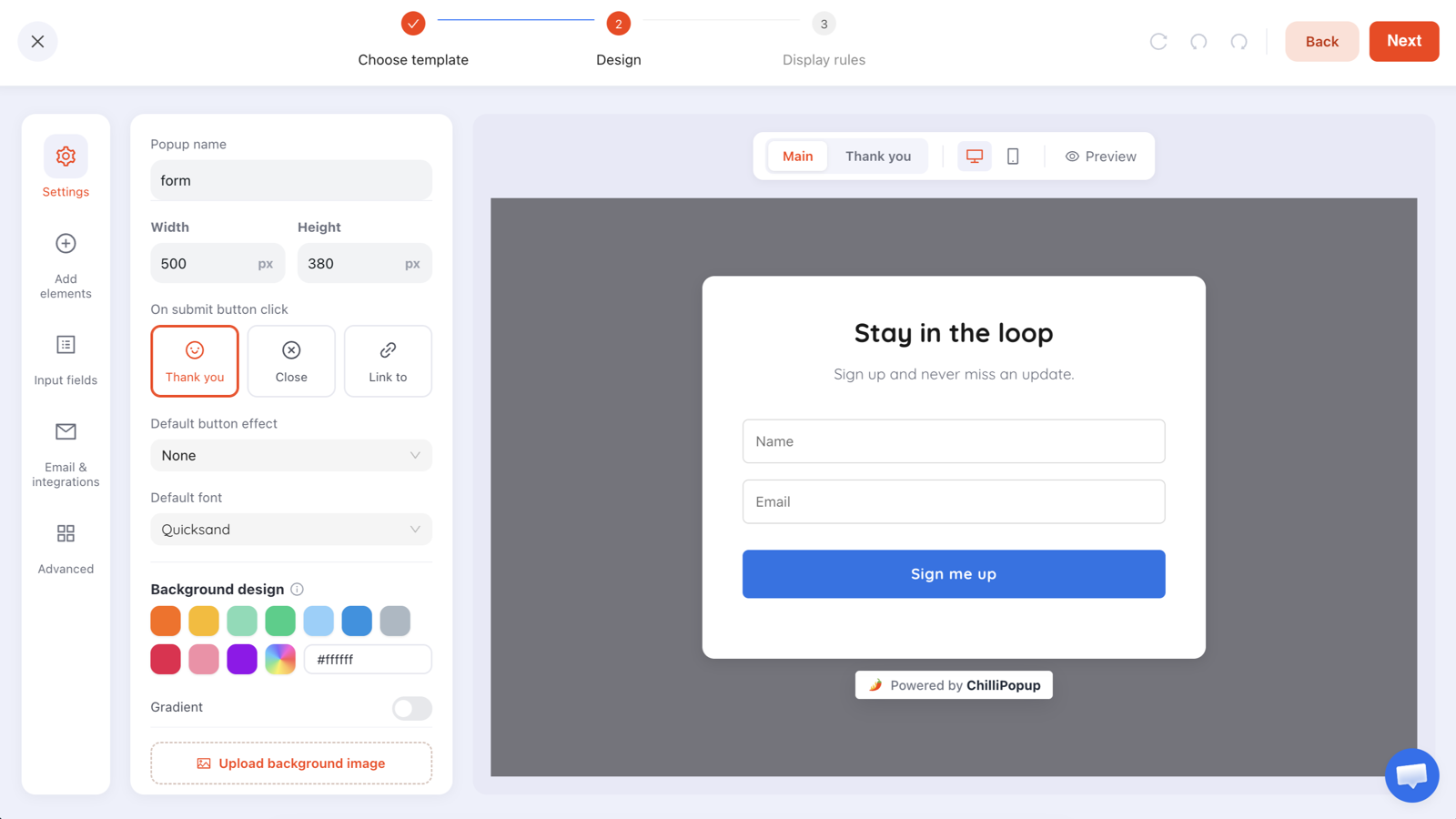
Same builder, different field lists — the design work is deciding what to leave out.
Build the form the job actually needs
Name, email, phone, message, choice and consent fields — with validation, an inline or triggered placement, and submissions stored per campaign. Free plan, no credit card required. Paid plans from $29/month.
Start free →The rules underneath all eight
Field order: easy to hard, identity to detail
Start with what people can answer without thinking — name, email — and finish with what requires composing a sentence. Starting with "How can we help?" as the first field makes people close the tab, because the first thing they meet is work.
Labels above fields, and no placeholder-only forms
A placeholder disappears the moment someone types, taking the label with it. Use a real label and let the placeholder do a different job — an example, or a hint about the level of detail you want.
Validate at submit, not on every keystroke
Nothing makes a form feel more hostile than an error appearing while you are still typing. Check on submit, mark the specific field, and say what to fix. Email validation catches malformed addresses and common typos; business-email validation is the right extra step on a sales form, and the wrong one on a support form where customers write in from personal addresses.
Explain any field that looks like a trap
| Field | Reads as | Label that fixes it |
|---|---|---|
| Phone | "We're going to call you repeatedly" | "Phone — only if you'd rather we call" |
| Company | "You're being qualified" | "Company — so we route this to the right person" |
| Budget | "We'll price to what you say" | Use ranges, mark optional, or ask on the call |
| Marketing consent | "This is actually a signup form" | Unticked, separate, and specific about what arrives |
That last row is not only a UX point. A contact form that quietly adds people to a mailing list is a consent problem too — the GDPR popup guide covers what the tick has to look like.
The confirmation screen is part of the form
Three sentences, always:
- It arrived. "Got it."
- When you will reply. "Within one working day."
- Where to look. "From hello@yourcompany.com — check spam if it's quiet."
Most duplicate enquiries are caused by a missing version of this screen. Someone who is not sure the message sent will send it again, from a different address, and now you have two threads.
Placement: inline, popup, or both
A form can live directly in the page or arrive as a triggered overlay, and the right answer depends on whether contacting you is the visitor's current task.
- Contact page → inline. Drop a mount div where the form should appear, and the pixel renders it in place:
<div class="chillipopup-inline" data-uuid="YOUR_FORM_UUID"></div>- Service or pricing page → exit intent. The visitor came to evaluate, not to write. Offer the enquiry form on the way out.
- Long article → inline, mid-page. Right after the section that creates the question.
- Every page → nothing. A site-wide contact popup is noise. Give people a contact link and let them choose.
Seven mistakes that quietly kill replies
- One form for every job. The most common, and the most expensive.
- Required fields nobody needs. Every asterisk is a small argument with the visitor.
- A subject dropdown built from your org chart. Label the options by the visitor's problem, not your teams.
- No promise of a reply time. Silence after submit is where trust is lost.
- An unexplained phone field. One of the single biggest drops in completion on a contact form.
- Errors that just say "invalid". Say which field and what is wrong with it.
- Nobody watching the inbox. The best form in the world cannot fix a two-week reply time.
Related reading
Frequently asked questions
What fields should a contact form have?
Name, email and message will carry most general enquiries — three fields, nothing else. Add a field only when it changes what happens to the message: a routing choice so it reaches the right person, a phone number if you will genuinely call, or a date if the enquiry is time-bound. Everything else is friction with no payoff.
How many fields is too many for a contact form?
It depends on the job, not on a magic number. A general enquiry form should be three fields; a quote request can justify six because the visitor wants an accurate answer and understands why you are asking. The test is whether the visitor can see why each field exists — when they cannot, the form starts feeling like an application.
Should a contact form have a phone number field?
Only if someone will actually call, and only if you say so. An unexplained phone field reads as a sales trap and is one of the biggest single drops in completion on a contact form. If you need it, label it honestly — "Phone (only if you'd rather we call)" — and make it optional.
What should a contact form say after it is submitted?
Three things: that it arrived, when to expect a reply, and where to look. "Got it — we reply within one working day, from hello@yourcompany.com" prevents the two support tickets that a bare "Thank you" creates. A confirmation screen that sets an expectation is the cheapest customer-service improvement available.
How do I stop spam in a contact form?
Start with email validation so malformed and obviously fake addresses are rejected at submit time, and for business enquiry forms consider restricting to business email addresses so free-provider signups are filtered out. Beyond that, avoid publishing a raw mailto address next to the form — the address is what bots harvest, not the form.
Is an inline contact form better than a popup?
For a contact page, inline — someone who navigated there has already decided to get in touch and should meet the form immediately. Popups are for the pages where contacting you is not the visitor's current task: an exit-intent enquiry offer on a service page, or a booking prompt on a menu page. Use both, for different jobs.