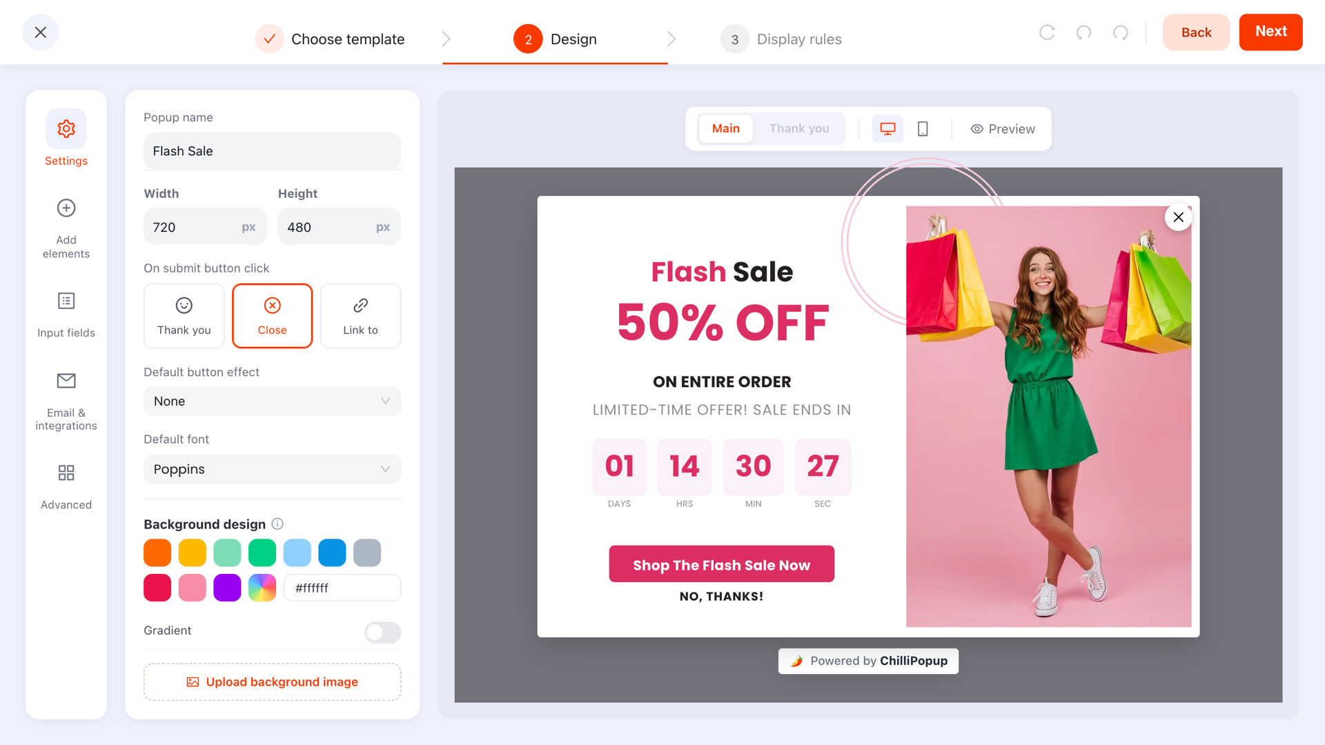
A popup thank-you screen has four jobs: confirm the submission worked, deliver whatever you promised, say what happens next and when, and offer one small next step if there is a useful one. The word "Thanks!" does none of them, which is why it is the most wasted screen in most popup campaigns.
It is also the only screen in the funnel where the visitor is unambiguously on your side. They typed something in. They want it to have worked. Whatever you put here is read — which is more than you can say for the popup that preceded it.
Key Takeaways
- Deliver on the screen, not only by email. A code the visitor can copy immediately converts far better than one that is "on its way".
- Set the expectation. Name the sender, say how long the email takes, mention Promotions and spam.
- One extra ask, maximum — and only if it is a single tap that changes what they receive.
- Keep the design continuous. The thank-you step inherits the popup's look by default; that is the right default.
- Games have three of these screens. The losing screen is the one that deserves the most care.
What the thank-you screen actually is
In ChilliPopup, a popup is not one canvas. It has a main step and a thank-you step that replaces it after a successful submit, with its own blocks — text, images, buttons, a coupon code — laid out exactly the way the main step is. By default it inherits the main design's background, image, font and text colour, so the visitor experiences one continuous moment rather than a jump to a different-looking box.
Every content type has one. Forms confirm inline where the form was. Surveys and quizzes finish on a thank-you step at the end of their steps. Prize games have three separate ones, covered further down.

Four jobs, in this order. Anything that is not doing one of them is decoration.
Job 1: confirm it worked
One short line, in the first person plural, in past tense. "You're in." "That's done." "Got it — you're on the list." The visitor's actual question at this moment is "did that submit?", and answering it in three words buys you the attention for everything else.
What does not work: "Thank you for subscribing to our newsletter." It is about you, it confirms nothing they did not already assume, and it uses the one line everybody skims past.
Job 2: deliver what you promised
If the popup offered a discount code, the code goes here. On the screen. Copyable. Not "check your email in a few minutes" — that is where conversions go to die, because a meaningful share of people never open the email and the ones who do have already left your site.
The coupon block exists for exactly this: it renders the code in a bordered, dashed-outline panel and copies it to the clipboard when the visitor taps it, so there is no select-and-drag on a phone. Put it in the centre of the screen at a size you can read from arm's length.
Belt and braces. Show the code on the screen and send it by email. The screen converts the session that is happening right now; the email rescues the person who closed the tab, and gives you a reason for the first message to land.
For non-discount offers the same rule applies in a different shape: a guide gets a download button, an early-access list gets the date, a quiz gets the result. Deliver something on the screen even when the substance arrives later.
Job 3: say what happens next — and when
This is the line almost every popup omits, and it is the one that reduces support messages, missed emails and unsubscribes.
- Name the sender. "It comes from Northfield Home" — because people search their inbox for a brand, not for "confirm subscription".
- Give a timescale. "Usually within a minute." Anything vaguer invites a second submission ten minutes later.
- Mention Promotions and spam in one short clause. It costs six words and recovers real subscribers.
- Say what the code applies to if there are conditions. Discovering an exclusion at checkout is worse than never having the code.
Job 4: one next step, if you have a good one
A button on the thank-you screen can link somewhere and close the popup at the same time, which makes it a genuinely useful piece of routing. Good destinations: the collection the offer applies to, the new arrivals page, the guide they just asked for. Bad destinations: your homepage, your social profiles, a second signup form.
One ask, and only if it is a tap. A single choice question — "What are you shopping for?" with four options — is fair here and gives you a segment you can route on. A second email field, a phone number or an open text box is not. You are spending goodwill you just earned; spend it once.
Twelve thank-you screens, with copy
Paste and adapt. Each of these assumes the popup that preceded it did its job — the copywriting guide covers that half.
| Campaign | Thank-you screen copy | The next step |
|---|---|---|
| First-order discount | "You're in. Here's 10% off — tap the code to copy it. We've emailed it too, in case you lose this tab." | Button: "Start shopping" |
| Newsletter signup | "Done. One email a week, on Thursdays, and nothing else. First one lands this Thursday." | Button: "See what's new" |
| Lead magnet / guide | "Your copy is on the way from Northfield — usually within a minute. Not there? Check Promotions." | Button: "Read it now" (direct link) |
| Back-in-stock alert | "We'll email you the moment it's back — you'll be in the first batch we tell." | Button: "See what's in stock now" |
| Waitlist | "You're on the list. Doors open on the 14th and you'll get 24 hours' head start." | Add to calendar link |
| Quiz result | "Based on your answers: the Medium Roast. Here's why, and 10% to try it." | Button: "Shop your match" |
| NPS or feedback survey | "Thank you — genuinely. A human reads every one of these, and this one goes to the product team." | None. Let it close. |
| Exit-intent save | "Nice one. Your basket is saved and the code is below — it's good for 48 hours." | Button: "Back to my basket" |
| B2B enquiry form | "Got it. Someone from the trade team replies within one working day, from @northfield.com." | Button: "Download the trade price list" |
| Event or webinar | "Saved your seat for Thursday 2pm. The joining link is in your inbox — add it to your calendar now so it's not a surprise." | Add to calendar link |
| Double opt-in signup | "Almost there. Click the button in the email we just sent and your code is yours." | None — the email is the next step |
| Post-purchase question | "Thanks — that's genuinely useful. Your order is already being packed." | Button: "Track my order" |
Notice how few of them say "thank you". Confirmation, delivery and the next step do the work; gratitude is implied by the fact that you gave them something.
Designing it: what to change and what to leave
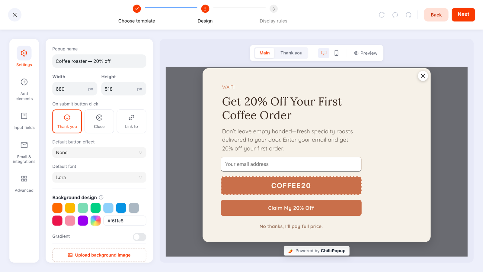
The thank-you step is a canvas like any other — same blocks, same controls, inheriting the main design unless you say otherwise.
Four design decisions, and sensible defaults for each:
- Inherit the style. On by default, and usually right. The background, image, font and text colour carry over, so the screen reads as the same object changing state rather than a new window. Turn inheritance off only for a deliberate effect.
- Confetti. A celebratory burst fires by default when the thank-you step appears. Keep it for wins and discounts; turn it off for anything sober — a complaint form, a feedback survey, a B2B enquiry.
- Less content than the main step. The main step had to persuade. This one has to confirm. Three or four blocks is usually the whole screen.
- Do not auto-close it if it carries a code. A thank-you screen that vanishes while someone is copying a discount is a support ticket waiting to happen.

The four jobs stay the same; only the delivery changes with the campaign type.
Prize games have three thank-you screens
A spin wheel, scratch card, slot machine or claw machine splits the after-moment into three named screens, each with its own canvas:
- The claim screen, shown after a winning play — this is where the email field belongs, and its only job is to be one field and one button.
- The win screen, which reveals the actual code. Confetti earns its place here. Say what the prize is, show the code, give the expiry.
- The losing screen. The one that gets three minutes of thought and deserves twenty. A visitor who played and lost is still a visitor who engaged — give them something small, say something warm, and do not make them feel foolish for playing.
A losing screen worth copying: "Ah — so close. Have 5% anyway for being a good sport, and we'll tell you when the next game goes live." It costs you almost nothing and it converts a loss into a subscriber.
Our spin wheel prize ideas guide covers what should be on the slices; this is what should be on the screens afterwards.
Design the screen everyone actually reads
Popups, forms, surveys, quizzes and prize games — each with its own thank-you canvas, coupon blocks and next-step buttons. Free plan, no credit card required. Paid plans from $29/month.
Start free →What never belongs on a thank-you screen
- A second real ask. Another email field, a phone number, a free-text box. One tap is the ceiling.
- Every social icon you own. You just earned an email address; sending the visitor to a feed they will lose an hour in is not a win.
- A wall of terms. Link to them. One line about the important condition, the rest behind a link.
- "Thanks for subscribing!" and nothing else. The default, and the waste.
- A code with no expiry mentioned. If it expires, say when, here — not only in the email.
- An auto-close timer on a screen with a code. See above. It is the single cruellest configuration in popup design.
How to tell whether it is working
The thank-you screen sits after the conversion, so it does not have a conversion rate of its own. Read it through the numbers around it instead.
- Code redemption rate. The clearest signal. If submissions are healthy and redemptions are not, the code is not reaching people — start with this screen.
- Clicks on the next-step button. Reported alongside views and submissions per campaign. A next step nobody takes is a next step worth changing.
- Support messages asking "where is my code?" The most honest usability metric you have, and it usually points straight at a missing expectation-setting line.
- Confirmation rate, if you run double opt-in. That number lives in your email tool and is decided almost entirely by what this screen said — the opt-in guide covers it.
One easy experiment to start with: add the code to the screen on a campaign that currently only emails it, change nothing else, and compare redemptions over the next two weeks. It is usually the largest single improvement available in a popup that already converts.
Related reading
Frequently asked questions
What should a popup thank-you screen say?
Four things, in this order: confirm that it worked, deliver whatever you promised, say what happens next and when, and — if it is genuinely useful — offer one small next step. "Thanks!" on its own does none of those, which is why it is the most wasted screen in most popups.
Can a popup show a discount code straight after signup?
Yes, and it usually should. A coupon block on the thank-you screen displays the code with a dashed border and copies it to the clipboard when the visitor taps it. Send the same code by email as well, so nobody loses it by closing the tab.
Should the thank-you screen look different from the popup?
Not by default. In ChilliPopup the thank-you step inherits the main design's background, image, font and text colour, which keeps the moment continuous. Turn inheritance off only when the change is deliberate — a full-bleed celebration, for example.
Is it OK to ask another question on the thank-you screen?
One, if it is a single tap and it genuinely changes what you send them. A choice question with three or four options is fair; a second email field, a phone number or a free-text box is not. The visitor has already converted — you are spending goodwill, so spend it once.
How long should a thank-you screen stay open?
Until the visitor closes it, unless it contains nothing they need. If it carries a code they have to copy, never auto-close it. If it is a plain confirmation, closing after a few seconds is fine and keeps the page clean.
Do surveys, quizzes and prize games have thank-you screens too?
Yes, and games have three of them: a claim screen after a winning play, a win screen that reveals the reward, and a losing screen. Each one is its own canvas with its own copy, and the losing screen is the one most worth spending time on.