
Most popups that fail are not badly designed. They are badly traded. The visitor is asked to hand over a permanent line of contact in exchange for the phrase "stay in the loop", and they decline — not because they hate popups, but because nothing was actually offered.
A lead generation popup is a trade. It has one offer, one field and one moment, and the whole craft is in making those three agree with each other. Get that right and the same widget that annoys people on one site quietly becomes the best-performing acquisition channel on another.
Key Takeaways
- One offer, one field, one moment. Every additional element you add is another reason to close it.
- The offer decides the conversion rate — far more than colours, corner radius or button copy.
- Timing is a rule, not a guess. Exit intent on commercial pages, 50% scroll on articles, a delay on pages people evaluate.
- Turn off "show again after conversion" or you will keep selling the newsletter to your own subscribers.
- Junk leads are a cost, not a vanity metric. Validate the address, ask for consent once, and delete fields nobody consumes.
What is a lead generation popup?
Lead generation popup, in two sentences
A lead generation popup is an overlay that offers a visitor something specific — a discount, a guide, early access, a quote — in exchange for a way to contact them. Unlike an announcement or a cookie notice, its success is measurable in contacts: one offer, one field, one follow-up.
That definition rules a lot of things out, which is useful. A popup that says "we use cookies" is not lead generation. Neither is one that promotes a sale without capturing anything, or one that asks six questions before it will let anyone through. If you cannot say what the visitor gets and what you get, you do not have a lead generation popup — you have an interruption.
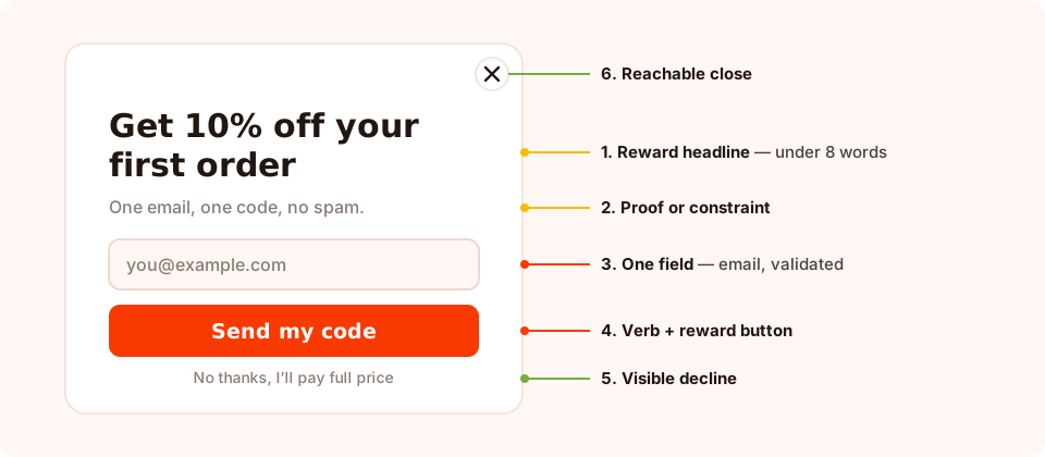
Six parts, and only one of them is a form field. Everything here exists to make the trade obvious.
Note what is not in that anatomy: a second field, a logo, a paragraph about your company, or two competing offers. Popups are read in about a second and a half. Anything that is not the offer, the ask or the exit is working against you.
The five rules of a lead generation popup that converts
1. Name the reward in the headline
The headline is the offer, not a greeting. "Get 10% off your first order" beats "Join our community" because it is specific, immediate and easy to value. If your headline would work on any other website in your industry, it is not a headline — it is wallpaper.
2. Ask for one thing
One field. Email, or a phone number if SMS is genuinely a channel you use. Not both, not a first name you will never merge into anything, and definitely not "How did you hear about us?" — a question that produces friction on the way in and nothing you can act on afterwards.
3. Trigger on a signal, not on arrival
A popup that fires the instant a page loads asks for a decision before the visitor has any reason to make one. Wait for a signal: they are leaving, they have read half the article, they have lingered on pricing, they have been idle for a while. The signal is what makes the interruption defensible.
4. Make the exit obvious
Counter-intuitively, a visible close control and an explicit decline link tend to raise conversions rather than lower them. A popup that feels like a trap gets dismissed reflexively; one that offers a clean "no thanks, I'll pay full price" gets read — and the people who then say yes are worth more.
5. Deliver instantly
The reward should appear on the thank-you screen the moment the form is submitted, not only in an email that may take minutes to arrive or land in spam. Set the submit action to a thank-you step, put the code or the download link on it, and send the email as a backup rather than as the delivery mechanism.
The one-sentence test. "In exchange for [reward], I am asking a [visitor type] on [page] for their [field] at the moment they [signal]." If you cannot finish that sentence, the campaign is not ready to launch.
Six offers that earn an email address
The offer is the single biggest lever you have. These six cover almost every site, ranked roughly by how much they cost you to run.
| Offer | Best for | What it costs you | Lead quality |
|---|---|---|---|
| Percentage or fixed discount | Stores with a repeat-purchase habit | Margin on the first order | Mixed — attracts deal seekers as well as buyers |
| Free shipping threshold | Higher basket values, heavy items | Fulfilment, but often less than a discount | Good — signals real purchase intent |
| Useful document (guide, checklist, template) | B2B, services, considered purchases | One-off production time | High when the document is narrow and specific |
| Early access or restock alert | Launches, limited drops, out-of-stock pages | Nothing — you were going to launch anyway | Very high — they asked to be told |
| A game with a prize | Traffic that ignores static popups | The prize pool | Mixed, but volume is usually the highest |
| A quiz with a result | Wide catalogues, "which one is right for me" questions | Building the question set once | High — you learn something as well as capturing |
Two of those deserve a note. A game — a spin wheel, scratch card, slot machine or claw machine — moves the ask to the claim screen: the visitor plays, then fills in the form to reveal what they won. The outcome is decided server-side, so the prize odds cannot be rigged from the browser, and the prize code is never exposed in the page source before it is won. A quiz does something different: it earns the email and tells you which segment the person belongs to, which is worth more than the address on its own.
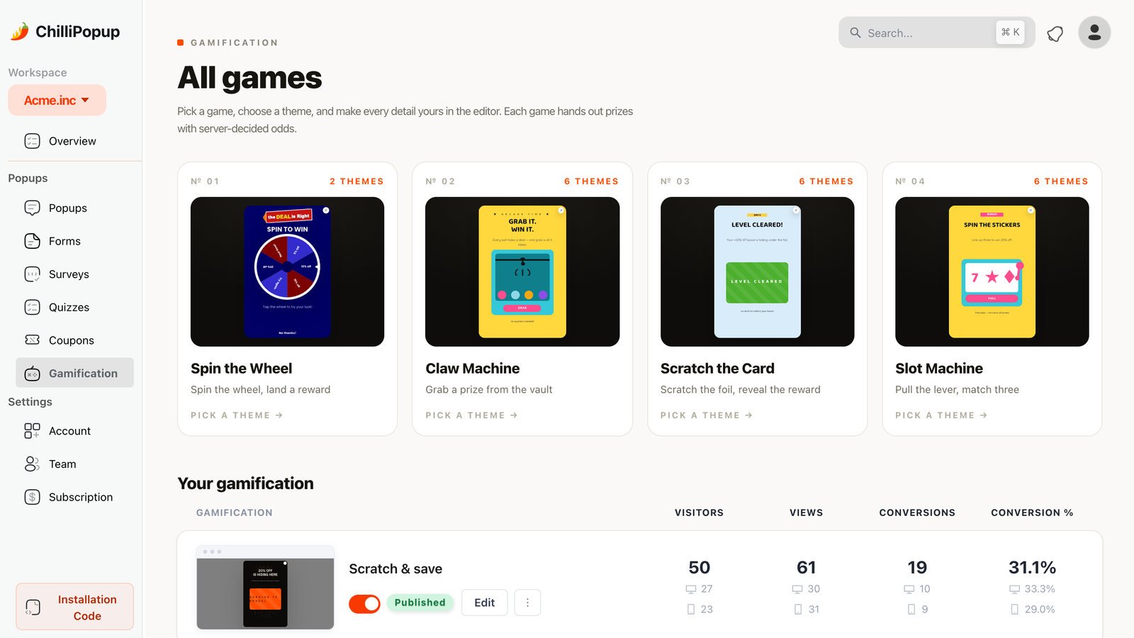
When a static offer has stopped working on a page, a played offer often still lands.
One offer per popup. A popup that offers a discount and a guide asks the visitor to choose before they have agreed to anything. Run them as two campaigns on two different pages, and let the page decide which offer is relevant.
Match the ask to the page
The same offer performs very differently depending on where it appears, because intent is a property of the page, not of the visitor. Use this as a starting map and then let your own numbers correct it.
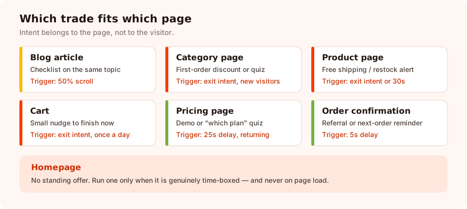
Seven page types, seven different trades. Page targeting is what keeps them from colliding.
| Page | Offer that fits | Trigger | Audience |
|---|---|---|---|
| Blog article | Checklist or guide on the article's topic | Page scroll 50% | Everyone |
| Category / collection | First-order discount, or a finder quiz | Exit intent | New visitors |
| Product page | Free shipping, or a restock alert when sold out | Exit intent, or 30s delay | Everyone |
| Cart / checkout | Small incentive to finish now | Exit intent | Everyone, once a day |
| Pricing / plans | Demo, walkthrough or a "which plan" quiz | 20-30s delay, or inactivity | Returning visitors |
| Homepage | Only a time-boxed offer — otherwise nothing | Delay, never on load | New visitors |
| Order confirmation | Referral, review request, next-order reminder | Delay of a few seconds | Everyone |
The display rules behind a lead generation popup
A lead generation popup is 30% design and 70% rules. In ChilliPopup every popup, form, survey and quiz carries its own display rules, and these are the ones that matter for lead capture:
- Triggers — exit intent, a time delay in seconds (counted on the page or across the whole visit), page scroll percentage, page count, click count, or inactivity. They are evaluated together: the popup appears as soon as the first enabled trigger fires.
- Page targeting — restrict a campaign by URL using contains, does not contain, is exactly, is not, starts with or ends with. This is how the cart offer stays on the cart.
- Audience — everyone, new visitors, or returning visitors, where you decide in days what counts as new and returning.
- Frequency — once a day, every visit, every session, once every N days, once every N visits, or all pages all the time. This is your politeness setting.
- Show again after conversion — turn it off and the campaign stops appearing to anyone who already submitted it. On a lead generation popup this is not optional.
- Devices — desktop and mobile toggles, plus optional OS and browser restrictions. Worth using, because exit intent depends on a mouse leaving the top of the viewport and has no true equivalent on a phone.
- Schedule and date window — a start and end date with hours, and a weekday-plus-hour schedule in a chosen GMT offset. Every enabled rule is an AND gate.
The audience and conversion controls live behind the frequency switch. Turn the display-frequency rule on first; the audience selector and the "show again after conversion" toggle only appear once it is enabled. It is the most common reason a popup keeps greeting people who already subscribed.
A worked example: a three-campaign lead engine
You do not need twelve popups. Three campaigns, ruled so they never collide, cover most sites.
Store version
- Acquire. Exit intent on category and product pages, new visitors, once every three days. "Wait — 10% off your first order. Where should we send the code?" One email field, code on the thank-you screen, and a plain "No thanks, I'll pay full price" decline.
- Rescue. Exit intent on the cart URL, everyone, once a day. "Leaving something behind? We'll hold your basket and send you free shipping." One field, delivered immediately.
- Expand. A five-second delay on the order-confirmation URL. "Want first pick of the next drop?" Early access costs you nothing and produces the best list you own.
SaaS or services version
- Acquire. 50% scroll on blog articles. A checklist that matches the article's topic — not a generic newsletter. Turn on business-email validation if your sales team works the list.
- Qualify. A 25-second delay on the pricing page for returning visitors: a one-question quiz on team size, followed by the matching call to action. You capture the address and the qualifier in one interaction.
- Recover. Inactivity of 45 seconds on documentation pages. "Stuck? Get the setup guide by email." The people who see this are the ones you most want to talk to.
What the three share: different pages, different triggers, different frequencies — so a single visitor never meets two of them in one session. That is the whole collision-avoidance strategy.
Copy that does the work
Four lines carry a lead generation popup. Here is the pattern, then a filled-in example.
- Headline — the reward, in under eight words.
- Subhead — one line of proof or a constraint: what it is, how often, when it ends.
- Button — a verb plus the reward: "Send my code", "Get the checklist", "Tell me when it's back". Never Submit.
- Decline — a plain sentence in the visitor's voice, not a guilt trip.
Headline:  Get 10% off your first order
Subhead:   One email, one code, no spam — unsubscribe any time.
Field:     you@example.com          (required, email validation on)
Button:    Send my code
Decline:   No thanks, I'll pay full price
Consent:   By subscribing you agree to receive our emails. See our privacy policy.
Two details in there matter more than they look. The subhead answers the unspoken question ("how often will you email me?"), which is the real objection behind most dismissals. And the consent line is one sentence — long enough to be honest, short enough to be read. If you need the fuller version of that conversation, the GDPR-compliant popups guide covers what to write and what not to collect.
Lead quality: keep the junk out
Volume is the easy half. A list full of asdf@asdf.com costs you deliverability, sending fees
and trust in your own numbers. Three controls do most of the work:
- Email validation on the field. Choose format checking, business-address only (which rejects free consumer mailboxes), both, or none. Business-only is right for B2B lists and wrong for consumer stores.
- Required only where it matters. Mark the email required; leave everything else optional. A required field that people do not want to answer produces fake answers, not data.
- Ask once, act on it. If a field does not change an email you send, a segment you build or a product you recommend, delete it. The "so what" test is the cheapest quality control there is.
Bots are the other half. Keep an eye on submissions that arrive with no matching views, and read the guide to stopping spam signups if a campaign starts producing suspiciously round numbers.
What to measure
Each campaign reports its own views, clicks, submissions and conversion rate, plus a breakdown of the values collected per field. That is enough to run a proper diagnosis, as long as you read them in the right order.

Read reach before rate. A campaign nobody sees cannot be fixed by rewriting the headline.
- Views — is the campaign even firing? A low number means the rules are wrong, not the copy.
- Conversion rate — submissions divided by views. Compare a campaign against itself over time, never a cart-exit popup against a homepage one.
- Collected fields — the top values per field. This is where you notice that half your "company" values are punctuation.
- Downstream — what those leads did next. A popup with a great rate that produces nothing but unsubscribes is not a good popup, it is a good-looking one.
When you want to compare two versions properly, run them as an A/B test: two variants of the same campaign, split by the percentage you choose, each with its own numbers. Change one thing at a time — the offer first, the moment second, the wording third. Colours are last for a reason.
Seven mistakes that kill lead generation popups
- Firing on arrival, on mobile. The one pattern search engines and visitors agree on disliking. Wait for a signal.
- An offer nobody can value. "Sign up for updates" is not an offer. If you cannot put a number or a noun on it, do not ship it.
- Leaving "show again after conversion" on. Now your subscribers get sold their own newsletter, forever.
- Two campaigns on the same page. Page targeting and frequency exist to stop this. Use them.
- Five fields "while we have their attention". You had it. That is what spent it.
- A reward that arrives only by email. Deliverability delays turn a converted lead into a support ticket. Put the code on the thank-you screen.
- Never reading the numbers. A popup launched and forgotten is a permanent tax on your site's experience. Look at it monthly; retire what is not earning its interruption.
Build your first lead generation popup
Thirty minutes, five steps. If the pixel is not on your site yet, start with the one-line install guide — one script serves every campaign you build afterwards.
1. Pick one offer and name its visitor
Write the one-sentence test out in full before you open the editor. Reward, visitor, page, field, signal. Most weak campaigns die at this step, which is the cheapest place for them to die.
2. Build it with one field and one button
Start from a template and delete more than you add. Headline states the reward, one email input with validation on, a verb-plus-reward button, a visible decline link. Set the submit action to a thank-you step and put the reward on it.
3. Set the trigger the page deserves
Exit intent on commercial pages, 50% scroll on articles, a 20-30 second delay where people evaluate. Restrict the URL with page targeting so the campaign cannot wander onto pages it was not written for.
4. Rule the audience and the frequency
Turn the display-frequency rule on, pick the audience, throttle to once a day or once every few days, and turn off "show again after conversion". Check the mobile toggle and give phones their own trigger if exit intent was your desktop choice.
5. Read it in two weeks and change one thing
Views, then conversion rate, then the field breakdown. Change the offer or the moment — not the button colour — and put the two versions head to head as an A/B test so the comparison means something.
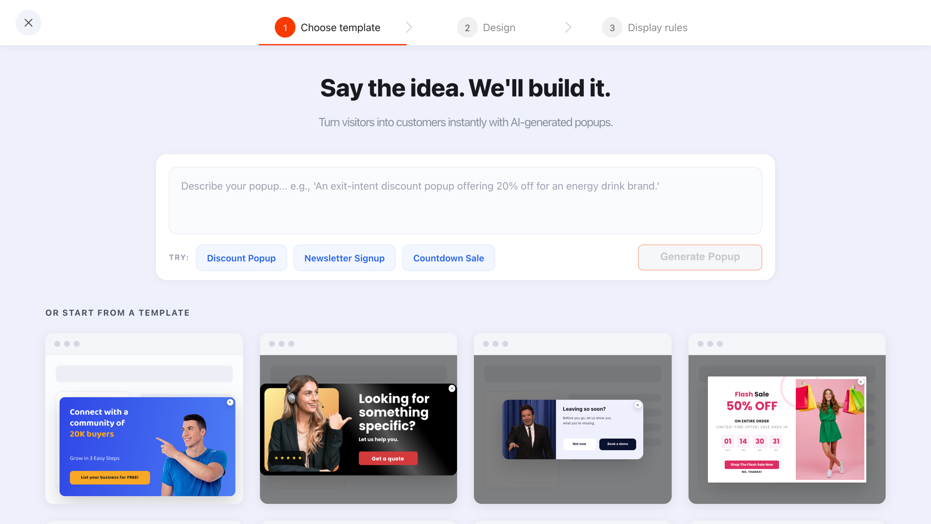
Starting from a template is faster, but the deleting is what makes it convert.
Build a lead generation popup in ten minutes
Popups, forms, surveys, quizzes and prize games from one editor and one script. Free plan, no credit card required. Paid plans from $29/month.
Start free →Related reading
Frequently asked questions
What is a lead generation popup?
A lead generation popup is an overlay on your website that offers a visitor something specific — a discount, a guide, early access, a quote — in exchange for a way to contact them, usually an email address. It differs from a general popup in that its only job is to capture a contact you can follow up with, so it carries one offer, one field and one call to action.
Do lead generation popups still work?
Yes, when the offer is worth the address and the timing respects the visit. What has stopped working is the undifferentiated "Join our newsletter" box shown to everyone on arrival. Popups that name a concrete reward, fire on a real signal such as exit intent or 50% scroll, and stop appearing once someone has converted still generate leads on almost every kind of site.
How many fields should a lead generation popup have?
One in most cases. Every extra field is another decision for the visitor, and on a phone it is also another keyboard and another scroll jump. Ask for the email, deliver the reward, and collect the segmenting details later on a return visit or on the thank-you step.
What is a good conversion rate for a lead generation popup?
There is no universal number worth chasing, because a popup shown to cart abandoners and one shown to every arriving visitor are measuring different populations. Use your own campaign as the baseline: read submissions divided by views in the dashboard, then compare the same popup against itself after one change, or run the two versions as an A/B test.
When should a lead generation popup appear?
At the moment the visitor has shown intent but is about to lose it. On product and cart pages that means exit intent. On articles it means around 50% scroll, once someone is actually reading. On pricing and documentation pages a 20-30 second delay works, because people who linger there are evaluating. Arrival popups only make sense for a genuinely time-boxed offer.
How do I get the leads out of my popup and into my email tool?
Every submission is stored with the campaign and shown in the dashboard as a collected-input table you can read and copy across. There is no built-in sync to an email platform or CRM, so either move them across in batches or listen for the pixel's submit event on your own site and post the payload to your endpoint. Decide which of those two you will actually keep doing before you launch.
Do lead generation popups hurt SEO?
Not by existing. Google penalises intrusive interstitials that cover the main content of a page immediately on arrival, especially on mobile. A popup triggered by exit intent, scroll depth or a delay, with a clearly reachable close control, sits outside that pattern.