A website feedback survey is a short set of questions shown on your own site, in the moment, instead of emailed three days later. One rating question, one optional comment, asked right after something happened — a purchase, a support reply, a page read. That is the whole format, and almost everything that goes wrong is a violation of it.
The failure mode is predictable: the questions get written by committee, and what ships is eleven of them on a homepage timer. This guide goes in the order the decisions actually happen — instrument, moment, length, wording, then reading the numbers.
Key Takeaways
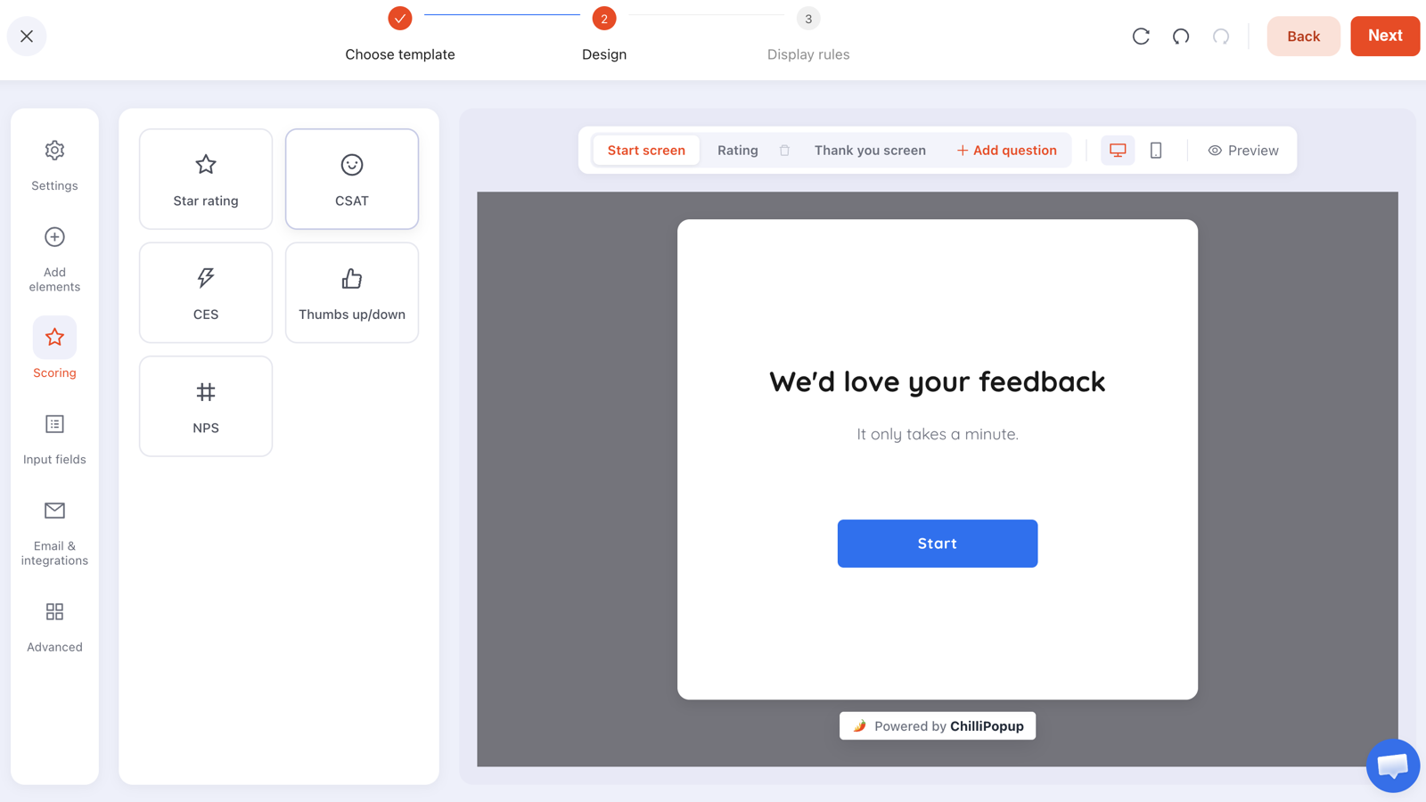
- Pick the instrument before the question. CSAT (1–5) measures an event, CES (1–7) measures effort, NPS (0–10) measures the relationship, stars (1–5) rate content, thumbs (up/down) is a helpfulness check.
- Ask where the experience ended — the order confirmation page, the help article, the exit from a cart — not on a homepage timer.
- Two or three questions, one per screen. The rating is the measurement; the open comment is the explanation; anything else is a completion tax.
- Make the follow-up optional. A required open text field is where completion goes to die — and a required field blocks the visitor from advancing at all.
- Build it as a survey, not a popup. Only surveys and quizzes report completion rate, average time, drop-off analysis and partial responses.
What a website feedback survey is (and isn't)
The format, in two sentences
A website feedback survey asks a visitor to rate something they just experienced, on your site, while the experience is still fresh. It is deliberately smaller than a research survey: one measurement, one optional explanation, and a thank-you screen that tells them what happens next.
It is not three things people keep turning it into:
- Not a research questionnaire. If you need twelve questions, you need customer calls, not an overlay that interrupts someone mid-task.
- Not a lead capture form in disguise. If the real goal is the email address, run a signup popup and be honest about it. Dressing an offer up as research poisons both.
- Not a review request. A public review is a different ask to a different audience: happy customers only, after fulfilment, usually by email.
One structural decision matters more than any wording advice below. In ChilliPopup, build feedback as a survey (or a quiz, if the questions are multiple choice) rather than as a popup or an inline form. Surveys and quizzes are the only content types that give you one question per screen, partial responses, and the Analytics & Results view with completion rate and drop-off. A popup with a rating in it still reports views, clicks and submissions — but no completion rate, no drop-off and no partial responses.
Pick the instrument: NPS vs CSAT vs CES vs stars vs thumbs
These are not interchangeable flavours of "how are we doing". Each measures a different object, so the wrong one gives you a clean number about the wrong thing. The survey builder ships all five as ready-made question widgets, each with editable endpoint labels.
| Instrument | Scale | Question wording to paste | What to do with the answer |
|---|---|---|---|
| NPS Loyalty / relationship |
0–10 Not at all likely → Extremely likely |
"How likely are you to recommend us to a friend or colleague?" | Track the NPS card over months, not days. Low scores go on a follow-up list your support team works through by hand; high scores are the people to invite to leave a public review. |
| CSAT One specific event |
1–5 Very dissatisfied → Very satisfied |
"How satisfied were you with your checkout today?" | Read it as a pass/fail on that one moment. A run of 1s and 2s on the same page is a bug report — go and look at the page before you touch the survey. |
| CES Effort |
1–7 Strongly disagree → Strongly agree |
"We made it easy for me to sort this out today." | Use it where the job was admin rather than pleasure — after support, returns and account changes. Every low score is a process to shorten, not a person to apologise to. |
| Star rating Content quality |
1–5 stars | "How useful was this guide?" | Rank your own pages against each other. The bottom decile is your content rewrite queue. |
| Thumbs up/down Binary helpfulness |
Up or down (0/1) | "Was this page helpful?" | The cheapest possible ask, so use it where you need volume: docs and help articles. A down-vote plus an optional comment is a support ticket you didn't have to receive. |
The one-line rule of thumb. If you can name the exact thing that just happened, use CSAT or CES. If you cannot, and you are asking about the brand in general, use NPS — and only on a slow cycle. If you are rating a page rather than an experience, use stars or thumbs.
Do not run all five
Every instrument you add is another survey firing at another moment, competing for the same finite patience. Most stores need two: a CSAT after purchase and a thumbs on the help centre. Add NPS once those are running and you have something to compare it against.
Where and when to ask
Timing beats wording. A mediocre question asked thirty seconds after a delivery arrives will outperform a beautifully written one asked at random. The rule: ask where the experience ended.
| Moment | Display rules to set | Instrument | Frequency |
|---|---|---|---|
| Post-purchase | Page URL contains /order-confirmation (or /thank-you), time delay 5 seconds |
CSAT, one open comment | Once every 30 days |
| Post-support | Paste the survey's direct link into the closing message your helpdesk already sends | CES | Per ticket — the link is the trigger |
| On exit | Exit intent, page URL contains /cart or /pricing |
Thumbs or one open question | Once every 7 days |
| After a specific page | Page scroll 60%, or a time delay of 30 seconds, URL starts with /help/ |
Thumbs or star rating | Once a day |
| Relationship check-in | Audience: returning visitors, page count 3 pages in the session | NPS | Once every 90 days |
Two mechanics do most of the work. Page URL targeting has six operators — contains,
does not contain, is exactly, is not, starts with, ends with — and every enabled rule is an AND gate, so
starts with /help/ plus device: desktop narrows to exactly the set you meant. And
the direct link on the same screen is a copyable URL that opens the survey on arrival,
which is how post-support feedback works without any integration: your helpdesk sends its normal
resolution email, you paste the link at the bottom of it.
One honest limit on timing. A time delay is always counted from page load. There is no "N seconds into the session" option, so a 30-second delay resets on every navigation — build your timing around the page the visitor lands on, not around how long they have been on the site.
Exit intent deserves its own note: it is the only trigger that catches people leaving without converting, which makes it the only way to ask "what stopped you today?" of the group you most want to hear from. It reads desktop pointer behaviour, so pair it with a scroll trigger for mobile traffic — the mechanics are in the exit intent popups guide.
One question per screen, two or three questions total
A stepped survey shows one question at a time, with a progress bar and a step transition (none, fade, slide up or slide horizontal), as a card or fullscreen. Everything answered arrives as a single submission at the end. That structure does something specific: it makes the ask look survivable.
Five questions stacked on one screen reads as a form. The same five one per screen costs the same total effort, but the visitor commits one decision at a time — and if they quit after question two, you keep what they gave you as a partial response instead of nothing.
The shape that works, almost every time:
- Screen 1 — the rating. Required. This is the measurement, and it takes one tap.
- Screen 2 — the open follow-up. Optional. Long text, Required toggle off.
- Screen 3 — only if it changes something. A single extra question, and only when you can name the decision it feeds.
The optional bit is not politeness. A required block gates advancing: an empty required text field means the visitor cannot continue, so their only remaining option is to close the survey — and you lose the rating they had already given you. Optional turns a hard stop into a shrug.
Steps run in order — there is no branching. You cannot show a different follow-up to people who scored 2 than to people who scored 9. The workaround that actually works: ask one neutral open question of everyone ("What is the main reason for your score?"), leave it optional, and read the comments beside the scores. If two audiences truly need different questions, that is two surveys targeted at two different URLs.
One more quirk to design around: if a visitor steps backwards, a rating or a choice stays selected, but a text or email field comes back empty and has to be retyped. Put anything typed on the last screen they will visit.
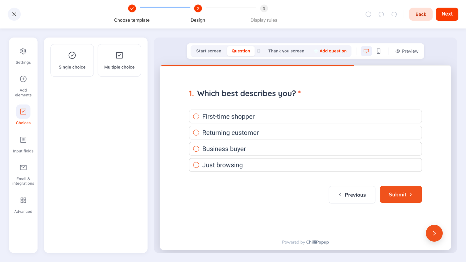
One question, one screen, a progress bar along the top. Multiple-choice option lists like this one live in quizzes; surveys pair the rating widgets with text fields.
That distinction decides how you build the follow-up. If you want an answer you can count — Delivery / Price / Product quality / Website — build the whole thing as a quiz and use its choice list, which returns clean, normalised values. If you want the sentence in the customer's own words, keep it a survey with a long text field. Both report the full Results view, so you trade away no analytics either way.
Write the questions: sample copy you can paste
The post-purchase CSAT survey
Two questions across four screens, counting the start and the thank-you. Roughly twenty seconds of the customer's life.
- Start screen — Headline: "Quick one — how did that go?" Subline: "Two questions, about 20 seconds. It goes straight to the team that packs your order." Button: "Sure"
- Screen 1 (CSAT, required) — "How satisfied are you with your order experience today?" Endpoint labels: "Not at all" → "Very satisfied"
- Screen 2 (long text, optional) — "What would have made it better?" Placeholder: "Optional — skip if everything was fine."
- Thank-you screen — "Thank you. We read every one of these on Monday mornings."
The help-centre thumbs
- Screen 1 (thumbs up/down, required) — "Was this page helpful?"
- Screen 2 (long text, optional) — "What were you trying to do?" Placeholder: "Optional — this is the fastest way to get the page fixed."
The exit question
- Screen 1 (long text, required — it is the only question) — "Before you go: what stopped you today?" Placeholder: "Price? Delivery? Could not find something? One line is plenty."
Five wording rules
- Name the thing. "How satisfied are you with your order experience today?" beats "How satisfied are you?" — the second one gets answered about the brand, the website, and the weather.
- One idea per question. "Was checkout fast and easy?" is two questions wearing a trench coat, and a single score cannot answer both.
- Don't lead. "How much did you enjoy our new checkout?" pre-loads the answer. "How was the new checkout?" does not.
- Put the time frame in. "Today", "on this order", "this visit". Without it people answer about the worst thing that ever happened to them.
- Say what happens next on the thank-you screen. It is the only payment the respondent gets, and it is the difference between a survey and a void.
Everything else about tone, length and button labels transfers straight from popup copywriting — a survey is a popup that happens to ask instead of offer.
Build it in ChilliPopup
Thirty minutes, no code. If the pixel isn't on your site yet, start with the one-line install guide — the same script serves every survey, popup and form, so there is nothing extra to embed later.
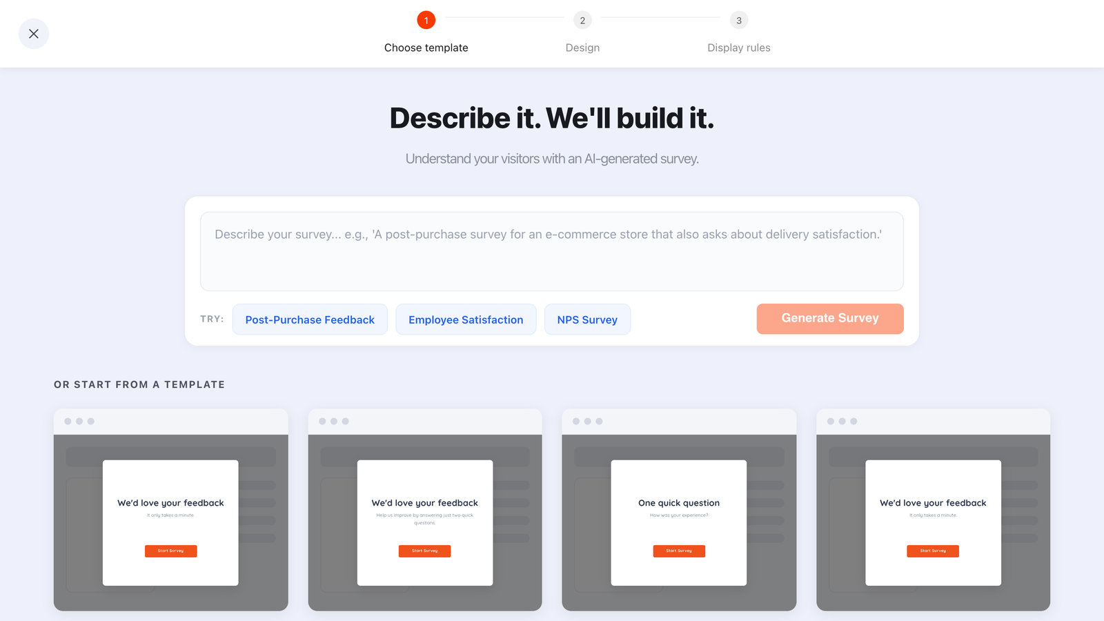
One sentence drafts the screens, copy and styling — the generator's own example is "A post-purchase survey for an e-commerce store that also asks about delivery satisfaction." Then you edit it like anything else.
1. Pick one moment and one instrument
Write down the sentence "I want to know whether ___ went well for people who just ___". If you can't fill in both blanks, you are not ready to ask. The blanks tell you the instrument and the page rule.
2. Create it under Surveys
Not Popups, not Forms. Surveys and quizzes are the content types that report completion rate, average time, drop-off and partial responses — everything you will want in two weeks. Describe it in one sentence to the AI generator, or start from a template and swap the question widget.
3. Add the rating, then the optional comment
Drag in one scoring widget (star, CSAT, CES, thumbs or NPS), set its endpoint labels in plain language, and mark it required. Add a second screen with a Long text field and leave the Required toggle off. Write a thank-you screen saying what you'll do with the answer.
4. Set the display rules to the moment
Page URL contains your confirmation path. Time delay 5 seconds, so the page has finished rendering. Frequency once every 30 days. Then the switch that matters most: turn off "show again after conversion", so anyone who answered stops being asked. It is per campaign — it suppresses this survey for someone who submitted this survey, and knows nothing about your other campaigns.
5. Publish, then leave it alone for two weeks
Only published content is served, so a draft never appears however the rules are set. Then wait a fortnight — feedback volume is lumpy, and a Tuesday with four responses means nothing.
Optional: a permanent "Give feedback" link
Alongside the timed survey, put a footer link that opens the same survey on demand, using the pixel's own API:
<a href="#" id="give-feedback">Give feedback</a>

<script>
document.getElementById('give-feedback').addEventListener('click', function (e) {
  e.preventDefault();
  window.ChilliPopup.close();               // open() is a forced open —
  window.ChilliPopup.open('YOUR_SURVEY_UUID');  // close first or overlays stack
});
</script>
Nothing will email you when a response arrives — answers wait for you in the dashboard. What you do get is a browser event on every submit, so you can pipe each response into whatever analytics or tag manager already runs on the page:
window.addEventListener('chillipopup:survey_submit', function (e) {
  // e.detail = { surveyUuid: '…', data: { … the answers … } }
  if (e.detail.surveyUuid !== 'YOUR_SURVEY_UUID') return;
  window.dataLayer = window.dataLayer || [];
  window.dataLayer.push({ event: 'feedback_submitted', answers: e.detail.data });
});
Quizzes, forms and popups fire their own equivalents — chillipopup:quiz_submit,
chillipopup:form_submit and chillipopup:submit — each carrying its own id key,
so match on the right one.
Reading the results without fooling yourself
Every content type reports the same headline numbers: views, unique views, clicks, submissions, conversion (submissions ÷ views), field inputs, an interactions-over-time chart, an event breakdown, shows by device, a Collected fields breakdown of top values per field, and a Collected input data table of raw submissions. That last table is where you read the comments one by one — the part everyone skips and shouldn't.

The headline numbers every campaign reports. Surveys and quizzes get a second view on top of this one.
Surveys and quizzes add the Analytics & Results view, which is the one built for feedback:
- The four-stage funnel — views → interactions → abandoned → submissions. A big gap between views and interactions is a timing problem; a big gap between interactions and submissions is a question problem. Two different fixes, constantly confused.
- Completion rate — the share who started and finished. Your main dial, and the only fair comparison is against itself last week.
- Average time from open to submit — a rising average usually means someone added a question, or the open field is doing more work than you intended.
- Drop-off analysis — "Where are users quitting?", ranked by the last field a session touched. This is your rewrite list. One honest mechanic: it ranks by field, not by step number, so give each question its own Field key in the block settings — two questions sharing a key collapse into one unreadable row.
- The NPS card and the day × hour heatmap — the heatmap tells you when responses actually arrive, which is often not when you assumed.
- Partial responses — "Answers visitors entered before leaving without submitting." Often the most useful screen in the dashboard: people who quit halfway are the ones with the complaint, and half their answer is sitting there.
A made-up example, purely to show the arithmetic. Say your post-purchase survey was viewed 400 times and submitted 96 times — a 24% conversion — but the drop-off analysis puts the comment field at the top of the quit list. That is not a wording problem. That is a Required toggle someone left on: the visitor rated you, hit an empty box they had nothing to say in, and closed the tab. One switch, and the number moves.
Two limits to plan around. Responses live in the dashboard, so reading them is a manual habit you have to build — put a recurring fifteen minutes in the calendar. And each campaign stores its own submissions; answers are not stitched into one contact record across surveys, so if you need to tie a comment to a customer, put an optional email field on the last screen and match by hand. The same constraint, and how to live with it, is covered in the progressive profiling guide.
Six mistakes that kill response rates
- Asking on arrival. A survey on a homepage timer is asking someone to rate a meal they haven't eaten. There is no experience to evaluate yet.
- The required open text field. The single most common completion killer. It converts "I have nothing to add" into "I close this window".
- Leaving "show again after conversion" on. Now the people who took the time to answer get asked again next week, which is a fast way to teach your best customers to dismiss you on sight.
- Two instruments in one survey. NPS and CSAT in the same three screens measures two different objects and doubles the length. Pick one.
- Surveying a page that also runs three other campaigns. Overlays compete; the survey loses. Use URL targeting and frequency so only one thing is asking at a time — the wider hygiene rules are in popup design best practices.
- Collecting feedback nobody reads. If no page, process or product decision changes because of the answers, you are not measuring satisfaction, you are performing it. Kill the survey and free up the attention for something you will act on.
When not to run an on-site survey
Sometimes the honest answer is that this is the wrong tool. Skip it when:
- Your volume is tiny. Ten responses a month is a conversation, not a dataset. Email five customers and ask them properly — you will learn more in an afternoon.
- The experience isn't finished on your site. If the thing you want rated is a delivery that arrives on Thursday, the survey has to reach them on Thursday, and that is your email tool's job, not an overlay's.
- You already know the answer. If support tickets have been telling you the same thing for a month, a survey is a way of postponing the fix.
- Nobody owns the follow-up. A feedback channel with no owner does more damage than no channel at all, because you asked and then visibly did nothing.
- You are asking for sensitive information. Health, financial or other special-category data has no place in a drive-by overlay. Collect it once, in context, with explicit purpose-specific consent.
Ask two questions. Get answers you can act on.
Build feedback surveys, quizzes, popups and forms from one editor — and one pixel. Free plan, no credit card required. Paid plans from $29/month.
Start free →Related reading
Frequently asked questions
What is a website feedback survey?
A website feedback survey is a short set of questions shown on your own site, in the moment, instead of emailed days later. It usually pairs one rating question — NPS, CSAT, CES, a star rating or a thumbs up or down — with one optional open comment, and it appears right after something happened: a purchase, a support reply, a page read.
Should I use NPS or CSAT?
Use CSAT when you are asking about one specific thing that just happened, such as a checkout or a delivery, because the 1 to 5 scale reads as a verdict on that event. Use NPS when you are asking about the relationship as a whole, on a slow cycle, because the 0 to 10 question is about the brand rather than the interaction. Running both is fine as long as they are separate surveys with different timing.
How many questions should a website feedback survey have?
Two or three, with one question per screen. One rating question is the measurement, one optional open comment is the explanation, and a third question is the most you should add before completion starts to fall. If a question does not change a decision you will actually make, delete it rather than moving it to the end.
Where should the survey appear on my site?
Where the experience you are measuring just ended. Target the order confirmation URL for a post-purchase survey, the help centre article for a helpfulness thumbs, and exit intent on the cart or pricing page for an abandonment question. A survey that appears on the homepage two seconds after landing has nothing to measure yet.
Can I ask a different follow-up question depending on the score?
No. Steps run strictly in order and there is no branching or skip logic, so everyone sees the same follow-up. The practical workaround is to ask one neutral open question of everyone and leave it optional, then read the answers next to the scores in the dashboard. If two audiences genuinely need different questions, build two separate surveys and target them at different pages.
What counts as a good completion rate?
Compare the survey against itself rather than against a published benchmark, because completion depends almost entirely on where you ask and how many questions you ask. Watch the completion rate and the drop-off analysis week over week, change one thing at a time, and treat a rising completion rate with a stable submission count as the signal that your timing improved.