A funnel-stage popup strategy means matching each popup to where the visitor already is: a first-time reader gets a different message from someone on their fourth product page, who gets a different message again from a customer who bought last week. The stage determines the size of ask you have earned.
You don't need a CRM, a data warehouse or an identity graph to do this. Four behavioural signals cover every stage a website can act on.
Key Takeaways
- Five stages a website can detect: discovery, consideration, intent, purchase, retention.
- The stage sets the size of the ask. An email at discovery, a segmenting question at consideration, a phone number only after purchase.
- Behaviour is the only signal you need — page type, page count, new vs returning, and the order-confirmation URL.
- Build the intent stage first. It sits closest to revenue and pays for the rest of the work.
- Every campaign gets a page rule, or two of them will fire on the same page and the visitor sees a stack.
The five stages, mapped to popups
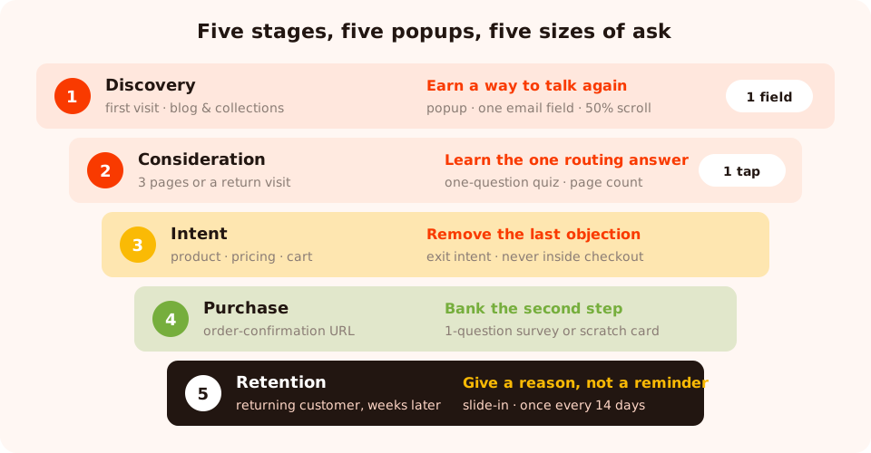
Five stages, five jobs. The ask gets bigger as the relationship does — never the other way round.
| Stage | The signal | Popup job | Best format | Trigger |
|---|---|---|---|---|
| 1. Discovery | First visit, content or collection page | Earn a way to talk again | Popup, one email field | 50–60% scroll, or exit intent |
| 2. Consideration | Several pages, or a return visit | Learn the one thing that routes them | One-question quiz | Page count, returning visitors |
| 3. Intent | Product, pricing or cart page | Remove the last objection | Popup or slide-in with an incentive | Exit intent, or inactivity on cart |
| 4. Purchase | Order-confirmation URL | Bank the second step while goodwill is high | Scratch card or short survey | Short delay after load |
| 5. Retention | Returning customer, weeks later | Bring them back to a reason | Slide-in or bar | Returning visitors, low frequency |
Stage 1 — Discovery: earn the right to talk again
A first-time visitor on a blog post or a collection page owes you nothing. The only sensible goal is a way to reach them later, and the only sensible ask is one field.
Headline: Get 10% off your first order
Support: One email a week. Unsubscribe in a click.
Field: Email · Button: Send my code
Trigger on scroll rather than time — scroll proves they're reading, a timer only proves the tab is open. On a blog, 50–60% is the sweet spot. On a store's collection pages, exit intent works better because browsing is non-linear.
This is the one stage where a game earns its keep on a cold visitor: a spin wheel or scratch card turns "give us your email" into "play for your welcome gift", which is a much easier first interaction.
Stage 2 — Consideration: learn the one thing that routes them
Someone on their third page, or their second visit, has told you they're interested. Now the valuable thing isn't another email address — it's the single answer that changes what you send them.
Use a one-question quiz, not a text field. Three to five tappable options complete in one gesture, work on
a phone, and return normalised values you can segment on instead of Mktg,
marketing ops and Marketing.
Ecommerce: "Welcome back — what are you shopping for?" → Women's · Men's · Kids · Home
B2B: "So we send the right things — what best describes you?" → Founder · Marketing · Product · Engineering
Trigger on page count (three pages in the session) or target returning visitors. Both are available as display rules, and either is a genuine consideration signal.
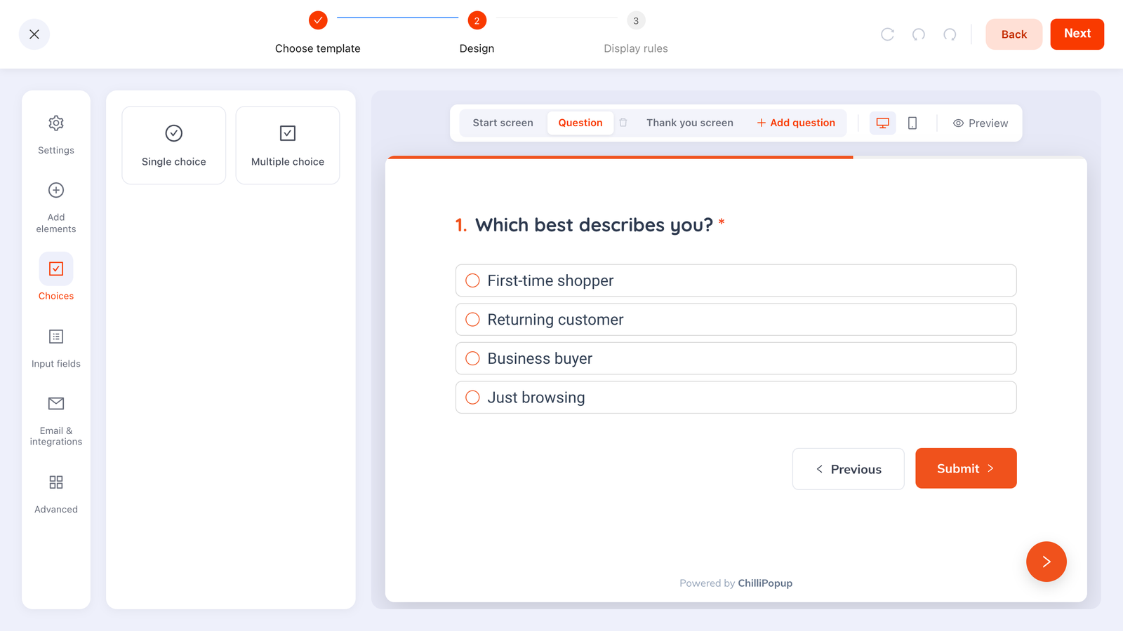
One question, four options, one tap — the cheapest segment you will ever collect.
Stage 3 — Intent: remove the last objection
Product pages, pricing pages, the cart. This is the stage that pays for the whole exercise, and the mistake here is introducing a new offer when the visitor is mid-decision. The job is subtraction: take away the reason they're hesitating.
The three objections worth answering with a popup:
- Shipping cost. "You're £12 from free shipping" beats any discount, and costs less.
- Risk. "30-day returns, no questions" on exit intent from a product page.
- Price. A first-order incentive — but only on exit intent, so you're not discounting people who were going to pay full price.
Never inside checkout. Once someone is entering card details, every interruption is a risk and none of them are upside. Rule your intent-stage campaigns to does not contain your checkout path.
The full sequence for the cart specifically is in the cart abandonment popups guide.
Stage 4 — Purchase: the friendliest popup you'll ever run
The order-confirmation page is the least contested real estate on your site. The visitor has converted, there's nothing left to interrupt, and goodwill is at its peak. It's the only place where an expensive ask is fair.
Three things worth asking for there, in order of value:
- One survey question. "What nearly stopped you buying?" is the highest-value sentence in ecommerce research, and it only works while the memory is fresh.
- The second-order fields. Birthday month, size, preferences — wrapped in a scratch card whose claim screen collects them, so it reads as a gift rather than an interrogation.
- A referral or social prompt. Cheap, and nobody minds it here.
Target it by URL — contains your confirmation path — with a short delay so the order details render first. And keep it to one ask.
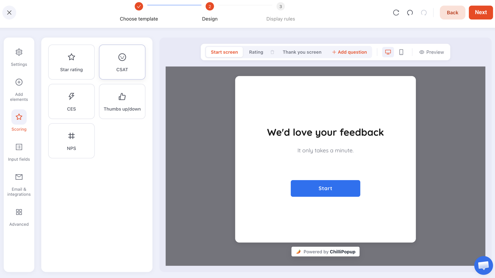
One question, one screen, on the confirmation page. It's the highest response rate you'll get all year.
Stage 5 — Retention: give them a reason, not a reminder
A returning customer doesn't need to be sold your brand. What they need is a reason to look now: the restock, the new drop, the thing that has changed since they last visited.
Keep it small — a slide-in or a bar rather than a centre-screen modal — and keep the frequency low. Once every N days, or once every N visits, are both available as frequency rules and both are more appropriate here than "every session".
Good: "New in this week: 14 pieces from the spring line" → See what's new
Bad: "Sign up for our newsletter!" — to someone who is already on it.
Which is the retention-stage version of the single most important switch in this whole article: turn show again after conversion off on every campaign, so subscribers stop being asked to subscribe.
Detecting the stage without a CRM
Everything above is built from four signals, all of which are display rules rather than data infrastructure.
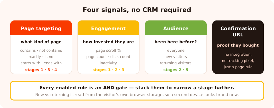
Four rules, five stages. No CRM, no identity graph, no tracking beyond the visitor's own browser.
- Page targeting — contains, does not contain, is exactly, is not, starts with, ends with. This is how a campaign knows it's on a cart page and not a blog post.
- Engagement triggers — page scroll percentage, page count, click count and inactivity all separate a skimmer from a considerer.
- Audience — everyone, new visitors or returning visitors, where you define what "new" and "returning" mean in days.
- The confirmation URL — the one page that proves the purchase stage without any integration at all.
One honest limit: new-versus-returning is computed from the visitor's own browser storage. Someone on a second device, or in a private window, looks like a brand-new visitor. Design your stage-2 and stage-5 campaigns so that being wrong about this is harmless rather than embarrassing.
A full five-stage example for an online store
| # | Campaign | Page rule | Trigger / audience | Ask |
|---|---|---|---|---|
| 1 | Welcome spin wheel | contains /blog/ or /collections/ | 50% scroll · new visitors | |
| 2 | "What are you shopping for?" quiz | contains /collections/ | page count 3 · returning | One tap + email |
| 3 | Free-shipping nudge | contains /cart, not /checkout | inactivity 30s | None — pure information |
| 4 | Post-purchase survey | contains /orders/thank-you | 5s delay | One question |
| 5 | "New in" slide-in | homepage only | returning · once every 14 days | None — a link |
Note what's true across the whole set: no two campaigns can fire on the same page, the ask gets bigger as the relationship does, and two of the five don't ask for anything at all. A popup that only informs is still a popup doing its job.
Read each stage on its own terms
The most common analytics mistake in a staged setup is comparing campaigns to each other. A discovery popup shown to cold traffic and a cart popup shown to people with items in their basket are not competing — they have different denominators and different jobs.
Per campaign, watch:
- Views — is the rule reaching the audience you intended, or almost nobody?
- Conversion rate against itself over time, never against another stage.
- What happened downstream — for the intent stage, the number that matters is orders, not submissions.
Definitions and diagnostics for each metric are in the popup analytics guide.
Six mistakes in a staged popup setup
- One popup for everyone. It's tuned for one stage and wasted on the other four.
- No page rule on any campaign. Site-wide plus site-wide equals a stack.
- A big ask at the discovery stage. Phone numbers and birthdays from strangers produce
0000000000, not data. - Interrupting checkout. There is no popup worth the risk once card details are on screen.
- Skipping the confirmation page. It's the cheapest research and enrichment you will ever run, and almost nobody uses it.
- Building all five at once. Ship the intent stage, learn from it, then add the next.
Build the funnel in ChilliPopup
One pixel serves every campaign, so there is nothing extra to install per stage — start with the one-line install guide if it isn't on your site yet.
1. Sort your URLs into five buckets
Discovery, consideration, intent, purchase, retention. This list becomes the page-targeting rule for every campaign you build.
2. Build the intent stage first
Cart or pricing page, exit intent or inactivity, one objection removed. It's closest to revenue, so it justifies the rest.
3. Add the discovery offer
New visitors, content and collection pages, one email field, a reward worth the interruption.
4. Give every campaign a page rule
Including the ones you think are already scoped. This is what stops collisions.
5. Add consideration and retention
A one-question quiz for returning visitors, and a low-frequency "new in" slide-in. Both need returning traffic, so build them once the first two have volume.
6. Review each stage separately
Every two weeks, fix the single worst-performing stage rather than tinkering with all five.
Run a different popup at every stage
Popups, forms, surveys, quizzes and prize games — all ruled from one editor and one pixel. Free plan, no credit card required. Paid plans from $29/month.
Start free →Related reading
Frequently asked questions
What are the funnel stages for popups?
Five that a website can actually detect: discovery (first visit, content pages), consideration (multiple pages or a return visit), intent (product, pricing or cart pages), purchase (checkout and the order-confirmation page), and retention (customers coming back). Each one has a different signal, a different popup job and a different acceptable size of ask.
How do I know which funnel stage a visitor is in?
From behaviour, not from a database. Page targeting tells you what kind of page they are on, page count and scroll tell you how engaged they are, the new-versus-returning audience rule tells you whether they have been here before, and the order-confirmation URL tells you they have bought. Those four signals cover every stage a popup needs.
Should every funnel stage have a popup?
No. Start with the two that pay for themselves — intent, where a cart or pricing page popup recovers revenue, and discovery, where a first-visit offer builds the list. Add consideration and retention once those are running well. Purchase-stage popups should be rare and never appear during checkout itself.
How do I stop two popups appearing on the same page?
Give every campaign a page-targeting rule instead of leaving it site-wide, and give each one a different trigger or audience. Two campaigns with no page rule and a short time delay will both fire on the same page, and the visitor sees a stack rather than a message.
What is a bottom-of-funnel popup?
One that appears when the visitor has already shown buying intent — on a cart, pricing or checkout-adjacent page — and removes the last objection rather than introducing an offer. Free shipping thresholds, a returns-policy reminder, or a small first-order incentive on exit intent all qualify.
Does this work for B2B as well as ecommerce?
Yes, with different pages. Discovery is the blog, consideration is the docs and case studies, intent is the pricing page, purchase is the demo or signup form, and retention is the logged-in help centre. The signals are the same — page type, page count, returning visitor — only the URLs change.