A multi-step popup splits one ask across several screens instead of showing every field at once. The visitor answers one small question, moves forward, and only ever sees a short screen — even though by the end you have collected as much as a long form would have.
It works for the same reason a staircase is easier than a ladder: the first step is small enough that people take it, and once they have started, finishing feels like the natural thing to do. This guide covers when a multi-step popup beats a single-screen one, how to order the screens, and the mechanics that decide whether the last screen ever gets reached.
Key Takeaways
- Screen one decides everything. Make it a single tap, not a text field, and the whole flow completes better.
- Multi-step is not more questions — it is the same questions, arranged so none of them looks like work.
- Put the email where it will not be retyped. Choice answers survive a back-step; text and email fields come back empty.
- Partial answers are still data. Someone who quits on screen three has told you something about screen three.
- Steps run in order — there is no branching, so design a short line, not a decision tree.
What is a multi-step popup?
Multi-step popup, in two sentences
A multi-step popup shows a sequence of small screens inside a single interaction: a question, then the next question, then a thank-you. Everything is answered in one visit, so — unlike a profiling ladder spread over weeks — it does not depend on recognising a returning visitor.
In practice, most multi-step popups are built as a survey or a quiz displayed as an overlay: those are the content types made of steps. A standard popup has one main screen plus a thank-you screen, which is enough for a two-beat flow but not for a real sequence of questions.
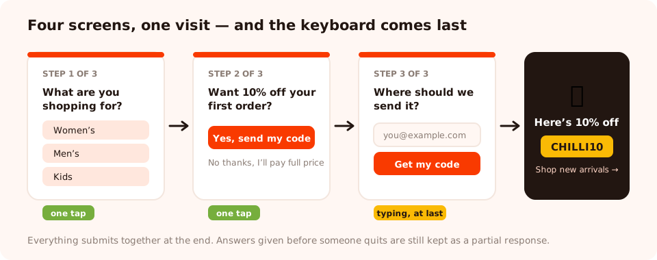
One tap, one tap, one field, done. The same information a five-field form asks for — arranged so nothing looks like work.
What it is not
- Not a longer form. Splitting six bad fields across three screens gives you six bad fields and two extra clicks. Multi-step earns its keep by making the first ask trivially small, not by hiding the size of the total ask.
- Not progressive profiling. That spreads the questions across separate visits and needs to recognise a returning visitor — see our progressive profiling guide. Multi-step happens in one sitting.
- Not a decision tree. Steps run in order. There is no "if they answer Kids, jump to question five".
When a multi-step popup beats a single screen
| Situation | Better choice | Why |
|---|---|---|
| You need one email and nothing else | Single screen | Adding a step to a one-field ask adds friction and buys nothing |
| You need an email and a segment | Multi-step | The tap-to-choose screen warms them up before the typing screen |
| Recommending a product from 3–5 answers | Multi-step quiz | The questions are the value — people finish because they want the result |
| Measuring satisfaction after purchase | Multi-step survey | A rating first, the "why" second — and the rating is banked either way |
| A single time-limited announcement | Single screen | Nothing to ask, so there is nothing to split |
| Traffic that visits once and never returns | Multi-step | It is your only chance to get more than one answer |
The test: would the second question stop someone answering the first? If yes, split them. If no, keep one screen — you are adding clicks for nothing.
How to order the screens
Screen 1 — one tap, never a keyboard
The first screen decides your completion rate more than everything after it combined. Make it a choice: three to five tappable options, answered with a thumb, no typing. "What are you shopping for?" outperforms "Enter your email" as an opener because it costs nothing and it does not feel like a transaction.
A rating works just as well as an opener — a star, a thumbs up or down, a satisfaction scale. One gesture, and the visitor is now someone who has started.
Screen 2 — the question you actually care about
This is where the segmenter goes: category, role, budget band, use case. By now the visitor has committed once, and a second tap is easy. Keep it to one question per screen; two questions on one screen undoes the thing that made the flow work.
Screen 3 — the identifier
Email goes last, framed as delivery rather than payment: "Where should we send your result?" is a different request from "Enter your email to continue". By this point you have their answers, and — importantly — you have a reason to need an address.
Screen 4 — the thank-you
Confirm it worked, deliver the reward immediately (show the code, do not just promise it), and offer one next step. Let it close itself after a few seconds so it is not in the way.
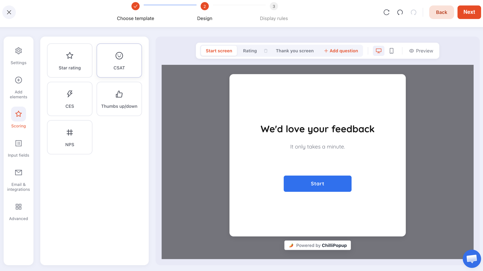
Each screen is its own step in the builder, with its own blocks and its own design — so screen one can be huge and friendly and screen three can be plain.
Put the required text field where it will not be revisited. If someone steps backwards, a choice or rating answer stays selected — but a text or email field comes back empty and has to be retyped before they can move on again. Placing the email on the screen people are least likely to go back past saves you a lot of quiet abandonment.
Two worked multi-step examples
Ecommerce: a three-screen welcome flow
Screen 1 — the tap. "First time here? What are you shopping for?" with chips for Women's, Men's, Kids and Home. No email in sight.
Screen 2 — the sweetener. "Nice pick. Want 10% off your first order?" with a single button: "Yes, send my code". A second tap, still no typing.
Screen 3 — the ask. "Where should we send it?" One email field, one button. The request now reads as logistics rather than a toll.
Screen 4 — the delivery. The code, visible on screen, plus "Shop new arrivals →".
SaaS: a four-screen qualification flow
Screen 1. "What are you trying to fix?" — four use-case options.
Screen 2. "How big is the team?" — four bands. This is the qualifier, and it arrives after the visitor has already told you what they want.
Screen 3. "Where should we send the walkthrough?" — email, with business-email validation switched on if list quality matters more than raw volume.
Screen 4. Thank-you with a booking link for teams above a certain size.
What both share: the visitor never sees more than one question at a time, the typing happens last, and every screen has a visible reason to move forward.
The mechanics that decide whether people finish
Partial answers are saved
If someone answers screens one and two and closes without submitting, what they entered is still recorded as a partial response. That matters twice over: you learn something from people who quit, and a half-finished flow is not a total loss. It applies to stepped content — surveys and quizzes. A plain popup or inline form that someone types into and abandons leaves no partial record, so do not design a step around data you assume is being kept.
Everything submits at the end
The complete set of answers arrives as one submission when the last step is finished. Design accordingly: if an answer needs to reach your email tool, it has to be on a screen that comes before the final submit, not after it.
Transitions are part of the experience
Each step change can fade, slide up or slide horizontally — or do nothing at all. A horizontal slide reads as "next page in a sequence" and subtly signals progress, which is usually what you want. Whatever you pick, use the same one throughout; mixed transitions feel broken rather than lively.
There is no branching
Steps run in order for everyone. If you genuinely need different questions for different audiences, build two campaigns and target them at different pages or audiences with display rules — that is the honest workaround, and it also keeps each flow short.
Build a multi-step popup in 20 minutes
Surveys, quizzes, popups and prize games — stepped screens, drop-off reporting and one pixel. Free plan, no credit card required. Paid plans from $29/month.
Start free →How many steps is too many?
Three to four screens is the sweet spot for a marketing flow. Five or six can work when the questions themselves are the reward — a genuine product-recommendation quiz, where each answer visibly narrows the result. Beyond that you are running a survey, and you should be honest with people about it: say how long it takes, up front, on screen one.
Two signals tell you a flow is too long:
- Drop-off concentrated on one screen. That is not length, that is one bad question — rewrite or delete it.
- Steady drop-off on every screen. That is length. Cut a question.

The drop-off ranking is the whole point of building stepped content: it names the question that is costing you completions.
What to measure
- Completion rate — of everyone who started, how many finished. This is the number a multi-step flow lives or dies by.
- Drop-off by question — a ranking of the questions people quit on, based on the last field they touched. Your rewrite list, in priority order.
- Average time to finish — if it is far longer than you expected, a question is confusing, not just unpopular.
- Partial responses — what people typed before leaving. Often the most useful qualitative data you will get all month.
The full walkthrough is in our popup analytics guide, and if response rate is your problem rather than completion rate, start with increasing survey response rates.
Five multi-step mistakes
- Opening with the email field. You have taken the one screen that could have been free and made it the most expensive one.
- Two questions on one screen. The moment a screen holds two decisions, it stops being a step and starts being a form.
- No progress signal. People will not walk down a corridor with no end in sight. Say "1 of 3", or use a consistent transition so forward motion is obvious.
- Asking something you will never use. A step that changes no email, no segment and no recommendation is pure friction with a nicer layout.
- Splitting a one-field ask. If the whole thing is an email, one screen is correct.
Build your first multi-step popup
Twenty minutes, five steps. If the pixel is not installed yet, start with the one-line install guide.
1. Write the three questions on paper first
One tap, one tap, one field. If you cannot get it down to three, cut the question whose answer changes the least about what you would do next.
2. Build it as a survey or a quiz
Those are the content types made of steps. Use a choice question for taps and a rating for satisfaction openers; keep one question per step.
3. Put the email on the last question screen
Frame it as delivery — "Where should we send it?" — and remember that a text field left behind on a back-step has to be retyped, so it belongs late in the sequence.
4. Write a thank-you screen that delivers
Show the code or the result on screen, add one next step, and let it auto-close after a few seconds.
5. Publish, then read the drop-off after two weeks
Fix the single worst screen — rewrite the question or remove it — and leave everything else alone. One change per fortnight is how you keep knowing which change did the work.
Related reading
Frequently asked questions
What is a multi-step popup?
A multi-step popup shows a sequence of small screens inside one interaction — a question, then the next question, then a thank-you — instead of putting every field on a single screen. Everything is answered in one visit, so it does not depend on recognising a returning visitor the way progressive profiling does.
Do multi-step popups convert better than single-screen popups?
They convert better when you need more than one piece of information, because the first screen can be a single tap instead of a keyboard. They do not help when all you need is an email — splitting a one-field ask across two screens adds clicks and buys nothing. The test is simple: would the second question stop someone answering the first?
How many steps should a multi-step popup have?
Three to four screens for a marketing flow. Five or six can work when the questions themselves are the reward, such as a genuine product-recommendation quiz where each answer narrows the result. If drop-off is spread evenly across every screen, the flow is too long; if it is concentrated on one screen, that question is the problem, not the length.
Where should the email field go in a multi-step popup?
On the last question screen, framed as delivery rather than payment — 'Where should we send your result?'. There is a practical reason as well as a psychological one: if a visitor steps backwards, choice and rating answers stay selected but text and email fields come back empty and have to be retyped, so late placement avoids that.
What happens if someone abandons a multi-step popup halfway?
On stepped content — surveys and quizzes — what they entered before leaving is recorded as a partial response, so you still learn which screen lost them and what they had typed. A plain popup or inline form that someone types into and closes leaves no partial record, so do not design a step around data you assume is being saved.
Can a multi-step popup show different questions based on the previous answer?
No — steps run in order for everyone, and there is no branching. If you genuinely need different questions for different audiences, build two separate campaigns and target them with display rules at different pages or visitor segments. That keeps each flow short, which is usually an improvement anyway.