
An inactivity popup fires when a visitor has stopped interacting with the page entirely — no mouse movement, no scroll, no keystroke, no touch — for a number of seconds you choose. Every other trigger reacts to something the visitor did. This one reacts to the absence of it.
That makes it useful in a narrow but valuable set of situations: the half-filled form, the stalled checkout, the comparison page someone has been staring at for two minutes. It also makes it the trigger most likely to annoy people if you set it to twelve seconds and put it on a blog.
Key Takeaways
- It's real idle detection. The countdown resets on mouse movement, scroll, keypress or touch — an active reader never sees it.
- 30–60 seconds is the useful range. Under 20 seconds catches people mid-paragraph.
- It works on phones, which exit intent does not — touches count as activity.
- Best on decision pages: checkout, pricing, long forms, comparison pages.
- Worst on reading and video pages, where stillness means engagement, not confusion.
How the inactivity trigger actually works
The mechanism is simple enough to reason about precisely, which matters when you're picking a number of seconds:
- A countdown starts when the page loads.
- Any of four events resets it to zero: mouse movement, scrolling, a key press, or a touch.
- If the countdown ever reaches your chosen duration without being reset, the popup fires.
So it is genuinely "nothing has happened", not "N seconds have passed". A visitor who moves their mouse once every ten seconds will never see a 30-second idle popup, no matter how long they stay. That's the whole distinction between inactivity and a plain time delay — and the reason the two triggers suit completely different campaigns.

Every interaction resets the clock. The popup only appears if the clock ever finishes.
Triggers race, they don't queue. Whichever enabled trigger fires first wins. So if you turn on inactivity and a 5-second delay, the delay always wins and the inactivity rule is decorative. Give an inactivity campaign inactivity alone.
Inactivity vs the other triggers
| Trigger | Catches | Works on mobile? | Best for |
|---|---|---|---|
| Inactivity | The visitor who stalled | Yes | Checkout, forms, pricing, comparison pages |
| Exit intent | The visitor who is leaving | No — needs a cursor | Last-chance offers on desktop |
| Time delay | Everyone, after N seconds | Yes | Announcements, welcome offers |
| Page scroll % | The visitor who kept reading | Yes | Blog posts, long pages |
| Page count | The visitor who browsed several pages | Yes | Engaged-session offers |
| Click count | The visitor who is clicking around | Yes | Help offers, navigation rescue |
The pairing worth knowing: inactivity is the mobile answer to exit intent. Exit intent reads a cursor leaving towards the browser chrome, which simply doesn't exist on a phone. Inactivity gives you a comparable "this person has disengaged" signal that behaves identically on both.
Six campaigns that fit a stalled visitor
1. The checkout rescue
Someone has reached your checkout and stopped. Usually that's an unanswered question, not a change of heart. Fire at 45 seconds with reassurance rather than a discount: "Questions about delivery or returns? Here's the short version." Keep it in a corner — never over the payment fields.
2. The half-filled form
Long forms produce long stalls. At 40–60 seconds idle, offer the shortcut: "Prefer we just call you? Leave a number and we'll do the rest." The stall usually means a field they don't want to answer, and a smaller ask beats a nudge to keep going.
3. The pricing-page helper
Nobody stares at a pricing table for a minute because it's clear. "Not sure which plan? Answer two questions." A short quiz converts far better here than a demo request, because it addresses the actual problem.
4. The "still there?" on a long page
Comparison pages, size guides, spec sheets. At 60 seconds: "Want this as a PDF to read later?" It's a lead magnet that arrives at exactly the moment someone is finding the page hard work.
5. The parked tab
Some visitors open your page and go elsewhere for ten minutes. A 90-second inactivity popup is what they come back to. Make it a re-orientation rather than a sale: what this page is, and the single next step.
6. The support catch
On help and documentation pages, a long stall often means the answer isn't there. "Didn't find it? Tell us what you were looking for." One free-text field, and you have a content roadmap written by the people who needed it.
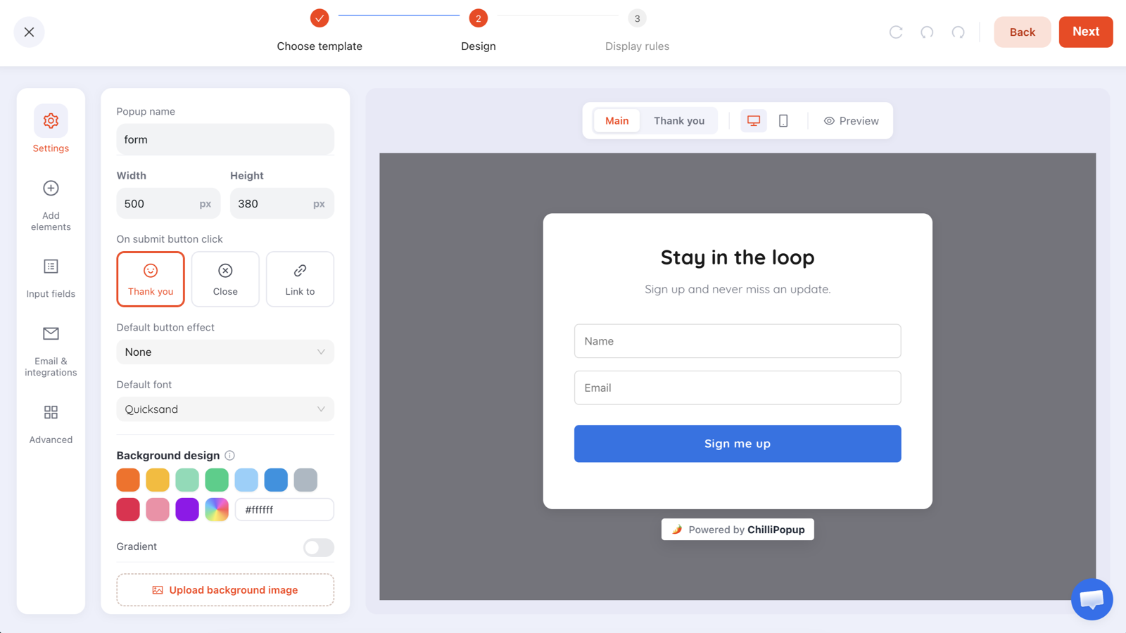
Idle popups should ask for less than the page was already asking for. That's the whole trick.
Choosing the number of seconds
| Page | Suggested idle delay | Why |
|---|---|---|
| Checkout | 40–60s | Long enough to be a real stall, short enough to still matter |
| Long form | 40–60s | People genuinely think between fields |
| Pricing / comparison | 45–75s | Reading a table produces long still periods |
| Product page | 60s | Image zooming and reading are quiet activities |
| Blog post | 90s or don't | Reading is inactivity — prefer scroll depth |
| Video page | Don't | Watching a video registers as complete stillness |
The most common mistake is a short delay. Fifteen seconds of no mouse movement is a normal paragraph. If your idle popup is interrupting engaged readers, it isn't the copy that's wrong — add thirty seconds and try again.
Copy that fits an idle moment
There's a tone problem unique to this trigger: the visitor knows they did nothing, so a popup that appears for no visible reason can feel like being watched. Three rules keep it comfortable:
- Never mention the stillness. "Still there?" and "Are you stuck?" sound like surveillance. Lead with the help, not the observation.
- Offer something smaller than the page asked for. They stalled on the big ask; a smaller one is a way forward.
- Keep it dismissible and quiet. A corner panel usually beats a centred overlay here, because it doesn't take the screen away from a decision that was already hard.
| Don't write | Write instead |
|---|---|
| "Still there?" | "Delivery is free over $50 — and returns are 30 days." |
| "You seem stuck!" | "Two questions and we'll point you at the right plan." |
| "Don't go!" | "Want this page as a PDF for later?" |
| "We noticed you stopped" | "Prefer we call you back? Leave a number." |
Rules to pair it with
Inactivity is a trigger, not a whole campaign. Three other settings decide whether it behaves:
- Page targeting. Restrict it hard. An idle popup that shows site-wide will find every reader on every long page. Use URL rules to keep it on decision pages.
- Frequency. Once per session at most. Twice in one visit reads as nagging, and it's the one trigger that can genuinely fire again in the same page view.
- Show again after conversion. Turn it off, so anyone who took the offer stops meeting it.
Everything about how these combine — audience, device, schedule — is covered in the targeting rules guide.
How to tell whether it's working
Read the campaign's own numbers, and read them in a particular order. Views come first: a low view count usually means the delay is too long or the page too short, while a suspiciously high one means it's firing on engaged readers. Then conversion rate — submissions divided by views.
Idle popups have a distinctive failure signature: plenty of views, almost no submissions, and a high close rate. That combination almost always means the popup arrived too early rather than that the offer was wrong. Add thirty seconds before you rewrite a word.

Views far above expectations mean the idle delay is catching readers, not stallers.
When not to use it
- Video and audio pages. Watching is indistinguishable from idling.
- Long-form reading. Use scroll depth, which measures engagement rather than the absence of it.
- Anywhere a discount would be wasted. A stalled visitor at the checkout is usually confused, not price-sensitive. Answer the question first.
- As your only campaign. Inactivity is a supporting trigger. The welcome offer and the exit catch do more of the work; this one covers a case they both miss.
Catch the visitor who stopped
Inactivity, exit intent, scroll, delay, page count and clicks — every trigger, on every content type. Free plan, no credit card required. Paid plans from $29/month.
Start free →Related reading
Frequently asked questions
What is an inactivity popup?
An inactivity popup appears after a visitor has stopped interacting with the page for a set number of seconds — no mouse movement, no scrolling, no typing, no touches. It targets the visitor who is stalled rather than the one who is leaving, which makes it different from every other popup trigger.
How does inactivity detection work?
A countdown starts when the page loads and resets every time the visitor moves the mouse, scrolls, presses a key or touches the screen. If the countdown ever reaches your chosen number of seconds without being reset, the popup fires. It is genuine idle detection, not a plain timer — someone reading actively will never see it.
How long should the inactivity delay be?
Between 30 and 60 seconds for most pages. Shorter than 20 seconds catches people who are simply reading a paragraph, which is the fastest way to make an idle popup feel intrusive. On long-form content, 60–90 seconds is safer, because reading genuinely produces long stretches with no input.
Is inactivity better than exit intent?
They catch different people. Exit intent fires when the cursor heads for the browser chrome, so it catches the visitor who has decided to go — and it does not work on phones. Inactivity catches the visitor who has stalled but has not decided anything. On a checkout or a long form, inactivity is often the more useful of the two.
Does the inactivity trigger work on mobile?
Yes. Touches count as activity, so the countdown resets on any interaction, and the popup fires when nothing has happened for your chosen period. That makes inactivity one of the few triggers that behaves the same on phones as it does on desktop — unlike exit intent, which needs a cursor.
When should you not use an inactivity popup?
On pages where stillness is the point. Video pages, long reads and anything someone watches rather than clicks will produce long idle stretches from a completely engaged visitor. Use scroll depth or exit intent there, and save inactivity for pages where a stalled visitor really is a stuck visitor.