
A homepage popup should ask for one thing, appear after the visitor has had a look around — a delay of 10–20 seconds, roughly half a page of scroll, or exit intent — and be effortless to close. That combination exists because the homepage is a strange page: it gets more traffic than anything else on the site and carries the least intent of any page on it.
Which means the popup that works brilliantly on a product page or a blog post is usually the wrong one here. This guide covers what belongs on a homepage, what to show the returning visitor instead, and the three things to keep off it entirely.
Key Takeaways
- Never fire on load. Wait for a signal — time, scroll or exit — that the visitor engaged.
- One ask, one field. Homepage visitors are orienting, not deciding; anything bigger reads as a demand.
- Split new and returning. Two campaigns, two audiences, two different offers — the returning visitor already saw the welcome.
- Use a bar for information, a modal for offers. Shipping deadlines don't deserve an overlay.
- Target the homepage precisely with a URL-is-exactly rule, or your homepage popup will leak onto every page of the site.
Why the homepage is the hardest page to popup
Every other page tells you something about the person on it. A product page means they're considering that product. A pricing page means they're evaluating cost. A blog post means they have a problem, and you can name it.
The homepage tells you almost nothing. It collects the brand-search visitor, the returning customer looking for their account, the person who clicked a link from a friend, the journalist, the job applicant, and someone who has genuinely never heard of you. They arrive within seconds of each other and want completely different things.
So a homepage popup has a harder job than any other campaign on the site: it has to be relevant to an audience you can't characterise. The two ways out are to ask smaller and to split the audience with rules.

A product page has one kind of visitor. A homepage has all of them at once.
The four campaigns that fit a homepage
1. The welcome offer (new visitors)
The default, and for a store it's usually the only one you need. One email field, one reward, exit intent on desktop and about 50% scroll on mobile. Audience: new visitors. Frequency: once every seven days, with "show again after conversion" off.
2. The announcement bar (everyone)
Free shipping thresholds, sale windows, holiday closing dates, delivery cut-offs. A slim bar anchored to the top or bottom of the viewport, no dimmed background, no interruption. Give it a date window so it retires itself when the promotion ends.
3. The orienting question (returning visitors)
A one-question quiz for people who came back: "Welcome back — what are you here for?" with three or four tappable options that route them to the right section. It reads as help, not capture, and the answer also segments them for email.
4. The exit catch (everyone, desktop)
The last-chance ask on the way out. On a homepage this should be softer than a checkout catch: not a discount, but the lowest-commitment thing you have — the newsletter, the guide, the "notify me when we launch".
| Campaign | Audience | Trigger | Frequency | Format |
|---|---|---|---|---|
| Welcome offer | New visitors | Exit intent / 50% scroll | Every 7 days | Centred modal |
| Announcement | Everyone | Immediate | All pages, all the time | Top or bottom bar |
| Orienting question | Returning | 15–20 second delay | Once per session | Corner panel or quiz |
| Exit catch | Everyone (desktop) | Exit intent | Once per session | Centred modal |
Don't run all four at once. Two is a healthy homepage: one bar and one modal, or one modal for new visitors and one for returning. Every additional overlay competes for the same three seconds of attention and increases the chance a visitor meets two in one session.
Targeting the homepage — and only the homepage
This trips people up constantly. A rule of "URL contains" your domain matches every page on the site, so a campaign meant for the homepage quietly appears on your pricing page, your blog and your checkout.
Use URL is exactly with your homepage address. Then layer the rest: audience (new or returning, with your own definition of how many days makes someone "new"), a trigger, a frequency, and a device rule if the mobile version is a separate campaign. Every enabled rule is an AND gate, so each one you add narrows who sees it. The full mechanics are in the popup targeting rules guide.
Split new and returning properly. Turn on the display frequency rule — the audience and conversion controls only appear once it is — then set the audience. Recognition is computed from the visitor's own browser storage, so someone on a second device or in a private window counts as new. Design for that instead of assuming perfect memory.
Timing: how long is long enough
Three signals are worth using on a homepage, in this order of preference:
- Exit intent (desktop). The best homepage trigger there is, because it costs the visit nothing — the visitor was leaving anyway. It reads a cursor heading for the browser chrome, so it doesn't exist on phones.
- Scroll percentage. The honest engagement signal on mobile. Around 50% of the page means they chose to keep going.
- Time delay. Simple and blunt. Ten seconds is the floor on a homepage; fifteen to twenty is more comfortable. Anything under five is a load-time popup wearing a disguise.
Two more that occasionally earn their place: page count, so the popup waits until someone has looked at two or three pages, and inactivity, which fires when a visitor has stopped moving entirely. Whichever enabled trigger fires first wins, so combining them makes the popup earlier, not later.
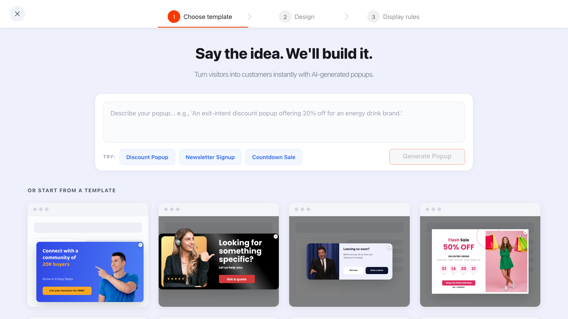
Start from a template that matches the ask — a homepage welcome should be visually quieter than a sale popup.
Worked copy for five kinds of site
Online store
"First time here? 10% off your first order."
"Enter your email and the code appears on the next screen."
New visitors, exit intent, once every 7 days. The code shows immediately — nobody should have to open
their inbox mid-browse.
Software
"Not sure where to start? Take the 2-minute tour."
Returning visitors, 15-second delay. For new visitors, offer the resource instead of the trial: a template, a
teardown, a checklist. Asking a twelve-second-old visitor to book a demo is how homepages earn their bad
reputation.
Local service business
"Need a quote this week? Tell us what you need and we'll call back today."
Name, phone, one "what do you need?" field. Everyone, 20-second delay, once per session. Add an
opening-hours line so nobody expects a call at 11pm.
Blog or publisher
"One good idea a week. No filler."
New visitors, exit intent. The homepage version should be softer than the in-article version — the reader
hasn't read anything yet, so the promise has to carry it alone.
Agency or studio
"See what we charge before you enquire."
A pricing guide behind an email. It filters your enquiries as well as building the list, which is the rare
case where a homepage popup does two jobs at once.
Mobile homepages need their own campaign
The homepage is usually the most mobile-heavy page on a site, and mobile is where homepage popups do the most damage.
- Exit intent doesn't fire on phones. Build the mobile version as a separate campaign on scroll or a delay, with the desktop one restricted to desktop.
- Leave the page visible. A popup that covers a phone screen entirely on first visit is exactly the intrusive-interstitial pattern search engines dislike.
- One field, big button, big close. Test the close control with a thumb, not a cursor.
- Bars beat modals on small screens more often than people expect — they say the thing without taking the screen.
Seven homepage popup mistakes
- Firing on load. The single most common mistake and the one with SEO consequences.
- Leaking onto every page. Use URL-is-exactly, then verify on three other pages.
- Asking subscribers to subscribe. Turn off "show again after conversion" and give returning visitors their own campaign.
- A homepage popup that sells a specific product. You don't know what they came for. Sell the relationship, not the SKU.
- Two overlays in one session. A cookie banner plus a welcome popup is a hostile front door. Delay past the banner.
- A hidden or tiny close button. It doesn't increase conversions; it increases exits and bad reviews.
- Never revisiting it. The homepage popup is the one campaign every site sets up once and leaves running for three years, offer and all.
How to judge whether it's working
Read three numbers per campaign, and read them per campaign rather than as a site average: views (is it actually being shown?), submissions, and conversion rate. Then look at the desktop-versus-mobile split, which explains most disappointing homepage results — typically a desktop campaign quietly showing on phones without an exit trigger that can ever fire.

Views first. A homepage campaign that isn't being shown is a rules problem, not a copy problem.
One number that isn't a popup number but matters more: what happened to your homepage bounce rate and click-through to the next page. A popup that gains subscribers while pushing people off the site is not a win, and the homepage is the page where that trade is most likely to be real. Our bounce rate guide covers how to read that honestly.
When to have no homepage popup at all
Three cases where the right answer is nothing:
- Your homepage is a login screen. If most traffic is existing customers signing in, a marketing popup is pure friction on a support-heavy page.
- You already have a strong inline signup above the fold. Two asks in one screen is one too many; test the inline form properly before adding an overlay.
- You have nothing to offer yet. "Join our newsletter" with no reason attached converts badly enough that the interruption costs more than the list gains. Build the offer first.
Give your homepage a popup it deserves
Build one campaign for first-timers and one for returning visitors, with rules that keep them apart. Free plan, no credit card required. Paid plans from $29/month.
Start free →Related reading
Frequently asked questions
Should you put a popup on your homepage?
Usually yes, but a smaller one than you would put elsewhere. Homepage traffic is high-volume and low-intent — people are orienting, not deciding — so a homepage popup should ask for one thing, arrive after the visitor has looked around, and be trivially easy to dismiss.
When should a homepage popup appear?
Never on load. Give it a signal that the visitor has engaged: a delay of roughly 10–20 seconds, a scroll of about half the page, or exit intent on desktop. A popup that covers the homepage before it has been read is the pattern search engines treat as an intrusive interstitial, and visitors treat as a reason to leave.
What should a homepage popup say?
One offer, in the visitor's language, with one field. On a store, the welcome discount. On a software site, the thing that makes the product make sense — a guide, a template, a short demo. Avoid asking someone who has been on your site for twelve seconds to book a call.
Should returning visitors see the same homepage popup?
No. A returning visitor has already seen your welcome offer and either took it or ignored it. Target them with a different campaign — a current promotion, a new arrival, a one-question segmenter — and turn off “show again after conversion” so anyone who already signed up stops being asked.
How often should a homepage popup show?
Once, then leave a gap. A frequency of once every seven days is a sane default for a welcome offer, and once per session is the most aggressive setting that stays polite. If someone dismissed it on the homepage, they should not meet it again on the next page they open.
Is an announcement bar better than a popup on the homepage?
For anything that is information rather than an ask — shipping deadlines, a sale window, opening hours — yes. A slim bar anchored to the top or bottom interrupts least and can stay visible for the whole visit, while a modal has to earn the interruption with a real offer.