
A high bounce rate means visitors arrive, look, and leave without doing anything else — no second page, no click, no scroll worth counting. To reduce it you fix the three things underneath it: page speed, message match between what they searched for and what they landed on, and an obvious next step once they've read it. Everything else in this guide is a variation on those three.
What follows is the practical version: what a bounce actually is in modern analytics, the six causes worth your time, twelve fixes ranked from "do it this afternoon" to "book a sprint", and the one-question survey that tells you which of the twelve you actually need — asked of the people who are leaving, at the moment they leave.
Key Takeaways
- Bounce rate is a symptom, not a disease. Chase the cause — slow load, wrong match, no next step — and the number follows.
- There is no "good" bounce rate. Compare a page to its own history or to sibling pages, never to an industry average you read somewhere.
- Ask the leavers. A single exit-intent question beats a month of speculation, and partial answers still count.
- Popups can cut bounce rate or cause it. Trigger on exit intent or 50% scroll, never on arrival, and exclude the pages where the interruption is the problem.
- Some bounces are wins. Someone who got their answer in eight seconds and left happy is not a failure — count the conversions, not just the sessions.
What counts as a bounce (and what doesn't)
Bounce, in two sentences
A bounce is a session that started on a page and ended there with no qualifying interaction — no second page view, no tracked event, no meaningful time on site. Bounce rate is the share of a page's sessions that ended that way.
The definition matters more than it used to, because analytics platforms moved the goalposts. The old model counted a bounce whenever a visitor viewed exactly one page, however long they stayed. The modern model flips it: sessions are classed as engaged when they last beyond a few seconds, fire a tracked event, or view more than one page — and bounce rate is simply everything that isn't engaged.
That flip has a practical consequence people miss. Under the modern definition, a visitor who reads one long article for four minutes and leaves is not a bounce. Neither is one who answers a survey, clicks a popup, or opens a video. Any tracked interaction moves them out of the bounce column — which is why "reduce bounce rate" and "give people something to do" are, in practice, the same project.
| Metric | What it counts | Where it's useful | Where it misleads |
|---|---|---|---|
| Bounce rate | Sessions that started here and ended with no engagement | Landing pages, paid campaign destinations, category pages | Single-answer pages — contact details, opening hours, a definition |
| Exit rate | Share of all views of this page that ended the session | Finding the leak inside a multi-step funnel | Confirmation and thank-you pages, where a high exit is correct |
| Engagement rate | The inverse of bounce rate in modern analytics | Reporting to people who hear "bounce" as "failure" | Same blind spot, positive framing — it still can't see intent |
| Scroll depth | How far down the page people actually got | Diagnosing where a long page loses attention | Short pages, where everything is above the fold anyway |
Watch for the fake improvement. Adding any tracked event to a page — a scroll milestone, a video play, a popup view — mechanically lowers bounce rate without changing a single visitor's behaviour. If your number drops the week you added tracking, you didn't fix anything. Check conversions and revenue alongside it, every time.
The six causes worth fixing
Almost every genuinely high bounce rate traces back to one of six things. Diagnose before you prescribe — the fixes below are cheap, but doing all twelve when you needed two is a wasted month.
- The page is slow. Every extra second before the first meaningful paint costs you visitors who were only mildly curious to begin with. Mobile on a weak connection is the case that decides this, not your laptop on office wifi.
- The message doesn't match. They searched for "waterproof hiking boots women" and landed on a generic footwear category. The click was earned by a promise the page doesn't immediately keep.
- There's no obvious next step. The visitor read it, agreed with it, and then found nothing to click. This is the single most common cause on blogs.
- It's unreadable on a phone. 11px grey body text, a cookie banner covering a third of the screen, images that reflow the text as they load.
- Something interrupts too early. A popup on arrival, an autoplaying video, a newsletter overlay before a single paragraph has been read. The first interaction you offered was a close button.
- The traffic is wrong. Broad paid keywords, clickbait social posts, or a title tag that oversells. No on-page fix rescues a visitor who was never going to want this.
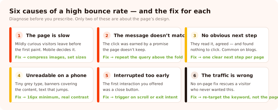
Diagnose first. Each cause has a different fix, and only two of them are about the page's design.
Twelve fixes, ranked by payback
Fixes 1–4: make the page keep its promise (this week)
- Compress and size your images properly. On most small sites, unoptimised hero images are the whole speed problem. Serve modern formats, set explicit width and height so nothing jumps as it loads, and lazy-load anything below the fold.
- Put the promise in the first screen. The headline should repeat the language of the query or ad that brought them. If someone clicked "free returns", the words free returns belong above the fold, not in a footer accordion.
- Answer the query in the first forty words. Don't warm up. State the answer, then expand. Visitors who get their answer immediately are far more likely to keep reading than ones who have to dig for it.
- Fix the mobile type. 16px minimum body text, generous line height, real contrast, short paragraphs. Then load the page on an actual phone — not a resized browser window — and read it.
Fixes 5–8: give them somewhere to go (this month)
- Add one clear next step per page. One. A page with seven equally weighted links gives the visitor a decision instead of a direction.
- Link internally, in the body, in context. Related-post grids at the bottom get a fraction of the clicks that a relevant in-paragraph link gets halfway down.
- Offer the thing they came for as a next action. On a guide, that's the checklist or template version of the guide. On a category page, it's a filter that narrows the choice.
- Use a scroll-triggered offer instead of an arrival popup. A visitor who has read half the page has demonstrated interest; one who has been there four seconds has demonstrated nothing. Trigger at 50% scroll and the same offer stops being an interruption.
Fixes 9–12: change what arrives (this quarter)
- Rewrite title tags and meta descriptions that oversell. A more honest snippet costs you clicks and gains you engaged sessions. That's a good trade.
- Split pages that serve two intents. One page trying to rank for "what is X" and sell X will bounce both audiences. Two pages, cross-linked, will not.
- Cut or re-target the worst paid keywords. Sort by bounce rate and spend. The intersection of "expensive" and "bounces hard" is usually one or two broad terms.
- Ask leavers why. The highest-value fix on this list, and the subject of the next section — because it tells you which of the previous eleven you actually needed.
Ask the people who are leaving
Every other fix on this page is a hypothesis. An exit survey is evidence. And the mechanics are forgiving: you're catching someone who was leaving anyway, so the downside of asking is close to zero.
Build it as a one-question survey on exit intent, page-targeted to your three worst-bouncing URLs. Four tappable options and one optional free-text box:
"You're heading off — what were you looking for?"
• Prices • Sizes and fit • Delivery and returns • Just browsing
Anything else we should have told you? (optional)
Two weeks of that on a mid-traffic page will hand you a ranked list of what your page fails to say. The pattern is usually blunt — one option takes half the votes, and it's nearly always information you thought was obvious or had buried three clicks deep.
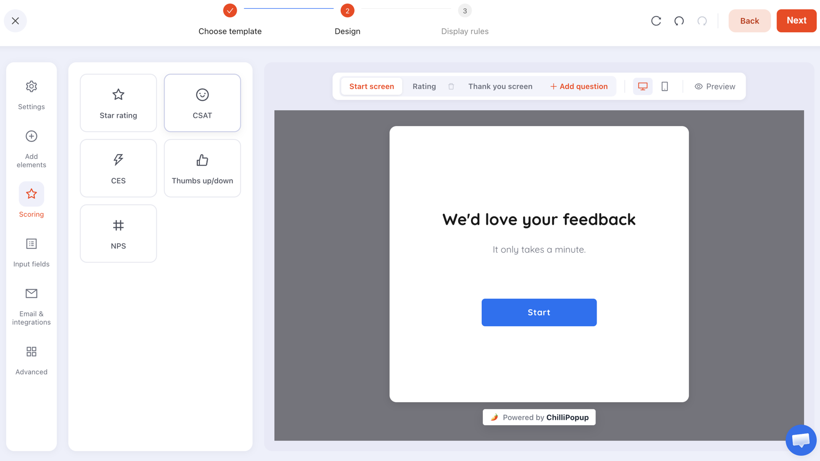
Stepped content is built one screen at a time. For an exit survey, one question is the whole survey — resist adding a second.
Two mechanics make this better than a generic feedback widget. First, partial responses: if someone taps an option and closes without submitting, what they touched is still recorded and shown in the dashboard under "Answers visitors entered before leaving without submitting." On an exit survey, that's a meaningful share of your data. Second, drop-off analysis ranks the questions people quit on — which, if you ignored the advice above and asked three questions, tells you which two to delete.
Exit intent is a desktop signal. It fires when the cursor leaves toward the browser chrome, and phones have no cursor. For mobile, run the same survey off a scroll or inactivity trigger instead, and expect a different mix of answers — mobile visitors leave for different reasons.
Where popups reduce bounce rate — and where they cause it
Both claims you've read are true, and the variable is always the rule set, never the popup. Here is the honest split.
| Setup | Effect on bounce rate | Why |
|---|---|---|
| Fires on arrival, full-screen, mobile | Worse | First interaction offered is a close button, before any value has landed |
| Fires at 50% scroll with a relevant offer | Better | Only reaches readers, and the interaction itself counts as engagement |
| Exit intent on desktop | Better or neutral | The session was ending anyway; anything they do next is upside |
| Same popup on every page, every visit | Worse over time | Returning visitors learn to dismiss before reading — including your good campaigns |
| An inline form in the body of the article | Better | Zero interruption cost, and it sits where interest peaks |
The rules that make the difference all live in one place. In ChilliPopup, every popup, form, survey and quiz carries its own display rules, and four of them decide whether a campaign helps or hurts engagement:
- Trigger — exit intent, a time delay in seconds, scroll percentage, page count, click count or inactivity. The content appears as soon as the first enabled trigger fires, so enabling five is the same as enabling the fastest one.
- Page targeting — restrict by URL with contains, does not contain, is exactly, is not, starts with or ends with. This is how you keep the campaign off your support and checkout pages.
- Frequency — once a day, every visit, every session, once every N days or once every N visits. This is what stops a returning reader meeting the same overlay six times.
- Show again after conversion — turn it off and subscribers stop seeing the signup popup. Leaving it on is the most reliable way to annoy your best visitors.
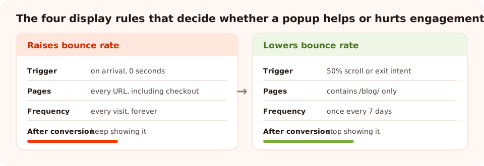
Same popup, same offer. Four settings decide whether it counts as engagement or as an interruption.
And if you're worried about the search side of this: interruption penalties are about intrusive interstitials on mobile at the moment of arrival, not popups in general. The full explanation is here, and the short version is that the same fix — don't fire on arrival, don't cover the content on a phone — solves both the ranking risk and the bounce-rate risk at once.
A worked example: a blog post bouncing at 86%
Take a realistic case — a comparison article on a small ecommerce blog. Here's the sequence that works:
Week 1 — measure honestly. The page bounces at 86%, ranks well, and gets 4,000 sessions a month. Scroll depth shows a median of 70%, which is the important clue: people are reading. This isn't a content problem, it's a next-step problem.
Week 1 — ask. A one-question exit survey goes live, page-targeted to that URL, triggered on exit intent for desktop and 60% scroll for mobile, frequency set to once a day. 147 responses in eight days. The top answer, at 41%: "Which one should I actually buy?"
Week 2 — fix the actual gap. A short verdict box goes in at the top ("If you just want the answer: X for most people, Y if you need Z"), plus two in-body links to the relevant product pages at the exact paragraphs where the reader is deciding.
Week 2 — add one relevant next step. A scroll-triggered popup at 55% offering the one-page comparison checklist as a download, in exchange for an email. Not a generic newsletter box — the checklist version of the thing they're already reading.
Week 4 — read the result. Bounce rate falls, but that is the least interesting number on the page. What you actually check is: did clicks to the product pages go up, and did the popup convert? If the popup converts at a reasonable rate and product clicks doubled, the page is fixed whatever the bounce column says.
The pattern generalises. Measure → ask the leavers → fix the one thing they named → add one relevant next step → check conversions, not just bounce rate. Four weeks, one page at a time.
Ask your leavers before they go
Build exit surveys, scroll-triggered offers and inline forms from one editor — and one pixel. Free plan, no credit card required. Paid plans from $29/month.
Start free →Seven mistakes that make bounce rate worse
- Chasing an industry benchmark. Those averages blend page types, devices and traffic sources that have nothing to do with yours. Your page's own last month is the only fair comparison.
- Adding tracked events to "improve" the number. It moves the metric and changes nothing real. If you do add events, note the date so you don't misread the step change later.
- Firing a popup on arrival. The one change that reliably makes both bounce rate and mobile search performance worse.
- Optimising a page that's doing its job. A page answering "what time do you open" in six seconds should bounce. Leave it alone.
- Fixing design when the problem is traffic. If one ad group bounces at 92% and everything else sits at 45%, the page isn't the variable.
- Adding seven next steps instead of one. More links, less action. Pick the one you actually want and make it visually louder than everything else.
- Never asking anyone. The cheapest data source on your site is the visitor with their cursor already halfway to the tab bar.
What to measure instead
Bounce rate is a fine tripwire and a terrible goal. Track it to notice that something changed, then judge the change on numbers that connect to money:
- Conversions per session, split by landing page. The only number that survives a change in how bounces are counted.
- Scroll depth on long pages. Tells you where attention dies, which bounce rate never will.
- Clicks on the intended next step. If this rises and bounce rate doesn't move, you still won.
- Campaign engagement. Each popup, form, survey and quiz reports its own views, clicks, submissions and conversion rate, plus the values collected per field — so you can see whether the thing you added to fix bounce rate is being used at all.
- Survey completion rate and average time, for stepped content. Surveys and quizzes report a four-stage funnel — views, interactions, abandoned, submissions — which is a far more honest engagement picture than one binary flag per session.
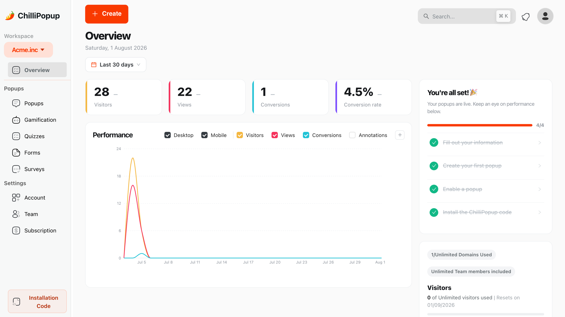
Judge the fix on conversions and engagement. Bounce rate is the alarm, not the outcome.
Reduce bounce rate in ChilliPopup: five steps
About an hour, no code. If the pixel isn't on your site yet, start with the one-line install guide — the same script serves every campaign below.
1. Pick your three worst pages
Sort landing pages by sessions × bounce rate, not bounce rate alone — a page bouncing at 95% with 30 visits a month is not your problem. Take the top three by lost sessions.
2. Put a one-question exit survey on them
One question, four options, one optional text box. Page-target those three URLs with contains. Trigger on exit intent, and add a scroll trigger around 60% so mobile visitors are covered too. Set frequency to once a day.
3. Read it after 100 responses, then fix the top answer
Check the collected-fields breakdown for the dominant option and read the free-text answers. Fix that one thing on the page — usually a missing piece of information or an absent next step.
4. Add one relevant next step as a scroll-triggered offer
Build a popup or an inline form offering the logical continuation of that page. Trigger at 50–60% scroll, turn the display frequency rule on, then set the audience and turn off "show again after conversion".
5. Re-measure in four weeks — on conversions
Compare conversions per session and clicks on the next step against the four weeks before. Then take the survey down, move it to the next three pages, and repeat.
Related reading
Frequently asked questions
What is a good bounce rate?
There is no universal number, because bounce rate depends entirely on page type and traffic source. A blog post that answers a question completely can bounce at 80% and be doing its job; a product page that bounces at 80% has a problem. The only comparison worth making is a page against its own history, or a page against other pages of the same type on the same site.
What causes a high bounce rate?
Six things, in rough order of frequency: the page loads too slowly, the content does not match what the visitor searched for, there is no obvious next step, the layout is unreadable on a phone, an interruption fires before the visitor has read anything, or the traffic itself is poorly matched — broad paid keywords and viral social clicks bounce hard no matter what you do.
What is the difference between bounce rate and exit rate?
Bounce rate is the share of sessions that started on a page and ended without any further interaction. Exit rate is the share of all views of a page that were the last page of the session, including sessions that began elsewhere. A checkout confirmation page should have a high exit rate and that is fine; a high bounce rate on a landing page almost never is.
Do popups increase bounce rate?
A badly ruled popup does — one that fires on arrival, covers the content on mobile, and gives the visitor a close button as their first interaction. A well ruled one usually lowers it, because an interaction with a popup is itself engagement, and an exit-intent offer gives a leaving visitor a reason to stay. The difference is entirely in the trigger and the targeting, not in the popup.
How do I find out why visitors are leaving?
Ask them. A one-question exit-intent survey — "You're heading off. What were you looking for?" — with four tappable options and an optional text box will collect more usable diagnosis in a week than a month of guessing at heatmaps. Partial answers are recorded too, so even people who quit mid-survey tell you something.
Does reducing bounce rate improve SEO rankings?
Not directly. Bounce rate is a number your own analytics computes; search engines do not read it. What helps rankings is the underlying thing you fix to lower it — a faster page, content that matches the query, and clear internal links — because those genuinely improve the experience the search engine is trying to reward.