
A landing page popup is a message that appears over a page whose entire purpose is a single conversion. That makes it the highest-stakes popup on your site: on a blog post an ill-timed interruption costs you a scroll, but on a landing page you are paying for the click and interrupting the exact person you paid for.
The good news is that the decision is not a matter of taste. There is one question that separates a popup that adds conversions from one that quietly steals them, and you can answer it before you build anything.
Key Takeaways
- One question decides everything: does the popup compete with the page's primary action, or catch the people who already refused it?
- Never fire on load on a paid landing page. Immediate full-screen interruptions are the pattern that damages both ad landing-page experience and organic rankings.
- Exit intent on desktop, scroll or time on mobile — both wait for a disengagement signal instead of interrupting a decision.
- The popup offer must be smaller and different from the page offer. Repeating the page headline gives a visitor a second chance to say no.
- Judge it on page conversion rate, not popup conversion rate. A popup converting at 6% while the page drops 8% is a loss dressed up as a win.
What counts as a landing page popup
Landing page popup, defined
A landing page popup is any overlay, slide-in or bar shown on a page built for a single conversion goal — a signup page, a demo request, a lead-magnet download, a product page you send ads to. Unlike a site-wide popup, it competes directly with the one action the page was built to produce, so it has to earn its place rather than simply be enabled.
The distinction that matters is not the popup's shape. A slide-in, a lightbox, a floating bar and an inline block are all just placements. What matters is when it fires relative to the visitor's decision about the page's own offer.
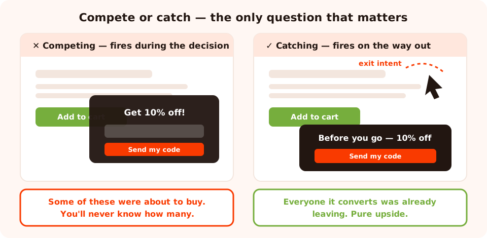
Same popup, same copy, two timings. Only one of them can add conversions.
The one rule: compete or catch
Before you write a word of popup copy, name the page's primary action. Not the business goal — the literal thing you want a person to click. "Start free trial." "Book a demo." "Add to cart." "Download the report."
Now put the popup in one of two buckets:
- Competing. It appears while the visitor is still reading, comparing or typing. Every conversion it takes might have been a primary conversion anyway — and you'll never know which.
- Catching. It appears only after a disengagement signal: the cursor heading for the tab bar, a long scroll with no interaction, a return visit that ends the same way as the last one. Everyone it converts was on their way out.
The working rule. On a landing page, a popup is only allowed to talk to people who have effectively already declined. If you can't point at the signal that says "this person is leaving", the popup is competing — and competing popups lose more than they win.
There is one honest exception: pages with a long, considered offer — pricing pages, comparison pages, long-form sales pages — where a slide-in at deep scroll offers something genuinely different (a printable checklist, a "send me this as a PDF" option). It doesn't cover the page, it doesn't replace the CTA, and it converts the reader who is interested but not ready.
Where landing page popups actually help
Different landing pages leak conversions in different places. Match the popup to the leak.
| Landing page type | Primary action | Popup job | Trigger |
|---|---|---|---|
| Paid product / offer page | Add to cart or buy | Recover the leaver with a first-order incentive | Exit intent (desktop), 50% scroll (mobile) |
| Demo / quote request | Submit the long form | Offer the lower-commitment asset instead — pricing sheet, guide | Exit intent, or inactivity after form abandonment |
| Lead magnet page | Download | Ask the one segmenting question after the download starts | Click on the download button |
| Webinar / event page | Register | "Can't make it live? Get the recording." | Exit intent |
| Pricing page | Choose a plan | Answer the objection: a quiz that recommends a plan, or a "talk to us" offer | Deep scroll or long time on page |
| Thank-you page | Already converted | The safest popup you'll ever run — ask for the second step | Short delay after load |
Notice the pattern: on every row except the last, the popup is offering something the page is not offering. That is the whole trick. A popup that repeats the page's headline ("Still want your free trial?") gives an unconvinced person a second opportunity to decline.
Four patterns that work — and one that doesn't
1. The exit-intent second chance
The default, and the only one most landing pages need. The visitor's cursor accelerates towards the browser chrome, the popup appears with a smaller ask than the page's, and the people who were leaving get one more option. On mobile there is no cursor, so substitute a scroll-depth or inactivity trigger.
2. The deep-scroll slide-in
A corner slide-in at 60–70% scroll on a long sales page. It never covers the content, it doesn't block the CTA, and it catches the reader who has consumed the whole argument without acting. Keep it to one line and one field.
3. The click-triggered lightbox
The best-converting "popup" on a landing page is often the one the visitor opens themselves. Put a plain link or button in the page copy — "See the 3 sizes side by side", "Get the price list" — and have it open the campaign on click. Zero interruption, high intent, and it never competes with anything because the visitor chose it.
<a href="#" onclick="ChilliPopup.open('YOUR_CONTENT_UUID'); return false;">
  Get the price list
</a>

<!-- or open it in a dimmed lightbox / a docked side panel -->
ChilliPopup.open('YOUR_CONTENT_UUID', { mode: 'lightbox' });
ChilliPopup.open('YOUR_CONTENT_UUID', { mode: 'sidebar' });
4. The inline block that isn't a popup at all
Sometimes the honest answer is "don't interrupt — embed". The same campaign you would have shown as an overlay can be rendered in the flow of the page, exactly where you drop it, by placing a single div next to the pixel script. It's the right call halfway down a long page, or in a sidebar, where an overlay would be obnoxious but a form is welcome.
<div class="chillipopup-inline" data-uuid="YOUR_CONTENT_UUID"></div>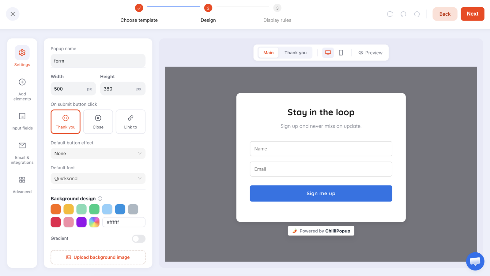
The same builder produces the overlay and the inline block — only the snippet you paste changes.
The pattern that doesn't work: the immediate full-screen interstitial on arrival. It is the single most damaging popup you can put on a landing page — it hurts the paid click you just bought, it is the exact pattern search engines penalise on mobile, and it converts the people who would have converted anyway. If your popup has a time trigger under five seconds on a landing page, change it before you read the rest of this.
Two worked examples with real copy
Example 1 — a paid product landing page
Page primary action: Add to cart. Leak: first-time visitors from ads bounce at the price.
The popup (exit intent, desktop; 50% scroll, mobile):
Headline: Before you go — 10% off your first order
Body: We'll email the code now. It works on everything, including the bundle.
Field: Email
Button: Send my code
Decline link: No thanks, I'll pay full price
Why it works: the offer is different from the page's (a discount, not the product), the ask is one field, and the decline link gives the visitor a dignified exit — which, counter-intuitively, is what keeps the popup from feeling like a trap.
Example 2 — a B2B demo request page
Page primary action: Submit a seven-field demo form. Leak: people who aren't ready to talk to sales.
The popup (exit intent):
Headline: Not ready for a demo?
Body: Take the pricing and implementation guide instead. No call required.
Field: Work email (email validation set to accept only business emails)
Button: Send me the guide
Decline link: No thanks
Why it works: it converts the exact objection that made them leave. The demo form stays untouched for the people who are ready, and the popup harvests the much larger group who weren't.
The display rules that keep it honest
Everything above is enforced in one screen. In ChilliPopup, every popup, form, survey and quiz carries its own display rules, and a landing page popup is simply a normal campaign ruled tightly enough that it can only reach leavers.
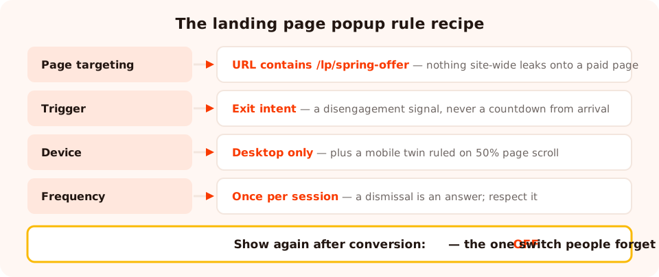
Four rules turn a site-wide popup into a landing page popup that can only ever talk to people who are leaving.
- Page targeting. Restrict the campaign by URL with contains, is exactly, starts with, ends with, does not contain or is not. A landing page popup should always be locked to its page — the most common mistake is a site-wide campaign leaking onto a paid page nobody meant it to touch.
- Trigger. Exit intent, a time delay, scroll percentage, page count, click count or inactivity. On a landing page, only the disengagement ones qualify.
- Device. Run two versions: exit intent for desktop, scroll for mobile. Exit intent has no reliable mobile equivalent, so a desktop-only rule plus a mobile twin beats one compromised campaign.
- Frequency. Once a day, every visit, every session, once every N days or once every N visits. On a paid page where visitors rarely return, once per session is enough; on an evergreen page, give a dismissal a real cooldown.
- Show again after conversion. Turn it off. Someone who took the offer should never see it again — nothing makes a brand look less attentive.
Two rules worth knowing about: every enabled rule is an AND gate, so device, browser, date window and even a weekday-and-hour schedule can narrow a campaign further; and new-versus-returning recognition is computed from the visitor's own browser storage, so a second device or a private window looks like a brand-new visitor.
Mobile landing pages need their own rules
Most of the damage attributed to "popups on landing pages" is really damage from desktop popups shown unchanged on phones. Three fixes cover nearly all of it:
- Replace the trigger. There is no cursor to detect, so exit intent silently becomes "never fires" or fires at the wrong moment. Use scroll depth or inactivity.
- Replace the layout. A 720×480 desktop card becomes a wall on a phone. Design the mobile version as its own campaign, or at minimum check it in the editor's mobile preview before publishing.
- Make the close button unmissable. A popup that is hard to dismiss on a phone is exactly the pattern that gets a page treated as an intrusive interstitial.
The full breakdown lives in our mobile popup best practices guide.
Measure the page, not the popup
This is where most landing page popup decisions go wrong. The popup dashboard will happily tell you the popup converted at 7%, and that number is completely silent on the question you actually asked: did the page produce more conversions per visitor than it did before?

Views, clicks, submissions and conversion rate per campaign — useful, but always read alongside the page's own conversion rate.
Three numbers, in this order:
- Page conversions per visitor, before and after the popup went live. This is the verdict. Everything else is diagnosis.
- Popup views vs page sessions. If the popup is being seen by most visitors, it is not a leaver-only popup — the rules are wrong, whatever the trigger says.
- Popup conversion rate, compared against itself over time. Rewriting the headline is the cheapest experiment on the page.
When you want a clean read on a copy or offer change, run it as an A/B test rather than a before-and-after — the traffic mix on a landing page shifts constantly, and a split test is the only way to keep that from contaminating the result. Deeper metric definitions are in the popup analytics guide.
Seven mistakes that sink a landing page popup
- Firing on load. Costs you the click you paid for and trips the intrusive-interstitial pattern. There is no version of this that is worth testing.
- Offering the same thing as the page. A second "Start your free trial" is a second no.
- Letting a site-wide popup leak onto the landing page. Always add the URL rule, even when you think the campaign is scoped.
- A popup form longer than the page form. The popup is the easier option by definition. One field.
- No visible decline. A clear "no thanks" link raises trust and costs almost nothing — the people who click it were not converting.
- Design that looks like an ad. If the popup doesn't share the page's typeface and colours, visitors read it as third-party and dismiss reflexively.
- Judging it by its own conversion rate. The popup is a component of the page. The page is the unit of measurement.
Build a landing page popup in ChilliPopup
Thirty minutes, no code beyond the one-line pixel. If it isn't installed yet, start with the install guide — one script covers every campaign on every page.
1. Write down the page's primary action
One sentence, the literal button text. Every later decision gets checked against it: is this popup competing with that, or catching the people who refused it?
2. Choose a smaller, different offer
The guide instead of the demo. The code instead of the cart. The recording instead of the live seat. If you can't name a second offer, you don't need a popup on this page.
3. Build it with one field
Start from a template or describe the popup in one sentence and let the AI generate the draft, then strip it to a headline, one email input, one button and a visible decline link. Match the landing page's fonts and colours in the editor's design step.
4. Rule it to leavers only
In display rules: page targeting contains your landing page path, trigger set to exit intent, device limited to desktop. Duplicate the campaign for mobile with a scroll trigger instead. Switch the display-frequency rule on, then turn off show again after conversion.
5. Read the page number in two weeks
Compare conversions per visitor for the page, not the popup. If it went up, keep it and start testing the headline. If it went flat or down, the popup is competing — move the trigger later or take it off the page.
Add the second chance to your best page
Build popups, forms, surveys, quizzes and prize games from one editor — and one pixel. Free plan, no credit card required. Paid plans from $29/month.
Start free →Related reading
Frequently asked questions
Do popups hurt landing page conversion rates?
Only when they compete with the page's primary action. A popup that fires while someone is reading the offer or filling in the form steals attention from the conversion you already paid for. A popup that fires on exit intent, or after a long scroll with no click, is talking to people who were leaving anyway — it can only add conversions. Judge every landing page popup by the page conversion rate, not the popup conversion rate.
What is the best trigger for a landing page popup?
Exit intent on desktop, and a scroll or time trigger on mobile where exit intent is unreliable. Both wait for a signal that the visitor is disengaging instead of interrupting them mid-decision. Avoid an immediate time delay on a paid landing page — it fires before anyone has read the offer, which is exactly when a popup costs you money.
Should I use a popup or an inline form on a landing page?
Use both, for different jobs. The inline form is the page's primary action and should never be replaced by a popup. A popup is the second chance: it appears when someone is about to leave without filling in that form. In ChilliPopup you can even render the same campaign inline by dropping a div with the class chillipopup-inline and the content uuid where you want it in the page.
How many popups should a landing page have?
One. A landing page has one goal, so it gets one interruption at most. If you have two offers worth showing, split them by URL — a different popup on the pricing page than on the blog post — rather than stacking two on the same page.
Do popups affect Google Ads quality score or SEO?
A popup that covers the main content immediately on arrival is the pattern search engines treat as an intrusive interstitial, and ad landing-page experience is scored on the same kind of friction. Delayed, dismissible, exit-triggered popups with an obvious close button are a different thing entirely. Never fire a full-screen popup on load on a page you are paying for traffic to.
What should a landing page popup say?
Something the page itself does not already offer. If the page sells a demo, the popup should not also sell the demo — it should offer the smaller thing a not-ready visitor will take: the guide, the pricing sheet, the checklist, the discount. A popup that repeats the page headline gives an unconvinced visitor a second chance to say no.