If your Shopify store gets traffic but not enough orders, the fix is almost never a new theme. It's one of three things: shoppers can't find the answer to their main objection on the product page, the real total cost only appears at checkout, or the store is quietly broken on a phone. Fix those and the conversion rate moves; restyle the homepage and it won't.
Below: how to read your store's own funnel to find the stage that's actually losing money, fourteen changes ranked by payback, the mobile checks most stores fail, and how to avoid the discount trap — the "win" that raises conversion rate and lowers profit at the same time.
Key Takeaways
- Read the funnel before you touch the theme. Sessions → product views → added to cart → reached checkout → converted. One gap is bigger than the rest.
- Most stores leak between product view and add to cart — an information problem, not a design problem.
- Surprise costs are the number-one checkout killer. Show delivery cost and timing on the product page, not at step three.
- Test on a real phone, on mobile data. Two-thirds of your traffic sees a version of the store you never look at.
- Judge everything on revenue per session. A discount that lifts conversion rate and cuts margin is not a win.
Read your own funnel first
Shopify's analytics already reports an online-store conversion funnel: sessions, sessions with product views, sessions that added to cart, sessions that reached checkout, and sessions that converted. Before anything else, write those five numbers down for the last 30 days and calculate the gap between each.
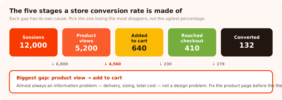
Four gaps. Only one of them is worth a month of your attention — and it's usually not checkout.
Then apply two rules. Work in absolute numbers: a stage losing 40% of 6,000 shoppers beats one losing 80% of 300. And remember that each gap has a different cause, so the gap you pick determines which of the fourteen changes below is even relevant to you.
| The gap | What it usually means | Where to work |
|---|---|---|
| Sessions → product views | Traffic mismatch, slow load, or a homepage with no route in | Ads and search terms, speed, collection navigation |
| Product views → add to cart | An unanswered objection — sizing, delivery, quality, total cost | The product page. This is the big one on most stores. |
| Add to cart → reached checkout | Shipping surprise, or the cart is being used as a wishlist | Cart drawer, shipping calculator, exit-intent recovery |
| Reached checkout → converted | Payment friction, forced account, unexpected final total | Checkout settings, payment methods, guest checkout |
Fourteen changes, ranked by payback
Product page (fixes the biggest gap on most stores)
- Put delivery cost and timing next to the price. "Ships in 1–2 days · Free over €60" in plain text. This single line resolves the most common reason a shopper stalls.
- Answer the top three objections on the page. Read your support inbox, take the three most frequent pre-purchase questions, and answer them above the fold — not in a tab nobody opens.
- Show the product in use, not just on white. Scale, texture and fit are what the shopper can't judge through a screen. One in-context photo beats four more studio angles.
- Make sizing unmissable. A real size chart, real model measurements, and a plain sentence about fit ("runs small — size up if you're between sizes").
- State the returns window in the buy area. Not the footer. Removing the risk is part of the price.
- Cut the noise around the add-to-cart button. One primary action. Badges, upsells and trust icons all compete with the thing you want clicked.
Collection and navigation
- Add the filters shoppers actually use — size, colour, price, availability. On a catalogue of any size, filtering is the difference between browsing and leaving.
- Fix in-stock sorting. Sold-out products at the top of a collection page train shoppers to assume you have nothing.
- Give every collection a two-line intro. It helps the shopper and it helps the page rank for the query that brought them.
Cart and checkout
- Show the free-shipping gap in the cart. "You're €12 away from free delivery" raises average order value and reduces the shipping shock at checkout.
- Turn on every payment method your audience expects, including the wallets. A missing wallet button is a silent drop-off.
- Allow guest checkout. Forced account creation is one of the most reliable ways to lose an order that was otherwise finished.
Everywhere
- Audit your installed apps for scripts. Every app that injects JavaScript on every page costs you load time. Uninstall the ones you no longer use — leftover scripts often stay behind.
- Compress and size your images. On most Shopify themes, unoptimised hero and collection images are the entire mobile speed problem.
Do them one at a time. Shipping all fourteen in a weekend feels productive and teaches you nothing — if conversion rate moves you won't know which change did it, and if it falls you won't know what to undo.
Ask shoppers what's actually stopping them
Every item on that list is a hypothesis until a shopper confirms it. The fastest way to find out which one applies to your store is to ask the people who are leaving, on the page where they leave.
Build a one-question survey, page-targeted to
URLs containing /products/, triggered on exit intent for desktop and a scroll percentage
for mobile:
"Before you go — anything stopping you from ordering today?"
• Price • Delivery time or cost • Not sure about size or fit
• Just browsing
Anything we should have told you? (optional)
Two hundred responses is plenty, and it usually takes a week or two on a store doing decent traffic. The winning option tells you which of the fourteen changes to make first; the free-text answers tell you exactly how to word it. Partial responses count too — if someone taps an option and closes without submitting, that tap is still recorded and shown in the dashboard.
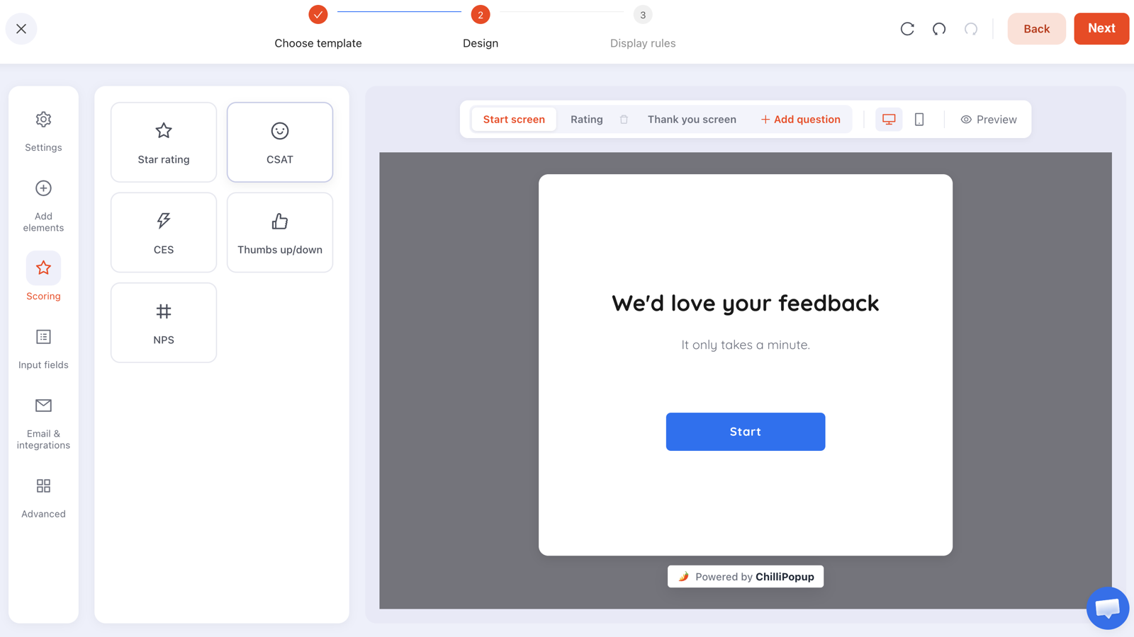
One question is the whole survey. Two questions halve your response count for information you probably won't act on.
The recovery layer: catching shoppers who are leaving anyway
Once the page itself is fixed, the second job is catching the people who still leave. This is where popups earn their place on a store — not as an arrival interruption, but as a last offer to someone whose session was ending regardless.
| Where | Campaign | Trigger | What it's for |
|---|---|---|---|
| Homepage & collections | First-order offer for new visitors | 50–60% scroll, or 15s delay | Turning a browser into a subscriber before they go |
| Product pages | The objection-answering survey | Exit intent | Research — this is what tells you what to fix next |
| Cart page | Cart recovery offer | Exit intent | Full carts about to be abandoned |
| Out-of-stock products | Back-in-stock email capture | On the product page, inline | Demand you would otherwise never hear about |
| Checkout | Nothing. Ever. | — | The shopper already decided — every interruption is pure cost |
The rules that keep this from becoming its own conversion problem all live in one panel. Every popup, form, survey and quiz carries its own display rules:
- Page targeting with contains, does not contain, is
exactly, is not, starts with or ends with — this is how you exclude
/checkoutand target/products/. - Audience — everyone, new visitors, or returning visitors, with your own definition of "new" in days. First-order offers belong on new visitors only.
- Frequency — once a day, every visit, every session, once every N days or once every N visits.
- Show again after conversion — turn it off so a shopper who already claimed the discount stops being offered it.
- Device targeting, so the desktop exit-intent campaign and the mobile scroll campaign can be genuinely different.
If you're on Shopify specifically, the pixel goes in through the app embed rather than a theme edit — the Shopify install guide walks through connecting the store and switching the embed on, and nothing needs to be re-added when you change theme.
Find out what your shoppers won't tell you
Exit surveys, cart-recovery offers, back-in-stock capture and spin-to-win, from one editor and one app embed. Free plan, no credit card required. Paid plans from $29/month.
Start free →The mobile checks most stores fail
Most Shopify traffic is mobile, and most store owners evaluate their store on a laptop. Do this once, properly: pick up an actual phone, turn off wifi, and buy something from your own store.
- Time the first screen. If the hero image is still loading after three seconds on mobile data, that's your project.
- Check the add-to-cart button without scrolling. On many themes the buy area sits below three paragraphs of description on a phone.
- Count the taps to checkout from a collection page. More than four and something is in the way.
- Watch what covers the screen. Cookie banner, chat bubble, app badge and a popup can stack until the product is invisible.
- Try the size chart and the filters. These are the two things that most often break or become unusable on small screens.
- Read the type. If you're squinting at your own product description, so is everyone else.
Exit intent doesn't exist on mobile. It's a cursor signal, and phones have no cursor. On mobile, use a scroll percentage, a time delay or the inactivity trigger instead — and expect the mobile version of a campaign to need different copy, not just a different trigger.
The discount trap
Discount popups are the fastest way to move a conversion-rate number and one of the easiest ways to lose money while doing it. The mechanic is simple: a share of the people who claim the code were always going to buy, so you've paid them a percentage for a decision they'd already made.
Four rules that keep the offer honest:
- New visitors only. Set the audience rule. Returning shoppers and existing customers shouldn't be paid to come back through the front door.
- Never on the checkout page. If they're on checkout, the discount buys you nothing.
- Judge on revenue per session, not conversion rate. That's the number that notices you gave margin away.
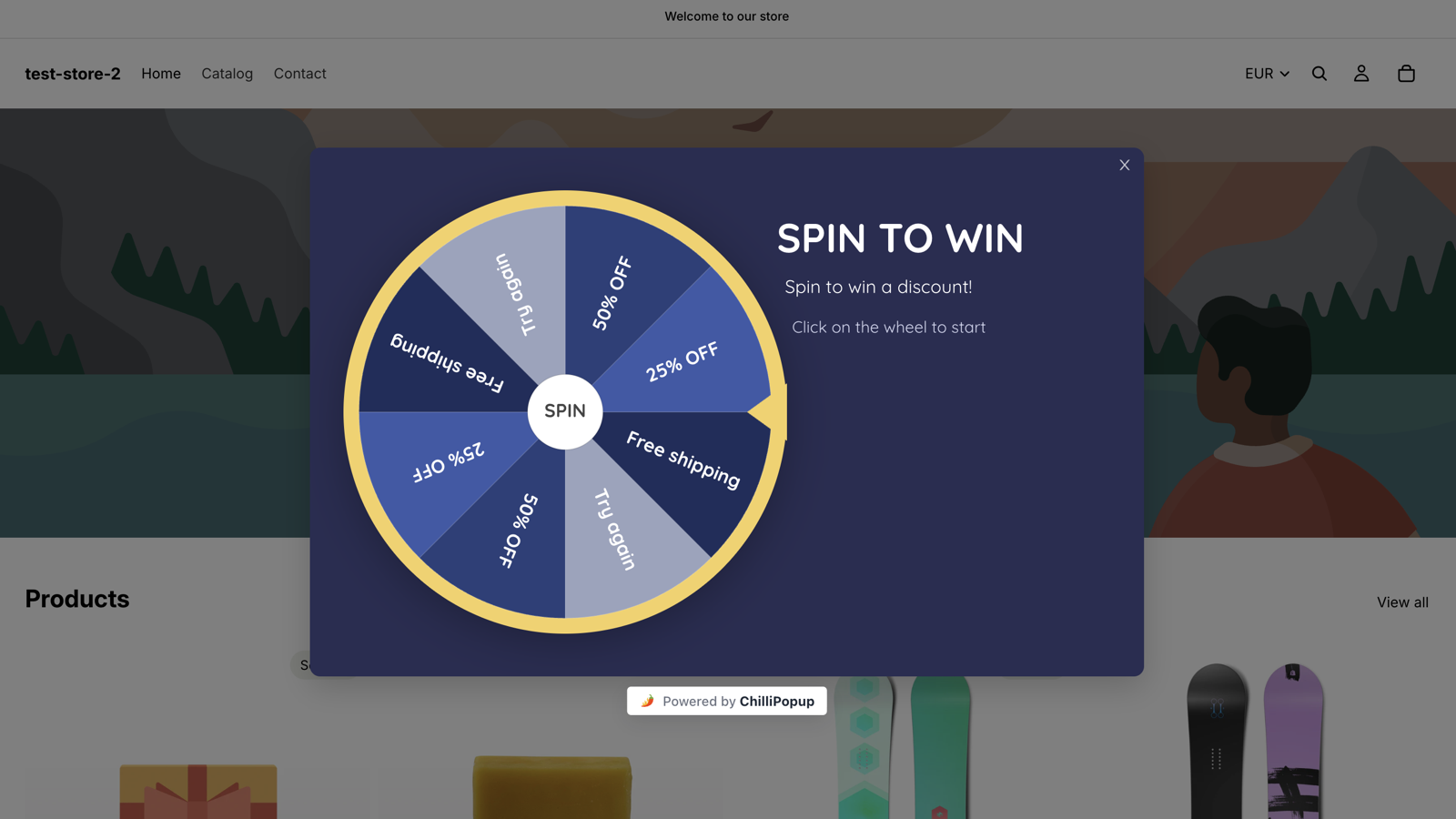
- Consider a non-price offer first. Free shipping over a threshold, an extended returns window, early access, a bundle, or a prize game where most prizes aren't cash off. Games work partly because the reward feels earned rather than handed out.
If you do run codes, one-time-use codes are safer than a single shared one — a pool of unique codes can't be posted to a coupon site and used ten thousand times, and you can set a fallback code for when the pool runs dry.
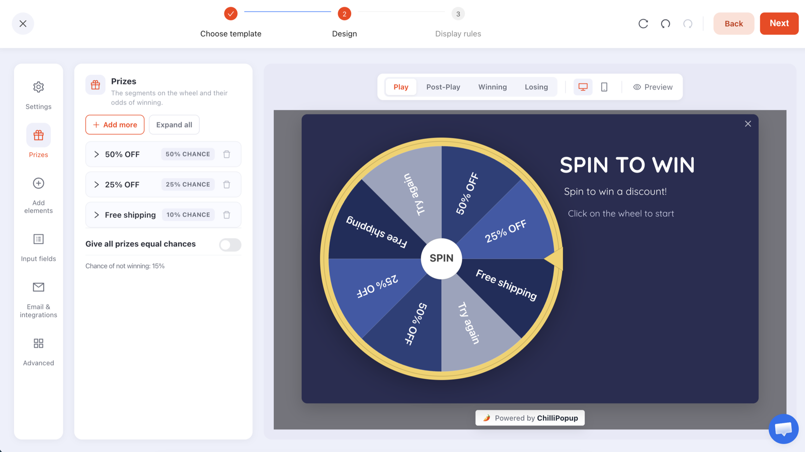
Per-prize win chances let you make the big discount rare. The outcome is decided server-side, so it can't be rigged from the browser.
Seven mistakes that keep a Shopify store flat
- Rebuilding the theme instead of fixing the funnel. A month of work, a fresh coat of paint, and the same unanswered objection on the product page.
- Chasing an industry benchmark. Your traffic mix decides more of your conversion rate than your store design does.
- Shipping cost revealed at checkout. Still the most common single cause of abandonment, and one of the easiest to fix.
- A popup on arrival, on mobile. Bad for conversion, and the exact pattern search engines discourage. Trigger on scroll instead.
- Installing apps and never removing them. Each one is a script tag on every page forever, including the ones you stopped using last year.
- Judging a change after three days. Two weeks minimum, four is better.
- Optimising the store while the traffic is wrong. If one ad set converts at a tenth of everything else, the page isn't the variable.
What to measure
Five numbers, checked monthly, split by device and by traffic source:
- Revenue per session. The master metric — it can't be gamed by discounting or by a traffic drop.
- Add-to-cart rate. Your product-page score. This is the one that moves when you fix an objection.
- Checkout completion rate. Isolates payment and cost friction from everything upstream.
- Average order value. Watch it alongside conversion rate, so a discount win can't hide.
- Campaign conversion rate. Each popup, form, survey and quiz reports its own opens, unique views, clicks, submissions and conversion rate, plus the values collected per field — so a campaign that isn't earning its interruption is easy to spot and switch off.

Raw counts next to the percentage. That's how you catch a "conversion rate improvement" that was really a traffic drop.
Raise your Shopify conversion rate: five steps
One afternoon of setup, then four weeks of leaving it alone. The Shopify install guide covers connecting the store and enabling the app embed.
1. Write down your five funnel numbers
Sessions, product views, added to cart, reached checkout, converted — last 30 days. Calculate the absolute loss at each gap and circle the biggest.
2. Put the objection survey on product pages
One question, four options, one optional text box. Page target contains
/products/, exit intent plus a scroll trigger for mobile, frequency once a day.
3. Fix the winning objection on the page
Put the answer next to the price, in the shopper's words rather than yours. Note the date you shipped it.
4. Add the recovery layer
A first-order offer on new visitors for homepage and collections, and an exit-intent cart offer.
Exclude /checkout with a does not contain rule on both, and turn off "show
again after conversion".
5. Re-measure on revenue per session
Four weeks later, compare revenue per session and add-to-cart rate with the equivalent previous period. Then take the survey's second-place answer and start again.
Related reading
Frequently asked questions
What is a good Shopify conversion rate?
There is no single number worth chasing, because conversion rate depends on price point, category, and where the traffic comes from. Branded and email traffic converts several times better than cold paid social on the same store. The comparison that matters is your store against its own previous month, and each traffic source against itself.
Why is my Shopify store getting traffic but no sales?
Almost always one of four things: the traffic is poorly matched to what you sell, the product page does not answer the shopper's top objection, the total cost including shipping only appears at checkout, or the store looks untrustworthy on a phone. Find which by looking at where the funnel drops, then asking the shoppers who are leaving.
Does page speed affect Shopify conversion rate?
Yes, and the effect is largest on mobile and on cold traffic. Oversized images and a pile of third-party apps are the usual causes on a Shopify theme. Audit your installed apps for scripts that load on every page, and make sure your hero images are properly compressed and sized.
Do discount popups increase Shopify conversions?
They increase claimed discounts, which is not the same thing. A first-order discount genuinely converts hesitant first-time buyers, but it also pays people who were going to buy anyway. Show it to new visitors only, exclude the checkout page, and judge it on revenue per session rather than conversion rate.
Should I use a popup on my Shopify store's checkout page?
No. Checkout is the one place where any interruption is pure cost — the shopper has already decided. Exclude your checkout URL with a page-targeting rule on every campaign, and put your recovery offers on product and cart pages instead.
How long does it take to see a conversion rate change?
Give any single change at least two full weeks, and preferably four, so that weekday and weekend behaviour and a full pay cycle are both represented. Judging a change after three good days is how stores convince themselves that noise was a result.