
Conversion rate optimization is the practice of getting more of your existing visitors to do the thing you want, instead of buying more visitors. The whole discipline reduces to a loop: find where people drop out, ask why, change one thing, check whether the number moved. Everything else — the tooling, the statistics, the jargon — is in service of that loop.
Most CRO writing assumes a research team and a hundred thousand sessions a month. This guide assumes neither. It covers where your leak actually is, what to change in what order, how to test honestly when your traffic is small, and the six results that look like wins and aren't.
Key Takeaways
- Find the leak before you fix anything. The biggest drop-off in absolute numbers is your project — not the worst-looking percentage.
- Offer > moment > friction > styling. That's the priority order, and it doesn't change with your industry.
- Low traffic isn't a blocker, it's a method change. Swap statistical testing for qualitative research and bigger, bolder changes.
- One change at a time, two weeks minimum. Anything faster is you reading noise and calling it a result.
- Check downstream. A lift in signups that costs you revenue or list quality is a loss wearing a win's clothes.
What conversion rate optimization actually is
CRO, in two sentences
Conversion rate optimization is increasing the percentage of visitors who complete a chosen action, without increasing traffic. It's a research and experimentation loop, not a checklist of design tweaks.
It helps to write the arithmetic down, because it tells you where the leverage is:
Revenue = Traffic × Conversion rate × Average order value
Traffic costs money. Average order value is constrained by what you sell. Conversion rate is the
term you can move with work rather than budget — which is why it gets its own discipline.
The second thing to write down is what counts as a conversion. Most small sites have several, and conflating them is how CRO programmes go nowhere. A store has add-to-cart, checkout-started, purchase and email signup. A service business has quote requests and phone calls. A blog has subscriptions. Pick the one that means the visit worked, define exactly where it's measured, and make every experiment answer to that number.
Conversion rate is a ratio, and ratios lie in both directions. It rises when the numerator grows and when the denominator shrinks. A campaign that halves your traffic and keeps the same number of buyers "doubles conversion rate". Always read the raw counts next to the percentage.
Find the leak before you fix anything
The most expensive mistake in CRO is optimising a stage that isn't losing anyone. Map your funnel to five stages, put real numbers against each, and calculate the drop between them.
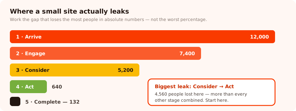
Five stages, four gaps. Work on the gap that loses the most people in absolute terms, not the ugliest percentage.
| Stage | What it means | Typical cause of the drop | First thing to try |
|---|---|---|---|
| 1. Arrive | They land and stay past a few seconds | Slow page, wrong match with the ad or search result | Speed, and a headline that repeats the query |
| 2. Engage | They scroll, click, read something | No hierarchy, no reason to continue | One clear next step above the fold |
| 3. Consider | They view a product, a price, a plan | Missing information — sizing, delivery, what's included | Answer the top three objections on the page itself |
| 4. Act | They start — add to cart, open the form | Too many fields, unexpected cost, no trust signal | Cut fields, surface shipping cost earlier |
| 5. Complete | They finish | Forced account creation, payment friction, errors | Guest checkout, clearer validation messages |
Two rules for reading this table. First, work in absolute numbers. A stage losing 30% of 8,000 people matters more than one losing 70% of 200. Second, the leak is usually earlier than you think. Teams love optimising checkout because it's closest to the money, but on most small sites more revenue is lost between "arrive" and "consider" than anywhere else.
Ask why — the research step everyone skips
Analytics tells you where people leave. It never tells you why. Skipping the why is how teams end up shipping twelve changes and learning nothing from any of them.
Three research methods, in order of cost:
- A one-question survey at the leaking stage. Ten minutes to build, runs all week. On a product page: "Anything stopping you from ordering today?" with four options and an optional text box. On a pricing page: "What's missing from this page?"
- Watching five people use the site. Not a lab — five colleagues, friends or customers, given a task and asked to narrate. You will find two obvious bugs and one wording problem in the first session.
- Reading your own support inbox. Free, already written, and it's a ranked list of everything your pages fail to explain. Sort by frequency; the top three questions belong on the page.
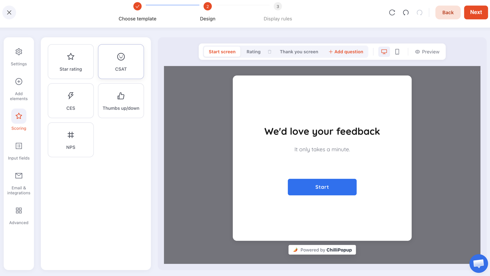
One question, four options, one optional text box — the cheapest research a small site can run.
Rule the research campaign so it reaches the people you actually need. Page-target the URL where the drop happens, trigger on exit intent for desktop and a scroll percentage or an inactivity delay for mobile, and set the frequency to once a day so nobody meets it twice in an afternoon. Because surveys record partial responses — what someone touched before closing without submitting — even abandoned answers add to the pile.
Don't ask what people want; ask what happened. "Would you buy if we had free shipping?" gets you a polite yes from everyone. "What were you looking for that you couldn't find?" gets you a fact.
What to change, in order of payback
Once you know the stage and the reason, there's a reliable priority order. It's the opposite of the order most teams work in.
1. The offer
The single biggest lever, and the one people avoid because it requires a decision rather than a design change. Free shipping over a threshold, a bundle, a longer guarantee, a first-order discount, a genuinely useful lead magnet instead of "join our newsletter". Changing why someone should act beats changing how the button looks by an order of magnitude.
2. The moment
The same offer at a different point in the visit is a different offer. Shown on arrival it's an interruption; shown at 60% scroll it's a suggestion; shown on exit intent it's a last chance. If you only test one thing this quarter, test when.
3. Friction
Every field, every step, every required account. Count fields and ask of each: what decision changes because of this answer? If nothing, delete it. Unexpected costs at checkout belong in this bucket too — the surprise is the friction, not the amount.
4. Clarity
Does the page say what it is, who it's for, and what happens next, in words a stranger understands without your internal vocabulary? Read the first screen aloud. If you'd never say it to a customer, rewrite it.
5. Trust
Returns policy, real photos, a physical address, review counts, delivery times. These matter most on first visits from cold traffic — exactly the audience most likely to leave without telling you why.
6. Styling
Colours, spacing, button shape. Last, because it's the smallest lever, and because it's where teams go when they don't want to make a decision about the first five.
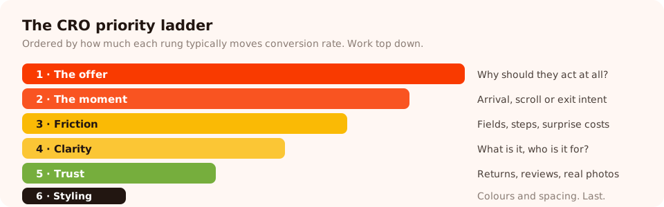
Work top down. Most teams start at the bottom because it's the least frightening rung.
Testing when you don't have the traffic
Classic A/B testing needs a lot of conversions per variant before a difference means anything. Most small sites don't have that, and pretending otherwise produces confident nonsense. Here's what actually works at each scale.
| Your scale | Method that works | How you decide |
|---|---|---|
| Under ~50 conversions/month | Qualitative research and big, obvious changes | Judgement, informed by what customers told you |
| ~50–300 conversions/month | Before/after over equal periods, one change at a time | Only act on large, sustained differences — ignore small ones |
| 300+ conversions/month | Proper A/B tests, two weeks minimum | A pre-declared metric and a pre-declared end date |
Whatever your scale, three rules hold. Change one thing. If you rewrite the headline and move the button and add a badge, you've learned that "something" worked. Run for at least two full weeks, so weekday and weekend traffic are both represented. And write down the metric before you start — the metric you name in advance is the one you're allowed to judge it on afterwards.
Where your capture campaigns are concerned, the testing is built in: A/B testing is available on every widget and on every plan, so a popup, form, survey or quiz can run two variants against each other and report which one converts. The what to test first guide covers the priority order for those specifically.
Run the research half of CRO this week
Exit surveys, on-page polls, scroll-triggered offers and A/B tests, from one editor and one pixel. Free plan, no credit card required. Paid plans from $29/month.
Start free →Six false wins
Every one of these will show up as a green number in a report. None of them is a win.
- The denominator win. Conversion rate up because traffic fell. Check absolute conversions, always.
- The pulled-forward win. A discount popup "converts" people who were going to buy anyway, at a lower margin. Compare revenue per session, not signups.
- The stopped-early win. A variant led on day three, you called it, and it regressed to the mean by day ten. Set the end date up front.
- The seasonal win. You shipped on the first of the month, and payday did the work. Compare like periods.
- The quality-loss win. Signups doubled because you removed validation. Now half the list bounces and your sender reputation pays for it. Watch what happens after the conversion.
- The tracking-change win. Someone added an event, or fixed a broken tag, and the step change is measurement, not behaviour. Annotate every tracking change on the same chart.
One habit prevents most of these: before you ship, write down the metric, the expected direction, the end date, and the number that would make you revert. Then look at exactly that on exactly that date.
A worked example: a small store at 1.1%
The situation. 12,000 sessions a month, 1.1% purchase rate, 130 orders. The owner wants "a better-converting theme".
Step 1 — find the leak. Product page views: 5,200. Add to cart: 640. Checkout started: 410. Purchased: 132. The biggest absolute loss is between product view and add to cart — 4,560 people. The theme is not the problem.
Step 2 — ask. An exit-intent survey on product pages only: "Anything stopping you from ordering today?" — Price · Delivery time · Not sure about size · Just browsing. 212 responses in two weeks. Delivery time takes 38%, and the free-text answers repeat the same complaint: the delivery estimate is only visible at checkout.
Step 3 — change one thing. A delivery estimate goes on the product page, next to the price, in plain language: "Ships in 1–2 days · Free over €60 · Free returns for 30 days".
Step 4 — judge it. Metric declared in advance: add-to-cart rate on product pages, over four weeks, compared with the four weeks before. Downstream check: orders and revenue per session, to make sure nothing was pulled forward or discounted away.
Step 5 — the next loop. Whatever happened, the survey stays up for one more cycle and the second-place answer becomes the next hypothesis. The point isn't the single fix — it's that the store now has a repeatable way to find the next one.
Where popups fit in a CRO programme
Popups do two distinct CRO jobs, and it's worth keeping them separate in your head.
- Research. Exit surveys and on-page polls at the leaking stage. This is the highest value use, and the one most teams never try.
- Capture. Converting a leaving visitor into an email address you can market to later — the difference between a lost session and a second chance. Lead capture, discount claims, back-in-stock requests, quote requests.
Both need rules, or they become a friction source of their own. The display rules that matter: trigger on scroll or exit intent rather than arrival; page-target so checkout and support pages are excluded; set a frequency so returning visitors don't meet the same overlay daily; and turn off show again after conversion so people who already subscribed stop being asked. Each campaign then reports its own opens, unique views, clicks, submissions and conversion rate, plus a breakdown of the values collected per field.
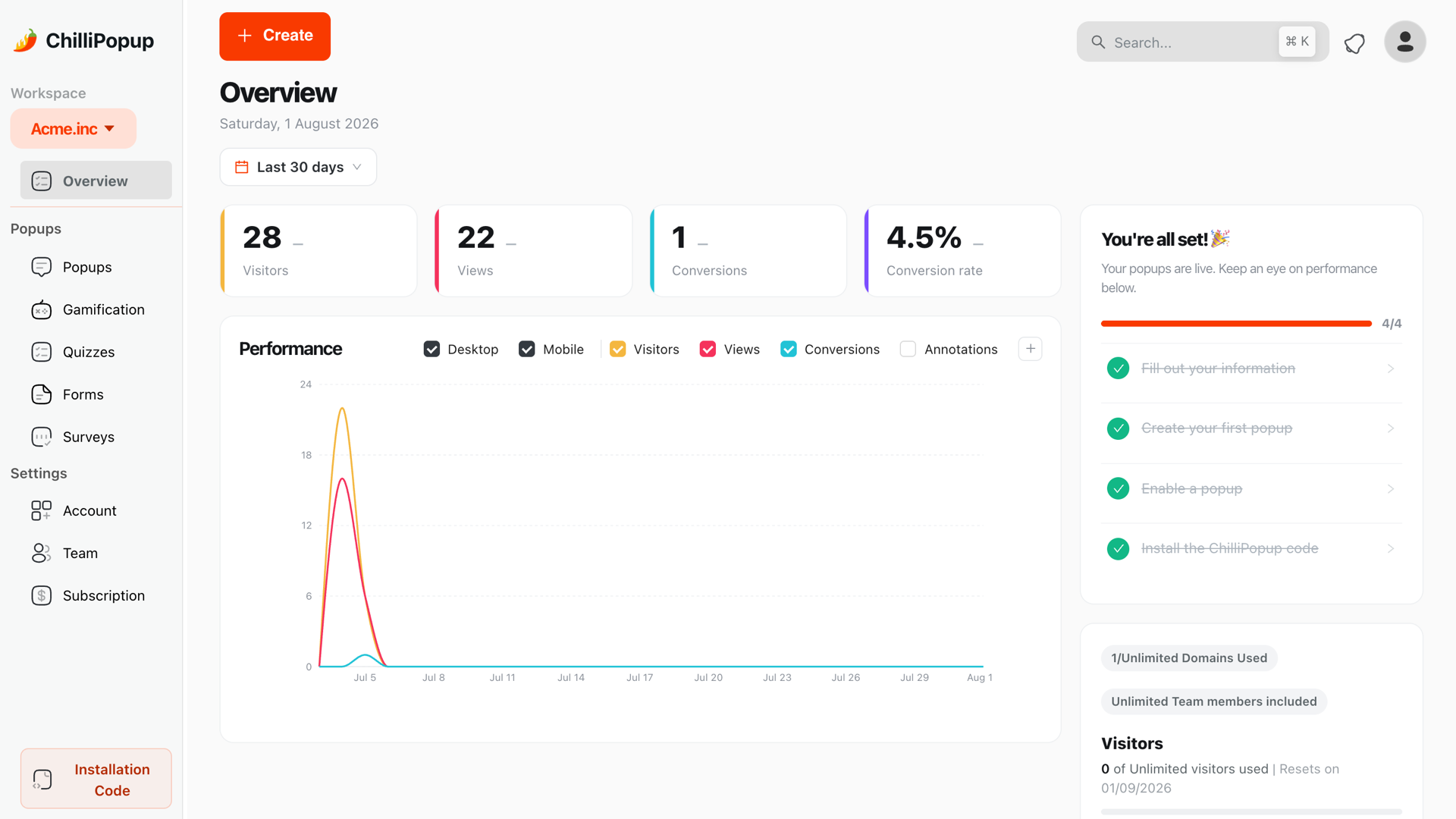
Visitors, views, conversions and conversion rate in one place — with the raw counts next to the percentage, which is how false wins get caught.
Run your first CRO cycle: five steps
Two hours of setup, then four weeks of patience. If the pixel isn't installed yet, the one-line install guide takes about five minutes.
1. Name one conversion
Write it down, including where it's measured. "Completed purchase, counted on the order-confirmation page." Not "engagement". Not three metrics.
2. Find the biggest leak
Put real numbers against the five stages and calculate the absolute drop at each gap. The winner is your project for the next month — everything else waits.
3. Ask why, for one to two weeks
A one-question survey, page-targeted to the leaking stage, exit intent on desktop plus a scroll or inactivity trigger for mobile, frequency once a day. Stop at 100–200 responses.
4. Ship one change
The change that answers the top response. Note the date. Resist the urge to bundle in the four other improvements you noticed while you were in there.
5. Judge it, then go again
Four weeks later, compare the metric you named against the equivalent previous period, check revenue per session for false wins, and start the next loop on the second-place answer.
Related reading
Frequently asked questions
What is conversion rate optimization?
Conversion rate optimization, or CRO, is the practice of increasing the share of visitors who complete a chosen action — buying, subscribing, booking, requesting a quote — without buying more traffic. In practice it is a loop: measure where people drop out, ask why, change one thing, and check whether the number that matters moved.
What is a good website conversion rate?
There is no useful universal figure, because conversion rate depends on what you count as a conversion, how much your product costs, and where the traffic comes from. Branded search converts many times better than cold social traffic on the same page. Compare your own site to its own last month, and compare pages of the same type to each other.
How do I do CRO with low traffic?
Stop trying to run classic A/B tests and switch to two things that work at small scale: qualitative research — exit surveys, on-page polls, watching real people use the site — and big obvious changes rather than button colours. If a change is large enough that it does not need statistics to see, low traffic is not a barrier.
How long should I run an A/B test?
Long enough to cover a full business cycle and to accumulate a real sample — for most small sites that means at least two full weeks, never a few days. Stopping the moment a variant looks ahead is the single most common way small teams convince themselves of a result that is not there.
What should I test first?
The offer and the moment, not the styling. A different reason to convert, or the same offer shown at a different point in the visit, moves conversion rate far more than a headline rewrite or a button colour. Test the biggest lever you are willing to change.
Do popups actually improve conversion rate?
They improve conversion of the specific action they ask for — email capture, discount claim, quote request — and they can hurt the rest of the page if they fire on arrival or repeat on every visit. Rule them on scroll or exit intent, exclude checkout and support pages, and turn off 'show again after conversion' so people who already converted stop seeing them.